AhaPrompt
Prompts
Featured
Models
Submit
Blog
Home
AI Prompt Library
Poster
Poster Prompts
Explore the best Poster prompts for AI image, video, and audio generation.
Browse AI Image Prompts
Browse AI Video Prompts
Browse AI Music & Voice Prompts
AI Prompt Library
All
Images
Videos
Audio
Newest
Popular
All categories
3D Render
Abstract
Advertising
Aerial
Ambient
Animals
Animation
Anime
Architecture
Avatar
Black & White
Bright
Cartoon
Character
Cinematic
Cityscape
Classical
Comic
Cyberpunk
Dark
Digital Art
Dramatic
Dynamic
Electronic
Ethereal
Fantasy
Fashion
Folk
Food
Game Assets
Gothic
Hip-Hop
Historical
Holiday
Horror
Infographic
Jazz
Landscape
Lo-Fi
Logo Design
Macro
Minimalist
Motion Graphics
Music Video
Mysterious
Mythology
Nature
Neon
Oil Painting
Peaceful
Pixel Art
Pop
Pop Art
Portrait
Poster
Product Photography
R&B
Realistic
Rock
Sci-Fi
Short Film
Sketch
Slow Motion
Sound Effects
Space
Sports
Steampunk
Sticker
Still Life
Street Photography
Surreal
Tattoo
Timelapse
Trailer
Typography
Vector
Vehicles
VFX
Vintage
Voiceover
Wallpaper
Watercolor
Whimsical
Nano Banana 2.1
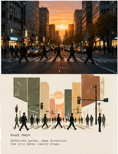
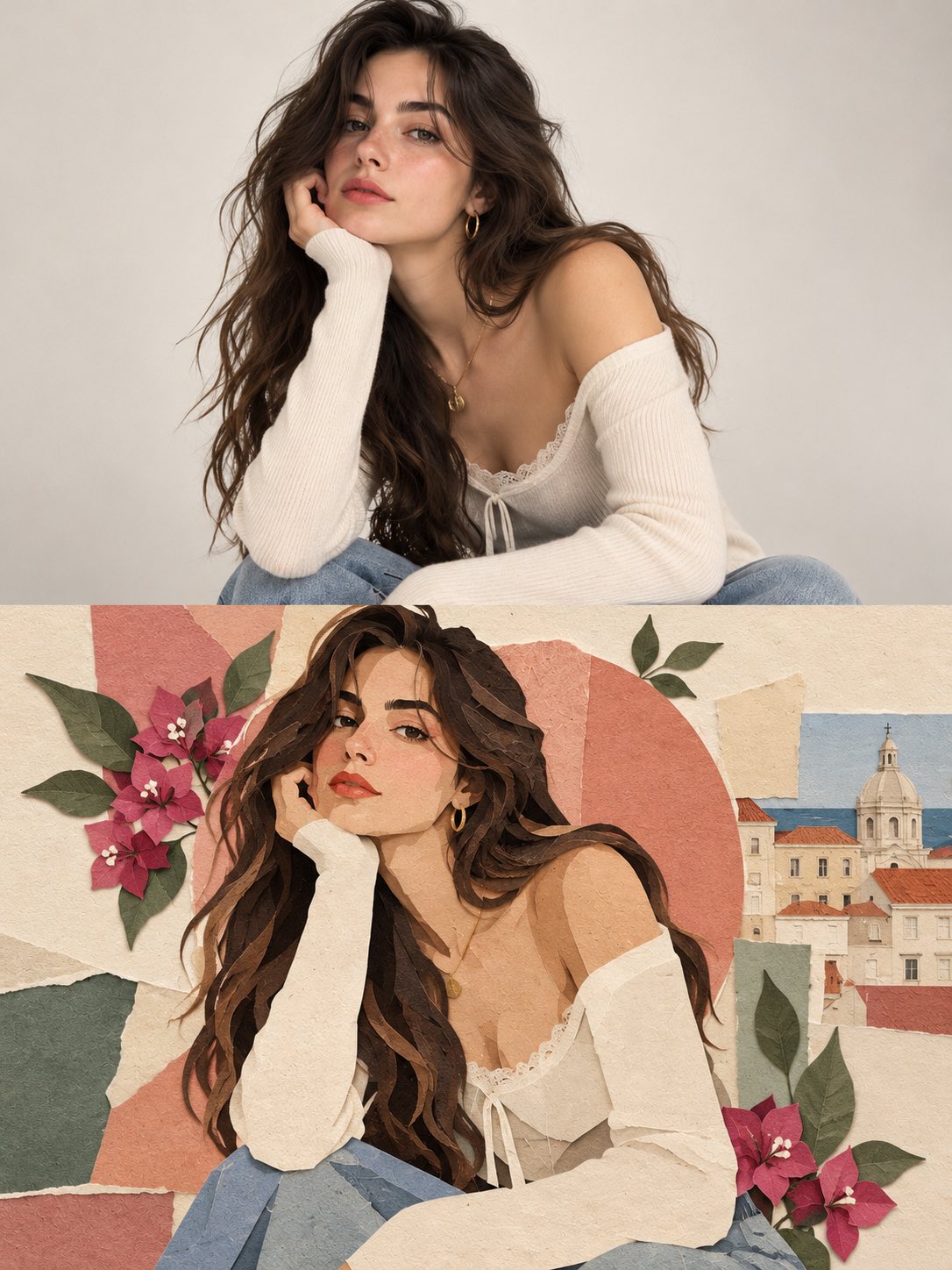
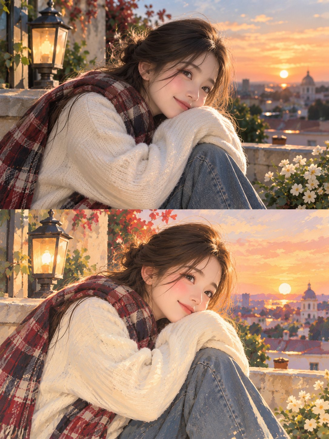
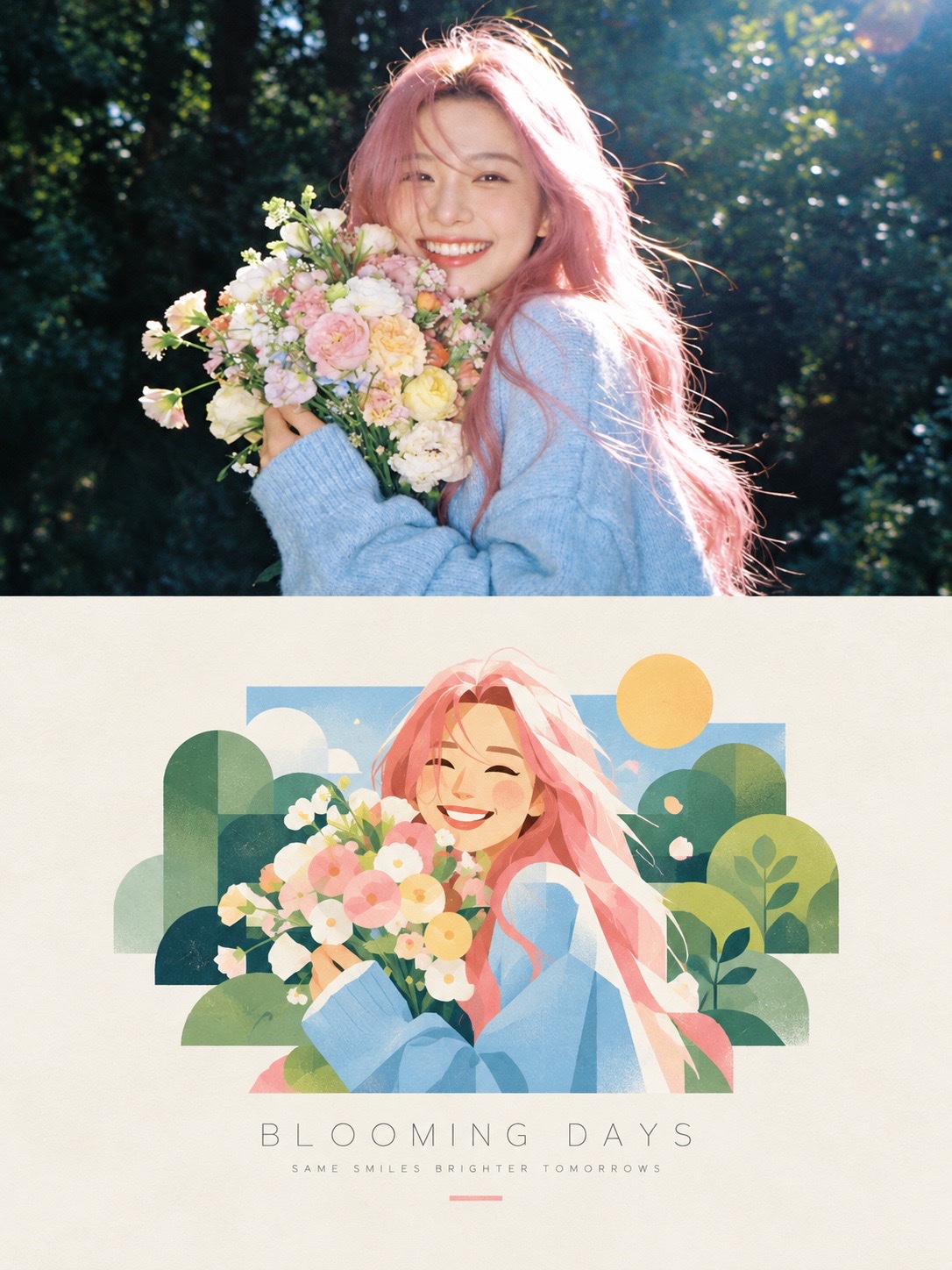
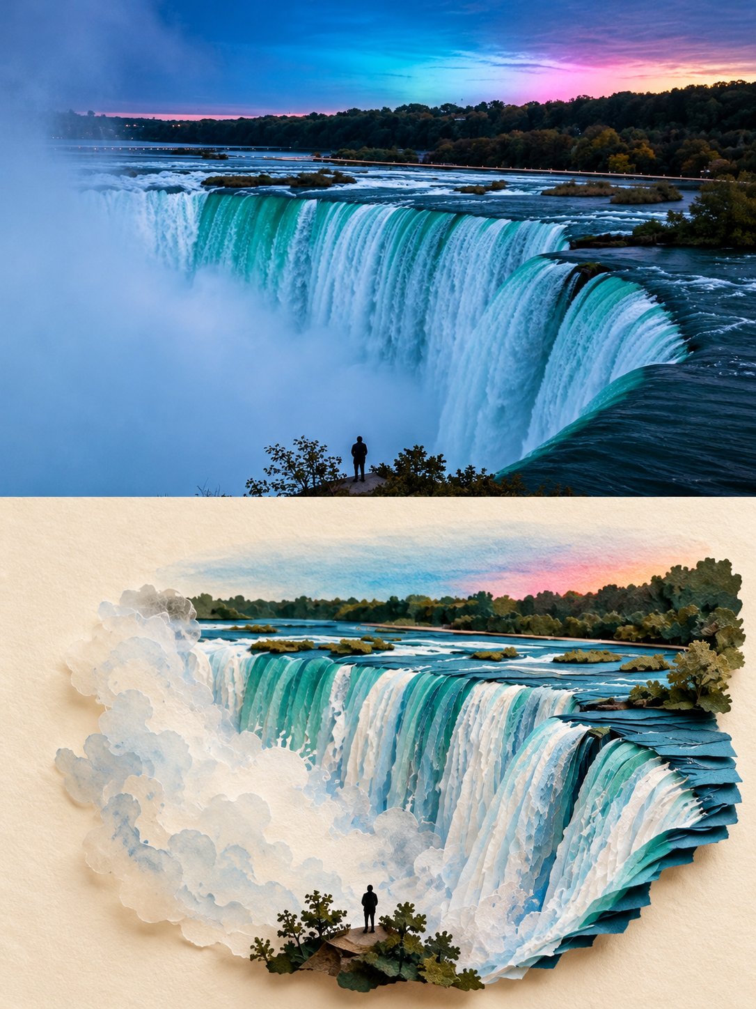
Design a sophisticated vertical editorial poster with a seamless two-section composition. In the upper section, present a highly realistic photograph of [SUBJECT] in [SETTING]. Use warm, natural daylight, authentic facial expression, detailed skin texture, subtle highlights, realistic shadows, and cinematic depth of field for a polished photographic feel. In the lower section, recreate the exact same moment as a refined hand-painted digital artwork. Keep the character instantly recognizable by matching the original pose, facial features, hairstyle, outfit, colors, lighting direction, and important background elements, while giving the scene a soft artistic interpretation. Surround the illustrated section with a warm ivory paper layout featuring subtle paper grain and elegant editorial spacing. The artwork should have delicate painterly strokes, organic shapes, muted pastel tones, gentle contours, and a nostalgic contemporary magazine aesthetic. Add a few minimal decorative botanical or seasonal details that naturally enhance the composition. Under the artwork, place a centered editorial heading: “[MAIN TITLE]” using thin, sophisticated uppercase lettering with generous spacing. Beneath it, add “[TAGLINE]” in a smaller elegant typeface with subtle letter spacing, followed by a short delicate pastel accent line. Keep the entire design clean, balanced, refined, and visually cohesive. Use a vertical 3:4 format, high resolution, sophisticated print aesthetics, natural color grading, and a seamless transition from photography to illustration. Avoid visual clutter, excessive typography, thick borders, harsh saturation, distorted anatomy, inconsistent facial details, awkward proportions, or unnecessary graphic decorations.
0
Details
GPT Image 2.5
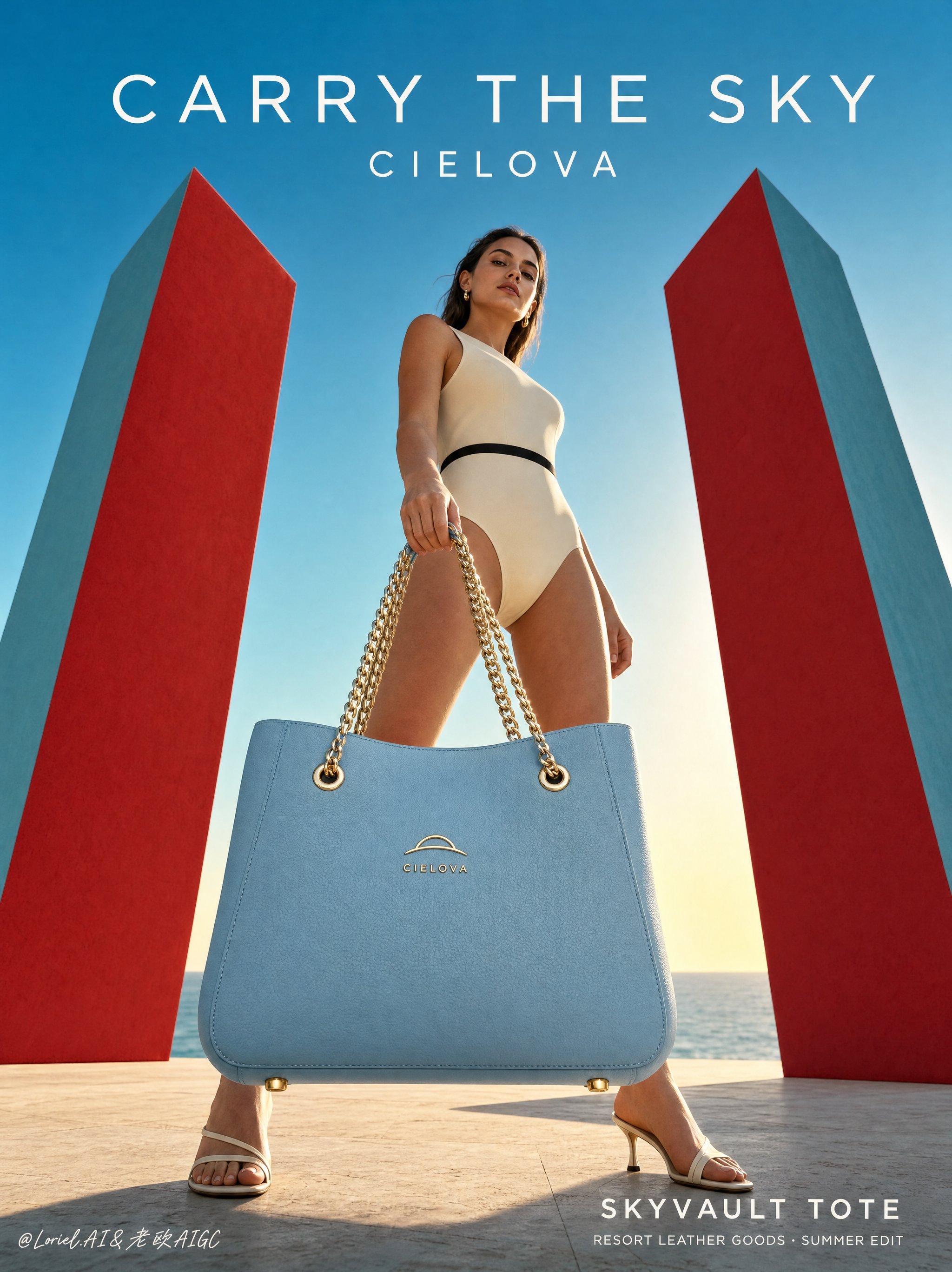
A full-bleed vertical luxury handbag poster for the original resort leather brand CIELOVA, merging wind-driven coastal narrative with precise trunk-bag craftsmanship. The hero product is the CIELOVA "SKYLOCK TRUNK", a powder-blue structured micro trunk bag suspended at the center of a low-angle fashion-commercial scene. The image combines realistic sunlit fashion photography, flat red-and-teal architectural color blocking, clean sky negative space, and sparse luxury typography. Extreme low-angle viewpoint from the terrace floor, looking upward from below waist height. The bag hangs in the lower-center foreground, close enough for the lock, corner plates, strap hardware, leather grain, and stitched panel edges to read clearly. The model, legs, and red geometric slabs rise around it, creating monumental scale without reducing product readability. Two tall red sculptural slabs stand at the left and right edges, with cool teal side planes angled inward to form a triangular gateway. The adult model bends forward from the upper right, one leg extended left and the other planted right, creating a dynamic arch over the suspended bag. The pale-blue strap curves from the foreground hand down to the central lock, guiding the eye into the product. The sky remains open for typography; no text overlaps the bag, face, hands, or lock. Hero product: CIELOVA "SKYLOCK TRUNK", a small structured powder-blue leather trunk bag with a rigid rectangular box body, fine pebble-grain surface, brushed-gold corner plates, polished gold rivets, central gold lock clasp, short top handle, detachable pale-blue shoulder strap, and precise stitched panel edges. The front lock plate carries an original CIELOVA emblem: a minimal gold arched-horizon mark above the small uppercase word "CIELOVA". The bag must feel symmetrical, tactile, sharply edged, and commercially credible. An adult female fashion model, clearly over 20, wears an ivory sleeveless resort bodysuit with a narrow black waist band and glossy burgundy pointed heels. She leans forward in a stable crouched stance, one hand gripping the pale-blue strap near the camera, the other controlling the hanging bag. Her gaze points downward toward the viewer with a composed, intent expression. Wind pushes her hair diagonally from upper right toward left, echoing the strap movement. The handbag hangs between the model’s legs and slightly in front of the torso, becoming the central point of weight and tension. The strap forms a clean curved line from hand to lock clasp; the gold rings and corner plates catch the same warm rim light as the shoe highlights. The red slabs sit behind the model, framing the product without intersecting the body. The pale terrace floor shows soft shoe contact shadows and a faint warm reflection below the suspended bag. Background: a minimal coastal terrace with pale textured stone floor, low distant sea line, warm horizon glow, and clean cyan sky. The red-and-teal slabs are simple hard-edged matte volumes. Depth comes from the low horizon, slab scale, leg spacing, strap overlap, and foreground product detail. No extra buildings, crowds, plants, vehicles, jewelry clutter, or decorative props. Late-afternoon backlight comes from low behind the model, creating warm rim highlights along the legs, hair, bag edges, lock clasp, rivets, and gold corner plates. Soft frontal fill keeps the bag’s front panel, emblem, stitching, leather grain, and lock readable. Color hierarchy: powder blue bag and sky as the cool core, deep red slabs and burgundy heels as accents, ivory bodysuit and pale stone as neutral support, brushed gold hardware as precise highlight points. Shadows stay warm and transparent, never dead black. Highest detail belongs to the handbag: rigid trunk geometry, pebble leather grain, brushed-gold protectors, clasp depth, rivet reflections, seam shadows, strap thickness, hardware tension, and believable hanging gravity. Skin and clothing are realistic but secondary. Hair has clear wind direction and separated edges. The slabs remain smooth and graphic. Product edges and typography must be crisp. Exact visible text only: "UNLOCK THE SKY" "CIELOVA" "SKYLOCK TRUNK" "RESORT LEATHER GOODS · COASTAL EDITION" Typography: refined geometric sans serif with wide letter spacing, white or pale ivory. "UNLOCK THE SKY" sits large in the upper sky negative space above the model’s shoulder line. "CIELOVA" sits smaller beneath it. "SKYLOCK TRUNK" and the auxiliary line align in the lower-right negative space above the terrace line. Maintain clear margins. Full-bleed vertical commercial poster. Preserve the low-angle perspective, central suspended powder-blue trunk bag, crouched model, diagonal wind-swept hair, curved strap gesture, red-and-teal architectural slabs, coastal horizon, clean sky negative space, and sparse luxury typography. The product must remain the sharpest, clearest, and most detailed object. Avoid warped handbag geometry, broken straps, floating bag, unstable crouch, extra limbs, distorted fingers, unclear scale, plastic leather, muddy blue surfaces, overexposed lock plate, dead black shadows, dirty stains, copied real logos, misspelled "CIELOVA", unreadable text, sci-fi elements, cluttered props, painterly drift, collage artifacts, and low-quality product edges.
0
Details
GPT Image 2.5
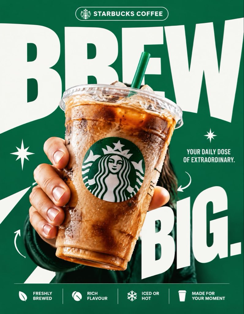
STARBUCKS — “BREW BIG.” 4:5 vertical premium poster, 8K, exaggerated bold typography × high-impact commercial art direction × photorealistic product advertising 🧠 CORE IDEA: “BREW BIG.” 🎬 LAYOUT: BACKGROUND BLOCK: Solid, vivid Starbucks green background with oversized graphic shapes and strong contrast. GIANT TYPOGRAPHY: “BREW” Extremely bold, oversized, tightly cropped typography dominating almost the entire composition. Letters extend beyond the canvas edges, with the Starbucks cup overlapping the text. 👤 SUBJECT: A hand holding an iced Starbucks drink directly toward the camera, extreme forced perspective, cup dramatically enlarged in the foreground, realistic condensation, crisp ice, natural lighting. ☕ PRODUCT + VISUAL TWIST: The Starbucks cup becomes the centerpiece of the typography. The oversized word “BREW” appears to wrap behind the cup, creating striking depth through scale, layering, and composition. Keep the cup, logo, and beverage completely photorealistic. ✨ GRAPHIC ELEMENTS: * Oversized green and white shapes * Sharp contrasting shadows * Minimal starburst accents * Small directional arrows * Bold editorial layering ✍️ TEXT SYSTEM: Top pill: “STARBUCKS COFFEE” Main headline: “BREW BIG.” Supporting text: “YOUR DAILY DOSE OF EXTRAORDINARY.” BOTTOM FEATURE STRIP: * Freshly Brewed * Rich Flavour * Iced or Hot * Made for Your Moment ANTI-SLOP DIRECTION: Typography is the main design feature, not a small decorative element. Extreme scale, aggressive cropping, strong visual hierarchy, deliberate overlap, premium print-ad finish. No floating coffee beans, no miniature landscapes, no random surreal objects, no excessive particles, no cluttered layouts, no generic gradients. The final poster should feel like a bold global advertising campaign with unmistakable graphic impact.
0
Details
GPT Image 2.5
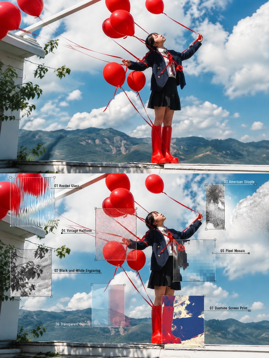
Create a high-quality editorial photography and graphic design composition using the reference image. Feature a stylish young woman in a dynamic, playful pose, holding oversized props—bright red balloons against a vivid blue sky with mountains in the background, or an oversized orange megaphone against a textured green urban wall. Present the original photorealistic scene in the upper half and a creative experimental art direction version in the lower half. Overlay the lower image with seven clearly defined visual texture samples: reeded glass, black-and-white engraving, American stipple, vintage halftone, pixel mosaic, transparent overlays, and duotone screen printing. Add fine white annotation lines, small numbered labels, and rectangular sample frames to explain each effect. Preserve the subject’s pose, clothing, lighting, and composition. Use vibrant colors, cinematic natural lighting, detailed textures, contemporary Japanese editorial aesthetics, and a sophisticated art-school design layout. Ultra-realistic photography combined with experimental mixed-media graphics, crisp details, balanced composition, high resolution, vertical 4:5 aspect ratio.
0
Details
GPT Image 2.5
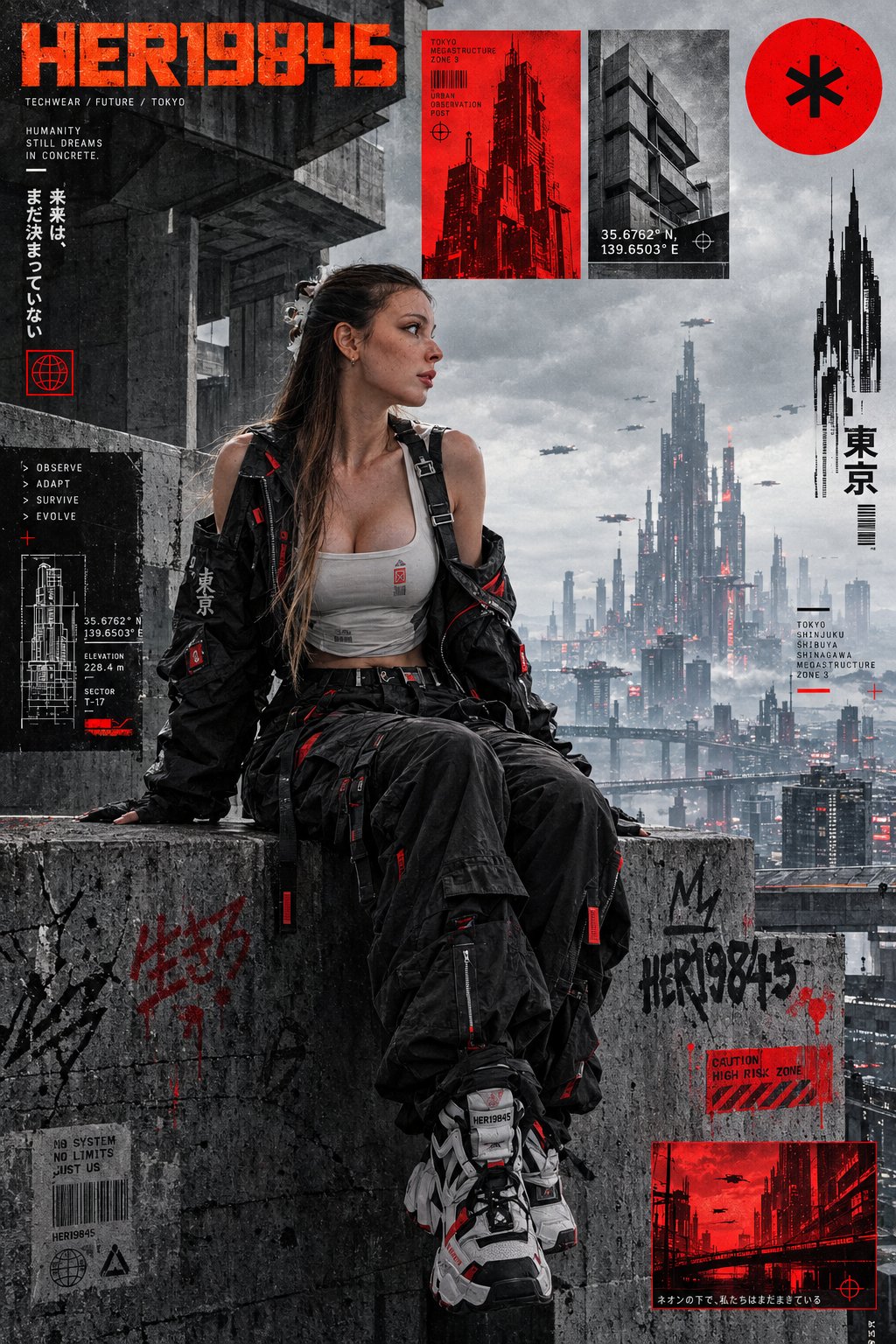
A high-fidelity, cyberpunk-themed editorial graphic design poster, featuring a layout reminiscent of a cyberpunk collage-style magazine. It depicts an anime-style character in techwear, seated on a brutalist concrete ledge. The background consists of complex, raw concrete brutalist architecture, with a distant view of a cyberpunk megalopolis beneath an overcast gray sky. The poster incorporates various overlapping technical graphic elements and text blocks. In the upper-left corner, the text "HER19845" appears in orange. In the upper-right corner, there is a large, solid red circle with an asterisk at its center. A red inset box displays a brutalist skyscraper, accompanied by the coordinates "35.6762° N, 139.6503° E." To the right, there is a silhouette of a skyscraper. The concrete surface features subtle micro-graffiti and scratches. The color palette consists of concrete grays, deep blacks, and a vibrant, warning-sign red. The scene is illuminated by cool, urban ambient light, with a clean yet gritty urban texture and sharp, intricate micro-details.
0
Details
Nano Banana 2.1
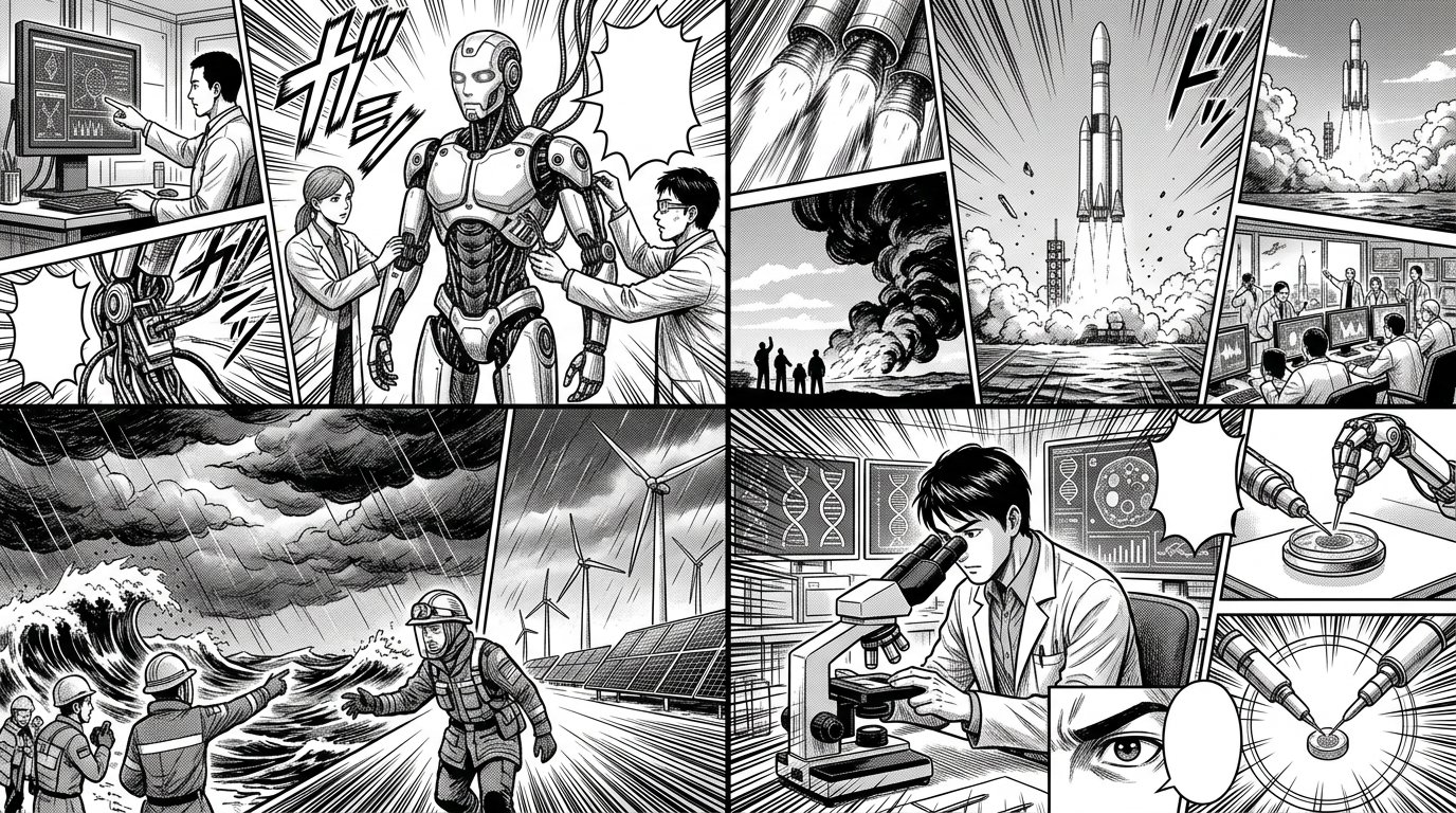
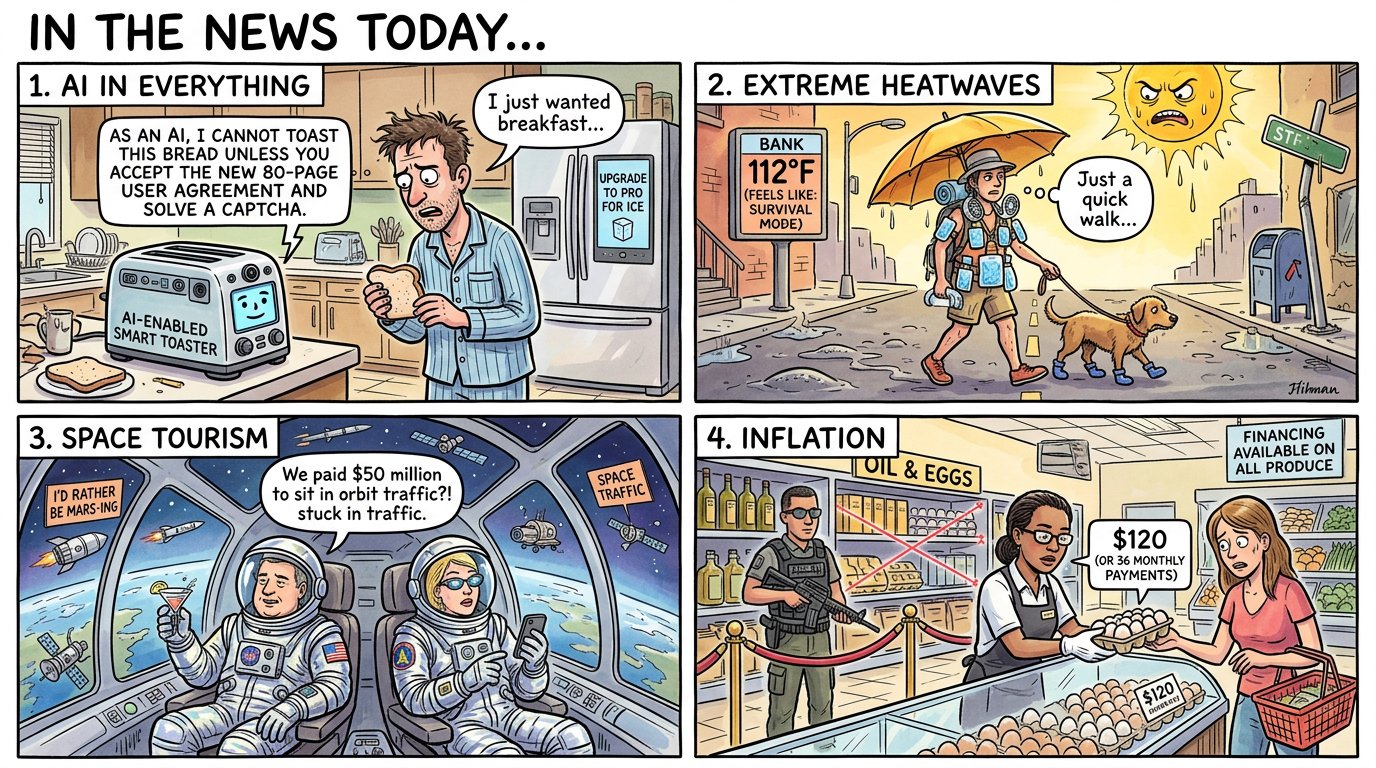
2x2 grid, 16:9, AI pick topics that are in the news today: FINAL_GRAPHIC = TOPIC_KNOWLEDGE ⊗ UNEXPECTED_CONNECTION( ASSOCIATION_A, ASSOCIATION_B ) → COMEDIC_KERNEL → SCENE( HERO?, CAST[0..N], SETTING?, ACTION, PROPS ) + OPTIONAL_TEXT( only_if_needed ) × STYLE_SELECTED_AFTER_JOKE × PRODUCT_ADAPTATION - ( fixed_cast_size + fixed_setting + mandatory_anthropomorphism + mandatory_dialogue + generic_meme_template + repeated_visual_format + unnecessary_explanation )
0
Details
Nano Banana 2.1
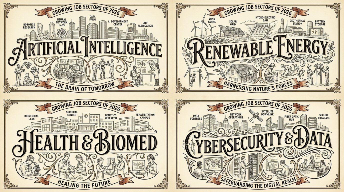
2x2 grid, 16:9, do this for 4 growing job sectors of 2026: W₁ WORDMARK SPINE (master) the place/topic name in giant decorative lettering across the center as the compositional spine; the letters CARRY the scene (landmarks above, life below). ¬W₁ = small title / title detached at top / plain sans. W₂ LABELED LANDMARK SKYLINE ABOVE a line‑drawn skyline of the place's iconic landmarks sitting on/above the wordmark, with small labels naming them. ¬W₂ = no skyline / unlabeled / wrong landmarks / skyline below the word. W₃ STREET‑LIFE VIGNETTES BELOW small vignette scenes of the place's characteristic life (café patrons, painters, dancers, stairs) below/around the wordmark, integrated via the letters' swashes/flourishes. ¬W₃ = no vignettes / vignettes floating detached / generic people. W₄ ERA/CAPTION RIBBONS curved ribbon/banner captions carrying the place's era or tagline. ¬W₄ = no ribbons / straight modern tagline box / lorem. W₅ VINTAGE LIMITED PALETTE + LINE ART fine ink line art on cream with a limited palette (black + gold/tan + ONE accent such as red); vintage print feel. ¬W₅ = full color / photoreal / gradient / dark ground. η HONEST LINE consistent fine line weight, delicate hatching, clean letterforms with decorative swashes. FORBIDDEN = small/detached title · plain sans · no skyline · unlabeled landmarks · no vignettes · detached vignettes · no ribbons · full color · photoreal · dark ground · lorem
0
Details
GPT Image 2.5
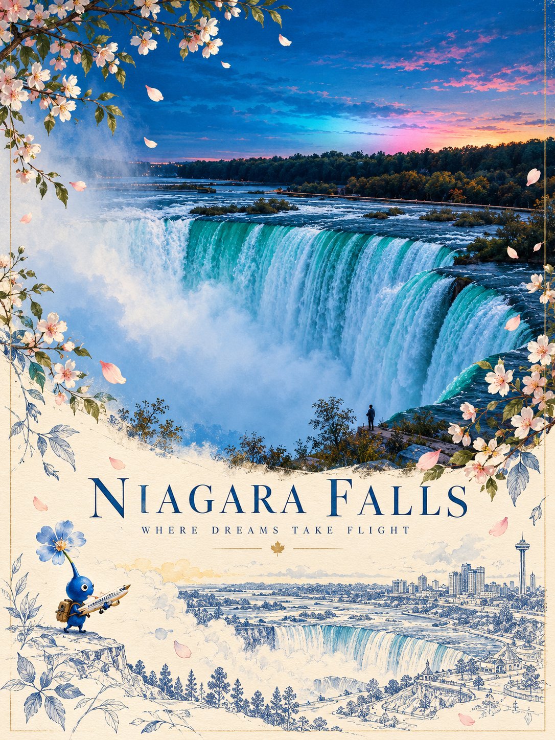
Create a sophisticated 3:4 vertical illustrated travel poster featuring [COUNTRY / CITY / DESTINATION], blending authentic architectural photography with whimsical storytelling, delicate botanical art, and elegant blue architectural sketches. MAIN SCENE: Feature the destination’s most recognizable landmark, preserving its authentic architecture, proportions, distinctive towers, and surrounding environment. Capture warm golden-hour sunlight, a luminous blue sky, and a natural photographic atmosphere. BOTANICAL FRAME: Surround the upper scene with graceful flowering branches and delicate petals, using a seasonal palette inspired by the destination. Let the flowers frame the landmark naturally without obscuring its defining features. ILLUSTRATED SECOND WORLD: In the lower half, transition into a warm ivory paper composition featuring a refined blue line-art illustration of the same landmark. Add floating petals, loose botanical sketches, subtle watercolor accents, and generous negative space. Include a tiny, adorable Pikmin-inspired blue flower creature carrying a miniature airplane, creating a whimsical story of courage, travel, and dreams taking flight. COLOR & STYLE: Sky blue, cobalt blue, soft ivory, warm gold, and delicate floral pink or blue. Combine realistic photography, fine architectural ink drawing, subtle watercolor textures, and premium editorial travel-poster design. STORYTELLING: Make the tiny character and its flower feel naturally connected to the destination. Convey wonder, optimism, and the poetic idea of flowers discovering their own way to fly. TYPOGRAPHY: Include a small, elegant destination name and restrained editorial details only where appropriate. Keep all lettering clean and correctly spelled. Avoid distorted architecture, clutter, oversized characters, excessive decoration, harsh colors, childish cartoon styling, watermarks, and logos. FORMAT: 3:4 vertical, high resolution, polished collectible travel-art poster.
0
Details
GPT Image 2.5
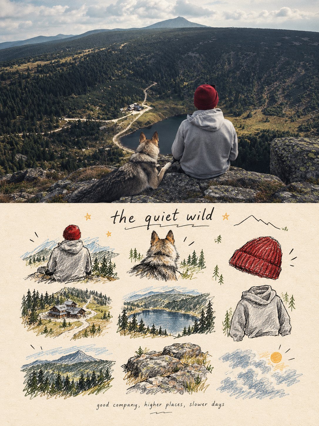
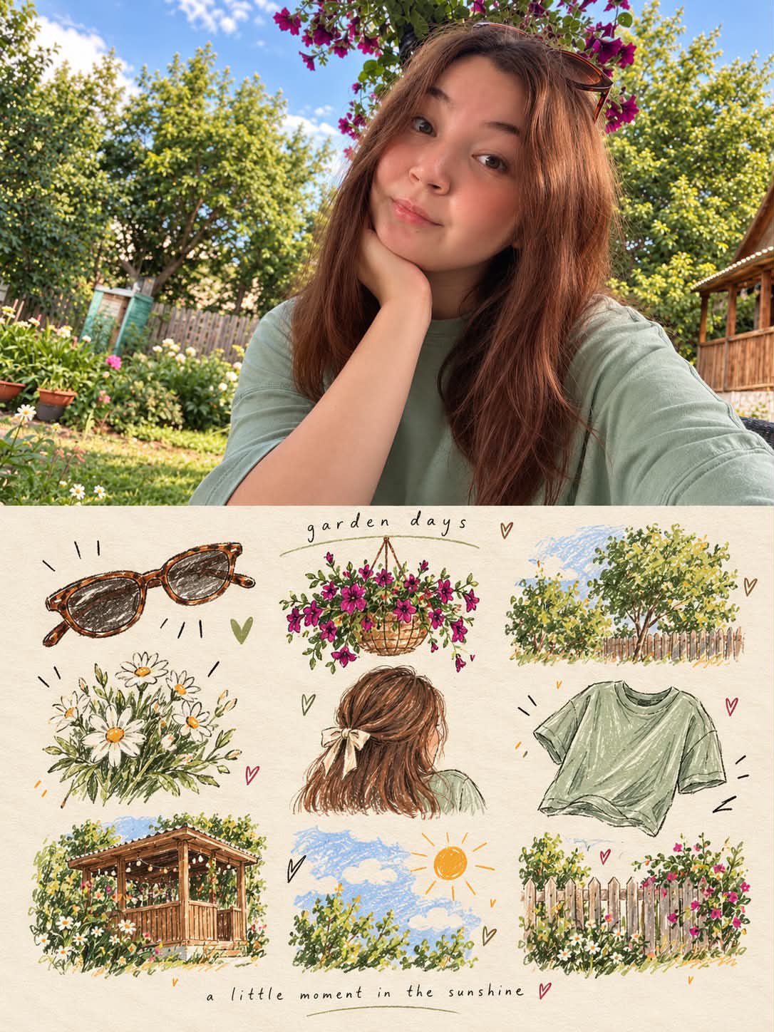
turn each photo I upload into a separate, high-end design poster. Do not combine multiple photos into a collage. Each photo must be processed and output individually. 1. Overall Layout and Composition Use a 3:4 vertical aspect ratio. Divide the canvas into two equal horizontal sections, with a strict 1:1 height ratio: the top half occupies exactly 50% of the canvas, and the bottom half occupies the remaining 50%. 2. Top Half — Original Photography Preserve the original photograph in the upper section. Maintain the subject’s identity, structure, pose, realistic textures, natural lighting, shadows, and original color atmosphere. Apply only subtle, sophisticated color grading to achieve the aesthetic of an art magazine, independent publication, or gallery exhibition image. You may naturally extend the environmental background to fit the composition, but never stretch, distort, or alter the subject. 3. Bottom Half — A Visual Memory Collection Extract the most recognizable subjects, distinctive details, action cues, objects, and narrative relationships from the photograph. Reinterpret them as a visual system combining a modular 3×3 icon grid, naïve hand-drawn doodle illustrations, crayon/p colored-pencil textures, and handwritten typography. Do not reproduce the original photograph in full detail, and do not create realistic illustrations. Instead, simplify the complex visual information into nine memorable visual elements. These may include: The main subject Distinctive physical or visual features Personal belongings or objects Plants or food Modes of transportation Poses or gestures Emotional symbols Small memorable details from the surrounding scene Every element must be a semantic extension of the same photograph above, creating a cohesive “memory checklist” that clearly belongs to that specific image. 4. Grid System and Visual Arrangement Use an implicit, loosely arranged 3×3 grid. The nine-cell structure should serve as an underlying compositional framework rather than a rigid, visible grid. Slightly vary the position, scale, angle, and placement of each icon to create an organic, imperfect arrangement that feels structured but never mechanical. Aim for a natural loose grid / organic grid aesthetic. At the top of the lower section, you may add a short handwritten title, accompanied by a few playful wavy lines, tiny stars, or decorative symbols. At the bottom, include a very small handwritten caption, making the overall design feel like a page from a personal journal, visual diary, or curated collection sheet. Maintain generous negative space. The layout should feel relaxed, cute, restrained, and visually balanced rather than cluttered. 5. Illustration Style and Texture Use a Naïve Hand-Drawn Doodle Illustration style. Keep shapes simple, slightly childlike, and intentionally imperfect. Use subtly shaky outlines with irregular line thickness. Allow contours to remain partially open rather than perfectly closed. Preserve a sense of deliberate imperfection and handmade character. Avoid overly dense coloring. Let the paper texture, white grain, and rough edges remain visible. Combine fine black outlines with colored-pencil or crayon fills and a few selective blocks of color. Use flat color / spot color to establish visual relationships instead of relying on realistic lighting and shading. If grid guidelines are included, keep them extremely faint, as if lightly sketched in pencil, rather than using clean, computer-generated table lines. Final Art Direction The finished poster should feel like a sophisticated independent art publication blended with a playful, handmade visual diary. The upper half should preserve the beauty and authenticity of the original photograph, while the lower half transforms its most meaningful details into nine charming, hand-drawn visual memories. The final result must be a separate 3:4 vertical poster for each uploaded photograph, with an exact 50/50 split between the original photograph and the illustrated memory collection.
0
Details
GPT Image 2.5
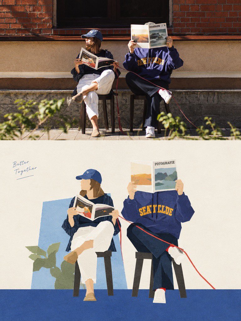
Create a vertical 3:4 editorial memory poster inspired by the uploaded photograph. Divide the composition into two horizontal sections: the top 50% preserves the original photograph with its recognizable subject, identity, pose, clothing, background, natural lighting, and realistic details. Do not redraw or stylize the top section. The bottom 50% becomes a warm, hand-drawn illustrated scrapbook inspired by the photograph. Fill it with 7–9 small illustrations representing memorable details from the original scene, including the subject’s clothing, hairstyle, accessories, surrounding plants, flowers, trees, architecture, weather, activities, and other relevant objects. Arrange the illustrations in a balanced, playful collage with varied sizes and natural spacing. ILLUSTRATION STYLE: Hand-drawn colored-pencil and watercolor sketches, delicate ink outlines, visible pencil strokes, imperfect artistic textures, soft coloring, charming doodles, tiny hearts, stars, arrows, and hand-drawn decorative accents. Use a warm cream-colored textured paper background with a nostalgic journal aesthetic. COLOR PALETTE: Derive colors from the original photograph. Use soft, natural tones with subtle vintage warmth, earthy colors, and gentle highlights. TYPOGRAPHY: Add a small handwritten title at the top of the illustrated section and a short, sentimental handwritten caption near the bottom. Keep the lettering elegant, lowercase, and naturally integrated into the artwork. Generate wording inspired by the photograph rather than using fixed text. COMPOSITION RULES: •Strict vertical 3:4 aspect ratio. •Top and bottom sections occupy exactly 50% each. •A perfectly straight horizontal division between sections. •Original photograph remains photorealistic and unchanged. •Bottom section contains illustrations related specifically to the uploaded image. •Maintain a cohesive, handmade travel-journal or lifestyle-scrapbook aesthetic. •High-quality textures, intricate sketch details, harmonious spacing, and professional editorial design. IMPORTANT: Adapt every illustration, color, and handwritten caption to the uploaded photograph. Do not reuse objects or themes from reference examples unless they are relevant to the actual image. No extra photographs, no 3D elements, no glossy digital art, and no cluttered layout. Result: A heartwarming, personalized photo-and-illustration poster that feels like a page from a beautifully illustrated personal diary.
0
Details
Nano Banana 2.1
Create a premium editorial poster featuring a two-part visual composition. The upper half shows a photorealistic photograph of [SUBJECT] in [SETTING], captured in warm natural sunlight with realistic skin texture, authentic expressions, soft highlights, and cinematic depth of field. The lower half transforms the exact same scene into a beautiful hand-painted digital illustration, preserving the subject’s pose, hairstyle, clothing, colors, and key visual details. Place the illustrated scene inside a clean rectangular frame on a warm ivory, subtly textured paper background. Use a charming contemporary illustration style with delicate brush textures, simplified organic shapes, pastel colors, soft outlines, and a nostalgic summer-magazine aesthetic. Add tasteful decorative elements that complement the scene. Below the illustration, include a centered minimalist editorial title reading “[MAIN TITLE]” in thin, widely spaced uppercase typography, followed by a smaller subtitle reading “[TAGLINE]” in elegant letter-spaced text. Add a short, thin pastel-colored line underneath. Maintain balanced spacing, refined art direction, a cohesive color palette, and a sophisticated print-design finish. Vertical 3:4 composition, high resolution, natural lighting, polished editorial layout, aesthetically pleasing, realistic-to-illustration transformation. Avoid clutter, excessive text, distorted anatomy, inconsistent facial features, harsh colors, heavy borders, and unnecessary graphic elements.
0
Details
GPT Image 2.5
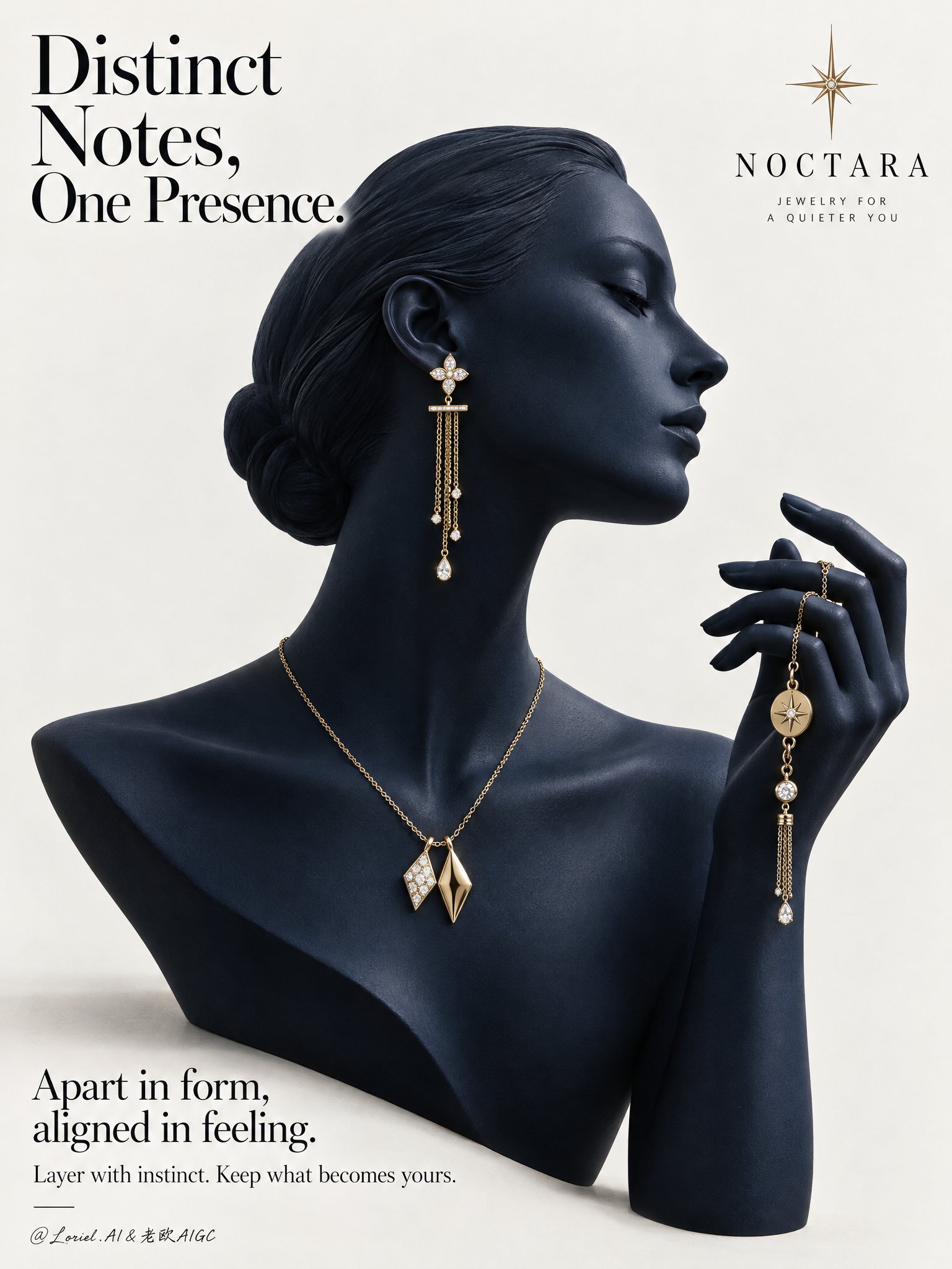
A Cannes-level luxury jewelry campaign poster for the fictional contemporary fine-jewelry brand NOCTARA, designed as a product-first editorial still life that fuses sculptural atmosphere, collector-grade material precision, and curator-level minimal restraint. The composition centers on a deep midnight-navy mannequin bust in elegant side profile, with a matching raised hand entering from the right to form one continuous sculptural gesture. The jewelry set remains the absolute focus: a refined yellow-gold mix-and-match composition across ear, neck, and hand, presented against a pale gallery-clean background with disciplined typography and strong negative space. Use a vertical poster format, straight-on with slight editorial monumentality. The mannequin occupies the center-left and center field, facing right. Preserve the clean poster rhythm: a large headline in the upper-left, a minimal star-like emblem near the upper-right, and a refined text block in the lower-left. The bust silhouette, neck curve, profile line, and raised hand should create a single elegant visual flow. Keep the background warm white to pale stone gray, uncluttered and spacious, with only a faint grounding shadow beneath the bust. The image should feel like a museum-grade print ad. The hero jewelry set is contemporary fine jewelry in polished champagne-yellow gold with restrained diamond-white accents. The visible ear wears one long drop earring with a small floral-geometric stud, a slim horizontal connector, and delicate chain tassels ending in tiny luminous drops. Around the neck sits a minimal gold chain necklace with two asymmetrical geometric pendants, intentionally non-identical yet harmonized, one brighter with a stone-led glint and one warmer sculptural gold form. The raised hand gently holds a coordinating chain bracelet or hand jewel with small medallion details and a slim dangling tassel. The overall language should feel modern, poetic, collectible, and quietly personal. The mannequin bust should be smooth, elongated, and refined, with poised chin, elegant collarbone line, and a calm profile directing attention toward the lifted hand. The hand must feel sculptural and couture-like, with gently curved fingers and believable tension where the jewelry is held. The jewelry distribution from ear to neck to hand should create a refined cadence, guiding the eye without crowding. Remove anything non-essential so the jewelry reads with maximum clarity and desirability. Keep the setting radically minimal and editorial. Depth should come from silhouette separation, tonal modeling, jewelry layering, and fine shadow falloff rather than scenery. The mannequin and hand should feel fully dimensional against the quiet pale background, with the jewelry emerging as warm points of precision. No props, furniture, texture overload, or narrative clutter. Use a restrained palette of midnight navy, pale stone white, champagne gold, and diamond-white highlights. Build a soft directional key from upper-left front grazing the profile, neck, shoulder line, fingers, and jewelry edges. Add subtle frontal fill to preserve detail in the navy surface while maintaining sculptural depth. Gold reflections should remain warm, crisp, and elegant, never harsh. Tiny diamond or pearl-like highlights should punctuate the jewelry with precision. Maintain premium contrast without dead black areas or flat gray dullness. Render everything with hyper-real luxury product photography and fashion-editorial polish. The mannequin surface should feel like matte-satin ceramic or lacquered resin with velvety density, between sculpture and couture display form. The gold jewelry must show immaculate polish, believable chain scale, precise link articulation, clean stone setting, and subtle micro-reflections. The finish should be immaculate, tactile, and high-end, with every edge resolved and every highlight controlled. No plastic sheen, muddy reflections, or cheap gloss. Place a refined wordmark for NOCTARA with a minimal starburst emblem in the upper composition. In the upper-left, set the headline: Distinct Notes, One Presence. In the lower-left, add: Apart in form, aligned in feeling. Beneath it: Layer with instinct. Keep what becomes yours. Typography must feel airy, elegant, and integrated, using a refined serif-led hierarchy with graceful spacing and no heavy crude fonts. Luxury jewelry poster, product-dominant, ultra-clean, editorial, hyper-real, no extra accessories, no clutter, no background scene, no gibberish text, no malformed fingers, no broken chain physics, no floating jewelry without support, no warped facial profile, no muddy navy tones, no dead black patches, no blown gold highlights, no duplicated pieces, no topology collapse, no style drift, no cheap catalog aesthetic.
0
Details
GPT Image 2.5
Create a 3:4 vertical travel-memory poster using [LOCATION / DESTINATION / SUBJECT] as the only scene reference. COMPOSITION: Divide the image into two equal horizontal halves. TOP HALF — REAL PHOTOGRAPH: Preserve the original photograph as faithfully as possible, retaining recognizable architecture, natural proportions, perspective, lighting, shadows, and environmental details. Allow only subtle color correction and necessary cropping. Do not redesign or invent elements. BOTTOM HALF — POP-UP PAPER WORLD: Show a real open travel journal against a warm ivory background, with visible page thickness, a defined spine, gently curled corners, and tactile paper texture. Reconstruct the photograph’s most distinctive landmarks and environmental features as a miniature three-dimensional paper-cut scene rising from the pages. Use delicate architectural linework, restrained pastel coloring, layered cutouts, folded paper, realistic occlusion, and natural contact shadows. TRANSITION: Connect both halves organically using elements from the actual location, such as a river flowing into the book, a street continuing across the spine, or trees transforming into layered paper shapes. Make the transition feel spatially continuous rather than like a collage. STYLE: A sophisticated blend of authentic photography, handcrafted paper engineering, and minimalist travel-journal artistry. Preserve the destination’s identity and create the feeling of collecting a real place inside a book. Avoid turning the photograph into an illustration, flattening the paper scene, distorting landmarks, adding unrelated objects, excessive decoration, titles, readable text, or watermarks. FORMAT: 3:4 vertical, exact 50/50 horizontal split.
0
Details
Grok Imagine 2
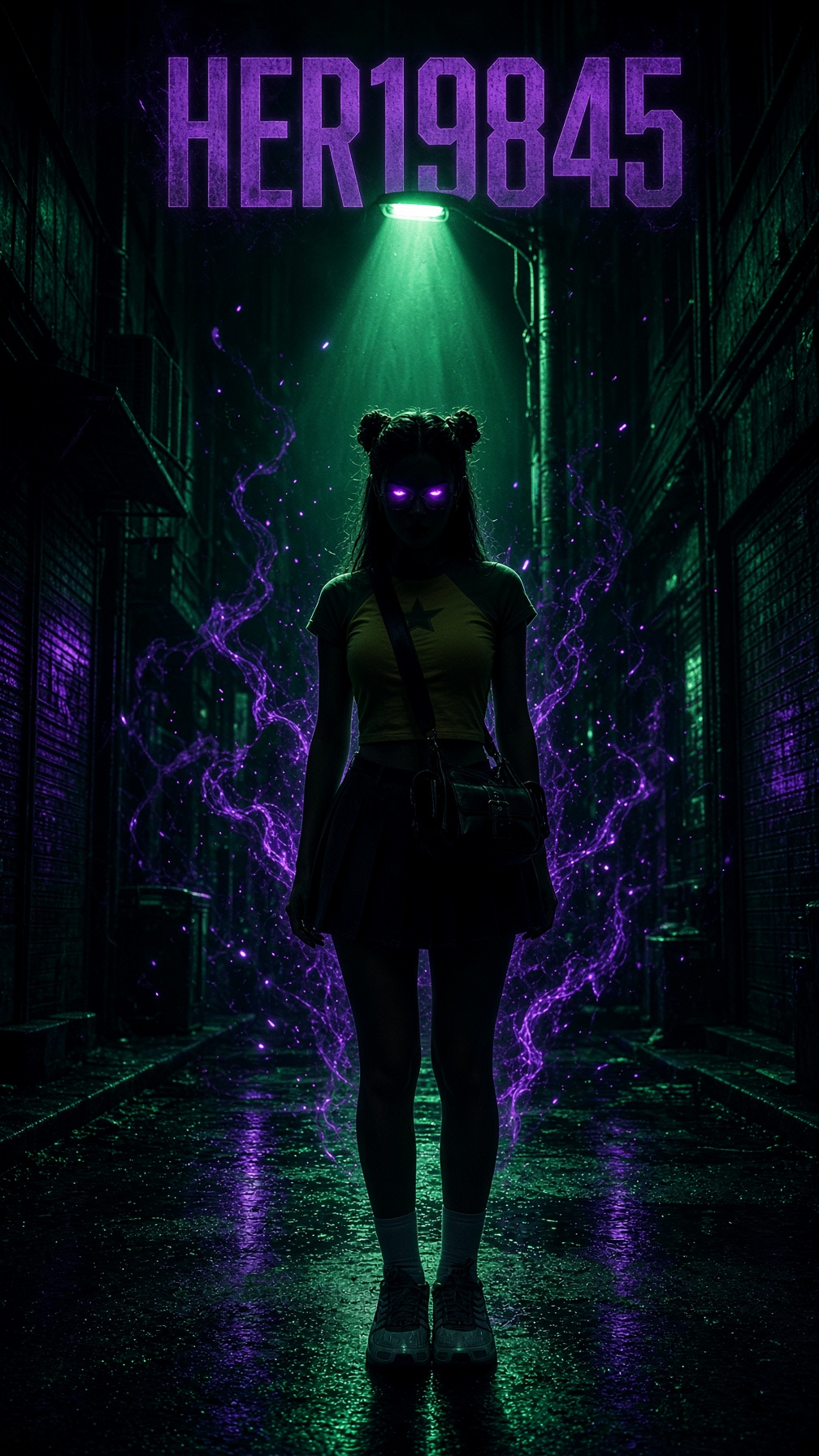
A promotional poster for a video game, featuring a dark cyberpunk and film noir aesthetic. A full-length vertical shot shows the model standing in the center of a narrow, urban alleyway at night. Her face is cast in shadow, with eyes that glow intensely with a violet neon light. Directly behind her, a streetlamp casts a cone of emerald-green light from above, creating a striking, dramatic backlight. Wisps of violet luminous energy surround her. At the top of the image, large, translucent purple characters appear, accompanied by the text "HER19845." The color palette is dominated by deep black and emerald green, with accents of neon violet. The image features a cinematic film grain, high visual definition, and an atmosphere of industrial mystery.
0
Details
GPT Image 2.5
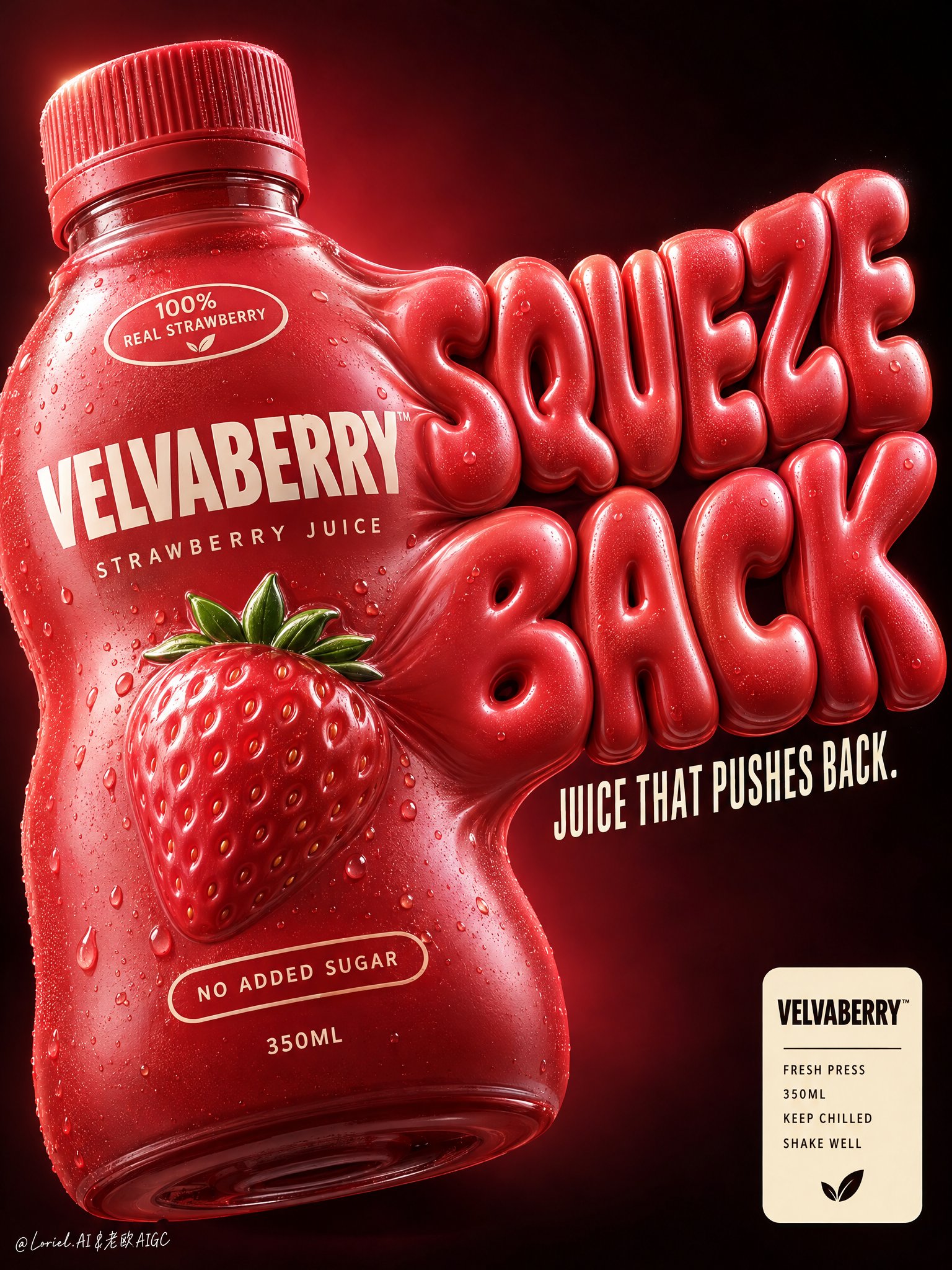
Create a premium vertical commercial poster for a fictional overseas juice brand, "VELVABERRY". Design it as a Cannes-level product-first beverage ad where one strawberry juice bottle becomes both the hero package and the engine of the graphic system. The bottle must look soft, overfilled, and under delicious internal pressure, visually inflating into giant sculptural typography that bursts outward from its right side. The result should feel bold, playful, tactile, and highly branded, with clean luxury execution. Use a close-up low-to-mid angle product composition against a deep black-to-burgundy gradient background with a concentrated crimson glow behind the product. Place one oversized bottle in the left-center foreground, slightly tilted, occupying most of the left half. The bottle body visibly swells and stretches toward the right, seamlessly transforming into a huge inflated slogan built from the same pressurized material language. Keep the lower-right reserved for a compact official info badge, and preserve enough negative space around the top and right edge for the enlarged typographic mass to breathe. The bottle remains the heaviest object even as the typography expands from it. The hero bottle is a short rounded squeeze-style juice bottle with a ribbed cap, made of soft-touch semi-gloss plastic in saturated strawberry red with subtle berry-coral undertones. It should look elastic and pressurized, with believable volume tension, smooth stretched curves, and controlled deformation, never melted or broken. The front branding must read exactly: "VELVABERRY" "STRAWBERRY JUICE" Add a small shoulder badge: "100% REAL STRAWBERRY" Add a lower badge: "NO ADDED SUGAR" Add the volume mark: "350ML" At the center, include one premium embossed strawberry icon with a tiny fresh green crown integrated into the label system. On the right side, create an enormous inflated 3D slogan physically extruded from the bottle wall: "SQUEEZE BACK" The letters must feel swollen, juicy, soft, and pressure-filled, with the same strawberry-red material identity as the bottle. Beneath it, in narrow elegant cream-white condensed type, place: "JUICE THAT PUSHES BACK." The slogan should feel like a direct continuation of the package form, not a separate graphic layer. Use strong commercial key lighting from upper left with clean highlight control on the cap ridges, bottle shoulders, embossed strawberry icon, and inflated letter surfaces. Add subtle right-edge separation light to keep the expanded typography crisp against the dark field. Build a disciplined palette: 50% strawberry red and berry coral, 25% deep burgundy-black background, 15% cream-white typography and badge accents, 10% tiny green fruit details and soft warm highlight bloom. Increase local contrast on the bottle bulge, cap texture, embossed icon, and inflated typography while avoiding muddy reds, dirty gradients, dead black holes, or cheap plastic shine. Render everything with elite FMCG poster realism: soft-touch semi-gloss plastic, crisp printed branding, pressure-stretched packaging curvature, embossed fruit emblem, ribbed cap detail, subtle micro-specular rolloff, and inflated typography with believable material continuity from the bottle body. The finish should feel like premium beverage branding fused with playful industrial design and high-end poster sculpture. In the lower-right corner, add a compact cream badge panel with: "VELVABERRY" "FRESH PRESS" "350ML" "KEEP CHILLED" "SHAKE WELL" This badge must feel official, minimal, and premium, balancing the expressive oversized slogan above. Premium vertical product poster, exact single-bottle hero, product-first hierarchy, bottle-to-typography fusion, dark luxury background, highly readable branding, and unified commercial finish. Maintain coherent bottle geometry, believable package inflation, crisp legible text, elegant negative space, and strong retail-ad impact. Avoid extra bottles, warped unreadable lettering, melted plastic artifacts, random fruit clutter, messy splashes, chaotic props, cartoon cheapness, muddy color, distorted cap geometry, accidental resemblance to any real beverage brand, or any loss of the bottle as the dominant hero.
0
Details
GPT Image 2.5
A professional educational infographic for a [Subject], designed in a modern "Terrestrial Life" series style. The layout features a large, realistic 3D central illustration of the [Subject] with anatomical labels like "Compound Eyes," "Thorax," and "Abdomen" using thin pointer lines. The color palette is clean with soft beige and muted tones. The composition includes multiple data modules: a "Quick Profile" sidebar, a "Top 5 Amazing Facts" list, a "Size Comparison" chart against a human silhouette, and a "Knowledge Score" star rating system. Include a "Detail Focus" section on the right with four square macro-photography close-ups of life stages or specific features. The bottom features "Habitat" and "Diet" icons, a "Conservation Status" slider, and a small "Did You Know?" footer. High resolution, crisp typography, clean vector lines, and a professional scientific journal aesthetic.
0
Details
GPT Image 2.5
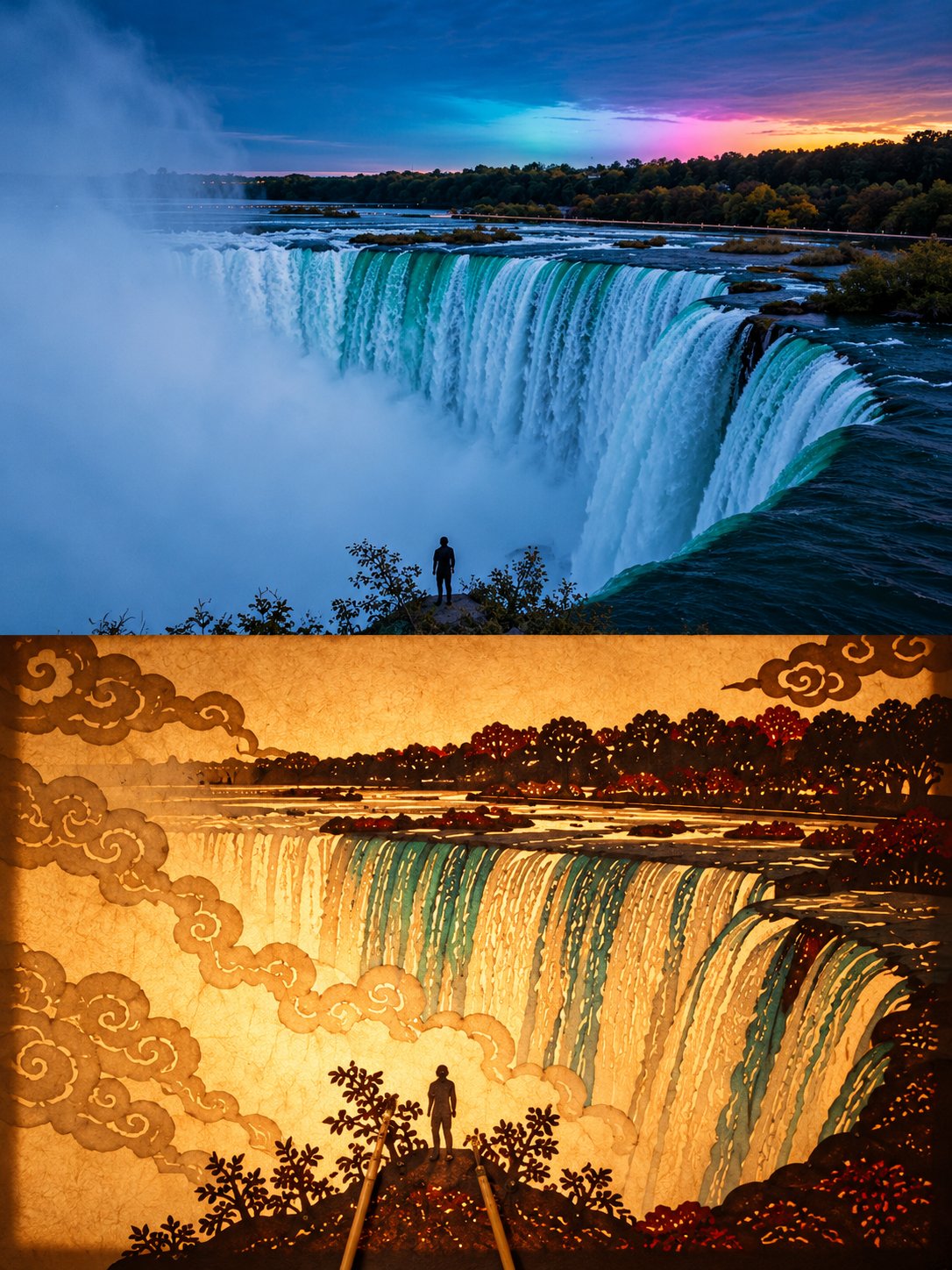
Create a premium 3:4 vertical shadow-puppet art poster from the uploaded photograph. COMPOSITION: Divide the canvas into two equal horizontal halves. TOP HALF: Preserve the original photograph’s subject, identity, pose, proportions, composition, textures, and natural lighting. Apply only subtle, refined color grading for an elegant fine-art exhibition aesthetic. Extend the background if necessary, without distorting the subject. BOTTOM HALF: Reinterpret the same subject as an authentic traditional Chinese shadow puppet, performing against warmly illuminated, translucent rice paper. Translate its defining silhouette, posture, and character into a flat, handcrafted leather-cutout figure with articulated joints, tiny connecting rivets, decorative perforations, intricate cloud motifs, and delicate geometric carvings. Use restrained translucent pigments inspired by traditional shadow-puppet craftsmanship. Add one or two slender bamboo control rods entering naturally from the bottom edge. Create realistic paper translucency, warm backlighting, subtle shadows, and exquisite handcrafted details. CREATIVE DIRECTION: The puppet must remain instantly recognizable as the original subject, whether it is a person, animal, building, plant, object, or landscape. Adapt the traditional shadow-puppet construction intelligently to the subject rather than forcing every image into a human-shaped figure. Make the transition between photography and traditional folk art visually meaningful, refined, and museum-worthy. Avoid photorealistic puppets, cartoon styling, excessive ornamentation, unrelated elements, distorted features, text, logos, and watermarks. FORMAT: 3:4 vertical, exact 50/50 horizontal split.
0
Details
Nano Banana
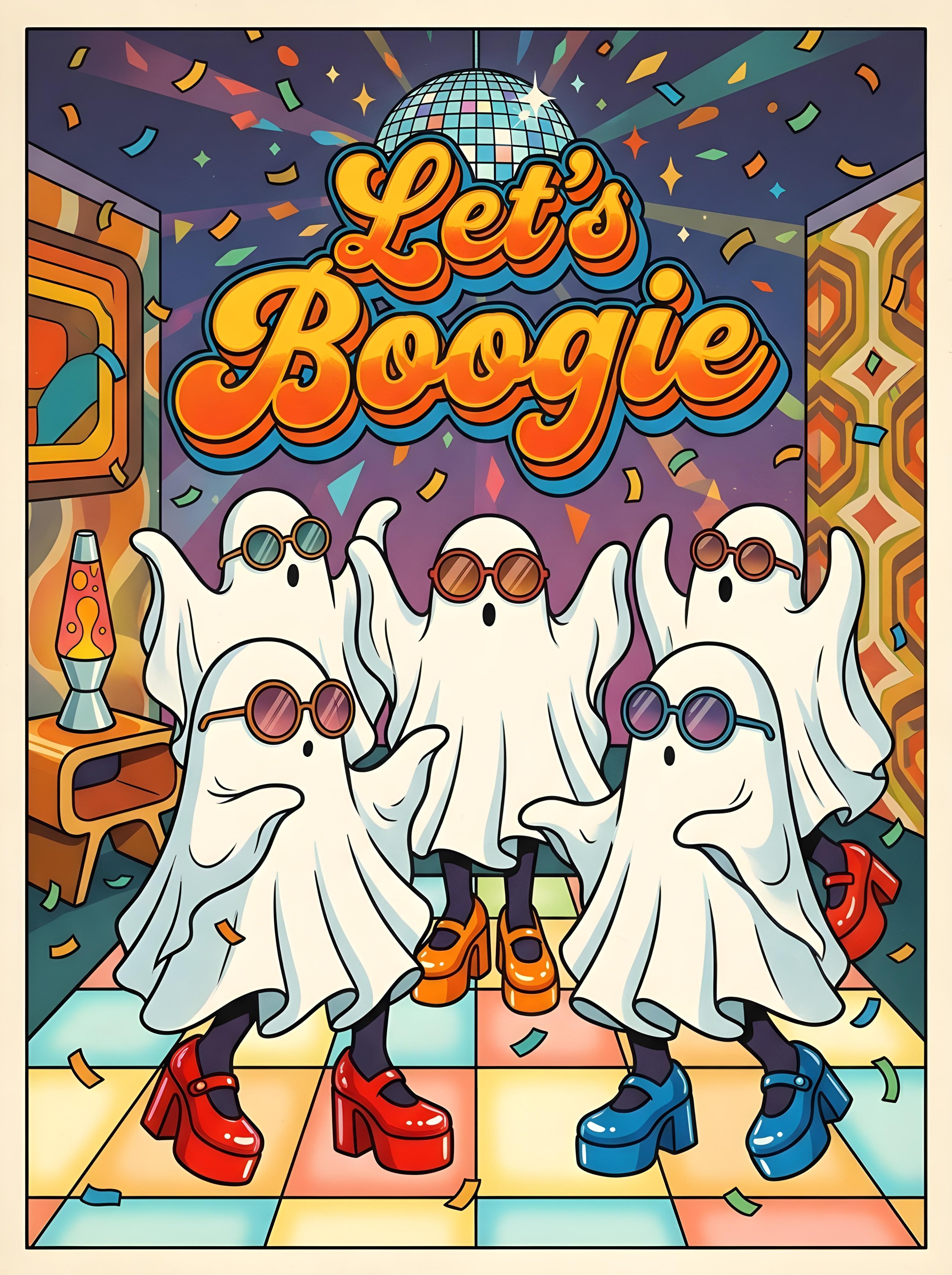
The entire scene is rendered as a cohesive, polished illustration, including the exact text “Let's Boogie,” which appears prominently in a bubbly, wavy 1970s retro font, with bold colorful lettering and a playful vintage feel. A lively group of sheet ghosts wear oversized 1970s sunglasses and large, vivid platform shoes, striking fun disco poses. Behind them, an illustrated sparkling disco ball scatters stylized light across a lava lamp, floating confetti, and other nostalgic retro décor; use vibrant colors, crisp drawn details, joyful party energy, and a balanced poster-style composition.
0
Details
GPT Image 2.5
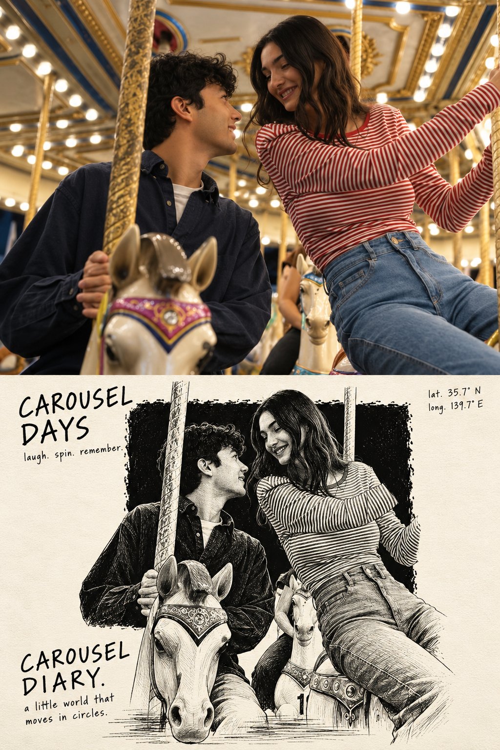
Create a high-resolution, vertical 2:3 editorial art poster using the uploaded reference photo. TOP HALF: Use the original photograph full bleed, preserving the subject's identity, appearance, natural lighting, and photographic quality. Crop carefully if needed. No borders or margins. BOTTOM HALF: On textured ivory paper, create a monochrome scratchboard illustration of only the main subject and essential accessories. Place a large, rough-edged black ink block in the center. The figure must be larger than the block, with roughly two-thirds inside it and the lower third breaking out onto the ivory paper. Add loose horizontal ink strokes beneath the feet for grounding. Inside the black block, use fine white and light-grey etched linework. Outside it, continue the same figure in expressive black pen strokes on ivory. Ensure a seamless transition between both tonal styles. Avoid excessive hatching and unnecessary background details. COLORS: The bottom half must use only black, white, and ivory, with subtle paper grain. TYPOGRAPHY: Use rough, upright handwritten lettering. - Top left: a 2 to 4 word title across two lines, followed by three short lowercase verbs separated by periods. - Top right: latitude and longitude on two lines only. - Bottom left: the location or theme followed by “DIARY.”, with a short descriptive sentence beneath. - Keep all typography black on ivory, natural and imperfect, never cursive. FINAL COMPOSITION: Exactly one standalone poster with two equal horizontal halves and one perfectly straight dividing line. Preserve the original subject's identity and proportions. Maintain generous negative space and a restrained, collectible editorial aesthetic, combining documentary photography with expressive hand-printed illustration. Print quality, 2:3 vertical aspect ratio.
0
Details
GPT Image 2.5
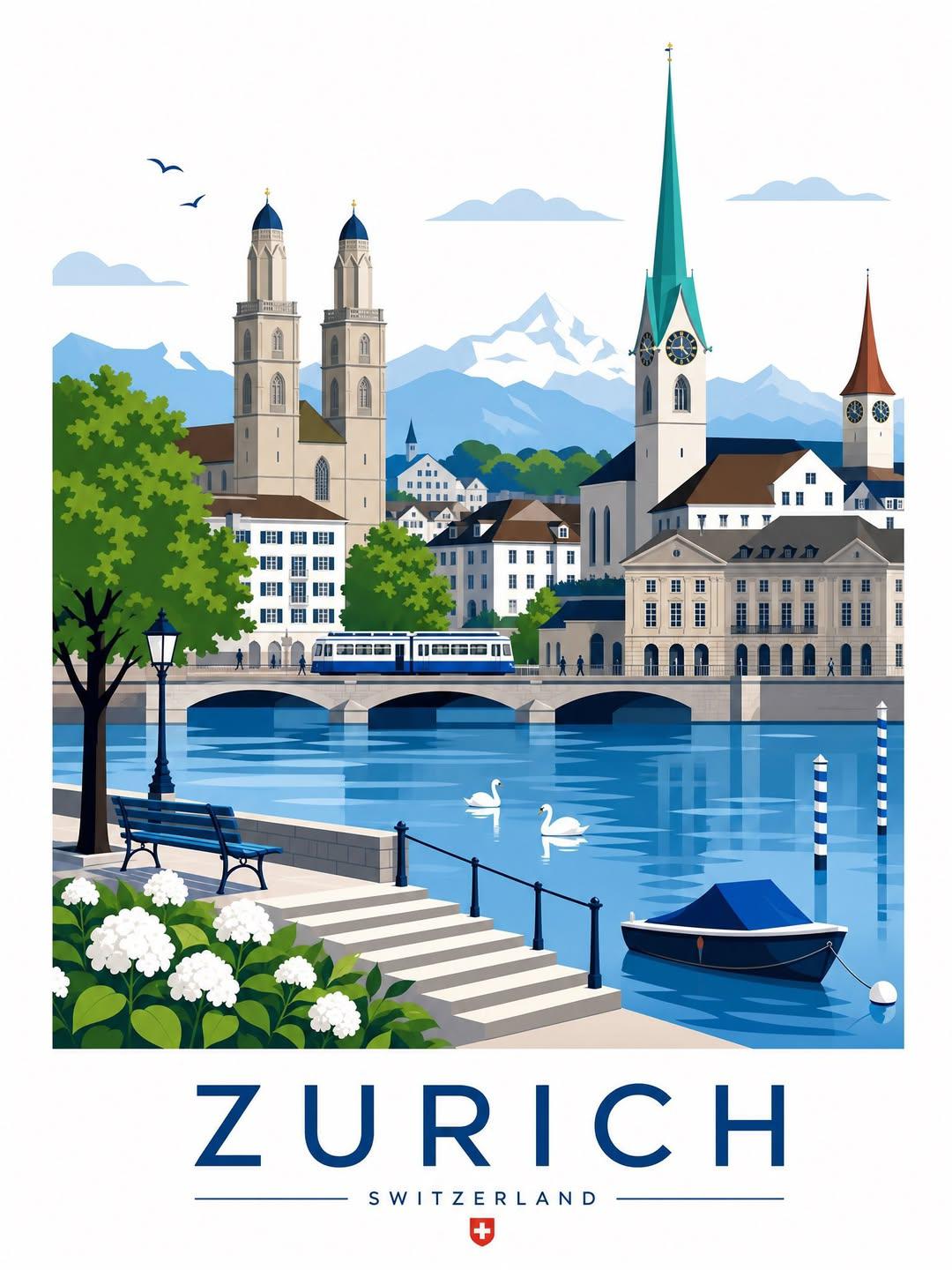
{ "input": { "city_name": "{{CITY NAME}}" }, "generation": { "type": "premium_illustrated_travel_poster", "aspect_ratio": "3:4", "orientation": "portrait", "resolution": "high", "reference_mode": "use_uploaded_images_for_style_reference_only", "city_adaptation": "fully_automatic" }, "creative_direction": { "objective": "Create a beautifully composed, destination-specific illustrated travel poster that resembles a premium vintage European travel print with crisp modern vector artwork. Every generated image must feel like an authentic visual postcard of the specified city.", "art_style": { "primary": "refined_flat_vector_illustration", "secondary": "mid_century_travel_poster", "influences": [ "classic European tourism posters", "Japanese illustrated travel prints", "modern editorial vector artwork", "minimalist architectural illustration" ], "rendering": "clean geometric shapes, precise architectural outlines, layered silhouettes, controlled shading, subtle tonal gradients, carefully simplified details", "texture": "smooth matte printed-paper appearance with extremely subtle print texture", "realism_level": "stylized illustration with recognizable architectural accuracy", "avoid": [ "photorealism", "3D rendering", "watercolor effects", "rough sketching", "childish cartoon styling", "excessive gradients", "plastic-looking surfaces", "generic AI artwork" ] }, "destination_intelligence": { "instruction": "Identify the actual city, its country, and its most recognizable visual landmarks. Build the composition around a carefully selected combination of authentic architecture, local scenery, transportation, public spaces, and cultural elements.", "landmarks": "Select 2 to 4 recognizable landmarks or architectural features associated with the specified city.", "architecture": "Reproduce the city's characteristic architectural styles, rooflines, facades, towers, monuments, and urban structures.", "natural_environment": "Include locally appropriate mountains, rivers, lakes, coastlines, gardens, trees, or other landscape elements when relevant.", "transportation": "Add a locally recognizable train, tram, bus, boat, bicycle, or other transportation element only when appropriate.", "cultural_details": "Include subtle, authentic local details such as street lamps, traditional storefronts, bridges, signage, or regional vegetation.", "accuracy_rule": "Do not invent landmarks or combine unrelated cities. All recognizable locations and cultural details must correspond to the requested destination.", "fallback": "If a city has limited internationally recognizable landmarks, create an authentic composition using its actual architecture, urban character, and regional landscape." }, "composition": { "layout": "large illustrated cityscape in the upper portion, destination typography in a separate lower section", "main_illustration": { "coverage": "approximately 78 to 83 percent of the canvas height", "framing": "a carefully composed, almost rectangular scenic illustration with clean edges", "perspective": "slightly elevated or street-level architectural perspective chosen to best showcase the destination", "depth_layers": [ "foreground with flowers, trees, benches, railings, steps, pedestrians, or waterfront details", "middle ground with streets, bridges, public spaces, transport, and prominent architecture", "background with the city's skyline, secondary landmarks, and natural landscape" ], "visual_hierarchy": "one dominant landmark supported by complementary architectural elements", "spacing": "balanced, intentional, and visually rich without overcrowding", "human_figures": "small, elegantly simplified pedestrians used sparingly to establish scale", "sky": "clean pale sky with a few minimal stylized clouds or birds when appropriate" }, "foreground_details": { "instruction": "Select destination-appropriate details that frame the scene naturally without obscuring its important landmarks.", "density": "moderate", "rule": "Avoid forcing flowers, boats, trees, or other elements into cities where they would look geographically or compositionally unnatural." }, "background": { "color": "warm white or very pale ivory", "style": "minimal, uncluttered, print-ready", "negative_space": "generous space surrounding the illustration and destination typography" } }, "color_palette": { "primary": [ "deep navy blue", "cobalt blue", "sky blue", "warm ivory", "soft cream" ], "secondary": [ "muted forest green", "sage green", "warm architectural beige", "terracotta", "soft grey" ], "adaptation": "Adjust accent colors to complement the city's architecture, national character, and natural surroundings.", "contrast": "clear and harmonious with strong separation between architectural layers", "saturation": "moderate, elegant, and print-friendly", "lighting": "bright, soft daylight with minimal hard shadows" }, "typography": { "placement": "centered beneath the illustration", "city_name": { "text": "{{CITY NAME IN UPPERCASE}}", "font_style": "large, elegant, geometric sans-serif", "weight": "regular to medium", "letter_spacing": "very wide", "alignment": "center", "color": "deep navy blue", "importance": "primary visual anchor of the lower section" }, "country_name": { "text": "Automatically identify the correct country and display its name in uppercase", "font_style": "small, clean sans-serif", "letter_spacing": "wide", "alignment": "center", "color": "muted navy or a restrained destination-appropriate accent", "position": "directly below the city name" }, "decorative_elements": { "horizontal_lines": "thin symmetrical horizontal lines on either side of the country name when visually appropriate"
0
Details
GPT Image 2.5
UNIVERSAL HALLOWEEN TRAVEL ART POSTER DESTINATION: [DESTINATION] Create a bold, hand-drawn Halloween travel poster featuring [DESTINATION], blending its authentic landmarks, architecture, landscapes, and local character with a mysterious, festive Halloween atmosphere. FORMAT Vertical 3:4 composition, high-resolution poster artwork with clean outer margins. CORE CONCEPT Reimagine [DESTINATION] as a stylish Halloween-night illustration while preserving its recognizable landmarks, real architecture, geography, and regional identity. The result should feel adventurous, atmospheric, sophisticated, and collectible—not like a generic haunted town. TYPOGRAPHY Place "[DESTINATION]" in large, bold, custom hand-drawn lettering across the upper-left area. Keep the title highly readable and visually integrated into the composition. Include only the destination name. No slogans, captions, extra text, logos, or watermarks. COMPOSITION Create a rich, vertically layered scene featuring the destination's most recognizable landmarks, streets, architecture, natural landscapes, local vegetation, and regional details. Include small pedestrians, vehicles, or everyday activities where appropriate. Interweave these elements into one continuous illustration using expressive scale, simplified perspective, overlapping shapes, and strong foreground-to-background depth. Preserve authentic architectural details and avoid inventing or replacing real landmarks. HALLOWEEN ATMOSPHERE Create a dramatic Halloween evening using a glowing full moon, deep twilight skies, theatrical shadows, subtle mist, silhouetted bats, warm lantern light, and a few naturally integrated pumpkins or jack-o'-lanterns. Adapt the details to the destination's environment and character. Keep Halloween decorations subtle so the destination remains the main subject. COLOR PALETTE Use a controlled palette of 4–6 colors: - Vivid pumpkin orange - Deep midnight navy - Dark violet or aubergine - Warm golden yellow - Forest green - Bright white highlights and negative space Adjust the balance to suit the destination while maintaining a distinctive Halloween identity. VISUAL STYLE Contemporary hand-drawn travel poster with screen-print and risograph aesthetics. Use linocut-inspired shapes, rough expressive outlines, irregular handmade forms, visible ink grain, dry-brush textures, slightly misregistered color layers, and energetic scribbled shading. Keep the architecture recognizable but artistically simplified. Emphasize tactile printing imperfections and a sophisticated independent art-book illustration style. BACKGROUND AND MOOD Balance generous negative space with dramatic areas of deep navy or violet night sky. Use contrasting moonlight and warm golden illumination to create depth and atmosphere. Maintain a narrow, clean margin around the poster. The final artwork should feel like a limited-edition Halloween travel print: bold, mysterious, adventurous, festive, and visually refined. AVOID Photorealism, 3D rendering, smooth vector graphics, gradients, glossy surfaces, generic haunted houses, excessive skulls or pumpkins, zombies, gore, cartoon ghosts, fantasy architecture replacing real landmarks, culturally inappropriate details, muted beige backgrounds, fake vintage aging, corporate tourism branding, and additional text. FINAL GOAL: Create an unmistakable [DESTINATION] travel poster reimagined through sophisticated Halloween illustration, authentic local details, bold colors, and expressive handmade print textures.
0
Details
Nano Banana 2.1
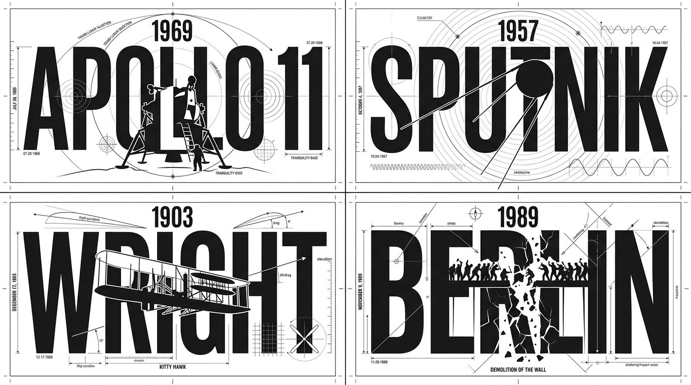
2x2 grid, 16:9, do this for 4 famous days that stunned humans: class Technical_Typographic_Draft: def __init__(self, figure="[FIGURE]", achievement="[ICONIC_ACHIEVEMENT]"): self.canvas = "Pure white background, flat 2D graphic design, strict monochrome black ink" self.aesthetic = "Engineering blueprint, Bauhaus minimalism, technical drawing" def generate_drafting_layout(self): # AI INFERENCE: Deduce the text and central geometric slice typography = f"Massive, bold, rigid sans-serif text spelling '{figure}'. The text is perfectly aligned on a horizontal grid." central_slice = f"AI_INFER(A sleek, minimalist, flat-vector silhouette of {achievement}). This silhouette sits dead-center, using pure white negative space to slice vertically through the heavy black typography." # The Technical Embellishments drafting_lines = "Razor-thin black hairlines spanning the canvas. AI_INFER(Technical drafting marks, concentric arcs, alignment nodes, and crosshairs integrating into the letters, e.g., using an 'O' as a radar/compass node)." return [typography, central_slice, drafting_lines, self.aesthetic] # EXECUTE: Render as a flawless, scalable vector logo. The contrast between thick letterforms and ultra-thin drafting lines is paramount.
0
Details
GPT Image 2.5
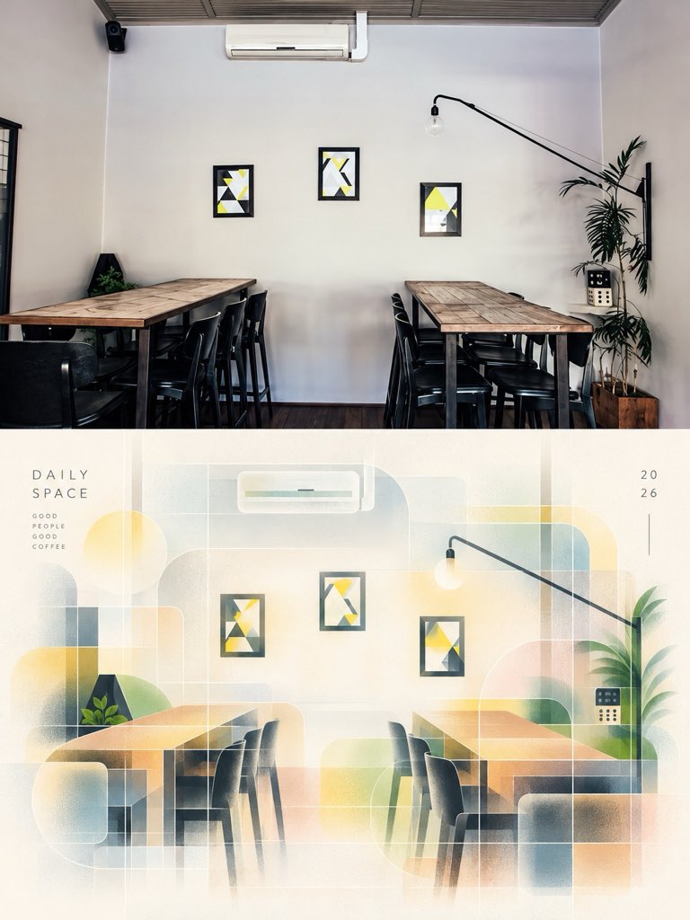
Transform the reference photograph into a sophisticated minimalist editorial art poster while preserving the original café interior, wooden tables, chairs, plants, lighting, and composition. Create a refined architectural illustration with translucent geometric overlays, soft pastel gradients, warm cream and beige tones, muted sage green, pale blue, and golden yellow. Use delicate grid lines, subtle paper texture, elegant negative space, and soft sunlight for an artistic, contemporary design-magazine aesthetic. Arrange the result as a vertical split composition, with the realistic photograph on top and an abstract artistic reinterpretation below. Add subtle typography reading “A QUIETER DAY” and “SAME PLACE, BRIGHTER THOUGHTS.” Premium graphic design, minimalist Swiss editorial layout, soft atmospheric glow, balanced composition, high detail, 4K quality, portrait 4:5 aspect ratio.
0
Details
GPT Image 2.5
DESTINATION: [DESTINATION] Create a sophisticated Halloween-edition geometric travel art poster of [DESTINATION]. Vertical 2:3, high-resolution, museum-quality editorial illustration. CORE PRINCIPLE 70% recognizable landmark and authentic cityscape, 30% geometric abstraction. Select one or two iconic landmarks as the unmistakable focal points, preserving their real silhouettes, architectural proportions and distinctive details. Simplify surrounding rooftops, streets, bridges, hills and foliage into elegant geometric color fields. COMPOSITION Reserve the upper 40–50% for an expansive, atmospheric twilight sky. Place only “[DESTINATION]” in small, widely spaced uppercase sans-serif lettering near the upper center. Arrange the authentic cityscape across the lower half with graceful architectural layering, compelling depth and a clear focal landmark. HALLOWEEN ATMOSPHERE Transform the city into an enchanting, subtly haunted autumn evening, not a horror scene. Use a dusky lavender-blue sky, a softly glowing harvest moon, a few tiny flying bats, delicate drifting clouds, copper-orange autumn leaves and warm amber lights shining through historic windows. Introduce gentle mystery, romantic twilight and understated cinematic magic. Adapt the seasonal details to the destination's actual architecture and geography. Halloween elements must remain secondary to the recognizable city. GEOMETRIC ART DIRECTION Blend Scandinavian editorial illustration, mid-century geometric design and refined architectural gouache painting. Use restrained arches, semicircles, rectangular planes and layered silhouettes as supporting compositional accents, never overwhelming the landmarks. Preserve an elegant balance of detailed architecture and simplified geometry. COLOR & TEXTURE Limit the palette to 6–10 harmonious colors: dusty periwinkle, muted violet, midnight navy, terracotta, burnt orange, pale peach, soft ivory and warm amber. Add subtle handmade gouache, dry-brush, colored-pencil and fine paper-fiber textures. Crisp, refined museum-print quality, not glossy vector art. MOOD Poetic, atmospheric, quietly magical, mysterious, romantic, sophisticated, collectible Halloween travel art. AVOID Generic fantasy architecture, distorted landmarks, oversized pumpkins, cartoon ghosts, witches, skeletons, horror imagery, excessive bats, neon orange, heavy black shadows, giant geometric circles, photorealism, 3D rendering, childish illustration, sepia filters, yellowed paper, decorative borders, logos, slogans and extra text. FINAL TEST The viewer should recognize [DESTINATION] immediately, then discover the subtle Halloween magic. The result must feel like a contemporary fine-art travel poster rather than a Halloween party advertisement.
0
Details
GPT Image 2.5
Create a 3:4 vertical “Second World” photographic art poster using [LOCATION / DESTINATION / SUBJECT] as the sole visual reference. COMPOSITION: Divide the canvas into two equal horizontal halves. TOP HALF — ORIGINAL PHOTOGRAPH: Preserve the photograph as faithfully as possible, including its subject, gestures, composition, perspective, colors, and natural lighting. Allow only necessary proportional cropping and subtle color correction. Do not redesign the scene. BOTTOM HALF — THE SECOND WORLD: Use a warm ivory paper background with generous negative space. Study the photograph’s most distinctive visual feature—such as water, reflections, shadows, roads, architectural edges, light, or human movement—and transform it into an imaginative miniature world that grows naturally from the image itself. CREATIVE INTERPRETATION: Let the photograph’s shapes and contours inspire the paper construction and visual narrative. Create an original, location-specific concept using refined paper-cut layers, subtle folds, tactile materials, realistic depth, and delicate shadows. Introduce miniature objects or tiny figures only when they meaningfully enhance the idea. Avoid generic templates and unnecessary decoration. VISUAL STYLE: A sophisticated fusion of authentic photography, handcrafted paper art, and miniature spatial storytelling. Maintain believable perspective, understated elegance, and poetic visual connections between the two halves. The lower scene must feel uniquely derived from the photograph, not like a simple copy, random collage, or conventional pop-up book. Avoid excessive fantasy, distorted subjects, unrelated props, watercolor filters, clutter, titles, readable text, borders, and watermarks. FORMAT: 3:4 vertical, precise 50/50 horizontal division.
0
Details
GPT Image 2.5
Create a charming 3:4 vertical vintage travel poster of [COUNTRY / CITY / DESTINATION], illustrated in a colorful, storybook-inspired style. SCENE: Show one iconic location with instantly recognizable landmarks, distinctive architecture, beautiful scenery, and authentic local details. Arrange the scene with an elevated viewpoint, layered depth, winding canals or streets, and a few lively elements that capture the destination’s character. Adapt the composition naturally to the location. ART STYLE: Clean hand-painted illustration with elegant outlines, simplified architectural details, rich colors, and a polished vintage travel-poster aesthetic. Make the scene whimsical, inviting, and richly detailed without looking photorealistic. COLORS & LIGHT: Use a harmonious palette of turquoise, sky blue, warm cream, coral, terracotta, golden yellow, and leafy green, adapted to the destination. Add soft clouds, warm sunlight, and a beautiful atmosphere. POSTER DESIGN: Frame the illustration with a subtle cream border. At the bottom, feature the destination’s name in large, elegant brush lettering, followed by the country in small uppercase letters and a short poetic travel-inspired tagline. Keep the landmark as the focal point, with balanced composition, crisp details, and a collectible vintage postcard finish. Ensure all lettering is correctly spelled and readable. Avoid photorealism, clutter, excessive decoration, distorted landmarks, illegible text, watermarks, and logos. FORMAT: 3:4 vertical, full poster composition.
0
Details
GPT Image 2.5
Create a premium cinematic art-book editorial poster using the uploaded image as the EXACT visual reference. CANVAS & LAYOUT - Vertical 3:4 aspect ratio - One poster divided horizontally into two equal 50/50 sections - Top half: original photorealistic image - Bottom half: minimalist handmade-paper illustration of the exact same scene - Warm ivory paper texture with subtle vintage print imperfections - Premium independent art-book editorial aesthetic TOP HALF — ORIGINAL PHOTOGRAPH Reproduce the uploaded image as faithfully as possible. Preserve its original subject, identity, appearance, pose, clothing, objects, environment, background, lighting, camera angle, perspective and composition. Do not replace the original subject with a different subject. Do not introduce unrelated objects or change the scene. If the uploaded image is already an illustration, faithfully preserve its visual appearance in the top panel rather than inventing a photograph. BOTTOM HALF — MATCHING PAPER ILLUSTRATION Transform the EXACT same subject and scene into a minimalist handmade-paper illustration. Automatically adapt the illustration to the uploaded image: - Portraits: preserve facial features, hairstyle, clothing and pose - Animals: preserve species, markings, proportions and pose - Cars and objects: preserve shape, color, distinctive features and orientation - Nature and landscapes: preserve the scenery, natural elements and composition - Buildings and city scenes: preserve architecture, perspective and surroundings - Any other subject: retain its defining visual characteristics Use simplified geometric shapes, layered paper-cut forms, muted natural colors, subtle distressed ink, rough printed edges and authentic handmade-paper texture. Simplify details artistically without losing the original subject's recognizability. COMPOSITION MATCH Keep the same subject placement, orientation, pose, major objects and visual direction in both panels. The bottom illustration must clearly represent the top image, not a different interpretation or unrelated scene. COLOR & MOOD Sample the dominant colors from the uploaded image and reinterpret them using a coordinated palette of muted earthy tones. Use warm ivory paper, restrained vintage print colors, delicate texture and sophisticated editorial balance. Adapt the mood to the original image. TYPOGRAPHY Do not invent captions, labels, signatures or random text. Leave the lower portion of the poster clean unless the user provides specific text to include. STRICT REQUIREMENTS Exactly two horizontal panels, each occupying 50% of the poster height. Vertical 3:4 composition. Top half preserves the uploaded image. Bottom half illustrates the same image in handmade-paper style. Maintain subject consistency and recognizable details. No extra panels, no unrelated objects, no unnecessary decorative frames, no random text, no logos, no watermark, no duplicated subjects, no distorted anatomy or geometry.
0
Details
GPT Image 2.5
Create a collection of individual, high-end editorial art posters, producing one separate design for every uploaded photograph. Treat each image as its own creative project, with no image merging, repeated layouts, or borrowed design elements between posters. CANVAS & STRUCTURE: Use a strict 3:4 vertical format with a precise 50/50 horizontal division. The upper section must retain the original photograph, including the subject’s face, identity, pose, clothing, defining details, original color relationships, and natural lighting. Apply only restrained tonal refinement for a polished magazine finish. Do not reconstruct, reshape, or replace the photographed subject. PHOTOGRAPHIC UPPER PANEL: Preserve the authentic image as the visual anchor. Simplify distracting surroundings only where necessary, without altering the subject or compromising the photograph’s original character. LOWER PANEL — PAPER SCULPTURE: Reinterpret the subject’s defining features, silhouette, or visual story as a contemporary handcrafted paper composition. Build the artwork from bold cutouts, abstract contours, overlapping cardstock, and carefully arranged geometric fragments. Reduce unnecessary details while retaining recognizable visual connections to the original photograph. The result should feel like an art director’s handcrafted mixed-media experiment, not a cartoon illustration. LAYOUT & SPATIAL DESIGN: Create a striking contrast between a spacious, pale upper field and a confidently colored lower section extending edge to edge. Let the subject interact visually with the dividing line, creating a seamless relationship between photography and collage. Introduce an off-center shape, architectural color panel, or restrained graphic accent only when it strengthens the composition. Keep the arrangement intentional, airy, and visually distinctive. PALETTE & MATERIALS: Derive a small selection of complementary colors from the source image, then translate them into luminous, understated pastel tones. Combine matte paper surfaces, fine fibrous grain, slightly irregular cut edges, and delicate overlapping layers. Establish dimension through the arrangement of paper elements rather than pronounced shadows, gradients, or artificial depth. EDITORIAL FINISH: Use typography sparingly. If suitable, include a small art-publication title, discreet caption, or minimal typographic detail, positioned with precision. Avoid unnecessary text, decorative labels, and oversized lettering. ARTISTIC DIRECTION: Contemporary gallery poster meets independent art-journal design. Balance photographic authenticity with tactile paper craftsmanship, bold color blocking, thoughtful asymmetry, and generous breathing room. Every poster should have its own visual character, derived directly from its source photograph. STRICT EXCLUSIONS: No combined photographs, duplicated designs, distorted anatomy, altered facial identity, full-scene illustration, cartoon rendering, glossy 3D elements, excessive drop shadows, gradients, busy backgrounds, or mass-produced template aesthetics. FINAL OBJECTIVE: Produce a refined, collectible-quality editorial poster that feels individually art-directed. The original photograph remains authentic in the upper half, while the lower half translates its visual identity into a fresh, tactile, minimalist paper-art interpretation.
0
Details
GPT Image 2.5
Create one premium editorial poster for each uploaded photo, outputting each separately without combining images or reusing other photos’ designs. FORMAT: Strict vertical 3:4 composition, divided into two equal horizontal halves. The upper 50% preserves the original photograph’s subject, identity, pose, colors, textures, and natural lighting, with only subtle editorial color grading. Never distort the subject. LOWER HALF: Transform the main subject into a minimalist cut-paper collage using simplified silhouettes, geometric shapes, layered paper, and subtle grain. Remove unnecessary background details while preserving the subject’s recognizable identity and story. COMPOSITION: Use a split color-field layout with generous near-white negative space above and a solid-color base spanning the entire bottom width. Position the subject near the boundary, optionally adding a simple geometric background panel. Maintain clean horizontal edges, asymmetrical balance, and strong visual hierarchy. COLORS & TEXTURES: Extract 2–4 colors from the original photo and refine them into a soft, bright pastel palette. Use subtle paper grain, handcrafted edges, and delicate layering. Create depth through overlapping shapes rather than realistic shadows or perspective. TYPOGRAPHY: Use minimal, elegant editorial text only when appropriate, placed discreetly within the negative space or near the composition’s edges. STYLE: Sophisticated art-magazine aesthetic combining authentic photography, minimalist paper-art collage, clean color blocks, generous negative space, and refined editorial design. AVOID: Clutter, complete scene redraws, gradients, heavy shadows, excessive details, distorted subjects, cartoon styles, 3D effects, and generic template-like layouts. Goal: Create a distinctive, gallery-worthy poster that preserves the original photograph above and artistically reinterprets its essence below.
0
Details
Nano Banana 2.1
2x2 grid, 16:9, do this for 4 topics in the news this week: Phi(x,y) = narrative_tension({{SLICE_BEAT}}, {{EMOTIONAL_TURN}}) F = grad(Phi) curl = curl(Phi) div = div(F) fixed_isocontour_of_Phi {{CHAR_SEED}}_hair_and_accessory pure_black (hair, deep dread) 10_percent, 30_percent, 50_percent ONLY divergence_spikes (embarrassment/shock) speed (parallel to F), focus (radiating from singularities) distorted_glyphs_along_curl_field, perspective_deformed max_3_shapes, placed_on_F_streamlines, tails_to_mouth
0
Details


![Create a 3:4 vertical travel-memory poster using [LOCATION / DESTINATION / SUBJECT] as the only scen — AI image prompt — GPT Image 2.5](https://cdn.ahaprompt.app/harvest-media/import-1792333581771-03a18u.jpg)

![A professional educational infographic for a [Subject], designed in a modern "Terrestrial Life" seri — AI image prompt — GPT Image 2.5](https://cdn.ahaprompt.app/harvest-media/import-1792815493317-0k3r6b.jpg)
![UNIVERSAL HALLOWEEN TRAVEL ART POSTER
DESTINATION: [DESTINATION]
Create a bold, hand-drawn Hallowe — AI image prompt — GPT Image 2.5](https://cdn.ahaprompt.app/harvest-media/import-1792728576564-tgspm7.jpg)
![DESTINATION: [DESTINATION]
Create a sophisticated Halloween-edition geometric travel art poster of — AI image prompt — GPT Image 2.5](https://cdn.ahaprompt.app/harvest-media/import-1792557783758-hik1t2.jpg)
![Create a charming 3:4 vertical vintage travel poster of [COUNTRY / CITY / DESTINATION], illustrated — AI image prompt — GPT Image 2.5](https://cdn.ahaprompt.app/harvest-media/import-1792333669975-wzennh.jpg)