AhaPrompt
Prompts
Featured
Models
Submit
Blog
Home
AI Prompt Library
Still Life
Still Life Prompts
Explore the best Still Life prompts for AI image, video, and audio generation.
Browse AI Image Prompts
Browse AI Video Prompts
Browse AI Music & Voice Prompts
AI Prompt Library
All
Images
Videos
Audio
Newest
Popular
All categories
3D Render
Abstract
Advertising
Aerial
Ambient
Animals
Animation
Anime
Architecture
Avatar
Black & White
Bright
Cartoon
Character
Cinematic
Cityscape
Classical
Comic
Cyberpunk
Dark
Digital Art
Dramatic
Dynamic
Electronic
Ethereal
Fantasy
Fashion
Folk
Food
Game Assets
Gothic
Hip-Hop
Historical
Holiday
Horror
Infographic
Jazz
Landscape
Lo-Fi
Logo Design
Macro
Minimalist
Motion Graphics
Music Video
Mysterious
Mythology
Nature
Neon
Oil Painting
Peaceful
Pixel Art
Pop
Pop Art
Portrait
Poster
Product Photography
R&B
Realistic
Rock
Sci-Fi
Short Film
Sketch
Slow Motion
Sound Effects
Space
Sports
Steampunk
Sticker
Still Life
Street Photography
Surreal
Tattoo
Timelapse
Trailer
Typography
Vector
Vehicles
VFX
Vintage
Voiceover
Wallpaper
Watercolor
Whimsical
GPT Image 2.5
Create a premium, Instagram-worthy handcrafted travel-journal scene representing [LOCATION]. Show an open cream-colored spiral notebook resting on a warm rustic wooden desk, photographed from a slightly elevated top-down angle in soft, cinematic golden-hour light. Turn the destination into a charming mixed-media miniature world. Build the architecture, landscape, plants, water, and cultural details from realistic, tactile hand-sculpted clay, with subtle handmade imperfections and fine textures. Add a small origami traveler, unmistakably folded from textured paper with visible creases and elegant, simple shapes, naturally exploring the miniature environment. Make one iconic landmark or visual symbol of [LOCATION] the clear hero, supported by a few authentic local elements such as architecture, terrain, vegetation, transportation, or cultural details. Avoid generic tourist objects. Dress the origami traveler in a tasteful outfit subtly inspired by the destination without relying on stereotypes. Use a sophisticated color palette inspired by [LOCATION], with detailed clay textures, realistic paper folds, miniature craftsmanship, soft shadows, atmospheric depth, and warm cinematic illumination. Make the miniature world feel physically integrated into the notebook page—not like a pasted photograph. Surround the artwork with subtle handwritten travel-journal notes, tiny doodles, arrows, stamps, and location-inspired sketches, keeping them secondary to the main scene. Composition: strong focal point, clear visual hierarchy, generous negative space, immersive depth, premium editorial photography, highly detailed handcrafted textures, whimsical yet sophisticated, emotionally evocative, visually distinctive, and highly shareable. Avoid: photorealistic people, clutter, excessive text, generic landmarks, flat digital illustration, plastic-looking materials, oversaturated colors, distorted architecture, and unnecessary decorations. Overall feel: a beautifully crafted tiny world inside a traveler's notebook—artistic, tactile, authentic, sophisticated, and unmistakably connected to [LOCATION], rather than a conventional travel photograph. STRICT FORMAT: Vertical 4:5 aspect ratio only - do not generate square, landscape, or any other aspect ratio.
0
Details
GPT Image 2
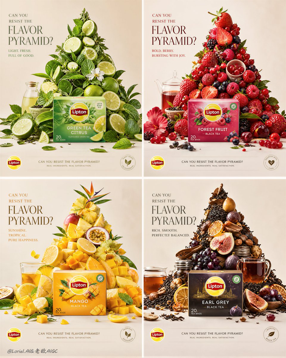
🍊Break down taste into four pyramids, each representing a different pace of life. Refreshing, rich and sweet, tropical, and mellow come together in a single romantic bite. Create an ultra-premium four-panel campaign board for Lipton, developed as the “Ingredient Summit System” version, but avoid an overly perfect or machine-built arrangement. The entire board must still preserve the same multi-flavor 2x2 series logic, real front-facing Lipton products, and four different flavor worlds expressed through pyramid-like ingredient structures, but each pyramid must now feel hand-built, naturally assembled, and slightly imperfect. The final image must feel like a world-class global advertising campaign that combines premium still-life design with believable human touch: hyper-real, elegant, flavorful, refined, but not sterile. Core concept: Each Lipton flavor becomes a hand-built ingredient summit. A real front-facing Lipton product pack anchors the lower front area of each panel, while above it rises a pyramid-like flavor structure made from fruit, leaves, petals, tea ingredients, and lifestyle-related objects. However, the pyramid must not feel too mathematically clean or mechanically precise. It should feel like a beautifully art-directed manual arrangement: some ingredients slightly tilted, some pieces subtly slipping, some elements lightly scattered at the base, some gaps and irregular stacking preserved, as if expert hands assembled it with care but allowed natural imperfection and living realism to remain. The image must feel premium and controlled, yet still human and tactile. 4-panel structure: Use a clean 2x2 campaign board with four equal panels. Each panel must maintain the same layout logic: upper area with elegant English headline, center area dominated by a pyramid-like flavor summit, lower front area anchored by one real front-facing Lipton product pack, lower strip or lower zone with minimal official campaign information. All four panels must clearly belong to one same campaign family, but each one must express a different flavor identity through its own ingredients, color system, and summit personality. Imperfection logic: This version must specifically avoid overly neat symmetry. The ingredient pyramids should still read clearly as triangular or summit-like forms, but they must feel assembled by hand rather than manufactured by a machine. Preserve: slightly uneven stacking, small natural gaps, subtle leaning fruit or leaves, a few fallen or rolled pieces near the base, some scattered petals, peels, seeds, or tea fragments, tiny irregular overlaps, slight asymmetry in edges, small signs of gravity and real placement. The result should feel premium, intelligent, and believable, like a luxurious handmade ingredient installation. Panel 1, green citrus freshness: Place a real front-facing Lipton green or citrus-green flavor product at the lower front center. Above it, build a fresh green summit from lime slices, green tea leaves, mint-like leaves, pale citrus peel, light green fruit, and a few wellness-oriented mini objects. The structure should still feel upward and pyramid-like, but let some lime slices slip outward, a few leaves scatter at the base, and some pieces sit imperfectly instead of in strict rows. This panel should feel fresh, light, uplifting, and slightly breezy rather than rigid. Panel 2, red berry intensity: Place a real front-facing Lipton berry or red fruit flavor product at the lower front center. Build the summit from strawberries, raspberries, cherries, red currants, berry leaves, and glossy red lifestyle details. Let the red fruit pile feel richer and more abundant, with berries naturally spilling outward, small fruit rolling near the base, and some clusters stacked in a lively imperfect way. The shape should still read as a pyramid, but one made through generous layered hand placement rather than exact geometry. Panel 3, yellow tropical brightness: Place a real front-facing Lipton mango or tropical-yellow flavor product at the lower front center. Build a sunny summit from mango pieces, pineapple chunks, lemon wedges, golden fruit rounds, tropical leaves, and bright cheerful mini objects. Preserve the triangular silhouette, but allow some mango cubes and citrus wedges to break outward, a few petals and leaves to drift around the base, and slight variations in density between the left and right side. The structure should feel optimistic, abundant, and naturally arranged. Panel 4, dark tea richness: Place a real front-facing Lipton black tea or deeper rich flavor product at the lower front center. Build a more grounded summit from darker tea leaves, figs, grapes, plum-toned fruit, citrus peel, spice-like accents, amber tea details, and ritual breakfast elements. Keep the pyramid form readable, but make it feel more layered and human: tea leaves fallen around the base, one or two fruit pieces slightly displaced, richer shadows in the stacking, and small object clusters suggesting manual composition. This panel should feel more refined, mature, and tactile. Product realism: Render each Lipton product pack with absolute realism and premium packaging fidelity. Every pack must be front-facing, clearly readable, physically accurate, and beautifully lit, with crisp logo print, box edges, flavor coding, printed surface finish, and premium shelf realism. The product must remain clearly visible and commercially dominant in every panel, even while the summit above carries much of the visual drama. Ingredient realism: All fruit, leaves, petals, tea fragments, and supporting objects must be rendered with hyper-real still-life precision. Show skin texture, pulp translucency, seed detail, moisture, leaf veins, peel edges, and tiny imperfections. The ingredients must feel fresh, tactile, and physically placed, not flat graphics. Some pieces should appear slightly bruised by pressure, compressed by stacking, or angled naturally by weight, but still remain premium and beautiful. Supporting scatter: At the foot of every pyramid, include a tasteful amount of natural scatter and leftover evidence of assembly: a few loose fruit slices, leaves, petals, seeds, tea dust, dropped wedges, small utensil-like elements, or tiny supporting pieces. This scatter must feel deliberate but believable, as if the summit was carefully built by hand and some ingredients remained around the base. Avoid chaos; keep it elegant and art-directed. Backgrounds: Use a clean soft-neutral premium studio background in each panel, close to warm ivory, pale cream, or very light gray-beige, with subtle tonal variation only. The background must remain bright and quiet so the ingredient summits and product packs dominate clearly. Let the flavor identity come mainly from the ingredients and packaging, not from overly saturated background color. Typography: Use an elegant English-led typography system that follows a premium global campaign layout. Each panel can feature a refined flavor-question or short campaign line in the upper area, with a minimal official information strip near the bottom. Main campaign direction: “CAN YOU RESIST THE FLAVOR PYRAMID?” Panel-specific copy can vary slightly by flavor mood while staying minimal and premium. Use only very restrained official logo placement and supporting English text. Typography must feel airy, modern, balanced, and beautifully spaced, never crude or heavy. Lighting: Use extremely delicate high-end studio-commercial lighting with soft directional highlights and refined shadows. Each summit must feel dimensional, tactile, and fresh, with fruit skins, tea leaves, petals, packaging, and small objects all rendered with exquisite realism. The light should be soft enough to preserve elegance and cleanliness, but precise enough to reveal texture, stacking depth, and slight imperfections. Every panel should feel premium, bright, and globally polished. Color direction: Build four distinct but harmonious flavor palettes: green freshness, red berry intensity, yellow tropical brightness, dark tea richness. The campaign must feel colorful but controlled, bright but elegant, playful but premium. The slight asymmetry and scatter must make the series feel more alive and more human without losing brand polish. Mood: fresh, premium, organized but human, tactile, hyper-real, elegant, flavorful, handcrafted, modern, internationally refined, commercially iconic Rendering style: ultra-premium Lipton multi-flavor campaign board, 2x2 layout, real front-facing product packs, four hand-built ingredient pyramid structures, slight asymmetry and natural scatter, premium still-life architecture, elegant English typography, bright neutral backgrounds, hyper-real food and packaging detail, refined soft lighting, world-class advertising key visual, 8k, global campaign quality Negative prompt: overly perfect symmetry, machine-built arrangement, sterile geometry, messy chaos, weak product dominance, cartoon rendering, cluttered layout, ugly typography, low-detail packaging, muddy palette, cheap supermarket poster style, flat lighting, low-end still life
0
Details
Nano Banana
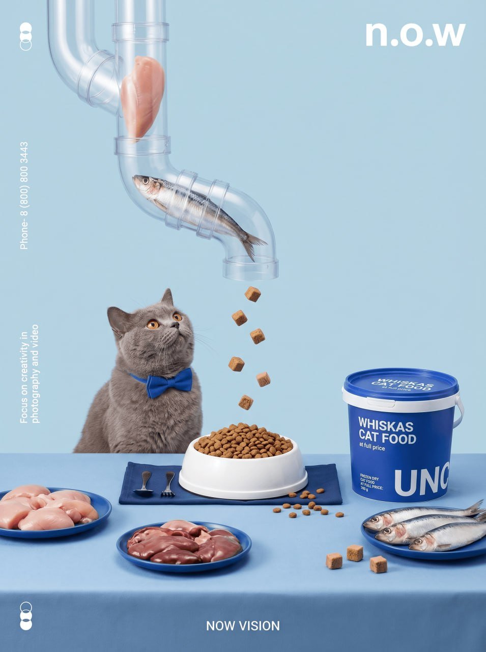
A bright, stylized still life and a conceptual photograph from an advertisement for premium chocolate on a delicate, pastel pink background. In the center is a luxurious dark chocolate bar wrapped in gold foil, slightly unwrapped to reveal glossy chocolate lying on a small pink velvet cushion. It is surrounded by a custom-made multi-tiered glass tray system descending from the top left. On the topmost tier there are whole cocoa beans, on the middle - pieces of roasted almonds, and on the bottom - small pieces of chocolate that fall into an elegant pink porcelain bowl. Various chocolate ingredients are laid out on the pink surface around the bar: right in front of the bar, on a delicate pink napkin, there is a large round plate filled with chocolate truffles. There is a small gold spoon and fork next to it. On the right is a tall cylindrical pink container with a golden label of the chocolate brand. There is an inscription on the lid: "LUXURY CHOCOLATE IS A PREMIUM CHOICE." On the side: "HANDMADE CHOCOLATE, 150 g" with large letters "LUX". Around the main plate are three separate pink plates with ingredients: a plate with whole cocoa beans (far left), a small central plate with pieces of caramel and a long plate with roasted almonds (far right). There are several pieces of chocolate and truffles scattered on the surface of the table, and five small truffles are neatly arranged on the rightmost plate. There are many text elements on and around the image: Top right: "LUXURY TASTE", typed in a clean white font. On the left (vertically): "Contact- 1 (800) 555 2020", On the handset (vertically): "Focus on creativity in photography and video." At the bottom of the center: "LUXE VISION". Logos in the form of three intertwining circles are located at the top left and bottom left. The soft but clear lighting highlights the texture of the chocolate and ingredients, and the overall composition is carefully chosen to show the transformation of raw cocoa into refined, ready-to-eat chocolate
0
Details
![Create a premium, Instagram-worthy handcrafted travel-journal scene representing [LOCATION].
Show a — AI image prompt — GPT Image 2.5](https://cdn.ahaprompt.app/harvest-media/import-1789139756827-ttdm7n.jpg)