AhaPrompt
Prompts
Featured
Models
Submit
Blog
Home
AI Prompt Library
Minimalist
Minimalist Prompts
Explore the best Minimalist prompts for AI image, video, and audio generation.
Browse AI Image Prompts
Browse AI Video Prompts
Browse AI Music & Voice Prompts
AI Prompt Library
All
Images
Videos
Audio
Newest
Popular
All categories
3D Render
Abstract
Advertising
Aerial
Ambient
Animals
Animation
Anime
Architecture
Avatar
Black & White
Bright
Cartoon
Character
Cinematic
Cityscape
Classical
Comic
Cyberpunk
Dark
Digital Art
Dramatic
Dynamic
Electronic
Ethereal
Fantasy
Fashion
Folk
Food
Game Assets
Gothic
Hip-Hop
Historical
Holiday
Horror
Infographic
Jazz
Landscape
Lo-Fi
Logo Design
Macro
Minimalist
Motion Graphics
Music Video
Mysterious
Mythology
Nature
Neon
Oil Painting
Peaceful
Pixel Art
Pop
Pop Art
Portrait
Poster
Product Photography
R&B
Realistic
Rock
Sci-Fi
Short Film
Sketch
Slow Motion
Sound Effects
Space
Sports
Steampunk
Sticker
Still Life
Street Photography
Surreal
Tattoo
Timelapse
Trailer
Typography
Vector
Vehicles
VFX
Vintage
Voiceover
Wallpaper
Watercolor
Whimsical
0:25
GPT-6 Astra
Set up model routing for this repo: 1. List this month's task types and how long each answer was. Table only, change nothing 2. Anything that ended past 128K goes to Gemini 4 Argon as one call, no chunking > Terminal and shell work stays on Opus 5.5 > Fixes that failed twice go to GPT-6 Astra > Cache the repo context on Argon so every run reuses it 3. Price each task type at Argon's intro rate next to what it costs today 4. Print the routing table with the price column, then wait for my yes before switching anything.
0
Details
GPT Image 2
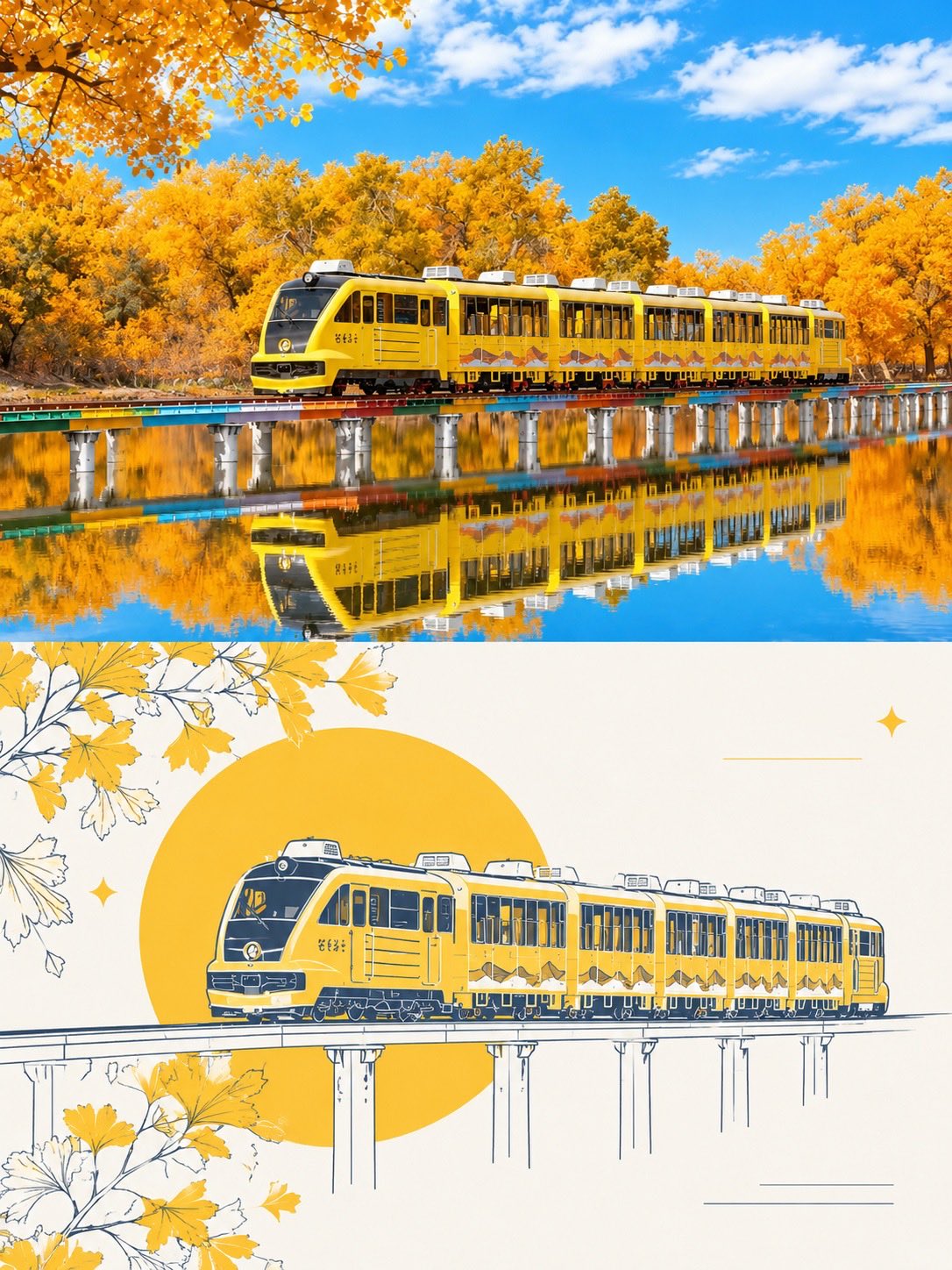
Create a two-panel travel poster inspired by the reference images. Top panel: a breathtaking photorealistic autumn landscape featuring a modern yellow sightseeing train traveling across a long elevated railway bridge over a perfectly calm lake. Surround the scene with dense golden-yellow autumn trees, vivid blue sky, soft white clouds, warm sunlight, and a crystal-clear reflection of the entire train, bridge, and foliage in the water. Highly detailed, vibrant colors, cinematic travel photography, realistic lighting, sharp focus. Bottom panel: transform the same scene into an elegant minimalist travel illustration. Show the yellow train crossing the elevated bridge, drawn with clean navy-blue hand-drawn linework and warm golden-yellow accents. Add a large golden sun/circle behind the train, stylized autumn leaves and branches framing the corners, subtle decorative stars and fine horizontal lines, and an off-white cream background. Preserve the recognizable train shape and composition from the photograph while giving it a refined editorial poster aesthetic. Style: premium travel magazine, sophisticated tourism poster, clean composition, harmonious color palette, highly detailed, balanced negative space, realistic-to-illustration transformation, vertical 4:5 layout, no text, no logos, no watermark.
0
Details
GPT Image 2.5
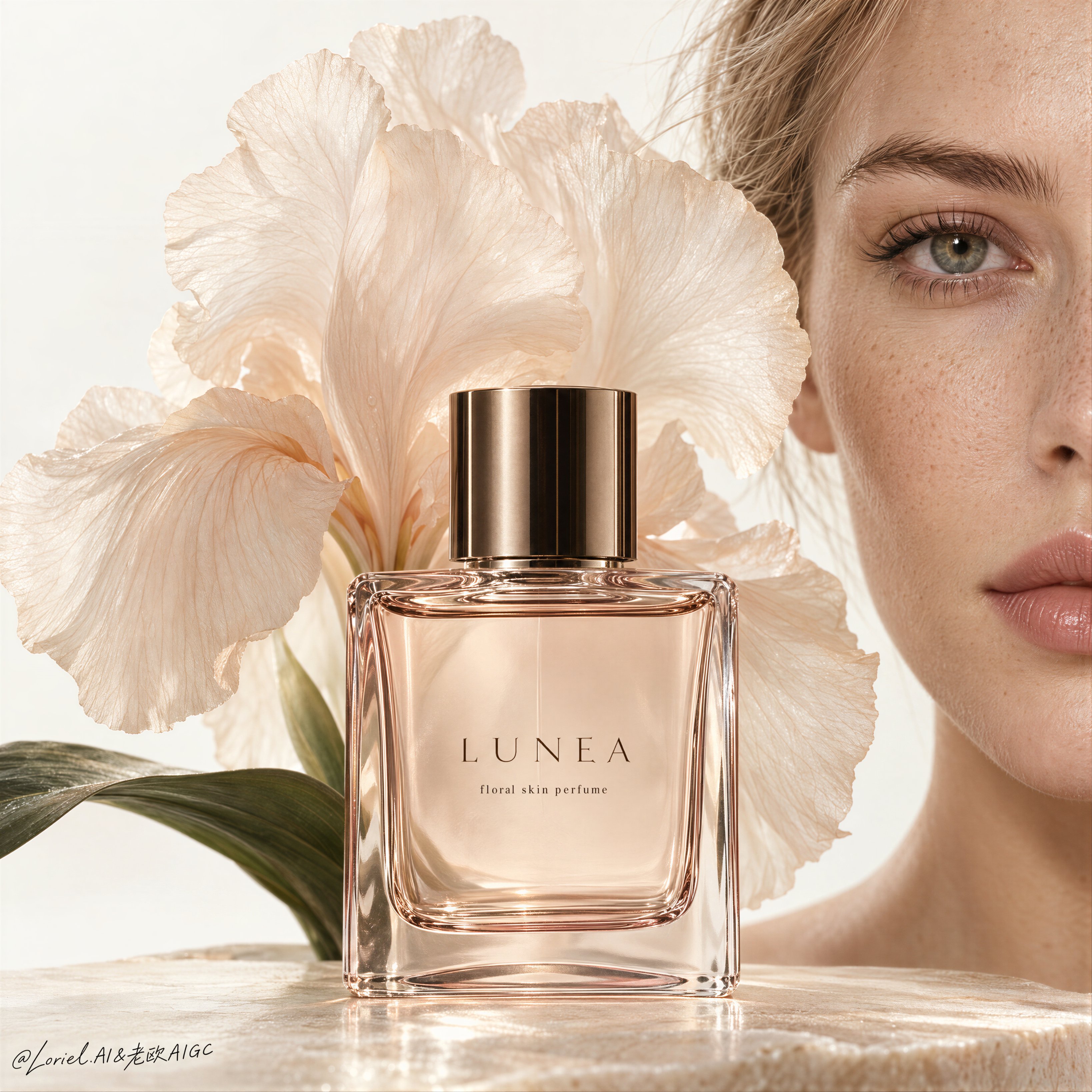
A luxury fragrance poster for fictional perfume house LUNEA, merging emotional intimacy, material precision, and curatorial minimalism into one unified image. Preserve the exact beauty-editorial structure: a clean high-key off-white background, the right half of an adult Western white girl’s face filling the right edge, a central rectangular perfume bottle in the lower middle foreground, and a large soft translucent flower blooming behind and slightly above the bottle like visible scent. The bottle is the absolute visual leader, while the face and flower act as quiet amplifiers. Use a tight front-facing close-up with strong negative space, calm vertical balance, and refined still-life discipline. The girl is photoreal, adult, naturally proportioned, anatomically correct, with realistic pale skin, visible freckles, subtle pores, natural lips, soft peach undertones, clean brows, natural lashes, and a serene neutral expression. Only half her face is visible on the right edge, vertically cropped, with one eye clearly readable and softly aligned with the bottle. Her skin must feel alive and real, never plastic or over-retouched. The perfume bottle is original and highly premium: transparent rectangular glass with warm blush-tinted edges, pale champagne-rose liquid inside, crisp beveled corners, refined thickness, subtle inner reflections, and a polished cylindrical cap in dark bronze or smoked gold. The label system is minimal and English only: brand mark “LUNEA” centered on the bottle, with one tiny support line such as “floral skin perfume”. Typography on the bottle is thin, luxurious, restrained, and perfectly spaced. The bottle sits large and centered, sharply lit, with clean readable edges and high-end cosmetic realism. Behind the bottle, place one large soft flower with broad translucent petals in a warm ivory-peach tone, like an iris or couture silk bloom, opening outward as a scent halo. The petals are delicate, semi-translucent, softly backlit, with fine veining, gentle curvature, and organic overlap. Add one or two dark green leaves near the lower left base for quiet balance, but keep them minimal and secondary. The flower should feel partly botanical, partly couture fabric, reinforcing softness and rarity without overpowering the bottle. Lighting is refined, soft, and sculptural: a large diffused frontal key with slight side direction, subtle warm sunlight character, clean highlights on the glass shoulders and cap, soft transmission through the liquid, delicate rim separation on the petals, and smooth facial modeling without harsh contrast. Keep the image clean, luminous, and free of dirty shadows or visual noise. Color hierarchy: 60% warm ivory, cream, and pale skin tones, 30% blush glass and soft peach floral tones, 10% dark bronze cap and deep green leaf accents. Materials must feel hyperreal and tactile: glass refraction, polished metal, translucent petals, living skin texture, and premium editorial print finish. If external typography is used, keep it minimal and distant, such as one short elegant line like “Quiet Bloom” or “Skin of Light”, placed far from the bottle and face with a tiny LUNEA wordmark. If it weakens the stillness, omit the external headline and let the bottle typography carry the image. The final result should feel like Orbit, Transit, and Port fused together: intimate, materially exact, globally refined, and rare. No copied branding, no extra objects, no muddy shadows, no warped bottle geometry, no broken label text, no distorted facial anatomy, no over-smoothed skin, no dirty background, no clutter.
0
Details
GPT Image 2.5
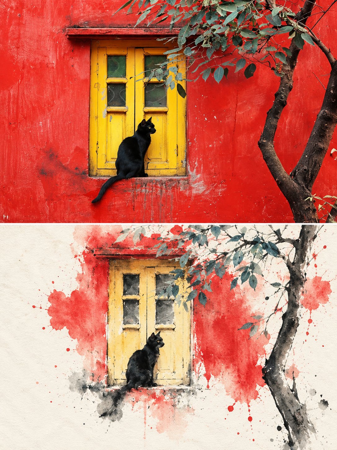
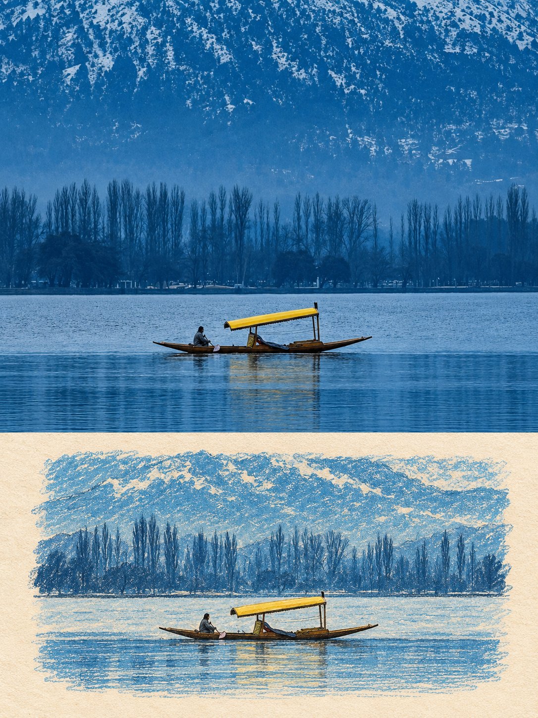
Split-Frame Ink Wash Reconstruction 3:4 vertical composition · photo / ink wash split · contemporary Eastern aesthetic The image is in a 3:4 vertical composition, divided into two regions, with a strict 1:1 ratio, each taking up 50% of the image. Upper Region — Original Photo Shoot Area Preserves the subject's identity, structure, perspective, and true material, natural light, and original color atmosphere, with only slight high-end color grading and image purification, presenting it with the texture of art magazines or exhibition photography. It allows for a moderate expansion of the background to fit the screen size, but does not stretch, distort, or reshape the subject, without changing the subject's structure, posture, and core composition. Lower Region — Minimalist Ink Wash Reconstruction Area First, refine the subject with the most memorable details, such as the outline, structure, trend, perspective, rhythm, and atmosphere, and then reconstruct the same scene into a minimalist ink wash material landscape. Do not copy the photo details, do not make a realistic copy, only preserve the most recognizable structure and charm, allowing people to recognize the corresponding relationship between the upper region and the original photo at first glance. The overall base of the lower half is milky white, warm white or paper white, with delicate paper fiber and natural texture. The main body is reconstructed in ink wash blending, dry-wet interplay, flying white, seepage, ink accumulation, and white space, forming a quiet, restrained, and poetic Eastern visual. Removing secondary details, only retaining the most distinctive contours, structural turns, spatial layers, and breath, not pursuing realistic completeness, but rather summarizing, refining, and leaving a lingering impression. The use of ink in black, gray, and light ink tones, layered and progressing, with varying intensities and rhythms. The most vibrant colors can be extracted from the original image to create a few spots of dyeing or coloring, without mechanically replicating the color values. The colors can be transformed locally into clear blue-gray, distant blue, soft gold, warm yellow, vermilion red, light cyan, etc., to emphasize the main focus and emotional rhythm, but the overall composition is still dominated by ink tones and negative space. Avoiding dull, heavy, old brown, excessive decoration, and vulgar color combinations. The main core areas should be more refined and concentrated, with edges gradually loosening, breaking away, disappearing, and scattering, forming a sense of breathing with the large negative space. The lower half of the composition should account for about 30%–45%, with the rest reserved for large negative spaces. The composition can be biased, framed, suspended, or slightly cut, but must maintain an asymmetrical balance and a high-end editorial feel. Negative space is not blank, but an important component of the visual structure. It is better to reduce information than to fill the entire image, so that the main focus looks like an ink seal or an oriental material work displayed on a page. Text Treatment Text is only allowed a very small amount of editing intervention, without preset titles and numbers. A small number of words or short sentences can be extracted from the subject, location, time, action, emotion, or metaphor, and quietly placed in the blank area or the edge of the subject. The text should be restrained, sparse, and have a sense of breathing, not noisy or dominant. Overall Presentation Contemporary Eastern aesthetics, minimalist ink wash reconstruction, large-scale art blank, small-scale seal impression, quiet editing layout and exhibition poster style. Avoid complex backgrounds, piled-up real details, overly decorative, excessive text, template layout and filled composition.
0
Details
0:15
MiniMax H3
a translucent curl of ice rising off the blade and dropping to the bench, holding its curl
0
Details
GPT Image 2.5
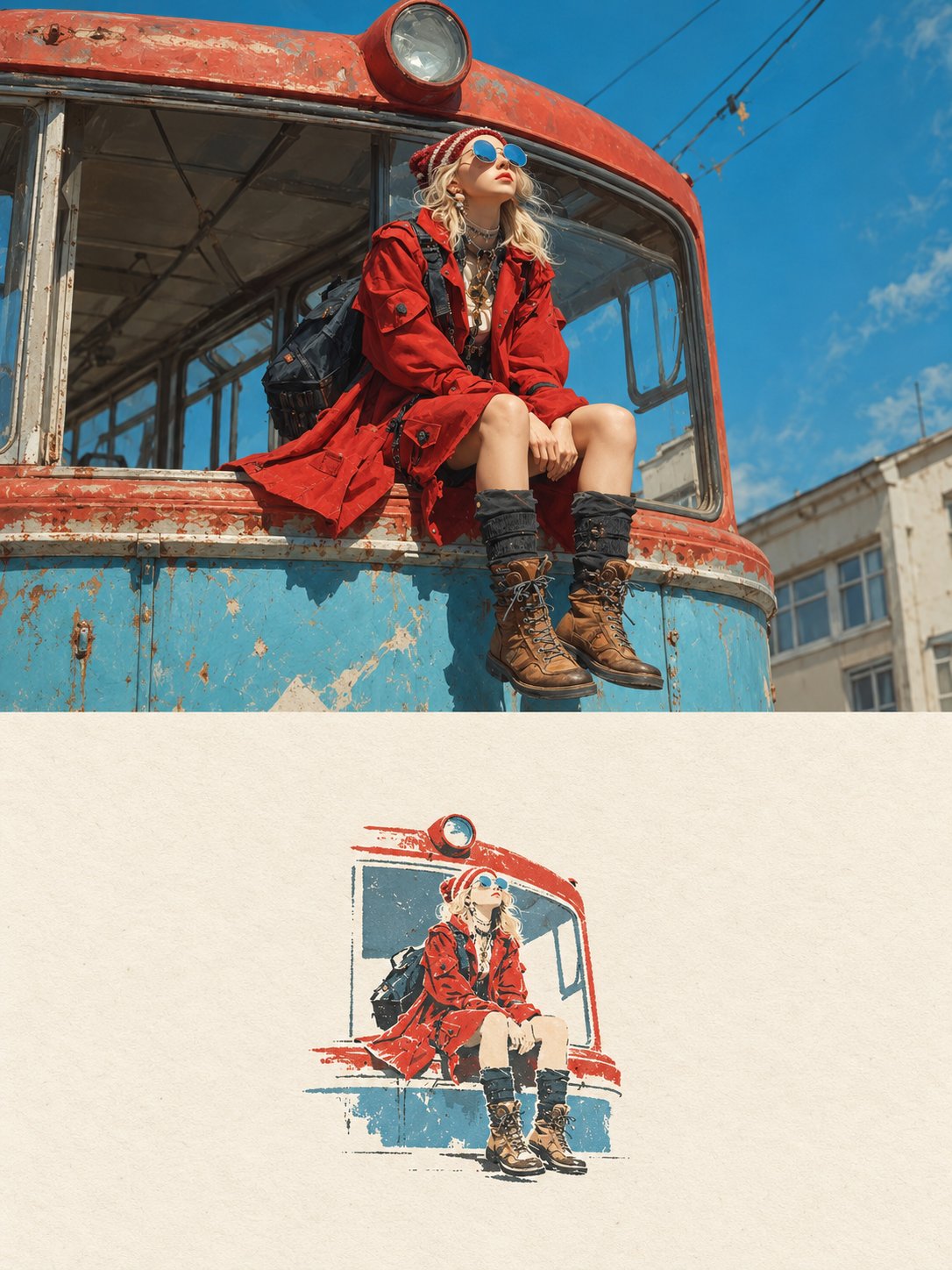
Create a high-end editorial poster using the uploaded photo as the exact reference, in a strict 3:4 vertical format divided horizontally into two equal 50/50 sections. Preserve the original photo faithfully in the top half, including subjects, identity, pose, clothing, objects, lighting, colors, and realistic texture, with only subtle premium editorial color grading. In the bottom half, reinterpret the most recognizable elements as a small, centered, minimalist handmade paper illustration using delicate imperfect lines, bold flat acrylic-like color shapes, subtle paper grain, organic edges, and no more than 4 colors extracted from the original photo. Keep the illustration only 10–20% of the bottom section with lots of warm off-white negative space and optional minimal editorial typography. The overall result should feel quiet, poetic, refined, artistic, premium, and like an independent art-book cover, avoiding cartoon, watercolor, colored-pencil, 3D, glossy, busy, or commercial aesthetics.
0
Details
GPT Image 2.5
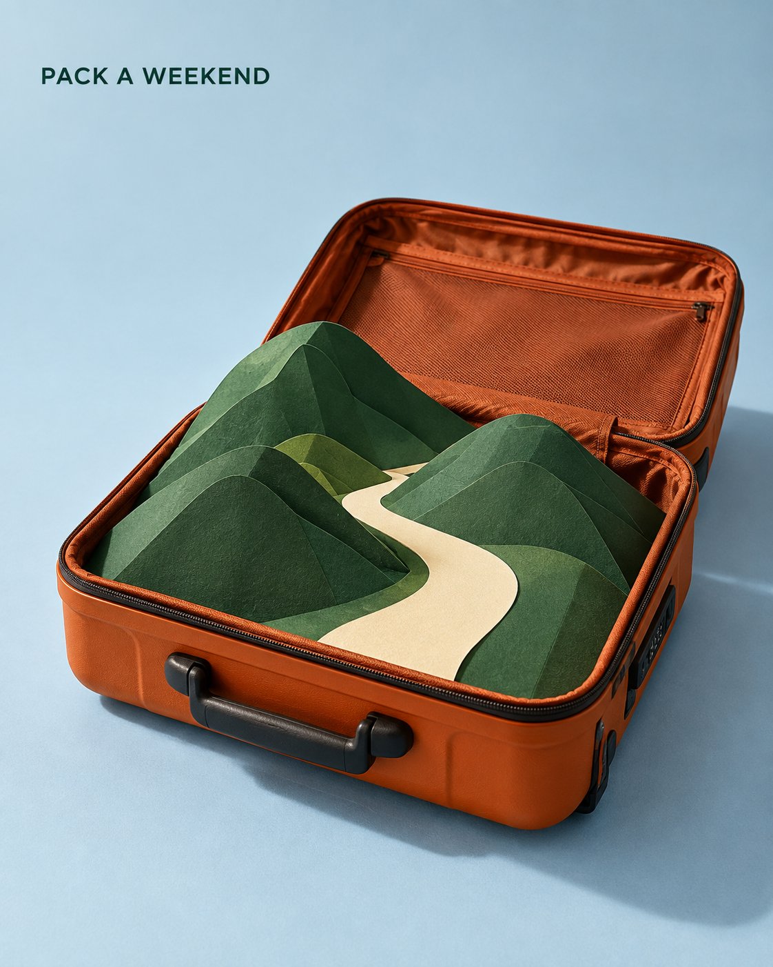
Create a vertical 4:5 travel campaign poster. One open burnt-orange hard-shell suitcase sits on a pale blue studio floor, viewed from an elevated three-quarter angle. Its open lid extends behind the base without obscuring the contents. Center the suitcase within the lower two-thirds of the composition, occupying approximately 60% of the image width. Inside the suitcase, replace clothing with a carefully constructed miniature paper landscape: three overlapping forest-green folded hills and one broad ivory paper path winding between them. All landscape elements originate inside the suitcase and remain within its footprint. The tallest hill rises just above the rim. Make the path the clearest high-contrast shape, leading the eye into the landscape. Render this as a photograph of a real handmade set. Show thick matte paper, precise folds, subtle cut edges, realistic suitcase fabric lining, hinges and zipper details. Keep the miniature’s scale consistent. No buildings or extra travel accessories. Use one large studio light from the upper left. Cast soft shadows toward the lower right, with convincing contact shadows where paper meets the suitcase lining. Palette: burnt orange, forest green, ivory and pale blue. Leave the upper quarter spacious. Place the small dark-green headline “[TITLE] ” near the upper-left margin in a clean sans-serif font. No other text. The paper landscape is the focal point; the suitcase provides context; typography stays subordinate. No people, animals, logos, floating objects or decorative graphics
0
Details
GPT Image 2.5
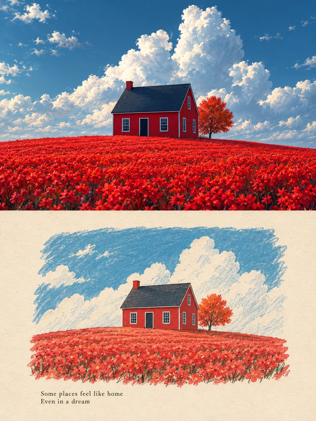
Use the uploaded photo as the only content source. Create a vertical 3:4 “real photo + minimal illustration” memory card based entirely on that image. Preserve the main subjects, subject count, pose, viewpoint, spatial relationships, and overall scene logic. Do not redesign the source or add unrelated content. Layout Split the card into two horizontal sections, about 50% top and 50% bottom. The top half keeps the uploaded photo with photographic texture. Crop naturally to fit, but do not stretch, mirror, rearrange, or alter the main subjects. Keep natural lighting, real materials, and the original color mood, with subtle editorial grading. The lower half uses a warm ivory handmade-paper background and shows a centered horizontal illustration of the same scene. The illustration occupies about 63-67% of the lower width, with generous blank space around it. Scene Translation In the lower illustration, preserve the most recognizable subjects, major structures, important objects, viewpoint, depth, relative scale, and key positions from the source. Remove tiny clutter, fine photographic texture, reflections, and complex shadows. Simplify the scene into slightly awkward geometric color blocks and thin hand-drawn lines. People and animals, when present, remain identifiable through silhouette, pose, hair or fur shape, clothing color, and placement, but facial detail may be reduced. Outlines may wobble, break, shift, or misalign slightly while the scene stays recognizable. Illustration Style Use restrained naive editorial drawing with soft geometric simplification and handmade quality. Combine thin sketchy linework with flat shapes. The lower scene should feel calm, clean, slightly imperfect, and visually reduced rather than technically precise. Avoid realistic rendering. Color Extract 4-6 representative colors from the uploaded photo and reinterpret them as a soft low-saturation palette. Use muted tones derived from the source, with flat fills and enough contrast to separate major subjects and scene layers. No complex gradients, glossy highlights, or heavy 3D modeling. Texture Blend crayon, pastel, screen-print, and old-book illustration qualities. Keep paper show-through, fine grain, slight pigment unevenness, worn edges, and subtle off-register shifts. The result should feel like an independent editorial illustration printed on aged paper: warm, quiet, nostalgic, and collectible. Typography Below the illustration, you may include exactly two short English lines related to the scene, mood, place, or moment. Use a small vintage serif font, left-aligned. If clean readable text cannot be rendered, leave the area blank. No other readable text. Cleanup Remove phone UI, subtitles, screenshot traces, and interface elements when present. Do not invent missing scenery or decorative props. Negative No major layout change, no added or missing primary subjects, no photoreal painting, no polished watercolor, no anime, no manga, no vector clip-art, no oil paint, no impasto, no 3D, no logo, no watermark, no black border, no UI, no unrelated decoration. Vertical 3:4 split card · photo top / naive illustration bottom · aged paper texture
0
Details
0:18
GPT-6 Astra
Create a complete, polished motion graphics video called “FOLD — Make room for focus” Generate an 18-second video at 1920×1080, 60 fps, with original or commercially licensed music and subtle sound effects Include the complete editable source Build the animation, render it, inspect it, and deliver the finished MP4 Do not stop at a storyboard or explanation No external assets are necessary: create the graphics procedurally A premium minimalist motion identity for a fictional creative workspace Palette: Warm paper # F2EFE6 Near-black ink # 181C1D Coral # F45D41 Off-white cards Use Geist or a comparable clean sans serif Large, confident typography with tight tracking Generous empty space, consistent margins, restrained shadows Keep one dominant visual idea in each composition The central motif is folded paper: one coral tile becomes notes, the notes become a ribbon, and the ribbon becomes a custom F monogram Motion should feel precise, fluid, and slightly weighty Fast transitions should resolve into readable compositions Use subtle material shading on the ribbon, without glow or shiny plastic 0–2 seconds: Warm paper background Large black headline on the left: “Make room” “for focus” Small supporting line: “A little less noise. A lot more possibility.” A coral rounded square sits on the right, containing a bold geometric F monogram made from three folded strokes Give the opening a subtle entrance and a readable hold 2–4 seconds: The coral tile travels toward the center and unfolds into seven note cards Stagger their movement slightly so they feel connected Arrange them across two or three loosely balanced rows Use short labels such as: “A fresh idea” “Something to make” “A useful note” “The next move” “Room to explore” “A small detail” “What matters” Most cards are warm white; one is coral Headline above: “A little less noise” 4–6 seconds: The scattered cards smoothly align into one centered vertical stack Headline changes to “One clear direction” Remove the card labels before the cards become too small to read Compress the entire stack into a narrow horizontal coral form Preserve its central position so the next transformation is easy to follow 6–10 seconds: An ink-colored aperture expands from behind the compressed form, filling the background The coral form unfurls into a broad flowing ribbon across the center Construct the ribbon from a continuous ruled surface or tightly joined strips It should gently twist, with coherent front/back shading and no visible cracks Large off-white headline: “Find your flow” Small supporting line below: “SPACE TO THINK / MOMENTUM TO MAKE” Let the ribbon carry the movement while the typography stays stable 10–12 seconds: The ribbon curls into a circular band Keep the same material and color through the transformation Reveal “01” inside the ring Below it, small text: “THING AT A TIME” The ring settles with controlled deceleration 12–14 seconds: Warm paper expands from the center, replacing the dark background The coral ring remains the anchor Show the supporting line: “That’s where good work begins” Allow a short readable pause before the final transformation 14–16 seconds: The ring folds and packs into the geometric F monogram The monogram must be constructed from the same moving geometry rather than appearing as an unrelated replacement Reveal “FOLD” beside it in large black type Below: “Make room for focus” 16–18 seconds: The monogram moves toward its original position on the right A coral tile forms around the moving monogram and follows it Restore the original left-side headline and supporting line Finish in the opening composition, ready to loop Use one coherent coordinate system and persistent objects Preserve a recognizable position, edge, material, or silhouette through every transition Do not crossfade between unrelated full-screen scenes Use critically damped springs or smooth minimum-jerk curves No repeated bouncing Position, scale, and rotation must have continuous motion Text has separate entrance and exit timing from its container Use masked text reveals and restrained fades Never allow outgoing and incoming labels to overlap The final visual state must match the first, including object positions and velocities 120 BPM, nine four-beat bars, exactly 18 seconds Use a restrained electronic rhythm with warm tones, soft percussion, and light transition accents Major transformations should anticipate or land on musical beats Keep effects below the music Use original synthesized audio or assets with a verified commercial-use license Do not reuse audio from reference videos Prefer a single HTML/Canvas/WebGL project with an async window seek(t) function Every visual property must be computed from absolute time No CSS animation clocks, setInterval, requestAnimationFrame-driven state, or accumulated physics during export Seeking frames out of order must produce identical results Render at true 60 fps Use spatial antialiasing and 3–5 temporal samples per output frame for subtle motion blur Keep text sharp during holds Do not use frame interpolation to disguise poor motion Inspect frames throughout the film and dense frame sequences around every transformation Fix overlap, ribbon seams, abrupt replacements, clipped typography, and loop discontinuities before delivery Generic slideshow transitions Particles, shockwaves, neon glows, lens flares, camera shake Random decorative movement Large elastic overshoots Unrelated stock footage Long empty pauses A logo reveal that disconnects from the preceding geometry
0
Details
GPT Image 2.5
A sophisticated minimalist lifestyle art poster featuring [PERSON / SUBJECT / MOMENT] as the central focus, transformed from a real-life photograph into a refined hand-drawn editorial illustration. Preserve the subject’s recognizable pose, silhouette, clothing, hairstyle, and key visual details while simplifying the scene into an elegant artistic composition. Use a limited vintage color palette inspired by the original environment, with warm muted tones printed on an ivory/off-white paper background. Combine delicate ink outlines, loose sketchwork, fine hatching, subtle halftone texture, faded print imperfections, and soft watercolor-like washes. Reduce the surrounding environment into a few recognizable contextual elements—[CAFÉ / BAR / STREET / LANDMARK / OBJECTS]—using simplified linework and layered shapes rather than detailed realism. Add subtle abstract circles, geometric forms, atmospheric marks, tiny decorative elements, or silhouettes to create visual depth. Include small minimalist typography on one side: [CITY / LOCATION], [SUBJECT / MOMENT], and optional coordinates, date, or short descriptor, designed like a premium collectible travel/lifestyle print. Generous negative space, elegant editorial composition, vintage screen-print aesthetic, hand-crafted illustration, sophisticated travel-magazine design, muted heritage colors, subtle paper grain, artistic but recognizable, no photorealistic background, no excessive details, 4:5 vertical composition.
0
Details
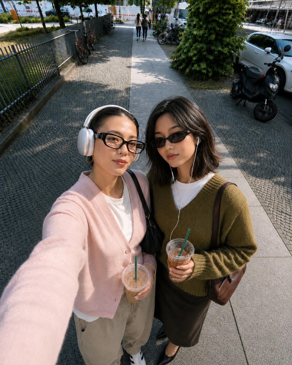
GPT Image 2
Transform the uploaded photo into a charming hand-drawn fashion illustration while preserving the original scene and composition. Keep the same people, number of people, pose, body positioning, facial expressions, clothing, accessories, hairstyles, objects, drinks, and overall framing from the reference photo. Do not add or remove important elements. Convert the realistic photograph into a minimal Japanese/Korean-inspired lifestyle sketch illustration, using loose but confident dark green ink linework with subtle hand-drawn imperfections. Simplify facial features while keeping each person’s recognizable hairstyle, glasses, headphones, clothing silhouette, and pose. Use a soft pastel pink background with the illustration drawn primarily in deep forest-green ink. Replace realistic textures, shadows, vehicles, buildings, pavement, and surroundings with simplified expressive linework and selective cross-hatching. Keep enough environmental details to make the original location and composition recognizable. Style: cute editorial illustration, Japanese stationery aesthetic, fashion sketch, casual slice-of-life manga drawing, imperfect pen strokes, clean negative space, minimal detailing, subtle vintage feel, handmade appearance. Color treatment: predominantly pastel pink background + dark green line art, with very minimal secondary tones if needed. No photorealism, no 3D rendering, no glossy digital painting. Important: preserve the original image’s composition, perspective, camera angle, poses, proportions, clothing, accessories, and key objects. The result should look like the exact photograph was redrawn by an illustrator, rather than redesigned into a different scene. Output: clean vertical illustration, aesthetically balanced, high-resolution, polished hand-drawn finish. Short version for image models: Turn this photo into a cute hand-drawn Japanese lifestyle/fashion sketch. Preserve the exact people, poses, expressions, clothing, hairstyles, accessories, drinks, composition, camera angle and important background elements. Redraw everything with loose imperfect dark forest-green ink linework on a soft pastel pink background, using minimal cross-hatching and simplified details. Charming editorial stationery aesthetic, casual manga-inspired illustration, handmade pen texture, clean negative space, elegant and whimsical. Do not change the composition or add/remove subjects; make it look like the original photo was directly illustrated by hand.
0
Details
GPT Image 2
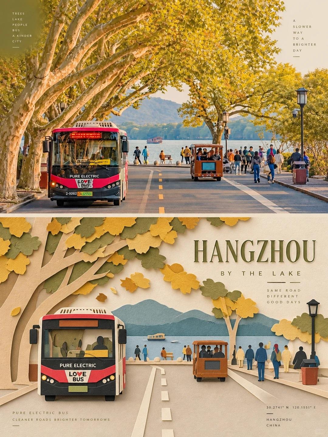
Create one independent editorial-style poster for each uploaded photo. Do not make a collage. Process and output each photo separately. Use a strict 3:4 vertical composition, divided horizontally into two exactly equal sections, each occupying 50% of the canvas. TOP HALF — ORIGINAL PHOTOGRAPH Preserve the original photo. Keep the main subject unchanged while retaining its realistic texture, natural lighting, and original color atmosphere. Apply only subtle editorial-grade color correction to create the refined feel of an art magazine, independent publication, or exhibition photography. To fit the composition, you may gently extend the sky, ground, or surrounding environmental background, but do not stretch, distort, or alter the main subject. BOTTOM HALF — LAYERED PAPER CUT / PAPER ART REINTERPRETATION Reinterpret the most recognizable subject, silhouette, pose, and spatial relationships from the photo as a minimalist layered paper-cut / paper-art composition. Use one primary subject as the visual anchor. Do not mechanically reproduce every detail. Instead, reconstruct the key silhouette, proportions, and structure through folding, cutting, layering, and overlapping. Transform only a few supporting environmental elements into foreground, midground, and background paper layers. Use scale contrast, negative space, clean alignment, and front-to-back layering to make the subject immediately recognizable while maintaining a restrained editorial composition. COLOR & MATERIAL Extract the most distinctive and recognizable colors from the original photo, then reduce them into a limited and harmonious paper-art palette. Use warm ivory or light-colored paper as the base, supported by a small amount of stronger accent colors, darker structural tones, soft transitional layer colors, and very limited highlights. The material should resemble high-quality matte cardstock, with subtle visible paper fibers, clean cut edges, and soft contact shadows under natural diffused lighting. Emphasize the tactile quality of real handcrafted paper art. Avoid glossy plastic-like 3D effects, cheap craft-paper aesthetics, neon colors, and overly saturated or complex gradients. EDITORIAL TYPOGRAPHY SYSTEM Add a refined editorial typography system. Based on the identity, location, action, material, emotion, or symbolic meaning of the subject, create one short main title. Add 2–4 groups of smaller supporting text. These may include object names, location information, numbers, sequence markers, coordinate-like numbers, direction words, status words, material descriptions, classification labels, or a very short poetic phrase. Do not use any year or date. The main title should convey emotion and identity, while the smaller text should add rhythm, structure, and refinement. TYPOGRAPHY INTEGRATION Integrate the typography naturally into the composition so that it interacts with the paper-cut forms. Arrange text along paper-layer edges, subject contours, geometric axes, or areas of negative space. Use horizontal or vertical typesetting, rotated text, generous letter spacing, edge alignment, corner placement, cross-section layouts, embedded typography, or partially overlapped text. The main title may have a subtle paper-cut or folded-paper quality, while the supporting text should remain thin, modern, restrained, and precise. The final result should feel elegant, tactile, balanced, art-directed, and distinctly editorial.
0
Details
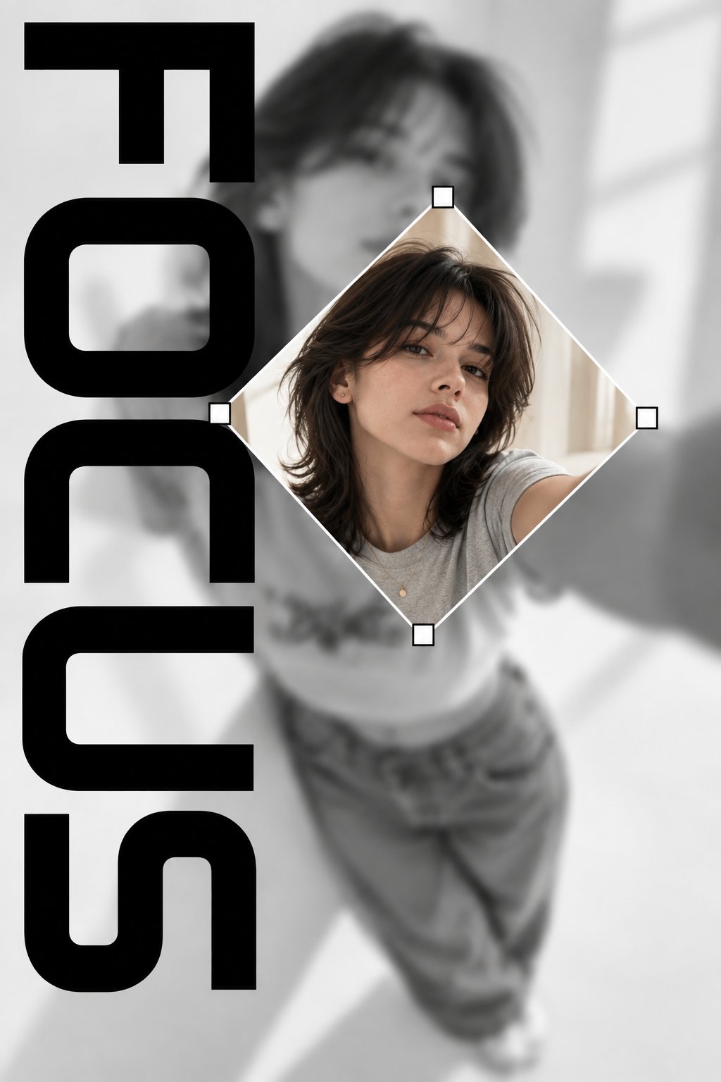
GPT Image 2.5
Create a vertical 2:3 editorial-style graphic poster with a minimalist black-and-white aesthetic. Use a blurred grayscale background featuring a young woman taking a selfie, with her face and upper body softly out of focus. In the center, place a sharp, full-color diamond-shaped photo of the same woman, slightly rotated, with a thin white border and small white square handles at each corner, resembling a graphic design crop tool. Add the word FOCUS in large, bold, black geometric typography arranged vertically along the left side, with oversized letters partially cropped by the edges. The word FOCUS should be the only text in the entire design. Use a clean white and light-gray background, strong contrast, modern fashion magazine composition, subtle shadows, balanced negative space, realistic photography, and a premium contemporary graphic design aesthetic. No other words, captions, logos, barcodes, symbols, or decorative text. Focus entirely on the word FOCUS and the central portrait.
0
Details
GPT Image 2.5
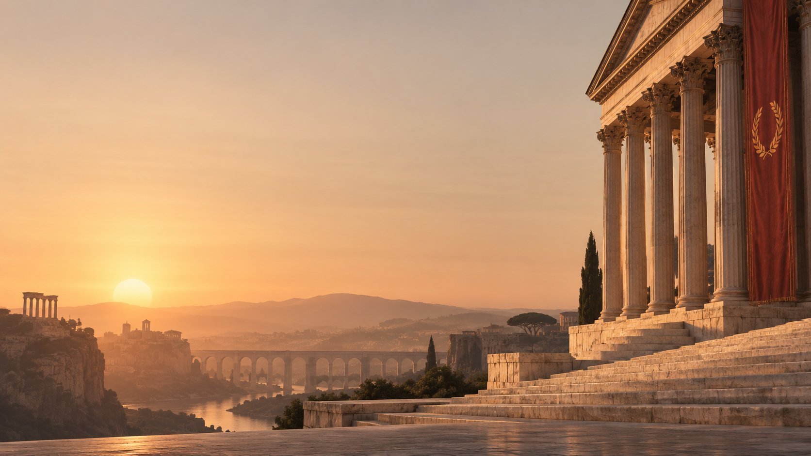
Ultra-minimal wallpaper of the Ancient Roman Empire, featuring a solitary grand Roman temple with towering marble columns, subtle distant aqueducts and classical ruins, warm golden sunset, muted beige and terracotta palette, vast negative space, clean geometric composition, soft cinematic lighting, elegant historical atmosphere, minimal details, no people, no text, premium editorial aesthetic, 16:9 aspect ratio
0
Details
GPT Image 2.5
Create a minimalist cultural travel poster for [CITY, COUNTRY] where [ICONIC LANDMARK] is transformed into a bold graphic symbol rather than a realistic illustration. Construct the landmark from a few elegant geometric shapes and architectural lines. Place it over a simplified abstract representation of the city—river curve, skyline, hills, streets or coastline. Use a warm ivory background with one dominant heritage color and deep black typography. Add oversized “[CITY]”, small “[COUNTRY]”, coordinates and a tiny archival catalog number. Swiss editorial design meets vintage European travel poster, sophisticated negative space, precise composition, subtle paper texture, premium museum graphic, vertical 4:5.
0
Details
GPT Image 2.5
Use the uploaded photo as the only content source. Create a vertical 3:4 "real photo + minimal illustration" memory card based entirely on that image. Preserve the main subjects, subject count, pose, viewpoint, spatial relationships, and overall scene logic. Do not redesign the source or add unrelated content. Layout:Split the card into two horizontal sections, about 50% top and 50% bottom. The top half keeps the uploaded photo with photographic texture. Crop naturally to fit, but do not stretch,mirror, rearrange, or alter the main subjects. Keep natural lighting, real materials, and the original color mood, with subtle editorial grading. The lower half uses a warm ivory handmade-paper background and shows a centered horizontal illustration of the same scene. The illustration occupies about 63-67% of the lower width, with generous blank space around it. Scene translation:In the lower illustration, preserve the most recognizable subjects, major structures, important objects, viewpoint, depth, relative scale, and key positions from the source. Remove tiny clutter, fine photographic texture, reflections, and complex shadows.Simplify the scene into slightly awkward geometric color blocks and thin hand-drawn lines. People and animals, when present, remain identifiable through silhouette, pose,hair or fur shape,clothing color, and placement, but facial detail may be reduced. Outlines may wobble, break, shift, or misalign slightly while the scene stays recognizable. Illustration style: Use restrained naive editorial drawing with soft geometric simplification and handmade quality. Combine thin sketchy linework with flat shapes. The lower scene should feel calm, clean, slightly imperfect, and visually reduced rather than technically precise. Avoid realistic rendering. Color:Extract 4-6 representative colors from the uploaded photo and reinterpret them as a soft low-saturation palette. Use muted tones derived from the source, with flat fills and enough contrast to separate major subjects and scene layers. No complex gradients,glossy highlights, or heavy 3D modeling. Texture:Blend crayon, pastel,screen-print, and old-book illustration qualities. Keep paper show-through, fine grain, slight pigment unevenness, worn edges, and subtle off-register shifts. The result should feel like an independent editorial illustration printed on aged paper:warm, quiet, nostalgic, and collectible. Typography:Below the illustration, you may include exactly two short English lines related to the scene.mood,place.or moment. Use a small vintage serif font, left-aligned. If clean readable text cannot be rendered, leave the area blank. No other readable text. Cleanup:Remove phone UI,subtitles, screenshot traces, and interface elements when present. Do not invent missing scenery or decorative props. Negative:No major layout change, no added or missing primary subjects, no photoreal painting, no polished watercolor,no anime,no manga, no vector clip-art, no oil paint, no impasto, no 3D, no logo,no watermark, no black border,no UI,no unrelated decoration.
0
Details
GPT Image 2
Transform the uploaded photograph into a minimalist, premium handmade editorial paper illustration. Use the photo strictly as reference and preserve the subject’s recognizable identity, facial features, hairstyle, facial hair, skin tone, body proportions, clothing, pose, expression, hands, umbrella and key recognizable details. Generate ONLY the illustration on a clean paper background. FORMAT LOCK Vertical 3:4 canvas. Small centered subject occupying approximately 15–25% of the canvas. Generous warm negative space. Do not crop important parts of the subject. STYLE TRANSFER Reinterpret the photograph as a sophisticated handmade watercolor, acrylic, colored-pencil and ink illustration. Preserve recognition while simplifying the image into a refined contemporary editorial artwork. Avoid photorealism and polished digital-vector aesthetics. DETAIL & COLOR Delicate imperfect ink outlines, loose watercolor washes, restrained acrylic shapes, dry-brush marks, rough pigment edges, subtle colored-pencil texture and natural paint imperfections. Warm ivory handmade paper with visible grain and fibers. Use a restrained palette of deep navy blue, muted dark green, natural skin tones and warm brown/ochre, with subtle blue and green environmental shapes. COMPOSITION LOCK Keep the subject small, centered and fully readable. Preserve the wavy dark hair, facial features and gentle smile, light facial hair, navy sweater, pale shirt collar, green umbrella, umbrella shaft, curved wooden handle, hand and ring. Simplify the environment aggressively into only a few loose painted shapes. Maintain a calm gallery-like composition with abundant clean negative space. STYLE Quiet, poetic, minimal, refined, warm, contemporary handmade editorial illustration. Premium art-book aesthetic, tactile paper surface, organic edges, subtle pigment variation and authentic traditional craftsmanship. NEGATIVE PROMPT No photograph, photorealism, split-screen, collage, top-and-bottom layout, second panel, photographic half, detailed background, oversized subject, large illustration, digital vector art, glossy CGI, 3D, anime, cartoon exaggeration, excessive detail, chaotic colors, typography, text, letters, words, numbers, logos, symbols, watermark or signature
0
Details
0:15
MiniMax H3
the pencil bird is drawn in a slightly different wing position, so it flaps across the paper
0
Details
GPT Image 2
Please create a separate, independently designed premium poster from each uploaded photo. Do not combine multiple photos into one composition; output one individual poster for each photo. Use a vertical 3:4 composition, with the upper and lower sections strictly divided 1:1, each occupying exactly 50% of the total height. Upper Half: Preserve the original photograph, maintaining the subject’s identity, structure, pose, realistic texture, natural lighting, and original color atmosphere. Apply only subtle, sophisticated color grading to give it the visual quality of an art magazine, independent publication, or exhibition image. To adapt the image to the 3:4 format, the surrounding background may be naturally extended, but do not stretch, distort, or alter the subject. Lower Half: Extract the most recognizable subject, silhouette, structure, pose, and narrative relationship from the photograph and reconstruct it in the style of Mid-century vernacular graphic illustration + schematic line drawing + two-color spot printing. Do not completely trace or replicate the photograph. Instead, use diagrammatic abstraction to compress complex objects into a small number of clear geometric shapes, functional contours, and essential structural elements. The result should resemble an illustration from an old instruction manual, advertising card, technical label, or vernacular print: immediately recognizable, yet more direct, humorous, and symbolic than the realistic object itself. Emphasize economy of line: if a structure can be explained with a single line, do not use unnecessary strokes. Use direct black pen outlines, rectangles, circles, diamonds, straight lines, and simple planes to describe the objects. People, animals, and objects may have slightly exaggerated proportions, while machines, buildings, and complex structures should be simplified into clear boxes, openings, panels, and silhouette relationships. Use a flat, schematic diagrammatic perspective rather than realistic lighting or strictly accurate spatial depth. The visual language should exist somewhere between illustration and technical diagram, maintaining this distinctive character throughout the composition. Reorganize the composition according to the most important narrative relationship in the original image. Maintain one clear primary subject, while using a small number of supporting objects, guide lines, directional relationships, or structural symbols to reinforce the story. Pay close attention to visual hierarchy, geometric order, scale contrast, positive and negative space, and intentional whitespace. The image may feel slightly naïve, awkward, or handmade in a vernacular way, but it must never feel cluttered. Every visual element should appear to exist for the purpose of “explaining what is happening”, rather than simply serving as decoration.
0
Details
GPT Image 2.5
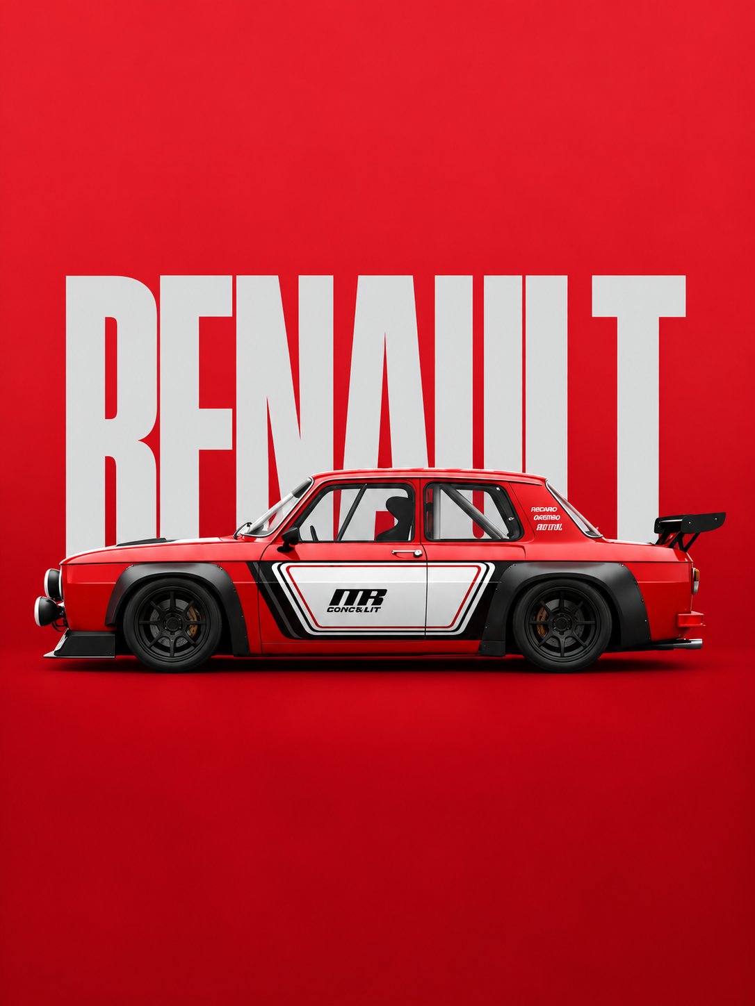
Create a premium minimalist automotive editorial poster in a vertical 3:4 composition. A classic boxy red rally racing sedan is shown in a clean full side profile, centered horizontally across the lower-middle portion of the frame. The car has a low, wide racing stance, box-shaped vintage body, glossy deep red paint, black wide fender extensions, black multi-spoke racing wheels, low-profile tires, front racing bumper, auxiliary round headlights, side exhaust details, roll cage visible through the windows, racing bucket seats, and a large black rear racing spoiler. The car should look like a professionally prepared vintage touring or rally race car, with realistic mechanical details, sharp body lines, subtle reflections, realistic rubber and metal textures, and high-end studio lighting. The car features a white and black geometric racing livery across the doors and lower body. Include a bold black racing number/logo style graphic on the door, with small technical racing text and decals. Keep the graphics clean, symmetrical, and authentic to motorsport design. Background: a completely flat, intense crimson-red studio backdrop with a subtle tonal gradient and very soft floor transition. Behind the car, place enormous bold condensed uppercase white typography reading “RENAULT”, positioned vertically centered in the upper and middle background. The typography should be partially hidden by the car, creating a strong layered poster composition. Use a heavy condensed sans-serif racing/editorial font. Composition: • Vertical 3:4 poster • Large empty red negative space above the car • Huge “RENAULT” text occupying most of the background width • Car centered around the lower-middle section • Full vehicle visible from front bumper to rear spoiler • Perfect clean side profile • Minimal visual clutter • Strong horizontal balance • Premium automotive advertising aesthetic Lighting: soft controlled studio lighting from above and slightly from the front, producing realistic highlights along the red bodywork and subtle shadows underneath the vehicle. Add a soft contact shadow beneath the tires without making the scene dramatic. Style: high-end automotive campaign photography, minimalist Swiss-inspired editorial poster design, vintage motorsport aesthetic, modern luxury advertising, photorealistic vehicle rendering, extremely clean composition, sharp details, realistic materials, subtle film grain. Color palette: intense crimson red background, bright white typography and livery, deep black wheels and aerodynamic parts, small neutral gray mechanical details. No people, no road, no city, no scenery, no extra vehicles, no unnecessary objects, no excessive reflections, no distorted wheels, no perspective distortion, no cropped car, no messy typography. Ultra-realistic, crisp, professional automotive photography, high detail, 8K quality.
0
Details
GPT Image 2.5
Create an exceptionally original minimalist architectural art poster featuring [LANDMARK]. Do NOT directly draw, paint, or fill the landmark. Instead, create the landmark entirely through negative space. The central silhouette of [LANDMARK] remains almost completely untouched — warm ivory paper showing through naturally. Around this empty silhouette, extremely delicate graphite lines describe the world that surrounds it: architectural measurements, tiny streets, distant rooftops, clouds, birds, shadows, perspective guides, fragments of maps and subtle environmental contours. The surrounding drawing becomes denser near the edges of the landmark, making the untouched negative space gradually reveal the unmistakable silhouette of [LANDMARK]. Some construction lines intentionally continue through the empty silhouette but become extremely faint, as if the artist started drawing the landmark and then erased it. Add one unexpected detail: a single continuous pencil line travels around the landmark without ever drawing its actual outline. At one point, the line breaks and leaves a tiny handwritten coordinate or date. Use warm ivory paper, graphite pencil, extremely fine architectural linework, subtle eraser dust, paper fibers, faint halftone imperfections and soft natural shadows. Color palette: almost entirely monochrome graphite and ivory, with one extremely subtle accent inspired by [CITY/COUNTRY]. Small refined typography placed in generous negative space: [LANDMARK NAME] [CITY, COUNTRY] “drawn by everything around it.” The composition must feel mysterious, intelligent and unexpectedly beautiful — like a contemporary museum artwork rather than a conventional travel poster. No photorealistic background. No obvious illustration of the landmark. No decorative clutter. No excessive typography. No people. 4:5 vertical, ultra-minimal, sophisticated editorial design, tactile handmade paper, elegant negative space, precise architectural details, smooth visual flow, premium contemporary gallery aesthetic.
0
Details
GPT Image 2.5
Create an exceptionally original minimalist architectural art poster featuring [LANDMARK] in [CITY, COUNTRY]. Depict the landmark in its recognizable natural architectural appearance, with its authentic proportions, distinctive structure, materials, and characteristic details. Combine fine graphite architectural drawing with subtle vintage watercolor washes, creating the feeling of a sophisticated illustrated travel archive. The landmark should be the central visual focus, surrounded by an intricate but restrained world of extremely delicate architectural linework: construction measurements, perspective guides, tiny streets, rooftops, surrounding buildings, local landscape, clouds, birds, shadows, fragments of maps, compass marks, elevation studies, structural details, and subtle environmental contours. Use a layered visual language where some elements are highly detailed while others fade into the paper, creating depth without making the composition feel crowded. Add one unexpected artistic detail: a single continuous pencil line travels around the landmark without directly tracing its outline. Allow it to occasionally intersect with construction lines, then break at one point beside a tiny handwritten coordinate, date, measurement, or architectural note. Use warm ivory handmade paper, graphite pencil, extremely fine ink lines, delicate watercolor washes, subtle eraser dust, visible paper fibers, faint halftone imperfections, soft natural shadows, and lightly weathered archival texture. Color palette Keep the overall artwork muted, sophisticated, and vintage. Use warm ivory and graphite as the foundation, with the landmark shown in its authentic recognizable colors through restrained watercolor washes. Add one subtle accent color inspired by [CITY/COUNTRY] — for example: - Italy → muted terracotta - Japan → restrained vermilion - France → faded blue - UK → muted navy or burgundy - India → subtle saffron - USA → muted teal or dusty red Avoid bright digital colors. Surrounding details Include carefully chosen elements associated with [CITY/COUNTRY], such as: - local architecture - landscape or geography - streets and rooftops - transportation - vegetation - small cultural details - map fragments - architectural ornaments - elevation or measurement diagrams - compass rose - coordinates - faint historical annotations These details should frame and contextualize the landmark rather than compete with it. Typography Place small, refined typography in generous negative space: [LANDMARK NAME] [CITY, COUNTRY] “drawn by everything around it.” Use elegant editorial serif typography with generous spacing. Add only a few tiny handwritten architectural annotations or coordinates. Artistic direction The final composition should feel mysterious, intelligent, timeless, and unexpectedly beautiful — somewhere between a vintage European travel poster, an architect's working sketch, a museum exhibition print, and a collector's archival illustration. No people. No photorealistic background. No excessive typography. No decorative clutter. No neon colors. No glossy digital rendering. No cartoon aesthetic. No generic stock-travel-poster appearance. 4:5 vertical composition, premium editorial design, tactile handmade paper, sophisticated architectural illustration, precise fine-line details, subtle watercolor, elegant negative space, balanced visual hierarchy, museum-quality contemporary art poster.
0
Details
GPT Image 2.5
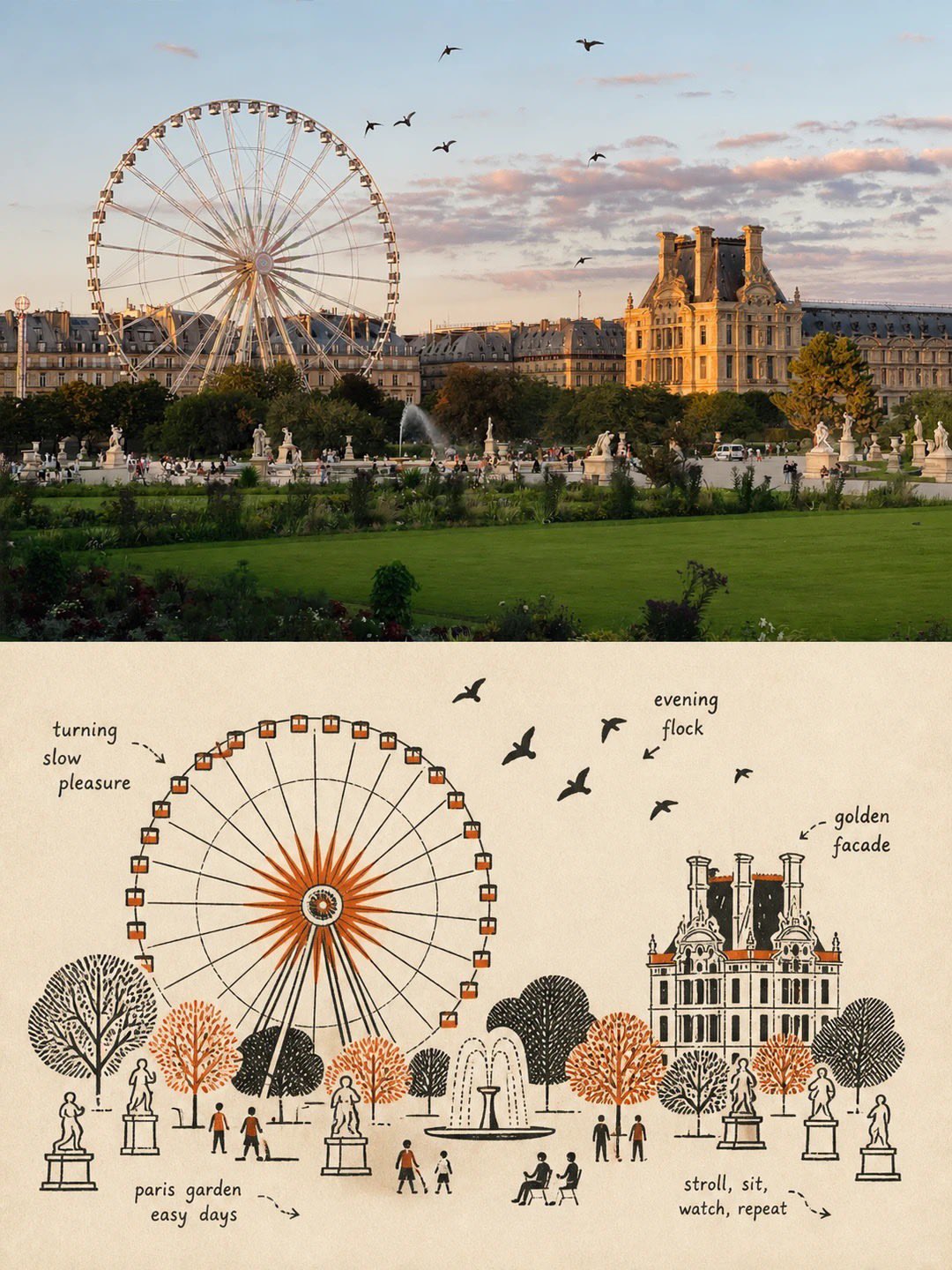
Create a premium 4:5 vertical editorial travel artwork for [COUNTRY / CITY / LOCATION / SUBJECT]. TEXT-TO-IMAGE ONLY — generate the entire composition creatively from [COUNTRY / CITY / LOCATION / SUBJECT] alone. No reference image required. CORE CONCEPT Create a realistic upper scene representing [COUNTRY / CITY / LOCATION / SUBJECT], paired with a small Minimal Geometric Graphic Vignette in the lower section. The lower artwork should visually echo the main scene without literally reproducing it. GRAPHIC VIGNETTE Automatically identify the 2–5 strongest visual memory points of [COUNTRY / CITY / LOCATION / SUBJECT]—its most recognizable silhouette, movement, posture, structure, object, or narrative relationship. Remove everything unnecessary and reconstruct these elements using simple geometric forms, clean silhouettes, solid color blocks, and a few carefully layered shapes. The vignette should remain small and refined, never attempting to recreate the entire scene. It may be slightly off-center, edge-aligned, floating, partially cropped, or asymmetrically positioned according to the visual weight of the subject. NEGATIVE SPACE Give the geometric artwork generous surrounding whitespace. Treat negative space as an essential design element, using scale contrast, positive/negative shapes, spacing, clustering, and asymmetrical balance to create a sophisticated editorial rhythm. COLOR Derive a restrained 2–4 color palette from the visual identity of [COUNTRY / CITY / LOCATION / SUBJECT]. Extract meaningful colors associated with the subject, environment, materials, season, atmosphere, clothing, architecture, vegetation, water, or food, then simplify and slightly brighten them into clean graphic colors. Use a very pale, soft background close to white. Avoid muddy neutrals, unnecessary muted palettes, fluorescent colors, or decorative colors unrelated to the subject. STYLE Keep the vignette small, simple, precise, and highly recognizable. Use professional graphic-design language rather than realistic volume, complex textures, or cartoon styling. Whether the subject is a person, building, animal, plant, object, vehicle, or landscape, transform it into an elegant spot illustration with strong visual identity and minimal geometry. TYPOGRAPHY Add only a very small amount of restrained editorial text if appropriate. Derive a short word or phrase from the destination, subject, action, mood, or visual metaphor. Keep it subtle and integrated into the surrounding negative space. FINAL AESTHETIC Minimal geometric graphic design × editorial spot illustration × contemporary travel art × intelligent negative space × semantic color palette. The result should feel refined, modern, playful, highly intentional, and collectible—not like a photo tracing or ordinary cartoon. Avoid photorealistic lower artwork, literal photo recreation, excessive detail, complex shading, gradients, 3D rendering, oversized graphics, clutter, decorative colors, generic icons, excessive typography, logos, watermarks, or filled-in backgrounds. FORMAT: 4:5 vertical, premium editorial composition, small geometric vignette with generous negative space.
0
Details
GPT Image 2.5
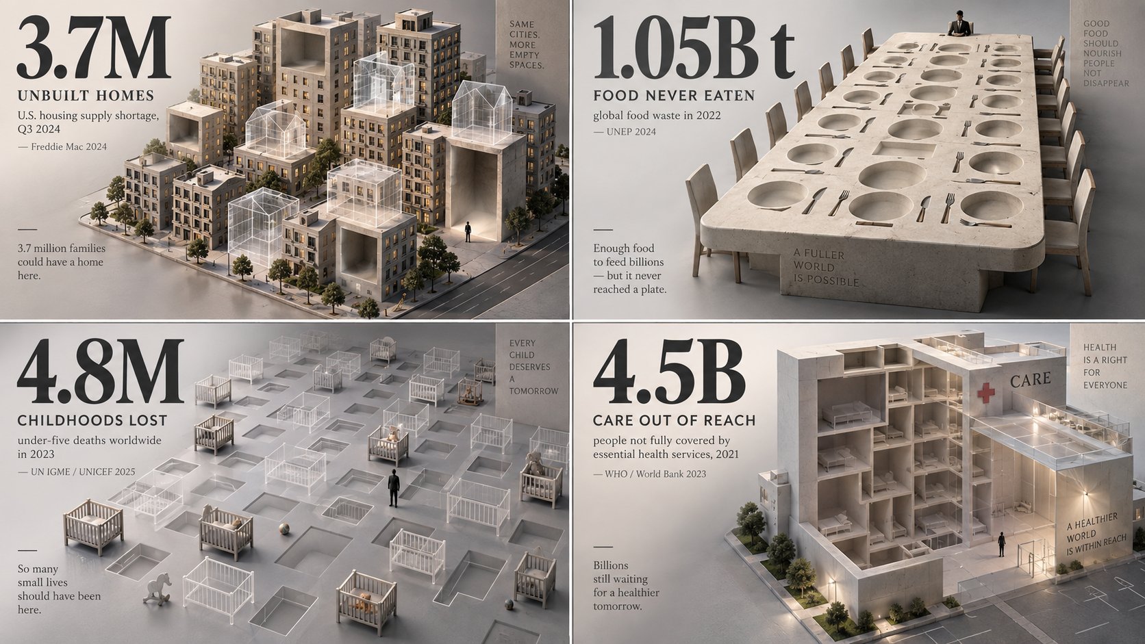
2x2 grid, 16:9, AI infers viral topics: Create a haunting, minimalist 3D visualization that represents what is missing, lost, avoided, delayed, or erased because of [TOPIC]. The AI should choose a statistic involving loss: missing sleep, lost time, extinct species, unbuilt homes, unpaid wages, wasted food, lost attention, preventable deaths, disappearing land, delayed care, or unrealized potential. Instead of showing the object directly, represent it as negative space: empty chairs, ghost outlines, hollow cubes, missing city blocks, erased silhouettes, transparent containers, absent books, unfilled beds, or a carved-out void in a solid mass. The missing quantity should feel physically present through absence. Style: museum-grade isometric 3D render, matte clay and translucent materials, soft directional lighting, quiet shadows, neutral grey backdrop. Use one oversized numeral as a solemn anchor. Caption: what is missing, time period, metric, and source year. Add a tiny human silhouette for emotional scale. The spirit: make absence feel heavier than presence.
0
Details
GPT Image 2.5
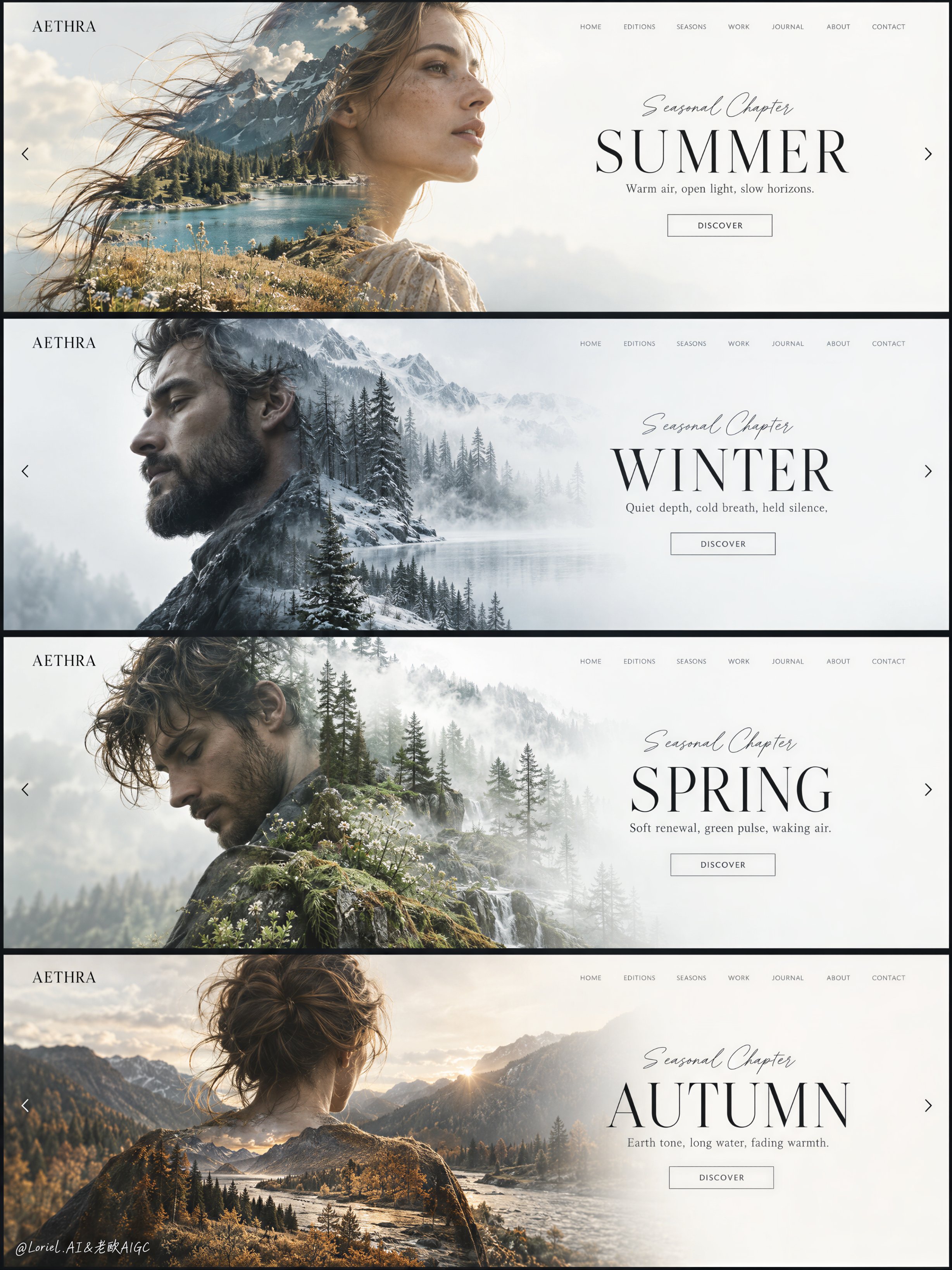
Create a premium editorial web-design campaign board for a fictional lifestyle brand called AETHRA, presented as one single tall composition containing four stacked full-screen website hero slides, each built from the same elegant interface system but reinterpreted through a different season. The entire image must feel like a luxury creative-direction presentation: minimalist, airy, high-end, and curatorially precise. Preserve a consistent layout across all four slides: a small square brand mark at the upper left, a thin refined navigation row across the upper right, a large human portrait on the left half rendered as a soft double-exposure silhouette, and a clean seasonal title block on the right half over a spacious white or near-white field. The “product” is the design system itself, and it must remain the dominant visual focus. Overall composition: four horizontal website hero banners stacked vertically in one clean presentation board, separated by thin dark dividers or slim frame gaps. Each slide follows the same structure but carries its own seasonal mood, palette, portrait direction, and embedded landscape. The board should read like a polished design showcase for a premium homepage slider concept. Typography, grid, whitespace, navigation rhythm, and button placement must stay consistent from slide to slide. The left portrait and right title area should always form the primary balance. Everything must feel deliberate, spacious, and highly art-directed. Slide 1, SUMMER: an adult woman in side profile or three-quarter profile facing right, with softly windblown hair and a graceful elongated silhouette. Inside her silhouette, blend a luminous alpine summer landscape: teal lake water, sunlit ochre grass, pale rocky mountains, soft cloud haze, and warm summer air. Main title on the right reads exactly: "SUMMER". Small script line above reads exactly: "Seasonal Chapter". Supporting line below reads exactly: "Warm air, open light, slow horizons." Small button text reads exactly: "DISCOVER". Slide 2, WINTER: an adult bearded man in left-facing side profile, calm and introspective. Inside the silhouette, blend a muted winter forest landscape with bare trees, cool fog, pale frost, bluish-grey shadows, and soft white atmospheric layering. Main title reads exactly: "WINTER". Small script line above reads exactly: "Seasonal Chapter". Supporting line below reads exactly: "Quiet depth, cold breath, held silence." Small button text reads exactly: "DISCOVER". Slide 3, SPRING: an adult man in a softly bent or turning pose, looking slightly downward, elegant and reflective. Inside the silhouette, blend a light spring woodland scene with soft evergreen layers, misty white light, pale moss, wet bark, and fresh emerging growth. Main title reads exactly: "SPRING". Small script line above reads exactly: "Seasonal Chapter". Supporting line below reads exactly: "Soft renewal, green pulse, waking air." Small button text reads exactly: "DISCOVER". Slide 4, AUTUMN: an adult woman or androgynous adult figure shown from the back or slight rear three-quarter view, head centered, silhouette broad and calm. Inside the silhouette, blend an autumn river-valley landscape with muted golden grasses, cool mountain shadow, forest edge, silver water flow, and pale amber dusk light. Main title reads exactly: "AUTUMN". Small script line above reads exactly: "Seasonal Chapter". Supporting line below reads exactly: "Earth tone, long water, fading warmth." Small button text reads exactly: "DISCOVER". Brand and interface system: the small top-left mark on every slide reads exactly: "AETHRA". The top-right navigation on every slide reads exactly: "HOME", "EDITIONS", "SEASONS", "WORK", "JOURNAL", "ABOUT", "CONTACT". Keep the UI elegant, understated, and believable as a real luxury website, but reduce clutter so it still feels like a gallery-grade image rather than a literal web screenshot. Include tiny left and right arrow cues near the side edges of each slide to imply a fullscreen slider. Typography should be thin, premium, editorial, and spatially balanced, with the main seasonal titles in large refined uppercase serif or elegant display text, the smaller interface elements in light modern sans-serif, and the script line above each title delicate and controlled. Double-exposure treatment: the portrait silhouettes must be photoreal and anatomically elegant, with clean profiles, believable shoulders and necks, natural skin and hair detail where visible, and very soft edge transitions where the landscapes merge into the faces and bodies. The landscapes should align with the contour logic of each portrait so the horizon lines, tree masses, grass layers, and fog fields feel embedded inside the figures rather than pasted on top. Keep the integration subtle and premium, with no harsh collage cutouts, no muddy overlaps, and no chaotic texture stacking. Lighting and palette: overall board palette must remain restrained, premium, and seasonally differentiated while unified by the clean white interface field. Use a 60/30/10 logic within each slide, but maintain a coherent full-board look. Summer: warm white, teal water, sunlit ochre. Winter: cool whites, fog grey, blue-green forest shadow. Spring: pale mist, fresh green, soft bark brown. Autumn: warm stone, muted amber, deep conifer shadow. Keep contrast soft but deliberate, with enough tonal separation to preserve facial silhouettes and text readability. The board
0
Details
GPT Image 2.5
Create a highly realistic Japanese washi-tape travel collage featuring the iconic landmark of [CITY], designed as a premium handcrafted journal page. The landmark should be instantly recognizable and depicted with accurate architectural details, realistic proportions, natural materials, and subtle photographic realism while still feeling physically integrated into the handmade paper composition. Use a warm off-white Japanese journal paper background with visible paper fibers, delicate imperfections, subtle grain, and authentic tactile texture. Build the composition from carefully layered pieces of translucent and matte washi tape, torn paper edges, small masking-tape strips, understated handwritten-style details, and neatly arranged editorial elements. The landmark should appear naturally attached to and emerging from the paper collage rather than looking digitally pasted onto it. Keep the layout minimal, sophisticated, balanced, and editorial, with generous negative space and a restrained visual hierarchy. Add soft ambient daylight, realistic contact shadows beneath every paper layer, subtle tape translucency, gentle edge lifting, tiny folds, and believable material interactions to create convincing physical depth. Avoid excessive decoration, clutter, artificial 3D effects, or overly saturated colors. The final result should resemble a high-end Japanese travel journal photographed in natural light, combining authentic handmade craftsmanship with refined contemporary poster design. The overall mood should be elegant, calm, collectible, tactile, and quietly majestic, with the landmark remaining the unmistakable hero of the composition. Strict Aspect ratio 4:5.
0
Details
GPT Image 2.5
Soft Minimalism wallpaper-style landscape of [MAIN LANDSCAPE/SCENE], featuring [KEY NATURAL ELEMENTS], surrounded by [BACKGROUND ELEMENTS], with [WEATHER/ATMOSPHERE], a muted [COLOR PALETTE] palette, soft diffused [TIME OF DAY] lighting, smooth simplified organic forms, subtle shadows, gentle atmospheric depth, vast negative space, clean balanced composition, minimal details, calm and serene mood, elegant modern aesthetic, dreamy yet natural appearance, premium desktop wallpaper feel, no people, no text, 16:9
0
Details
GPT Image 2.5
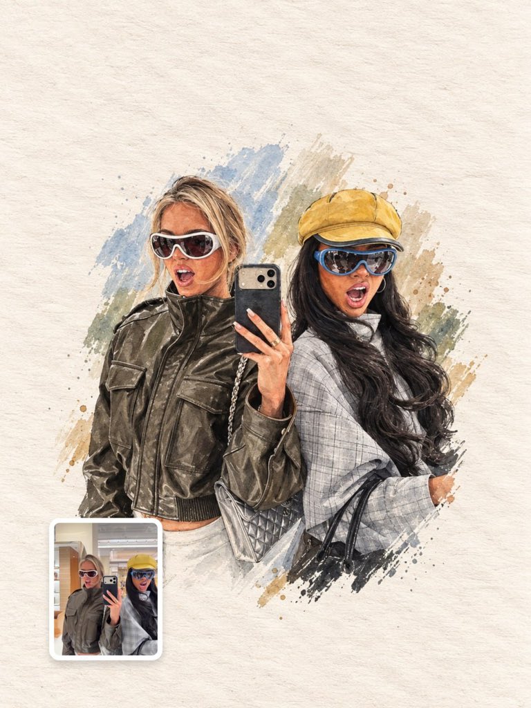
Create a standalone 3:4 vertical contemporary risograph-style art poster based on the original photograph. Preserve the woman's silhouette, facial character so the scene remains immediately recognizable. Use bold simplified shapes, rough ink edges, visible risograph grain, slight color misregistration, imperfect printing and handmade texture. Background should be warm cream paper with extensive negative space. Reduce the entire image to only four colors: navy blue, warm cream, mustard yellow and muted red. Keep the composition clean and graphic with the woman and motorcycle forming one strong central illustration. Add only tiny understated editorial text if needed. Aesthetic: Japanese design magazine, independent art print, vintage motorsport poster, sophisticated and collectible.
0
Details
GPT Image 2.5
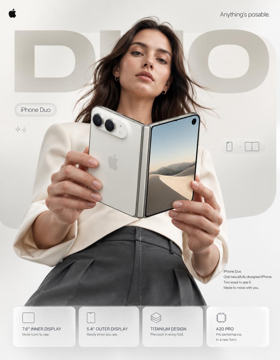
4:5 vertical premium smartphone campaign poster, ultra-high resolution (8K), global OOH + digital + social ready Style: Apple-level art direction × contemporary product photography × bold editorial composition × hyper-real commercial photography 🧠 CORE INTENT: “ANYTHING’S POSABLE.” One iPhone. More ways to see it. More ways to use it. More ways to make it yours. Effortless flexibility. Physical intelligence. One device that adapts to the moment. 🎬 SCENE COMPOSITION: BACKGROUND: Pure matte white architectural studio environment with a dominant oversized rounded rectangle block in ultra-soft warm silver gradient (top-left → bottom-right illumination) The background block creates a subtle dimensional stage behind the subject and product. GIANT TYPOGRAPHY (BACKGROUND LAYER): “DUO” * ultra-bold geometric sans-serif * stretched wide kerning * partially cropped by frame edges * soft shadow depth * color: very light warm grey * subtle embossed / debossed effect * typography positioned behind the subject and product * large enough to function as an architectural graphic element 👤 SUBJECT (HUMAN ELEMENT): Female model, clean contemporary editorial look, Apple-style casting * neutral expression * confident, calm, effortless * natural skin texture * hair: natural flow, slightly wind-touched * minimal makeup * understated styling OUTFIT: → sculptural off-white tailored top → deep graphite trousers → minimal accessories → no visible branding → sophisticated contemporary styling POSE: * Shot from slightly low angle (hero perspective) * Body slightly angled toward camera * One hand holding iPhone Duo in its compact closed configuration * Other hand lightly supporting the device as it opens * iPhone Duo positioned prominently between viewer and subject * Face aligned toward viewer * direct eye contact * relaxed posture * pose communicates control rather than excitement 📱 PRODUCT (HERO FOCUS): DEVICE: iPhone Duo FINISH: Premium titanium finish with physically accurate metallic surface response POSITION: Extreme foreground (forced perspective) Slightly rotated toward camera to reveal the thin profile, hinge construction and display relationship The device must remain the dominant visual object. PRODUCT CONFIGURATION: iPhone Duo shown transitioning from compact outer-display mode into its expansive unfolded configuration. One continuous physical device. No impossible geometry. No duplicated products. No floating components. DETAILING: * ultra-thin titanium frame * precision hinge construction * seamless folding display * extremely thin bezels * hyper-sharp camera system * lens reflections physically accurate * brushed titanium edge highlights * subtle micro-scratches * realistic fingerprints / material response kept extremely subtle * Apple logo centered with restrained reflective gloss * physically accurate display reflections * realistic hinge shadow and contact points The unfolded display should feel expansive and architectural rather than simply “larger.” REFLECTION: * soft studio reflection across titanium edges * subtle screen reflections * controlled highlight around hinge * micro light bloom around metallic edges ✨ LIGHTING SYSTEM: MAIN LIGHT: Soft studio key light (front-left) → smooth skin tones → clean product highlights → controlled white-to-silver transitions RIM LIGHT: Cool-white edge light from right → enhances phone silhouette → separates titanium edges from white background → reveals the thinness of the device ACCENT LIGHT: Very subtle warm-silver glow from background architectural block SHADOW: Soft drop shadow beneath subject + phone Soft contact shadow around hinge (no harsh contrast) 🎨 COLOR SYSTEM: * Primary: clean Apple white * Secondary: titanium silver / warm metallic grey * Accent: subtle graphite * Background: warm neutral white * Contrast: deep micro-shadows No over-saturation. No neon. No unnecessary color effects. Controlled premium palette. ✨ GRAPHIC ELEMENTS: * Minimal sparkle icons ✦ (2 only) * One subtle translucent UI pill floating near the unfolded display * Thin technical construction line following the phone’s folding axis * Very subtle grain for realism * Minimal geometric indicators showing the transition between closed and open states All graphic elements remain secondary to the product. ✍️ TYPOGRAPHY SYSTEM: TOP LEFT: Apple logo (black, small, clean) TOP RIGHT: “Anything’s posable.” (thin sans-serif) MID LEFT (pill): “iPhone Duo” CENTER DOMINANT: “DUO” (background type) BOTTOM RIGHT (body text): Small paragraph: “iPhone Duo. One beautifully designed iPhone. Two ways to see it. Made to move with you.” 📊 FEATURE STRIP (BOTTOM GRID): 4 rounded cards (glass-white panels): 1. 7.6″ INNER DISPLAY “More room to see.” 2. 5.4″ OUTER DISPLAY “Ready when you are.” 3. TITANIUM DESIGN “Precision in every fold.” 4. A20 PRO “Pro performance. In a new form.” Icons minimal line style. Cards must feel integrated into the poster rather than appearing as a generic technology specification panel. 📐 COMPOSITION GRID: * Top: brand + statement * Mid: subject + product (dominant) * Background: giant “DUO” typography layer * Bottom: feature modules Strong vertical hierarchy. The product overlaps the background typography. The model creates secondary depth behind the phone. Eye flow: Face → Phone → Hinge → “DUO” → Features The iPhone Duo must remain the first visual priority. 🎥 CAMERA SPECS: * ARRI Alexa Mini LF * 50mm premium anamorphic lens * shallow depth of field around subject * product maintained in extremely high optical clarity * HDR rendering * ultra-real skin + titanium material detail * subtle lens distortion for realism * physically accurate reflections * controlled cinematic highlight roll-off * realistic depth separation * premium commercial product photography Slightly low camera position for a subtle hero perspecti
0
Details
GPT Image 2.5
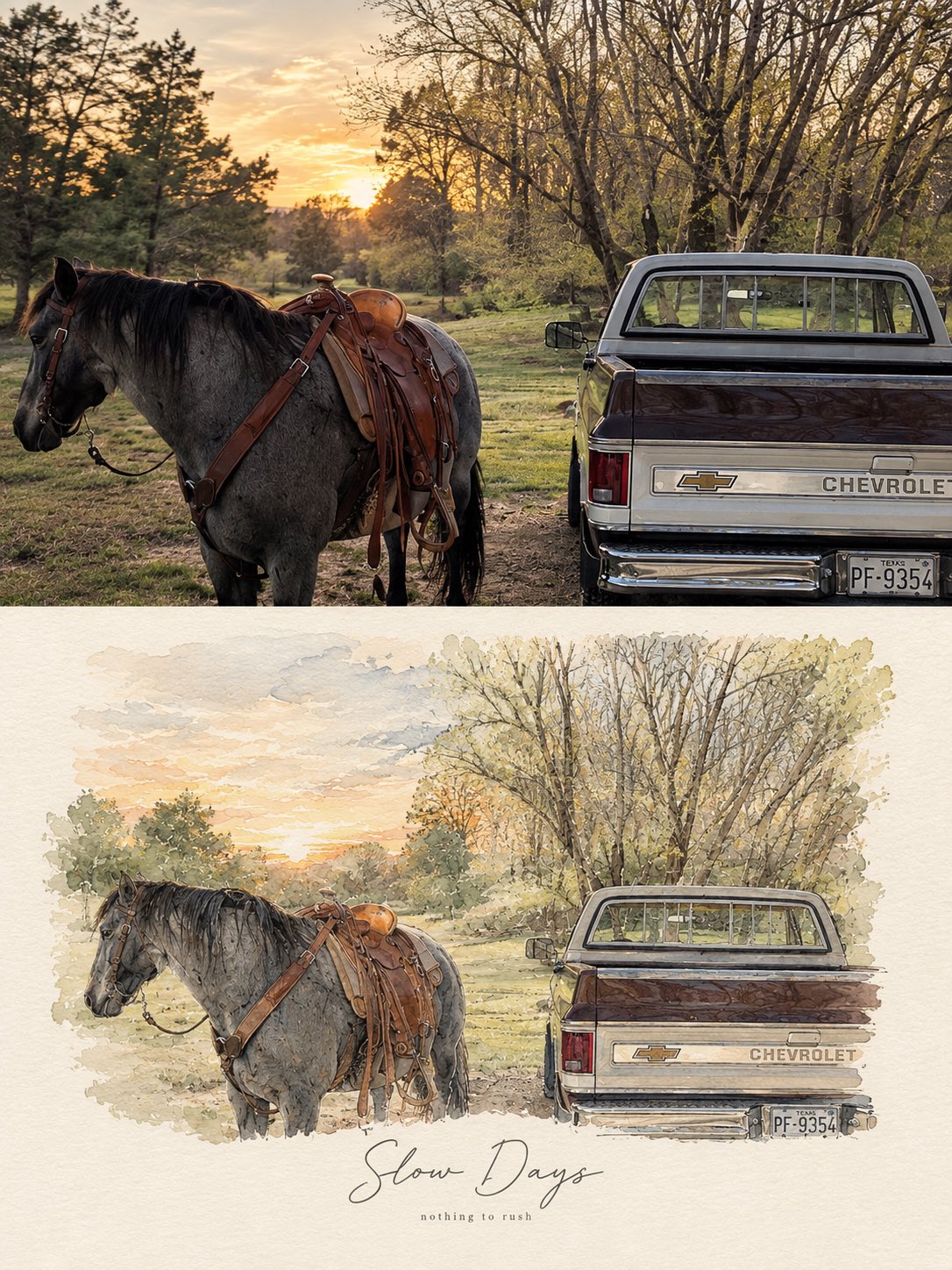
Create a refined, high-end PHOTO + MINIMAL WATERCOLOR VIGNETTE artwork based entirely on the uploaded photograph. Use the photograph as the only visual reference and preserve the exact subject, composition, environment, clothing, objects, lighting, colors, and mood. FORMAT: Vertical 3:4 editorial composition. TOP SECTION — ORIGINAL PHOTOGRAPH: Place the original photograph in the upper 55–60% of the canvas. Keep it photorealistic and naturally detailed. Do not alter the identity, pose, proportions, objects, architecture, scenery, or important visual details. Give it a subtle premium editorial photography finish with natural cinematic light and gentle tonal balance. BOTTOM SECTION — HAND-PAINTED INTERPRETATION: Transform the same exact scene into a delicate minimal watercolor and fine-ink illustration. Recreate the main subject, pose, perspective, key objects, and recognizable background elements from the photograph. Use loose watercolor washes, subtle pencil/ink outlines, imperfect hand-painted edges, soft paper texture, and restrained pastel tones. Keep the illustration airy, elegant, and slightly imperfect rather than digitally polished. The illustration should feel like a fashion/lifestyle magazine sketchbook page, with plenty of clean negative space and a warm off-white textured paper background. Do not introduce new subjects or details. TYPOGRAPHY: Add a short elegant handwritten brush-script phrase underneath or integrated naturally into the illustrated section, similar to a premium lifestyle editorial poster. Underneath it, add a tiny minimalist lowercase serif/sans-serif subtitle. Typography should be subtle, sophisticated, thin, and balanced with the artwork. AESTHETIC: Scandinavian editorial design, quiet luxury, nostalgic travel journal, soft watercolor, delicate ink drawing, handmade paper texture, muted natural palette, sophisticated minimalism, emotional storytelling, premium art-book layout. IMPORTANT: The photograph and illustration must clearly represent the same exact moment and scene. No collage of unrelated images, no dramatic redesign, no excessive watercolor, no cartoon appearance, no heavy outlines, no saturated colors, no clutter. Output: photorealistic upper section + matching delicate watercolor illustration below, seamless premium editorial composition, vertical 3:4, high detail. For different photos, just change the text phrase Examples: •Good Days — a kinder me •Better Together — same window, same silence •Little Moments — worth remembering •Slow Days — nothing to rush •Somewhere Quiet — just for a while •Golden Hours — softly remembered
1
Details


![A sophisticated minimalist lifestyle art poster featuring [PERSON / SUBJECT / MOMENT] as the central — AI image prompt — GPT Image 2.5](https://cdn.ahaprompt.app/harvest-media/import-1789829073994-e31mb5.jpg)
![Create a minimalist cultural travel poster for [CITY, COUNTRY] where [ICONIC LANDMARK] is transforme — AI image prompt — GPT Image 2.5](https://cdn.ahaprompt.app/harvest-media/import-1789139696605-pc52gc.jpg)
![Create an exceptionally original minimalist architectural art poster featuring [LANDMARK].
Do NOT d — AI image prompt — GPT Image 2.5](https://cdn.ahaprompt.app/harvest-media/import-1790608152126-8d90n7.jpg)
![Create an exceptionally original minimalist architectural art poster featuring [LANDMARK] in [CITY, — AI image prompt — GPT Image 2.5](https://cdn.ahaprompt.app/harvest-media/import-1790608046909-bo6w1q.jpg)
![Create a premium 4:5 vertical editorial travel artwork for [COUNTRY / CITY / LOCATION / SUBJECT].
T — AI image prompt — GPT Image 2.5](https://cdn.ahaprompt.app/harvest-media/import-1790608011651-93l30t.jpg)
![Create a highly realistic Japanese washi-tape travel collage featuring the iconic landmark of [CITY] — AI image prompt — GPT Image 2.5](https://cdn.ahaprompt.app/harvest-media/import-1789739942412-ff0tqe.jpg)
![Soft Minimalism wallpaper-style landscape of [MAIN LANDSCAPE/SCENE], featuring [KEY NATURAL ELEMENTS — AI image prompt — GPT Image 2.5](https://cdn.ahaprompt.app/harvest-media/import-1789369151198-73omrd.jpg)