AhaPrompt
Prompts
Featured
Models
Submit
Blog
Home
AI Prompt Library
Product Photography
Product Photography Prompts
Explore the best Product Photography prompts for AI image, video, and audio generation.
Browse AI Image Prompts
Browse AI Video Prompts
Browse AI Music & Voice Prompts
AI Prompt Library
All
Images
Videos
Audio
Newest
Popular
All categories
3D Render
Abstract
Advertising
Aerial
Ambient
Animals
Animation
Anime
Architecture
Avatar
Black & White
Bright
Cartoon
Character
Cinematic
Cityscape
Classical
Comic
Cyberpunk
Dark
Digital Art
Dramatic
Dynamic
Electronic
Ethereal
Fantasy
Fashion
Folk
Food
Game Assets
Gothic
Hip-Hop
Historical
Holiday
Horror
Infographic
Jazz
Landscape
Lo-Fi
Logo Design
Macro
Minimalist
Motion Graphics
Music Video
Mysterious
Mythology
Nature
Neon
Oil Painting
Peaceful
Pixel Art
Pop
Pop Art
Portrait
Poster
Product Photography
R&B
Realistic
Rock
Sci-Fi
Short Film
Sketch
Slow Motion
Sound Effects
Space
Sports
Steampunk
Sticker
Still Life
Street Photography
Surreal
Tattoo
Timelapse
Trailer
Typography
Vector
Vehicles
VFX
Vintage
Voiceover
Wallpaper
Watercolor
Whimsical
Nano Banana 2.1
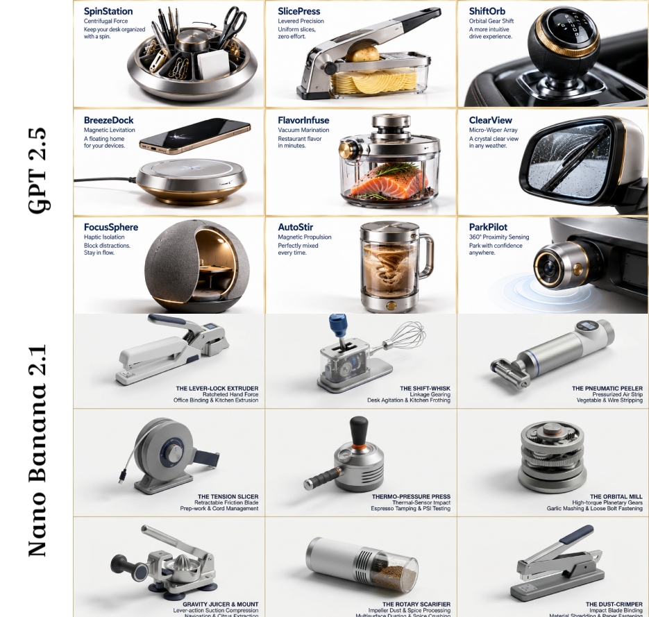
16:9, do this by picking a desk gadget, kitchen gadget, and car gadget: Instructions PHASE 1 PROMPT: Analyze these [OBJECT 1], [OBJECT 2], [OBJECT 3] images. Extract: 1) Primary function, 2) Material DNA (metal/plastic ratio, texture), 3) Ergonomic signature (grip angle, weight distribution), 4) Mechanical principle, 5) Cultural association. Output as structured JSON. PHASE 2 PROMPT: Create a 3x3 grid of photorealistic product renderings on a pristine white background. Each cell must be a hyper-realistic 3D concept that fuses elements from the previous analysis. For each invention, add minimalist navy blue text in Helvetica Neue: [Invention Name], [Core Mechanism], [Use Case]. Style: Dieter Rams meets Dyson - clean, technical, premium. Include subtle shadows and a 1px gold border on each cell. Make inventions absurd yet plausible (e.g., "Acoustic Peeler: uses sound waves to strip vegetables").
0
Details
GPT Image 2.5
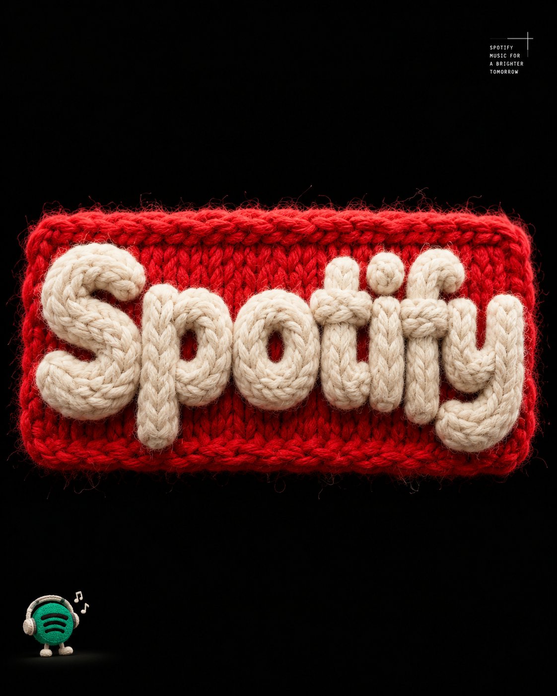
Create a premium, ultra-realistic 3D typography poster featuring the exact word "[YOUR TEXT]", sculpted entirely from thick, fluffy wool yarn. MAIN TYPOGRAPHY Form the letters into chunky, bold, tightly packed shapes crafted from soft, off-white cotton fibers. Give each letter a dense, plush, tactile appearance with intricate individual strands, realistic fiber variation, and subtle natural irregularities. Mount the typography on a vibrant red knitted rectangular patch featuring clearly visible stitches, fuzzy edges, raised yarn patterns, and an authentic woven texture. Ensure the text is spelled exactly as provided, with every letter clearly distinguishable, correctly formed, and fully readable. The typography must remain the dominant visual element. BACKGROUND & LIGHTING Use a pure black background with generous negative space around the central composition. Apply dramatic studio lighting to emphasize the contrast between the creamy white yarn, vivid red knitted patch, and deep black surroundings. Create realistic contact shadows, subtle ambient occlusion, dimensional highlights, and convincing depth. EDITORIAL DETAILS Add small, minimalist, monospaced white typography in the top-right corner, arranged neatly like a refined editorial design annotation. In the bottom-left corner, include a tiny, charming illustrated mascot accompanied by a short, understated descriptive caption. Keep both elements secondary, precisely aligned, and visually unobtrusive. MATERIAL REALISM Render every material with exceptional tactile accuracy, including individual wool fibers, soft fuzz, tightly looped stitches, subtle textile imperfections, and realistic light interaction. The result should feel like a meticulously handcrafted textile artwork photographed in a professional macro studio. COMPOSITION & OUTPUT Vertical 4:5 aspect ratio. Centered composition, balanced visual hierarchy, generous negative space, crisp focus on the main typography, high contrast, sophisticated editorial art direction, premium experimental graphic design, photorealistic 3D rendering, and exceptionally detailed materials. FINAL REQUIREMENT: Prioritize exact spelling, immediate readability, realistic knitted construction, and a striking visual contrast. Avoid extra words, distorted letters, clutter, excessive decorative elements, or anything that competes with the main text.
0
Details
GPT Image 2.5
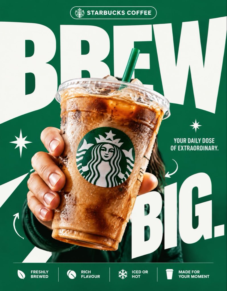
STARBUCKS — “BREW BIG.” 4:5 vertical premium poster, 8K, exaggerated bold typography × high-impact commercial art direction × photorealistic product advertising 🧠 CORE IDEA: “BREW BIG.” 🎬 LAYOUT: BACKGROUND BLOCK: Solid, vivid Starbucks green background with oversized graphic shapes and strong contrast. GIANT TYPOGRAPHY: “BREW” Extremely bold, oversized, tightly cropped typography dominating almost the entire composition. Letters extend beyond the canvas edges, with the Starbucks cup overlapping the text. 👤 SUBJECT: A hand holding an iced Starbucks drink directly toward the camera, extreme forced perspective, cup dramatically enlarged in the foreground, realistic condensation, crisp ice, natural lighting. ☕ PRODUCT + VISUAL TWIST: The Starbucks cup becomes the centerpiece of the typography. The oversized word “BREW” appears to wrap behind the cup, creating striking depth through scale, layering, and composition. Keep the cup, logo, and beverage completely photorealistic. ✨ GRAPHIC ELEMENTS: * Oversized green and white shapes * Sharp contrasting shadows * Minimal starburst accents * Small directional arrows * Bold editorial layering ✍️ TEXT SYSTEM: Top pill: “STARBUCKS COFFEE” Main headline: “BREW BIG.” Supporting text: “YOUR DAILY DOSE OF EXTRAORDINARY.” BOTTOM FEATURE STRIP: * Freshly Brewed * Rich Flavour * Iced or Hot * Made for Your Moment ANTI-SLOP DIRECTION: Typography is the main design feature, not a small decorative element. Extreme scale, aggressive cropping, strong visual hierarchy, deliberate overlap, premium print-ad finish. No floating coffee beans, no miniature landscapes, no random surreal objects, no excessive particles, no cluttered layouts, no generic gradients. The final poster should feel like a bold global advertising campaign with unmistakable graphic impact.
0
Details
GPT Image 2.5
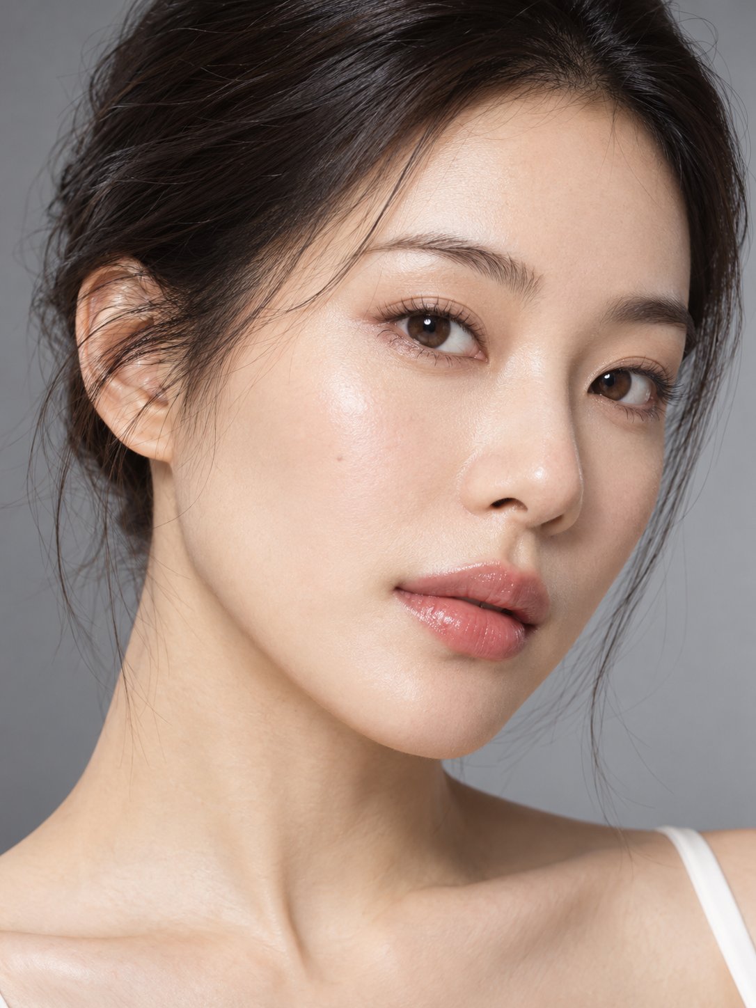
Combine the two reference images into a single realistic high-end commercial skincare advertisement photo. Reference Image 1 (M0): The sole reference for the person's identity and photography style. Reference Image 2 (K0): The sole reference for the essence bottle's structure and material. [Identity and Product Consistency] Maintain M0's original facial features, age appearance, hairstyle, skin tone, light makeup, and naturally hydrated skin. The product must retain K0's bottle body, pump head, cap, and frosted glass material; do not redesign the product. [Pose and Actions] The person should face forward naturally or with a very slight side turn of the face, head relaxed, gaze soft and directed near the camera. The right hand naturally holds the essence bottle, presenting the product near the right chest to shoulder area, with the full bottle visible and sized to match the realistic visual proportions of a 30mL product. The left hand is raised, with the fingertips of the index and middle fingers very gently touching the outer edge of the left cheek, showing a natural skincare experience gesture. Both hands must have anatomically correct five-finger structure, wrist connections, and natural joint bending. Fingers must not pass through the face or the bottle; very slight realistic skin deformation is allowed where the cheek is touched. [Photography and Lighting] 3:4 commercial beauty photography composition, including the full face, both hands, and the product. Simulate an 85mm f/8 photography effect, maintaining reasonable sharpness for both the product and the person's face. Use the same clamshell lighting and neutral warm gray background as M0. Hand shadows, skin highlights, and glass and metal reflections must all be consistent with the existing lighting. [Realism] Retain skin pores, natural facial texture, and realistic hand details. The image should be refined but not over-retouched. Prohibited: floating product, incorrect fingers, extra joints, bottle deformation, smoothed skin, face swapping, and added brand text.
0
Details
GPT Image 2.5
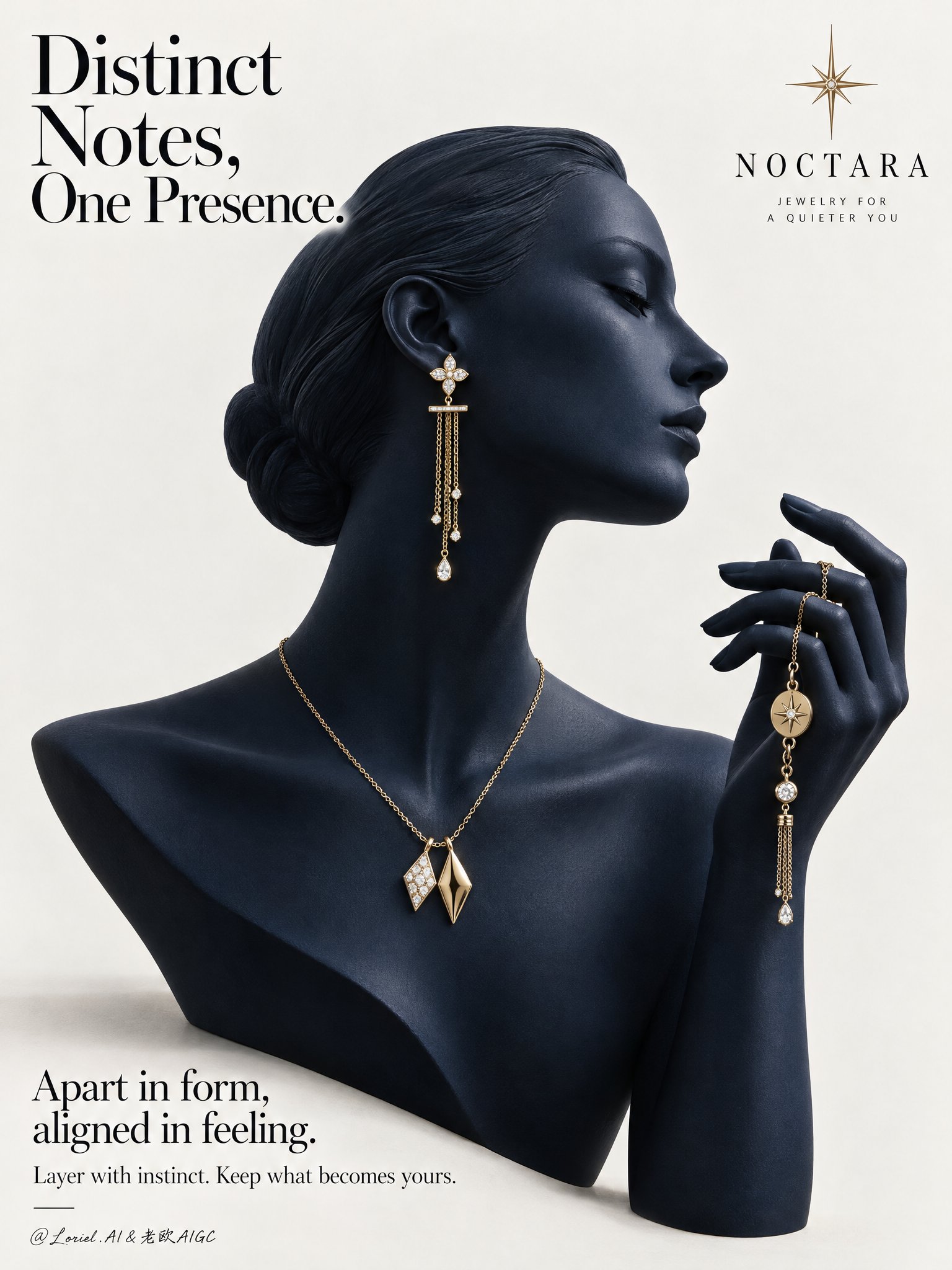
A Cannes-level luxury jewelry campaign poster for the fictional contemporary fine-jewelry brand NOCTARA, designed as a product-first editorial still life that fuses sculptural atmosphere, collector-grade material precision, and curator-level minimal restraint. The composition centers on a deep midnight-navy mannequin bust in elegant side profile, with a matching raised hand entering from the right to form one continuous sculptural gesture. The jewelry set remains the absolute focus: a refined yellow-gold mix-and-match composition across ear, neck, and hand, presented against a pale gallery-clean background with disciplined typography and strong negative space. Use a vertical poster format, straight-on with slight editorial monumentality. The mannequin occupies the center-left and center field, facing right. Preserve the clean poster rhythm: a large headline in the upper-left, a minimal star-like emblem near the upper-right, and a refined text block in the lower-left. The bust silhouette, neck curve, profile line, and raised hand should create a single elegant visual flow. Keep the background warm white to pale stone gray, uncluttered and spacious, with only a faint grounding shadow beneath the bust. The image should feel like a museum-grade print ad. The hero jewelry set is contemporary fine jewelry in polished champagne-yellow gold with restrained diamond-white accents. The visible ear wears one long drop earring with a small floral-geometric stud, a slim horizontal connector, and delicate chain tassels ending in tiny luminous drops. Around the neck sits a minimal gold chain necklace with two asymmetrical geometric pendants, intentionally non-identical yet harmonized, one brighter with a stone-led glint and one warmer sculptural gold form. The raised hand gently holds a coordinating chain bracelet or hand jewel with small medallion details and a slim dangling tassel. The overall language should feel modern, poetic, collectible, and quietly personal. The mannequin bust should be smooth, elongated, and refined, with poised chin, elegant collarbone line, and a calm profile directing attention toward the lifted hand. The hand must feel sculptural and couture-like, with gently curved fingers and believable tension where the jewelry is held. The jewelry distribution from ear to neck to hand should create a refined cadence, guiding the eye without crowding. Remove anything non-essential so the jewelry reads with maximum clarity and desirability. Keep the setting radically minimal and editorial. Depth should come from silhouette separation, tonal modeling, jewelry layering, and fine shadow falloff rather than scenery. The mannequin and hand should feel fully dimensional against the quiet pale background, with the jewelry emerging as warm points of precision. No props, furniture, texture overload, or narrative clutter. Use a restrained palette of midnight navy, pale stone white, champagne gold, and diamond-white highlights. Build a soft directional key from upper-left front grazing the profile, neck, shoulder line, fingers, and jewelry edges. Add subtle frontal fill to preserve detail in the navy surface while maintaining sculptural depth. Gold reflections should remain warm, crisp, and elegant, never harsh. Tiny diamond or pearl-like highlights should punctuate the jewelry with precision. Maintain premium contrast without dead black areas or flat gray dullness. Render everything with hyper-real luxury product photography and fashion-editorial polish. The mannequin surface should feel like matte-satin ceramic or lacquered resin with velvety density, between sculpture and couture display form. The gold jewelry must show immaculate polish, believable chain scale, precise link articulation, clean stone setting, and subtle micro-reflections. The finish should be immaculate, tactile, and high-end, with every edge resolved and every highlight controlled. No plastic sheen, muddy reflections, or cheap gloss. Place a refined wordmark for NOCTARA with a minimal starburst emblem in the upper composition. In the upper-left, set the headline: Distinct Notes, One Presence. In the lower-left, add: Apart in form, aligned in feeling. Beneath it: Layer with instinct. Keep what becomes yours. Typography must feel airy, elegant, and integrated, using a refined serif-led hierarchy with graceful spacing and no heavy crude fonts. Luxury jewelry poster, product-dominant, ultra-clean, editorial, hyper-real, no extra accessories, no clutter, no background scene, no gibberish text, no malformed fingers, no broken chain physics, no floating jewelry without support, no warped facial profile, no muddy navy tones, no dead black patches, no blown gold highlights, no duplicated pieces, no topology collapse, no style drift, no cheap catalog aesthetic.
0
Details
GPT Image 2.5
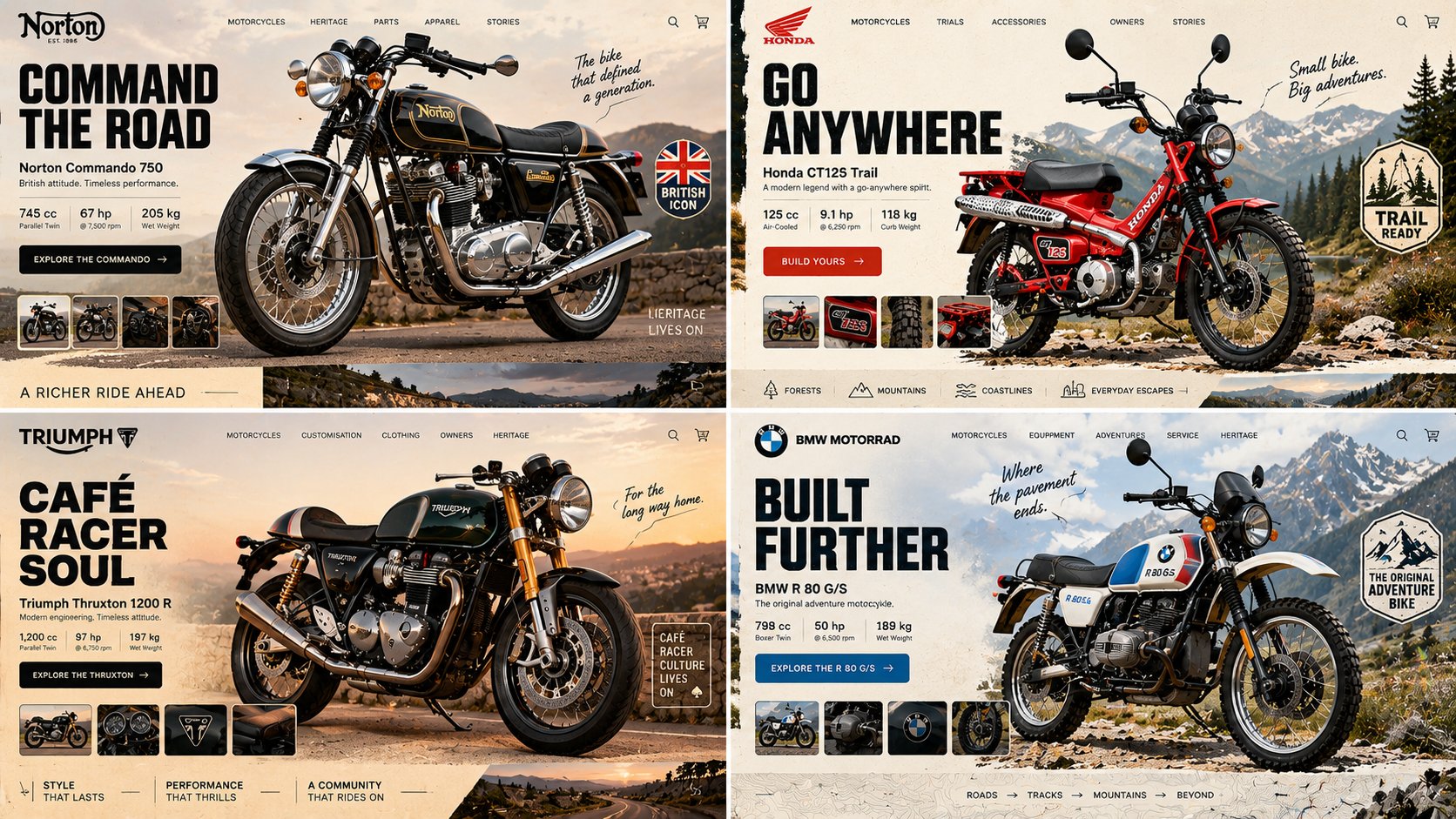
16:9, 2x2 grid, do this for an unusual but real classic motorcycles INPUT = [ TOPIC / HERO_OBJECT / BRAND_TEMPERAMENT / VIEWPORT / GRAVITY_LAW ] Run HERO_PRODUCT_GRAVITY: TOPIC_DNA := infer the category from TOPIC alone — what's sold, who buys it, what its shelf looks like HERO_DNA := ONE photographic hero object, cut out, oversized, 30–40% of frame; real material response — specular on foil, matte on paper, subsurface scatter on skin or fruit BRAND_DNA := derive the palette FROM the object — 1 dominant, 1 accent pulled from a hue the object actually contains, 1 near-neutral ground LIGHT_ANCHOR := decide key light position ONCE (upper-left or upper-right); every shadow — object, cards, pills, floating confetti — falls the same direction at the same angle and softness GRAVITY_LAW := the hero is either GROUNDED (contact shadow touching a visible surface plane) or SUSPENDED (ambient occlusion beneath, blur growing with height) — never both, never floating with a hard cast shadow and no plane to cast it onto DEPTH_ORDER := ground wash < decorative rays/confetti < hero object < UI chrome. Nav, cart and buttons are ALWAYS in front, never occluded TYPE_LOGIC := one display face for the headline (heavy — pick condensed OR wide, not both), one neutral for everything else; headline ≤ 6 words, body renders as legible micro-type, never enlarged gibberish IMPERFECTION := exactly one element breaks its bounding box — a badge rotated 4–7°, a sticker overlapping the product silhouette, a stray mark in the gutter FRAME := desktop 16:10, 64–80px outer gutter; the bottom edge reveals the top 15% of the next section so the page reads as scrollable MOOD := appetite, immediacy, one unmistakable action Render: one screen where the product's own light governs every pixel of interface around it. Forbidden — objects: stock-photo humans, lorem blocks at display size, a second competing hero Forbidden — look: conflicting shadow directions, cut-out halo or chewed edges, cast shadows on flat 2D illustration, palette colors absent from the object, three type families, nav bar sitting behind the product
0
Details
GPT Image 2.5
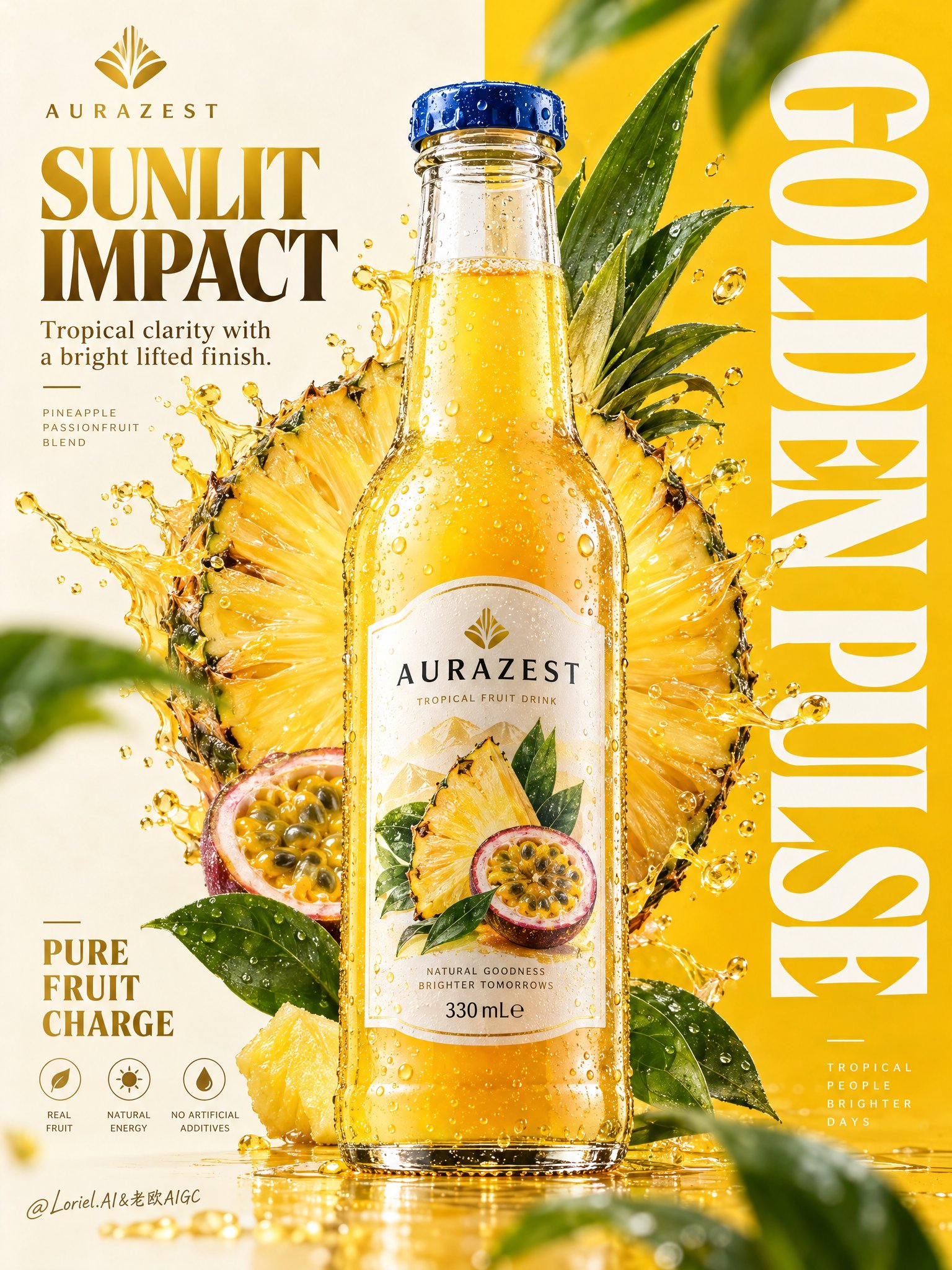
Create a premium vertical commercial poster for a fictional overseas fruit drink brand, "AURAZEST". Design it as a Cannes-level beverage ad where a hyper-real glass bottle is the absolute visual hero, fused with disciplined graphic poster design. Use a strict split composition: the left half is a refined warm-ivory information field, the right half a saturated solar-yellow brand field with a giant vertical typographic block. Position the hero bottle exactly across the central dividing line so it bridges both zones and controls the full hierarchy. The bottle is a chilled elegant glass bottle filled with luminous golden pineapple-passionfruit juice, with thick transparent glass, realistic refraction, a precise blue-metal cap, dense micro-condensation, varied tiny droplets, visible meniscus, crisp label print, and premium manufacturing detail. The front label must read exactly "AURAZEST". It should feel tactile, cold, collectible, and physically believable, carrying the strongest focal weight in the poster. Behind the bottle, build a large radiant fruit halo combining a pineapple cross-section with a more art-directed geometric fruit-core structure so it feels natural and iconic. The fruit disk sits slightly left of center behind the bottle, partially occluded, with juicy fiber detail, wet rind texture, bright translucency, and controlled splash arcs bursting outward. The splash must feel physically accurate yet graphically composed, with clear directional force, believable viscosity, suspended droplets, and no messy chaos. Add several fresh green leaves around the outer frame as rhythm accents, some softly blurred in the near foreground and some crisp in the midground, always supporting freshness and depth. Typography must be newly invented and fully art directed. In the top-left, place a minimalist emblem and the brand name "AURAZEST". Beneath it, set the headline "SUNLIT IMPACT", with the smaller line "Tropical clarity with a bright lifted finish." In the lower-left, place a compact benefit lockup: "PURE FRUIT CHARGE". Across the entire right panel, place a massive vertical white typographic block reading "GOLDEN PULSE". Typography should feel integrated into the poster architecture, elegant and precise, with clean spacing, balanced weight, and no collision with the bottle label or fruit core. Use a tightly controlled palette: 55% pineapple gold and radiant mango-yellow, 20% warm ivory and pale cream, 15% vivid botanical green, 10% deep amber shadow accents and cool blue cap contrast. Light the scene with a clean key from the upper left, luminous transmission through the juice, crisp specular edges on the bottle shoulders, soft reflected bounce from the pale background, and enough contrast to carve volume into the glass, fruit, and splash without muddy blacks or dirty haze. The finish should feel bright, premium, sharp, and globally campaign-ready. Materials must read with extreme clarity: translucent juice glow, fibrous juicy flesh, glossy wet rind, fresh waxy leaves, sparkling droplets, clean heavy glass, and sharp printed label edges. The poster should combine commercial product realism, fruit freshness, and curatorial graphic discipline in one unified system. Maintain correct bottle proportions, label readability, coherent splash physics, clean perspective, elegant negative space, and powerful retail-ad impact. Keep one single hero bottle only, product-first hierarchy, clean premium advertising realism, coherent fruit geometry, coherent droplet scale, plausible leaf perspective, and crisp typography. Avoid warped bottle shape, broken glass proportions, unreadable label text, accidental extra bottles, duplicated fruit slices, muddy shadows, dirty texture buildup, chaotic splashes, cheap font treatment, distorted vertical lettering, weak hierarchy, random clutter, off-theme decorative particles, accidental resemblance to existing real beverage brands, or style drift away from high-end commercial poster design.
0
Details
Nano Banana
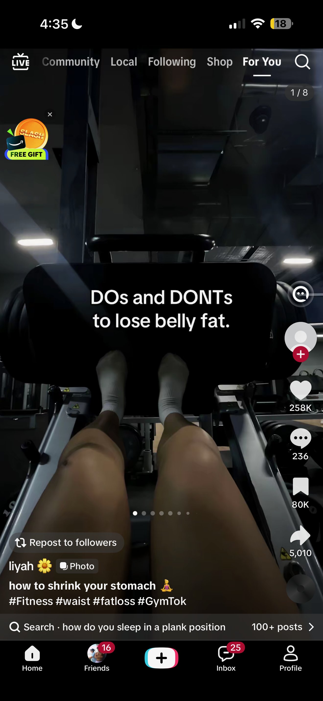
Make me a 6-slide TikTok photo carousel for [app]: slide 1 is a wide, candid, realistic photo with the hook "5 ways to get [result in your niche]" in white text, and slides 2-6 are genuinely useful numbered tips with specific numbers. Exactly ONE middle slide (never the first or last) mentions the "[app]" app in quotes, inside its tip, with a photo of a phone in a hand showing the real app screen; every other slide is pure value. Generate the images with fal ai: Flux Ultra for any shot with faces, nano-banana/edit with that photo as a reference to keep the same people across slides, and Flux Schnell for cheap b-roll, all with "candid iPhone photo, no text, no logos" in the prompt. Keep the text between 300px from the top and the bottom 25% of a 1080x1920 frame so TikTok's UI doesn't cover it, then write a casual lowercase caption with 4-6 hashtags.
0
Details
Nano Banana
build a 20-second ad for this product. first, create 3 concepts. then: → pick the strongest concept → break it into 7 shots → choose the best model for each shot → generate 3 versions of every shot → score them for realism, motion + product consistency → keep the best version → regenerate anything below 8/10 → keep the same character, product and visual style throughout make the first 2 seconds impossible to scroll past.
0
Details
GPT Image 2.5
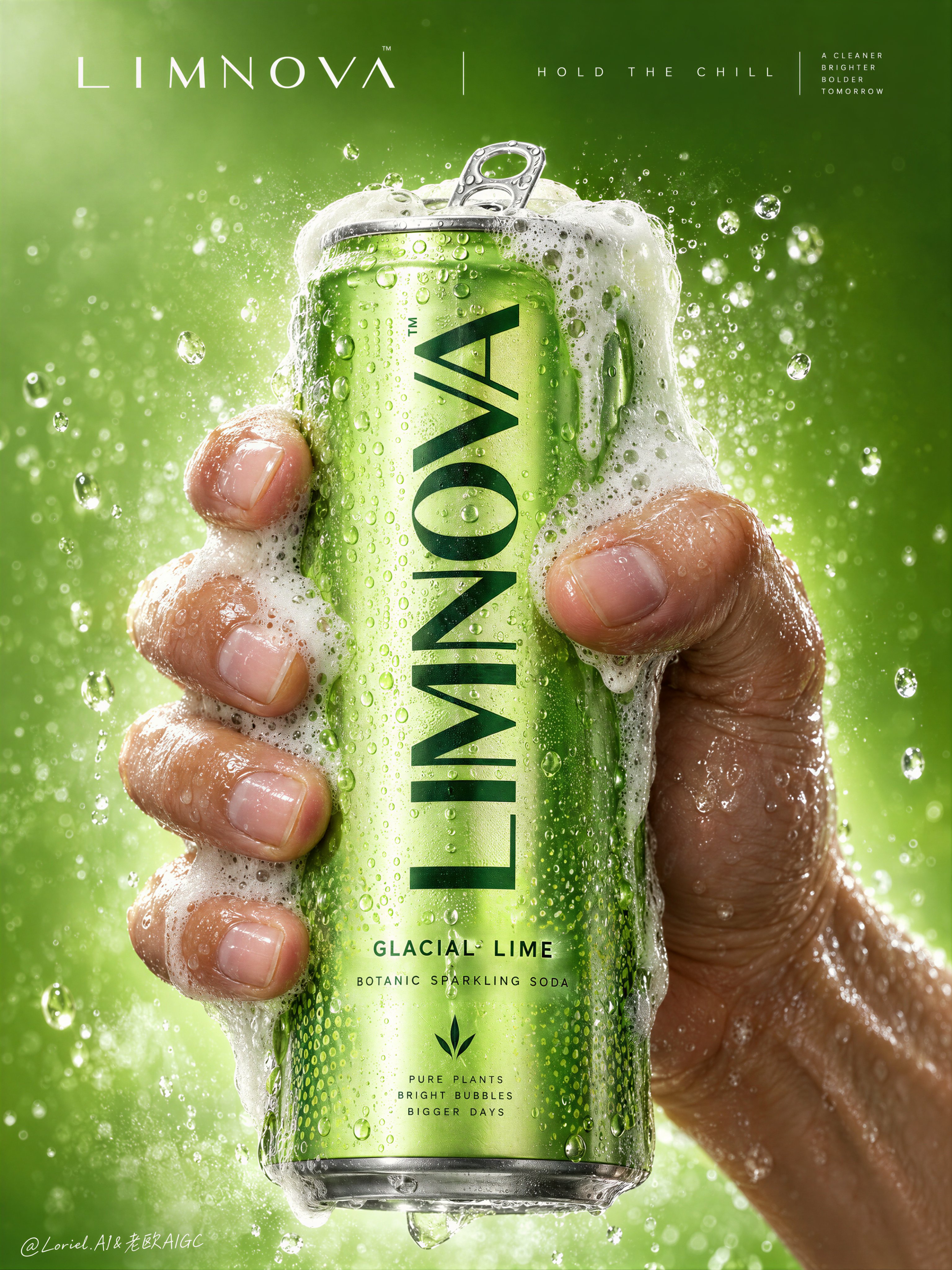
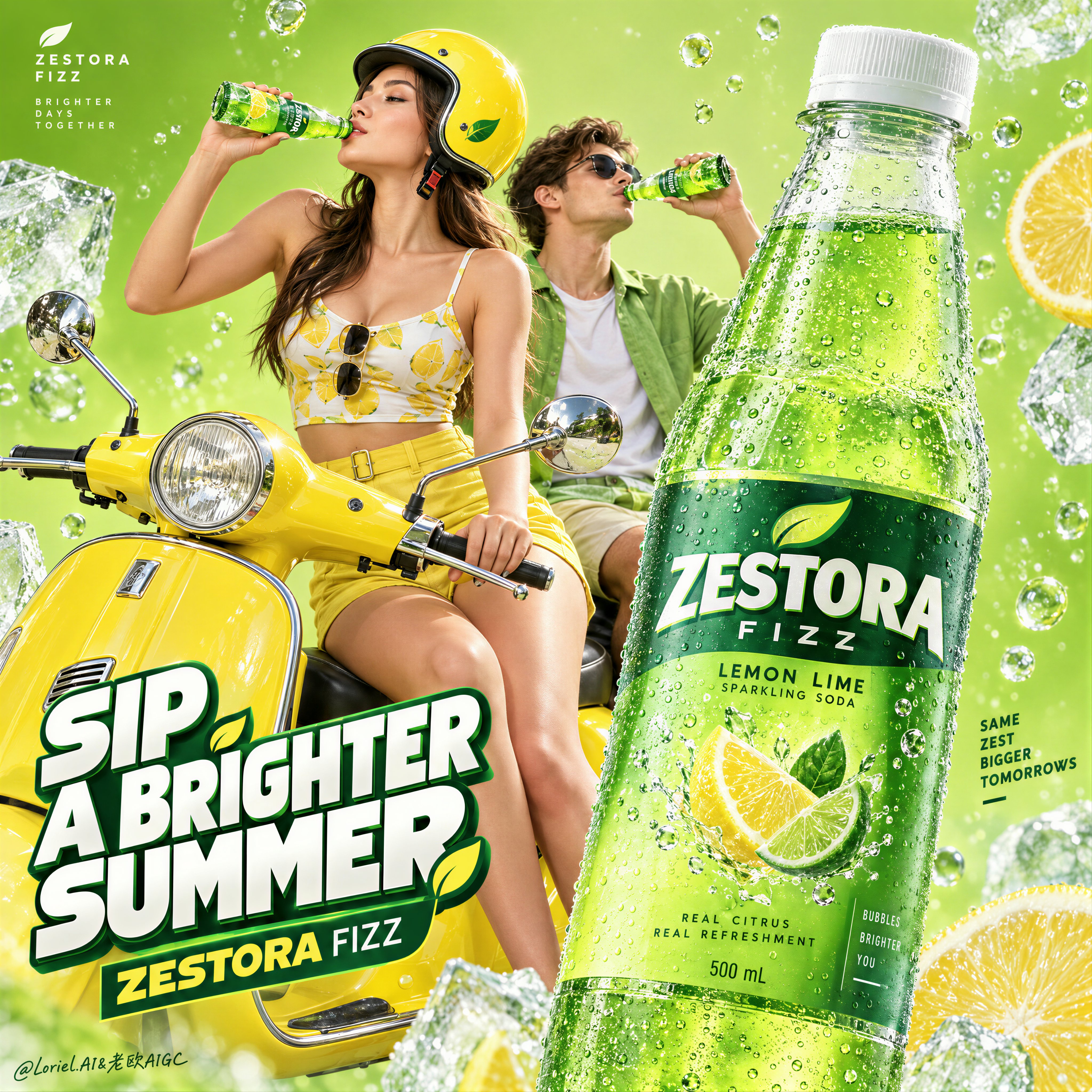
Create a Cannes-level commercial poster for fictional premium sparkling soda brand LIMNOVA, merging tactile product realism, pressure-driven human interaction, and ultra-clean gallery-grade graphic design into one unified hero image. The core concept is controlled release: a cold lime soda can gripped at peak tension, overflowing with foam and condensation, turning an ordinary beverage moment into a sculptural event of freshness, pressure, and desire. Use a vertical full-bleed poster in extreme close-up, rule-of-thirds disciplined but visually centralized. Preserve the exact structure: a single slim can dominates the center, held tightly by one wet human hand wrapping from the right and lower rear; dense foam crowns the top and spills down the can; broad negative space remains above for elegant brand typography. The hand, can, and foam should read as one compressed central mass, surrounded by a luminous citrus atmosphere with no extra props. The can must remain the undisputed focal point and fully legible. The subject is a hyperreal slim aluminum soda can in radiant glacial lime green, with crisp pull-tab geometry, subtle printed microtexture, dense condensation droplets, and refined premium branding. Use the fictional text “LIMNOVA” as the main vertical logo, “GLACIAL LIME” as the flavor line, and “BOTANIC SPARKLING SODA” as the descriptor. The identity should feel bold, contemporary, and luxury-clean, with strong custom letterforms and exact print clarity. The can should look manufacturable, collectible, and ice-cold. One realistic human hand grips the can firmly with correct five-finger anatomy, natural finger spacing, believable knuckle tension, realistic nail beds, subtle skin compression, and wet highlights. The grip communicates force and freshness, not aggression. Foam surges over the top rim and flows across the fingers and can in airy dense clusters, while suspended micro-droplets and faint carbonation mist activate the space. The can remains undeformed except for natural optical tension created by the grip and liquid pressure. No extra hands, no anatomy drift. Build a minimal studio field rather than a literal location. The background is a luminous acid-lime to chilled-chartreuse gradient with suspended droplets, vapor-like fizz haze, and a soft freshness halo around the product. Keep the space clean and abstract, letting the product, hand, and foam generate all depth. No fruit slices, no ice cubes, no bar setup, no clutter. The world should feel like a distilled atmosphere of citrus pressure and cold carbonation. Lighting is a premium studio setup with a bright frontal key, cool upper-left freshness lift, and narrow specular edge highlights on wet aluminum and skin. Palette hierarchy: 60% glacial lime and electric citrus green, 30% white foam and bright condensation highlights, 10% natural warm skin tone as tactile counterpoint. Contrast should be crisp yet soft-edged, with no dead blacks, dirty grey mud, or cartoon oversaturation. The emotional tone is icy, alive, compressed, clean, and addictive. Materials must feel extremely photoreal: sharp reflective aluminum edges, chilled metallic bloom, droplets merging into trails, subtle ink adhesion texture; foam that feels light, wet, aerated, and creamy with translucent bubble variation and convincing thickness at the rim and fingers; and a real, de-AI hand with accurate anatomy, realistic skin texture, natural moisture sheen, crease detail, true finger joints, and no swollen or fused forms. Apply restrained high-end commercial polish, keeping hero detail sharp and print-ready. Integrate a minimalist top header as a refined brand system, not ad clutter. Place “LIMNOVA” on one side of the top band and a secondary studio-style signature or edition mark on the other, separated by a thin elegant divider. If an extra micro-headline is used, keep it very restrained, such as “HOLD THE CHILL” or “PRESS THE FIZZ”, set small outside the can recognition zone. Typography must feel architected into the negative space, aligned with the product axis, and never heavy or crude. Output: a premium beverage poster with product-first hierarchy, hyper-clean execution, strong tactile realism, elegant negative space, and exact brand readability. No extra cans, no fruit garnish, no ice props, no chaotic splash overload, no warped can geometry, no broken tab, no malformed hand, no extra or merged fingers, no unreadable text, no muddy shadows, no large dead black blocks, no low-quality AI artifacts, no clutter, no style drift, and no resemblance to existing real soda branding.
1
Details
GPT Image 2.5
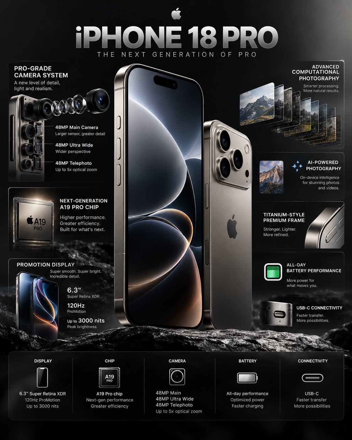
Create a premium, photorealistic 4K technology infographic showcasing the iPhone 18 Pro as the hero product. Design a sleek, high-end editorial infographic with a minimalist Apple-inspired aesthetic, dark graphite/black background, subtle metallic gradients, soft studio reflections, and precise technical callouts. Place a large iPhone 18 Pro vertically in the center, shown at a slight three-quarter angle with the front display and titanium-style frame clearly visible. Add a second smaller rear-angle view beside it to showcase the camera system. Around the phone, create clean infographic callouts connected with thin elegant lines and small technical markers. Highlight key features such as: • Pro-grade camera system • Advanced main camera sensor • Ultra-wide camera • Telephoto zoom • Next-generation A-series Pro chip • ProMotion high-refresh-rate display • Titanium-style premium frame • USB-C connectivity • Advanced computational photography • All-day battery performance • AI-powered photography and on-device intelligence Use clear, modern typography, strong visual hierarchy, restrained text, and realistic technical diagrams. Include subtle exploded-view details of the camera module and internal components without making the design look cluttered. Add a refined title at the top: “iPHONE 18 PRO” Subtitle: “THE NEXT GENERATION OF PRO” At the bottom, include a compact specification strip with categories such as: DISPLAY • CHIP • CAMERA • BATTERY • CONNECTIVITY Visual style: luxury technology advertising, premium product launch presentation, futuristic but believable, extremely clean composition, realistic materials, sharp details, controlled reflections, cinematic studio lighting, sophisticated black and silver palette, professional product photography, magazine-quality graphic design. Aspect ratio: 4:5 vertical Ultra-sharp, high-resolution, photorealistic, no unnecessary decorative elements, no distorted phone geometry, no messy typography.
0
Details
GPT Image 2.5
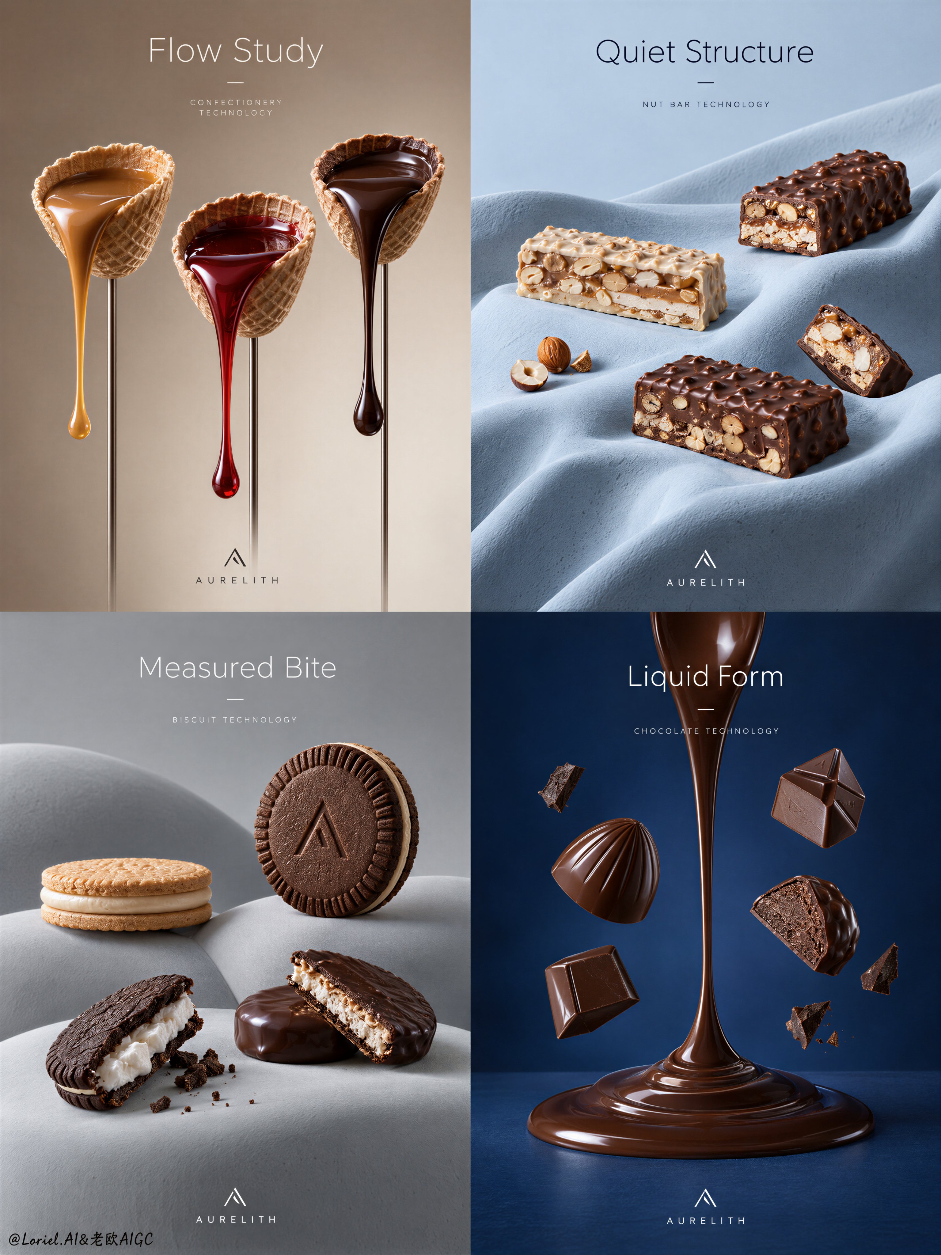
A Cannes-level four-panel confectionery technology campaign poster for a fictional premium brand called AURELITH, built as one refined 2x2 grid with the exact visual discipline of an industrial luxury food advertisement. Preserve the core structural logic of a modular poster series: each quadrant is an independent product scene with a restrained headline zone near the top, a hero product composition in the middle, and a tiny minimal brand mark placed quietly near the lower edge. Reduce typography to the absolute minimum. No body copy paragraphs, no marketing blocks, no loud captions. Only one short English headline per panel, two words maximum, plus one tiny minimal logo mark and one micro line of technical labeling. The overall feeling is colder, quieter, more curated, with larger negative space and more measured breathing room. Panel 1: a warm taupe-to-cream field with three wafer cup forms lifted on slender vertical stems, each holding a different flowing confection material: satin caramel, translucent ruby syrup, and dense dark chocolate. The liquid ribbons hang with physically exact gravity, elegant tension, clean tapering ends, and mirror-like edible highlights. Panel 2: a pale powder-blue sculpted drape with long soft folds, holding several layered nut bars and chocolate-coated bar fragments placed sparsely and precisely across the surface, like museum objects. Panel 3: a cool light-grey abstract landscape of smooth rounded mounds with sandwich biscuits and cream-filled chocolate cookies staged with generous spacing, one upright hero piece and a few opened pieces revealing crisp filling texture and fine crumb detail. Panel 4: a deep restrained cobalt field with one iconic vertical chocolate gesture, a spoon-like molten stream forming a central axis, surrounded by a few suspended molded chocolates and small fragments, controlled and sparse rather than explosive. Use elevated frontal product photography with disciplined central weighting, rule of thirds, clean symmetry tension, and expansive negative space. The objects must remain visually dominant at all times. The composition should feel like Orbit, Transit, and Port merged into one master solution: emotionally magnetic, materially exact, and curatorially reduced. The image language is hyperreal commercial still life, not illustration, with a calm futuristic sensibility. Lighting is layered and soft: upper-front key light, low-intensity fill for shadow readability, delicate specular control, smooth tonal transitions, subtle atmospheric separation, strong volume without heavy blacks. Keep the campaign cooler and quieter than a typical confection ad, with restrained contrast and clean air around every object. Materials must be deeply believable and tactile: tempered chocolate with smooth reflective bloom and dense body, wafer shells with fine porous texture and crisp edges, nougat bars with visible nut fragmentation and layered compression, cream fillings with soft whipped density, sculpted set surfaces in matte ceramic-plaster finish, subtle micro imperfections that increase realism. Color hierarchy: 60% cocoa, cream, and caramel browns, 30% cool architectural backdrop tones, 10% sharp glossy highlights. The surfaces are immaculate, premium, and uncluttered. Typography must behave like graphic architecture, not decoration. Use elegant thin-to-medium weight sans-serif English type, carefully kerned, integrated into the empty zones, aligned with the grid, never crossing the core product recognition area. Headline direction: one minimal phrase per panel such as “Flow Study”, “Quiet Structure”, “Measured Bite”, “Liquid Form”. The logo is abstract, geometric, tiny, and discreet. The final image must feel like a luxury design annual cover story merged with a food technology campaign: minimal, exact, silent, premium, sculptural, sharply art-directed, physically plausible, cleanly printed, with no clutter, no excessive text, no random decorative particles, no busy branding, no dead shadows, no muddy gradients, no deformed food geometry, no broken letters, no chaotic composition.
0
Details
GPT Image 2.5
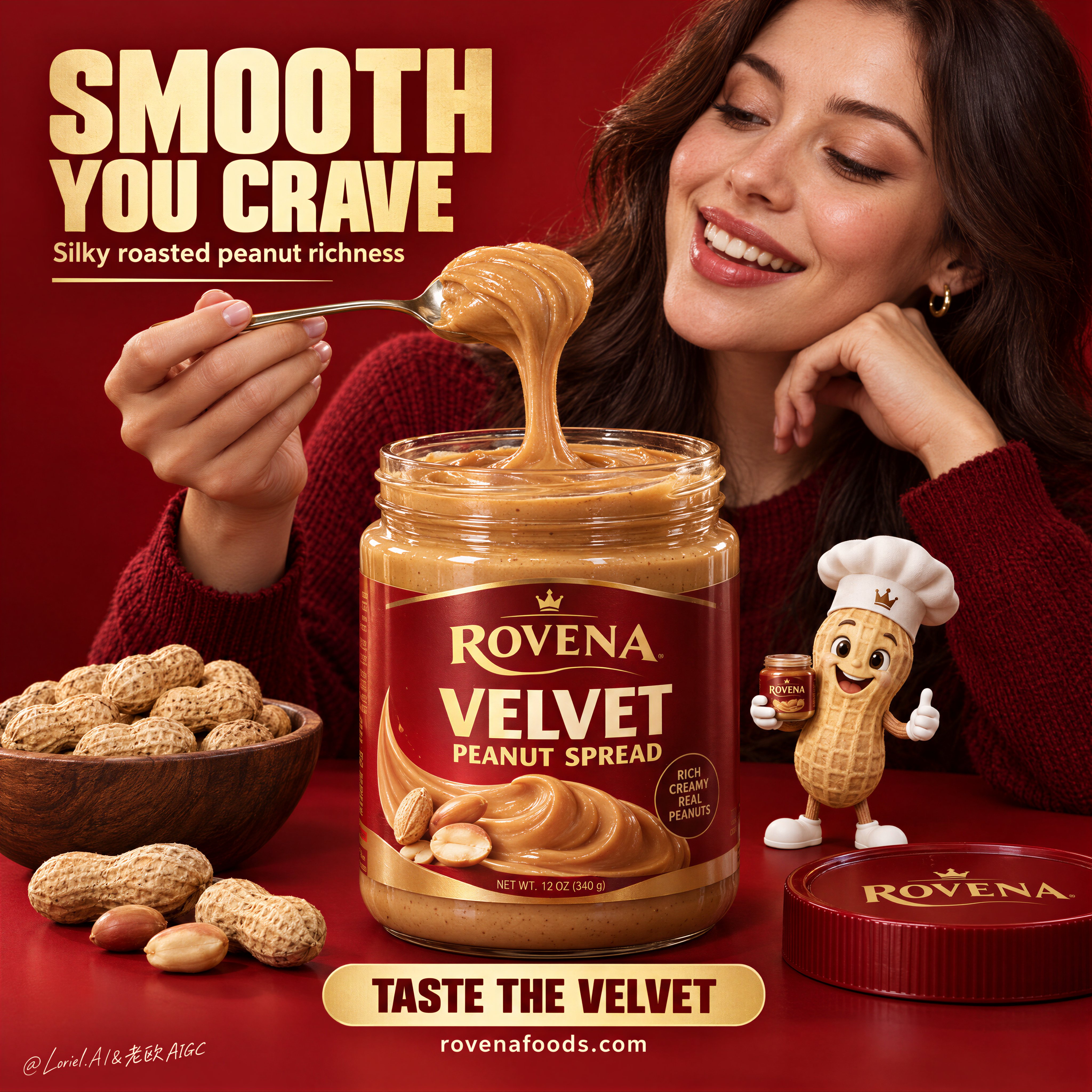
A bold FMCG food poster for fictional premium peanut spread brand ROVENA, with the product as the absolute visual leader. Keep the same structure: a saturated deep-red monochrome studio background and tabletop, one large open jar of silky peanut spread centered in the foreground, an adult woman in a dark red knit sweater behind and slightly right of the jar, smiling warmly at a spoonful she lifts above it, a small premium peanut mascot at the lower right, a bowl of whole peanuts at the lower left, the lid nearby, and a few loose peanuts along the front edge. Use a medium close-up frontal advertising shot with strong central weighting, shallow depth separation, negative space in the upper left for the headline and lower center for the CTA. The jar must dominate the hierarchy and feel large, tactile, and desirable. The woman is adult, photoreal, naturally proportioned, anatomically correct, with realistic skin texture, subtle pores, natural lips, soft hair density, correct head-neck-shoulder structure, and elegant hands with five normal fingers, clear joints, natural nails, no deformation. Her expression shows genuine delight and appetite, eyes on the lifted spoonful. Her torso stays secondary and never overpowers the jar. The spread is the key material event: smoother, softer, silkier, and more refined than ordinary chunky peanut butter, with creamy satin body, rounded folds, velvety gloss, slow elastic pull, softened micro-granular texture, gentle roasted-peanut color variation, and thick luxurious viscosity. The lifted spoonful stretches in a smooth continuous ribbon with plush curved edges, glossy highlights, and realistic gravity drag, while keeping a subtle nut-rich identity, never melted-candy-like. The transparent jar has believable thickness and reflections, filled with dense silky spread. Redesign the packaging fully in English with an original premium system: brand mark “ROVENA”, product name “VELVET PEANUT SPREAD”, and only a few small clean support details, with no excessive claims. The peanut mascot is polished, charming, cleanly modeled, wearing a chef hat and holding a tiny jar, playful but clearly secondary. Lighting is soft and layered: a large diffused key from upper front-left, controlled fill from the opposite side, smooth highlights on the spoon and jar rim, refined contour light on the woman’s face and hair, and strong material clarity on the spread, with rich volume and no dead black shadows. Color hierarchy: deep campaign red dominant, silky caramel-gold and roasted nut tones secondary, with small cream and metallic accents for text and spoon highlights. The finish is hyperreal, clean, appetizing, poster-ready, and fully coherent as one commercial brand world. Typography follows the same logic: a large bold English headline block in the upper left, one short supporting line beneath, a strong bottom-center CTA banner, and a small social or website line below. Use original copy only, not source wording. Suggested system: “SMOOTH YOU CRAVE”, “Silky roasted peanut richness”, “TASTE THE VELVET”, “https://t.co/P1ZBjZb8iL”. Use bold condensed sans serif for the headline, smaller support text, and a clean rounded CTA bar. Keep text aligned, graphic, warm cream or golden, integrated into the composition, and always outside the product’s core recognition area. Vertical poster composition, clean commercial finish, realistic ingredient detail, sharp label design, controlled staging, no copied branding, no extra props, no messy crumbs, no floating objects, no malformed hands, no extra fingers, no distorted face, no warped jar, no broken text, no muddy shadows, no chaotic composition, no anatomy errors, no cartoon drift outside the mascot.
0
Details
GPT Image 2
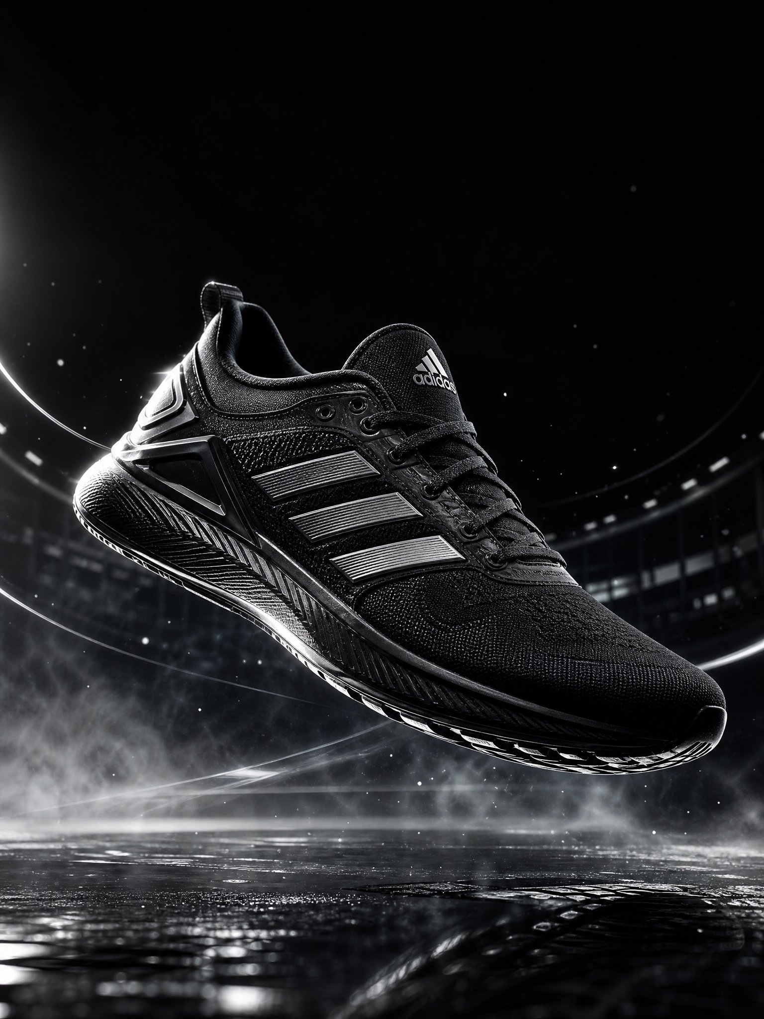
Create a premium cinematic Adidas sports advertising image featuring a futuristic black Adidas performance sneaker as the hero product, suspended slightly above a dark reflective surface in a dramatic studio environment. The sneaker should look powerful, aerodynamic, and meticulously engineered, with realistic mesh, engineered knit, rubber outsole, subtle stitching, fine material textures, and the iconic Adidas three-stripe design clearly visible. Keep the product design authentic and commercially polished. Use dramatic directional lighting from above and behind, creating sharp rim highlights along the silhouette while revealing the intricate texture of the shoe. Add subtle atmospheric mist, tiny floating particles, and controlled motion-inspired light trails around the sneaker to suggest speed and energy without distracting from the product. The background transitions from deep charcoal to black with a subtle architectural texture inspired by a modern urban sports arena. The composition should feel minimal, bold, premium, and technologically advanced. Place the Adidas logo naturally and tastefully within the composition, with clean brand visibility and generous negative space. No unnecessary text. Camera: low-angle three-quarter product photography, 85mm lens, shallow depth of field, ultra-detailed macro-level textures, crisp focus on the sneaker, realistic reflections, cinematic contrast, professional commercial photography. Visual style: premium global sports campaign, futuristic athletic aesthetic, luxury product photography, dramatic editorial lighting, photorealistic materials, high dynamic range, sophisticated composition. Color palette: black, graphite, subtle metallic silver, with restrained white highlights. Aspect ratio: 3:4 vertical. Ultra-photorealistic, 4K detail, realistic materials, physically accurate lighting, premium advertising quality, clean composition, no distortion, no extra shoes, no malformed logos, no duplicate objects, no watermark.
0
Details
GPT Image 2.5
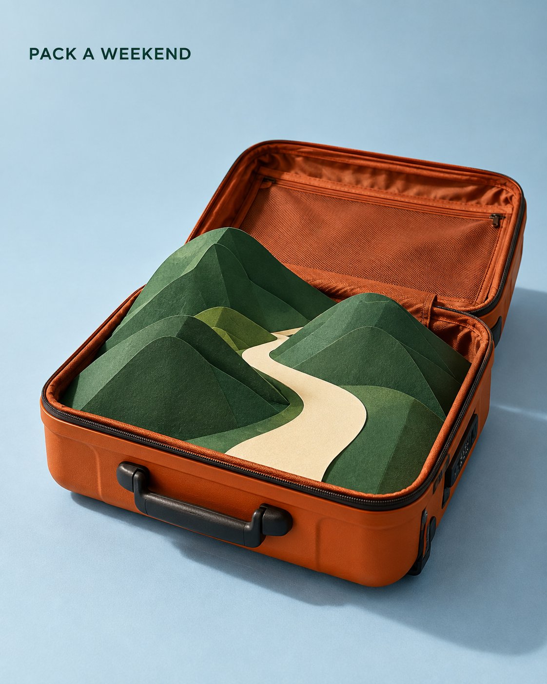
Create a vertical 4:5 travel campaign poster. One open burnt-orange hard-shell suitcase sits on a pale blue studio floor, viewed from an elevated three-quarter angle. Its open lid extends behind the base without obscuring the contents. Center the suitcase within the lower two-thirds of the composition, occupying approximately 60% of the image width. Inside the suitcase, replace clothing with a carefully constructed miniature paper landscape: three overlapping forest-green folded hills and one broad ivory paper path winding between them. All landscape elements originate inside the suitcase and remain within its footprint. The tallest hill rises just above the rim. Make the path the clearest high-contrast shape, leading the eye into the landscape. Render this as a photograph of a real handmade set. Show thick matte paper, precise folds, subtle cut edges, realistic suitcase fabric lining, hinges and zipper details. Keep the miniature’s scale consistent. No buildings or extra travel accessories. Use one large studio light from the upper left. Cast soft shadows toward the lower right, with convincing contact shadows where paper meets the suitcase lining. Palette: burnt orange, forest green, ivory and pale blue. Leave the upper quarter spacious. Place the small dark-green headline “[TITLE] ” near the upper-left margin in a clean sans-serif font. No other text. The paper landscape is the focal point; the suitcase provides context; typography stays subordinate. No people, animals, logos, floating objects or decorative graphics
0
Details
GPT Image 2.5
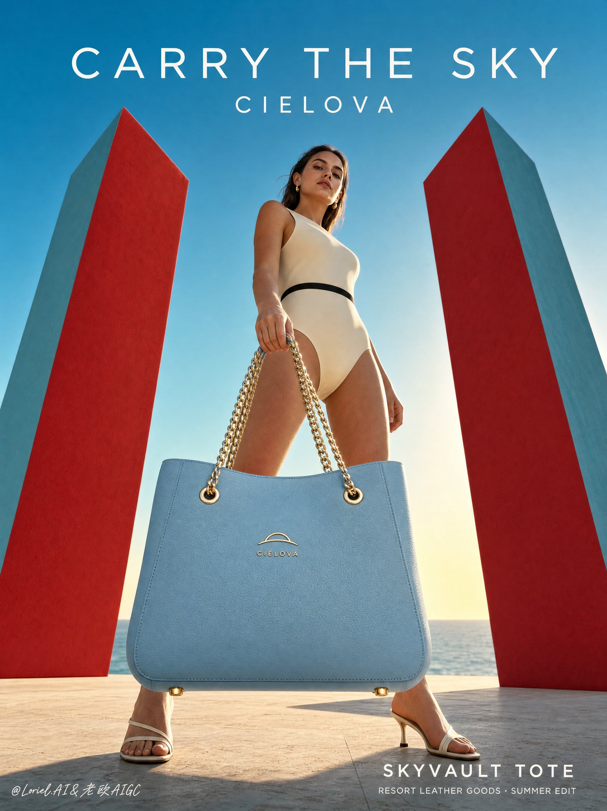
A full-bleed vertical luxury handbag poster for the original resort leather brand CIELOVA, merging wind-driven coastal narrative with precise trunk-bag craftsmanship. The hero product is the CIELOVA "SKYLOCK TRUNK", a powder-blue structured micro trunk bag suspended at the center of a low-angle fashion-commercial scene. The image combines realistic sunlit fashion photography, flat red-and-teal architectural color blocking, clean sky negative space, and sparse luxury typography. Extreme low-angle viewpoint from the terrace floor, looking upward from below waist height. The bag hangs in the lower-center foreground, close enough for the lock, corner plates, strap hardware, leather grain, and stitched panel edges to read clearly. The model, legs, and red geometric slabs rise around it, creating monumental scale without reducing product readability. Two tall red sculptural slabs stand at the left and right edges, with cool teal side planes angled inward to form a triangular gateway. The adult model bends forward from the upper right, one leg extended left and the other planted right, creating a dynamic arch over the suspended bag. The pale-blue strap curves from the foreground hand down to the central lock, guiding the eye into the product. The sky remains open for typography; no text overlaps the bag, face, hands, or lock. Hero product: CIELOVA "SKYLOCK TRUNK", a small structured powder-blue leather trunk bag with a rigid rectangular box body, fine pebble-grain surface, brushed-gold corner plates, polished gold rivets, central gold lock clasp, short top handle, detachable pale-blue shoulder strap, and precise stitched panel edges. The front lock plate carries an original CIELOVA emblem: a minimal gold arched-horizon mark above the small uppercase word "CIELOVA". The bag must feel symmetrical, tactile, sharply edged, and commercially credible. An adult female fashion model, clearly over 20, wears an ivory sleeveless resort bodysuit with a narrow black waist band and glossy burgundy pointed heels. She leans forward in a stable crouched stance, one hand gripping the pale-blue strap near the camera, the other controlling the hanging bag. Her gaze points downward toward the viewer with a composed, intent expression. Wind pushes her hair diagonally from upper right toward left, echoing the strap movement. The handbag hangs between the model’s legs and slightly in front of the torso, becoming the central point of weight and tension. The strap forms a clean curved line from hand to lock clasp; the gold rings and corner plates catch the same warm rim light as the shoe highlights. The red slabs sit behind the model, framing the product without intersecting the body. The pale terrace floor shows soft shoe contact shadows and a faint warm reflection below the suspended bag. Background: a minimal coastal terrace with pale textured stone floor, low distant sea line, warm horizon glow, and clean cyan sky. The red-and-teal slabs are simple hard-edged matte volumes. Depth comes from the low horizon, slab scale, leg spacing, strap overlap, and foreground product detail. No extra buildings, crowds, plants, vehicles, jewelry clutter, or decorative props. Late-afternoon backlight comes from low behind the model, creating warm rim highlights along the legs, hair, bag edges, lock clasp, rivets, and gold corner plates. Soft frontal fill keeps the bag’s front panel, emblem, stitching, leather grain, and lock readable. Color hierarchy: powder blue bag and sky as the cool core, deep red slabs and burgundy heels as accents, ivory bodysuit and pale stone as neutral support, brushed gold hardware as precise highlight points. Shadows stay warm and transparent, never dead black. Highest detail belongs to the handbag: rigid trunk geometry, pebble leather grain, brushed-gold protectors, clasp depth, rivet reflections, seam shadows, strap thickness, hardware tension, and believable hanging gravity. Skin and clothing are realistic but secondary. Hair has clear wind direction and separated edges. The slabs remain smooth and graphic. Product edges and typography must be crisp. Exact visible text only: "UNLOCK THE SKY" "CIELOVA" "SKYLOCK TRUNK" "RESORT LEATHER GOODS · COASTAL EDITION" Typography: refined geometric sans serif with wide letter spacing, white or pale ivory. "UNLOCK THE SKY" sits large in the upper sky negative space above the model’s shoulder line. "CIELOVA" sits smaller beneath it. "SKYLOCK TRUNK" and the auxiliary line align in the lower-right negative space above the terrace line. Maintain clear margins. Full-bleed vertical commercial poster. Preserve the low-angle perspective, central suspended powder-blue trunk bag, crouched model, diagonal wind-swept hair, curved strap gesture, red-and-teal architectural slabs, coastal horizon, clean sky negative space, and sparse luxury typography. The product must remain the sharpest, clearest, and most detailed object. Avoid warped handbag geometry, broken straps, floating bag, unstable crouch, extra limbs, distorted fingers, unclear scale, plastic leather, muddy blue surfaces, overexposed lock plate, dead black shadows, dirty stains, copied real logos, misspelled "CIELOVA", unreadable text, sci-fi elements, cluttered props, painterly drift, collage artifacts, and low-quality product edges.
0
Details
GPT Image 2.5
Gold texture showcase, vertical 9:16, photorealistic 3D render, 8K ultra HD, luxury object visualization. Photorealistic 3D render: pure gold object with exquisite golden texture and metallic luster, studio lighting with clean white background. [Object Properties] - Type: Auto-detect object form - Form: Realistic natural form preserved - Material: Pure gold (24K gold texture) - Surface: Polished / brushed texture / matte finish (selectable) - Reflection: High mirror reflection, clear environment mapping - Metallic characteristics: Warm luster unique to gold, ductile visual quality, heavy texture [Gold Texture Details] - Primary color: Pure gold (#FFD700 to #DAA520 gradient) - Highlight effects: Specular highlights, metallic luster, caustic effects - Reflection characteristics: Warm golden reflections, clear environment mapping - Surface textures: * Polished surface: Mirror-smooth, reflecting the surrounding environment * Brushed texture: Fine parallel lines, presenting an industrial aesthetic * Matte surface: Soft diffusion, reduced specular reflection * Hammered texture: Hand-hammered texture, presenting a crafted feel - Edge treatment: Sharp edges present bright highlights, rounded corners present soft transitions [Color and Lighting] - Primary color: Pure gold (warm gold #FFD700) - Secondary color: Deep gold shadows (#B8860B) - Highlights: Bright gold specular reflections (#FFF8DC) - Lighting setup: * Studio three-point lighting * Key light: Soft white light source, 45-degree angle * Fill light: Fills shadow areas, preserves details * Rim light: Outlines object edges, enhances three-dimensionality * Background: Pure white or light gray gradient, highlighting the gold subject - Caustic effects: Light reflected on the gold surface forms warm light spots [Style] - Art style: * Photorealistic 3D render * Gold texture showcase * Luxury object visualization - Design language: * Precision metal modeling * Jewelry-grade rendering * Optical depth and metallic luster * Warm tones and luxurious feel [Technical Details] - Render engine: Blender Cycles / Cinema 4D + Redshift/Octane - Rendering techniques: * Physically based rendering (PBR) * Ray tracing * Global illumination * Metallic material shader (Metallic Workflow) - Material parameters: * Metallic: 1.0 (pure metal) * Roughness: 0.1-0.3 (adjusted based on surface treatment) * Specular: 0.9-1.0 * IOR: Not applicable (metal is opaque) - Resolution: Ultra-high resolution (4K-8K) - Post-processing: * Soft glow to enhance metallic luster * Enhanced reflection contrast * Slight color saturation adjustment to maintain warm gold tones * Sharpened details to highlight surface texture [Prompt Template] A 3D rendered image of a {object}, made of pure gold (24K gold), with a {polished/brushed/matte/hammered} surface finish. It reflects a warm golden luster with sparkling specular highlights, set against a clean studio background, blending realism with luxurious design. The heavy texture and warm tones of gold are perfectly presented, with every detail showcasing the preciousness and beauty of the noble metal. Negative GPT image Prompt: Gemstones, crystals, diamonds, jewelry inlay, colored gemstones, low resolution, blurry, plastic texture, matte, lusterless, cool tones, silver, chrome alloy, cluttered studio background, overexposed, underexposed, distorted reflections, unnatural shadows, cartoon style, illustration style, hand-drawn style
0
Details
Nano Banana 2.1
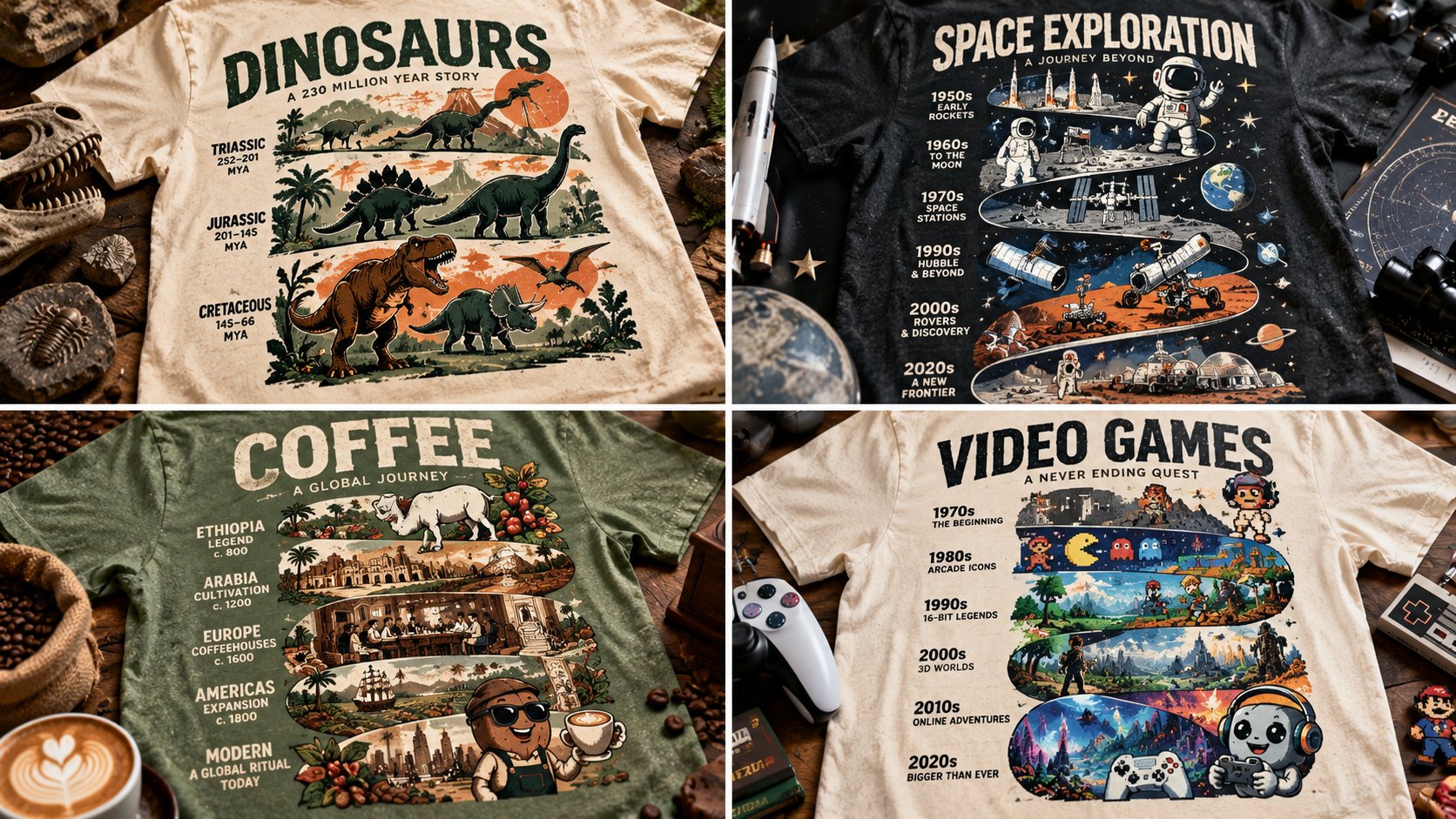
WITH input(topic) AS (VALUES (:TOPIC)), spec AS (SELECT chronological_eras(topic) er, mascot(topic) ma, spine_word(topic) sp, two_inks(topic) ik FROM input) SELECT tee_mockup(totem=>stack(er, ma, sp), inks=>ik, negative=>0.5, garment=>fabric_realism(weave=>TRUE)) AS totem_timeline_tee FROM spec -- T₁: CHECK ( tiers chronological AND connected silhouette ) -- T₂: CHECK ( mascot present AND spine legible ) -- T₃: CHECK ( two inks AND negative ≈ 0.5 ) -- T₄: CHECK ( garment mockup with weave ) -- T₅: CHECK ( era cues match years )
0
Details
GPT Image 2.5
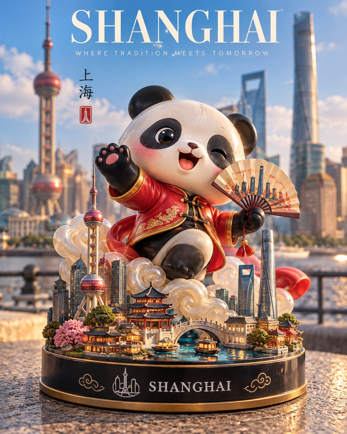
Create a premium 4:5 vertical 3D designer-toy collectible inspired by [COUNTRY / CITY / DESTINATION]. CHARACTER: Transform the destination’s most iconic symbol, mascot, or landmark into a cute, stylized vinyl figurine. Give it distinctive local features, a playful pose, an expressive face, and a smooth glossy finish. Add a signature sculptural effect inspired by the location, such as flowing water, swirling clouds, sparkling energy, or another culturally relevant element. DISPLAY BASE: Place the figurine on a polished circular base featuring miniature versions of the destination’s most recognizable landmarks, tiny trees, and carefully sculpted local details. Add “[DESTINATION]” in clean white lettering on the front, accompanied by a simple emblem inspired by the location. SETTING: Photograph the collectible outdoors in an authentic, recognizable location, with the real landmark or cityscape softly blurred in the background. Include a tasteful promotional banner reading “[DESTINATION SLOGAN]” and place the toy on a natural surface that complements the setting. LIGHTING & MATERIALS: Bright natural daylight, soft realistic shadows, detailed reflections, polished vinyl, tactile sculpted surfaces, and crisp miniature craftsmanship. STYLE: High-end designer-toy photography meets premium travel-souvenir advertising. Vibrant, joyful, imaginative, and professionally art-directed. Automatically select a fitting character design, signature effect, miniature landmarks, emblem, and background based on the destination. Avoid generic characters, inaccurate landmarks, clutter, people in focus, excessive text, watermarks, and logos. FORMAT: Strict 4:5 vertical composition.
0
Details
GPT Image 2.5
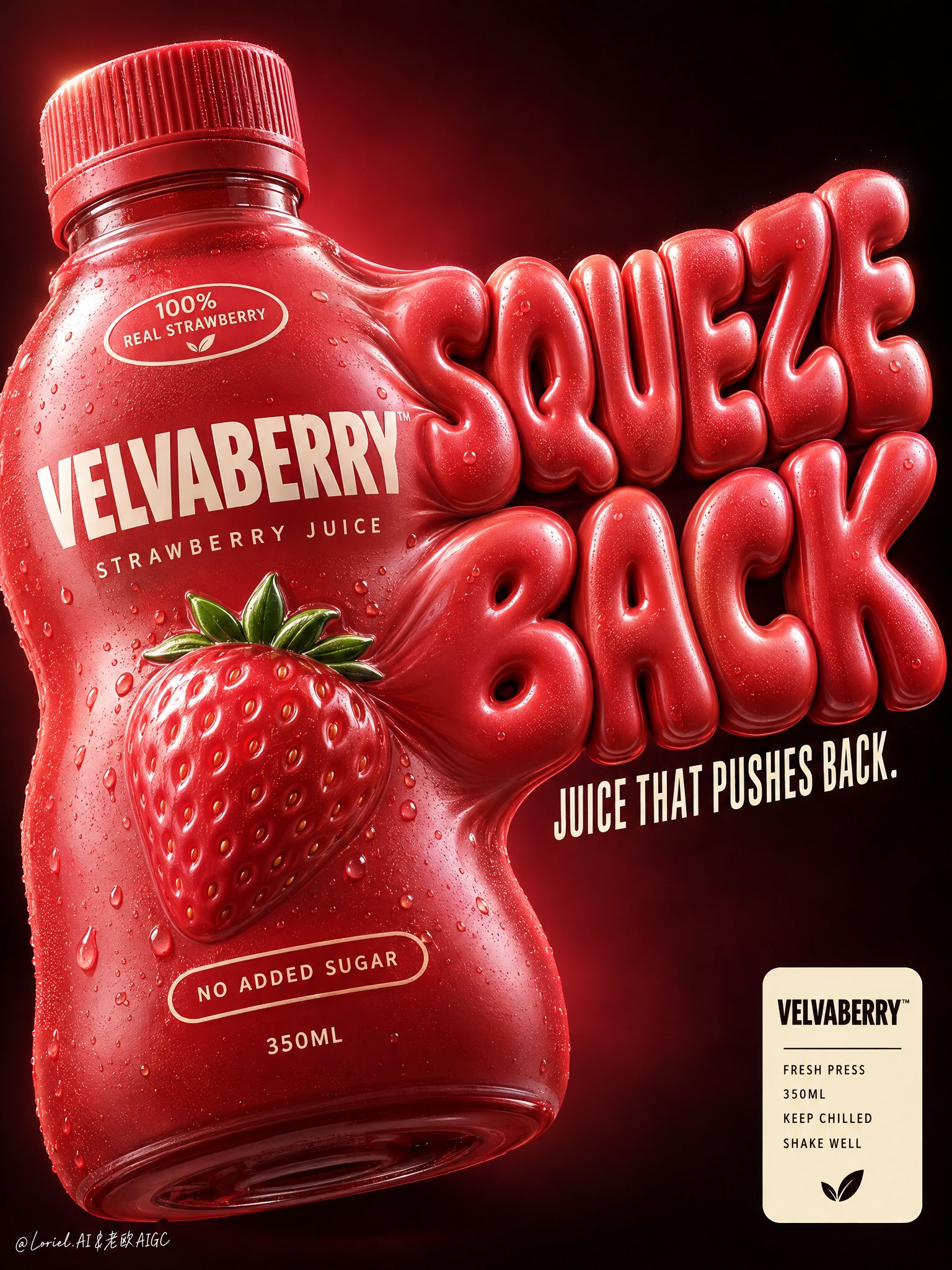
Create a premium vertical commercial poster for a fictional overseas juice brand, "VELVABERRY". Design it as a Cannes-level product-first beverage ad where one strawberry juice bottle becomes both the hero package and the engine of the graphic system. The bottle must look soft, overfilled, and under delicious internal pressure, visually inflating into giant sculptural typography that bursts outward from its right side. The result should feel bold, playful, tactile, and highly branded, with clean luxury execution. Use a close-up low-to-mid angle product composition against a deep black-to-burgundy gradient background with a concentrated crimson glow behind the product. Place one oversized bottle in the left-center foreground, slightly tilted, occupying most of the left half. The bottle body visibly swells and stretches toward the right, seamlessly transforming into a huge inflated slogan built from the same pressurized material language. Keep the lower-right reserved for a compact official info badge, and preserve enough negative space around the top and right edge for the enlarged typographic mass to breathe. The bottle remains the heaviest object even as the typography expands from it. The hero bottle is a short rounded squeeze-style juice bottle with a ribbed cap, made of soft-touch semi-gloss plastic in saturated strawberry red with subtle berry-coral undertones. It should look elastic and pressurized, with believable volume tension, smooth stretched curves, and controlled deformation, never melted or broken. The front branding must read exactly: "VELVABERRY" "STRAWBERRY JUICE" Add a small shoulder badge: "100% REAL STRAWBERRY" Add a lower badge: "NO ADDED SUGAR" Add the volume mark: "350ML" At the center, include one premium embossed strawberry icon with a tiny fresh green crown integrated into the label system. On the right side, create an enormous inflated 3D slogan physically extruded from the bottle wall: "SQUEEZE BACK" The letters must feel swollen, juicy, soft, and pressure-filled, with the same strawberry-red material identity as the bottle. Beneath it, in narrow elegant cream-white condensed type, place: "JUICE THAT PUSHES BACK." The slogan should feel like a direct continuation of the package form, not a separate graphic layer. Use strong commercial key lighting from upper left with clean highlight control on the cap ridges, bottle shoulders, embossed strawberry icon, and inflated letter surfaces. Add subtle right-edge separation light to keep the expanded typography crisp against the dark field. Build a disciplined palette: 50% strawberry red and berry coral, 25% deep burgundy-black background, 15% cream-white typography and badge accents, 10% tiny green fruit details and soft warm highlight bloom. Increase local contrast on the bottle bulge, cap texture, embossed icon, and inflated typography while avoiding muddy reds, dirty gradients, dead black holes, or cheap plastic shine. Render everything with elite FMCG poster realism: soft-touch semi-gloss plastic, crisp printed branding, pressure-stretched packaging curvature, embossed fruit emblem, ribbed cap detail, subtle micro-specular rolloff, and inflated typography with believable material continuity from the bottle body. The finish should feel like premium beverage branding fused with playful industrial design and high-end poster sculpture. In the lower-right corner, add a compact cream badge panel with: "VELVABERRY" "FRESH PRESS" "350ML" "KEEP CHILLED" "SHAKE WELL" This badge must feel official, minimal, and premium, balancing the expressive oversized slogan above. Premium vertical product poster, exact single-bottle hero, product-first hierarchy, bottle-to-typography fusion, dark luxury background, highly readable branding, and unified commercial finish. Maintain coherent bottle geometry, believable package inflation, crisp legible text, elegant negative space, and strong retail-ad impact. Avoid extra bottles, warped unreadable lettering, melted plastic artifacts, random fruit clutter, messy splashes, chaotic props, cartoon cheapness, muddy color, distorted cap geometry, accidental resemblance to any real beverage brand, or any loss of the bottle as the dominant hero.
0
Details
GPT Image 2.5
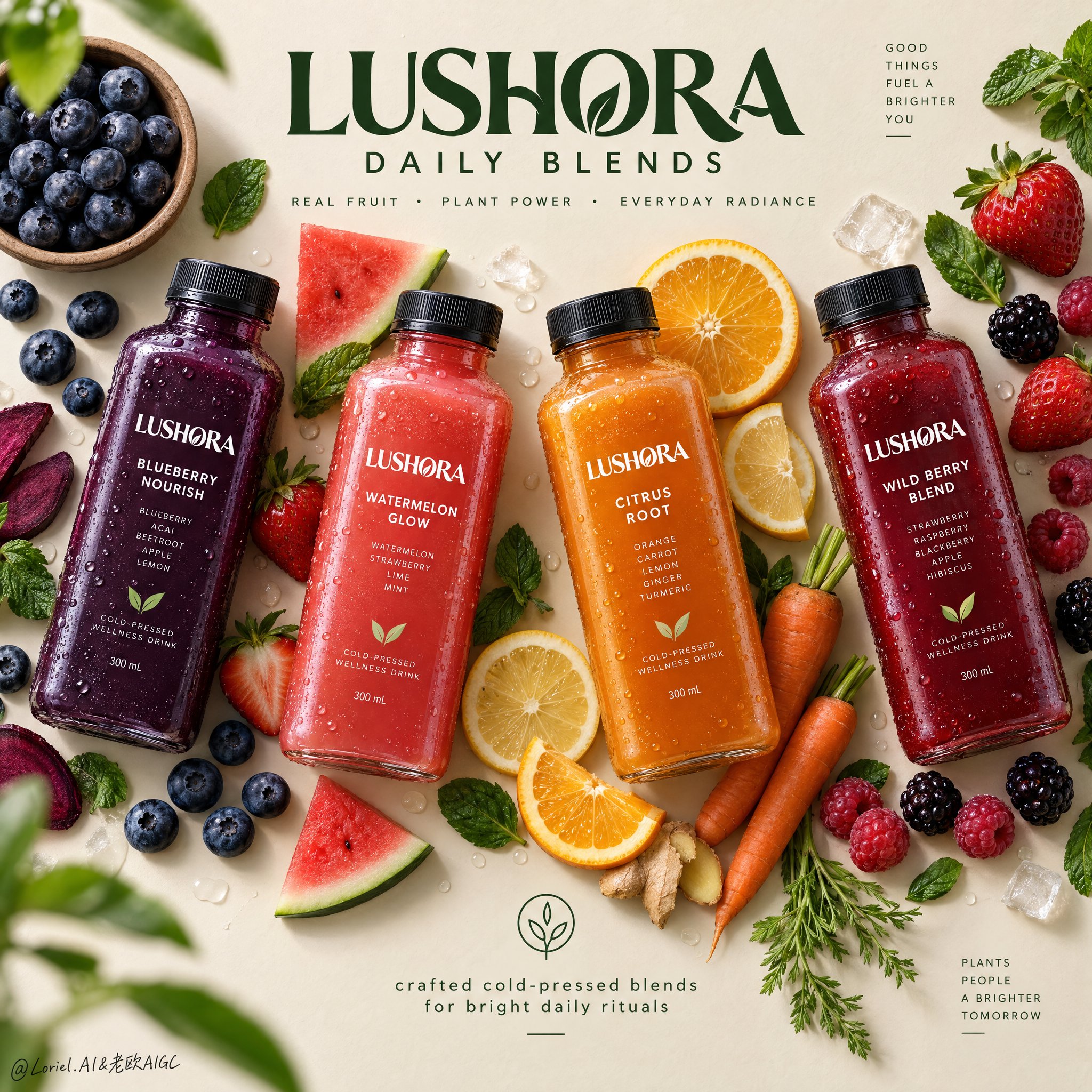
Create a Cannes-level top-down commercial poster for a fictional overseas cold-pressed wellness drink brand, "LUSHORA". Design a clean premium flat-lay on a warm matte oat-cream background, with four hyper-real chilled square bottles arranged in a refined diagonal rhythm across the frame. Fuse premium grocery advertising, editorial food styling, and contemporary exhibition-poster discipline. Keep the bottles as the absolute visual heroes, while fruit, vegetable, and leaf elements form a controlled perimeter frame that supports freshness, flavor identity, and spatial rhythm without clutter. Use a straight overhead camera with precise poster geometry. Arrange four bottles with slight angle variation for elegance and motion: deep indigo-purple on the left, vivid coral-red left-center, glowing amber-orange right-center, and rich berry-crimson on the right. Preserve strong negative space at the upper center for the master brand mark and at the lower center for a minimal information lockup. The layout should feel balanced, crisp, modern, and campaign-ready. Each bottle must feel tactile, cold, and commercially believable: thick clear PET or glass walls, realistic cap threading, matte black caps, micro-condensation, varied droplets, visible liquid density, subtle refraction, and sharp premium labels. The labels must read exactly "LUSHORA". Flavor lineup: "BLUEBERRY NOURISH", "WATERMELON GLOW", "CITRUS ROOT", and "WILD BERRY BLEND". The packaging should look globally branded, elegant, healthy, shelf-ready, with consistent hierarchy and clear typography. Build a flavor halo with highly realistic ingredients placed with curatorial restraint: blueberries in a small natural bowl, loose berries, strawberries with leafy tops, sliced oranges, lemon rounds, raspberries, blackberries, mint leaves, and a few carrot elements for the citrus-root bottle. Keep ingredients visually grouped near their corresponding bottle without messy clusters. Add a few sliced and whole pieces for contrast. Some leaves and berries may sit near the edges as subtle framing accents, with one or two elements softly defocused for shallow depth, while the bottles stay perfectly crisp. Lighting should be soft premium studio daylight from the upper left, with clean shadow falloff and gentle grounding beneath every bottle and ingredient. Use a controlled palette: 45% warm oat, cream, and sand neutrals; 35% vivid fruit colors from indigo, coral, amber, and crimson liquids; 20% botanical greens and fresh citrus highlights. Increase local contrast on bottle shoulders, droplets, fruit flesh, citrus translucency, berry skins, and mint veins so the image feels bright, tactile, and luxurious. Avoid dull greys, muddy shadows, and heavy black patches. Materials must read with exquisite clarity: cold slick bottle surfaces, clean label print, soft matte caps, translucent citrus pulp, juicy strawberry flesh, powdery blueberry bloom, glossy berry skins, fresh mint veining, and slightly fibrous carrot texture. The finish should feel like premium health-beverage campaign art: minimal but abundant, bright but controlled, natural but highly designed, with freshness, wellness, appetite appeal, and modern retail sophistication. Typography must be newly invented and art directed into the composition. At the upper center, place a bold premium custom logotype: "LUSHORA DAILY BLENDS". Beneath it, in smaller clean sans serif: "REAL FRUIT • PLANT POWER • EVERYDAY RADIANCE". At the lower center, add a minimal lockup with a small clean icon and the line "crafted cold-pressed blends for bright daily rituals". Use deep botanical green typography so it feels calm, premium, and naturally integrated with the ingredients. Keep all type elegant, readable, and clear of product labels. The final image should unify emotional freshness, material richness, and graphic restraint into an international design-poster campaign. Maintain exact four-bottle hierarchy, coherent scale, realistic ingredient-to-flavor logic, clean spacing, crisp labels, premium advertising realism, and top-tier visual discipline. Avoid extra bottles, duplicated fruit, warped packaging, unreadable text, sloppy garnish clutter, broken bottle perspective, muddy background, cheap typography, excessive decorative particles, weak hierarchy, dead black shadows, or drift away from premium fresh wellness beverage advertising.
0
Details
GPT Image 2.5
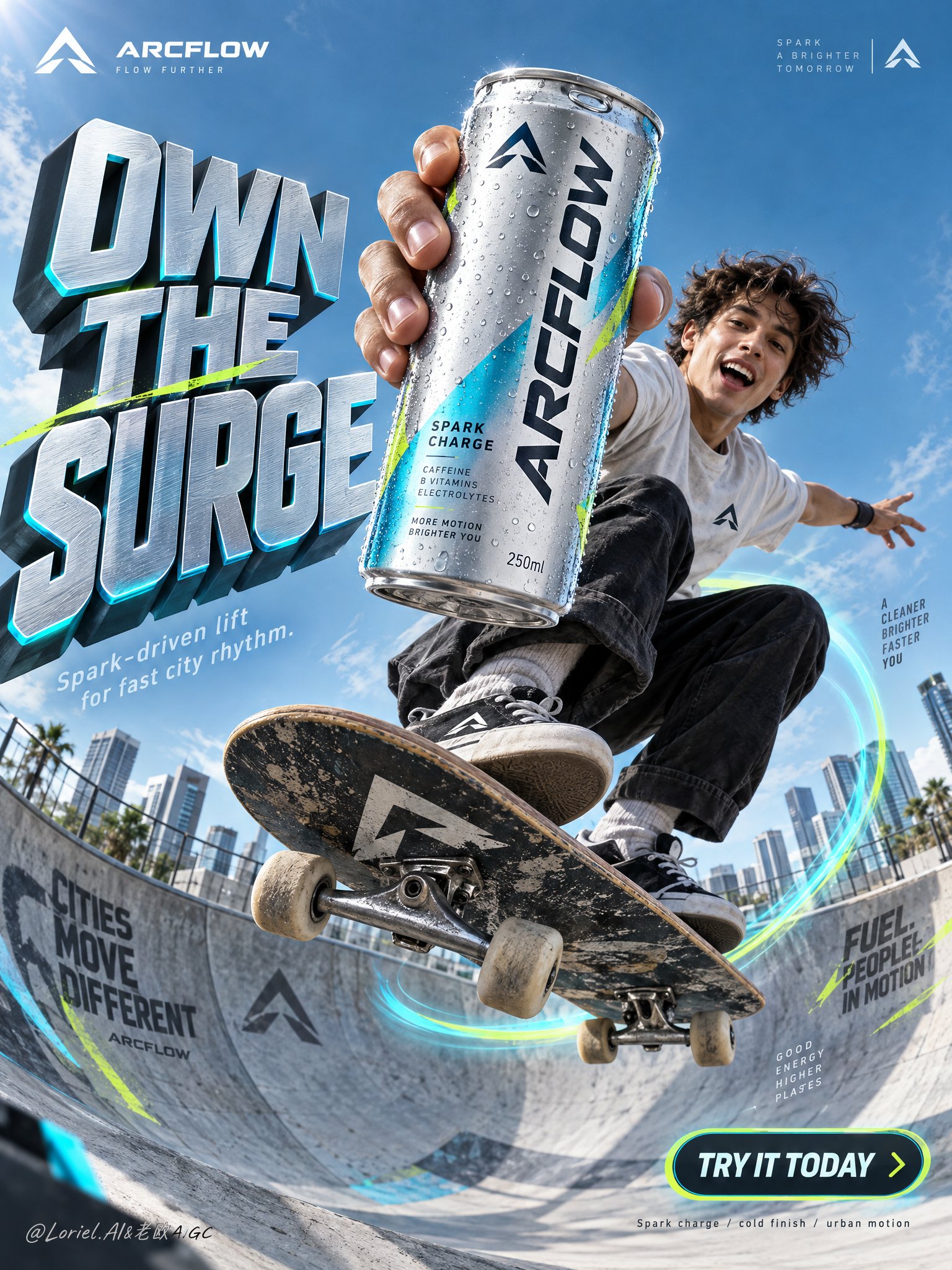
Create a premium vertical commercial poster for a fictional overseas functional sparkling drink brand, "ARCFLOW". Fuse a real physical beverage can with high-concept urban action ad language, keeping the product as the absolute visual leader. Build the scene around a frozen skateboard jump in a modern concrete bowl, with the can thrust closest to the lens and dominating the composition while the athlete and environment amplify its energy without competing. Use an ultra-low-angle wide commercial lens from inside the bowl, looking upward into a clean open sky. Preserve a poster architecture with a massive sculptural headline block on the left, the athlete and hero can aligned along the center-right axis, luminous motion arcs wrapping the board trajectory, small official brand marks in the upper corners, and a rounded CTA badge in the lower right. Keep strong negative space in the upper background so the title and product silhouette stay instantly readable. The can must appear larger than the athlete’s face and occupy the strongest focal zone. The hero product is a hyper-real 250ml can of ARCFLOW Spark Charge in brushed silver aluminum with electric cyan accents, acid-lime micro details, and a deep graphite logo lockup. The surface shows realistic condensation droplets, crisp pull-tab geometry, subtle edge reflections, premium label sharpness, and tactile coated-metal finish. The exact front text must read "ARCFLOW". Add a small minimalist symbol logo in the top corners, reduced, elegant, and globally branded. A young skater is captured at the peak of a jump above the bowl in a compact crouched pose, one arm aggressively extending the can toward camera, the other stretched outward for balance. The skateboard cuts diagonally through the lower middle with believable tilt, visible trucks and wheels, and physically correct foot pressure. Body mechanics must feel athletic and grounded, with coherent center of gravity, convincing grip, natural clothing tension, and correct hand anatomy. The athlete’s expression is exhilarated and alive, but the product remains dominant. Set the action in a clean urban skate bowl with refined wall graphics, smooth concrete curvature, and soft-focus city blocks in the far background. Replace playful clutter with a disciplined tech-sport visual language: only a few angular branded shards and sleek directional graphic fragments near the lens. Depth should layer clearly: near-lens graphic accents, hero can and skater in the mid-foreground, bowl and motion ring in the midground, architecture and sky in the background. Use bright directional daylight from the upper left with crisp highlights on the can rim, condensation, face, limbs, shoes, and board edges. Add subtle cyan reflected light from the bowl and motion trails to enrich shadows without flattening form. Build a 60/30/10 palette: 60% cool sky blue and silver-cyan atmosphere, 30% graphite and deep neutral structure, 10% acid lime accents. Increase light-shadow separation to sculpt volume in the can and skateboard, while avoiding dirty blacks, dead shadows, haze, or oversaturated chaos. Render everything with elite commercial realism. The can must feel manufactured and touchable: brushed aluminum, coated print, varied droplets, soft specular roll-off, real seam lines, and precise tab indentation. The skateboard shows believable grip texture, layered wood edge, metal truck reflections, and slightly worn wheels. Concrete has fine grain and controlled mural overspray. Clothing feels light, breathable, and sunlit. The image should read as a synthesis of luxury product photography, sports advertising, and award-level graphic poster design. Create all typography as newly invented art-directed copy integrated into the composition flow. Main left headline: "OWN THE SURGE". Secondary line below: "Spark-driven lift for fast city rhythm." Lower-right rounded badge: "TRY IT TODAY". Very small bottom technical note: "Spark charge / cold finish / urban motion". Typography should be sculptural, high-impact, cleanly spaced, and fused with the environment, using cool metallic silver faces, cyan edge glow, graphite side planes, and subtle lime accents. Keep all text away from the can label and the athlete’s face. Vertical ad-poster composition, product-first hierarchy, physically believable frozen action, clean premium commercial execution, no copied slogans, no real person names, no unrelated props, no clutter, no sticker collage, no generic stock-ad feeling. Maintain sharp packaging readability, correct can proportions, coherent skateboard geometry, correct fingers and joints, a single clean hero product, unified style language, elegant layout rhythm, and disciplined negative space. Avoid duplicated limbs, malformed hands, warped board shape, floating objects without support logic, unreadable label text, chaotic type placement, distorted logo, muddy grading, dirty blacks, accidental extra cans, cheap font treatment, cartoon drift, painterly drift, overdecorated particles, and broken spatial perspective.
0
Details
GPT Image 2.5
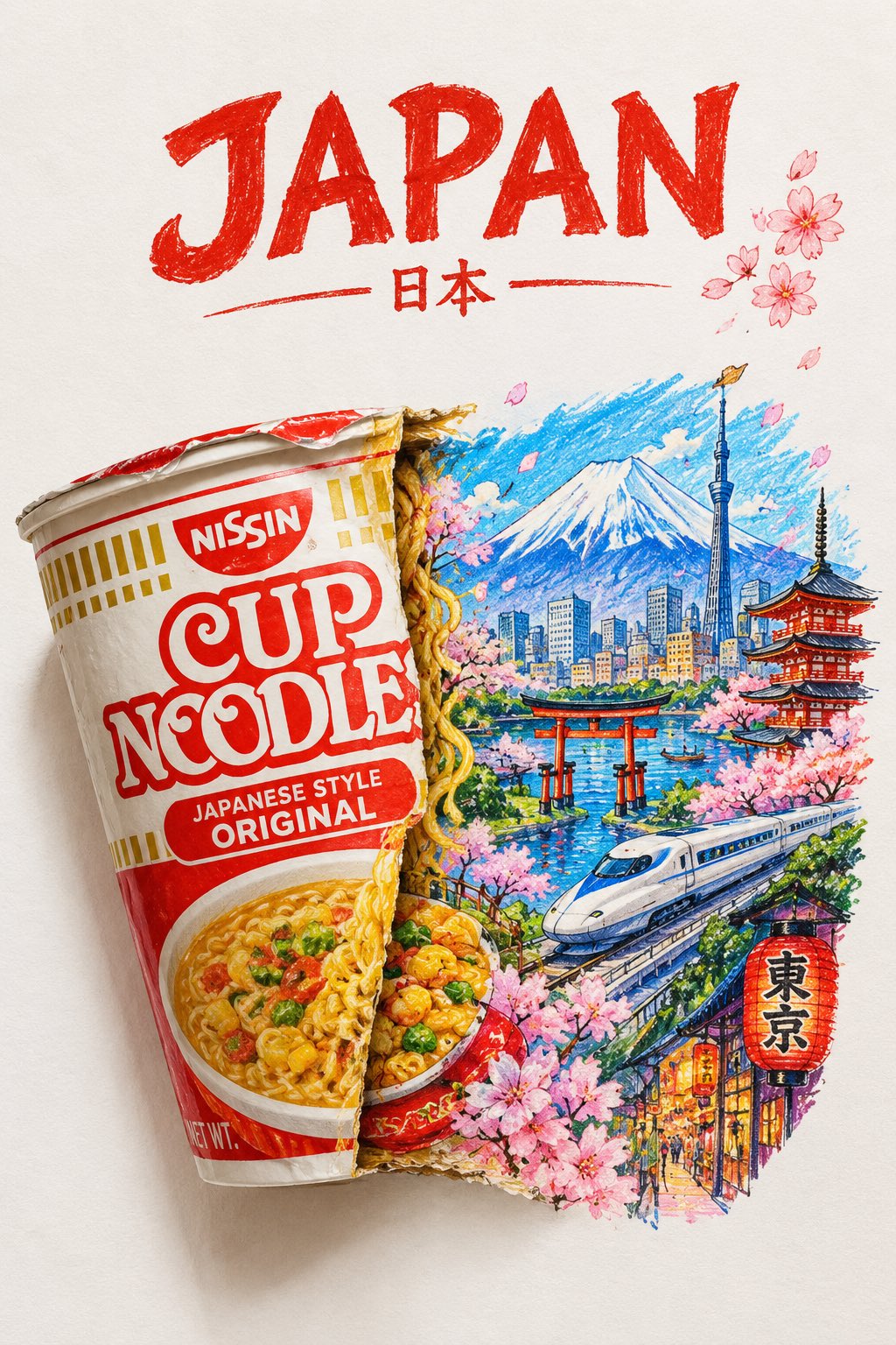
A striking top-down art photograph of a famous packaged food/snack from [COUNTRY], placed on a clean white sheet of paper. At the very top of the paper, write “[COUNTRY NAME]” in large, bold, beautiful typography. Directly underneath, place a realistic, colorful packet of “[FAMOUS FOOD/SNACK]” from that country. The packet is creatively split/opened down the center, and the inside artwork transforms into a vibrant miniature illustration of the country — featuring its most iconic landmark, architecture, landscape, cultural elements and recognizable local details. Keep the original food packet highly realistic with authentic-looking folds, crinkles, printed graphics and vivid colors, while the emerging country illustration uses expressive colored-pencil and wax-crayon strokes. White paper background, overhead composition, playful handmade imperfections, rich saturated colors, premium editorial art photography, extremely detailed, visually satisfying, viral social-media aesthetic.
1
Details
GPT Image 2.5
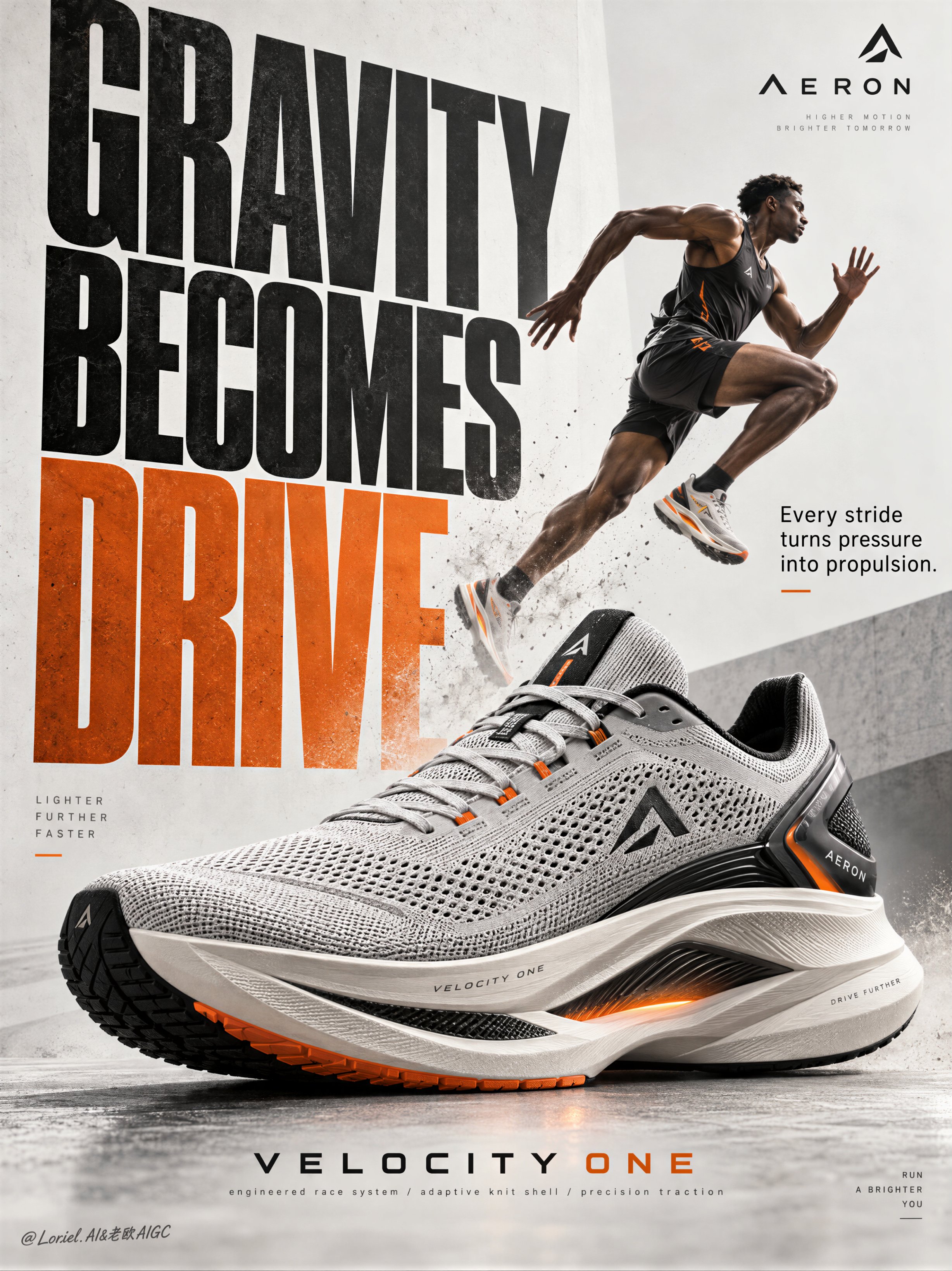
Create a Cannes-level poster ad for fictional premium performance footwear brand AERON, combining narrative athletic tension, engineered material realism, and minimalist curatorial graphic design in one unified image. Build the poster around one hyperreal hero sneaker as the absolute visual anchor, fused with monumental typography and one motion-driven athlete accent, translating speed, pressure, balance, and release into a clean but forceful commercial image. Use a vertical full-bleed poster with strict poster-design logic and rule of thirds inside a typographic architecture. Preserve the exact structure: oversized condensed letters, large controlled negative space, strong scale contrast, and one figure intersecting the type field. The hero sneaker dominates the middle-to-lower center in a three-quarter side profile, large enough to control the composition. Behind and partly around it, stack a monumental vertical title column as a graphic wall, with one secondary text block and one minimal brand zone creating rhythmic pauses. The image must feel editorial, sharply weighted, and highly legible from distance. The product is the fictional AERON VELOCITY ONE, a premium race trainer rendered as a real commercial object: engineered knit upper, ventilated mesh zones, tension-wrapped lacing, molded heel frame, sculpted superfoam midsole, carbon-response plate suggestion, segmented traction rubber, subtle reflective trims, and a minimal geometric logo mark. Preserve accurate footwear anatomy, believable manufacturing precision, realistic seam logic, crisp edge definition, authentic sole thickness, and premium industrial finish. Introduce one secondary athlete as a kinetic narrative accent rather than the hero: a lean elite runner captured in suspended stride, body diagonally stretched upward through the typography, with one knee lifted, one leg extended, arms naturally counterbalancing motion, and gaze focused forward. The athlete remains smaller than the shoe and functions as a motion vector. Anatomy must be correct, fingers normal and separated, limbs proportionate, gravity believable, posture elegant, and cast shadow physically consistent. The athlete should feel like a frozen instant of breakthrough, not a decorative sticker. Use an abstract poster-space environment rather than a literal location: a refined mineral white and pale concrete-grey field with subtle paper grain, faint tonal falloff, and soft spatial depth created through overlap, scale, and controlled shadows. No clutter, no random props, no useless particles. If motion energy is needed, suggest it through directional water mist, soft sole dust, or aerodynamic blur traces tightly integrated around the product and athlete, always clean and intentional. Lighting is a coherent studio-commercial setup: soft frontal key light from upper left, low-intensity side fill from camera right, restrained rim separation on the shoe edges, and delicate shadow pooling beneath athlete and product to anchor them. If the frame risks looking flat, increase tonal contrast through gentle chiaroscuro rather than harsh black blocks. Palette: 60% mineral white, pale concrete grey, and soft paper ivory; 30% deep charcoal, graphite, and asphalt black; 10% kinetic burnt orange shifting toward signal amber. The orange should energize the main typography and one micro-accent on the product or layout. Materials must feel hyperreal and tactile: dry engineered knit texture, micro-perforated mesh clarity, semi-matte polymer supports, subtle rubber sheen, precise embossed logo details, clean reflective trim response, and realistic sole geometry. Typography should feel like premium editorial print integrated into the space, with crisp matte ink edges, refined overlap, and elegant depth through shadow and layering. Add faint contemporary print grain and controlled photographic sharpness, keeping the product recognition zones razor clear while softer surrounding areas preserve sophistication. Use only English and original advertising copy. Main title: “GRAVITY BECOMES DRIVE”. Support line: “Every stride turns pressure into propulsion.” Brand mark: “AERON”. Model line: “VELOCITY ONE”. Micro information: “engineered race system / adaptive knit shell / precision traction”. Set the oversized condensed sans-serif title vertically behind and alongside the athlete and shoe, with selected letter cropping for tension; place the support line in a smaller clean sans-serif block near the mid-right; keep the brand mark minimal near the top edge; align model line and micro information near the lower margin with disciplined spacing, elegant hierarchy, and safe margins. Typography must avoid the product recognition zone and harmonize with the lighting environment. Output: a polished, hyperreal, commercially deployable poster where the product remains unquestionably dominant, the athlete intensifies motion, and the typography becomes structural design. The result must feel sharp, premium, clean, and contemporary, with no visual mud, dead black patches, layout clutter, unreadable text blocks, malformed anatomy, extra or fused fingers, broken limbs, distorted footwear proportions, unstable perspective, inconsistent shadows, dirty textures, or style drift. No real person names, no existing brand names, and no invented packaging claims beyond what is visually supported.
0
Details
GPT Image 2.5
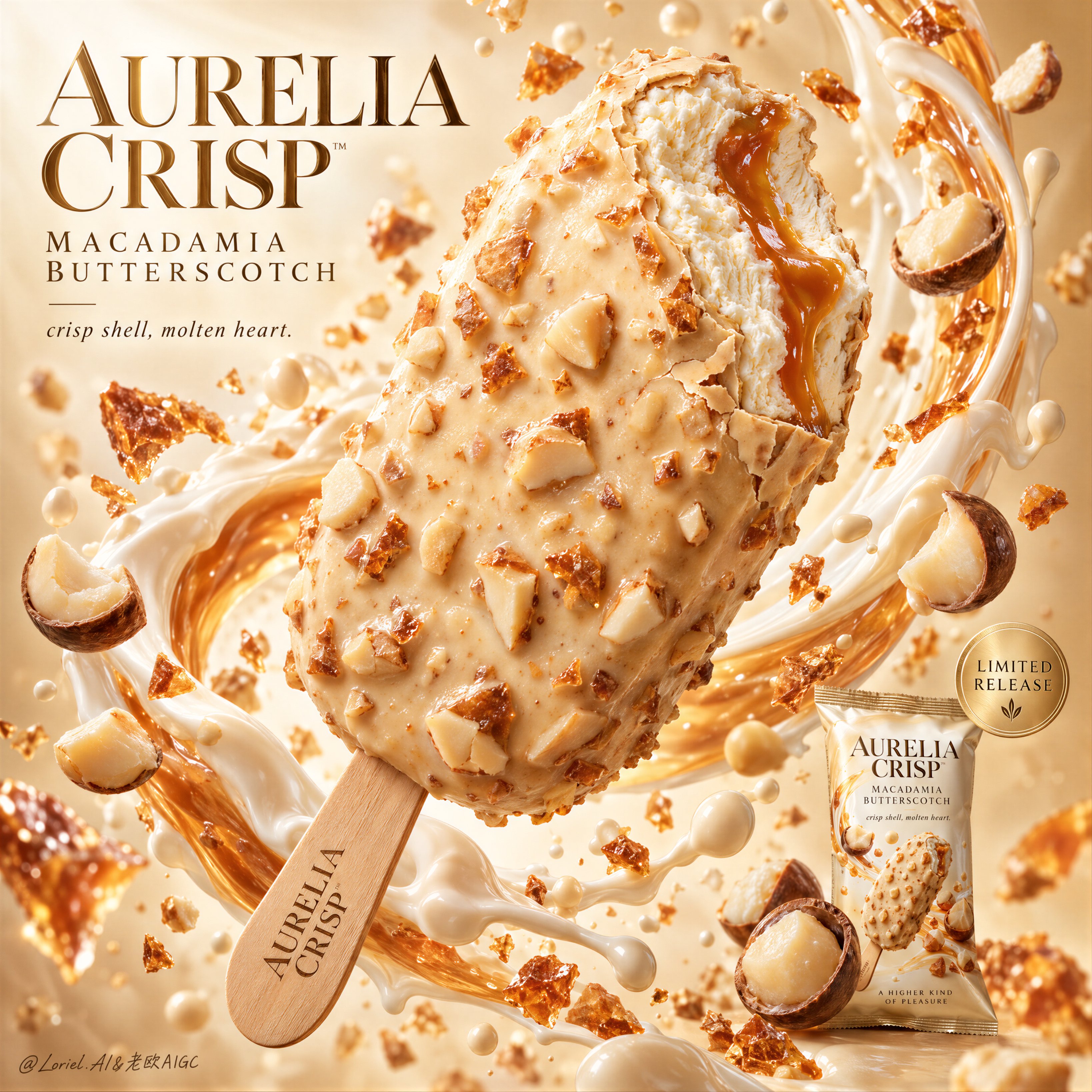
Create a Cannes-level commercial dessert poster for fictional luxury ice cream bar brand AURELIA CRISP, merging indulgent food realism, sculptural liquid motion, and gallery-clean advertising design into one unified hero image. The core concept is suspended decadence: a single bitten macadamia-butterscotch ice cream bar floats as the central icon, wrapped by a controlled arc of cream, caramel gloss, and airborne nut fragments. The product must remain the absolute visual leader. Use a vertical full-bleed poster with a close-up hero dessert shot, staged diagonally from lower left to upper right. Preserve the exact structure: one oversized floating bar at center, a surrounding crescent of creamy splash behind and around it, floating macadamia halves and crunchy fragments across foreground and background, a refined headline block in the upper left, and a small secondary package shot with release seal in the lower right. The bitten tip must face the viewer enough to expose the interior clearly. The layout should feel explosive yet controlled, rich yet minimal, luxurious yet instantly readable. Design a premium coated ice cream bar with a pale champagne-ivory shell infused with macadamia chunks and butterscotch brittle. A single bite is taken from the upper front edge, revealing dense velvety vanilla-toned ice cream with a molten amber butterscotch ribbon running through the center. The shell should feel crisp, slightly thick, and luxuriously irregular, with delicate fracture lines around the bite edge and embedded nut relief across the surface. The stick is clean light wood, refined, and subtly branded with the fictional mark AURELIA CRISP. The hero product must feel edible, tactile, expensive, and impeccably finished. Build an abstract premium dessert studio field with a luminous warm ivory-to-butterscotch gradient background, airy and bright but not flat. A silk-like ring of milk cream and caramelized dairy splash curves behind the bar, creating enclosure and motion while preserving hierarchy. Macadamia kernels, broken nut halves, crisp caramel shards, and fine cream droplets occupy layered depths around the hero object. Keep all elements clean, intentional, and spacious. No table, no hands, no clutter, no extra props. Lighting is bright luxury studio light with a soft frontal key, delicate upper-left glow, and refined specular shaping along the shell texture, bitten interior, and syrup core. Palette hierarchy: 60% ivory cream, pale vanilla, and macadamia beige; 30% champagne caramel, butterscotch amber, and soft gold; 10% toasted nut brown, warm wood, and subtle shadow accents. Maintain high brightness, creamy contrast, and precise edge separation. No muddy beige, no dead white blowout, no dirty shadows. The emotional tone is velvety, crisp, radiant, collectible, and indulgent. Materials must feel extremely photoreal: crunchy nut topology, subtle gloss variation, tiny coating ripples, and believable shell thickness; fine creamy ice crystal softness in the bitten interior without looking frozen-solid or plastic; a viscous glossy butterscotch ribbon; macadamia pieces with dry matte interiors, slightly satin outer surfaces, and realistic color variation; and a thick silky cream splash with coherent physical flow. The packaging in the lower right should be a small but sharp premium packshot with matching palette logic and precise label print. Integrate premium English typography into the poster architecture. In the upper left, place a sculpted headline block reading “AURELIA CRISP / MACADAMIA BUTTERSCOTCH”, using an elegant couture-inspired serif or high-contrast editorial type system with generous spacing. Below it, add the restrained phrase “crisp shell, molten heart.” In the lower right, near the secondary packshot, place a subtle circular champagne-gold seal with concise microcopy such as “limited release”. Typography must feel light, art-directed, and embedded into the motion flow, never heavy or intrusive. Output: a full-bleed premium dessert poster with product-first hierarchy, ultra-clean execution, hyperreal edible texture, elegant graphic rhythm, sharp packaging support, and high-end commercial readability. Avoid extra bars, malformed nuts, duplicated fragments, chaotic splash overload, collapsed melting, plastic-looking coating, unreadable packaging text, warped bite anatomy, dead highlights, muddy cream haze, low-grade AI texture, stock-poster genericity, overdecorated luxury cliches, or resemblance to existing real ice cream branding.
0
Details
GPT Image 2.5
ZARA — TOTE BAG MERCH DROP “THE EVERYDAY ICON” Act as a Senior Brand Art Director, Editorial Fashion Photographer, Art Director, Set Designer, Typography Designer and Behance-level campaign designer. Create ONE horizontal 16:9 editorial campaign poster announcing a ZARA tote-bag merch drop. REFERENCE PRODUCT: Use the uploaded reference image as the EXACT product reference. The tote must remain visually faithful to the reference: — deep burgundy / oxblood leather appearance — structured rounded tote silhouette — wide curved upper body — distinctive double-handle construction — long shoulder straps — short top handles — visible stitched construction — minimal metal detailing — understated luxury finish — same proportions, silhouette, handle architecture and material character DO NOT redesign the bag. DO NOT change the silhouette. DO NOT add pockets, logos, hardware or decorative elements that do not exist on the reference. The product must remain the recognizable hero SKU throughout the composition. ━━━━━━━━━━━━━━━━━━━━ CONCEPT — MERCH DROP ━━━━━━━━━━━━━━━━━━━━ This is NOT a conventional Zara product photoshoot. It should feel like a highly art-directed ZARA merchandise DROP campaign created for Instagram, fashion media and a Behance editorial case study. The tote is treated as a CULT OBJECT — photographed with the visual confidence of a fashion campaign rather than a standard ecommerce product image. Visual language: fashion editorial × contemporary retail × art-directed street photography × premium merchandise launch. The campaign should immediately communicate: NEW DROP. LIMITED MOMENT. DESIRABLE OBJECT. ZARA ENERGY. ━━━━━━━━━━━━━━━━━━━━ LAYOUT ARCHITECTURE ━━━━━━━━━━━━━━━━━━━━ 16:9 horizontal editorial poster. Create a dramatic split composition: LEFT 45%: Bold graphic field with a strong ZARA-inspired editorial treatment. RIGHT 55%: Full-bleed cinematic fashion photograph featuring a realistic fashion model carrying the exact reference tote. Hard vertical compositional division. The graphic and photographic zones must feel designed together rather than like two separate images. ━━━━━━━━━━━━━━━━━━━━ BACKGROUND ━━━━━━━━━━━━━━━━━━━━ Use a bold, unexpected fashion-editorial background rather than plain white. Deep oxblood / burgundy, warm off-white and charcoal-black visual relationships inspired by the reference tote. The background should feel expensive, architectural and contemporary. Possible visual environment: minimalist brutalist architecture, large geometric walls, oversized stone surfaces, architectural shadows, fashion-store exterior, urban European street, or sculptural concrete environment. No generic studio backdrop. The environment should feel like an actual ZARA fashion campaign location. ━━━━━━━━━━━━━━━━━━━━ HERO PHOTOGRAPHY ━━━━━━━━━━━━━━━━━━━━ A realistic adult fashion model, completely fictional and non-identifiable. The model wears contemporary ZARA-style fashion: minimal tailored oversized coat, structured trousers, refined footwear, restrained accessories. The burgundy tote is the visual hero. The model holds the bag naturally at their side while walking through the architectural environment. Pose: confident, editorial, slightly candid, non-confrontational, fashion-week street-style energy. The model should NOT look like a celebrity or recognizable public figure. Natural human anatomy. Natural skin texture. Realistic hands. Realistic grip on the handles. The tote must remain clearly visible and unobstructed. ━━━━━━━━━━━━━━━━━━━━ CAMERA / PHOTOGRAPHY ━━━━━━━━━━━━━━━━━━━━ High-end professional fashion editorial photography. Full-frame / medium-format fashion photography aesthetic. 50mm editorial lens. Camera positioned slightly below eye level. Subtle perspective compression. Shallow but controlled depth of field. The tote must remain tack-sharp. Natural environmental depth behind the model. Professional fashion campaign lighting: hard directional sunlight mixed with controlled architectural shadow, subtle reflected fill, natural specular highlights on the leather, deep but detailed shadows. No artificial CGI lighting. No beauty-filter appearance. No plastic skin. No AI-generated fashion look. The image should feel photographed by an elite fashion photographer. ━━━━━━━━━━━━━━━━━━━━ TYPOGRAPHIC SYSTEM ━━━━━━━━━━━━━━━━━━━━ Typography is a PRIMARY DESIGN ELEMENT. Use a refined contemporary fashion-editorial sans-serif character: high contrast, clean geometry, precise spacing, strong vertical presence, minimal, luxury retail aesthetic. Do NOT imitate or distort the official ZARA wordmark. Use only legitimate ZARA branding where appropriate. HEADLINE: NEW DROP Two enormous lines. “NEW” positioned across the graphic zone. “DROP” dramatically oversized and extending across the vertical split into the photograph. The typography should partially overlap the model and tote while remaining completely legible. Very large scale. Tight leading. Slightly compressed editorial proportions. Flat typography. No glow. No bevel. No 3D. No shadows. No gradient. ━━━━━━━━━━━━━━━━━━━━ TYPOGRAPHIC BRIDGE ━━━━━━━━━━━━━━━━━━━━ CRITICAL: The word “DROP” must physically cross the boundary between the graphic field and photograph. Approximately 40–50% of the word sits over the left graphic field. The remaining letters continue over the photographic environment. The type must visually interact with the model and architecture. The tote may partially intersect with the typography, creating a sophisticated editorial layering effect. This is the key Behance-level composition device. ━━━━━━━━━━━━━━━━━━━━ MICRO TYPOGRAPHY ━━━━━━━━━━━━━━━━━━━━ Use restrained fashion-editorial information blocks. Small uppercase tracking. Example layout: ZARA WOMAN NEW SEASON LEATHER TOTE DROP 01 2026 ONLINE + SELECTED STORES SHOP NOW → Keep the micro-copy secondary. Do not fill the poster with unnecessary text. Generous negative space. ━━━━━━━━━━━━━━━━━━━━ PRODU
0
Details
GPT Image 2.5
A luxury fragrance poster for fictional perfume house LUNEA, merging emotional intimacy, material precision, and curatorial minimalism into one unified image. Preserve the exact beauty-editorial structure: a clean high-key off-white background, the right half of an adult Western white girl’s face filling the right edge, a central rectangular perfume bottle in the lower middle foreground, and a large soft translucent flower blooming behind and slightly above the bottle like visible scent. The bottle is the absolute visual leader, while the face and flower act as quiet amplifiers. Use a tight front-facing close-up with strong negative space, calm vertical balance, and refined still-life discipline. The girl is photoreal, adult, naturally proportioned, anatomically correct, with realistic pale skin, visible freckles, subtle pores, natural lips, soft peach undertones, clean brows, natural lashes, and a serene neutral expression. Only half her face is visible on the right edge, vertically cropped, with one eye clearly readable and softly aligned with the bottle. Her skin must feel alive and real, never plastic or over-retouched. The perfume bottle is original and highly premium: transparent rectangular glass with warm blush-tinted edges, pale champagne-rose liquid inside, crisp beveled corners, refined thickness, subtle inner reflections, and a polished cylindrical cap in dark bronze or smoked gold. The label system is minimal and English only: brand mark “LUNEA” centered on the bottle, with one tiny support line such as “floral skin perfume”. Typography on the bottle is thin, luxurious, restrained, and perfectly spaced. The bottle sits large and centered, sharply lit, with clean readable edges and high-end cosmetic realism. Behind the bottle, place one large soft flower with broad translucent petals in a warm ivory-peach tone, like an iris or couture silk bloom, opening outward as a scent halo. The petals are delicate, semi-translucent, softly backlit, with fine veining, gentle curvature, and organic overlap. Add one or two dark green leaves near the lower left base for quiet balance, but keep them minimal and secondary. The flower should feel partly botanical, partly couture fabric, reinforcing softness and rarity without overpowering the bottle. Lighting is refined, soft, and sculptural: a large diffused frontal key with slight side direction, subtle warm sunlight character, clean highlights on the glass shoulders and cap, soft transmission through the liquid, delicate rim separation on the petals, and smooth facial modeling without harsh contrast. Keep the image clean, luminous, and free of dirty shadows or visual noise. Color hierarchy: 60% warm ivory, cream, and pale skin tones, 30% blush glass and soft peach floral tones, 10% dark bronze cap and deep green leaf accents. Materials must feel hyperreal and tactile: glass refraction, polished metal, translucent petals, living skin texture, and premium editorial print finish. If external typography is used, keep it minimal and distant, such as one short elegant line like “Quiet Bloom” or “Skin of Light”, placed far from the bottle and face with a tiny LUNEA wordmark. If it weakens the stillness, omit the external headline and let the bottle typography carry the image. The final result should feel like Orbit, Transit, and Port fused together: intimate, materially exact, globally refined, and rare. No copied branding, no extra objects, no muddy shadows, no warped bottle geometry, no broken label text, no distorted facial anatomy, no over-smoothed skin, no dirty background, no clutter.
0
Details
GPT Image 2.5
A Cannes-level luxury fragrance poster for a fictional perfume house called AURELLE, merging emotional aura, jewel-like material precision, and cold curatorial minimalism into one image. Preserve the exact structural power of a minimalist fashion-beauty campaign: a single elegant adult female hand enters vertically from the top center and holds a rectangular perfume bottle in the middle of a seamless off-white gallery-like studio background. The bottle is the absolute visual leader. The wrist is wrapped in a soft ivory boucle cuff with one polished gold button, adding couture texture and a quiet fashion signal above the product. The fingers curl naturally around the lower half of the bottle with graceful pressure, anatomically correct joints, elegant spacing, realistic skin texture, normal five-finger anatomy, and refined natural nails with tiny minimal nail accents in red, black, and muted gold. The bottle is an original premium object: transparent architectural glass, a luminous amber fragrance core glowing like captured light, a sculptural brushed-gold metal monogram frame crossing the bottle body, a faceted deep-black cap, crisp beveled edges, realistic glass thickness, subtle refraction, and jewelry-level detailing. The amber liquid is the only warm fire in the composition, creating a restrained emotional center inside a colder curated field. Use a close-up front-facing commercial product shot with centered composition, strong vertical symmetry tension, large negative space, and editorial stillness. Typography follows the same luxury poster logic: a short elegant English line above the bottle, such as “Hold the Glow”, a large italic fragrance name below, such as “Aurelle”, one thin bordered call-to-action box with refined text like “DISCOVER NOW”, and one tiny website line at the bottom center. All text is perfectly aligned, fashion-editorial, thin, precise, and expensive, integrated into the composition as graphic architecture, never heavy, never generic, never covering the product’s core recognition area. Lighting is soft, sculptural, and layered: diffuse frontal key light, subtle side fill, clean specular control on the gold structure, luminous transmission through the amber liquid, delicate shadow separation beneath the hand, and refined tonal contrast without dirty greys or dead blacks. Color hierarchy: 70% warm white and cool ivory space, 20% amber gold glow, 10% black and polished metallic accents. The final image should feel like Orbit, Transit, and Port fused together: intimate and magnetic, materially exact, visually rare, colder and more gallery-like than a typical perfume ad. Hyperreal luxury cosmetics photography, pristine studio finish, crisp typography, quiet negative space, couture restraint, no clutter, no extra props, no copied text, no anatomy errors, no extra fingers, no distorted nails, no warped bottle geometry, no broken letters, no muddy reflections, no cheap packaging feel.
0
Details
GPT Image 2
Transform every visible person in the uploaded image into realistic LEGO-style minifigure toys while preserving each person’s recognizable identity, hairstyle, outfit, colors, accessories, relative height, pose, and relationship to each other. FORMAT LOCK — NON-NEGOTIABLE Vertical 3:4 aspect ratio. Full-body product composition. All figures must be fully visible from head to toe. Do not generate square, landscape, widescreen, close-up, cropped, or half-body compositions. PERSON COUNT LOCK — NON-NEGOTIABLE Detect all visible people in the uploaded image. If there is 1 person, create 1 LEGO-style minifigure. If there are 2 people, create 2 LEGO-style minifigures. If there are 3 or more people, create the same number of LEGO-style minifigures. Do not remove, merge, ignore, duplicate, or replace any person. Every person visible in the reference image must appear as their own separate LEGO-style minifigure. REFERENCE LOCK — NON-NEGOTIABLE Use the uploaded image as the only reference for all subjects. Preserve each person’s recognizable facial identity as much as possible within the simplified LEGO minifigure style. Maintain each person’s hairstyle and hair color, adapted into molded LEGO-style plastic hairpieces. Preserve each person’s facial expression, clothing colors, clothing design, visible patterns, accessories, and styling. The final figures must clearly represent the same people translated into LEGO-style toy form. Do not create generic minifigures. Do not redesign outfits or invent new accessories. CLOTHING DETAIL LOCK Recreate each person’s outfit as accurately as possible in LEGO minifigure form. Preserve the exact clothing color palette, layering, garment type, collar shape, neckline, sleeves, jacket shape, pants or skirt style, shoes, visible patterns, seams, buttons, zippers, belts, logos, jewelry, bags, glasses, hats, and accessories. Translate real clothing into printed LEGO torso and leg graphics with clean toy-style linework. Outerwear should appear as molded or printed LEGO-style clothing details. Shoes should be simplified into LEGO foot/leg prints while keeping the original color and style. Do not replace outfits with generic LEGO clothing. Do not simplify clothing so much that the original styling is lost. GROUP COMPOSITION Keep the same number of people from the uploaded image. Preserve the relationship between subjects. Preserve relative height differences. Preserve basic pose direction and body language. If the reference shows a couple, create a matching LEGO-style couple. If the reference shows a group, create the full group as separate minifigures. Arrange the figures naturally together in a clean product-style composition. LEGO MINIFIGURE STRUCTURE Use authentic LEGO-style minifigure proportions for every figure. Cylindrical heads. Simplified printed facial features. Block-shaped torsos. Printed clothing details on each torso. Standard minifigure arms. Curved minifigure hands. Short minifigure legs. Custom molded plastic hairpieces matching each subject’s hairstyle. Classic yellow heads or realistic skin-tone heads depending on the uploaded subjects and chosen visual direction. MATERIAL & TEXTURE Render all figures as realistic molded plastic. Subtle glossy finish. Fine molded seams. Clean toy-surface reflections. Realistic plastic highlights. Printed face, torso, and leg details. Hairpieces should look like molded plastic, not real hair. Clothing should appear as printed LEGO-style graphics and molded toy details, not real fabric. COMPOSITION Full-body minifigures visible from head to toe. All figures centered in the frame. Entire group fully visible. No cropping. No close-up portrait framing. No props. No scenery. No extra elements. BACKGROUND Pure clean white background. Studio product photography setup. Minimal and premium. No environment, no table clutter, no unrelated objects. LIGHTING Soft diffused studio lighting. Subtle natural shadows beneath the figures. Crisp detail visibility. Balanced reflections across the plastic surfaces. Professional toy photography quality. OUTPUT STYLE Photorealistic LEGO-style minifigure toy render. High-quality 3D product visualization. Sharp focus. Clean white-background presentation. Premium collectible toy aesthetic. Highly detailed plastic texture. Professional studio lighting. The final image should look like realistic custom LEGO-style minifigures of every visible person from the uploaded image, photographed as a premium toy product.
1
Details
GPT Image 2.5
Create the definitive Orbit + Transit + Port final poster for the fictional international lemon soda brand ZESTORA FIZZ. The image must preserve the exact commercial architecture of a high-impact summer beverage campaign while refining it into a cleaner, sharper, more collectible global hero poster. Keep the same core logic: acid-lime field, lemon-yellow retro scooter, stylish young couple drinking, one monumental foreground bottle, floating carbonation and ice-cold freshness cues, and one bold stacked typographic block. The final result must feel more premium, more controlled, and more product-led than a typical youth soda ad. The absolute hero is one oversized lemon soda bottle in the right foreground, pushed closest to camera and dominating the composition through scale, cold realism, and retail clarity. The bottle must read first from across the room. Render it as a sleek transparent bottle with a frosted white cap, filled with vivid sparkling emerald-lime soda and dense fine carbonation. Design newly invented English-only ZESTORA FIZZ branding with elegant premium soft-drink typography, refined citrus icon behavior, crisp flavor hierarchy, and a clean modern packaging system. The bottle surface must show exact transparent plastic behavior, accurate refraction through the liquid, luxurious condensation droplets, sharp label edges, subtle cold gloss, believable micro-reflections, and precise cylindrical perspective. No warped packaging, no muddy label, no fake text behavior. The bottle is the entire campaign anchor. Near center-left, place a fashionable young woman seated at the front of a glossy lemon-yellow retro scooter, lifting a small chilled glass bottle to her lips in a natural mid-sip pose. Slightly behind and to the right, a young man also drinks from a matching bottle, reinforcing shared summer energy without competing with the hero product. Their function is emotional atmosphere and scale confirmation, not narrative dominance. The woman must remain the stronger visual figure between the two people. She should wear a lemon-yellow and white editorial fashion look with restrained citrus-inspired print language, paired with a coordinated glossy yellow helmet. Her anatomy must be elegant and realistic: correct head-neck-shoulder proportion, natural mature chest gravity, believable torso and pelvis structure, smooth hip-to-thigh transition, naturally full lower-body volume, subtle skin elasticity, faint natural dimpling, realistic hands with five fingers, clean finger spacing, clear knuckles, natural wrist behavior, and no mannequin stiffness. The man wears a fresh lime-green casual look that supports the palette and rhythm without overpowering the heroine or the bottle. The retro scooter is a lifestyle stage and compositional bridge, not the hero object. It should be a saturated lemon-yellow European-style step-through scooter with polished chrome mirrors, clean headlamp detailing, refined lacquer reflections, and compact iconic geometry. The scooter must support the youthful campaign attitude while remaining secondary to the product and the foreground bottle. The background must be reduced into a highly controlled acid-lime commercial field with suspended carbonation bubbles, a few oversized ice fragments or frosted freshness accents pushed toward the edges, and subtle citrus-energy atmosphere. Keep it graphic, minimal, luminous, and clean. No literal road, city, landscape, or unnecessary set dressing. This is a poster-space built for product desire, not an environmental scene. Preserve generous negative space so the bottle, figures, and text architecture breathe. Typography must be minimal, bold, and newly invented in English only. Do not copy any wording from the source image. Use one stacked headline block in the lower-left area as graphic architecture, not as cluttered ad copy. The wording should be short, punchy, and campaign-ready, such as a custom phrase in the spirit of “CHASE THE CHILL” or an equally sharp summer-refreshment line, with the brand name integrated below in a restrained premium way. Add one tiny brand mark in an upper corner. Typography must feel dimensional, crisp, youthful, and internationally polished, with white lettering, deep green framing, and tiny lemon accents if needed. Keep all text secondary to the foreground bottle. Lighting must be bright, premium, and ultra-clean: a sunny frontal commercial key with slight side shaping so skin, helmet gloss, chrome mirrors, scooter lacquer, and especially bottle condensation all feel dimensional and luxurious. The bottle should carry the sharpest highlight control and the crispest reflective behavior in the frame. Avoid muddy shadows, overexposed whites, or cheap flash aesthetics. The whole image should feel polished, fresh, and expensive. Use a disciplined 60/30/10 palette hierarchy: 60% acid lime and luminous citrus-green atmosphere, 30% lemon yellow and bottle-green product color, 10% white, chrome, and icy highlight accents. The color balance must feel instantly cold, refreshing, youthful, and globally campaign-ready. Material semantics are critical. The hero bottle must feel cold, wet, transparent, sparkling, and commercially irresistible. The smaller bottles must feel consistent with the same product family. The scooter must feel lacquered and premium. The helmet must feel glossy and solid. The clothing must feel lightweight and editorial. The skin must feel natural and alive. The i
0
Details