Typography Prompts
Text in generated images survives when you quote it exactly, keep it short, and describe the surface it lives on.
About Typography prompts
Text is the hardest thing to get out of an image model, and the failure is famous: plausible letterforms that spell nothing. Recent models handle it far better than they used to, but the improvement only shows up when the prompt is written in a way that gives the model an unambiguous string to render.
Three rules cover most of it. Put the exact words in quotation marks so the model treats them as a literal rather than a theme. Keep the string short — every additional word multiplies the chance of a mangled letter. And describe the physical surface the type lives on: embossed on leather, painted on a wall, cut from paper, glowing in a tube. Type that has a material behaves far better than type floating in space.
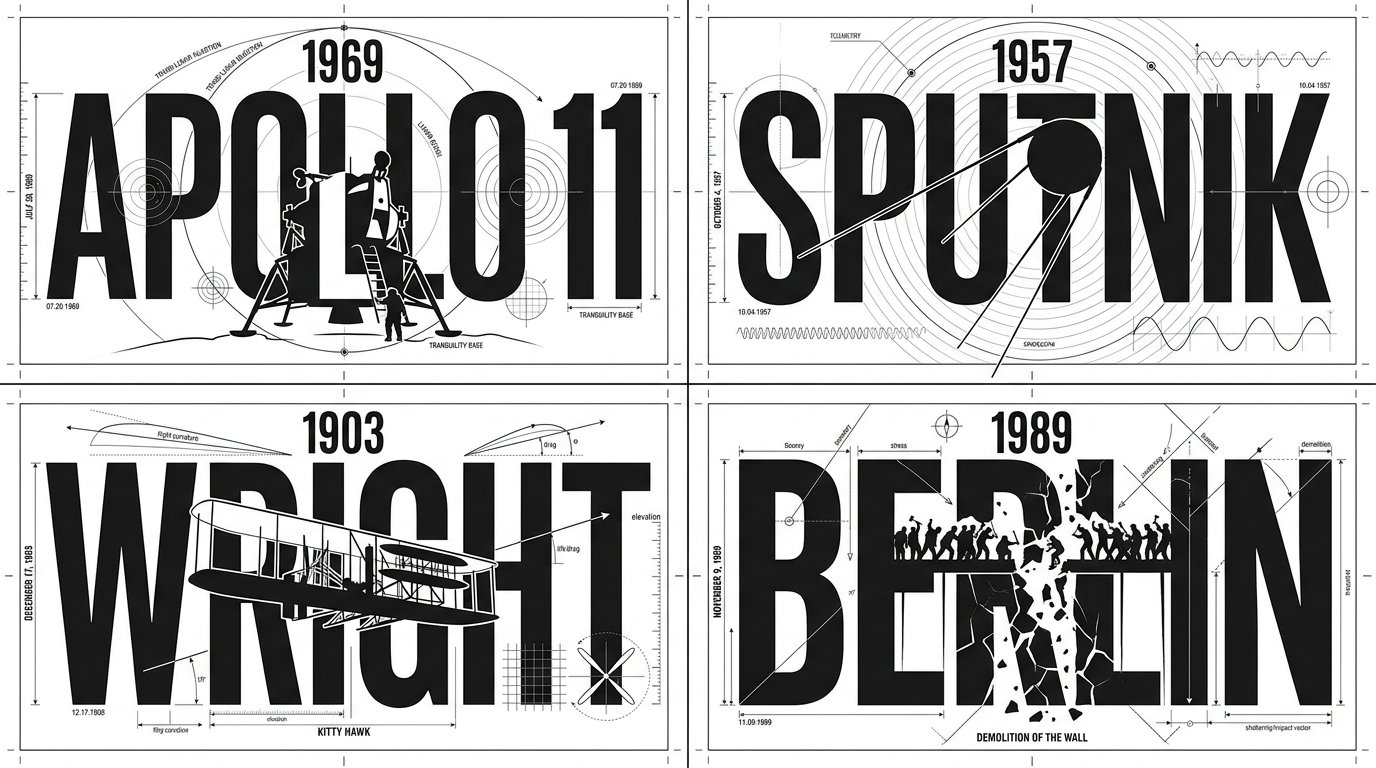
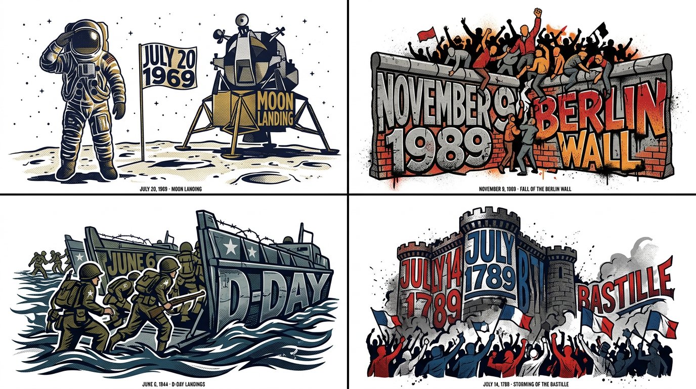
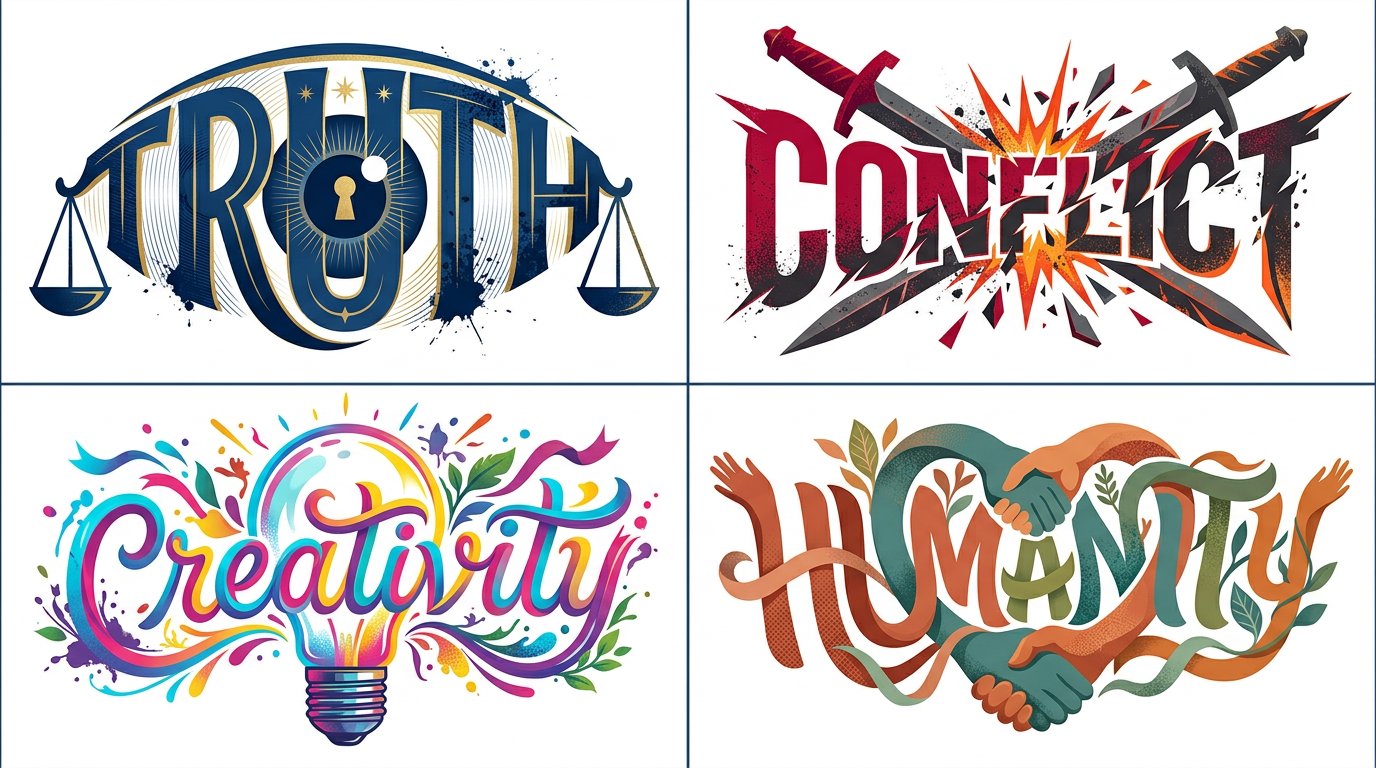
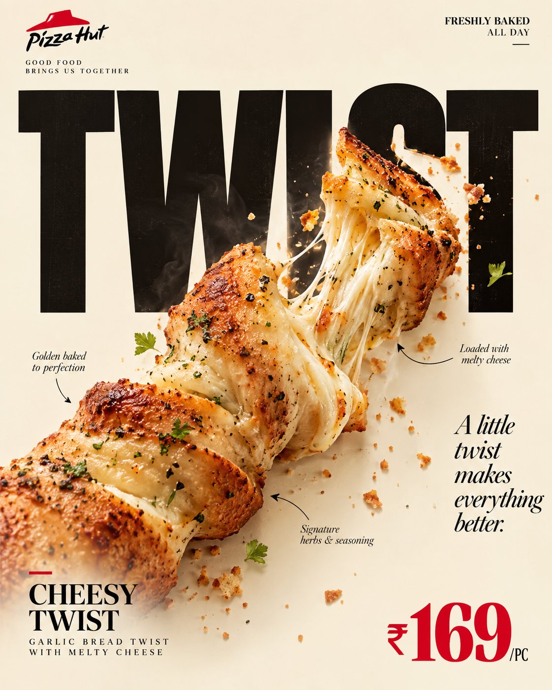
The prompts collected here are tested with their real outputs. Note how many of them treat the lettering as an object with weight and lighting rather than as an overlay.
How to write Typography prompts
- 1Put the exact wording in quotes: a poster reading "NIGHT SHIFT". Quoted strings are treated as literals; paraphrased text gets reinterpreted.
- 2Keep it to one to three words. Legibility falls off sharply with length, and a short line rendered perfectly beats a paragraph rendered approximately.
- 3Give the type a material and a surface — carved into stone, neon tube, embroidered thread, chalk on slate. Material brings lighting and edge behavior with it, which is what makes the letters look real.
- 4Describe the letterforms in plain terms rather than naming fonts: "heavy geometric sans, tight spacing, all caps" works; a specific typeface name usually does not.
- 5Say where the text sits in the composition and what surrounds it: "centered, large, wide margins, nothing else in frame". Type-led designs need the space that makes them read as design.
Frequently asked questions
How do I get AI to spell text correctly in an image?
Put the exact words in quotation marks, keep the string to one to three words, and give the lettering a physical material such as neon, carved stone, or embroidery. Quoting makes the model treat the text as a literal string, and shorter strings have far fewer chances to break.
Can I ask for a specific font?
Naming a typeface rarely works reliably. Describe the letterforms instead — weight, width, whether it is serif or geometric sans, spacing, and case. Those attributes are visible in training data in a way that font names are not.
What makes typography-led images look designed?
Space and a single idea. Large type, wide margins, one or two colors, and nothing competing for attention. Most weak results come from adding decorative elements around text that was already carrying the composition.
![Create a premium, ultra-realistic 3D typography poster featuring the exact word "[YOUR TEXT]", sculp — AI image prompt — GPT Image 2.5](https://cdn.ahaprompt.app/harvest-media/import-1792815457346-tyi46g.jpg)


![A striking top-down art photograph of a famous packaged food/snack from [COUNTRY], placed on a clean — AI image prompt — GPT Image 2.5](https://cdn.ahaprompt.app/harvest-media/import-1791346430372-t49ibf.jpg)
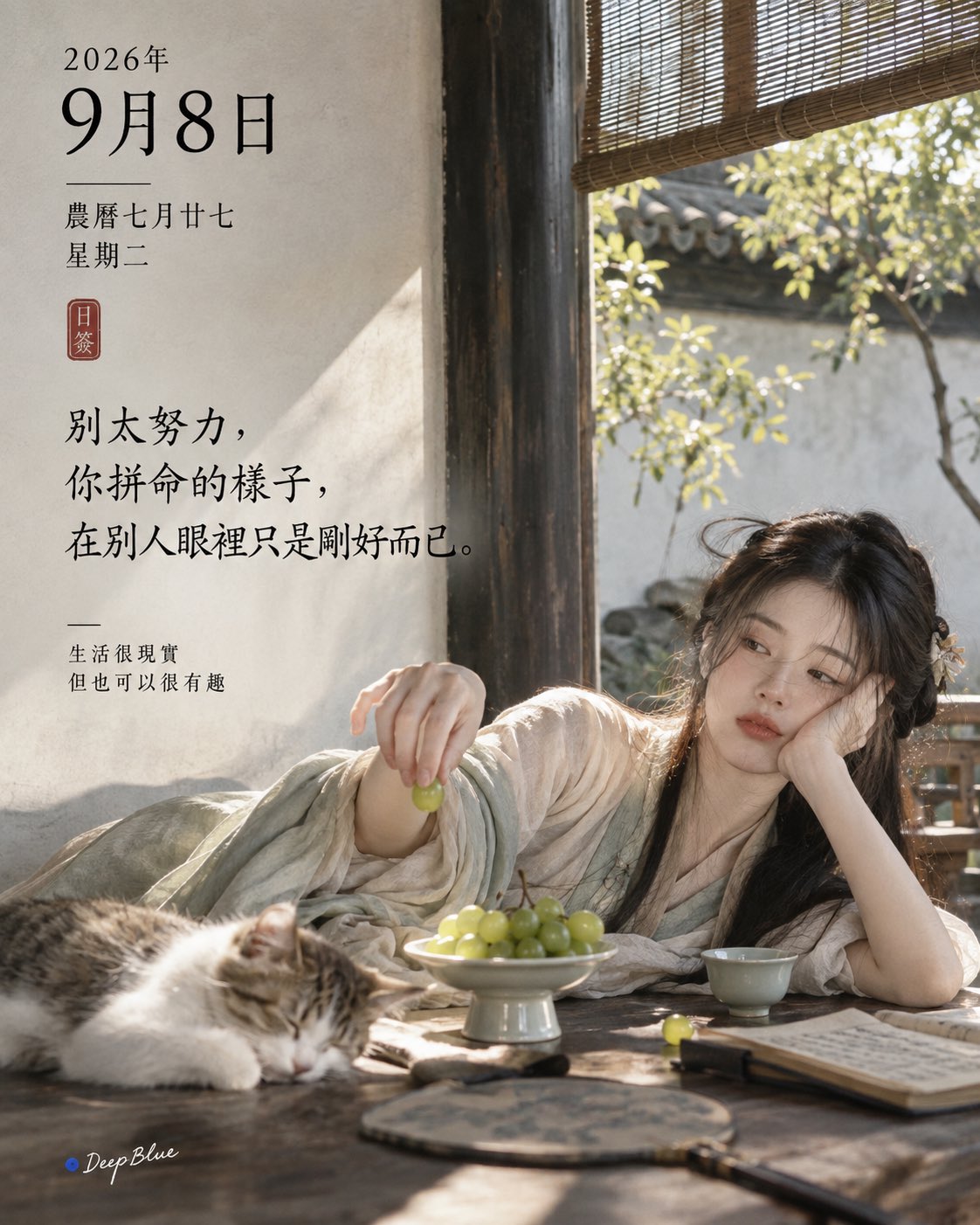
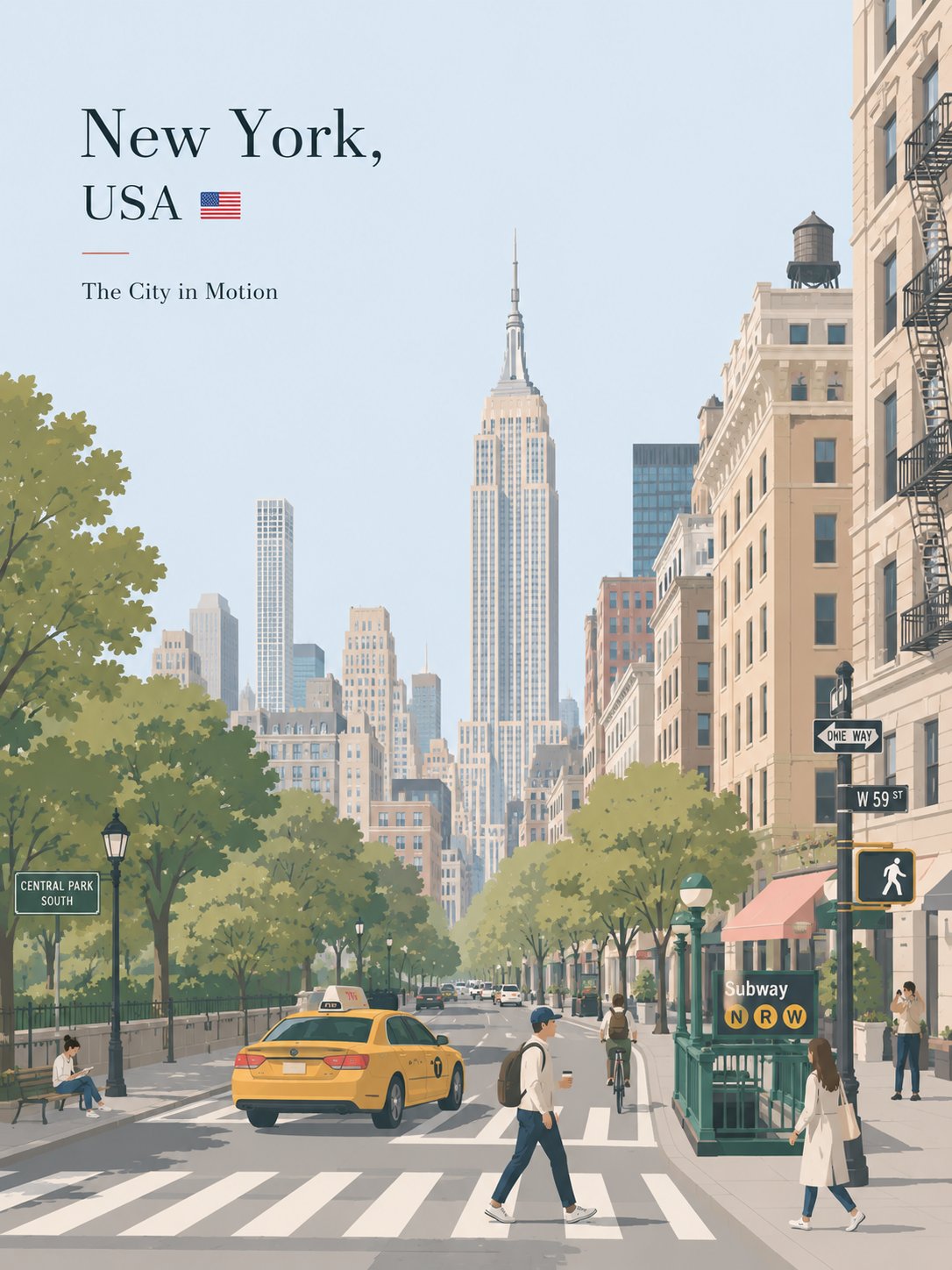
![Create a premium minimalist vintage travel poster for [DESTINATION / CITY, COUNTRY], inspired by cla — AI image prompt — GPT Image 2](https://cdn.ahaprompt.app/harvest-media/import-1787112642905-wdrrwk.jpg)
![CITY = [CITY NAME]
Create a vertical 3:4 minimal fluorescent brush-art travel poster for [CITY] on — AI image prompt — GPT Image 2](https://cdn.ahaprompt.app/harvest-media/import-1786864097798-fz6qbk.jpg)
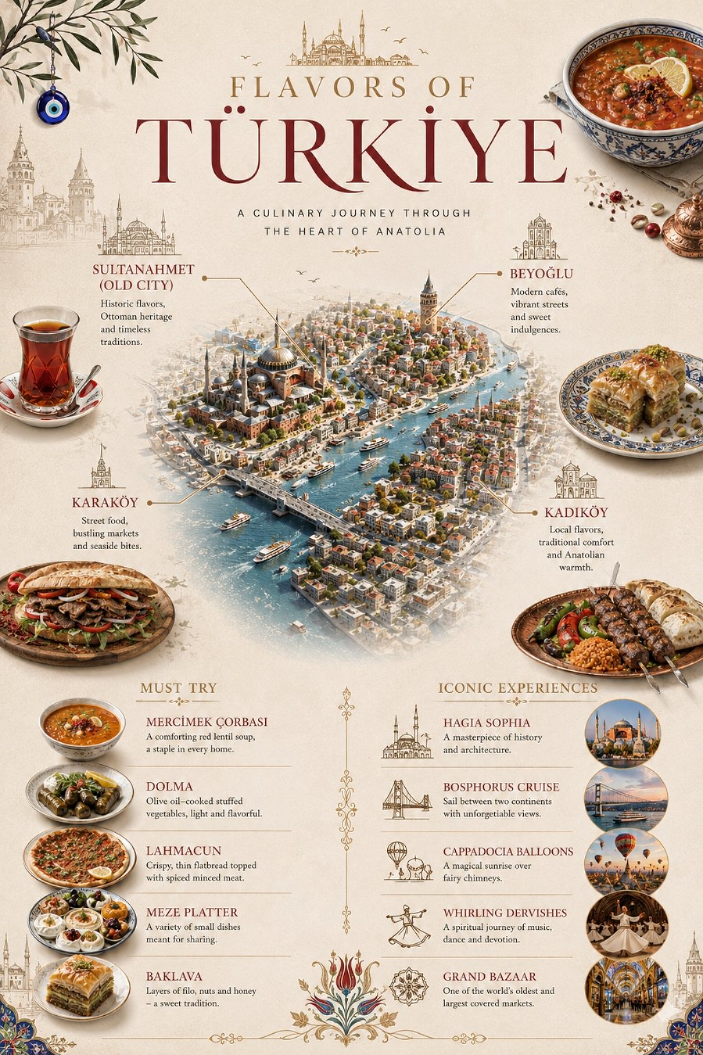
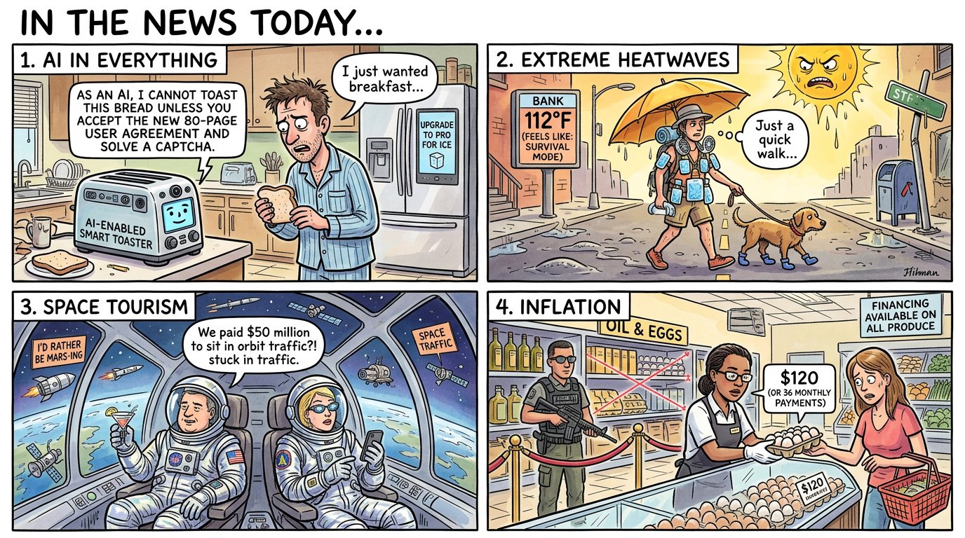
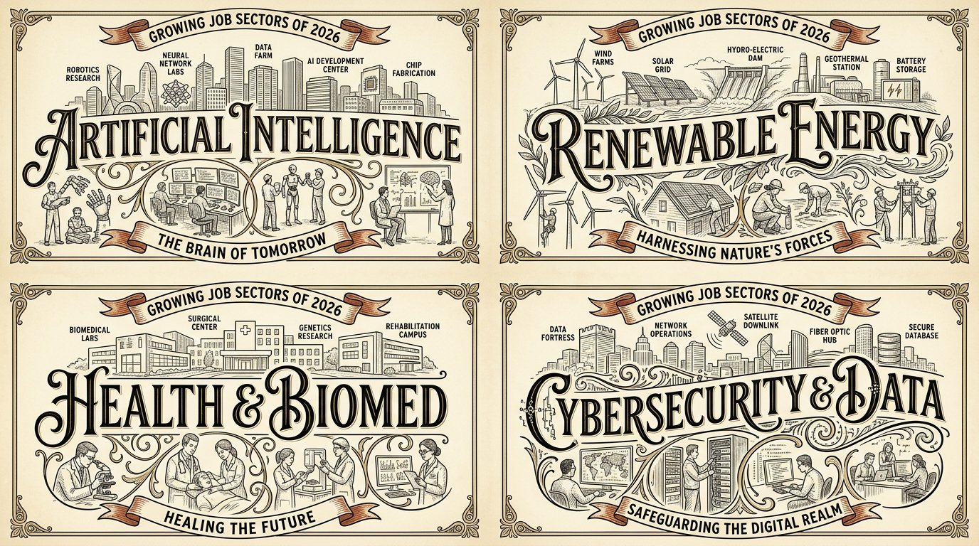
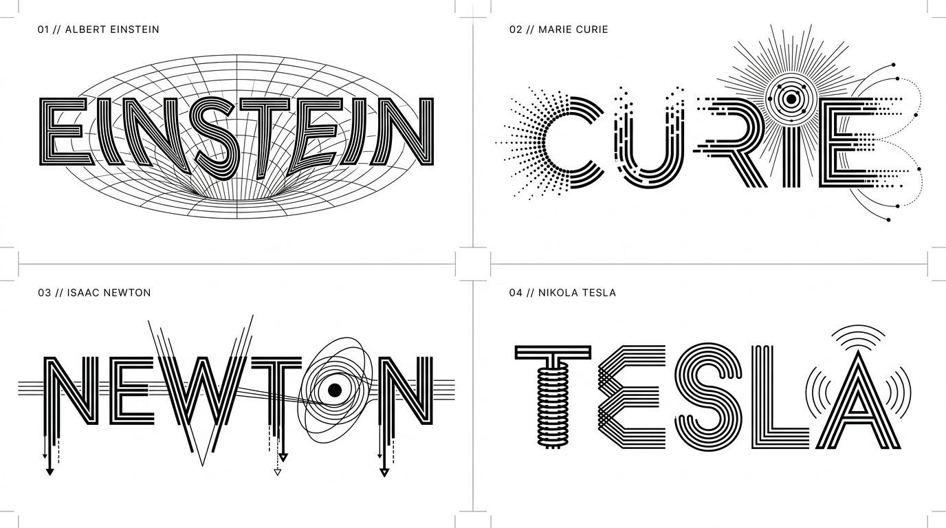
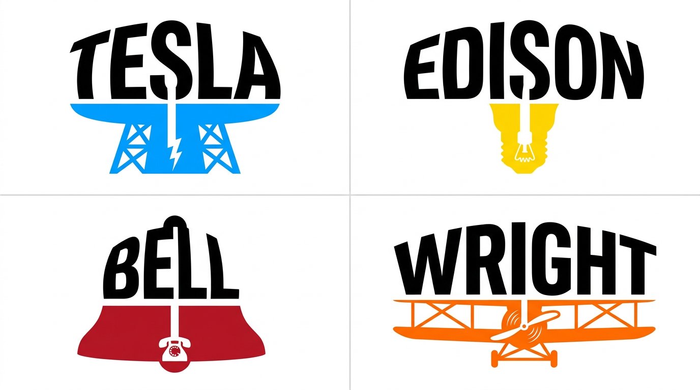
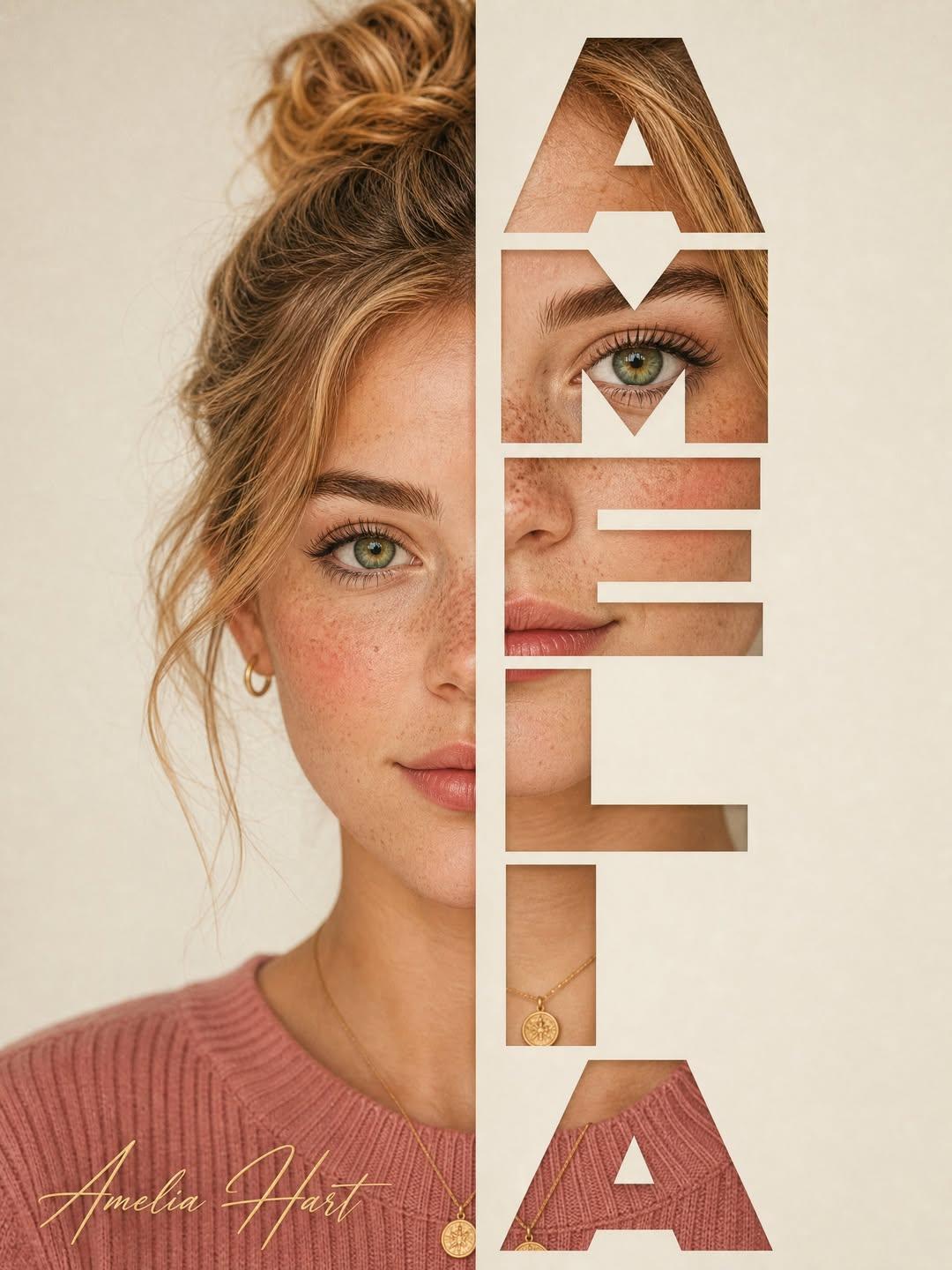
![Design a professional charity bingo event flyer for “[EVENT NAME].”
Create a polished community-eve — AI image prompt — GPT Image 2.5](https://cdn.ahaprompt.app/harvest-media/import-1791086882371-pmgfgg.jpg)
![2x2 grid, 9:16, 4 goat chess players who passed away [SUBJECT] :: single standalone vertical tribute — AI image prompt — GPT Image 2.5](https://cdn.ahaprompt.app/harvest-media/import-1789139801507-ah2jvt.jpg)
![High-contrast black and white typographic portrait poster of [HUMAN], shown in side profile with [FE — AI image prompt — GPT Image 2](https://cdn.ahaprompt.app/harvest-media/import-1787917899128-2kimkm.jpg)
![Vertical editorial collage poster featuring [CHARACTER] in [CLOTHING], full-body cutout positioned a — AI image prompt — GPT Image 2](https://cdn.ahaprompt.app/harvest-media/import-1787306658989-q4lguy.jpg)
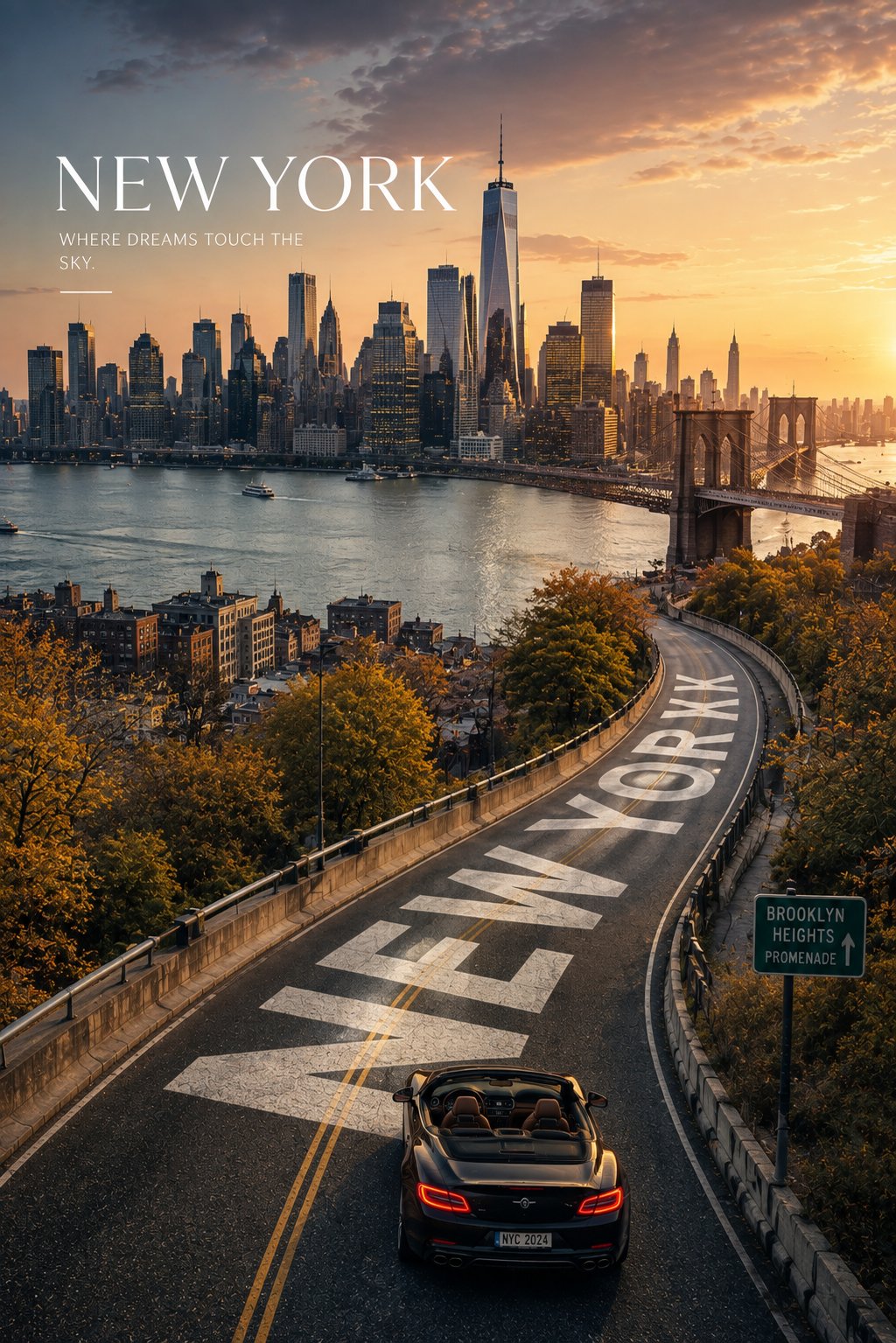
![Create a premium 4:5 vertical vintage travel poster for [CITY], [COUNTRY], designed as an elegant co — AI image prompt — GPT Image 2](https://cdn.ahaprompt.app/harvest-media/import-1786864051441-2ubxb4.jpg)