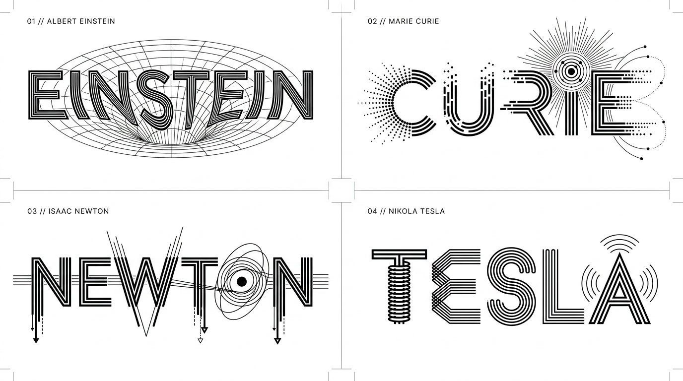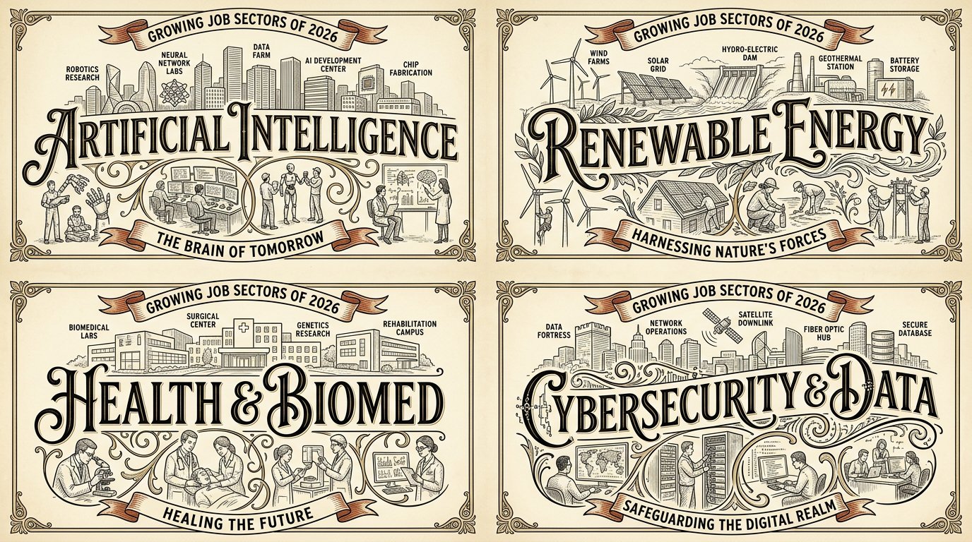
Vintage Wordmark Grid for Job Sectors

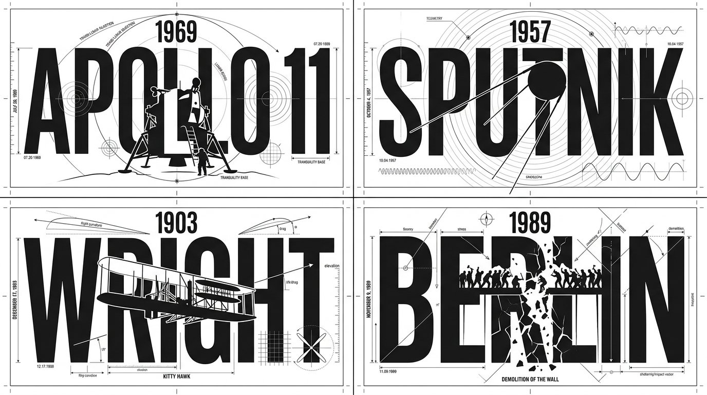
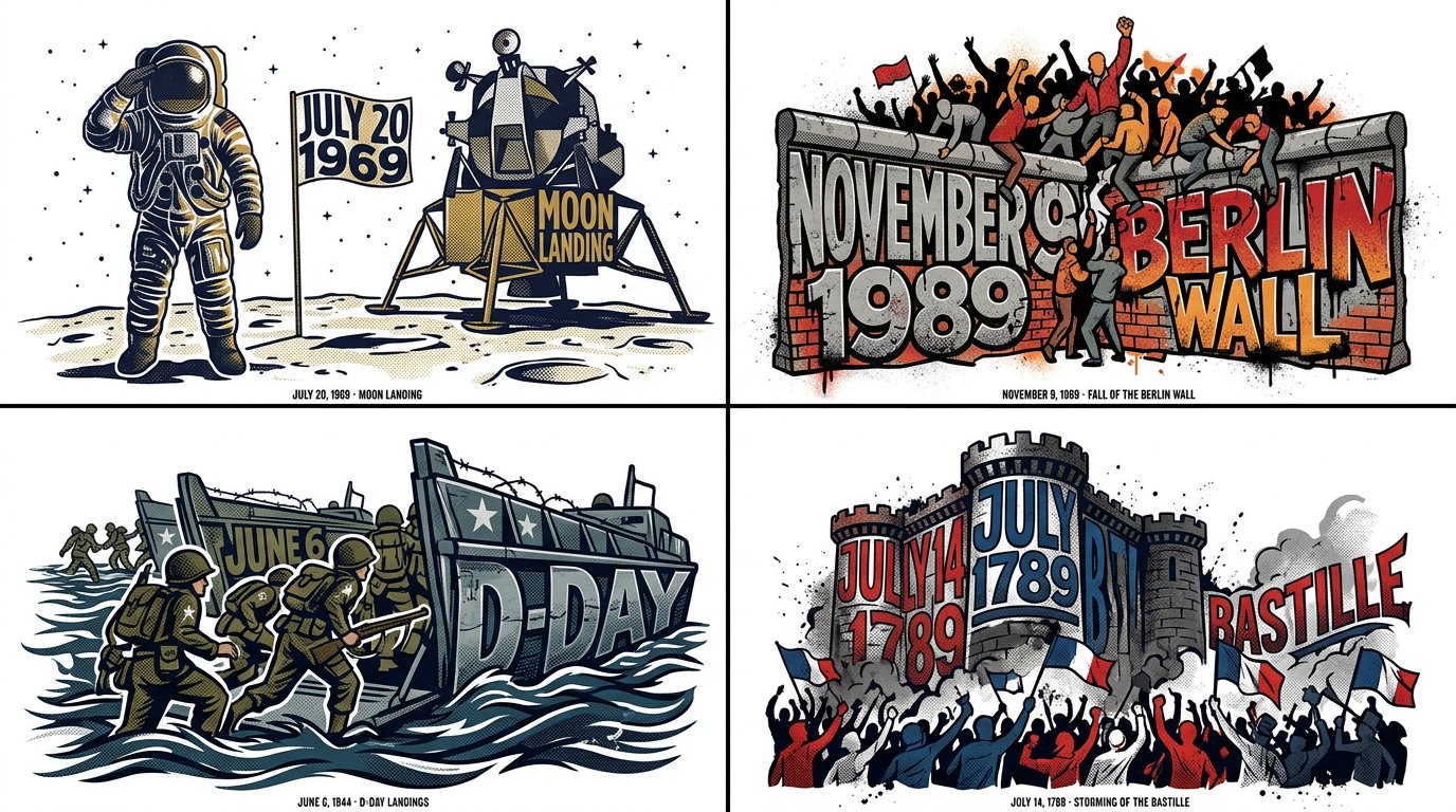
2x2 grid, 16:9, do this for 4 growing job sectors of 2026: W₁ WORDMARK SPINE (master) the place/topic name in giant decorative lettering across the center as the compositional spine; the letters CARRY the scene (landmarks above, life below). ¬W₁ = small title / title detached at top / plain sans. W₂ LABELED LANDMARK SKYLINE ABOVE a line‑drawn skyline of the place's iconic landmarks sitting on/above the wordmark, with small labels naming them. ¬W₂ = no skyline / unlabeled / wrong landmarks / skyline below the word. W₃ STREET‑LIFE VIGNETTES BELOW small vignette scenes of the place's characteristic life (café patrons, painters, dancers, stairs) below/around the wordmark, integrated via the letters' swashes/flourishes. ¬W₃ = no vignettes / vignettes floating detached / generic people. W₄ ERA/CAPTION RIBBONS curved ribbon/banner captions carrying the place's era or tagline. ¬W₄ = no ribbons / straight modern tagline box / lorem. W₅ VINTAGE LIMITED PALETTE + LINE ART fine ink line art on cream with a limited palette (black + gold/tan + ONE accent such as red); vintage print feel. ¬W₅ = full color / photoreal / gradient / dark ground. η HONEST LINE consistent fine line weight, delicate hatching, clean letterforms with decorative swashes. FORBIDDEN = small/detached title · plain sans · no skyline · unlabeled landmarks · no vignettes · detached vignettes · no ribbons · full color · photoreal · dark ground · lorem
Details
- Type
- AI Image Prompts
- Aspect Ratio
- 43:24
- Updated
- Oct 22, 2026
Category
How to use this prompt
- 1Copy the full prompt with the copy button above.
- 2Open Nano Banana 2.1 by Google, or any image generator with a similar style range.
- 3Paste the prompt, then swap the subject and style keywords to match your idea.
- 4Match the example's settings (43:24 · Typography · Infographic · Poster), then iterate — small wording changes shift the output a lot.
Frequently asked questions
Which AI model generated this image?
This image was generated with Nano Banana 2.1 by Google. The prompt on this page is the exact text used to create it.
What settings does this prompt use?
The example was generated with Nano Banana 2.1 using: 43:24 · Typography · Infographic · Poster. Reusing these settings gives the closest match.
How do I get similar results?
Copy the prompt as-is first, then replace only the subject while keeping the style, lighting, and composition keywords. Generate a few variations — outputs differ between runs.
Can I modify this prompt?
Yes. Prompts work best as starting points — adjust descriptors, aspect ratio, or style tags to make the output your own.