LogoAhaPrompt
  • Prompts
  • Featured
  • Models
  • Submit
  • Blog
AhaPromptAhaPrompt

AI Prompts for Images, Video & Audio — Every Model, One Library

Built withLogoNEXTY.DEV
Explore
  • All Prompts
  • Featured Prompts
  • Image Prompts
  • Video Prompts
  • Audio Prompts
  • AI Models
  • Submit a Prompt
  • Blog
Languages
  • English
  • 中文
  • 日本語
  • 한국어

Copyright © 2026 AhaPrompt All rights reserved.

Privacy PolicyTerms of Service
HomeAI Prompt LibraryAI Image PromptsLuxury Fragrance Poster With Translucent Flower
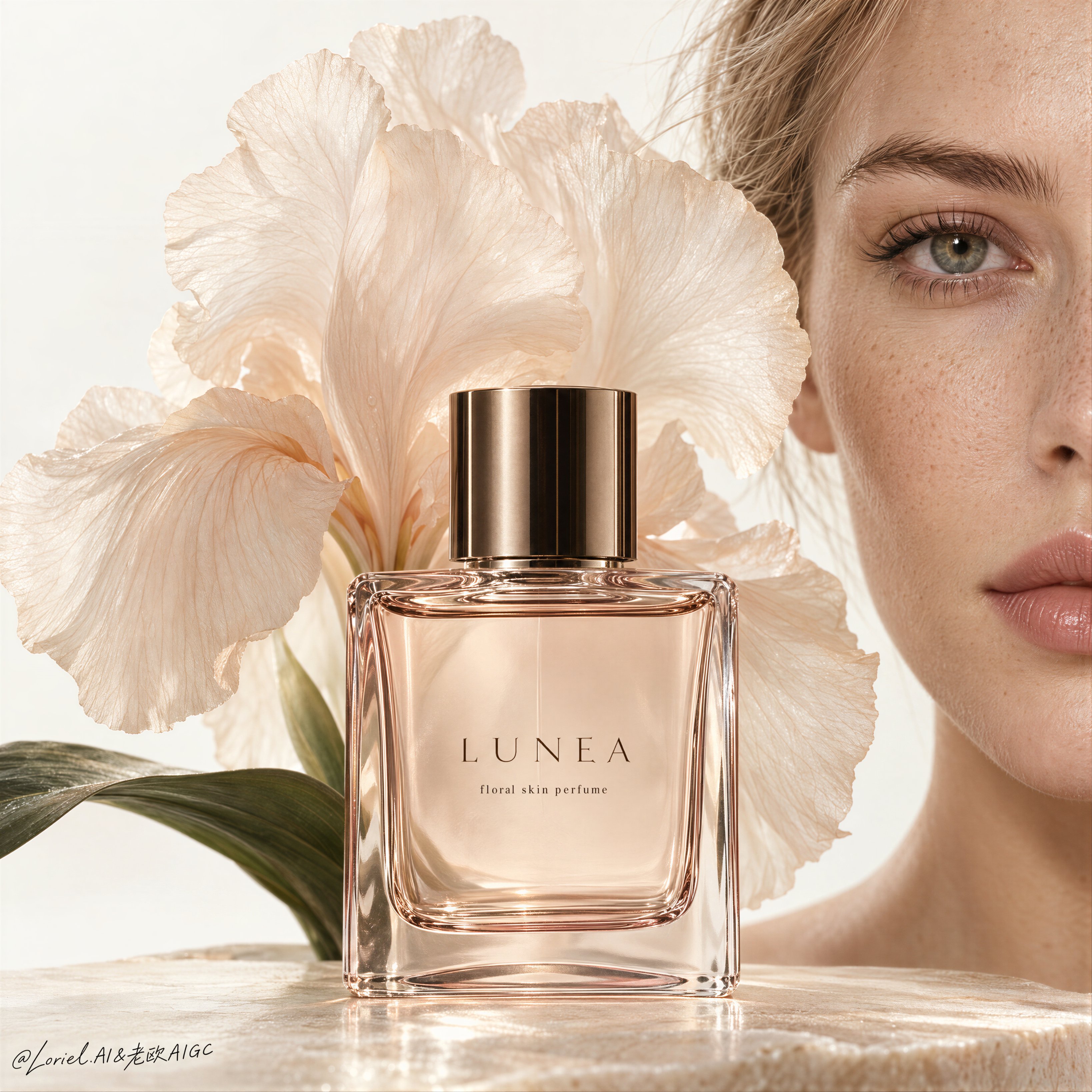
Luxury Fragrance Poster With Translucent Flower — AI image prompt — GPT Image 2.5 — Product Photography, Advertising, Minimalist

Luxury Fragrance Poster With Translucent Flower

OpenAIGPT Image 2.5OpenAIimage

A luxury fragrance poster for fictional perfume house LUNEA, merging emotional intimacy, material precision, and curatorial minimalism into one unified image. Preserve the exact beauty-editorial structure: a clean high-key off-white background, the right half of an adult Western white girl’s face filling the right edge, a central rectangular perfume bottle in the lower middle foreground, and a large soft translucent flower blooming behind and slightly above the bottle like visible scent. The bottle is the absolute visual leader, while the face and flower act as quiet amplifiers. Use a tight front-facing close-up with strong negative space, calm vertical balance, and refined still-life discipline. The girl is photoreal, adult, naturally proportioned, anatomically correct, with realistic pale skin, visible freckles, subtle pores, natural lips, soft peach undertones, clean brows, natural lashes, and a serene neutral expression. Only half her face is visible on the right edge, vertically cropped, with one eye clearly readable and softly aligned with the bottle. Her skin must feel alive and real, never plastic or over-retouched. The perfume bottle is original and highly premium: transparent rectangular glass with warm blush-tinted edges, pale champagne-rose liquid inside, crisp beveled corners, refined thickness, subtle inner reflections, and a polished cylindrical cap in dark bronze or smoked gold. The label system is minimal and English only: brand mark “LUNEA” centered on the bottle, with one tiny support line such as “floral skin perfume”. Typography on the bottle is thin, luxurious, restrained, and perfectly spaced. The bottle sits large and centered, sharply lit, with clean readable edges and high-end cosmetic realism. Behind the bottle, place one large soft flower with broad translucent petals in a warm ivory-peach tone, like an iris or couture silk bloom, opening outward as a scent halo. The petals are delicate, semi-translucent, softly backlit, with fine veining, gentle curvature, and organic overlap. Add one or two dark green leaves near the lower left base for quiet balance, but keep them minimal and secondary. The flower should feel partly botanical, partly couture fabric, reinforcing softness and rarity without overpowering the bottle. Lighting is refined, soft, and sculptural: a large diffused frontal key with slight side direction, subtle warm sunlight character, clean highlights on the glass shoulders and cap, soft transmission through the liquid, delicate rim separation on the petals, and smooth facial modeling without harsh contrast. Keep the image clean, luminous, and free of dirty shadows or visual noise. Color hierarchy: 60% warm ivory, cream, and pale skin tones, 30% blush glass and soft peach floral tones, 10% dark bronze cap and deep green leaf accents. Materials must feel hyperreal and tactile: glass refraction, polished metal, translucent petals, living skin texture, and premium editorial print finish. If external typography is used, keep it minimal and distant, such as one short elegant line like “Quiet Bloom” or “Skin of Light”, placed far from the bottle and face with a tiny LUNEA wordmark. If it weakens the stillness, omit the external headline and let the bottle typography carry the image. The final result should feel like Orbit, Transit, and Port fused together: intimate, materially exact, globally refined, and rare. No copied branding, no extra objects, no muddy shadows, no warped bottle geometry, no broken label text, no distorted facial anatomy, no over-smoothed skin, no dirty background, no clutter.

Details
Type
AI Image Prompts
Aspect Ratio
1:1
Updated
Oct 2, 2026
Category
Product PhotographyAdvertisingMinimalist
Source

How to use this prompt

  1. 1Copy the full prompt with the copy button above.
  2. 2Open GPT Image 2.5 by OpenAI, or any image generator with a similar style range.
  3. 3Paste the prompt, then swap the subject and style keywords to match your idea.
  4. 4Match the example's settings (1:1 · Product Photography · Advertising · Minimalist), then iterate — small wording changes shift the output a lot.

Frequently asked questions

Which AI model generated this image?

This image was generated with GPT Image 2.5 by OpenAI. The prompt on this page is the exact text used to create it.

What settings does this prompt use?

The example was generated with GPT Image 2.5 using: 1:1 · Product Photography · Advertising · Minimalist. Reusing these settings gives the closest match.

How do I get similar results?

Copy the prompt as-is first, then replace only the subject while keeping the style, lighting, and composition keywords. Generate a few variations — outputs differ between runs.

Can I modify this prompt?

Yes. Prompts work best as starting points — adjust descriptors, aspect ratio, or style tags to make the output your own.
More GPT Image 2.5 prompts

Create a Cannes-level travel destination advertising poster for TURKIYE, preserving the exact struct — AI image prompt — GPT Image 2.5
OpenAIGPT Image 2.5
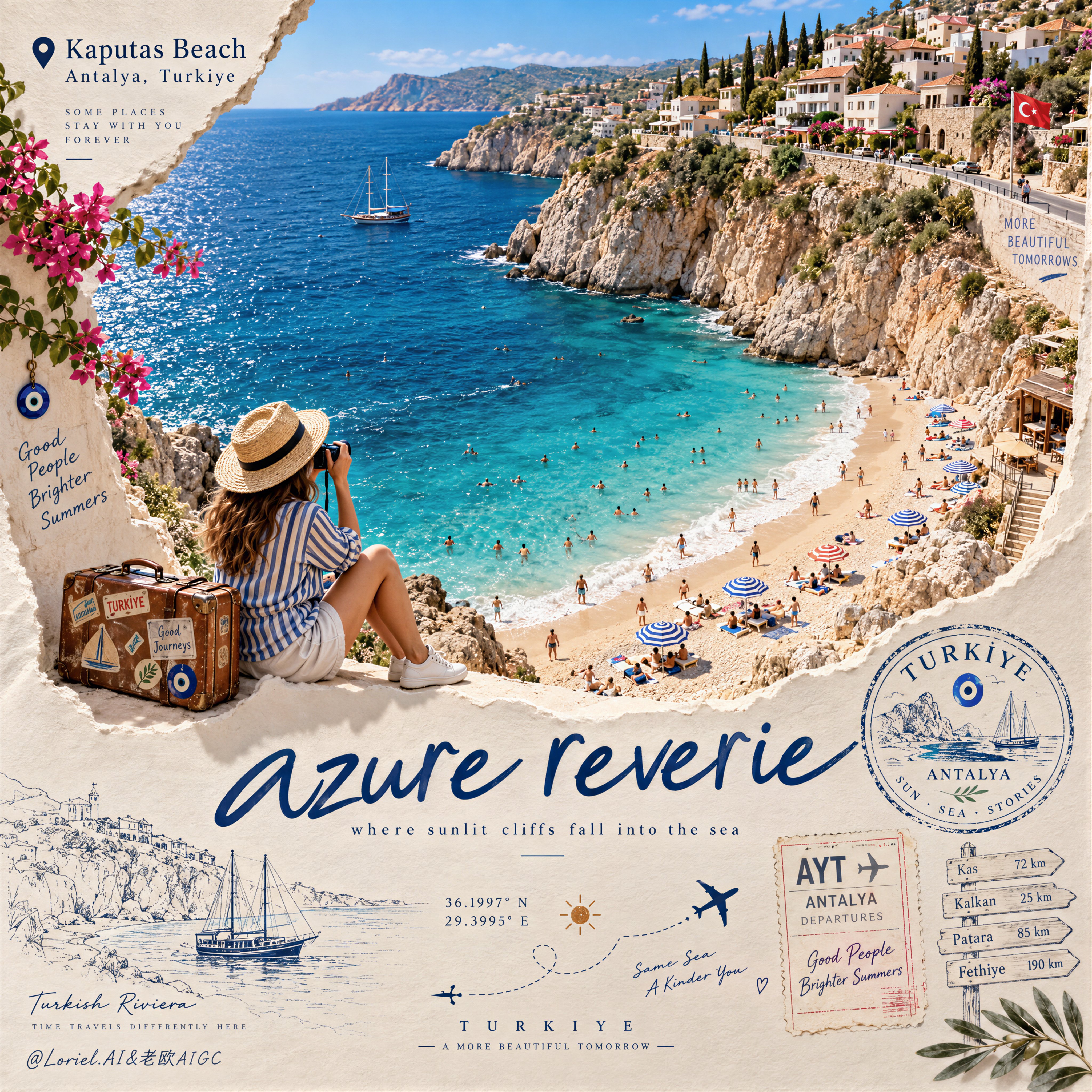
Create a Cannes-level travel destination advertising poster for TURKIYE, preserving the exact structural logic of a premium paper-sculpture tourism print while merging emotional summer atmosphere with forensic material realism. The composition is vertical and built around one large curved torn-paper window that reveals a luminous handcrafted miniature view of KAPUTAS BEACH, ANTALYA, TURKIYE, while the lower foreground remains a refined cream paper field carrying elegant destination typography, travel stamps, route sketches, coordinates, and curated tourism graphics. The final image must feel like a collector-grade Mediterranean travel memory object: tactile, sun-warmed, cinematic, and exquisitely constructed. Hero destination scene: inside the curved paper opening, reveal a radiant turquoise cove embraced by pale limestone cliffs and a gently arcing golden beach. Show layered Mediterranean water bands shifting from pale aqua near the shore to saturated teal and deep azure farther out, with delicate repeating wave lines and bright foam edges rolling onto the sand. Populate the beach with tiny yet believable sunbathers, swimmers, striped parasols, towels, and scattered leisure details, all proportionally correct and integrated into the scene. Along the upper horizon, build a densely stepped hillside of whitewashed and pastel coastal houses, terracotta roofs, boutique balconies, cypress trees, and warm stone terraces, arranged like a refined miniature Mediterranean village. The entire destination window must feel like a luxury handcrafted 3D diorama enhanced with highly realistic micro-surface detail. Narrative foreground: on the lower edge of the cutout, place one seated miniature traveler figure as an emotional invitation into the destination. The traveler wears elegant striped resort clothing, a straw hat, white sneakers, and holds a camera, beside a small vintage suitcase covered in tasteful travel stickers. The anatomy, hands, posture, and clothing folds must be natural and correct. This figure should feel quietly alive, as if pausing at the threshold of memory, adding warmth and human scale without competing with the destination itself. Typography and editorial layout: preserve the same poster rhythm as the reference. At the upper left, place a small map-pin icon followed by “Kaputas Beach” and beneath it “Antalya, Turkiye” in refined editorial type. On the lower paper field, place one large flowing handwritten English title in deep Mediterranean blue, such as “azure reverie”, followed by a small subtitle like “where sunlit cliffs fall into the sea”. Distribute a few highly curated travel graphics across the lower area: one circular passport-style destination stamp, one boarding-pass or visa-stamp element, one dotted flight-path doodle with tiny airplane icons, precise latitude-longitude coordinates, a small sun glyph, a fine-line coastal sketch, and one discreet signpost marking nearby destinations. All typography must feel elegant, airy, and graphically integrated, never generic, heavy, or cluttered. Turkey-specific accents: add subtle premium local cues with restraint. Integrate a tiny evil-eye motif into one stamp or baggage sticker, a delicate line illustration of a gulet sailboat or coastal architectural silhouette in the lower graphics, and visual cues that suggest refined Turkish Riviera identity without becoming folkloric or overloaded. Everything should feel international, luxurious, and compositionally clean. Atmosphere: the poster should carry the sensation of late-morning Mediterranean light, salt in the air, and the emotional softness of an unforgettable summer coast remembered through beautifully crafted paper. The sea must feel alive and breezy, the sky fresh and expansive, and the destination window should radiate optimism, escape, and warmth. The image should feel like a tactile travel keepsake elevated into a world-class advertising object. Material realism: emphasize thick layered paper edges, crisp cut contours, matte card texture, embossed shadow transitions, tiny architectural facade details, miniature umbrellas, foam ridges, cliff stratification, printed stamp ink, luggage leather grain, sticker gloss, clothing fabric weave, and precise micro-scale beach props. The sea should have dimensional depth without losing the handcrafted paper language. The paper opening must cast believable soft shadows onto the lower field, and every surface should read as physically buildable, premium, and photographically convincing. Lighting: use bright Mediterranean daylight from the upper left with soft clean shadows that enhance the paper relief and miniature depth. The waves, parasols, rooftops, cliffs, and traveler should receive warm, luminous highlights. The lower paper field remains softly lit with subtle shadowing from the cut edge, stamps, and seated figure, producing a polished museum-quality commercial finish. Avoid harsh contrast, dull flatness, or dirty shadow masses. Color hierarchy: 60% luminous turquoise, aqua, pale sand, sun-bleached ivory, and clear coastal sky blue; 30% terracotta roof tones, limestone beige, sage-green foliage, and soft neutral ink tones; 10% deep navy typography, warm suitcase browns, and small accent colors from parasols and travel graphics. The palette must feel fresh, upscale, joyful, and unmistakably Mediterranean. Design intent: the final image must preserve the reference’s exact logic of a
Details
Create a refined, high-end PHOTO + MINIMAL WATERCOLOR VIGNETTE artwork based entirely on the uploade — AI image prompt — GPT Image 2.5
OpenAIGPT Image 2.5
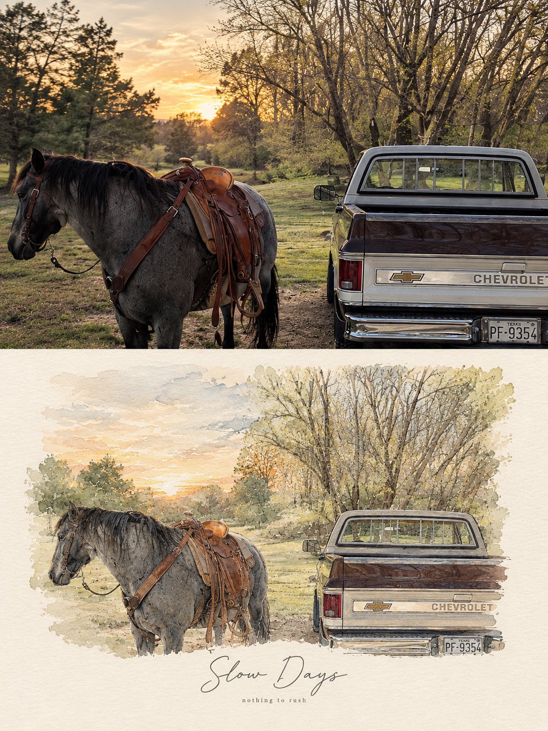
Create a refined, high-end PHOTO + MINIMAL WATERCOLOR VIGNETTE artwork based entirely on the uploaded photograph. Use the photograph as the only visual reference and preserve the exact subject, composition, environment, clothing, objects, lighting, colors, and mood. FORMAT: Vertical 3:4 editorial composition. TOP SECTION — ORIGINAL PHOTOGRAPH: Place the original photograph in the upper 55–60% of the canvas. Keep it photorealistic and naturally detailed. Do not alter the identity, pose, proportions, objects, architecture, scenery, or important visual details. Give it a subtle premium editorial photography finish with natural cinematic light and gentle tonal balance. BOTTOM SECTION — HAND-PAINTED INTERPRETATION: Transform the same exact scene into a delicate minimal watercolor and fine-ink illustration. Recreate the main subject, pose, perspective, key objects, and recognizable background elements from the photograph. Use loose watercolor washes, subtle pencil/ink outlines, imperfect hand-painted edges, soft paper texture, and restrained pastel tones. Keep the illustration airy, elegant, and slightly imperfect rather than digitally polished. The illustration should feel like a fashion/lifestyle magazine sketchbook page, with plenty of clean negative space and a warm off-white textured paper background. Do not introduce new subjects or details. TYPOGRAPHY: Add a short elegant handwritten brush-script phrase underneath or integrated naturally into the illustrated section, similar to a premium lifestyle editorial poster. Underneath it, add a tiny minimalist lowercase serif/sans-serif subtitle. Typography should be subtle, sophisticated, thin, and balanced with the artwork. AESTHETIC: Scandinavian editorial design, quiet luxury, nostalgic travel journal, soft watercolor, delicate ink drawing, handmade paper texture, muted natural palette, sophisticated minimalism, emotional storytelling, premium art-book layout. IMPORTANT: The photograph and illustration must clearly represent the same exact moment and scene. No collage of unrelated images, no dramatic redesign, no excessive watercolor, no cartoon appearance, no heavy outlines, no saturated colors, no clutter. Output: photorealistic upper section + matching delicate watercolor illustration below, seamless premium editorial composition, vertical 3:4, high detail. For different photos, just change the text phrase Examples: •Good Days — a kinder me •Better Together — same window, same silence •Little Moments — worth remembering •Slow Days — nothing to rush •Somewhere Quiet — just for a while •Golden Hours — softly remembered
Details
Create an ultra-premium Instagram social media campaign poster for Maersk that looks like an officia — AI image prompt — GPT Image 2.5
OpenAIGPT Image 2.5
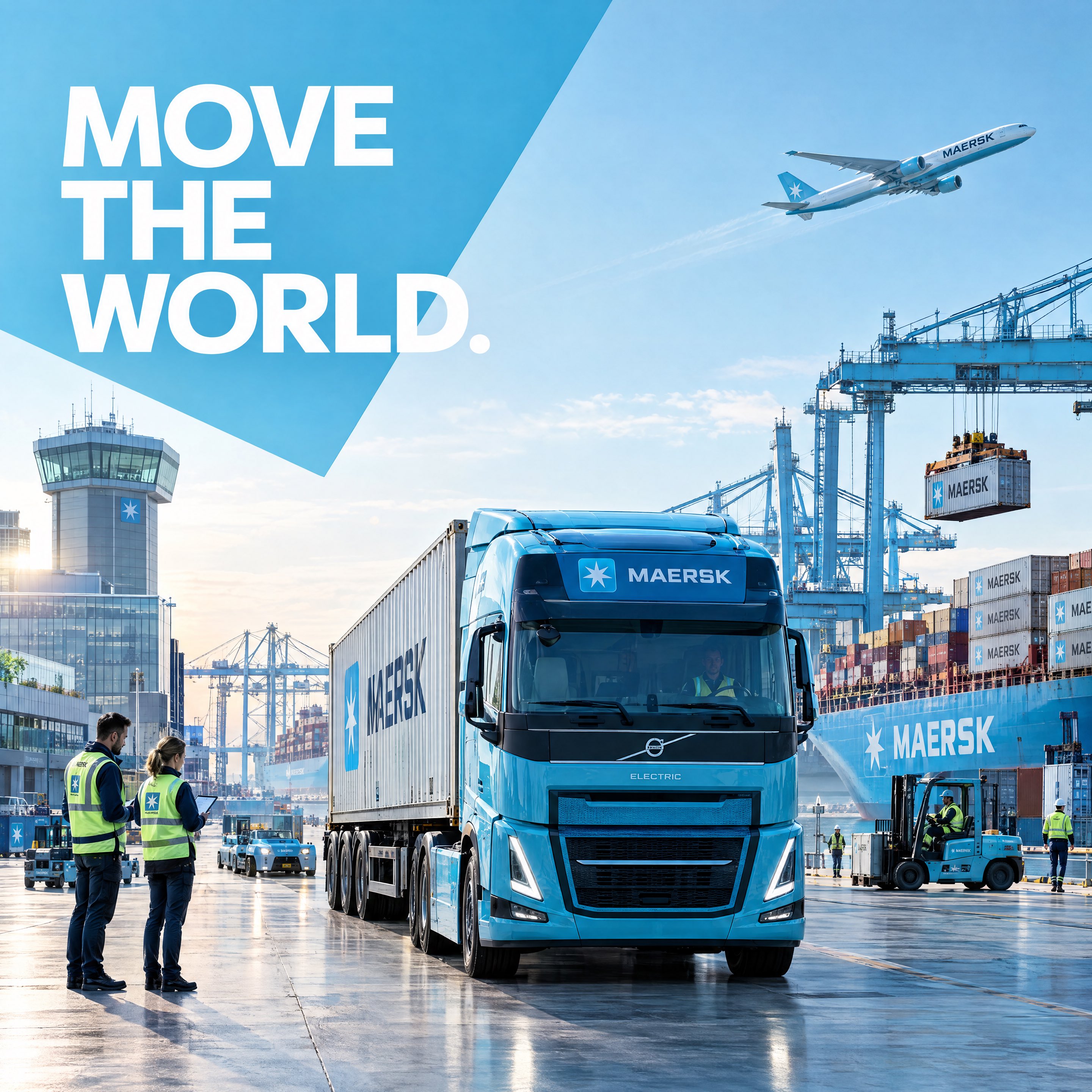
Create an ultra-premium Instagram social media campaign poster for Maersk that looks like an official global brand campaign designed by Pentagram, AKQA, or DesignStudio for Behance and Cannes Lions. Aspect ratio 4:5 vertical, 8K ultra-high resolution, hyper-realistic commercial advertising, premium editorial composition, Scandinavian minimalist design language, bold corporate branding, clean visual hierarchy, generous negative space. Scene: A massive modern Maersk logistics hub at sunrise. In the foreground, a pristine Maersk-blue electric container truck drives confidently toward the camera from a premium logistics terminal. The truck is loaded with an official Maersk shipping container featuring the authentic Maersk star logo and corporate blue livery. The vehicle is positioned in a dramatic front three-quarter perspective, becoming the visual hero of the composition. Behind it, a state-of-the-art container terminal is alive with activity. Giant ship-to-shore cranes lift containers with precision, automated guided vehicles move seamlessly through the yard, and neatly stacked Maersk containers create a strong geometric rhythm. In the distance, an enormous Maersk container vessel is docked at the terminal with hundreds of containers onboard. Above the horizon, a modern cargo aircraft climbs into the sky, completing the end-to-end logistics story from sea to air. Human presence adds life to the campaign: logistics managers in safety helmets reviewing operations on digital tablets, crane operators coordinating container movement, forklift operators transporting cargo, dock workers inspecting containers, all captured naturally without looking at the camera. Every action feels authentic, creating a living industrial ecosystem rather than a staged corporate photo. The environment is clean, engineered and premium, inspired by Scandinavian industrial architecture with polished concrete, glass control towers, organized container stacks, calm ocean water, crisp blue skies and subtle atmospheric haze. The entire logistics hub feels efficient, sustainable and technologically advanced. The composition is bold and highly graphic. Oversized white negative space balances the industrial scene. Massive editorial typography reading “MOVE THE WORLD.” integrates into the architecture, partially overlapping containers without hiding important subjects. Thin technical grid lines, subtle route graphics, coordinate markers and minimal logistics-inspired design elements reinforce Maersk's engineering precision. Large Maersk-blue geometric panels anchor the composition, creating a modern corporate visual system without clutter. Colour palette: authentic Maersk Blue (#42B0D5), pure white, soft concrete grey, steel grey, deep ocean blue with restrained safety yellow accents. Scandinavian minimalism, clean contrast, premium corporate aesthetic. Lighting: bright natural morning daylight, soft diffused sunlight, realistic reflections on painted metal, shipping containers, truck bodywork and glass architecture, crisp atmospheric depth, premium commercial automotive and industrial photography. Captured on a Phase One XF IQ4 150MP medium-format camera with a Schneider Kreuznach 55mm lens, ultra-high dynamic range, razor-sharp details, realistic container textures, steel surfaces, tyre rubber, glass reflections, painted metal, subtle wear, authentic industrial materials, natural human skin texture and premium color science. The final image should feel like the hero cover of a Behance case study for Maersk's global integrated logistics campaign—modern, bold, clean, highly designed, unmistakably premium, and instantly recognizable as an official Maersk social media advertisement.
Details
Create a premium minimalist automotive editorial poster in a vertical 3:4 composition.

A classic bo — AI image prompt — GPT Image 2.5
OpenAIGPT Image 2.5
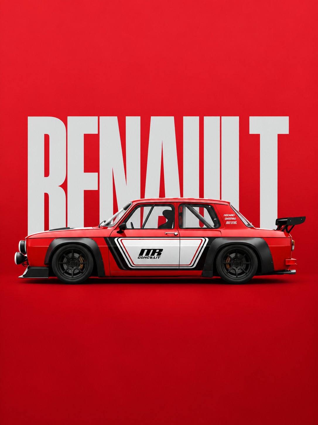
Create a premium minimalist automotive editorial poster in a vertical 3:4 composition. A classic boxy red rally racing sedan is shown in a clean full side profile, centered horizontally across the lower-middle portion of the frame. The car has a low, wide racing stance, box-shaped vintage body, glossy deep red paint, black wide fender extensions, black multi-spoke racing wheels, low-profile tires, front racing bumper, auxiliary round headlights, side exhaust details, roll cage visible through the windows, racing bucket seats, and a large black rear racing spoiler. The car should look like a professionally prepared vintage touring or rally race car, with realistic mechanical details, sharp body lines, subtle reflections, realistic rubber and metal textures, and high-end studio lighting. The car features a white and black geometric racing livery across the doors and lower body. Include a bold black racing number/logo style graphic on the door, with small technical racing text and decals. Keep the graphics clean, symmetrical, and authentic to motorsport design. Background: a completely flat, intense crimson-red studio backdrop with a subtle tonal gradient and very soft floor transition. Behind the car, place enormous bold condensed uppercase white typography reading “RENAULT”, positioned vertically centered in the upper and middle background. The typography should be partially hidden by the car, creating a strong layered poster composition. Use a heavy condensed sans-serif racing/editorial font. Composition: • Vertical 3:4 poster • Large empty red negative space above the car • Huge “RENAULT” text occupying most of the background width • Car centered around the lower-middle section • Full vehicle visible from front bumper to rear spoiler • Perfect clean side profile • Minimal visual clutter • Strong horizontal balance • Premium automotive advertising aesthetic Lighting: soft controlled studio lighting from above and slightly from the front, producing realistic highlights along the red bodywork and subtle shadows underneath the vehicle. Add a soft contact shadow beneath the tires without making the scene dramatic. Style: high-end automotive campaign photography, minimalist Swiss-inspired editorial poster design, vintage motorsport aesthetic, modern luxury advertising, photorealistic vehicle rendering, extremely clean composition, sharp details, realistic materials, subtle film grain. Color palette: intense crimson red background, bright white typography and livery, deep black wheels and aerodynamic parts, small neutral gray mechanical details. No people, no road, no city, no scenery, no extra vehicles, no unnecessary objects, no excessive reflections, no distorted wheels, no perspective distortion, no cropped car, no messy typography. Ultra-realistic, crisp, professional automotive photography, high detail, 8K quality.
Details
A sweet fun kids footwear advertisement poster. An adorable young girl age 7 with a big smile in a s — AI image prompt — GPT Image 2.5
OpenAIGPT Image 2.5
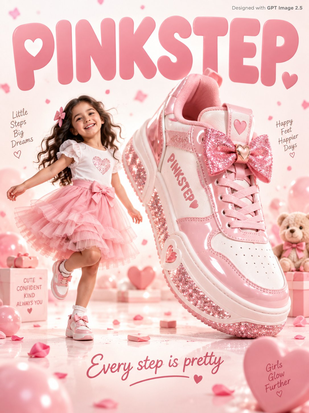
A sweet fun kids footwear advertisement poster. An adorable young girl age 7 with a big smile in a soft pink tulle skirt and white top skips joyfully beside a giant pink and white sneaker 3x her height with a glittery sole and bow detail on the tongue, "PINKSTEP" written in soft rose font on the sneaker side. Warm white and blush pink gradient studio background with soft pink confetti petals and tiny hearts floating gently. Friendly rounded soft typography "PINKSTEP" in blush pink filling the warm white background. Tagline bottom in rose: "Every step is pretty." Small text top-right corner reads "Designed with GPT Image 2.5" in grey. Photorealistic, sweet kids footwear commercial, soft warm white pink studio lighting.
Details
A premium stadium-food poster for fictional snack brand NETBITE, merging emotional impact, material  — AI image prompt — GPT Image 2.5
OpenAIGPT Image 2.5
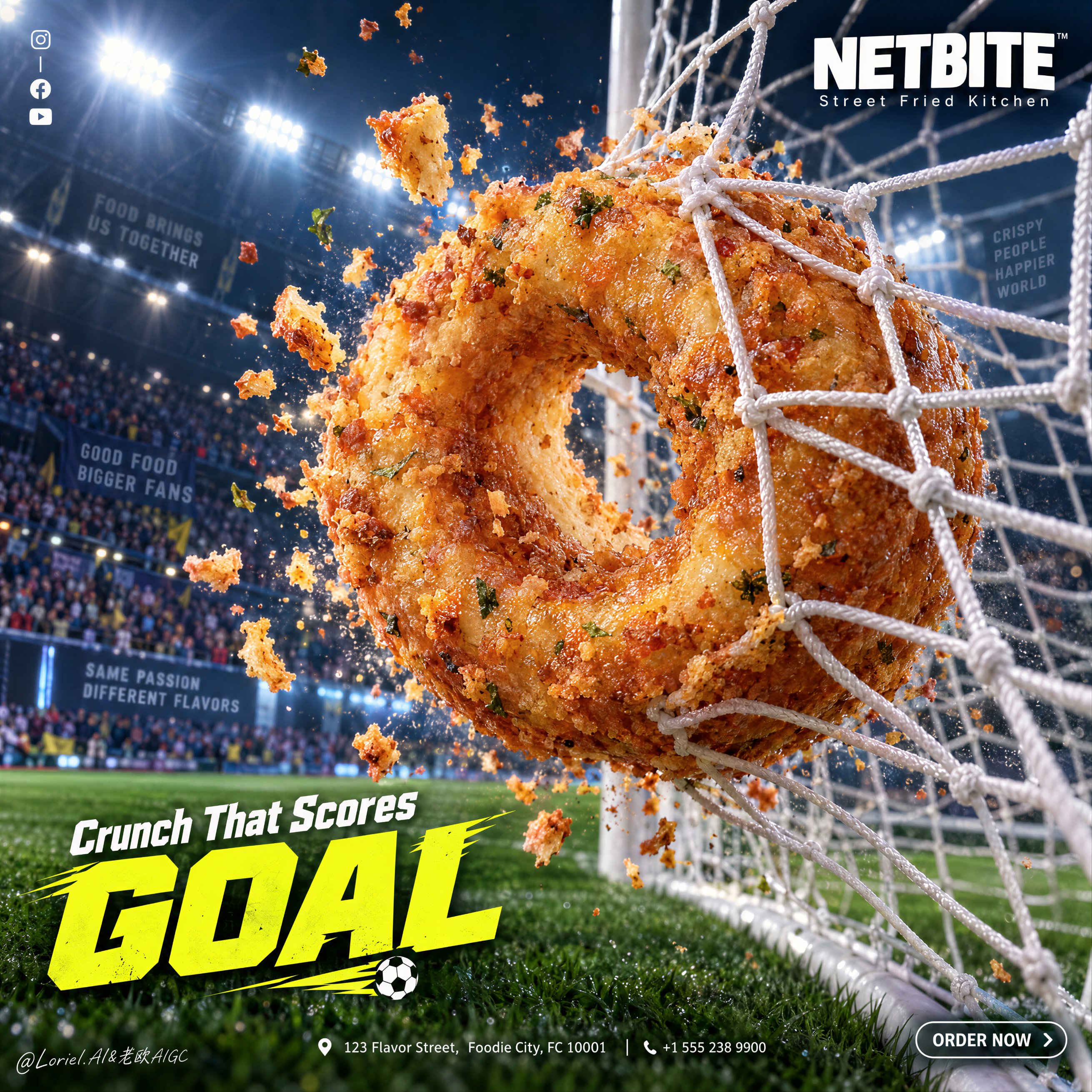
A premium stadium-food poster for fictional snack brand NETBITE, merging emotional impact, material precision, and curatorial clarity into one unified ad image. Preserve the exact goal-shot poster logic: a night football stadium under intense floodlights, blurred crowd atmosphere, a green pitch below, a goal net stretched diagonally across the right half, and one oversized fried ring snack crashing into the net like a winning goal. The snack is the absolute visual leader. Use a dramatic close-up sports-commercial angle near the goal, slightly low and forward, with strong rule-of-thirds balance so the fried ring appears huge in the foreground as it slams into the white net. The net wraps tightly around it with visible tension, stretched cords, compressed knots, and believable impact physics. Small hot crumbs and crisp fragments explode outward, frozen at the moment of collision. The stadium stays secondary: blue-white floodlights, soft crowd blur, dark arena atmosphere, and a clean green field base. The image should feel like Orbit, Transit, and Port fused together: explosive, materially exact, and graphically elevated. The hero food is a hyperreal savory fried ring snack inspired by a spiced lentil fritter, presented as a premium commercial object. It should look thick, freshly fried, golden-brown, crunchy outside, airy and soft inside, with tiny herb flecks, micro bubbles in the crust, subtle oil sheen, warm interior tone, and crisp broken crumbs flying off on impact. The ring shape stays clean, iconic, and instantly legible as both food and goal symbol. It must feel hot, edible, tactile, and irresistibly real, with strong volume and no greasy muddiness. Create a fully original English-only brand system. Place a clean white NETBITE logo in the upper right with a short descriptor such as “Street Fried Kitchen”. Keep a minimal vertical strip of tiny social icons in the upper left. In the lower left, place a bold promo headline with one dominant word such as “GOAL”, supported by a short line like “Crunch That Scores”. “GOAL” should be large, angular, sporty, and bright yellow-green; the support line stays compact and white. Along the lower edge, add a small address line and phone number in white, and a rounded “ORDER NOW” button in the lower right. All text must feel sharp, premium, and integrated without covering the hero food. Lighting is cinematic and commercially precise: hard stadium backlight from upper left and rear, crisp rim light on snack edges, soft front fill preserving crust detail, controlled specular highlights on the fried surface, and enough contrast to separate the snack from the darker background without dirty shadows or clutter. Color hierarchy: 55% dark blue-black stadium atmosphere, 25% golden-brown snack tones, 10% green pitch accents, 10% white net and bright yellow headline energy. Materials must feel exact and hyperreal: taut nylon net, crisp fried crust, floating crumb particles, humid stadium air, grass texture, and subtle premium poster polish. The final result should feel like a Cannes-level food campaign fused with a football winning moment: explosive, playful, premium, product-first, visually clean, and instantly memorable.
Details
Split-Frame Ink Wash Reconstruction
3:4 vertical composition · photo / ink wash split · contemporary — AI image prompt — GPT Image 2.5
OpenAIGPT Image 2.5
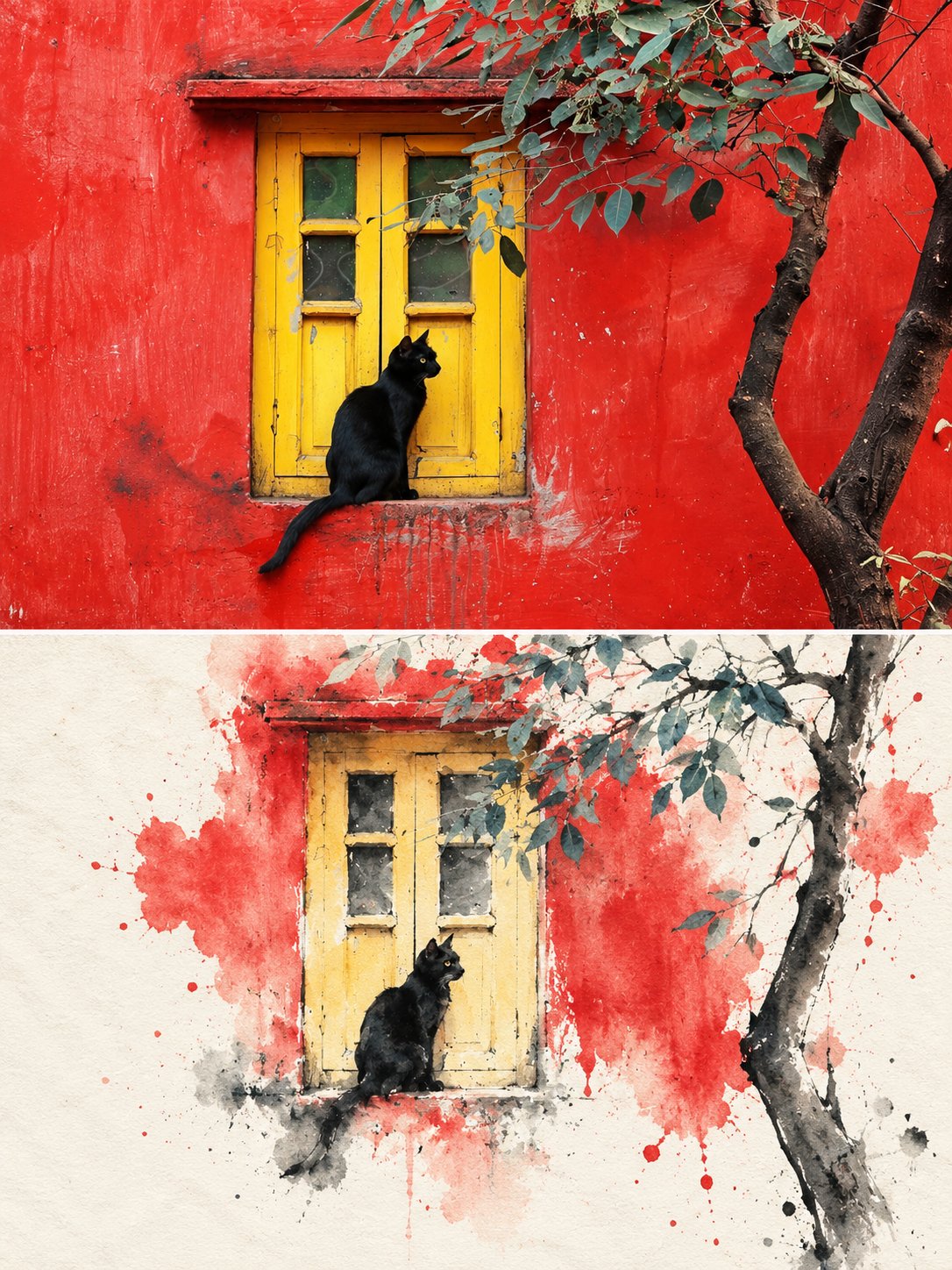
Split-Frame Ink Wash Reconstruction 3:4 vertical composition · photo / ink wash split · contemporary Eastern aesthetic The image is in a 3:4 vertical composition, divided into two regions, with a strict 1:1 ratio, each taking up 50% of the image. Upper Region — Original Photo Shoot Area Preserves the subject's identity, structure, perspective, and true material, natural light, and original color atmosphere, with only slight high-end color grading and image purification, presenting it with the texture of art magazines or exhibition photography. It allows for a moderate expansion of the background to fit the screen size, but does not stretch, distort, or reshape the subject, without changing the subject's structure, posture, and core composition. Lower Region — Minimalist Ink Wash Reconstruction Area First, refine the subject with the most memorable details, such as the outline, structure, trend, perspective, rhythm, and atmosphere, and then reconstruct the same scene into a minimalist ink wash material landscape. Do not copy the photo details, do not make a realistic copy, only preserve the most recognizable structure and charm, allowing people to recognize the corresponding relationship between the upper region and the original photo at first glance. The overall base of the lower half is milky white, warm white or paper white, with delicate paper fiber and natural texture. The main body is reconstructed in ink wash blending, dry-wet interplay, flying white, seepage, ink accumulation, and white space, forming a quiet, restrained, and poetic Eastern visual. Removing secondary details, only retaining the most distinctive contours, structural turns, spatial layers, and breath, not pursuing realistic completeness, but rather summarizing, refining, and leaving a lingering impression. The use of ink in black, gray, and light ink tones, layered and progressing, with varying intensities and rhythms. The most vibrant colors can be extracted from the original image to create a few spots of dyeing or coloring, without mechanically replicating the color values. The colors can be transformed locally into clear blue-gray, distant blue, soft gold, warm yellow, vermilion red, light cyan, etc., to emphasize the main focus and emotional rhythm, but the overall composition is still dominated by ink tones and negative space. Avoiding dull, heavy, old brown, excessive decoration, and vulgar color combinations. The main core areas should be more refined and concentrated, with edges gradually loosening, breaking away, disappearing, and scattering, forming a sense of breathing with the large negative space. The lower half of the composition should account for about 30%–45%, with the rest reserved for large negative spaces. The composition can be biased, framed, suspended, or slightly cut, but must maintain an asymmetrical balance and a high-end editorial feel. Negative space is not blank, but an important component of the visual structure. It is better to reduce information than to fill the entire image, so that the main focus looks like an ink seal or an oriental material work displayed on a page. Text Treatment Text is only allowed a very small amount of editing intervention, without preset titles and numbers. A small number of words or short sentences can be extracted from the subject, location, time, action, emotion, or metaphor, and quietly placed in the blank area or the edge of the subject. The text should be restrained, sparse, and have a sense of breathing, not noisy or dominant. Overall Presentation Contemporary Eastern aesthetics, minimalist ink wash reconstruction, large-scale art blank, small-scale seal impression, quiet editing layout and exhibition poster style. Avoid complex backgrounds, piled-up real details, overly decorative, excessive text, template layout and filled composition.
Details
A Cannes-level four-panel confectionery technology campaign poster for a fictional premium brand cal — AI image prompt — GPT Image 2.5
OpenAIGPT Image 2.5
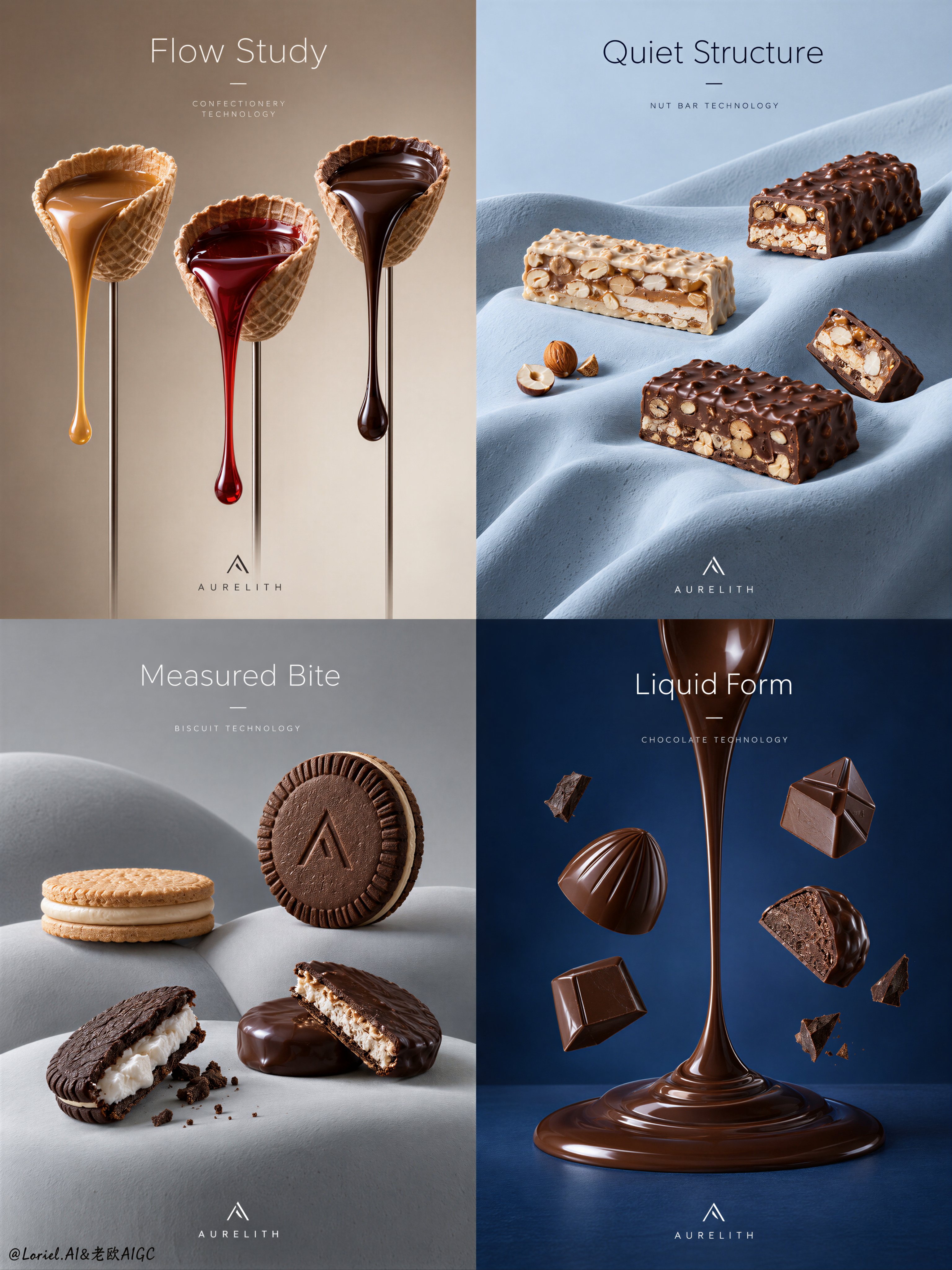
A Cannes-level four-panel confectionery technology campaign poster for a fictional premium brand called AURELITH, built as one refined 2x2 grid with the exact visual discipline of an industrial luxury food advertisement. Preserve the core structural logic of a modular poster series: each quadrant is an independent product scene with a restrained headline zone near the top, a hero product composition in the middle, and a tiny minimal brand mark placed quietly near the lower edge. Reduce typography to the absolute minimum. No body copy paragraphs, no marketing blocks, no loud captions. Only one short English headline per panel, two words maximum, plus one tiny minimal logo mark and one micro line of technical labeling. The overall feeling is colder, quieter, more curated, with larger negative space and more measured breathing room. Panel 1: a warm taupe-to-cream field with three wafer cup forms lifted on slender vertical stems, each holding a different flowing confection material: satin caramel, translucent ruby syrup, and dense dark chocolate. The liquid ribbons hang with physically exact gravity, elegant tension, clean tapering ends, and mirror-like edible highlights. Panel 2: a pale powder-blue sculpted drape with long soft folds, holding several layered nut bars and chocolate-coated bar fragments placed sparsely and precisely across the surface, like museum objects. Panel 3: a cool light-grey abstract landscape of smooth rounded mounds with sandwich biscuits and cream-filled chocolate cookies staged with generous spacing, one upright hero piece and a few opened pieces revealing crisp filling texture and fine crumb detail. Panel 4: a deep restrained cobalt field with one iconic vertical chocolate gesture, a spoon-like molten stream forming a central axis, surrounded by a few suspended molded chocolates and small fragments, controlled and sparse rather than explosive. Use elevated frontal product photography with disciplined central weighting, rule of thirds, clean symmetry tension, and expansive negative space. The objects must remain visually dominant at all times. The composition should feel like Orbit, Transit, and Port merged into one master solution: emotionally magnetic, materially exact, and curatorially reduced. The image language is hyperreal commercial still life, not illustration, with a calm futuristic sensibility. Lighting is layered and soft: upper-front key light, low-intensity fill for shadow readability, delicate specular control, smooth tonal transitions, subtle atmospheric separation, strong volume without heavy blacks. Keep the campaign cooler and quieter than a typical confection ad, with restrained contrast and clean air around every object. Materials must be deeply believable and tactile: tempered chocolate with smooth reflective bloom and dense body, wafer shells with fine porous texture and crisp edges, nougat bars with visible nut fragmentation and layered compression, cream fillings with soft whipped density, sculpted set surfaces in matte ceramic-plaster finish, subtle micro imperfections that increase realism. Color hierarchy: 60% cocoa, cream, and caramel browns, 30% cool architectural backdrop tones, 10% sharp glossy highlights. The surfaces are immaculate, premium, and uncluttered. Typography must behave like graphic architecture, not decoration. Use elegant thin-to-medium weight sans-serif English type, carefully kerned, integrated into the empty zones, aligned with the grid, never crossing the core product recognition area. Headline direction: one minimal phrase per panel such as “Flow Study”, “Quiet Structure”, “Measured Bite”, “Liquid Form”. The logo is abstract, geometric, tiny, and discreet. The final image must feel like a luxury design annual cover story merged with a food technology campaign: minimal, exact, silent, premium, sculptural, sharply art-directed, physically plausible, cleanly printed, with no clutter, no excessive text, no random decorative particles, no busy branding, no dead shadows, no muddy gradients, no deformed food geometry, no broken letters, no chaotic composition.
Details
Browse all GPT Image 2.5 promptsExplore AI Image Prompts