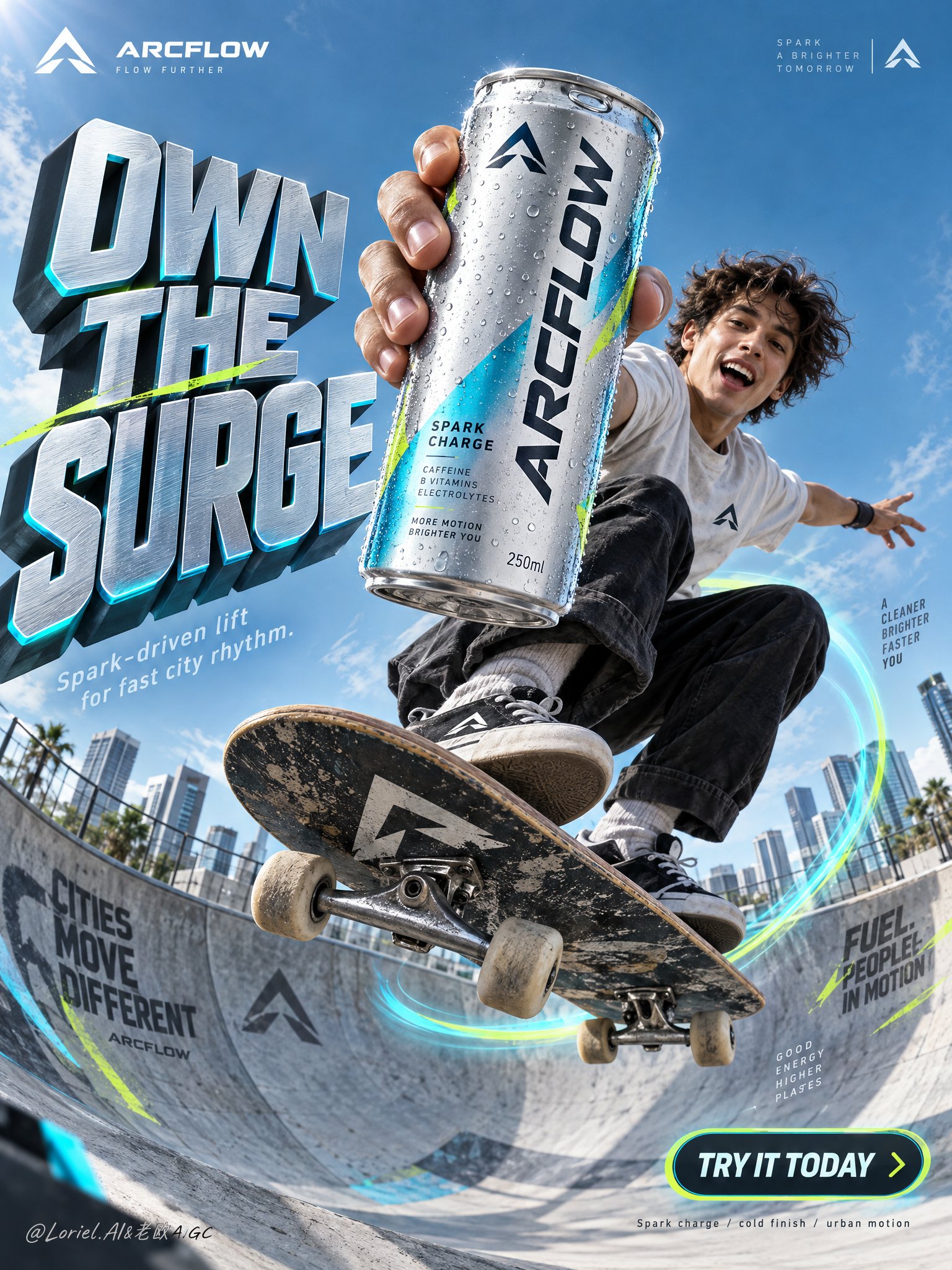
ARCFLOW Sparkling Drink Skateboard Poster
 GPT Image 2.5OpenAIimage
Create a premium vertical commercial poster for a fictional overseas functional sparkling drink brand, "ARCFLOW". Fuse a real physical beverage can with high-concept urban action ad language, keeping the product as the absolute visual leader. Build the scene around a frozen skateboard jump in a modern concrete bowl, with the can thrust closest to the lens and dominating the composition while the athlete and environment amplify its energy without competing. Use an ultra-low-angle wide commercial lens from inside the bowl, looking upward into a clean open sky. Preserve a poster architecture with a massive sculptural headline block on the left, the athlete and hero can aligned along the center-right axis, luminous motion arcs wrapping the board trajectory, small official brand marks in the upper corners, and a rounded CTA badge in the lower right. Keep strong negative space in the upper background so the title and product silhouette stay instantly readable. The can must appear larger than the athlete’s face and occupy the strongest focal zone. The hero product is a hyper-real 250ml can of ARCFLOW Spark Charge in brushed silver aluminum with electric cyan accents, acid-lime micro details, and a deep graphite logo lockup. The surface shows realistic condensation droplets, crisp pull-tab geometry, subtle edge reflections, premium label sharpness, and tactile coated-metal finish. The exact front text must read "ARCFLOW". Add a small minimalist symbol logo in the top corners, reduced, elegant, and globally branded. A young skater is captured at the peak of a jump above the bowl in a compact crouched pose, one arm aggressively extending the can toward camera, the other stretched outward for balance. The skateboard cuts diagonally through the lower middle with believable tilt, visible trucks and wheels, and physically correct foot pressure. Body mechanics must feel athletic and grounded, with coherent center of gravity, convincing grip, natural clothing tension, and correct hand anatomy. The athlete’s expression is exhilarated and alive, but the product remains dominant. Set the action in a clean urban skate bowl with refined wall graphics, smooth concrete curvature, and soft-focus city blocks in the far background. Replace playful clutter with a disciplined tech-sport visual language: only a few angular branded shards and sleek directional graphic fragments near the lens. Depth should layer clearly: near-lens graphic accents, hero can and skater in the mid-foreground, bowl and motion ring in the midground, architecture and sky in the background. Use bright directional daylight from the upper left with crisp highlights on the can rim, condensation, face, limbs, shoes, and board edges. Add subtle cyan reflected light from the bowl and motion trails to enrich shadows without flattening form. Build a 60/30/10 palette: 60% cool sky blue and silver-cyan atmosphere, 30% graphite and deep neutral structure, 10% acid lime accents. Increase light-shadow separation to sculpt volume in the can and skateboard, while avoiding dirty blacks, dead shadows, haze, or oversaturated chaos. Render everything with elite commercial realism. The can must feel manufactured and touchable: brushed aluminum, coated print, varied droplets, soft specular roll-off, real seam lines, and precise tab indentation. The skateboard shows believable grip texture, layered wood edge, metal truck reflections, and slightly worn wheels. Concrete has fine grain and controlled mural overspray. Clothing feels light, breathable, and sunlit. The image should read as a synthesis of luxury product photography, sports advertising, and award-level graphic poster design. Create all typography as newly invented art-directed copy integrated into the composition flow. Main left headline: "OWN THE SURGE". Secondary line below: "Spark-driven lift for fast city rhythm." Lower-right rounded badge: "TRY IT TODAY". Very small bottom technical note: "Spark charge / cold finish / urban motion". Typography should be sculptural, high-impact, cleanly spaced, and fused with the environment, using cool metallic silver faces, cyan edge glow, graphite side planes, and subtle lime accents. Keep all text away from the can label and the athlete’s face. Vertical ad-poster composition, product-first hierarchy, physically believable frozen action, clean premium commercial execution, no copied slogans, no real person names, no unrelated props, no clutter, no sticker collage, no generic stock-ad feeling. Maintain sharp packaging readability, correct can proportions, coherent skateboard geometry, correct fingers and joints, a single clean hero product, unified style language, elegant layout rhythm, and disciplined negative space. Avoid duplicated limbs, malformed hands, warped board shape, floating objects without support logic, unreadable label text, chaotic type placement, distorted logo, muddy grading, dirty blacks, accidental extra cans, cheap font treatment, cartoon drift, painterly drift, overdecorated particles, and broken spatial perspective.
Details
- Type
- AI Image Prompts
- Aspect Ratio
- 3:4
- Updated
- Oct 10, 2026
How to use this prompt
- 1Copy the full prompt with the copy button above.
- 2Open GPT Image 2.5 by OpenAI, or any image generator with a similar style range.
- 3Paste the prompt, then swap the subject and style keywords to match your idea.
- 4Match the example's settings (3:4 · Poster · Product Photography · Advertising), then iterate — small wording changes shift the output a lot.
Frequently asked questions
Which AI model generated this image?
This image was generated with GPT Image 2.5 by OpenAI. The prompt on this page is the exact text used to create it.
What settings does this prompt use?
The example was generated with GPT Image 2.5 using: 3:4 · Poster · Product Photography · Advertising. Reusing these settings gives the closest match.
How do I get similar results?
Copy the prompt as-is first, then replace only the subject while keeping the style, lighting, and composition keywords. Generate a few variations — outputs differ between runs.
Can I modify this prompt?
Yes. Prompts work best as starting points — adjust descriptors, aspect ratio, or style tags to make the output your own.