GPT Image 2 Prompts

OpenAI's reasoning image model — it plans the layout, thinks through your instructions, and checks its own work before drawing.


image
Prompt: Prompt:
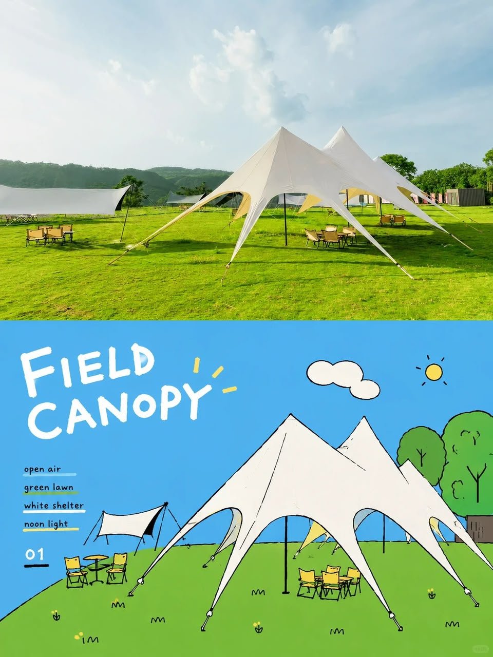
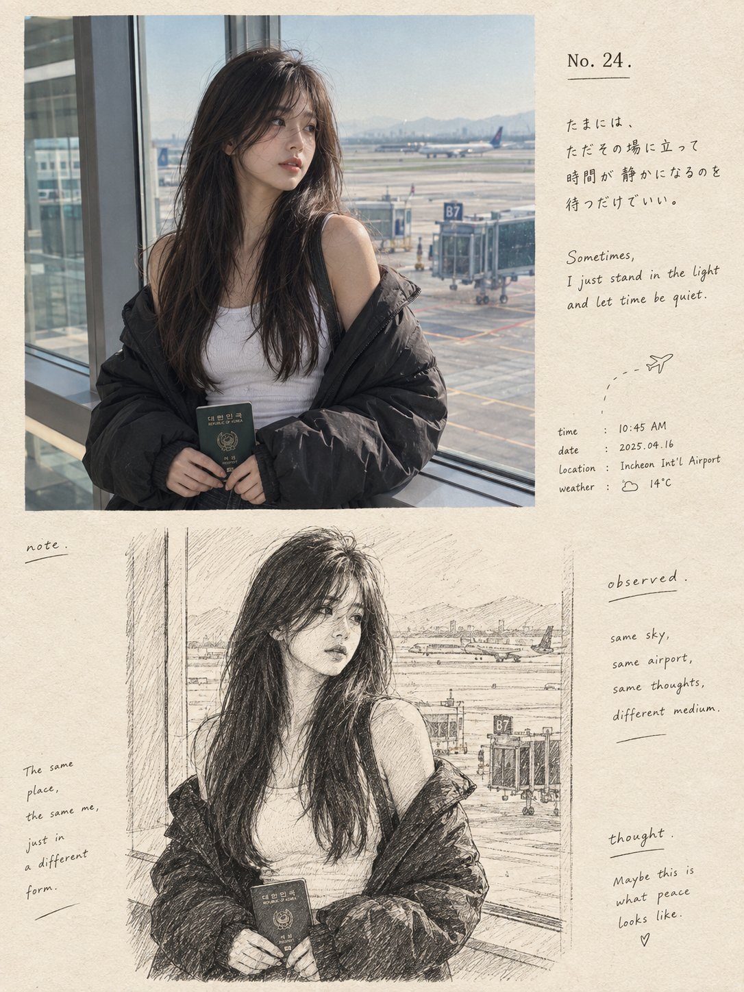
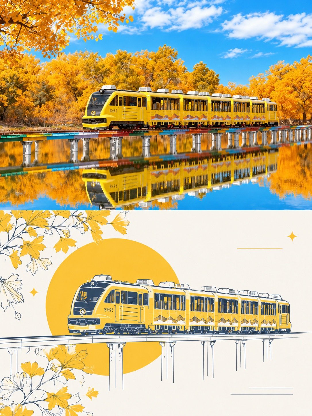
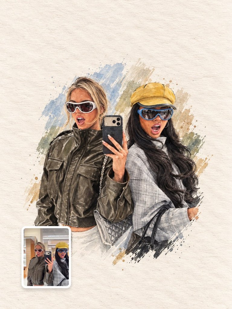
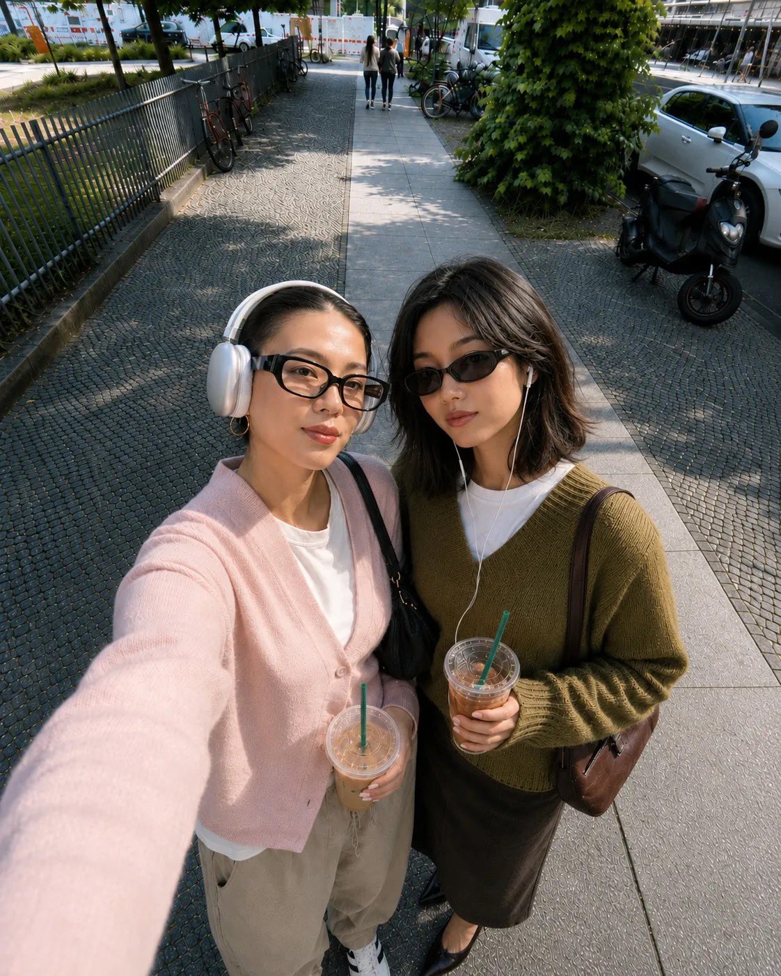
Transform this photo into a clean, hand-drawn editorial illustration with a modern urban lifestyle aesthetic. Preserve the exact composition, pose, clothing, headphones around the neck, smartphone, motorcycle, yellow e-scooters, glass fence, and apartment buildings in the background. Use bold black outlines, simplified geometric shapes, minimal facial details, soft beige and cream tones, muted brick red, slate blue, charcoal black, and warm yellow accents. Apply a textured paper/grain finish with subtle ink scratches and brush imperfections. Flatten the lighting with gentle shadows, giving it a cozy Scandinavian-inspired illustrated poster look. Maintain a calm, everyday city atmosphere while keeping the proportions accurate and the character recognizable from the original photo. High-quality digital illustration, flat colors, vector-inspired, minimalistic, artistic, clean linework, textured print aesthetic, 4:5 aspect ratio.

Negative prompt (optional):

Photorealistic, 3D render, anime, watercolor, oil painting, excessive detail, hyper-realistic skin, blurry, distorted anatomy, extra limbs, messy lines, noisy background, oversaturated colors, text, logo, watermark, low quality.
PeacefulPoster
Prompt: Transform this photo into a clean, hand-drawn editorial illustration with a modern urban lifestyle aesthetic. Preserve the exact composition, pose, clothing, headphones around the neck, smartphone, motorcycle, yellow e-scooters, glass fence, and apartment buildings in the background. Use bold black outlines, simplified geometric shapes, minimal facial details, soft beige and cream tones, muted brick red, slate blue, charcoal black, and warm yellow accents. Apply a textured paper/grain finish with subtle ink scratches and brush imperfections. Flatten the lighting with gentle shadows, giving it a cozy Scandinavian-inspired illustrated poster look. Maintain a calm, everyday city atmosphere while keeping the proportions accurate and the character recognizable from the original photo. High-quality digital illustration, flat colors, vector-inspired, minimalistic, artistic, clean linework, textured print aesthetic, 4:5 aspect ratio. Negative prompt (optional): Photorealistic, 3D render, anime, watercolor, oil painting, excessive detail, hyper-realistic skin, blurry, distorted anatomy, extra limbs, messy lines, noisy background, oversaturated colors, text, logo, watermark, low quality.
Details
Prompt: 🍊Break down taste into four pyramids, each representing a different pace of life. Refreshing, rich and sweet, tropical, and mellow come together in a single romantic bite.

Create an ultra-premium four-panel campaign board for Lipton, developed as the “Ingredient Summit System” version, but avoid an overly perfect or machine-built arrangement. The entire board must still preserve the same multi-flavor 2x2 series logic, real front-facing Lipton products, and four different flavor worlds expressed through pyramid-like ingredient structures, but each pyramid must now feel hand-built, naturally assembled, and slightly imperfect. The final image must feel like a world-class global advertising campaign that combines premium still-life design with believable human touch: hyper-real, elegant, flavorful, refined, but not sterile.

Core concept:
Each Lipton flavor becomes a hand-built ingredient summit. A real front-facing Lipton product pack anchors the lower front area of each panel, while above it rises a pyramid-like flavor structure made from fruit, leaves, petals, tea ingredients, and lifestyle-related objects. However, the pyramid must not feel too mathematically clean or mechanically precise. It should feel like a beautifully art-directed manual arrangement: some ingredients slightly tilted, some pieces subtly slipping, some elements lightly scattered at the base, some gaps and irregular stacking preserved, as if expert hands assembled it with care but allowed natural imperfection and living realism to remain. The image must feel premium and controlled, yet still human and tactile.

4-panel structure:
Use a clean 2x2 campaign board with four equal panels. Each panel must maintain the same layout logic:
upper area with elegant English headline,
center area dominated by a pyramid-like flavor summit,
lower front area anchored by one real front-facing Lipton product pack,
lower strip or lower zone with minimal official campaign information.
All four panels must clearly belong to one same campaign family, but each one must express a different flavor identity through its own ingredients, color system, and summit personality.

Imperfection logic:
This version must specifically avoid overly neat symmetry. The ingredient pyramids should still read clearly as triangular or summit-like forms, but they must feel assembled by hand rather than manufactured by a machine. Preserve:
slightly uneven stacking,
small natural gaps,
subtle leaning fruit or leaves,
a few fallen or rolled pieces near the base,
some scattered petals, peels, seeds, or tea fragments,
tiny irregular overlaps,
slight asymmetry in edges,
small signs of gravity and real placement.
The result should feel premium, intelligent, and believable, like a luxurious handmade ingredient installation.

Panel 1, green citrus freshness:
Place a real front-facing Lipton green or citrus-green flavor product at the lower front center. Above it, build a fresh green summit from lime slices, green tea leaves, mint-like leaves, pale citrus peel, light green fruit, and a few wellness-oriented mini objects. The structure should still feel upward and pyramid-like, but let some lime slices slip outward, a few leaves scatter at the base, and some pieces sit imperfectly instead of in strict rows. This panel should feel fresh, light, uplifting, and slightly breezy rather than rigid.

Panel 2, red berry intensity:
Place a real front-facing Lipton berry or red fruit flavor product at the lower front center. Build the summit from strawberries, raspberries, cherries, red currants, berry leaves, and glossy red lifestyle details. Let the red fruit pile feel richer and more abundant, with berries naturally spilling outward, small fruit rolling near the base, and some clusters stacked in a lively imperfect way. The shape should still read as a pyramid, but one made through generous layered hand placement rather than exact geometry.

Panel 3, yellow tropical brightness:
Place a real front-facing Lipton mango or tropical-yellow flavor product at the lower front center. Build a sunny summit from mango pieces, pineapple chunks, lemon wedges, golden fruit rounds, tropical leaves, and bright cheerful mini objects. Preserve the triangular silhouette, but allow some mango cubes and citrus wedges to break outward, a few petals and leaves to drift around the base, and slight variations in density between the left and right side. The structure should feel optimistic, abundant, and naturally arranged.

Panel 4, dark tea richness:
Place a real front-facing Lipton black tea or deeper rich flavor product at the lower front center. Build a more grounded summit from darker tea leaves, figs, grapes, plum-toned fruit, citrus peel, spice-like accents, amber tea details, and ritual breakfast elements. Keep the pyramid form readable, but make it feel more layered and human: tea leaves fallen around the base, one or two fruit pieces slightly displaced, richer shadows in the stacking, and small object clusters suggesting manual composition. This panel should feel more refined, mature, and tactile.

Product realism:
Render each Lipton product pack with absolute realism and premium packaging fidelity. Every pack must be front-facing, clearly readable, physically accurate, and beautifully lit, with crisp logo print, box edges, flavor coding, printed surface finish, and premium shelf realism. The product must remain clearly visible and commercially dominant in every panel, even while the summit above carries much of the visual drama.

Ingredient realism:
All fruit, leaves, petals, tea fragments, and supporting objects must be rendered with hyper-real still-life precision. Show skin texture, pulp translucency, seed detail, moisture, leaf veins, peel edges, and tiny imperfections. The ingredients must feel fresh, tactile, and physically placed, not flat graphics. Some pieces should appear slightly bruised by pressure, compressed by stacking, or angled naturally by weight, but still remain premium and beautiful.

Supporting scatter:
At the foot of every pyramid, include a tasteful amount of natural scatter and leftover evidence of assembly: a few loose fruit slices, leaves, petals, seeds, tea dust, dropped wedges, small utensil-like elements, or tiny supporting pieces. This scatter must feel deliberate but believable, as if the summit was carefully built by hand and some ingredients remained around the base. Avoid chaos; keep it elegant and art-directed.

Backgrounds:
Use a clean soft-neutral premium studio background in each panel, close to warm ivory, pale cream, or very light gray-beige, with subtle tonal variation only. The background must remain bright and quiet so the ingredient summits and product packs dominate clearly. Let the flavor identity come mainly from the ingredients and packaging, not from overly saturated background color.

Typography:
Use an elegant English-led typography system that follows a premium global campaign layout. Each panel can feature a refined flavor-question or short campaign line in the upper area, with a minimal official information strip near the bottom.
Main campaign direction:
“CAN YOU RESIST THE FLAVOR PYRAMID?”
Panel-specific copy can vary slightly by flavor mood while staying minimal and premium.
Use only very restrained official logo placement and supporting English text. Typography must feel airy, modern, balanced, and beautifully spaced, never crude or heavy.

Lighting:
Use extremely delicate high-end studio-commercial lighting with soft directional highlights and refined shadows. Each summit must feel dimensional, tactile, and fresh, with fruit skins, tea leaves, petals, packaging, and small objects all rendered with exquisite realism. The light should be soft enough to preserve elegance and cleanliness, but precise enough to reveal texture, stacking depth, and slight imperfections. Every panel should feel premium, bright, and globally polished.

Color direction:
Build four distinct but harmonious flavor palettes:
green freshness,
red berry intensity,
yellow tropical brightness,
dark tea richness.
The campaign must feel colorful but controlled, bright but elegant, playful but premium. The slight asymmetry and scatter must make the series feel more alive and more human without losing brand polish.

Mood:
fresh, premium, organized but human, tactile, hyper-real, elegant, flavorful, handcrafted, modern, internationally refined, commercially iconic

Rendering style:
ultra-premium Lipton multi-flavor campaign board, 2x2 layout, real front-facing product packs, four hand-built ingredient pyramid structures, slight asymmetry and natural scatter, premium still-life architecture, elegant English typography, bright neutral backgrounds, hyper-real food and packaging detail, refined soft lighting, world-class advertising key visual, 8k, global campaign quality

Negative prompt:
overly perfect symmetry, machine-built arrangement, sterile geometry, messy chaos, weak product dominance, cartoon rendering, cluttered layout, ugly typography, low-detail packaging, muddy palette, cheap supermarket poster style, flat lighting, low-end still life
Still LifeFoodCinematic
🍊Break down taste into four pyramids, each representing a different pace of life. Refreshing, rich and sweet, tropical, and mellow come together in a single romantic bite. Create an ultra-premium four-panel campaign board for Lipton, developed as the “Ingredient Summit System” version, but avoid an overly perfect or machine-built arrangement. The entire board must still preserve the same multi-flavor 2x2 series logic, real front-facing Lipton products, and four different flavor worlds expressed through pyramid-like ingredient structures, but each pyramid must now feel hand-built, naturally assembled, and slightly imperfect. The final image must feel like a world-class global advertising campaign that combines premium still-life design with believable human touch: hyper-real, elegant, flavorful, refined, but not sterile. Core concept: Each Lipton flavor becomes a hand-built ingredient summit. A real front-facing Lipton product pack anchors the lower front area of each panel, while above it rises a pyramid-like flavor structure made from fruit, leaves, petals, tea ingredients, and lifestyle-related objects. However, the pyramid must not feel too mathematically clean or mechanically precise. It should feel like a beautifully art-directed manual arrangement: some ingredients slightly tilted, some pieces subtly slipping, some elements lightly scattered at the base, some gaps and irregular stacking preserved, as if expert hands assembled it with care but allowed natural imperfection and living realism to remain. The image must feel premium and controlled, yet still human and tactile. 4-panel structure: Use a clean 2x2 campaign board with four equal panels. Each panel must maintain the same layout logic: upper area with elegant English headline, center area dominated by a pyramid-like flavor summit, lower front area anchored by one real front-facing Lipton product pack, lower strip or lower zone with minimal official campaign information. All four panels must clearly belong to one same campaign family, but each one must express a different flavor identity through its own ingredients, color system, and summit personality. Imperfection logic: This version must specifically avoid overly neat symmetry. The ingredient pyramids should still read clearly as triangular or summit-like forms, but they must feel assembled by hand rather than manufactured by a machine. Preserve: slightly uneven stacking, small natural gaps, subtle leaning fruit or leaves, a few fallen or rolled pieces near the base, some scattered petals, peels, seeds, or tea fragments, tiny irregular overlaps, slight asymmetry in edges, small signs of gravity and real placement. The result should feel premium, intelligent, and believable, like a luxurious handmade ingredient installation. Panel 1, green citrus freshness: Place a real front-facing Lipton green or citrus-green flavor product at the lower front center. Above it, build a fresh green summit from lime slices, green tea leaves, mint-like leaves, pale citrus peel, light green fruit, and a few wellness-oriented mini objects. The structure should still feel upward and pyramid-like, but let some lime slices slip outward, a few leaves scatter at the base, and some pieces sit imperfectly instead of in strict rows. This panel should feel fresh, light, uplifting, and slightly breezy rather than rigid. Panel 2, red berry intensity: Place a real front-facing Lipton berry or red fruit flavor product at the lower front center. Build the summit from strawberries, raspberries, cherries, red currants, berry leaves, and glossy red lifestyle details. Let the red fruit pile feel richer and more abundant, with berries naturally spilling outward, small fruit rolling near the base, and some clusters stacked in a lively imperfect way. The shape should still read as a pyramid, but one made through generous layered hand placement rather than exact geometry. Panel 3, yellow tropical brightness: Place a real front-facing Lipton mango or tropical-yellow flavor product at the lower front center. Build a sunny summit from mango pieces, pineapple chunks, lemon wedges, golden fruit rounds, tropical leaves, and bright cheerful mini objects. Preserve the triangular silhouette, but allow some mango cubes and citrus wedges to break outward, a few petals and leaves to drift around the base, and slight variations in density between the left and right side. The structure should feel optimistic, abundant, and naturally arranged. Panel 4, dark tea richness: Place a real front-facing Lipton black tea or deeper rich flavor product at the lower front center. Build a more grounded summit from darker tea leaves, figs, grapes, plum-toned fruit, citrus peel, spice-like accents, amber tea details, and ritual breakfast elements. Keep the pyramid form readable, but make it feel more layered and human: tea leaves fallen around the base, one or two fruit pieces slightly displaced, richer shadows in the stacking, and small object clusters suggesting manual composition. This panel should feel more refined, mature, and tactile. Product realism: Render each Lipton product pack with absolute realism and premium packaging fidelity. Every pack must be front-facing, clearly readable, physically accurate, and beautifully lit, with crisp logo print, box edges, flavor coding, printed surface finish, and premium shelf realism. The product must remain clearly visible and commercially dominant in every panel, even while the summit above carries much of the visual drama. Ingredient realism: All fruit, leaves, petals, tea fragments, and supporting objects must be rendered with hyper-real still-life precision. Show skin texture, pulp translucency, seed detail, moisture, leaf veins, peel edges, and tiny imperfections. The ingredients must feel fresh, tactile, and physically placed, not flat graphics. Some pieces should appear slightly bruised by pressure, compressed by stacking, or angled naturally by weight, but still remain premium and beautiful. Supporting scatter: At the foot of every pyramid, include a tasteful amount of natural scatter and leftover evidence of assembly: a few loose fruit slices, leaves, petals, seeds, tea dust, dropped wedges, small utensil-like elements, or tiny supporting pieces. This scatter must feel deliberate but believable, as if the summit was carefully built by hand and some ingredients remained around the base. Avoid chaos; keep it elegant and art-directed. Backgrounds: Use a clean soft-neutral premium studio background in each panel, close to warm ivory, pale cream, or very light gray-beige, with subtle tonal variation only. The background must remain bright and quiet so the ingredient summits and product packs dominate clearly. Let the flavor identity come mainly from the ingredients and packaging, not from overly saturated background color. Typography: Use an elegant English-led typography system that follows a premium global campaign layout. Each panel can feature a refined flavor-question or short campaign line in the upper area, with a minimal official information strip near the bottom. Main campaign direction: “CAN YOU RESIST THE FLAVOR PYRAMID?” Panel-specific copy can vary slightly by flavor mood while staying minimal and premium. Use only very restrained official logo placement and supporting English text. Typography must feel airy, modern, balanced, and beautifully spaced, never crude or heavy. Lighting: Use extremely delicate high-end studio-commercial lighting with soft directional highlights and refined shadows. Each summit must feel dimensional, tactile, and fresh, with fruit skins, tea leaves, petals, packaging, and small objects all rendered with exquisite realism. The light should be soft enough to preserve elegance and cleanliness, but precise enough to reveal texture, stacking depth, and slight imperfections. Every panel should feel premium, bright, and globally polished. Color direction: Build four distinct but harmonious flavor palettes: green freshness, red berry intensity, yellow tropical brightness, dark tea richness. The campaign must feel colorful but controlled, bright but elegant, playful but premium. The slight asymmetry and scatter must make the series feel more alive and more human without losing brand polish. Mood: fresh, premium, organized but human, tactile, hyper-real, elegant, flavorful, handcrafted, modern, internationally refined, commercially iconic Rendering style: ultra-premium Lipton multi-flavor campaign board, 2x2 layout, real front-facing product packs, four hand-built ingredient pyramid structures, slight asymmetry and natural scatter, premium still-life architecture, elegant English typography, bright neutral backgrounds, hyper-real food and packaging detail, refined soft lighting, world-class advertising key visual, 8k, global campaign quality Negative prompt: overly perfect symmetry, machine-built arrangement, sterile geometry, messy chaos, weak product dominance, cartoon rendering, cluttered layout, ugly typography, low-detail packaging, muddy palette, cheap supermarket poster style, flat lighting, low-end still life
Details
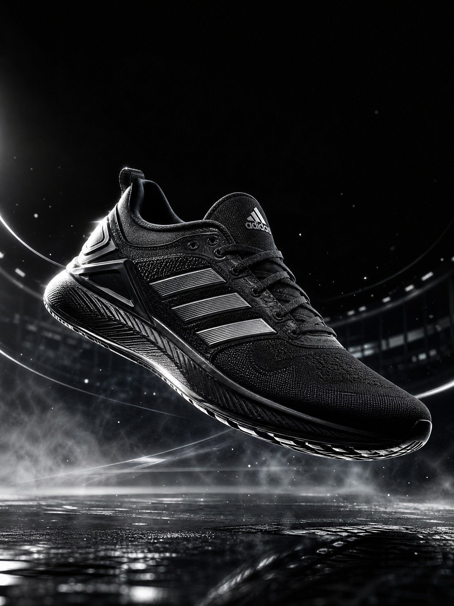
Prompt: Create a premium 4:5 **PRODUCT HAS GRAVITY advertising poster** for [PRODUCT/BRAND] on a clean editorial background. Place the authentic photorealistic product floating at the visual center as a powerful gravitational force, pulling product-relevant objects, particles, light, energy and typography into dramatic curved trajectories around it. Build a realistic spatial vortex with warped perspective, radial motion trails and bent environmental elements, while keeping the hero product perfectly sharp, undistorted and dominant. Create a **short, bold campaign headline specifically based on the product's main benefit, expressed through a gravity, orbit, pull, force, mass or attraction metaphor; never use a fixed generic gravity headline**. Surrounding objects must directly relate to the product's real use case and visually reinforce its benefit. Use controlled brand-color accents, cinematic commercial lighting, realistic physics, strong depth, generous negative space and premium global advertising art direction; surreal yet believable, sophisticated, minimal, high-impact, no irrelevant objects, no clutter.
CinematicSurrealFoodFashion
Create a premium 4:5 **PRODUCT HAS GRAVITY advertising poster** for [PRODUCT/BRAND] on a clean editorial background. Place the authentic photorealistic product floating at the visual center as a powerful gravitational force, pulling product-relevant objects, particles, light, energy and typography into dramatic curved trajectories around it. Build a realistic spatial vortex with warped perspective, radial motion trails and bent environmental elements, while keeping the hero product perfectly sharp, undistorted and dominant. Create a **short, bold campaign headline specifically based on the product's main benefit, expressed through a gravity, orbit, pull, force, mass or attraction metaphor; never use a fixed generic gravity headline**. Surrounding objects must directly relate to the product's real use case and visually reinforce its benefit. Use controlled brand-color accents, cinematic commercial lighting, realistic physics, strong depth, generous negative space and premium global advertising art direction; surreal yet believable, sophisticated, minimal, high-impact, no irrelevant objects, no clutter.
Details
Prompt: Create an ultra-premium advertising poster for Minute Maid, centered on a hyper-real grape-flavor Minute Maid juice package that appears physically fused with the trunk of a living grapevine tree, as if the product itself has grown directly from the plant. The image must feel fresh, natural, luminous, and commercially powerful, with a deep organic integration between the package and the tree structure. The final result should look like a flagship Minute Maid campaign where the drink is not placed in nature, but born from it.

Core concept:
The hero is a hyper-real grape-flavor Minute Maid carton or bottle standing upright in the center of a lush natural vineyard-garden environment. The key visual idea is that the packaging is not separate from the tree. It must look like it is part of the trunk itself, emerging from bark, roots, and vine wood as a living extension of the grape plant. The lower and side edges of the package should merge naturally into the trunk base, root system, and vine-wrapped bark, creating the impression that the product is a cultivated fruit-bearing life form. The message must feel immediate and visually unforgettable: Minute Maid grape juice is grown directly from living nature.

Composition:
Use a vertical premium poster layout with the Minute Maid product placed prominently in the lower-middle center, integrated into the core of a vine-covered tree or thick grapevine trunk. The tree must rise behind and around the package, with the bark, roots, and woody vine structure wrapping the product naturally. In the foreground, use grass, vineyard soil, small flowers, tendrils, and root extensions to anchor the fusion. Above and around the product, grapevine branches should carry clusters of ripe grapes and broad leaves, creating a natural canopy and flavor crown. The background should open into a soft vineyard or garden landscape with subtle depth and cinematic air.

Product realism:
Render the Minute Maid grape-flavor packaging with absolute realism and premium fidelity:
accurate carton or bottle structure,
clear Minute Maid branding,
precise cap details,
clean printed grape flavor identity,
subtle reflections,
realistic material texture,
and strong commercial sharpness.
The package must remain the most polished and readable object in the image, even while fused with the organic tree form.

Tree-package fusion:
The fusion between packaging and tree must be strong and unmistakable. The package should appear embedded in or emerging from the trunk, with bark textures, root structures, vine wood, and grape tendrils partially wrapping and blending around the lower edges and side planes. The transition must feel elegant and believable, not grotesque or random. The viewer should immediately understand that the product is part of the tree’s living structure.

Grape flavor fidelity:
Use only grapevine logic for the botanical system:
abundant grape clusters,
rich purple and deep red grapes,
healthy vine leaves,
tendrils,
woody vine branches,
and vineyard-like natural richness.
The grapes must feel ripe, juicy, sunlit, and luxurious. All visible fruit must clearly reinforce grape flavor identity.

Environment:
Create a clean cinematic vineyard-garden environment:
lush grass,
soft soil,
tiny flowers,
vine roots,
warm natural air,
distant vineyard greenery,
and subtle morning or late-afternoon light haze.
The setting should feel believable but idealized, clean yet abundant, premium rather than rustic-messy.

Background:
Use a luminous natural vineyard backdrop with soft sky opening, distant vine rows or orchard-like depth, warm haze, and elegant atmospheric layering. The background must remain soft enough to keep the package-tree fusion dominant.

Typography:
Use an elegant minimal English-led typography system.
Suggested text direction:
Main English title:
“GROWN INTO FLAVOR”
or
“ROOTED IN GRAPE”
Supporting English copy:
“From the vine. From the trunk. Into every sip.”
Typography should be minimal, clean, and premium, placed with generous spacing and strong hierarchy.

Brand coding:
Preserve Minute Maid identity through:
clear product visibility,
grape flavor clarity,
premium natural realism,
living botanical integration,
and international commercial polish.
The result must feel like a flagship Minute Maid hero poster with a stronger brand-memory image.

Lighting:
Use soft cinematic natural light, like warm morning sun or golden late-afternoon light. Let the light brush across the grape skins, leaves, bark, roots, and packaging edges. The product-tree fusion should feel luminous, fresh, and premium, with subtle reflections and realistic depth.

Mood:
fresh, natural, rooted, vineyard-born, luminous, premium, alive, rich, inviting, organic

Rendering style:
hyper-real Minute Maid product poster, grape-flavor package fused into living vine trunk, rooted botanical integration, lush vineyard-garden environment, cinematic soft sunlight, premium editorial typography, world-class commercial image quality, 8k

Negative prompt:
cheap juice ad, cartoon vineyard, weak product visibility, packaging separate from tree, unrealistic bark fusion, low-detail grapes, messy environment, incorrect fruit type, harsh artificial lighting, rough typography, low-end commercial design
FoodCinematicBright
Create an ultra-premium advertising poster for Minute Maid, centered on a hyper-real grape-flavor Minute Maid juice package that appears physically fused with the trunk of a living grapevine tree, as if the product itself has grown directly from the plant. The image must feel fresh, natural, luminous, and commercially powerful, with a deep organic integration between the package and the tree structure. The final result should look like a flagship Minute Maid campaign where the drink is not placed in nature, but born from it. Core concept: The hero is a hyper-real grape-flavor Minute Maid carton or bottle standing upright in the center of a lush natural vineyard-garden environment. The key visual idea is that the packaging is not separate from the tree. It must look like it is part of the trunk itself, emerging from bark, roots, and vine wood as a living extension of the grape plant. The lower and side edges of the package should merge naturally into the trunk base, root system, and vine-wrapped bark, creating the impression that the product is a cultivated fruit-bearing life form. The message must feel immediate and visually unforgettable: Minute Maid grape juice is grown directly from living nature. Composition: Use a vertical premium poster layout with the Minute Maid product placed prominently in the lower-middle center, integrated into the core of a vine-covered tree or thick grapevine trunk. The tree must rise behind and around the package, with the bark, roots, and woody vine structure wrapping the product naturally. In the foreground, use grass, vineyard soil, small flowers, tendrils, and root extensions to anchor the fusion. Above and around the product, grapevine branches should carry clusters of ripe grapes and broad leaves, creating a natural canopy and flavor crown. The background should open into a soft vineyard or garden landscape with subtle depth and cinematic air. Product realism: Render the Minute Maid grape-flavor packaging with absolute realism and premium fidelity: accurate carton or bottle structure, clear Minute Maid branding, precise cap details, clean printed grape flavor identity, subtle reflections, realistic material texture, and strong commercial sharpness. The package must remain the most polished and readable object in the image, even while fused with the organic tree form. Tree-package fusion: The fusion between packaging and tree must be strong and unmistakable. The package should appear embedded in or emerging from the trunk, with bark textures, root structures, vine wood, and grape tendrils partially wrapping and blending around the lower edges and side planes. The transition must feel elegant and believable, not grotesque or random. The viewer should immediately understand that the product is part of the tree’s living structure. Grape flavor fidelity: Use only grapevine logic for the botanical system: abundant grape clusters, rich purple and deep red grapes, healthy vine leaves, tendrils, woody vine branches, and vineyard-like natural richness. The grapes must feel ripe, juicy, sunlit, and luxurious. All visible fruit must clearly reinforce grape flavor identity. Environment: Create a clean cinematic vineyard-garden environment: lush grass, soft soil, tiny flowers, vine roots, warm natural air, distant vineyard greenery, and subtle morning or late-afternoon light haze. The setting should feel believable but idealized, clean yet abundant, premium rather than rustic-messy. Background: Use a luminous natural vineyard backdrop with soft sky opening, distant vine rows or orchard-like depth, warm haze, and elegant atmospheric layering. The background must remain soft enough to keep the package-tree fusion dominant. Typography: Use an elegant minimal English-led typography system. Suggested text direction: Main English title: “GROWN INTO FLAVOR” or “ROOTED IN GRAPE” Supporting English copy: “From the vine. From the trunk. Into every sip.” Typography should be minimal, clean, and premium, placed with generous spacing and strong hierarchy. Brand coding: Preserve Minute Maid identity through: clear product visibility, grape flavor clarity, premium natural realism, living botanical integration, and international commercial polish. The result must feel like a flagship Minute Maid hero poster with a stronger brand-memory image. Lighting: Use soft cinematic natural light, like warm morning sun or golden late-afternoon light. Let the light brush across the grape skins, leaves, bark, roots, and packaging edges. The product-tree fusion should feel luminous, fresh, and premium, with subtle reflections and realistic depth. Mood: fresh, natural, rooted, vineyard-born, luminous, premium, alive, rich, inviting, organic Rendering style: hyper-real Minute Maid product poster, grape-flavor package fused into living vine trunk, rooted botanical integration, lush vineyard-garden environment, cinematic soft sunlight, premium editorial typography, world-class commercial image quality, 8k Negative prompt: cheap juice ad, cartoon vineyard, weak product visibility, packaging separate from tree, unrealistic bark fusion, low-detail grapes, messy environment, incorrect fruit type, harsh artificial lighting, rough typography, low-end commercial design
Details
Prompt: Retro motorsport poster for [CAR], 4:5 vertical. Show a front-facing low-angle hero view of the [COLOR] [CAR], centered in the composition on [SCENERY]. Build the background with minimalist scenic depth and layered graphic design elements: a large sun shape, overlapping geometric blocks, angled panels, soft stripes, translucent shapes, and clean negative space, all blended into the scenery. Add a bold title reading “[TITLE]” at the top, a small [BRAND] logo, and a short slogan reading “[SLOGAN]”. Use [PALETTE], vintage print fading, distressed paper texture, subtle scratches, slightly sun-bleached tones, crisp automotive detail, poster-style symmetry, and a refined race-inspired editorial finish.
Cinematic
Retro motorsport poster for [CAR], 4:5 vertical. Show a front-facing low-angle hero view of the [COLOR] [CAR], centered in the composition on [SCENERY]. Build the background with minimalist scenic depth and layered graphic design elements: a large sun shape, overlapping geometric blocks, angled panels, soft stripes, translucent shapes, and clean negative space, all blended into the scenery. Add a bold title reading “[TITLE]” at the top, a small [BRAND] logo, and a short slogan reading “[SLOGAN]”. Use [PALETTE], vintage print fading, distressed paper texture, subtle scratches, slightly sun-bleached tones, crisp automotive detail, poster-style symmetry, and a refined race-inspired editorial finish.
Details
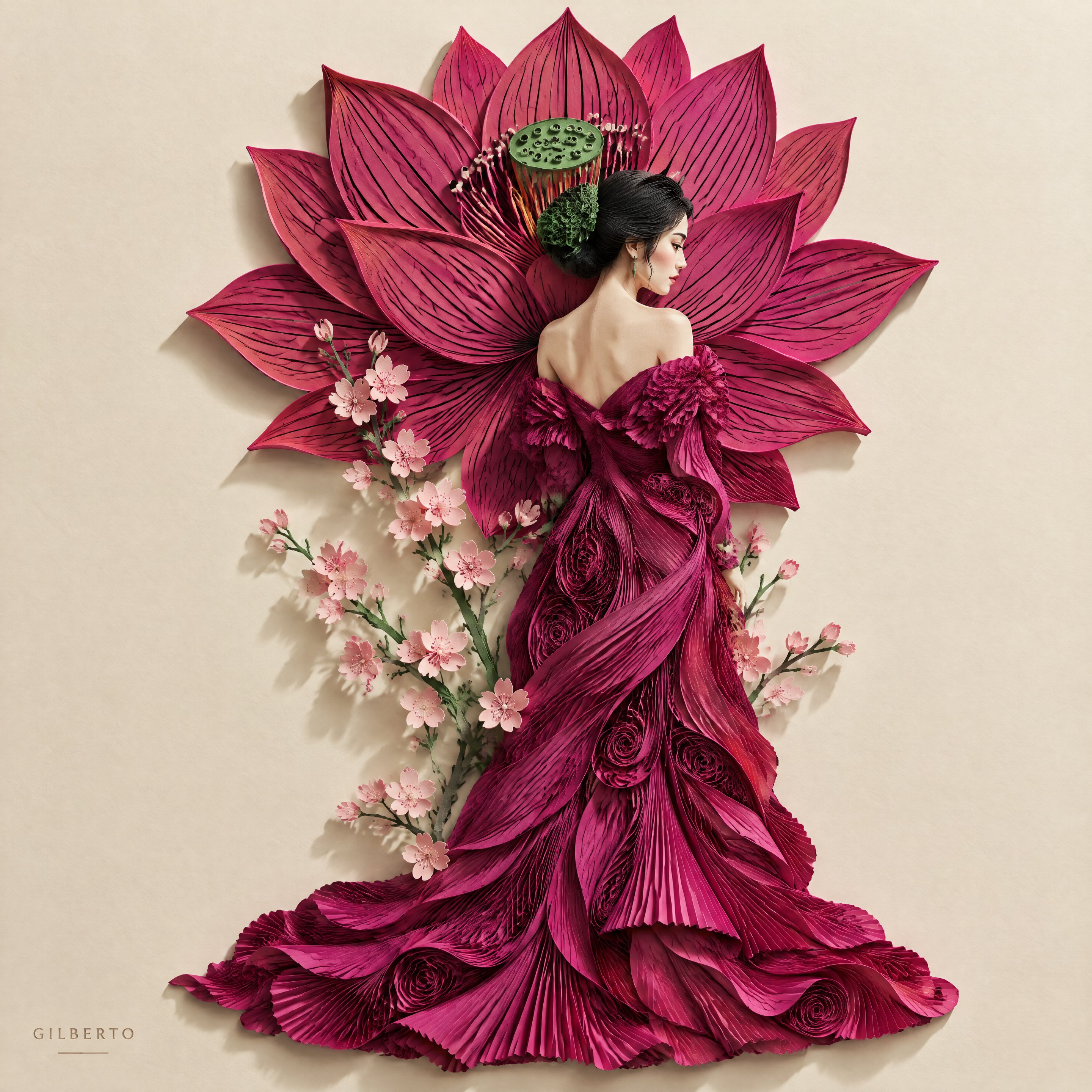
Prompt: Create a vintage-inspired travel poster in a layered 3D paper-cut collage style, designed like a worn traveler’s scrapbook page. Use torn parchment paper with sepia textures, realistic paper layers, soft drop shadows, and an antique map subtly visible beneath. Arrange iconic landmarks in a balanced composition with delicate handwritten labels and arrows, complemented by lush greenery, cobblestone streets, and charming local architecture. Add whimsical travel details such as a paper airplane with a dotted flight path, flying birds, vintage postage stamps, postal marks, and a compass rose. Finish with elegant serif typography featuring the destination name in large spaced letters and a smaller line listing notable cities below. The overall mood should feel nostalgic, handcrafted, richly detailed, timeless, and suitable for a premium vintage travel poster.
ArchitectureDigital Art
Create a vintage-inspired travel poster in a layered 3D paper-cut collage style, designed like a worn traveler’s scrapbook page. Use torn parchment paper with sepia textures, realistic paper layers, soft drop shadows, and an antique map subtly visible beneath. Arrange iconic landmarks in a balanced composition with delicate handwritten labels and arrows, complemented by lush greenery, cobblestone streets, and charming local architecture. Add whimsical travel details such as a paper airplane with a dotted flight path, flying birds, vintage postage stamps, postal marks, and a compass rose. Finish with elegant serif typography featuring the destination name in large spaced letters and a smaller line listing notable cities below. The overall mood should feel nostalgic, handcrafted, richly detailed, timeless, and suitable for a premium vintage travel poster.
Details
Prompt: Create an ultra-premium cinematic advertising poster for [PRODUCT] by [BRAND]. The product is the hero of the composition, featuring hyper-realistic materials, cinematic lighting, realistic reflections, premium textures, atmospheric depth, floating particles, and luxury editorial styling. Showcase extreme detail with macro-quality realism, physically accurate materials, elegant branding, shallow depth of field, minimal premium background, and world-class commercial photography. Include [BRAND], [PRODUCT], and an optional tagline: "[TAGLINE]". 8K, photorealistic, award-winning luxury advertising campaign.

Negative Prompt: cartoon, blurry, plastic, low-detail, fake materials, poor lighting, cheap advertising style, watermark, noise, distorted proportions.
CinematicDigital ArtDramatic
Create an ultra-premium cinematic advertising poster for [PRODUCT] by [BRAND]. The product is the hero of the composition, featuring hyper-realistic materials, cinematic lighting, realistic reflections, premium textures, atmospheric depth, floating particles, and luxury editorial styling. Showcase extreme detail with macro-quality realism, physically accurate materials, elegant branding, shallow depth of field, minimal premium background, and world-class commercial photography. Include [BRAND], [PRODUCT], and an optional tagline: "[TAGLINE]". 8K, photorealistic, award-winning luxury advertising campaign. Negative Prompt: cartoon, blurry, plastic, low-detail, fake materials, poor lighting, cheap advertising style, watermark, noise, distorted proportions.
Details
Prompt: Create an ultra-luxury advertising poster for Chanel N°5 perfume, in a breathtaking fusion of hyper-realistic perfume photography and refined Eastern ink-wash landscape art. The image should feel serene, poetic, museum-worthy, and impossibly elegant, with an overwhelming sense of beauty, restraint, and timeless sophistication.

Main concept:
The Chanel N°5 bottle is the absolute visual anchor and must remain exquisitely realistic, crystal-clear, and modern, while a monochrome oriental shan shui landscape appears to grow organically from the perfume itself. The landscape should not sit separately beside the bottle. Instead, it should emerge delicately from the edges, base, and fragrance aura of the bottle, as if the scent is quietly transforming into mist, mountains, clouds, and waterfalls.

Product:
Place one hyper-realistic Chanel N°5 bottle in the composition as the central hero. The bottle must be unmistakably Chanel N°5: iconic rectangular crystal glass silhouette, elegant faceted cap, pale champagne-golden perfume liquid, crisp black-and-white label, luminous transparency, exquisite glass reflections, and perfect luxury realism. The bottle should feel pristine, silent, and precious.

Fusion logic:
The relationship between the bottle and the ink landscape must include a few carefully controlled points of fusion. Do not keep them fully separate, and do not over-blend them. The fusion should feel rare, subtle, and magical:
soft ink mist may seep from the lower bottle edge,
mountain ridges may appear to grow from the perfume’s inner golden glow,
waterfall-like white space may descend from the bottle base,
faint brush-wash textures may kiss the bottle’s outer contour,
a scroll-like ink terrain may partially dissolve into the transparent glass edge.
These fusion zones should be very limited, elegant, and seamless, creating the sensation that the fragrance is birthing the landscape.

Ink-wash world:
Build a refined black-white-gray Chinese shan shui landscape with:
misty layered mountains,
ink cliffs,
pine trees,
flowing waterfalls,
soft clouds,
fog banks,
paper-like ink diffusion,
brush-washed contours,
subtle scroll texture,
and poetic negative space.
The landscape should feel highly sophisticated, airy, and painterly, never decorative or overloaded.

Composition:
Use a large amount of blank space. The bottle should remain central or slightly off-center, with the ink landscape unfolding asymmetrically from it in a graceful directional flow. The overall layout must feel breathable, quiet, and perfectly balanced, like a luxury gallery poster. Avoid symmetry and avoid crowding the frame.

Color palette:
Keep the image almost entirely monochrome:
rice-paper white,
ivory white,
mist gray,
ash gray,
deep ink black.
Use only a restrained touch of pale champagne gold from the Chanel N°5 liquid as the single warm accent. This minimal warmth should make the perfume feel sacred and luminous against the calm ink world.

Visual feeling:
The image must feel like the ultimate encounter between modern French perfume luxury and classical Eastern mountain poetry. It should suggest stillness, fragrance, memory, nature, and elegance without becoming literal or theatrical. The result should be exceptionally beautiful, soft, and emotionally transporting.

Typography:
Typography must be extremely restrained and elegant, like a museum label or couture fragrance campaign. No cluttered copy.

Use:
“CHANEL”
“N°5”

Optional very subtle Chinese support:
“香奈儿 N°5”
“山水由香而生”
“于留白与墨意之间,见永恒”

The text should be small, airy, and placed only within the negative space.

Lighting and rendering:
Use soft premium light on the bottle, with crystal highlights, subtle shadowing, and immaculate material realism. The ink landscape should feel feathered, atmospheric, and painterly, while the bottle remains sharp, tactile, and ultra-real. The contrast between glass precision and ink softness must be extraordinary. 8k, hyper-detailed, luxury fragrance campaign quality, visually unforgettable.

Negative prompt:
busy collage, colorful scenery, hard separation between bottle and background, excessive fusion, cartoon style, fantasy palace, red lantern overload, gold overload, cheap oriental decor, cluttered typography, blurry bottle, generic perfume ad, noisy background, overdecorated Chinese elements, symmetrical composition
CinematicFantasyEthereal
Create an ultra-luxury advertising poster for Chanel N°5 perfume, in a breathtaking fusion of hyper-realistic perfume photography and refined Eastern ink-wash landscape art. The image should feel serene, poetic, museum-worthy, and impossibly elegant, with an overwhelming sense of beauty, restraint, and timeless sophistication. Main concept: The Chanel N°5 bottle is the absolute visual anchor and must remain exquisitely realistic, crystal-clear, and modern, while a monochrome oriental shan shui landscape appears to grow organically from the perfume itself. The landscape should not sit separately beside the bottle. Instead, it should emerge delicately from the edges, base, and fragrance aura of the bottle, as if the scent is quietly transforming into mist, mountains, clouds, and waterfalls. Product: Place one hyper-realistic Chanel N°5 bottle in the composition as the central hero. The bottle must be unmistakably Chanel N°5: iconic rectangular crystal glass silhouette, elegant faceted cap, pale champagne-golden perfume liquid, crisp black-and-white label, luminous transparency, exquisite glass reflections, and perfect luxury realism. The bottle should feel pristine, silent, and precious. Fusion logic: The relationship between the bottle and the ink landscape must include a few carefully controlled points of fusion. Do not keep them fully separate, and do not over-blend them. The fusion should feel rare, subtle, and magical: soft ink mist may seep from the lower bottle edge, mountain ridges may appear to grow from the perfume’s inner golden glow, waterfall-like white space may descend from the bottle base, faint brush-wash textures may kiss the bottle’s outer contour, a scroll-like ink terrain may partially dissolve into the transparent glass edge. These fusion zones should be very limited, elegant, and seamless, creating the sensation that the fragrance is birthing the landscape. Ink-wash world: Build a refined black-white-gray Chinese shan shui landscape with: misty layered mountains, ink cliffs, pine trees, flowing waterfalls, soft clouds, fog banks, paper-like ink diffusion, brush-washed contours, subtle scroll texture, and poetic negative space. The landscape should feel highly sophisticated, airy, and painterly, never decorative or overloaded. Composition: Use a large amount of blank space. The bottle should remain central or slightly off-center, with the ink landscape unfolding asymmetrically from it in a graceful directional flow. The overall layout must feel breathable, quiet, and perfectly balanced, like a luxury gallery poster. Avoid symmetry and avoid crowding the frame. Color palette: Keep the image almost entirely monochrome: rice-paper white, ivory white, mist gray, ash gray, deep ink black. Use only a restrained touch of pale champagne gold from the Chanel N°5 liquid as the single warm accent. This minimal warmth should make the perfume feel sacred and luminous against the calm ink world. Visual feeling: The image must feel like the ultimate encounter between modern French perfume luxury and classical Eastern mountain poetry. It should suggest stillness, fragrance, memory, nature, and elegance without becoming literal or theatrical. The result should be exceptionally beautiful, soft, and emotionally transporting. Typography: Typography must be extremely restrained and elegant, like a museum label or couture fragrance campaign. No cluttered copy. Use: “CHANEL” “N°5” Optional very subtle Chinese support: “香奈儿 N°5” “山水由香而生” “于留白与墨意之间,见永恒” The text should be small, airy, and placed only within the negative space. Lighting and rendering: Use soft premium light on the bottle, with crystal highlights, subtle shadowing, and immaculate material realism. The ink landscape should feel feathered, atmospheric, and painterly, while the bottle remains sharp, tactile, and ultra-real. The contrast between glass precision and ink softness must be extraordinary. 8k, hyper-detailed, luxury fragrance campaign quality, visually unforgettable. Negative prompt: busy collage, colorful scenery, hard separation between bottle and background, excessive fusion, cartoon style, fantasy palace, red lantern overload, gold overload, cheap oriental decor, cluttered typography, blurry bottle, generic perfume ad, noisy background, overdecorated Chinese elements, symmetrical composition
Details
Prompt: Create an ultra-vibrant commercial poster for M&M’s chocolate candies, featuring a highly realistic mini M&M’s tube package at the exact center as the absolute hero object. The image should combine one realistic product with an explosive hand-drawn illustrated background, creating a youthful, saturated, energetic, and extremely lively candy campaign poster.

Main composition:
Place one realistic mini M&M’s tube package exactly at the center of the image. The package should be a slim portable candy tube, compact and upright, with a rounded cap and a clean cylindrical body, clearly designed as a mini snack tube for M&M’s. It must feel highly realistic, glossy, tactile, and instantly recognizable, with vivid M&M’s logo, colorful branding, premium printed label wrap, sharp reflections, and strong commercial product rendering. The mini tube should be the only fully realistic object in the composition and must dominate the center.

Packaging direction:
The tube should feel playful, portable, collectible, and snackable, like a convenient mini candy tube sold at retail checkout counters. The cap can be bold red, yellow, blue, or white. The body should clearly show M&M’s identity and may include a transparent section revealing colorful candies inside, or a bright fully printed wrapper with bold brand graphics. The tube should feel modern, cute, and highly display-friendly.

Background concept:
Behind the mini tube, create an explosive illustrated universe that radiates outward like a burst of candy energy. The background should not be realistic. Instead, it should be a dense, dynamic, hand-drawn graphic world made of bold black outlines, candy splashes, bounce arcs, swirls, pop-art shapes, looping doodles, comic impact bursts, and rhythmic motion graphics. The illustration should erupt from behind the tube and wrap around it in a circular energetic explosion.

Illustrated elements:
Build the illustrated background from M&M’s-inspired candy energy:
flying colorful chocolate beans in red, yellow, blue, green, orange, and brown,
candy trails,
sugar splash shapes,
confetti,
comic impact bursts,
lightning bolts,
stars,
hearts,
bounce curves,
looping lines,
speech-bubble icons,
playful smiley doodles,
cheerful motion marks,
curved wave forms,
mini balloons,
striped speed lines,
roller-skate energy,
fun geometric symbols.
The illustrations should feel premium, bold, rhythmic, and highly art-directed, not messy childish scribbles.

Style contrast:
The mini tube must feel solid, glossy, realistic, and sharply rendered, while the illustrated universe behind it feels wild, colorful, playful, and explosive. This contrast between realism and hand-drawn candy chaos is the key visual hook. The product remains the visual anchor at all times.

Color palette:
Use a highly saturated M&M’s palette:
bright candy red,
electric blue,
sunny yellow,
vivid green,
orange,
chocolate brown,
clean white highlights,
and bold black line work.
Choose one strong dominant background field color such as vivid sky blue, rich yellow, or bright red, then let the multicolor candy illustration explode around the central mini tube.

Motion and energy:
The poster must feel like candy energy is bursting outward from the mini tube with bounce, swirl, pop, splash, spin, and playful impact. The overall mood should be dynamic, joyful, fast, pop, and impossible to ignore.

Typography:
Keep typography concise and energetic, placed cleanly without cluttering the composition. Use playful premium lettering, rounded and graphic, not ugly heavy black fonts.

Include text such as:
“M&M’s”
“MINI TUBE, MAX FUN”
“POP THE COLOR”
“SHAKE. SNAP. PLAY.”

Optional artistic Chinese text:
“M&M’s 玛氏巧克力豆”
“迷你小管装”
“小小一管,快乐爆开”
“随手一拿,彩色开玩”

Keep text short, bold, youthful, and balanced with the central tube and illustrated explosion.

Mood:
playful, saturated, dynamic, youthful, colorful, pop-art, joyful, energetic, collectible, premium, unforgettable.

Rendering:
hyper-detailed realistic mini candy tube packaging, glossy rounded cap, premium label texture, vivid brand graphics, optional visible candies inside, bold hand-drawn doodle illustration, saturated clean colors, crisp black outlines, premium poster composition, 8k, high-end commercial candy campaign quality.

Negative prompt:
soft pouch packaging, cardboard box, plastic jar, glass jar, metal tin, large family pack, realistic background scene, dull colors, weak motion, cluttered messy layout, low saturation, generic snack ad, blurry product, cheap cartoon style, muddy colors, flat composition, too much text, weak M&M’s branding, dark moody atmosphere
FoodComicBright
Create an ultra-vibrant commercial poster for M&M’s chocolate candies, featuring a highly realistic mini M&M’s tube package at the exact center as the absolute hero object. The image should combine one realistic product with an explosive hand-drawn illustrated background, creating a youthful, saturated, energetic, and extremely lively candy campaign poster. Main composition: Place one realistic mini M&M’s tube package exactly at the center of the image. The package should be a slim portable candy tube, compact and upright, with a rounded cap and a clean cylindrical body, clearly designed as a mini snack tube for M&M’s. It must feel highly realistic, glossy, tactile, and instantly recognizable, with vivid M&M’s logo, colorful branding, premium printed label wrap, sharp reflections, and strong commercial product rendering. The mini tube should be the only fully realistic object in the composition and must dominate the center. Packaging direction: The tube should feel playful, portable, collectible, and snackable, like a convenient mini candy tube sold at retail checkout counters. The cap can be bold red, yellow, blue, or white. The body should clearly show M&M’s identity and may include a transparent section revealing colorful candies inside, or a bright fully printed wrapper with bold brand graphics. The tube should feel modern, cute, and highly display-friendly. Background concept: Behind the mini tube, create an explosive illustrated universe that radiates outward like a burst of candy energy. The background should not be realistic. Instead, it should be a dense, dynamic, hand-drawn graphic world made of bold black outlines, candy splashes, bounce arcs, swirls, pop-art shapes, looping doodles, comic impact bursts, and rhythmic motion graphics. The illustration should erupt from behind the tube and wrap around it in a circular energetic explosion. Illustrated elements: Build the illustrated background from M&M’s-inspired candy energy: flying colorful chocolate beans in red, yellow, blue, green, orange, and brown, candy trails, sugar splash shapes, confetti, comic impact bursts, lightning bolts, stars, hearts, bounce curves, looping lines, speech-bubble icons, playful smiley doodles, cheerful motion marks, curved wave forms, mini balloons, striped speed lines, roller-skate energy, fun geometric symbols. The illustrations should feel premium, bold, rhythmic, and highly art-directed, not messy childish scribbles. Style contrast: The mini tube must feel solid, glossy, realistic, and sharply rendered, while the illustrated universe behind it feels wild, colorful, playful, and explosive. This contrast between realism and hand-drawn candy chaos is the key visual hook. The product remains the visual anchor at all times. Color palette: Use a highly saturated M&M’s palette: bright candy red, electric blue, sunny yellow, vivid green, orange, chocolate brown, clean white highlights, and bold black line work. Choose one strong dominant background field color such as vivid sky blue, rich yellow, or bright red, then let the multicolor candy illustration explode around the central mini tube. Motion and energy: The poster must feel like candy energy is bursting outward from the mini tube with bounce, swirl, pop, splash, spin, and playful impact. The overall mood should be dynamic, joyful, fast, pop, and impossible to ignore. Typography: Keep typography concise and energetic, placed cleanly without cluttering the composition. Use playful premium lettering, rounded and graphic, not ugly heavy black fonts. Include text such as: “M&M’s” “MINI TUBE, MAX FUN” “POP THE COLOR” “SHAKE. SNAP. PLAY.” Optional artistic Chinese text: “M&M’s 玛氏巧克力豆” “迷你小管装” “小小一管,快乐爆开” “随手一拿,彩色开玩” Keep text short, bold, youthful, and balanced with the central tube and illustrated explosion. Mood: playful, saturated, dynamic, youthful, colorful, pop-art, joyful, energetic, collectible, premium, unforgettable. Rendering: hyper-detailed realistic mini candy tube packaging, glossy rounded cap, premium label texture, vivid brand graphics, optional visible candies inside, bold hand-drawn doodle illustration, saturated clean colors, crisp black outlines, premium poster composition, 8k, high-end commercial candy campaign quality. Negative prompt: soft pouch packaging, cardboard box, plastic jar, glass jar, metal tin, large family pack, realistic background scene, dull colors, weak motion, cluttered messy layout, low saturation, generic snack ad, blurry product, cheap cartoon style, muddy colors, flat composition, too much text, weak M&M’s branding, dark moody atmosphere
Details
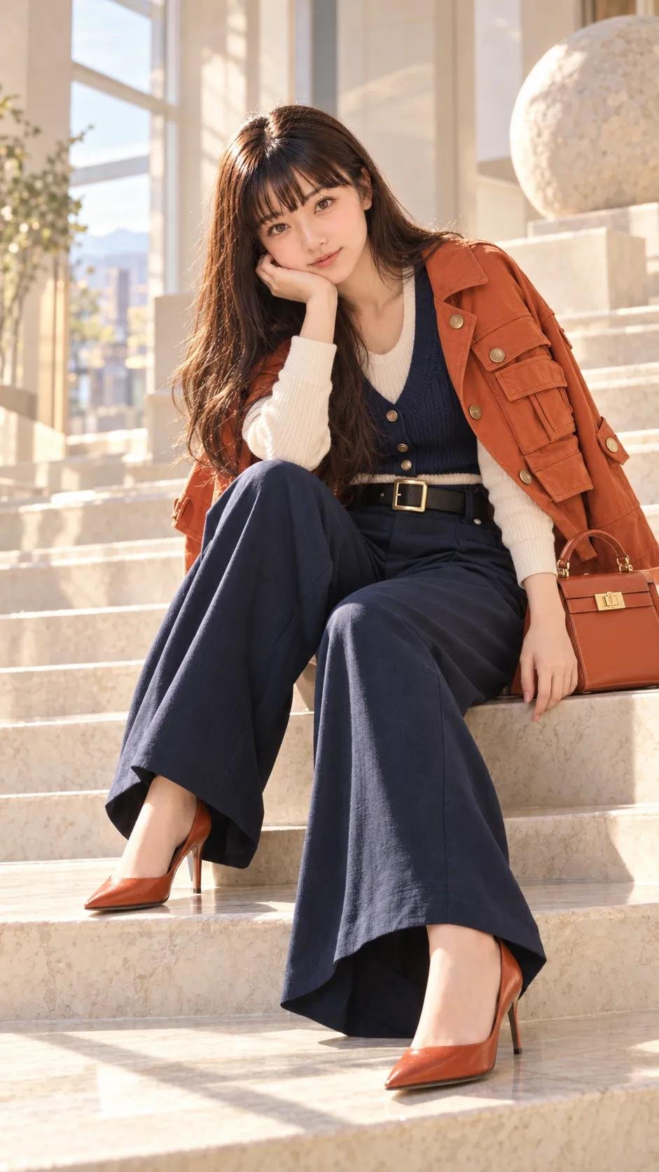
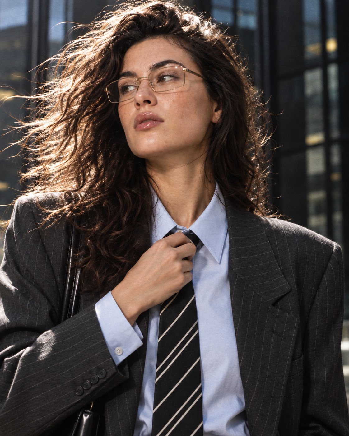
An ultra-premium luxury fashion editorial portrait of a beautiful young East Asian woman with long, naturally wavy black hair and flawless natural makeup, walking confidently toward the camera with a calm, powerful CEO-like presence. She wears an elegant ivory silk satin button-up blouse with soft natural folds, tucked into high-waisted tailored black wide-leg trousers, paired with black pointed-toe leather heels. One hand rests casually inside the trouser pocket while the other hand loosely holds a pair of luxury black sunglasses. She wears minimal refined gold jewelry including a delicate necklace, small earrings, a luxury gold wristwatch, and a subtle bracelet. Background: A seamless premium studio backdrop featuring a deep emerald green fading into dark forest green with a perfectly smooth gradient. Behind the subject is a large soft warm golden circular spotlight creating beautiful depth and luxury separation. The polished studio floor has a very subtle cinematic reflection without appearing glossy. Pose: Walking naturally toward the camera with crossed strides, shoulders relaxed, spine perfectly straight, chin slightly raised, confident posture, elegant runway-inspired movement, natural arm swing, luxurious body language, eyes looking directly into the lens with a composed editorial expression. Lighting: Premium Vogue-style three-point studio lighting with a large soft diffused key light, warm golden rim light outlining the hair and shoulders, subtle fill light preserving realistic shadows, cinematic HDR lighting, soft highlight roll-off, realistic reflections on the satin fabric, rich contrast, luxury commercial photography lighting. Camera: Full-body portrait, eye-level angle, 85mm full-frame lens, f/2.2 aperture, shallow depth of field, razor-sharp focus on the eyes and face, realistic optical perspective, premium fashion campaign composition. Color Grading: Luxury editorial color grading with deep emerald greens, warm golden highlights, rich blacks, natural ivory fabric tones, balanced skin tones, soft bloom, HDR dynamic range, subtle filmic contrast, premium Vogue, Zara, Ralph Lauren and COS campaign aesthetic. Quality: Hyper-realistic, photorealistic, ultra-detailed skin texture, natural hair strands, realistic fabric physics, luxury commercial fashion photography, editorial masterpiece, magazine cover quality, 8K ultra-HD, award-winning fashion campaign, clean composition, no text, no watermark.
Details
Prompt: GPT Image 2 on ChatGPT 

Prompt:

Ultra-cinematic surreal clone photography, aerial high-angle view of a young Indian man standing motionless at the center of a vast urban plaza while dozens of identical copies of him move around in different directions. The clones all share the same appearance as each other, creating a striking visual repetition effect, but are not based on any reference image or real person. Handsome Indian male with a sharp jawline, neatly styled textured black hair, trimmed beard, expressive dark eyes, natural skin texture, and realistic facial proportions. Every clone has the exact same face, outfit, hairstyle, and body proportions.

The central character remains perfectly sharp and isolated from the crowd, standing confidently with hands in pockets, wearing an oversized cream hoodie, black cargo pants, white sneakers, and dark sunglasses. Surrounding clones wear the identical outfit and appear slightly motion-blurred as they walk, run, and cross paths around him. Strong contrast between stillness and motion.

Expansive geometric stone pavement, minimal modern architecture, subtle city elements, warm early-morning sunlight, soft atmospheric haze, realistic shadows, cinematic depth, and premium editorial fashion photography aesthetics. Tilt-shift effect creates a miniature-world illusion while maintaining realistic scale. Mood is introspective, powerful, and surreal, one person surrounded by endless versions of himself.

Hyper-realistic skin detail, authentic anatomy, natural proportions, realistic clothing folds, cinematic color grading, shallow depth of field, HDR lighting, subtle film grain, luxury fashion campaign quality, contemporary surreal visual storytelling. No face distortion, no extra limbs, no duplicated body errors, no asymmetrical eyes, no cartoon style, no artificial AI-looking faces. Shot on Sony A7R IV, 85mm lens, f/1.8, aerial perspective, ultra-detailed, 8K, vertical 9:16 composition.
SurrealCinematicFashion
GPT Image 2 on ChatGPT Prompt: Ultra-cinematic surreal clone photography, aerial high-angle view of a young Indian man standing motionless at the center of a vast urban plaza while dozens of identical copies of him move around in different directions. The clones all share the same appearance as each other, creating a striking visual repetition effect, but are not based on any reference image or real person. Handsome Indian male with a sharp jawline, neatly styled textured black hair, trimmed beard, expressive dark eyes, natural skin texture, and realistic facial proportions. Every clone has the exact same face, outfit, hairstyle, and body proportions. The central character remains perfectly sharp and isolated from the crowd, standing confidently with hands in pockets, wearing an oversized cream hoodie, black cargo pants, white sneakers, and dark sunglasses. Surrounding clones wear the identical outfit and appear slightly motion-blurred as they walk, run, and cross paths around him. Strong contrast between stillness and motion. Expansive geometric stone pavement, minimal modern architecture, subtle city elements, warm early-morning sunlight, soft atmospheric haze, realistic shadows, cinematic depth, and premium editorial fashion photography aesthetics. Tilt-shift effect creates a miniature-world illusion while maintaining realistic scale. Mood is introspective, powerful, and surreal, one person surrounded by endless versions of himself. Hyper-realistic skin detail, authentic anatomy, natural proportions, realistic clothing folds, cinematic color grading, shallow depth of field, HDR lighting, subtle film grain, luxury fashion campaign quality, contemporary surreal visual storytelling. No face distortion, no extra limbs, no duplicated body errors, no asymmetrical eyes, no cartoon style, no artificial AI-looking faces. Shot on Sony A7R IV, 85mm lens, f/1.8, aerial perspective, ultra-detailed, 8K, vertical 9:16 composition.
Details
Prompt: Clean, modern typographic travel poster in a 3:2 landscape format. The words "NEW YORK" — seven large, bold, uppercase geometric sans-serif letters set on a single line (or "NEW" stacked above "YORK" if better balanced) — span the full width and ARE the entire composition. Every illustrated element lives strictly INSIDE the letterforms, as if each letter is a window cut out of white paper revealing a scene; nothing spills outside the letter silhouettes. Outside the letters: pure, empty, flat white background — no objects, no cast shadows, no decoration.

— WHAT FILLS EACH LETTER (NYC-accurate, clipped to the letter shape) —
N : the Statue of Liberty — standing torch raised, following one vertical of the N.
E : stacked Manhattan brownstone facades with fire escapes nested in the three horizontal bars.
W : the Brooklyn Bridge — its two Gothic stone arches and suspension cables spanning the W's zig-zag, a small boat on the East River below.
Y : the Empire State Building — the Art-Deco spire cradled in the fork of the Y.
O : the ring frames Times Square — glowing billboards, a yellow taxi cab, a scramble of tiny pedestrians.
R : the Flatiron Building's distinctive triangular wedge silhouette inside the R.
K : Central Park greenery and the One World Trade Center spire slicing along the K's diagonals; a subway car along the base.

Small city details (a yellow cab, a hot-dog cart with faint steam, a pigeon, a subway roundel, drifting clouds) appear ONLY where they fit within a letter's interior. Keep full legibility of "NEW YORK".

— STYLE —
Elegant flat vector illustration, crisp geometric shapes, minimal detail, clean outlines, subtle shadows contained inside the letters only. Limited palette: deep navy, warm cream, muted red, soft gray-blue — a restrained warm-yellow accent used ONLY on the taxis / Times Square glow. Optional minimal tagline beneath in wide-spaced small capitals: "THE CITY THAT NEVER SLEEPS", thin and understated. Perfectly balanced centered composition.

premium flat vector, minimalist travel poster, geometric illustration, editorial tourism branding, clean typography, high contrast, ultra-sharp lines, museum-quality print, scalable SVG aesthetic, 8K.
CityscapeVector
Clean, modern typographic travel poster in a 3:2 landscape format. The words "NEW YORK" — seven large, bold, uppercase geometric sans-serif letters set on a single line (or "NEW" stacked above "YORK" if better balanced) — span the full width and ARE the entire composition. Every illustrated element lives strictly INSIDE the letterforms, as if each letter is a window cut out of white paper revealing a scene; nothing spills outside the letter silhouettes. Outside the letters: pure, empty, flat white background — no objects, no cast shadows, no decoration. — WHAT FILLS EACH LETTER (NYC-accurate, clipped to the letter shape) — N : the Statue of Liberty — standing torch raised, following one vertical of the N. E : stacked Manhattan brownstone facades with fire escapes nested in the three horizontal bars. W : the Brooklyn Bridge — its two Gothic stone arches and suspension cables spanning the W's zig-zag, a small boat on the East River below. Y : the Empire State Building — the Art-Deco spire cradled in the fork of the Y. O : the ring frames Times Square — glowing billboards, a yellow taxi cab, a scramble of tiny pedestrians. R : the Flatiron Building's distinctive triangular wedge silhouette inside the R. K : Central Park greenery and the One World Trade Center spire slicing along the K's diagonals; a subway car along the base. Small city details (a yellow cab, a hot-dog cart with faint steam, a pigeon, a subway roundel, drifting clouds) appear ONLY where they fit within a letter's interior. Keep full legibility of "NEW YORK". — STYLE — Elegant flat vector illustration, crisp geometric shapes, minimal detail, clean outlines, subtle shadows contained inside the letters only. Limited palette: deep navy, warm cream, muted red, soft gray-blue — a restrained warm-yellow accent used ONLY on the taxis / Times Square glow. Optional minimal tagline beneath in wide-spaced small capitals: "THE CITY THAT NEVER SLEEPS", thin and understated. Perfectly balanced centered composition. premium flat vector, minimalist travel poster, geometric illustration, editorial tourism branding, clean typography, high contrast, ultra-sharp lines, museum-quality print, scalable SVG aesthetic, 8K.
Details

About GPT Image 2

GPT Image 2 is OpenAI's image generation model, and it works differently from most: instead of diving straight into pixels, it plans the layout, reasons about your instructions, and self-checks before it draws. That deliberate pipeline is why it handles briefs that would trip up faster models.

Its standout strength is complex multi-part instructions. Ask for a labeled diagram, an infographic with several panels, or a scene where three characters each do something specific, and GPT Image 2 keeps track of every requirement. Text rendering is another reliable strength — signs, labels, and headlines come out legible instead of garbled.

A model that actually reads your whole prompt rewards prompts worth reading. Vague briefs waste its reasoning; precise ones let it shine. The gallery below collects tested GPT Image 2 prompts with their real outputs, so you can start from a structure that already works.

How to write GPT Image 2 prompts

  1. 1Write the full brief, not a keyword pile. GPT Image 2 reasons over your instructions, so numbered requirements and complete sentences outperform comma-separated tags.
  2. 2Spell out every element and its relationship: "a three-panel comic; panel one shows…, panel two shows…". The model tracks multi-part structure — give it the structure to track.
  3. 3Put exact text in quotation marks: a sign reading "OPEN 24 HOURS", a mug printed with "World's Okayest Coder". Quoted strings render far more faithfully than paraphrased ones.
  4. 4Describe layout intent explicitly — foreground vs. background, left vs. right, what overlaps what. Because the model plans composition first, spatial language directly shapes the plan.
  5. 5State constraints as rules, not hopes: "no watermark, flat vector style, white background, exactly four icons". GPT Image 2 treats explicit rules as a checklist during its self-check.
  6. 6Iterate by editing the brief, not rerolling. When one element is wrong, revise that clause and keep the rest verbatim — the model's instruction-following makes targeted fixes stick.

Frequently asked questions

What is GPT Image 2 best at?

Complex, multi-requirement images: infographics, diagrams, UI mockups, scenes with several distinct elements, and anything that needs readable text. Because it plans and self-checks before drawing, it is among the strongest models at following long, precise instructions without dropping details.

How do I write good GPT Image 2 prompts?

Treat the prompt as a design brief. List every element, its position, and any exact text in quotes, then state your style and constraints as explicit rules. The tested prompts on this page show the pattern in action — copy one and swap in your own content.

Can GPT Image 2 render text inside images?

Yes, and reliably — legible signs, labels, headlines, and packaging copy are one of its signature strengths. Put the exact wording in quotation marks and describe where it should appear; the model's self-check pass helps keep the spelling intact.

Where can I use GPT Image 2?

GPT Image 2 is available through ChatGPT and via the OpenAI API for developers. Copy any prompt from this page, paste it there, and adjust the elements or text to fit your project.