LogoAhaPrompt
  • Prompts
  • Featured
  • Models
  • Submit
  • Blog
AhaPromptAhaPrompt

AI Prompts for Images, Video & Audio — Every Model, One Library

Built withLogoNEXTY.DEV
Explore
  • All Prompts
  • Featured Prompts
  • Image Prompts
  • Video Prompts
  • Audio Prompts
  • AI Models
  • Submit a Prompt
  • Blog
Languages
  • English
  • 中文
  • 日本語
  • 한국어

Copyright © 2026 AhaPrompt All rights reserved.

Privacy PolicyTerms of Service
HomeAI Prompt LibraryAI Image PromptsLuxury Ice Cream Bar Commercial Poster
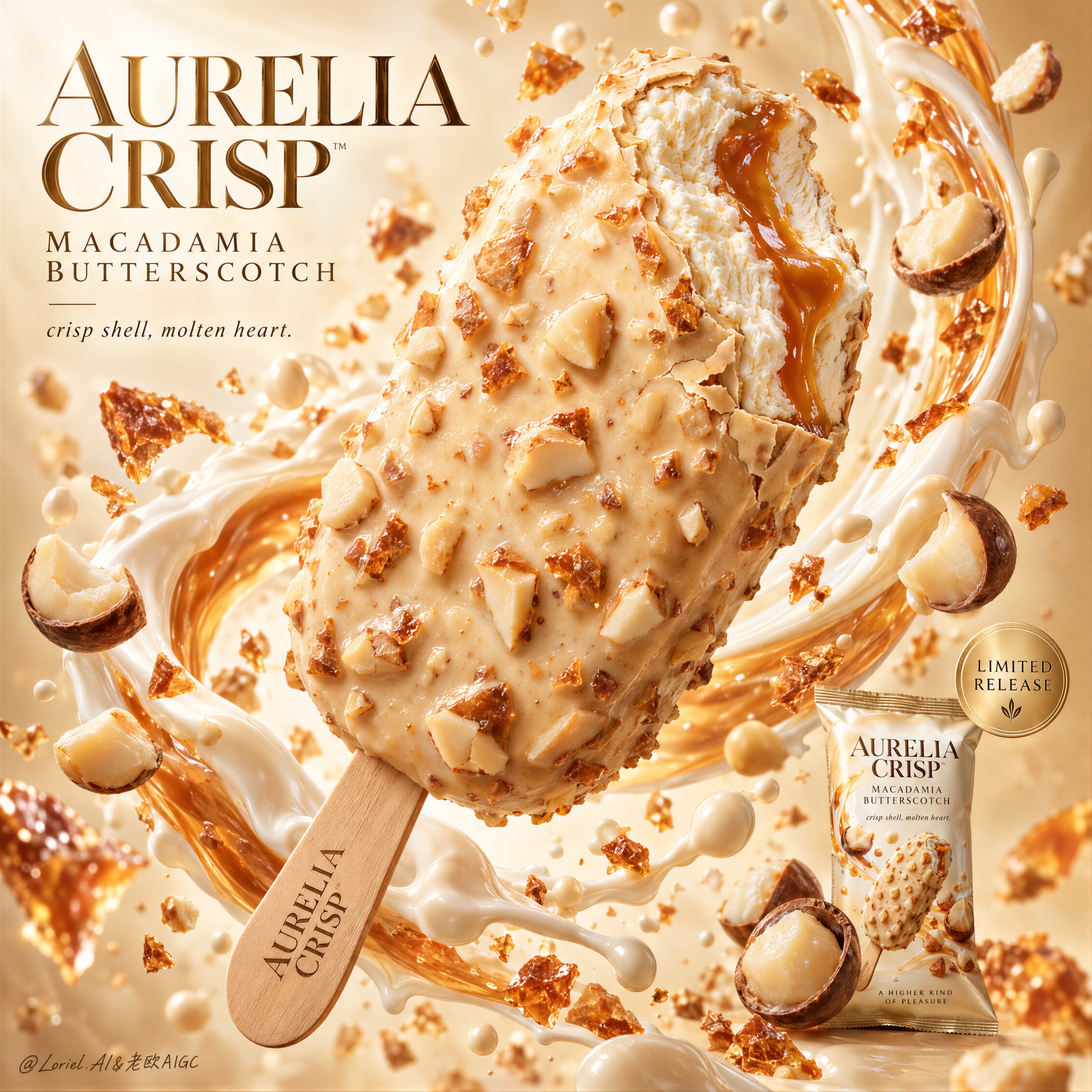
Luxury Ice Cream Bar Commercial Poster — AI image prompt — GPT Image 2.5 — Product Photography, Advertising, Food

Luxury Ice Cream Bar Commercial Poster

OpenAIGPT Image 2.5OpenAIimage

Create a Cannes-level commercial dessert poster for fictional luxury ice cream bar brand AURELIA CRISP, merging indulgent food realism, sculptural liquid motion, and gallery-clean advertising design into one unified hero image. The core concept is suspended decadence: a single bitten macadamia-butterscotch ice cream bar floats as the central icon, wrapped by a controlled arc of cream, caramel gloss, and airborne nut fragments. The product must remain the absolute visual leader. Use a vertical full-bleed poster with a close-up hero dessert shot, staged diagonally from lower left to upper right. Preserve the exact structure: one oversized floating bar at center, a surrounding crescent of creamy splash behind and around it, floating macadamia halves and crunchy fragments across foreground and background, a refined headline block in the upper left, and a small secondary package shot with release seal in the lower right. The bitten tip must face the viewer enough to expose the interior clearly. The layout should feel explosive yet controlled, rich yet minimal, luxurious yet instantly readable. Design a premium coated ice cream bar with a pale champagne-ivory shell infused with macadamia chunks and butterscotch brittle. A single bite is taken from the upper front edge, revealing dense velvety vanilla-toned ice cream with a molten amber butterscotch ribbon running through the center. The shell should feel crisp, slightly thick, and luxuriously irregular, with delicate fracture lines around the bite edge and embedded nut relief across the surface. The stick is clean light wood, refined, and subtly branded with the fictional mark AURELIA CRISP. The hero product must feel edible, tactile, expensive, and impeccably finished. Build an abstract premium dessert studio field with a luminous warm ivory-to-butterscotch gradient background, airy and bright but not flat. A silk-like ring of milk cream and caramelized dairy splash curves behind the bar, creating enclosure and motion while preserving hierarchy. Macadamia kernels, broken nut halves, crisp caramel shards, and fine cream droplets occupy layered depths around the hero object. Keep all elements clean, intentional, and spacious. No table, no hands, no clutter, no extra props. Lighting is bright luxury studio light with a soft frontal key, delicate upper-left glow, and refined specular shaping along the shell texture, bitten interior, and syrup core. Palette hierarchy: 60% ivory cream, pale vanilla, and macadamia beige; 30% champagne caramel, butterscotch amber, and soft gold; 10% toasted nut brown, warm wood, and subtle shadow accents. Maintain high brightness, creamy contrast, and precise edge separation. No muddy beige, no dead white blowout, no dirty shadows. The emotional tone is velvety, crisp, radiant, collectible, and indulgent. Materials must feel extremely photoreal: crunchy nut topology, subtle gloss variation, tiny coating ripples, and believable shell thickness; fine creamy ice crystal softness in the bitten interior without looking frozen-solid or plastic; a viscous glossy butterscotch ribbon; macadamia pieces with dry matte interiors, slightly satin outer surfaces, and realistic color variation; and a thick silky cream splash with coherent physical flow. The packaging in the lower right should be a small but sharp premium packshot with matching palette logic and precise label print. Integrate premium English typography into the poster architecture. In the upper left, place a sculpted headline block reading “AURELIA CRISP / MACADAMIA BUTTERSCOTCH”, using an elegant couture-inspired serif or high-contrast editorial type system with generous spacing. Below it, add the restrained phrase “crisp shell, molten heart.” In the lower right, near the secondary packshot, place a subtle circular champagne-gold seal with concise microcopy such as “limited release”. Typography must feel light, art-directed, and embedded into the motion flow, never heavy or intrusive. Output: a full-bleed premium dessert poster with product-first hierarchy, ultra-clean execution, hyperreal edible texture, elegant graphic rhythm, sharp packaging support, and high-end commercial readability. Avoid extra bars, malformed nuts, duplicated fragments, chaotic splash overload, collapsed melting, plastic-looking coating, unreadable packaging text, warped bite anatomy, dead highlights, muddy cream haze, low-grade AI texture, stock-poster genericity, overdecorated luxury cliches, or resemblance to existing real ice cream branding.

Details
Type
AI Image Prompts
Aspect Ratio
1:1
Updated
Oct 5, 2026
Category
Product PhotographyAdvertisingFood
Source

How to use this prompt

  1. 1Copy the full prompt with the copy button above.
  2. 2Open GPT Image 2.5 by OpenAI, or any image generator with a similar style range.
  3. 3Paste the prompt, then swap the subject and style keywords to match your idea.
  4. 4Match the example's settings (1:1 · Product Photography · Advertising · Food), then iterate — small wording changes shift the output a lot.

Frequently asked questions

Which AI model generated this image?

This image was generated with GPT Image 2.5 by OpenAI. The prompt on this page is the exact text used to create it.

What settings does this prompt use?

The example was generated with GPT Image 2.5 using: 1:1 · Product Photography · Advertising · Food. Reusing these settings gives the closest match.

How do I get similar results?

Copy the prompt as-is first, then replace only the subject while keeping the style, lighting, and composition keywords. Generate a few variations — outputs differ between runs.

Can I modify this prompt?

Yes. Prompts work best as starting points — adjust descriptors, aspect ratio, or style tags to make the output your own.
More GPT Image 2.5 prompts

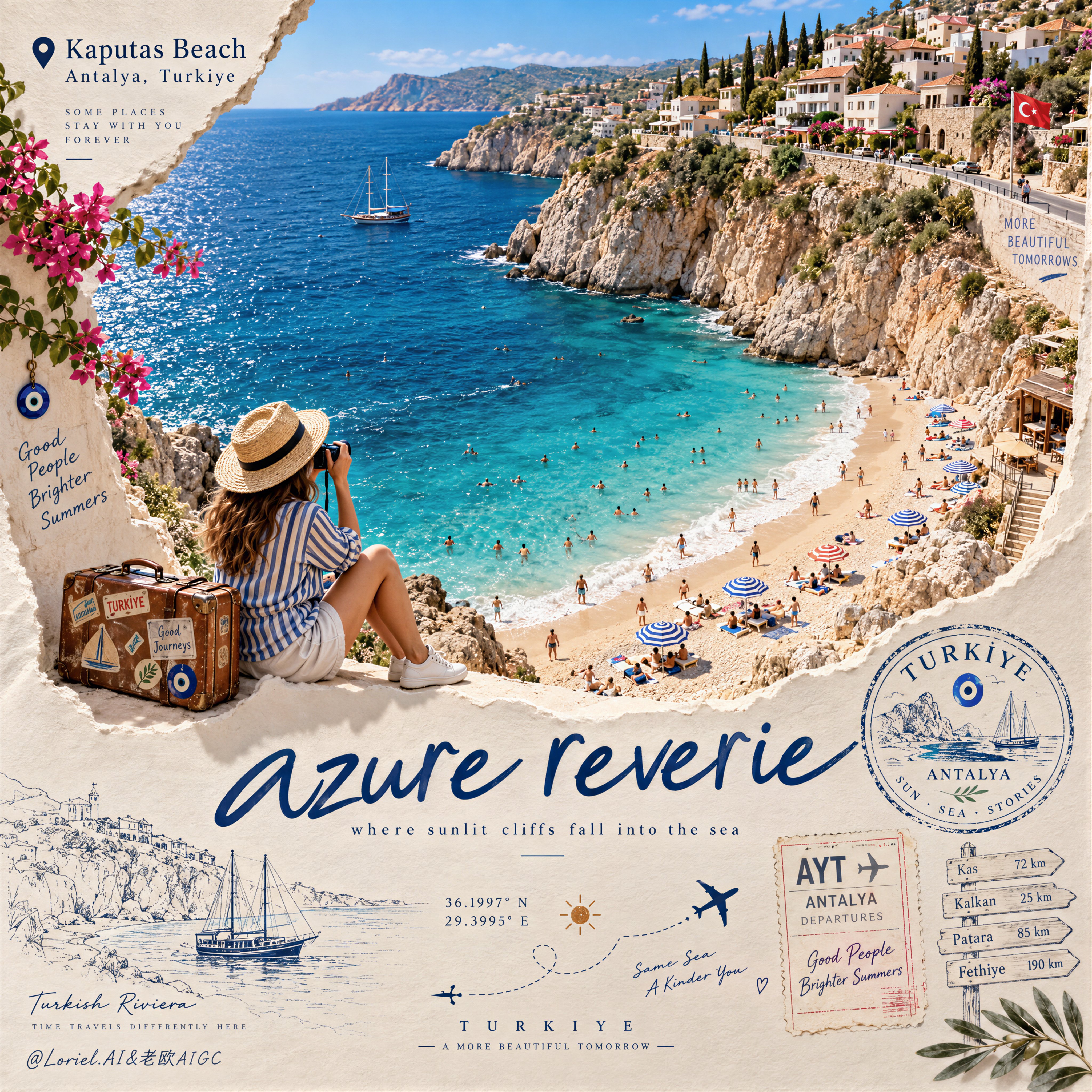
Create a Cannes-level travel destination advertising poster for TURKIYE, preserving the exact struct — AI image prompt — GPT Image 2.5
OpenAIGPT Image 2.5
Create a Cannes-level travel destination advertising poster for TURKIYE, preserving the exact structural logic of a premium paper-sculpture tourism print while merging emotional summer atmosphere with forensic material realism. The composition is vertical and built around one large curved torn-paper window that reveals a luminous handcrafted miniature view of KAPUTAS BEACH, ANTALYA, TURKIYE, while the lower foreground remains a refined cream paper field carrying elegant destination typography, travel stamps, route sketches, coordinates, and curated tourism graphics. The final image must feel like a collector-grade Mediterranean travel memory object: tactile, sun-warmed, cinematic, and exquisitely constructed. Hero destination scene: inside the curved paper opening, reveal a radiant turquoise cove embraced by pale limestone cliffs and a gently arcing golden beach. Show layered Mediterranean water bands shifting from pale aqua near the shore to saturated teal and deep azure farther out, with delicate repeating wave lines and bright foam edges rolling onto the sand. Populate the beach with tiny yet believable sunbathers, swimmers, striped parasols, towels, and scattered leisure details, all proportionally correct and integrated into the scene. Along the upper horizon, build a densely stepped hillside of whitewashed and pastel coastal houses, terracotta roofs, boutique balconies, cypress trees, and warm stone terraces, arranged like a refined miniature Mediterranean village. The entire destination window must feel like a luxury handcrafted 3D diorama enhanced with highly realistic micro-surface detail. Narrative foreground: on the lower edge of the cutout, place one seated miniature traveler figure as an emotional invitation into the destination. The traveler wears elegant striped resort clothing, a straw hat, white sneakers, and holds a camera, beside a small vintage suitcase covered in tasteful travel stickers. The anatomy, hands, posture, and clothing folds must be natural and correct. This figure should feel quietly alive, as if pausing at the threshold of memory, adding warmth and human scale without competing with the destination itself. Typography and editorial layout: preserve the same poster rhythm as the reference. At the upper left, place a small map-pin icon followed by “Kaputas Beach” and beneath it “Antalya, Turkiye” in refined editorial type. On the lower paper field, place one large flowing handwritten English title in deep Mediterranean blue, such as “azure reverie”, followed by a small subtitle like “where sunlit cliffs fall into the sea”. Distribute a few highly curated travel graphics across the lower area: one circular passport-style destination stamp, one boarding-pass or visa-stamp element, one dotted flight-path doodle with tiny airplane icons, precise latitude-longitude coordinates, a small sun glyph, a fine-line coastal sketch, and one discreet signpost marking nearby destinations. All typography must feel elegant, airy, and graphically integrated, never generic, heavy, or cluttered. Turkey-specific accents: add subtle premium local cues with restraint. Integrate a tiny evil-eye motif into one stamp or baggage sticker, a delicate line illustration of a gulet sailboat or coastal architectural silhouette in the lower graphics, and visual cues that suggest refined Turkish Riviera identity without becoming folkloric or overloaded. Everything should feel international, luxurious, and compositionally clean. Atmosphere: the poster should carry the sensation of late-morning Mediterranean light, salt in the air, and the emotional softness of an unforgettable summer coast remembered through beautifully crafted paper. The sea must feel alive and breezy, the sky fresh and expansive, and the destination window should radiate optimism, escape, and warmth. The image should feel like a tactile travel keepsake elevated into a world-class advertising object. Material realism: emphasize thick layered paper edges, crisp cut contours, matte card texture, embossed shadow transitions, tiny architectural facade details, miniature umbrellas, foam ridges, cliff stratification, printed stamp ink, luggage leather grain, sticker gloss, clothing fabric weave, and precise micro-scale beach props. The sea should have dimensional depth without losing the handcrafted paper language. The paper opening must cast believable soft shadows onto the lower field, and every surface should read as physically buildable, premium, and photographically convincing. Lighting: use bright Mediterranean daylight from the upper left with soft clean shadows that enhance the paper relief and miniature depth. The waves, parasols, rooftops, cliffs, and traveler should receive warm, luminous highlights. The lower paper field remains softly lit with subtle shadowing from the cut edge, stamps, and seated figure, producing a polished museum-quality commercial finish. Avoid harsh contrast, dull flatness, or dirty shadow masses. Color hierarchy: 60% luminous turquoise, aqua, pale sand, sun-bleached ivory, and clear coastal sky blue; 30% terracotta roof tones, limestone beige, sage-green foliage, and soft neutral ink tones; 10% deep navy typography, warm suitcase browns, and small accent colors from parasols and travel graphics. The palette must feel fresh, upscale, joyful, and unmistakably Mediterranean. Design intent: the final image must preserve the reference’s exact logic of a
Details
A striking top-down art photograph of a famous packaged food/snack from [COUNTRY], placed on a clean — AI image prompt — GPT Image 2.5
OpenAIGPT Image 2.5
A striking top-down art photograph of a famous packaged food/snack from [COUNTRY], placed on a clean white sheet of paper. At the very top of the paper, write “[COUNTRY NAME]” in large, bold, beautiful typography. Directly underneath, place a realistic, colorful packet of “[FAMOUS FOOD/SNACK]” from that country. The packet is creatively split/opened down the center, and the inside artwork transforms into a vibrant miniature illustration of the country — featuring its most iconic landmark, architecture, landscape, cultural elements and recognizable local details. Keep the original food packet highly realistic with authentic-looking folds, crinkles, printed graphics and vivid colors, while the emerging country illustration uses expressive colored-pencil and wax-crayon strokes. White paper background, overhead composition, playful handmade imperfections, rich saturated colors, premium editorial art photography, extremely detailed, visually satisfying, viral social-media aesthetic.
Details
Premium Editorial Poster Instructions

Each uploaded photo must be made into a separate, independent — AI image prompt — GPT Image 2.5
OpenAIGPT Image 2.5
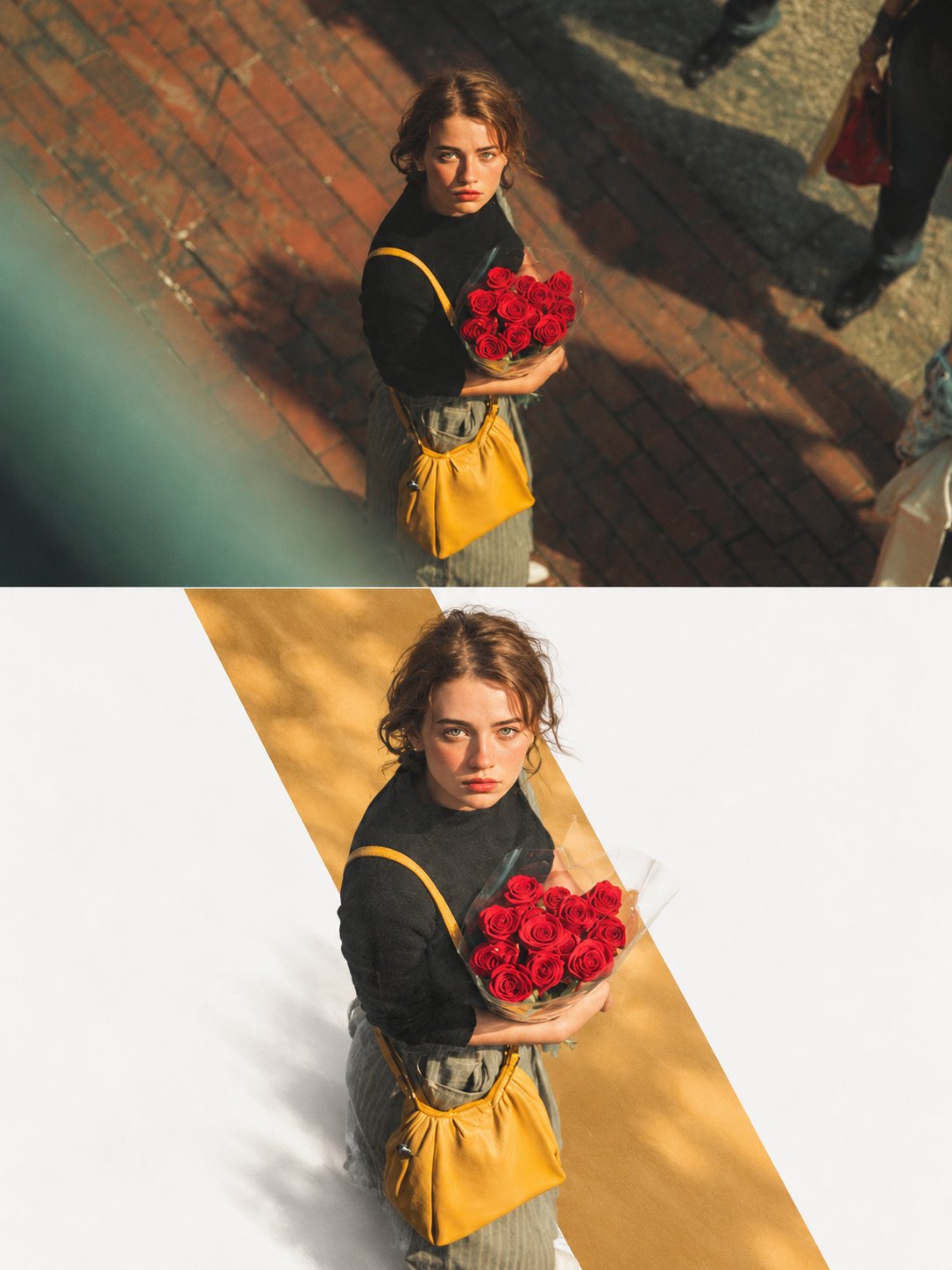
Premium Editorial Poster Instructions Each uploaded photo must be made into a separate, independent, premium editorial poster, and multiple photos must not be combined. Use a strict 3:4 vertical canvas. Split the canvas horizontally in the exact center: the upper half and the lower half each occupy 50% of the height, are equally wide, and equally high, with no alteration of proportion. The upper half uses the original photo directly and must not be regenerated. Preserve the identity of the main subject, the human body or architectural structure, proportions, perspective, spatial relationships, texture, natural light and shadow, color, and environment in their entirety. Only slight cropping and restrained premium color grading are permitted; re-drawing the main subject, fictional light, HDR, excessive saturation, plastic texture, and fictional content are prohibited. hibited. When needing to adapt to the frame, only environmental areas such as sky, water surface, ground, walls, plants, or background can be extended. The lower half extracts and reconstructs the "narrative core" of the photo: it can be a single primary subject, or a group of related elements that together embody the photo's identity, scale, action, o story relationship. Maintain its realistic, recognizable appearance, proportion, internal structure, texture, and relative position. Do not remove important related elements, and do not directly us rectangular photo cutouts. The reconstructed subject typically occupies 55%-80% of the width of the lower area. It should naturally extend based on the photo's primary direction and retain plausible ground, water lines, shadows, or softly dissipated edges to integrate into the background, avoiding a sticker-like or floating appearance. Incorporate a narrow, low-saturation geometric color field behind or through the center of the subject, serving as a "critical window" between reality and editorial abstraction. The color of the window must be extracted from the original photo, and its orientation (horizontal, vertical, or diagonal) chosen based on the overall narrative direction. The subject must actively pass through the window: part of it is within the color field, and part enters the open negative space, naturally crossing the window's boundary to create occlusion, penetration, and spatial depth. The window is not a frame or a card; it must not fully enclose the subject. Only one primary window is allowed; multiple color blocks, thick borders, rounded corners, strong gradients, and drop shadows are prohibited. Use a white, cool white, very light gray, or near-white background for the lower half, coordinated with the photo. Employ a restrained asymmetrical composition and abundant negative space to establish a three-tier hierarchy: Reconstructed subject or narrative composition Low-saturation geometric window
Details
ZARA — TOTE BAG MERCH DROP
“THE EVERYDAY ICON”
Act as a Senior Brand Art Director, Editorial Fashion — AI image prompt — GPT Image 2.5
OpenAIGPT Image 2.5
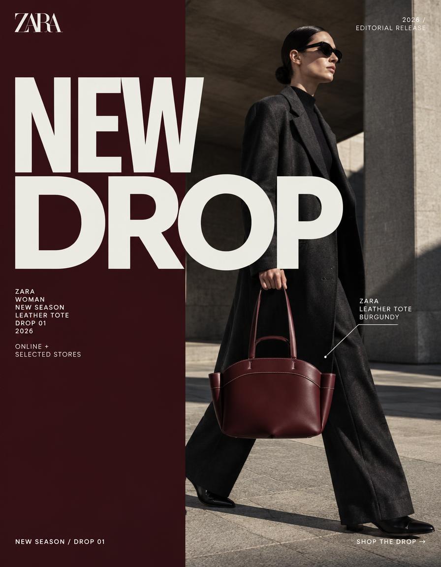
ZARA — TOTE BAG MERCH DROP “THE EVERYDAY ICON” Act as a Senior Brand Art Director, Editorial Fashion Photographer, Art Director, Set Designer, Typography Designer and Behance-level campaign designer. Create ONE horizontal 16:9 editorial campaign poster announcing a ZARA tote-bag merch drop. REFERENCE PRODUCT: Use the uploaded reference image as the EXACT product reference. The tote must remain visually faithful to the reference: — deep burgundy / oxblood leather appearance — structured rounded tote silhouette — wide curved upper body — distinctive double-handle construction — long shoulder straps — short top handles — visible stitched construction — minimal metal detailing — understated luxury finish — same proportions, silhouette, handle architecture and material character DO NOT redesign the bag. DO NOT change the silhouette. DO NOT add pockets, logos, hardware or decorative elements that do not exist on the reference. The product must remain the recognizable hero SKU throughout the composition. ━━━━━━━━━━━━━━━━━━━━ CONCEPT — MERCH DROP ━━━━━━━━━━━━━━━━━━━━ This is NOT a conventional Zara product photoshoot. It should feel like a highly art-directed ZARA merchandise DROP campaign created for Instagram, fashion media and a Behance editorial case study. The tote is treated as a CULT OBJECT — photographed with the visual confidence of a fashion campaign rather than a standard ecommerce product image. Visual language: fashion editorial × contemporary retail × art-directed street photography × premium merchandise launch. The campaign should immediately communicate: NEW DROP. LIMITED MOMENT. DESIRABLE OBJECT. ZARA ENERGY. ━━━━━━━━━━━━━━━━━━━━ LAYOUT ARCHITECTURE ━━━━━━━━━━━━━━━━━━━━ 16:9 horizontal editorial poster. Create a dramatic split composition: LEFT 45%: Bold graphic field with a strong ZARA-inspired editorial treatment. RIGHT 55%: Full-bleed cinematic fashion photograph featuring a realistic fashion model carrying the exact reference tote. Hard vertical compositional division. The graphic and photographic zones must feel designed together rather than like two separate images. ━━━━━━━━━━━━━━━━━━━━ BACKGROUND ━━━━━━━━━━━━━━━━━━━━ Use a bold, unexpected fashion-editorial background rather than plain white. Deep oxblood / burgundy, warm off-white and charcoal-black visual relationships inspired by the reference tote. The background should feel expensive, architectural and contemporary. Possible visual environment: minimalist brutalist architecture, large geometric walls, oversized stone surfaces, architectural shadows, fashion-store exterior, urban European street, or sculptural concrete environment. No generic studio backdrop. The environment should feel like an actual ZARA fashion campaign location. ━━━━━━━━━━━━━━━━━━━━ HERO PHOTOGRAPHY ━━━━━━━━━━━━━━━━━━━━ A realistic adult fashion model, completely fictional and non-identifiable. The model wears contemporary ZARA-style fashion: minimal tailored oversized coat, structured trousers, refined footwear, restrained accessories. The burgundy tote is the visual hero. The model holds the bag naturally at their side while walking through the architectural environment. Pose: confident, editorial, slightly candid, non-confrontational, fashion-week street-style energy. The model should NOT look like a celebrity or recognizable public figure. Natural human anatomy. Natural skin texture. Realistic hands. Realistic grip on the handles. The tote must remain clearly visible and unobstructed. ━━━━━━━━━━━━━━━━━━━━ CAMERA / PHOTOGRAPHY ━━━━━━━━━━━━━━━━━━━━ High-end professional fashion editorial photography. Full-frame / medium-format fashion photography aesthetic. 50mm editorial lens. Camera positioned slightly below eye level. Subtle perspective compression. Shallow but controlled depth of field. The tote must remain tack-sharp. Natural environmental depth behind the model. Professional fashion campaign lighting: hard directional sunlight mixed with controlled architectural shadow, subtle reflected fill, natural specular highlights on the leather, deep but detailed shadows. No artificial CGI lighting. No beauty-filter appearance. No plastic skin. No AI-generated fashion look. The image should feel photographed by an elite fashion photographer. ━━━━━━━━━━━━━━━━━━━━ TYPOGRAPHIC SYSTEM ━━━━━━━━━━━━━━━━━━━━ Typography is a PRIMARY DESIGN ELEMENT. Use a refined contemporary fashion-editorial sans-serif character: high contrast, clean geometry, precise spacing, strong vertical presence, minimal, luxury retail aesthetic. Do NOT imitate or distort the official ZARA wordmark. Use only legitimate ZARA branding where appropriate. HEADLINE: NEW DROP Two enormous lines. “NEW” positioned across the graphic zone. “DROP” dramatically oversized and extending across the vertical split into the photograph. The typography should partially overlap the model and tote while remaining completely legible. Very large scale. Tight leading. Slightly compressed editorial proportions. Flat typography. No glow. No bevel. No 3D. No shadows. No gradient. ━━━━━━━━━━━━━━━━━━━━ TYPOGRAPHIC BRIDGE ━━━━━━━━━━━━━━━━━━━━ CRITICAL: The word “DROP” must physically cross the boundary between the graphic field and photograph. Approximately 40–50% of the word sits over the left graphic field. The remaining letters continue over the photographic environment. The type must visually interact with the model and architecture. The tote may partially intersect with the typography, creating a sophisticated editorial layering effect. This is the key Behance-level composition device. ━━━━━━━━━━━━━━━━━━━━ MICRO TYPOGRAPHY ━━━━━━━━━━━━━━━━━━━━ Use restrained fashion-editorial information blocks. Small uppercase tracking. Example layout: ZARA WOMAN NEW SEASON LEATHER TOTE DROP 01 2026 ONLINE + SELECTED STORES SHOP NOW → Keep the micro-copy secondary. Do not fill the poster with unnecessary text. Generous negative space. ━━━━━━━━━━━━━━━━━━━━ PRODU
Details
A sweet fun kids footwear advertisement poster. An adorable young girl age 7 with a big smile in a s — AI image prompt — GPT Image 2.5
OpenAIGPT Image 2.5
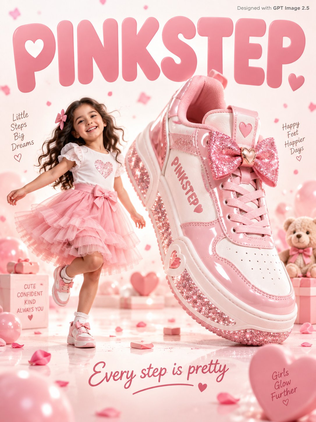
A sweet fun kids footwear advertisement poster. An adorable young girl age 7 with a big smile in a soft pink tulle skirt and white top skips joyfully beside a giant pink and white sneaker 3x her height with a glittery sole and bow detail on the tongue, "PINKSTEP" written in soft rose font on the sneaker side. Warm white and blush pink gradient studio background with soft pink confetti petals and tiny hearts floating gently. Friendly rounded soft typography "PINKSTEP" in blush pink filling the warm white background. Tagline bottom in rose: "Every step is pretty." Small text top-right corner reads "Designed with GPT Image 2.5" in grey. Photorealistic, sweet kids footwear commercial, soft warm white pink studio lighting.
Details
Create a Cannes-level conceptual lifestyle poster for fictional premium fruit-fashion brand SUNTHREA — AI image prompt — GPT Image 2.5
OpenAIGPT Image 2.5
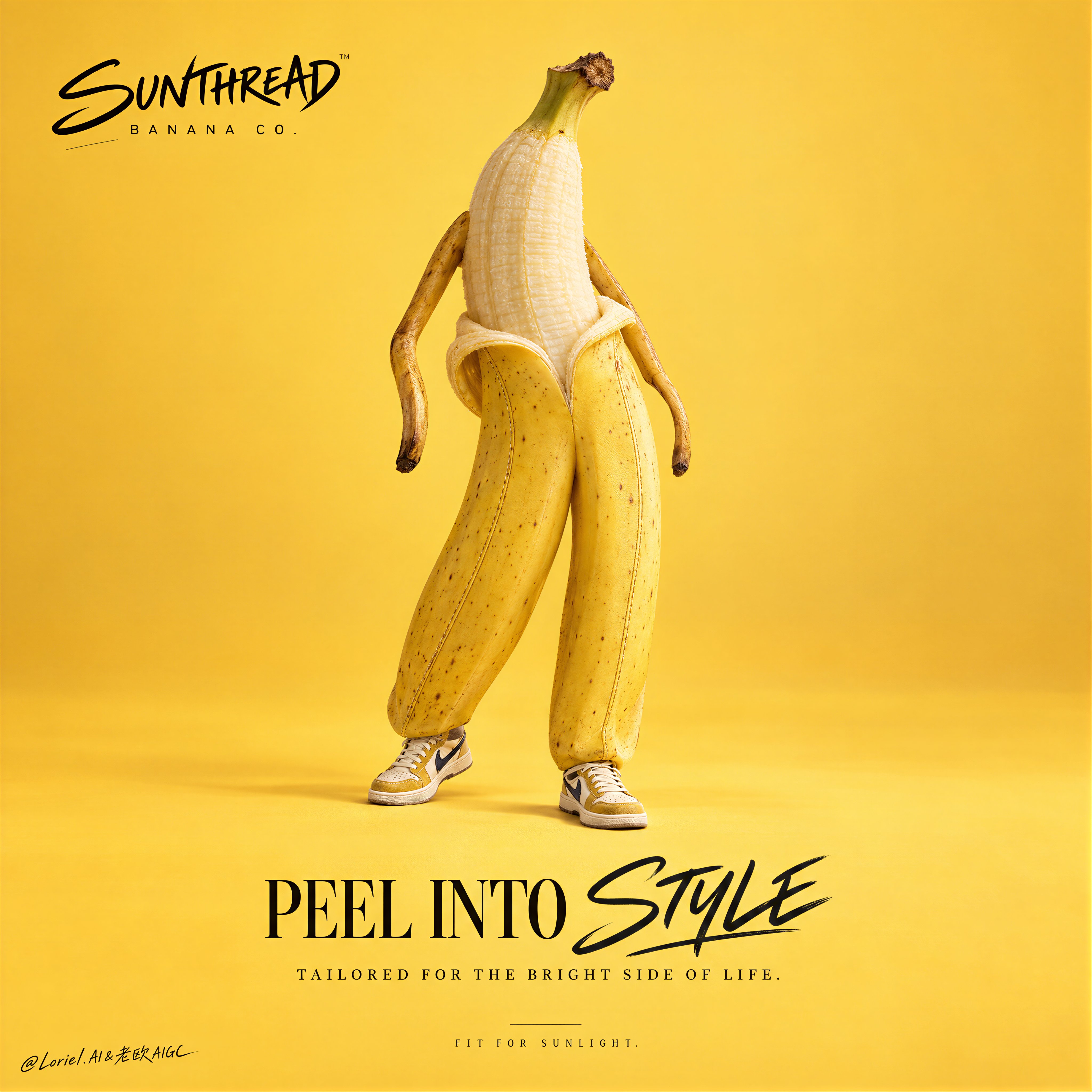
Create a Cannes-level conceptual lifestyle poster for fictional premium fruit-fashion brand SUNTHREAD BANANA CO., merging product realism, playful anthropomorphism, and gallery-clean graphic design into one unified hero image. The core concept is edible couture: a single ripe banana becomes a fashion figure through form, posture, and styling, standing alone against a luminous monochrome field like a collectible runway object. The banana must remain the absolute visual leader. Use a vertical full-bleed poster with a front-facing centered hero composition, strong negative space, and disciplined minimal balance. Preserve the exact structure: one anthropomorphic banana character centered in the frame, brand mark in the upper left, bold main title and support line in the lower half, and no clutter anywhere else. The figure occupies the middle third, leaving large breathing zones above and below for premium visual silence. The silhouette must read instantly from a distance like a fashion campaign object on a monochrome set. Design a realistic ripe banana transformed into a couture-inspired character without losing fruit integrity. Two full yellow peel sections act like tailored trouser legs, slightly separated with believable curvature, subtle seam-like stitch graphics, and structured silhouette logic. The peeled upper section reveals a soft ivory fruit interior that reads like a torso. Two slim curved brown arms emerge from the upper sides, hanging loosely with elegant asymmetry. The top stem becomes a minimal crown-like head marker with no face. Add very small premium sneaker-like footwear at the base, cleanly integrated and correctly scaled. The figure must feel witty, sculptural, and fashion-forward, not childish or cartoonish. The banana stands in a relaxed editorial pose, one peel-leg carrying more weight, hips subtly offset, arms falling with easy rhythm, feet slightly turned as if in a quiet runway pause. The pose should communicate confidence through fruit geometry rather than human mimicry. No face, no eyes, no mouth, no exaggerated animation. The overall stance must feel art-directed, cool, and premium. Create a seamless single-color studio environment in luminous mango-gold, sunlit banana yellow, or softened citrus amber, with only a faint floor-to-wall tonal shift and one soft grounded shadow beneath the figure. No furniture, scenery, extra fruit, or props. The empty space is part of the brand language. The scene should feel like a luxury campaign set where silhouette, color, and typography carry the full idea. Lighting and color follow a controlled minimal palette: 70% ripe banana yellow, mango-gold, and warm citrus light; 20% natural cream fruit interior, stem brown, and soft shadow warmth; 10% restrained accent tones in the footwear and typography, such as ink black, muted plum, or midnight navy. Use clean premium studio lighting with a soft frontal key, gentle top-left lift, and restrained grounding shadow. Keep the image vivid but disciplined, with no muddy saturation, dirty shadows, or visual noise. The tone is playful, stylish, editorial, and expensive. Materials must feel extremely real: natural peel sheen, slight organic speckling, subtle bruiseless variation, soft fruit texture in the peeled upper area, and fine seam-like graphic details on the peel legs suggesting tailored construction. The small shoes should feel like miniature premium fashion footwear with believable textile and rubber logic. The final finish must read as a luxury print campaign with razor-clean edges, precise shadow control, pure background, and high-end retouching. All in-image text must be English only, original, and art-directed into the empty space. Place the brand mark “SUNTHREAD BANANA CO.” in the upper left in a handwritten-meets-editorial custom logo style. In the lower center, place the main title “PEEL INTO STYLE”, using a mixed system where one keyword receives expressive script treatment and the rest is set in an elegant serif or refined condensed sans-serif. Beneath it, add a concise support line such as “tailored for the bright side of life.” Near the bottom margin, place a small campaign tag: “FIT FOR SUNLIGHT.” Typography must feel premium, airy, and compositionally precise, never crowded or meme-like. Output: a full-bleed minimalist conceptual fashion poster with one single banana hero only, no extra fruits, no human face, no copied wording, no childish cartoon styling, no clutter, no warped fruit anatomy, no broken peel logic, no unreadable typography, no muddy yellow background, no dead black blocks, no low-quality AI texture, no generic meme-poster energy, and no style drift.
Details
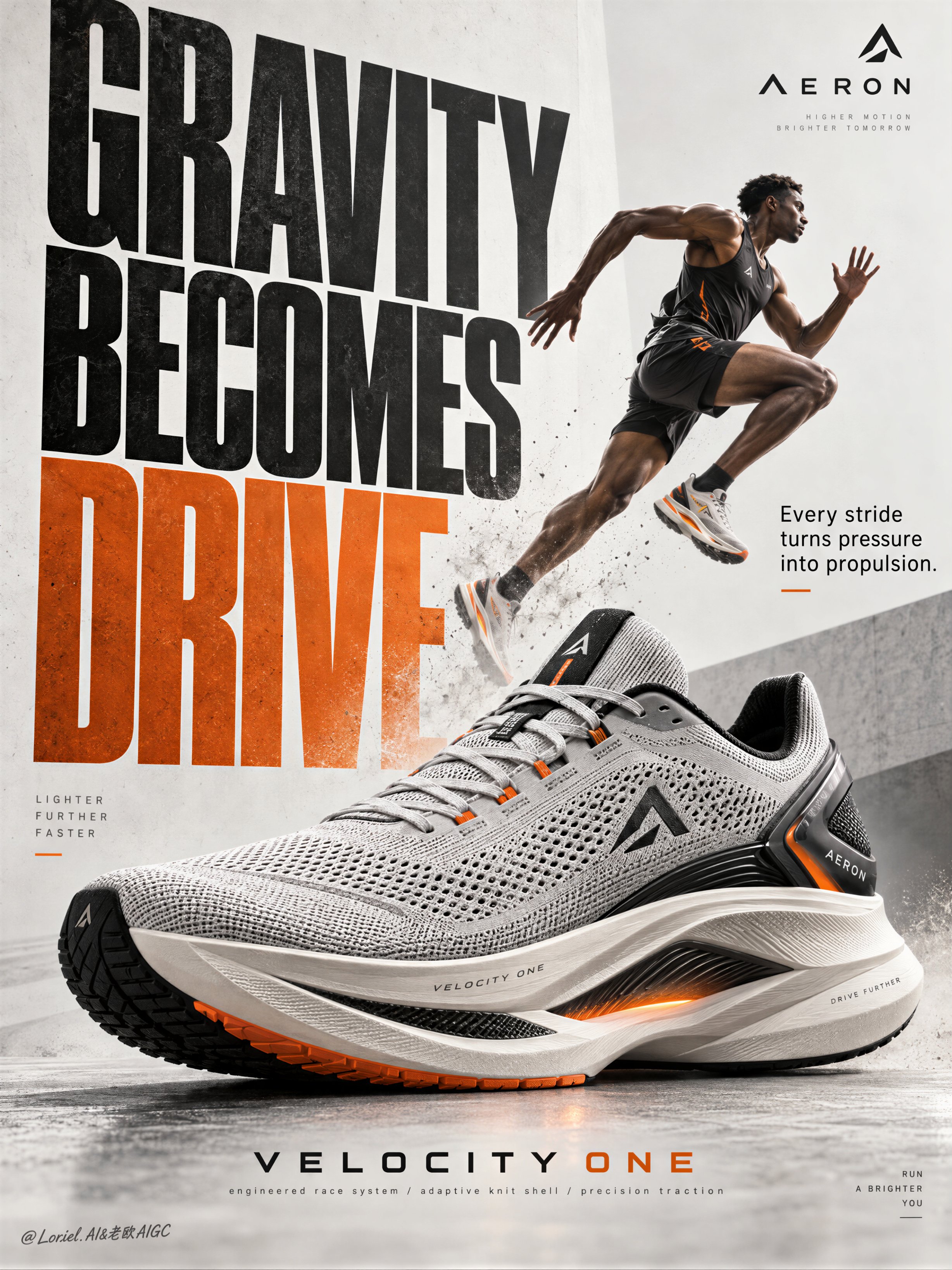
Create a Cannes-level poster ad for fictional premium performance footwear brand AERON, combining na — AI image prompt — GPT Image 2.5
OpenAIGPT Image 2.5
Create a Cannes-level poster ad for fictional premium performance footwear brand AERON, combining narrative athletic tension, engineered material realism, and minimalist curatorial graphic design in one unified image. Build the poster around one hyperreal hero sneaker as the absolute visual anchor, fused with monumental typography and one motion-driven athlete accent, translating speed, pressure, balance, and release into a clean but forceful commercial image. Use a vertical full-bleed poster with strict poster-design logic and rule of thirds inside a typographic architecture. Preserve the exact structure: oversized condensed letters, large controlled negative space, strong scale contrast, and one figure intersecting the type field. The hero sneaker dominates the middle-to-lower center in a three-quarter side profile, large enough to control the composition. Behind and partly around it, stack a monumental vertical title column as a graphic wall, with one secondary text block and one minimal brand zone creating rhythmic pauses. The image must feel editorial, sharply weighted, and highly legible from distance. The product is the fictional AERON VELOCITY ONE, a premium race trainer rendered as a real commercial object: engineered knit upper, ventilated mesh zones, tension-wrapped lacing, molded heel frame, sculpted superfoam midsole, carbon-response plate suggestion, segmented traction rubber, subtle reflective trims, and a minimal geometric logo mark. Preserve accurate footwear anatomy, believable manufacturing precision, realistic seam logic, crisp edge definition, authentic sole thickness, and premium industrial finish. Introduce one secondary athlete as a kinetic narrative accent rather than the hero: a lean elite runner captured in suspended stride, body diagonally stretched upward through the typography, with one knee lifted, one leg extended, arms naturally counterbalancing motion, and gaze focused forward. The athlete remains smaller than the shoe and functions as a motion vector. Anatomy must be correct, fingers normal and separated, limbs proportionate, gravity believable, posture elegant, and cast shadow physically consistent. The athlete should feel like a frozen instant of breakthrough, not a decorative sticker. Use an abstract poster-space environment rather than a literal location: a refined mineral white and pale concrete-grey field with subtle paper grain, faint tonal falloff, and soft spatial depth created through overlap, scale, and controlled shadows. No clutter, no random props, no useless particles. If motion energy is needed, suggest it through directional water mist, soft sole dust, or aerodynamic blur traces tightly integrated around the product and athlete, always clean and intentional. Lighting is a coherent studio-commercial setup: soft frontal key light from upper left, low-intensity side fill from camera right, restrained rim separation on the shoe edges, and delicate shadow pooling beneath athlete and product to anchor them. If the frame risks looking flat, increase tonal contrast through gentle chiaroscuro rather than harsh black blocks. Palette: 60% mineral white, pale concrete grey, and soft paper ivory; 30% deep charcoal, graphite, and asphalt black; 10% kinetic burnt orange shifting toward signal amber. The orange should energize the main typography and one micro-accent on the product or layout. Materials must feel hyperreal and tactile: dry engineered knit texture, micro-perforated mesh clarity, semi-matte polymer supports, subtle rubber sheen, precise embossed logo details, clean reflective trim response, and realistic sole geometry. Typography should feel like premium editorial print integrated into the space, with crisp matte ink edges, refined overlap, and elegant depth through shadow and layering. Add faint contemporary print grain and controlled photographic sharpness, keeping the product recognition zones razor clear while softer surrounding areas preserve sophistication. Use only English and original advertising copy. Main title: “GRAVITY BECOMES DRIVE”. Support line: “Every stride turns pressure into propulsion.” Brand mark: “AERON”. Model line: “VELOCITY ONE”. Micro information: “engineered race system / adaptive knit shell / precision traction”. Set the oversized condensed sans-serif title vertically behind and alongside the athlete and shoe, with selected letter cropping for tension; place the support line in a smaller clean sans-serif block near the mid-right; keep the brand mark minimal near the top edge; align model line and micro information near the lower margin with disciplined spacing, elegant hierarchy, and safe margins. Typography must avoid the product recognition zone and harmonize with the lighting environment. Output: a polished, hyperreal, commercially deployable poster where the product remains unquestionably dominant, the athlete intensifies motion, and the typography becomes structural design. The result must feel sharp, premium, clean, and contemporary, with no visual mud, dead black patches, layout clutter, unreadable text blocks, malformed anatomy, extra or fused fingers, broken limbs, distorted footwear proportions, unstable perspective, inconsistent shadows, dirty textures, or style drift. No real person names, no existing brand names, and no invented packaging claims beyond what is visually supported.
Details
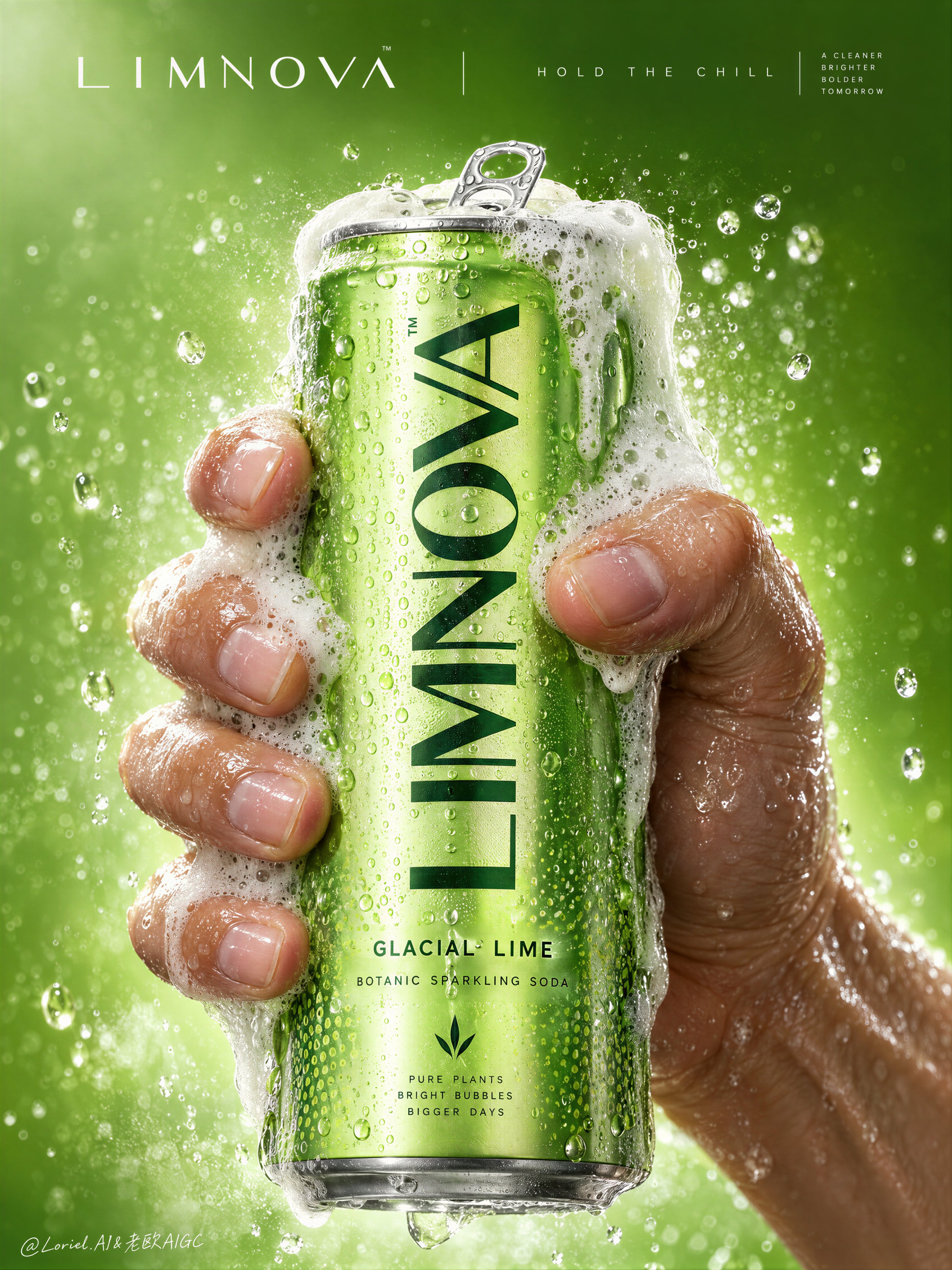
Create a Cannes-level commercial poster for fictional premium sparkling soda brand LIMNOVA, merging  — AI image prompt — GPT Image 2.5
OpenAIGPT Image 2.5
Create a Cannes-level commercial poster for fictional premium sparkling soda brand LIMNOVA, merging tactile product realism, pressure-driven human interaction, and ultra-clean gallery-grade graphic design into one unified hero image. The core concept is controlled release: a cold lime soda can gripped at peak tension, overflowing with foam and condensation, turning an ordinary beverage moment into a sculptural event of freshness, pressure, and desire. Use a vertical full-bleed poster in extreme close-up, rule-of-thirds disciplined but visually centralized. Preserve the exact structure: a single slim can dominates the center, held tightly by one wet human hand wrapping from the right and lower rear; dense foam crowns the top and spills down the can; broad negative space remains above for elegant brand typography. The hand, can, and foam should read as one compressed central mass, surrounded by a luminous citrus atmosphere with no extra props. The can must remain the undisputed focal point and fully legible. The subject is a hyperreal slim aluminum soda can in radiant glacial lime green, with crisp pull-tab geometry, subtle printed microtexture, dense condensation droplets, and refined premium branding. Use the fictional text “LIMNOVA” as the main vertical logo, “GLACIAL LIME” as the flavor line, and “BOTANIC SPARKLING SODA” as the descriptor. The identity should feel bold, contemporary, and luxury-clean, with strong custom letterforms and exact print clarity. The can should look manufacturable, collectible, and ice-cold. One realistic human hand grips the can firmly with correct five-finger anatomy, natural finger spacing, believable knuckle tension, realistic nail beds, subtle skin compression, and wet highlights. The grip communicates force and freshness, not aggression. Foam surges over the top rim and flows across the fingers and can in airy dense clusters, while suspended micro-droplets and faint carbonation mist activate the space. The can remains undeformed except for natural optical tension created by the grip and liquid pressure. No extra hands, no anatomy drift. Build a minimal studio field rather than a literal location. The background is a luminous acid-lime to chilled-chartreuse gradient with suspended droplets, vapor-like fizz haze, and a soft freshness halo around the product. Keep the space clean and abstract, letting the product, hand, and foam generate all depth. No fruit slices, no ice cubes, no bar setup, no clutter. The world should feel like a distilled atmosphere of citrus pressure and cold carbonation. Lighting is a premium studio setup with a bright frontal key, cool upper-left freshness lift, and narrow specular edge highlights on wet aluminum and skin. Palette hierarchy: 60% glacial lime and electric citrus green, 30% white foam and bright condensation highlights, 10% natural warm skin tone as tactile counterpoint. Contrast should be crisp yet soft-edged, with no dead blacks, dirty grey mud, or cartoon oversaturation. The emotional tone is icy, alive, compressed, clean, and addictive. Materials must feel extremely photoreal: sharp reflective aluminum edges, chilled metallic bloom, droplets merging into trails, subtle ink adhesion texture; foam that feels light, wet, aerated, and creamy with translucent bubble variation and convincing thickness at the rim and fingers; and a real, de-AI hand with accurate anatomy, realistic skin texture, natural moisture sheen, crease detail, true finger joints, and no swollen or fused forms. Apply restrained high-end commercial polish, keeping hero detail sharp and print-ready. Integrate a minimalist top header as a refined brand system, not ad clutter. Place “LIMNOVA” on one side of the top band and a secondary studio-style signature or edition mark on the other, separated by a thin elegant divider. If an extra micro-headline is used, keep it very restrained, such as “HOLD THE CHILL” or “PRESS THE FIZZ”, set small outside the can recognition zone. Typography must feel architected into the negative space, aligned with the product axis, and never heavy or crude. Output: a premium beverage poster with product-first hierarchy, hyper-clean execution, strong tactile realism, elegant negative space, and exact brand readability. No extra cans, no fruit garnish, no ice props, no chaotic splash overload, no warped can geometry, no broken tab, no malformed hand, no extra or merged fingers, no unreadable text, no muddy shadows, no large dead black blocks, no low-quality AI artifacts, no clutter, no style drift, and no resemblance to existing real soda branding.
Details
Browse all GPT Image 2.5 promptsExplore AI Image Prompts