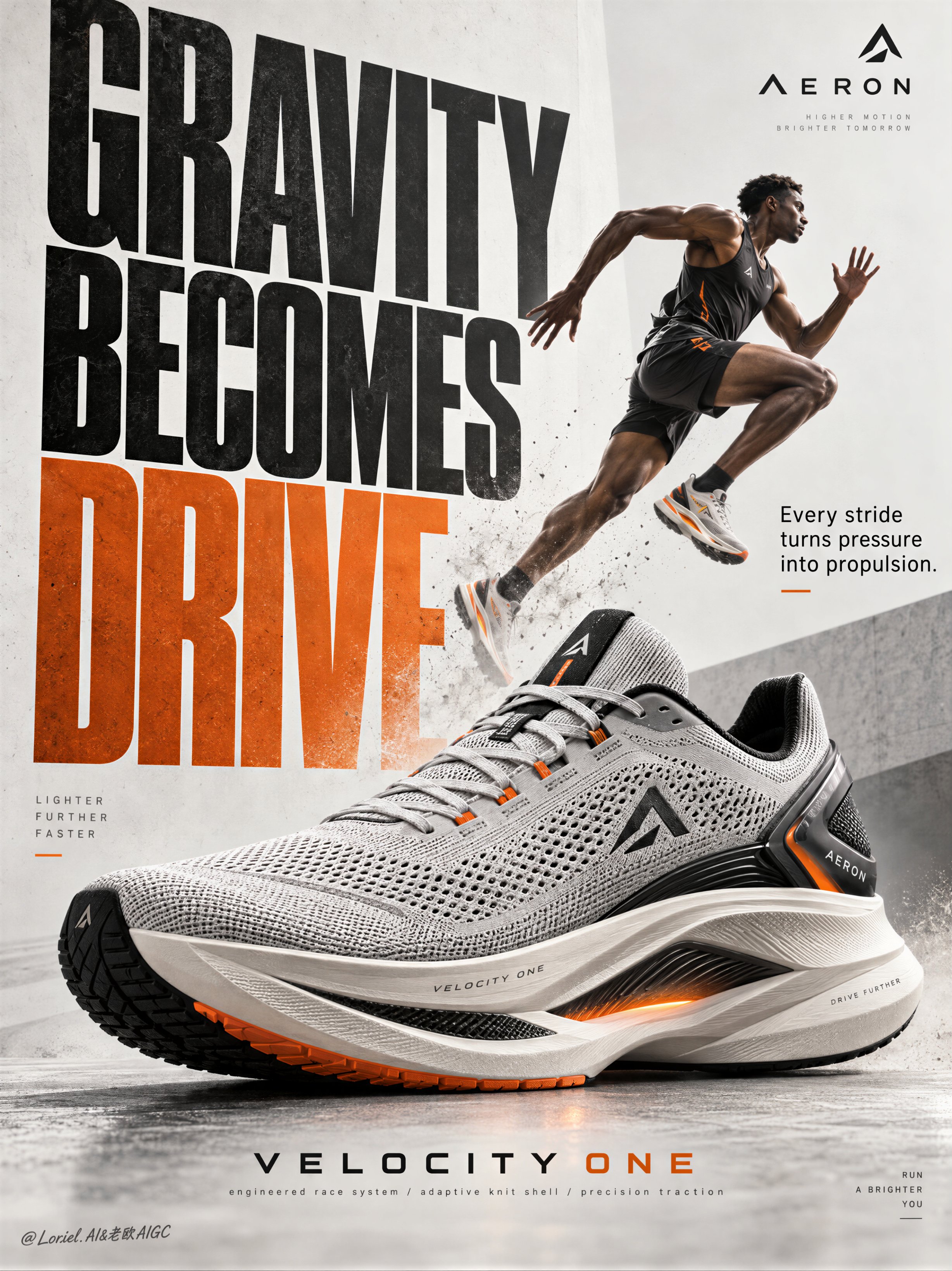
AERON Sneaker Performance Poster Ad
 GPT Image 2.5OpenAIimage
Create a Cannes-level poster ad for fictional premium performance footwear brand AERON, combining narrative athletic tension, engineered material realism, and minimalist curatorial graphic design in one unified image. Build the poster around one hyperreal hero sneaker as the absolute visual anchor, fused with monumental typography and one motion-driven athlete accent, translating speed, pressure, balance, and release into a clean but forceful commercial image. Use a vertical full-bleed poster with strict poster-design logic and rule of thirds inside a typographic architecture. Preserve the exact structure: oversized condensed letters, large controlled negative space, strong scale contrast, and one figure intersecting the type field. The hero sneaker dominates the middle-to-lower center in a three-quarter side profile, large enough to control the composition. Behind and partly around it, stack a monumental vertical title column as a graphic wall, with one secondary text block and one minimal brand zone creating rhythmic pauses. The image must feel editorial, sharply weighted, and highly legible from distance. The product is the fictional AERON VELOCITY ONE, a premium race trainer rendered as a real commercial object: engineered knit upper, ventilated mesh zones, tension-wrapped lacing, molded heel frame, sculpted superfoam midsole, carbon-response plate suggestion, segmented traction rubber, subtle reflective trims, and a minimal geometric logo mark. Preserve accurate footwear anatomy, believable manufacturing precision, realistic seam logic, crisp edge definition, authentic sole thickness, and premium industrial finish. Introduce one secondary athlete as a kinetic narrative accent rather than the hero: a lean elite runner captured in suspended stride, body diagonally stretched upward through the typography, with one knee lifted, one leg extended, arms naturally counterbalancing motion, and gaze focused forward. The athlete remains smaller than the shoe and functions as a motion vector. Anatomy must be correct, fingers normal and separated, limbs proportionate, gravity believable, posture elegant, and cast shadow physically consistent. The athlete should feel like a frozen instant of breakthrough, not a decorative sticker. Use an abstract poster-space environment rather than a literal location: a refined mineral white and pale concrete-grey field with subtle paper grain, faint tonal falloff, and soft spatial depth created through overlap, scale, and controlled shadows. No clutter, no random props, no useless particles. If motion energy is needed, suggest it through directional water mist, soft sole dust, or aerodynamic blur traces tightly integrated around the product and athlete, always clean and intentional. Lighting is a coherent studio-commercial setup: soft frontal key light from upper left, low-intensity side fill from camera right, restrained rim separation on the shoe edges, and delicate shadow pooling beneath athlete and product to anchor them. If the frame risks looking flat, increase tonal contrast through gentle chiaroscuro rather than harsh black blocks. Palette: 60% mineral white, pale concrete grey, and soft paper ivory; 30% deep charcoal, graphite, and asphalt black; 10% kinetic burnt orange shifting toward signal amber. The orange should energize the main typography and one micro-accent on the product or layout. Materials must feel hyperreal and tactile: dry engineered knit texture, micro-perforated mesh clarity, semi-matte polymer supports, subtle rubber sheen, precise embossed logo details, clean reflective trim response, and realistic sole geometry. Typography should feel like premium editorial print integrated into the space, with crisp matte ink edges, refined overlap, and elegant depth through shadow and layering. Add faint contemporary print grain and controlled photographic sharpness, keeping the product recognition zones razor clear while softer surrounding areas preserve sophistication. Use only English and original advertising copy. Main title: “GRAVITY BECOMES DRIVE”. Support line: “Every stride turns pressure into propulsion.” Brand mark: “AERON”. Model line: “VELOCITY ONE”. Micro information: “engineered race system / adaptive knit shell / precision traction”. Set the oversized condensed sans-serif title vertically behind and alongside the athlete and shoe, with selected letter cropping for tension; place the support line in a smaller clean sans-serif block near the mid-right; keep the brand mark minimal near the top edge; align model line and micro information near the lower margin with disciplined spacing, elegant hierarchy, and safe margins. Typography must avoid the product recognition zone and harmonize with the lighting environment. Output: a polished, hyperreal, commercially deployable poster where the product remains unquestionably dominant, the athlete intensifies motion, and the typography becomes structural design. The result must feel sharp, premium, clean, and contemporary, with no visual mud, dead black patches, layout clutter, unreadable text blocks, malformed anatomy, extra or fused fingers, broken limbs, distorted footwear proportions, unstable perspective, inconsistent shadows, dirty textures, or style drift. No real person names, no existing brand names, and no invented packaging claims beyond what is visually supported.
Details
- Type
- AI Image Prompts
- Aspect Ratio
- 614:819
- Updated
- Oct 7, 2026
How to use this prompt
- 1Copy the full prompt with the copy button above.
- 2Open GPT Image 2.5 by OpenAI, or any image generator with a similar style range.
- 3Paste the prompt, then swap the subject and style keywords to match your idea.
- 4Match the example's settings (614:819 · Poster · Product Photography · Advertising), then iterate — small wording changes shift the output a lot.
Frequently asked questions
Which AI model generated this image?
This image was generated with GPT Image 2.5 by OpenAI. The prompt on this page is the exact text used to create it.
What settings does this prompt use?
The example was generated with GPT Image 2.5 using: 614:819 · Poster · Product Photography · Advertising. Reusing these settings gives the closest match.
How do I get similar results?
Copy the prompt as-is first, then replace only the subject while keeping the style, lighting, and composition keywords. Generate a few variations — outputs differ between runs.
Can I modify this prompt?
Yes. Prompts work best as starting points — adjust descriptors, aspect ratio, or style tags to make the output your own.
![Create a premium vertical 4:5 editorial travel poster for [COUNTRY], where the outline of the countr — AI image prompt — GPT Image 2.5](https://cdn.ahaprompt.app/harvest-media/import-1789369064970-j9jipe.jpg)
![Create a sophisticated, dreamy editorial magazine cover titled “[COUNTRY NAME] — A COUNTRY IN ONE DR — AI image prompt — GPT Image 2.5](https://cdn.ahaprompt.app/harvest-media/import-1789368946131-xefjx1.jpg)
![Create a premium educational travel poster featuring [STRUCTURE NAME], one of the world’s most famou — AI image prompt — GPT Image 2.5](https://cdn.ahaprompt.app/harvest-media/import-1789369131185-x1iuzs.jpg)
![Create a premium cinematic luxury tourism poster for [COUNTRY / DESTINATION] in a STRICT 4:5 vertica — AI image prompt — GPT Image 2.5](https://cdn.ahaprompt.app/harvest-media/import-1789369001673-dctuvc.jpg)
![Create a premium contemporary editorial art poster for [LOCATION] in a playful Japanese design-ZINE — AI image prompt — GPT Image 2.5](https://cdn.ahaprompt.app/harvest-media/import-1789139846025-v6z310.jpg)
![2x2 grid, 9:16, 4 goat chess players who passed away [SUBJECT] :: single standalone vertical tribute — AI image prompt — GPT Image 2.5](https://cdn.ahaprompt.app/harvest-media/import-1789139801507-ah2jvt.jpg)