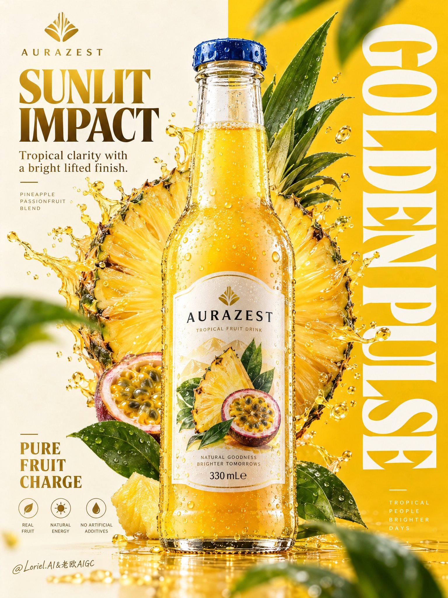
AURAZEST Split Layout Beverage Poster
 GPT Image 2.5OpenAIimage
Create a premium vertical commercial poster for a fictional overseas fruit drink brand, "AURAZEST". Design it as a Cannes-level beverage ad where a hyper-real glass bottle is the absolute visual hero, fused with disciplined graphic poster design. Use a strict split composition: the left half is a refined warm-ivory information field, the right half a saturated solar-yellow brand field with a giant vertical typographic block. Position the hero bottle exactly across the central dividing line so it bridges both zones and controls the full hierarchy. The bottle is a chilled elegant glass bottle filled with luminous golden pineapple-passionfruit juice, with thick transparent glass, realistic refraction, a precise blue-metal cap, dense micro-condensation, varied tiny droplets, visible meniscus, crisp label print, and premium manufacturing detail. The front label must read exactly "AURAZEST". It should feel tactile, cold, collectible, and physically believable, carrying the strongest focal weight in the poster. Behind the bottle, build a large radiant fruit halo combining a pineapple cross-section with a more art-directed geometric fruit-core structure so it feels natural and iconic. The fruit disk sits slightly left of center behind the bottle, partially occluded, with juicy fiber detail, wet rind texture, bright translucency, and controlled splash arcs bursting outward. The splash must feel physically accurate yet graphically composed, with clear directional force, believable viscosity, suspended droplets, and no messy chaos. Add several fresh green leaves around the outer frame as rhythm accents, some softly blurred in the near foreground and some crisp in the midground, always supporting freshness and depth. Typography must be newly invented and fully art directed. In the top-left, place a minimalist emblem and the brand name "AURAZEST". Beneath it, set the headline "SUNLIT IMPACT", with the smaller line "Tropical clarity with a bright lifted finish." In the lower-left, place a compact benefit lockup: "PURE FRUIT CHARGE". Across the entire right panel, place a massive vertical white typographic block reading "GOLDEN PULSE". Typography should feel integrated into the poster architecture, elegant and precise, with clean spacing, balanced weight, and no collision with the bottle label or fruit core. Use a tightly controlled palette: 55% pineapple gold and radiant mango-yellow, 20% warm ivory and pale cream, 15% vivid botanical green, 10% deep amber shadow accents and cool blue cap contrast. Light the scene with a clean key from the upper left, luminous transmission through the juice, crisp specular edges on the bottle shoulders, soft reflected bounce from the pale background, and enough contrast to carve volume into the glass, fruit, and splash without muddy blacks or dirty haze. The finish should feel bright, premium, sharp, and globally campaign-ready. Materials must read with extreme clarity: translucent juice glow, fibrous juicy flesh, glossy wet rind, fresh waxy leaves, sparkling droplets, clean heavy glass, and sharp printed label edges. The poster should combine commercial product realism, fruit freshness, and curatorial graphic discipline in one unified system. Maintain correct bottle proportions, label readability, coherent splash physics, clean perspective, elegant negative space, and powerful retail-ad impact. Keep one single hero bottle only, product-first hierarchy, clean premium advertising realism, coherent fruit geometry, coherent droplet scale, plausible leaf perspective, and crisp typography. Avoid warped bottle shape, broken glass proportions, unreadable label text, accidental extra bottles, duplicated fruit slices, muddy shadows, dirty texture buildup, chaotic splashes, cheap font treatment, distorted vertical lettering, weak hierarchy, random clutter, off-theme decorative particles, accidental resemblance to existing real beverage brands, or style drift away from high-end commercial poster design.
Details
- Type
- AI Image Prompts
- Aspect Ratio
- 3:4
- Updated
- Oct 12, 2026
How to use this prompt
- 1Copy the full prompt with the copy button above.
- 2Open GPT Image 2.5 by OpenAI, or any image generator with a similar style range.
- 3Paste the prompt, then swap the subject and style keywords to match your idea.
- 4Match the example's settings (3:4 · Poster · Product Photography · Advertising), then iterate — small wording changes shift the output a lot.
Frequently asked questions
Which AI model generated this image?
This image was generated with GPT Image 2.5 by OpenAI. The prompt on this page is the exact text used to create it.
What settings does this prompt use?
The example was generated with GPT Image 2.5 using: 3:4 · Poster · Product Photography · Advertising. Reusing these settings gives the closest match.
How do I get similar results?
Copy the prompt as-is first, then replace only the subject while keeping the style, lighting, and composition keywords. Generate a few variations — outputs differ between runs.
Can I modify this prompt?
Yes. Prompts work best as starting points — adjust descriptors, aspect ratio, or style tags to make the output your own.