Vintage Travel Poster Template
 GPT Image 2OpenAIimage
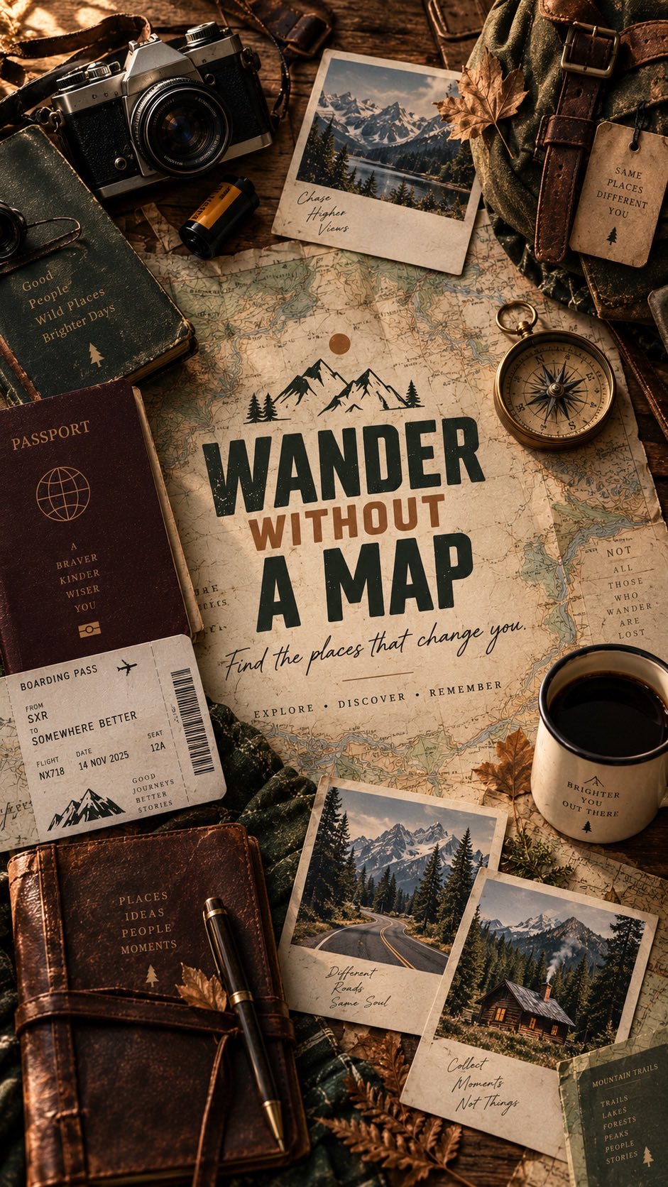
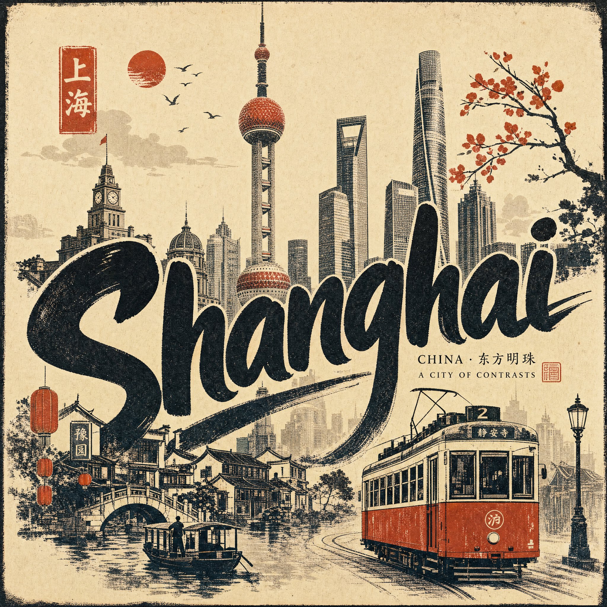
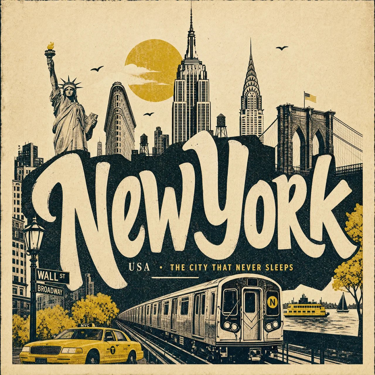
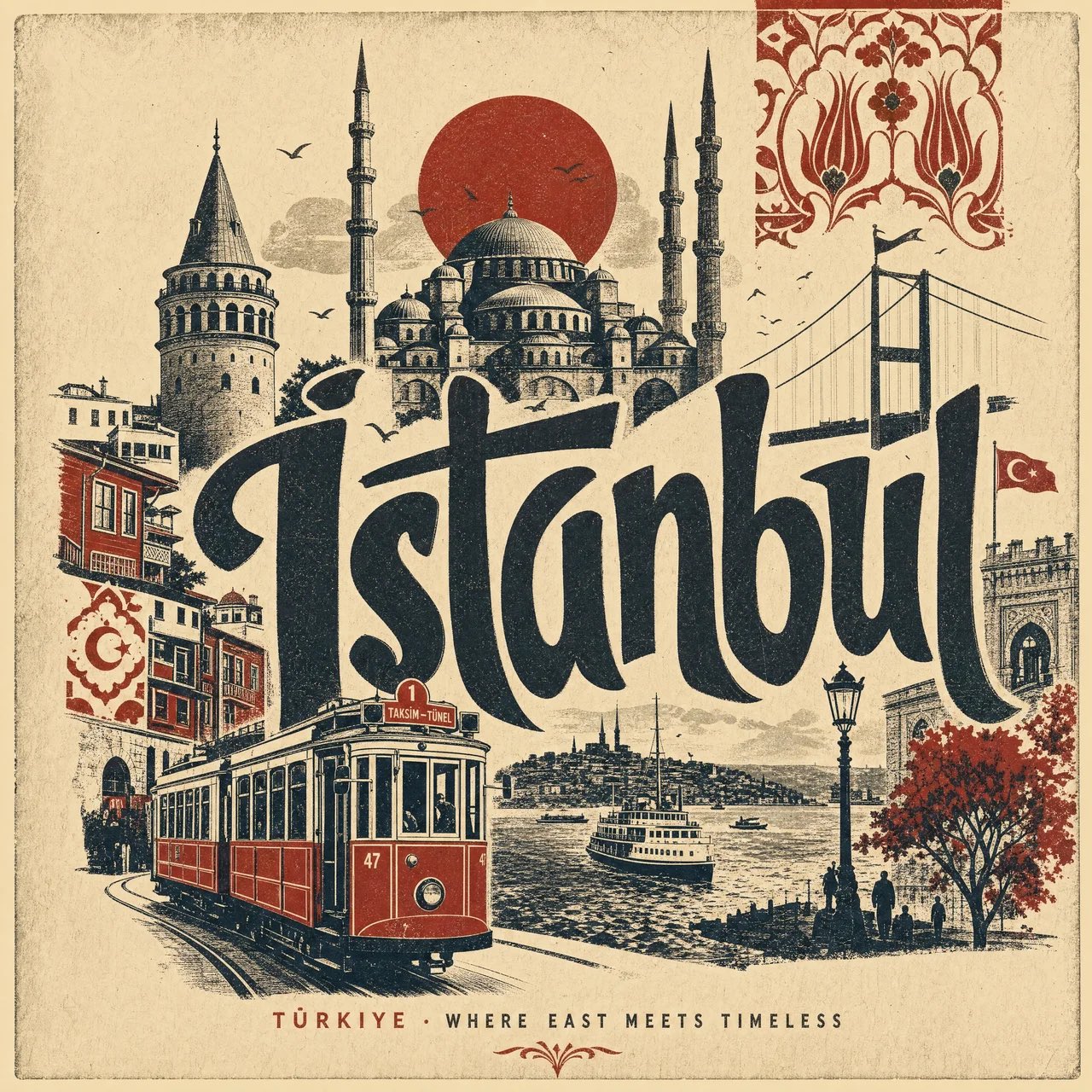
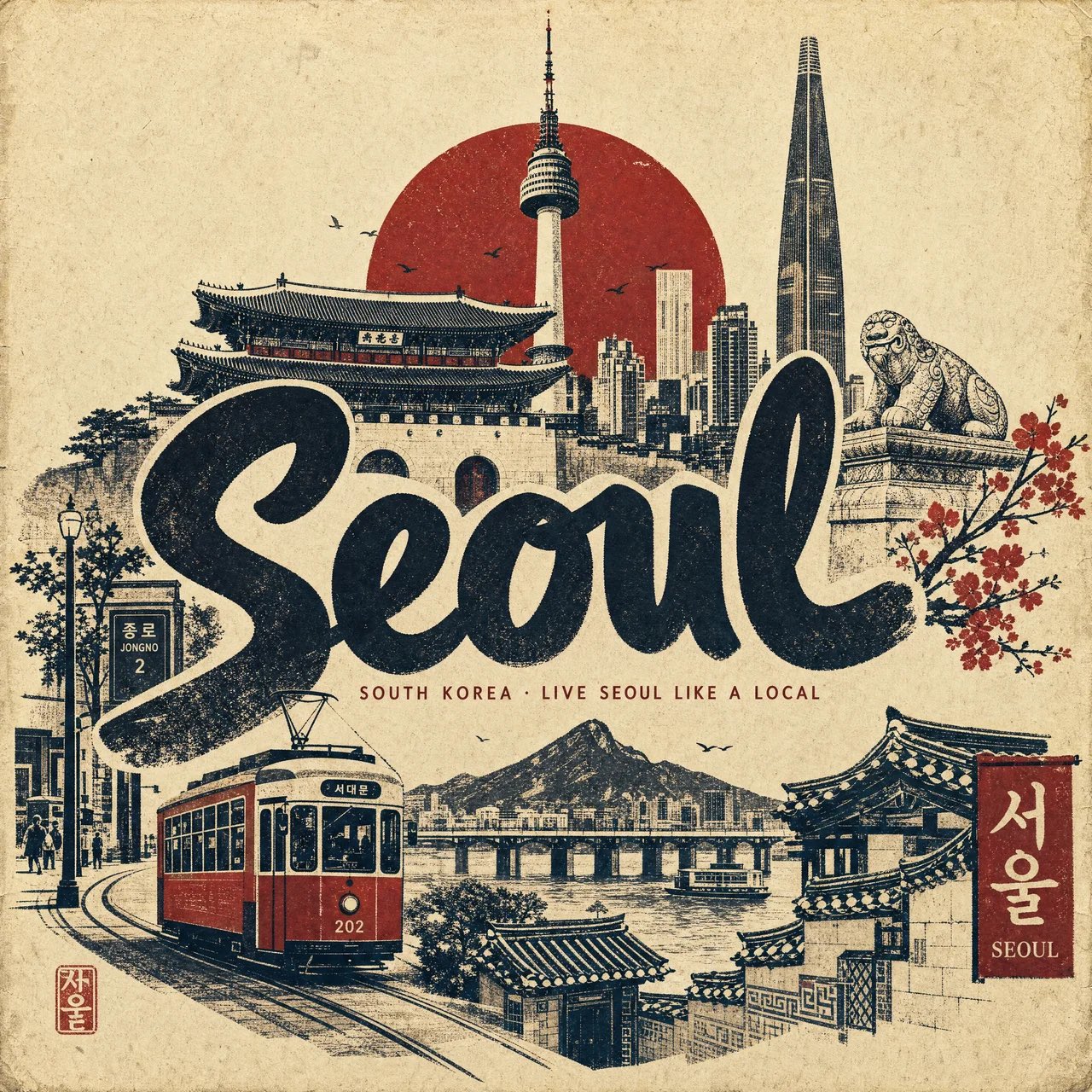
Create a premium 4:5 vertical vintage travel poster for [CITY], [COUNTRY], designed as an elegant contemporary hand-pulled screen print / linocut collage on warm, textured archival paper. ART DIRECTION Create an artistic poster that feels collected from an old European travel archive, but redesigned with sophisticated modern composition. Use bold simplified silhouettes, imperfect hand-printed edges, subtle ink distress, tiny registration imperfections, rough paper fibers, and tactile layered shapes. The composition should feel graphic, charming, nostalgic and instantly recognizable, with the city presented as a visual story rather than a collection of random landmarks. COMPOSITION Place a large, expressive hand-lettered “[CITY]” across the central portion of the poster. Behind and around the typography, arrange simplified silhouettes of 5–7 iconic elements of [CITY], creating depth through overlapping layers: [LANDMARK 1] [LANDMARK 2] [LANDMARK 3] [LANDMARK 4] [LOCAL ARCHITECTURE] [NATURAL FEATURE] [CULTURAL SYMBOL] Do not make every landmark the same size. Use an editorial hierarchy: one dominant landmark, several secondary landmarks, and tiny atmospheric details. Add one recognizable local transportation element sweeping through the lower foreground — such as a red double-decker bus, yellow taxi, tram, tuk-tuk, metro train, bicycle, gondola, boat, or vintage automobile — depending on the identity of the city. VISUAL STYLE Use a restrained palette of warm ivory paper + deep charcoal/black ink + one carefully chosen signature color associated with the city. The artwork should look genuinely printed rather than digitally rendered: visible paper grain natural ink absorption distressed screen-print texture slightly uneven ink coverage tiny imperfections around edges subtle misregistration handmade cut-paper contours imperfect but beautiful typography no glossy digital effects no photorealism no excessive gradients TYPOGRAPHY Make [CITY] the visual centerpiece. Use bold, oversized, hand-cut display lettering with irregular organic contours. Allow the typography to partially overlap the landmarks, creating an integrated poster composition. Add a small understated line beneath it: [COUNTRY] · [SHORT CITY PHRASE] Keep the secondary typography minimal and elegant. ATMOSPHERE Include tiny visual storytelling details that make the city feel lived-in: small birds, clouds, rooftops, street lamps, trees, windows, pedestrians, flags, bicycles, water reflections, or subtle architectural patterns. Avoid clutter. Every element should feel intentionally placed. COLOR & MATERIAL Warm aged ivory background, deep charcoal ink, and a single sophisticated accent color. The paper should have subtle fibers, faint grain, slightly darker edges, and the appearance of a beautifully preserved vintage print. FINAL LOOK The finished artwork should resemble a rare vintage travel poster discovered in an old design archive, combining classic travel-poster charm with contemporary graphic design. Highly recognizable city landmarks, elegant negative space, bold handmade typography, sophisticated composition, tactile printmaking texture, imperfect ink edges, archival paper, artistic editorial aesthetic, premium collectible poster design, timeless rather than touristy. No photorealistic buildings, no 3D rendering, no glossy effects, no modern advertising aesthetic, no excessive text, no generic landmarks that do not belong to the city.
Details
- Type
- AI Image Prompts
- Aspect Ratio
- 1:1
- Updated
- Aug 17, 2026
Category
How to use this prompt
- 1Copy the full prompt with the copy button above.
- 2Open GPT Image 2 by OpenAI, or any image generator with a similar style range.
- 3Paste the prompt, then swap the subject and style keywords to match your idea.
- 4Match the example's settings (1:1 · Typography · Poster · Vintage), then iterate — small wording changes shift the output a lot.
Frequently asked questions
Which AI model generated this image?
This image was generated with GPT Image 2 by OpenAI. The prompt on this page is the exact text used to create it.
What settings does this prompt use?
The example was generated with GPT Image 2 using: 1:1 · Typography · Poster · Vintage. Reusing these settings gives the closest match.
How do I get similar results?
Copy the prompt as-is first, then replace only the subject while keeping the style, lighting, and composition keywords. Generate a few variations — outputs differ between runs.
Can I modify this prompt?
Yes. Prompts work best as starting points — adjust descriptors, aspect ratio, or style tags to make the output your own.