AhaPrompt
提示詞
精選
模型
AI 反推
定價
投稿
部落格
首頁
AI 提示詞庫
Product Photography
Product Photography 提示詞
探索最佳 Product Photography 類提示詞,適用於 AI 圖片、影片與音訊生成。
瀏覽AI 圖片提示詞
瀏覽AI 影片提示詞
瀏覽AI 音樂與語音提示詞
AI 提示詞庫
全部
圖片
影片
音訊
最新
熱門
全部分類
3D Render
Abstract
Advertising
Aerial
Ambient
Animals
Animation
Anime
Architecture
Avatar
Black & White
Bright
Cartoon
Character
Cinematic
Cityscape
Classical
Comic
Cyberpunk
Dark
Digital Art
Dramatic
Dynamic
Electronic
Ethereal
Fantasy
Fashion
Folk
Food
Game Assets
Gothic
Hip-Hop
Historical
Holiday
Horror
Infographic
Jazz
Landscape
Lo-Fi
Logo Design
Macro
Minimalist
Motion Graphics
Music Video
Mysterious
Mythology
Nature
Neon
Oil Painting
Peaceful
Pixel Art
Pop
Pop Art
Portrait
Poster
Product Photography
R&B
Realistic
Rock
Sci-Fi
Short Film
Sketch
Slow Motion
Sound Effects
Space
Sports
Steampunk
Sticker
Still Life
Street Photography
Surreal
Tattoo
Timelapse
Trailer
Typography
Vector
Vehicles
VFX
Vintage
Voiceover
Wallpaper
Watercolor
Whimsical
Nano Banana Pro
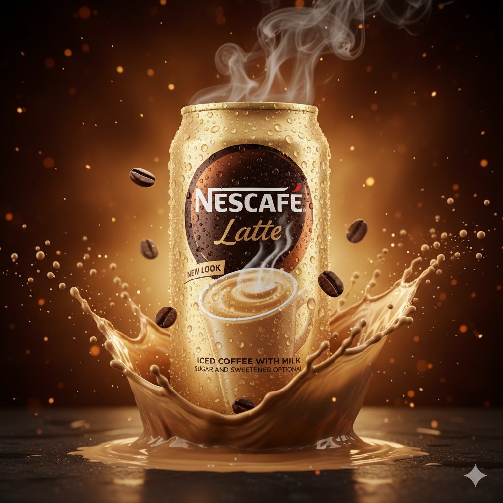
Create an ultra-realistic, premium commercial product advertisement featuring a deep navy-blue matte plastic protein drink bottle. Use a vertical 3:4 composition with exceptionally fine details and an 8K-quality finish. Product Appearance: A sleek, slightly tilted blue bottle captured from a three-quarter angle. Realistic condensation covering the entire bottle, with tiny water droplets catching the studio light. The label should clearly display: "milk & yogurt", "mock up", "protein", and "SEPARATED SHADOWS". Dynamic Liquid Effects: Surround the bottle with a dramatic swirl of creamy white milk mixed with subtle beige tones. Create an energetic splash that flows upward from the bottom and curls around the sides of the packaging. Freeze individual droplets in mid-air for a high-speed photography effect. Decorative Elements: Fresh blueberries, including whole and sliced pieces, floating at different distances. Delicate green mint leaves with clearly visible natural textures. Suspended milk droplets and tiny liquid spheres adding depth and movement. Scene & Lighting: Use a sophisticated gradient background transitioning from midnight blue into warm amber. Add subtle, softly blurred light particles for an atmospheric cinematic effect. Place the bottle above a matte surface with a small amount of pooled milk and a naturally separated soft shadow. Final Quality: Premium advertising photography, realistic materials, crisp typography, accurate product proportions, cinematic highlights, controlled shadows, detailed liquid physics, and flawless image clarity. Avoid unwanted visual distortions, random text, noise, and artificial-looking details.
0
檢視詳情
GPT Image 2.5
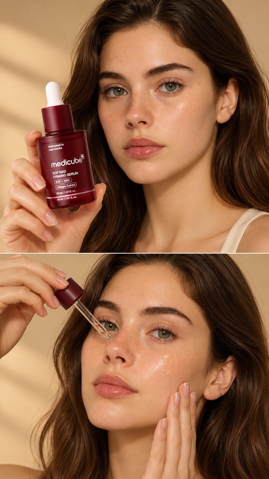
Create a luxurious, ultra-realistic skincare UGC advertisement featuring a beautiful young woman holding a Medicube EGF NAD Firming Serum bottle close to the camera. She has glowing, dewy glass skin, natural makeup, glossy lips, and neatly tied-back hair. She gently brings the serum bottle closer to the camera, rotates it slightly to showcase the product label, then looks directly into the camera with a soft confident smile. In the next shot, she applies a few drops of serum to her cheek using the dropper and gently massages it into her skin. Warm beige studio background, soft golden sunlight, premium Korean skincare commercial aesthetic, realistic skin texture, elegant hand movements, cinematic close-up shots, smooth camera movement, professional product lighting, 4K ultra-realistic quality. Keep the Medicube bottle, logo, packaging, and label exactly consistent with the reference image. No distorted hands, no extra fingers, no text overlays.
0
檢視詳情
GPT Image 2.5
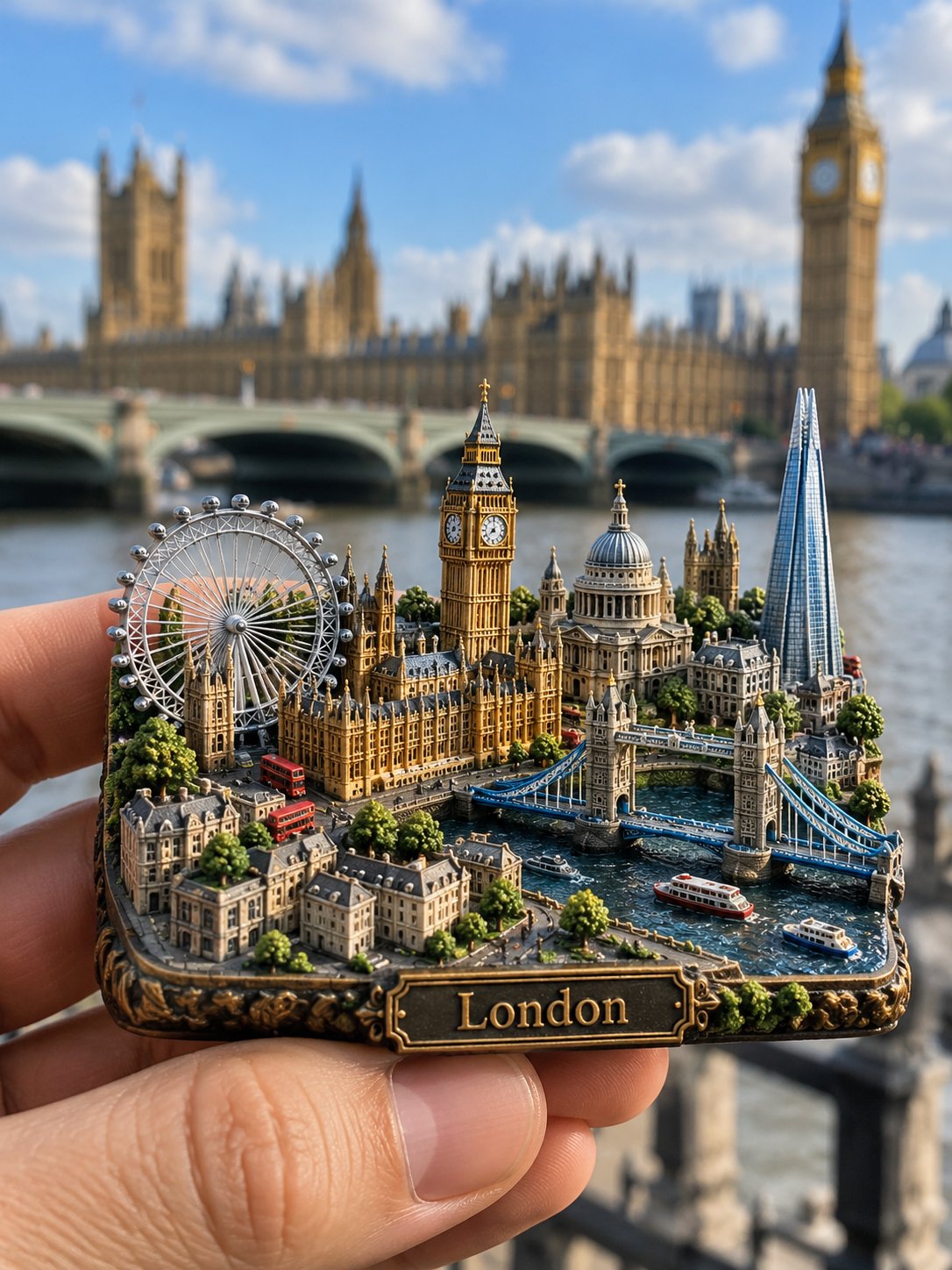
ULTRA-REALISTIC 3D MINIATURE CITY FRIDGE MAGNET Create an ultra-photorealistic product photograph of a premium 3D miniature cityscape refrigerator magnet featuring LONDON. Generate everything entirely from the text description, without requiring any reference image. The main subject is a compact, thick, rectangular refrigerator magnet with softly rounded edges, featuring an intricately sculpted miniature London city built directly into its surface. Include Big Ben, the Palace of Westminster, Tower Bridge, the London Eye, St Paul's Cathedral, The Shard, the River Thames, historic buildings, tiny streets, bridges, trees and landscaped gardens. Arrange the landmarks together in a dense, beautifully layered architectural composition, preserving their recognizable real-world designs and proportions. The miniature should have extraordinary physical depth, realistic architectural textures, tiny windows, detailed rooftops, stone facades and elegant antique bronze and golden metallic accents. Add a small engraved metal nameplate reading "London" along the front edge. A realistic human hand gently holds the magnet close to the camera, showcasing its intricate miniature craftsmanship. In the background, show the actual Big Ben and Westminster architecture, softly blurred but recognizable, creating a beautiful contrast between the real city and its miniature recreation. Professional travel souvenir photography, natural daylight, realistic shadows, macro-level detail, shallow depth of field, authentic materials, cinematic composition, DSLR photography and exceptional photorealism. The final result must look like a real, physically manufactured miniature city refrigerator magnet, not an illustration, poster or digitally floating city. Aspect ratio: 3:4, vertical composition.
0
檢視詳情
Nano Banana
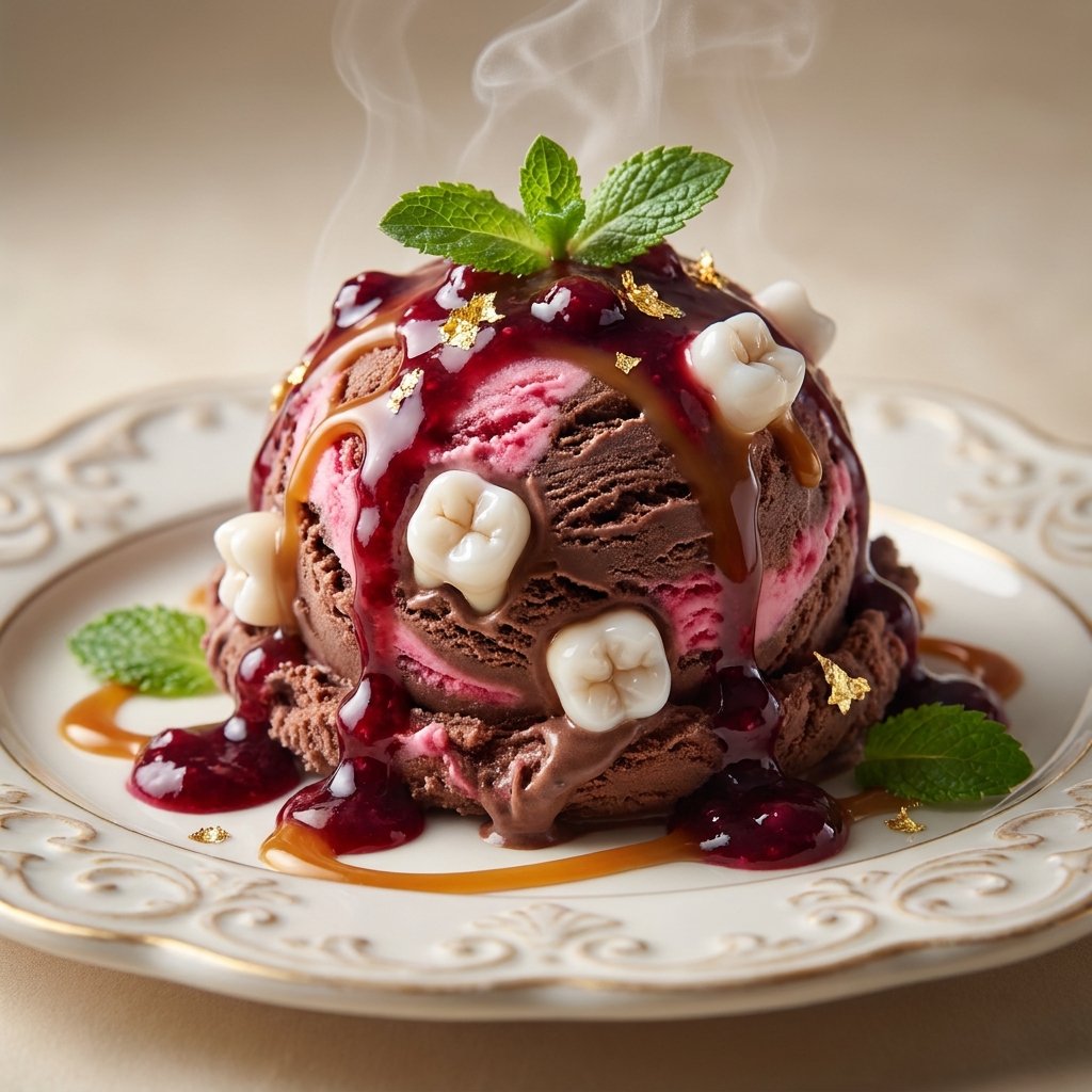
[DISH] with [GROTESQUE ELEMENT], high-end food commercial product photography, the dish presented as a luxurious hero shot on an elegant plate, appetizing and disturbing at the same time, the grotesque detail blending seamlessly and realistically into the food, glossy sauces, fresh garnish and perfect plating, professional studio lighting with soft key light, crisp rim light and subtle reflections, macro lens close-up, shallow depth of field with creamy background blur, clean seamless neutral backdrop, ultra detailed textures, visible moisture, steam and surface sheen, photorealistic, sharp focus on the main subject, premium advertising campaign look, no text, no logos, no watermark, no blood, no gore
0
檢視詳情
GPT Image 2.5
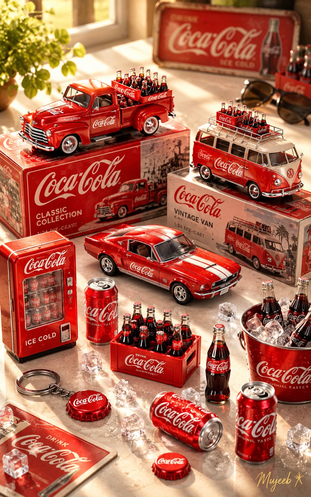
Using ChatGPT’s creative capabilities and the provided reference image, create a high-resolution, exquisitely detailed commercial product photograph blended with a warm, sunlit lifestyle photography aesthetic. SUBJECT / THEME: [PRODUCT OR COLLECTION THEME] Create a beautifully arranged display of miniature collectibles, die-cast models, and matching accessories inspired by the selected theme. Adapt the colors, products, branding, and surrounding props to match the subject while maintaining a cohesive, premium collectible-display aesthetic. SCENE & COMPOSITION: Use a high-angle, top-down perspective combined with macro photography. The scene takes place on a clean, bright white tabletop, illuminated by warm sunlight streaming diagonally across the surface, creating soft shadows, natural highlights, and a cozy, nostalgic atmosphere. Arrange the main collectible models and accessories in a carefully layered composition: - Back row: Place two prominent collectible models on top of beautifully designed display boxes or premium packaging, showcasing their distinctive shapes, colors, and intricate details. - Front row: Arrange additional miniature models in different angles and configurations, highlighting their craftsmanship, accessories, and realistic construction. - Surrounding details: Scatter small, theme-related accessories naturally across the foreground, including miniature containers, bottles, packaging, decorative objects, or other relevant collectibles. - Background accents: Place a few playful, complementary props in the upper-right background, slightly out of focus to create depth and a natural photographic composition. MATERIALS & REALISM: Emphasize exceptionally realistic materials, glossy painted surfaces, finely rendered metal, transparent glass or plastic, detailed packaging, and authentic miniature craftsmanship. Capture the way warm sunlight reflects off polished surfaces, producing delicate highlights, subtle lens glow, and rich, natural tonal variations. PHOTOGRAPHIC STYLE: Premium commercial product photography, photorealistic macro detail, warm vintage-inspired lifestyle aesthetics, soft natural sunlight, realistic shadows, shallow depth of field, carefully balanced composition, crisp textures, and professional editorial quality. The final image should feel like a real photograph of a thoughtfully curated collectible collection rather than a digital render. SIGNATURE & FORMAT: Add a tasteful, luminous golden signature watermark reading “[SIGNATURE OR BRAND NAME] ✻” in the bottom-right corner, accompanied by a delicate four-point starburst motif. ASPECT RATIO: 10:16 vertical portrait. QUALITY: High resolution, exceptionally detailed, photorealistic, premium commercial finish. Use the provided reference image to guide the composition and visual arrangement. Adapt the entire scene to the selected theme while preserving the same warm lighting, miniature-display aesthetic, realistic materials, and sophisticated photographic quality.
0
檢視詳情
Nano Banana 2.1
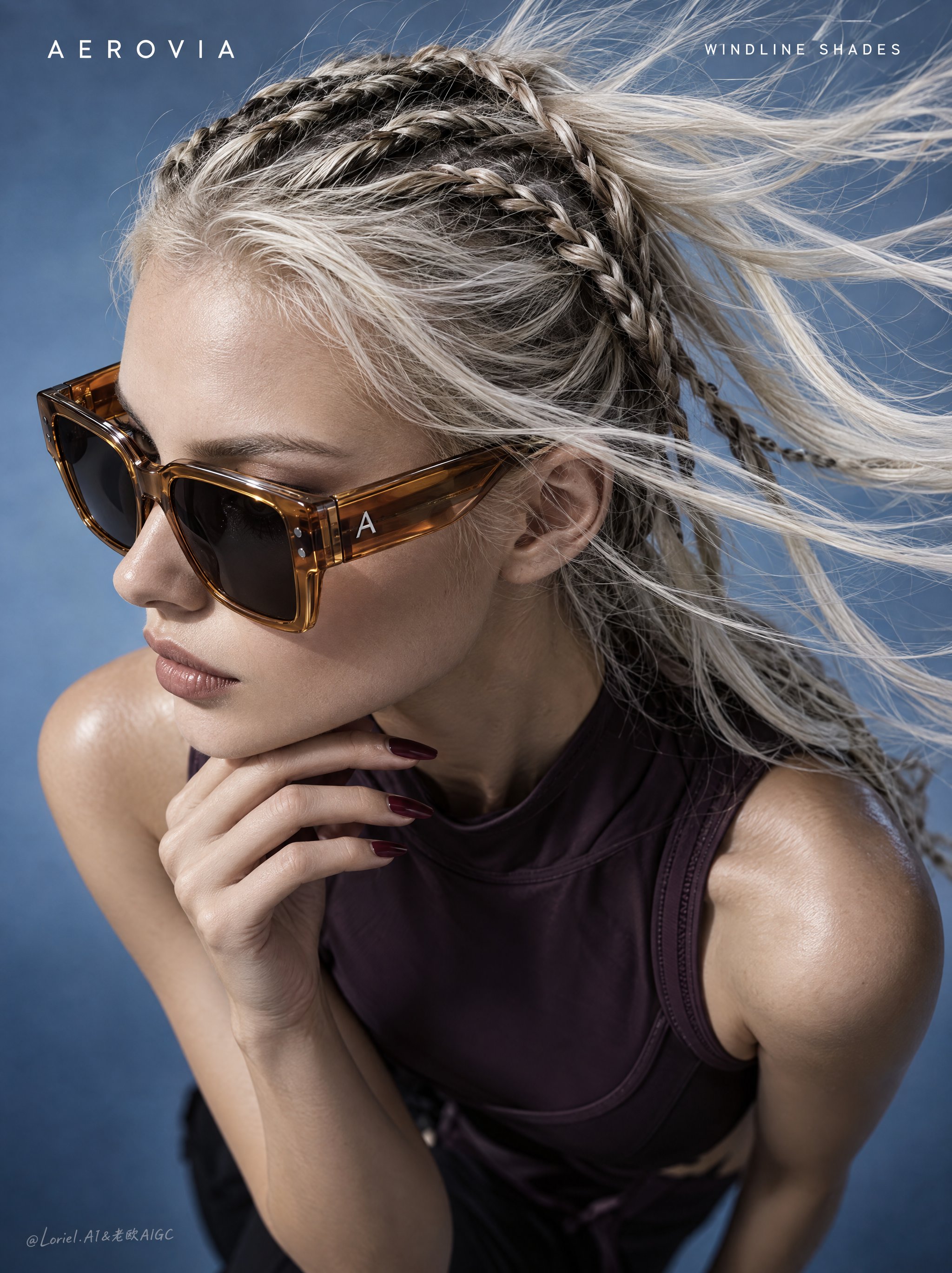
A full-bleed vertical luxury eyewear poster for the original overseas brand "AEROVIA", combining wind-driven profile tension, precise eyewear-and-hair detail, and a reduced curatorial layout. The hero product is the "WINDLINE SHADES": oversized translucent amber sunglasses shown in high-fashion studio photography from an extreme high overhead three-quarter angle. Show an adult female model, clearly over 20, in a left-facing profile with head slightly lowered, cropped from head and flying hair to upper torso. The face, sunglasses, and hand form a compact diagonal from upper left to lower center. One hand rests under the chin with elongated fingers and deep burgundy nails, staying below the jawline and away from the lenses. The sunglasses must be the sharpest element: oversized square frames with warm translucent amber acetate rims, thick sculpted temples, dark smoke lenses, black hinge details, and a tiny original silver "A" mark on the side arm. Keep rim thickness, bridge form, hinge pins, temple connection, lens reflections, and face contact structurally believable. Hair is platinum blonde in tight dark-and-blonde braids wrapping the scalp, with loose wind-blown strands sweeping toward the upper right as the main motion cue. A sleeveless dark plum technical top remains secondary and acts only as a grounding mass. Use a minimal cool blue-gray gradient studio background with no props or scenery. Depth comes from the overhead angle, floating hair strands, hand-to-face overlap, the sunglass silhouette, and soft falloff under the shoulders. Lighting is hard-soft studio light from the upper left, creating highlights on the amber acetate, cheekbone, platinum strands, burgundy nails, and shoulder, with cool fill preserving shadow detail. Color hierarchy: blue-gray background as the dominant field, amber sunglasses as the hero accent, platinum hair as motion highlight, dark plum top as the grounding tone, burgundy nails as a small secondary accent. Keep highest detail on the eyewear and hair: glossy amber acetate, smoke lens reflections, hinge pins, temple edges, bridge geometry, braided texture, loose strands, and clean hand contact near the jaw. Skin stays realistic with natural editorial texture. Hair edges remain fine and separated. Exact visible text only: Top-left: "AEROVIA" Top-right: "WINDLINE SHADES" Typography: small white uppercase sans serif with wide spacing, placed in the upper corners away from the face, hair, hand, and sunglasses. Negative constraints: no distorted profile, broken sunglass geometry, missing temples, extra hands, distorted fingers, impossible neck angle, or hair covering the eyewear; no plastic skin, muddy amber acetate, dead black lenses, smeared hair, flat light, or dirty background; no copied real logos, misspelled "AEROVIA", extra text, gibberish marks, or typography over the face or sunglasses; no street background, excessive jewelry, sci-fi interface, painterly drift, collage artifacts, or low-quality eyewear edges.
0
檢視詳情
GPT Image 2.5
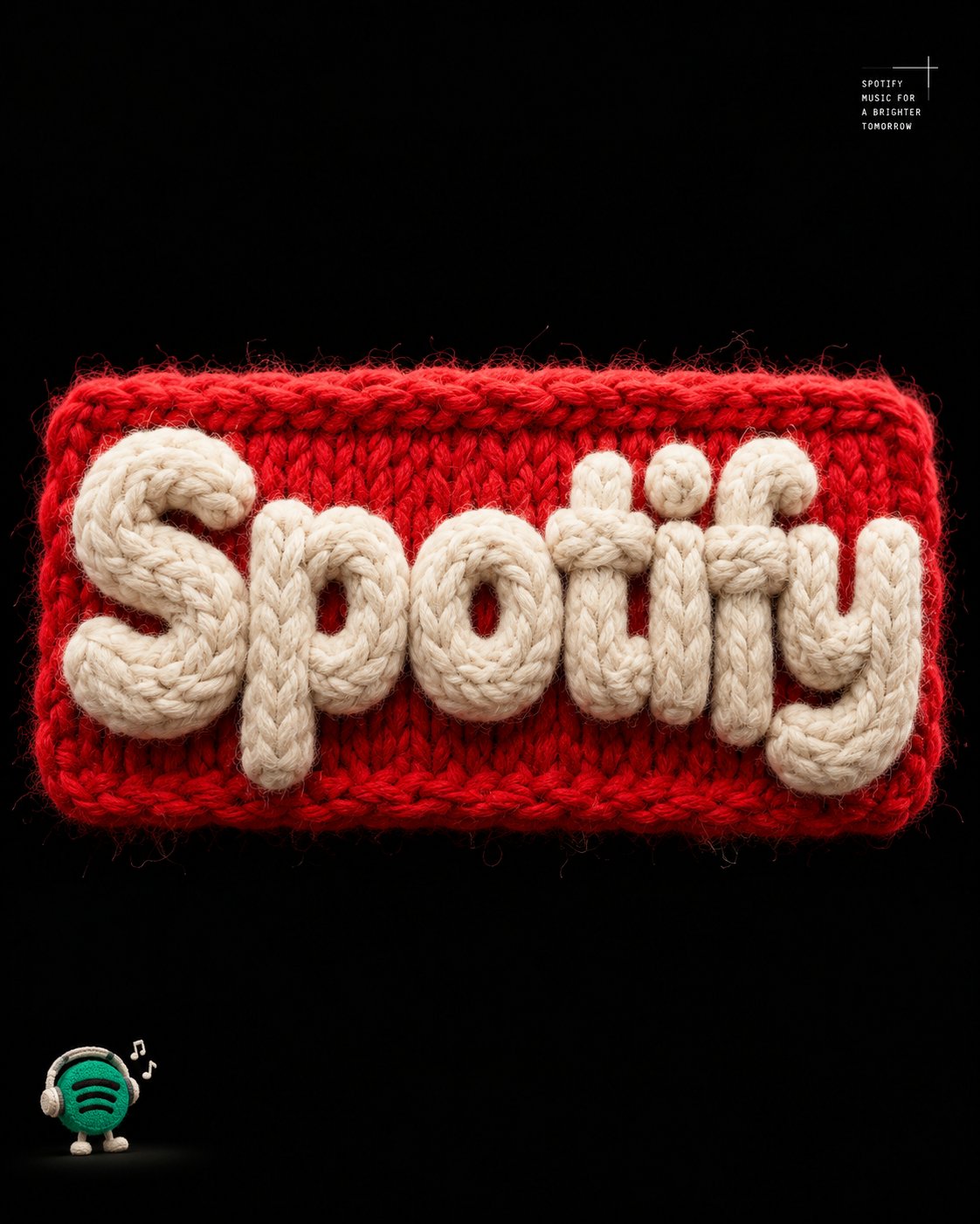
Create a premium, ultra-realistic 3D typography poster featuring the exact word "[YOUR TEXT]", sculpted entirely from thick, fluffy wool yarn. MAIN TYPOGRAPHY Form the letters into chunky, bold, tightly packed shapes crafted from soft, off-white cotton fibers. Give each letter a dense, plush, tactile appearance with intricate individual strands, realistic fiber variation, and subtle natural irregularities. Mount the typography on a vibrant red knitted rectangular patch featuring clearly visible stitches, fuzzy edges, raised yarn patterns, and an authentic woven texture. Ensure the text is spelled exactly as provided, with every letter clearly distinguishable, correctly formed, and fully readable. The typography must remain the dominant visual element. BACKGROUND & LIGHTING Use a pure black background with generous negative space around the central composition. Apply dramatic studio lighting to emphasize the contrast between the creamy white yarn, vivid red knitted patch, and deep black surroundings. Create realistic contact shadows, subtle ambient occlusion, dimensional highlights, and convincing depth. EDITORIAL DETAILS Add small, minimalist, monospaced white typography in the top-right corner, arranged neatly like a refined editorial design annotation. In the bottom-left corner, include a tiny, charming illustrated mascot accompanied by a short, understated descriptive caption. Keep both elements secondary, precisely aligned, and visually unobtrusive. MATERIAL REALISM Render every material with exceptional tactile accuracy, including individual wool fibers, soft fuzz, tightly looped stitches, subtle textile imperfections, and realistic light interaction. The result should feel like a meticulously handcrafted textile artwork photographed in a professional macro studio. COMPOSITION & OUTPUT Vertical 4:5 aspect ratio. Centered composition, balanced visual hierarchy, generous negative space, crisp focus on the main typography, high contrast, sophisticated editorial art direction, premium experimental graphic design, photorealistic 3D rendering, and exceptionally detailed materials. FINAL REQUIREMENT: Prioritize exact spelling, immediate readability, realistic knitted construction, and a striking visual contrast. Avoid extra words, distorted letters, clutter, excessive decorative elements, or anything that competes with the main text.
0
檢視詳情
GPT Image 2.5
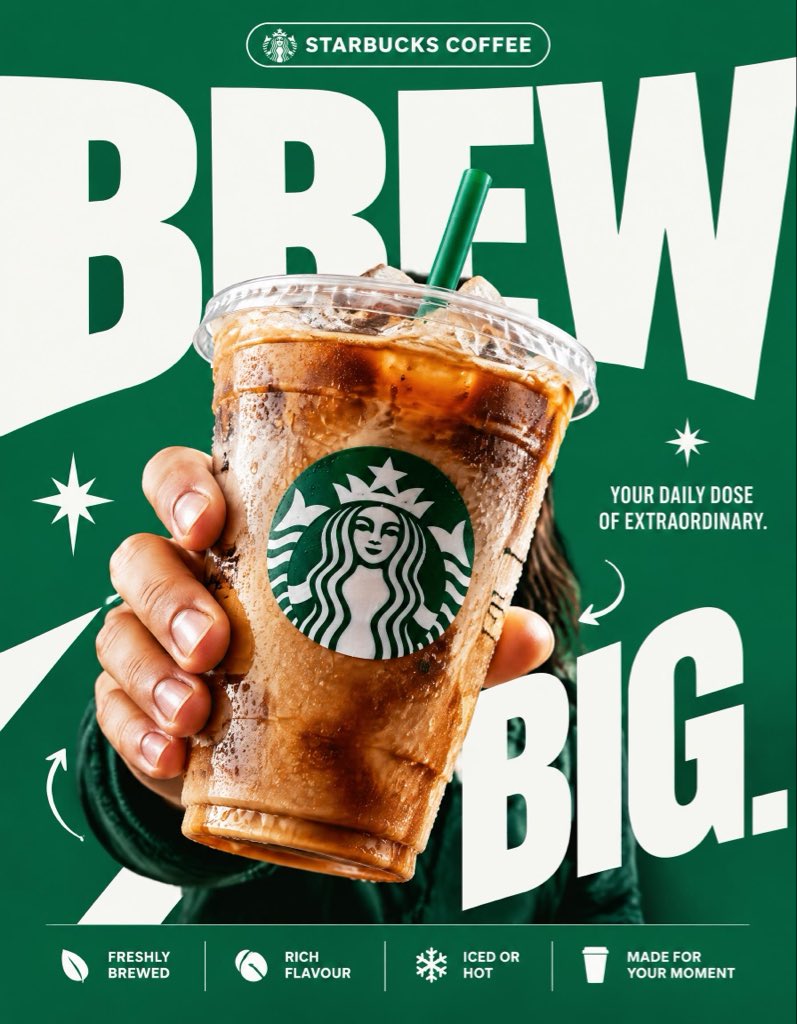
STARBUCKS — “BREW BIG.” 4:5 vertical premium poster, 8K, exaggerated bold typography × high-impact commercial art direction × photorealistic product advertising 🧠 CORE IDEA: “BREW BIG.” 🎬 LAYOUT: BACKGROUND BLOCK: Solid, vivid Starbucks green background with oversized graphic shapes and strong contrast. GIANT TYPOGRAPHY: “BREW” Extremely bold, oversized, tightly cropped typography dominating almost the entire composition. Letters extend beyond the canvas edges, with the Starbucks cup overlapping the text. 👤 SUBJECT: A hand holding an iced Starbucks drink directly toward the camera, extreme forced perspective, cup dramatically enlarged in the foreground, realistic condensation, crisp ice, natural lighting. ☕ PRODUCT + VISUAL TWIST: The Starbucks cup becomes the centerpiece of the typography. The oversized word “BREW” appears to wrap behind the cup, creating striking depth through scale, layering, and composition. Keep the cup, logo, and beverage completely photorealistic. ✨ GRAPHIC ELEMENTS: * Oversized green and white shapes * Sharp contrasting shadows * Minimal starburst accents * Small directional arrows * Bold editorial layering ✍️ TEXT SYSTEM: Top pill: “STARBUCKS COFFEE” Main headline: “BREW BIG.” Supporting text: “YOUR DAILY DOSE OF EXTRAORDINARY.” BOTTOM FEATURE STRIP: * Freshly Brewed * Rich Flavour * Iced or Hot * Made for Your Moment ANTI-SLOP DIRECTION: Typography is the main design feature, not a small decorative element. Extreme scale, aggressive cropping, strong visual hierarchy, deliberate overlap, premium print-ad finish. No floating coffee beans, no miniature landscapes, no random surreal objects, no excessive particles, no cluttered layouts, no generic gradients. The final poster should feel like a bold global advertising campaign with unmistakable graphic impact.
0
檢視詳情
GPT Image 2.5
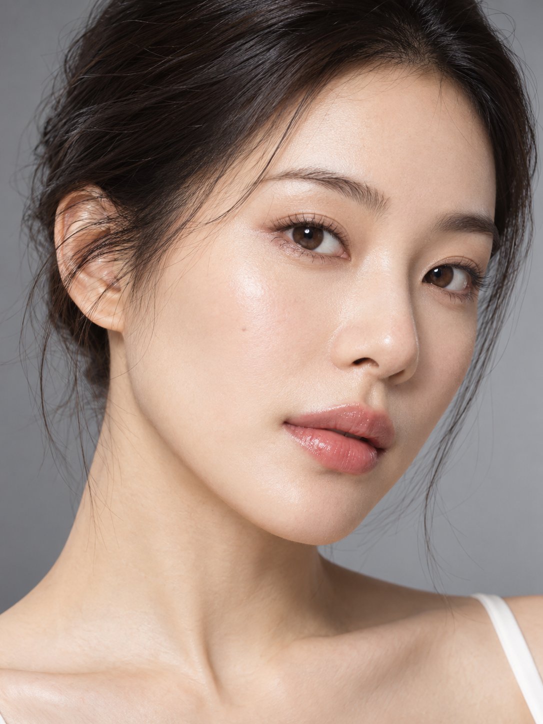
请将两张参考图组合为一张真实的高端商业护肤广告照片。 参考图1(M0):唯一人物身份及摄影风格参考。 参考图2(K0):唯一精华瓶结构及材质参考。 【身份与产品一致性】 保持M0人物原有五官、年龄感、发型、肤色、轻薄妆容和自然水润肌肤。产品必须沿用K0的瓶身、泵头、盖子及磨砂玻璃材质,不重新设计产品。 【人物动作】 人物保持自然正面或极轻微侧脸,头部放松,视线柔和看向镜头附近。 右手自然握持精华瓶,将产品展示于右侧胸前至肩部附近,瓶身完整可见,大小符合真实30mL产品的视觉比例。 左手抬起,用食指和中指的指腹非常轻柔地触碰左侧面颊外缘,呈现自然护肤体验动作。 两只手均具有合理的五指结构、手腕连接和自然关节弯曲。手指不能穿过面部或瓶身,面颊接触处允许非常轻微的真实皮肤形变。 【摄影与布光】 3:4商业美妆摄影构图,包含完整面部、双手和产品。模拟85mm f/8摄影效果,产品和人物面部保持合理清晰度。 使用与M0相同的Clamshell布光和中性暖灰背景。手部阴影、皮肤高光、玻璃及金属反射均符合现有灯光。 【真实感】 保留皮肤毛孔、面部自然纹理与真实手部细节。画面精致但不过度修饰。 禁止产品悬浮、错误手指、额外关节、瓶身变形、皮肤磨平、人物换脸和新增品牌文字。
0
檢視詳情
GPT Image 2.5
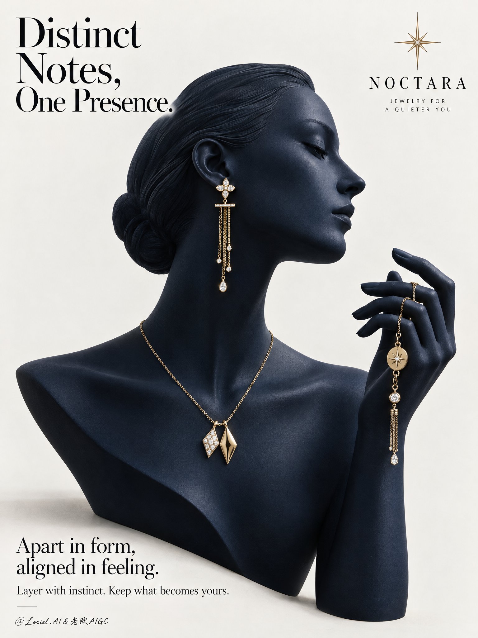
A Cannes-level luxury jewelry campaign poster for the fictional contemporary fine-jewelry brand NOCTARA, designed as a product-first editorial still life that fuses sculptural atmosphere, collector-grade material precision, and curator-level minimal restraint. The composition centers on a deep midnight-navy mannequin bust in elegant side profile, with a matching raised hand entering from the right to form one continuous sculptural gesture. The jewelry set remains the absolute focus: a refined yellow-gold mix-and-match composition across ear, neck, and hand, presented against a pale gallery-clean background with disciplined typography and strong negative space. Use a vertical poster format, straight-on with slight editorial monumentality. The mannequin occupies the center-left and center field, facing right. Preserve the clean poster rhythm: a large headline in the upper-left, a minimal star-like emblem near the upper-right, and a refined text block in the lower-left. The bust silhouette, neck curve, profile line, and raised hand should create a single elegant visual flow. Keep the background warm white to pale stone gray, uncluttered and spacious, with only a faint grounding shadow beneath the bust. The image should feel like a museum-grade print ad. The hero jewelry set is contemporary fine jewelry in polished champagne-yellow gold with restrained diamond-white accents. The visible ear wears one long drop earring with a small floral-geometric stud, a slim horizontal connector, and delicate chain tassels ending in tiny luminous drops. Around the neck sits a minimal gold chain necklace with two asymmetrical geometric pendants, intentionally non-identical yet harmonized, one brighter with a stone-led glint and one warmer sculptural gold form. The raised hand gently holds a coordinating chain bracelet or hand jewel with small medallion details and a slim dangling tassel. The overall language should feel modern, poetic, collectible, and quietly personal. The mannequin bust should be smooth, elongated, and refined, with poised chin, elegant collarbone line, and a calm profile directing attention toward the lifted hand. The hand must feel sculptural and couture-like, with gently curved fingers and believable tension where the jewelry is held. The jewelry distribution from ear to neck to hand should create a refined cadence, guiding the eye without crowding. Remove anything non-essential so the jewelry reads with maximum clarity and desirability. Keep the setting radically minimal and editorial. Depth should come from silhouette separation, tonal modeling, jewelry layering, and fine shadow falloff rather than scenery. The mannequin and hand should feel fully dimensional against the quiet pale background, with the jewelry emerging as warm points of precision. No props, furniture, texture overload, or narrative clutter. Use a restrained palette of midnight navy, pale stone white, champagne gold, and diamond-white highlights. Build a soft directional key from upper-left front grazing the profile, neck, shoulder line, fingers, and jewelry edges. Add subtle frontal fill to preserve detail in the navy surface while maintaining sculptural depth. Gold reflections should remain warm, crisp, and elegant, never harsh. Tiny diamond or pearl-like highlights should punctuate the jewelry with precision. Maintain premium contrast without dead black areas or flat gray dullness. Render everything with hyper-real luxury product photography and fashion-editorial polish. The mannequin surface should feel like matte-satin ceramic or lacquered resin with velvety density, between sculpture and couture display form. The gold jewelry must show immaculate polish, believable chain scale, precise link articulation, clean stone setting, and subtle micro-reflections. The finish should be immaculate, tactile, and high-end, with every edge resolved and every highlight controlled. No plastic sheen, muddy reflections, or cheap gloss. Place a refined wordmark for NOCTARA with a minimal starburst emblem in the upper composition. In the upper-left, set the headline: Distinct Notes, One Presence. In the lower-left, add: Apart in form, aligned in feeling. Beneath it: Layer with instinct. Keep what becomes yours. Typography must feel airy, elegant, and integrated, using a refined serif-led hierarchy with graceful spacing and no heavy crude fonts. Luxury jewelry poster, product-dominant, ultra-clean, editorial, hyper-real, no extra accessories, no clutter, no background scene, no gibberish text, no malformed fingers, no broken chain physics, no floating jewelry without support, no warped facial profile, no muddy navy tones, no dead black patches, no blown gold highlights, no duplicated pieces, no topology collapse, no style drift, no cheap catalog aesthetic.
0
檢視詳情
GPT Image 2.5
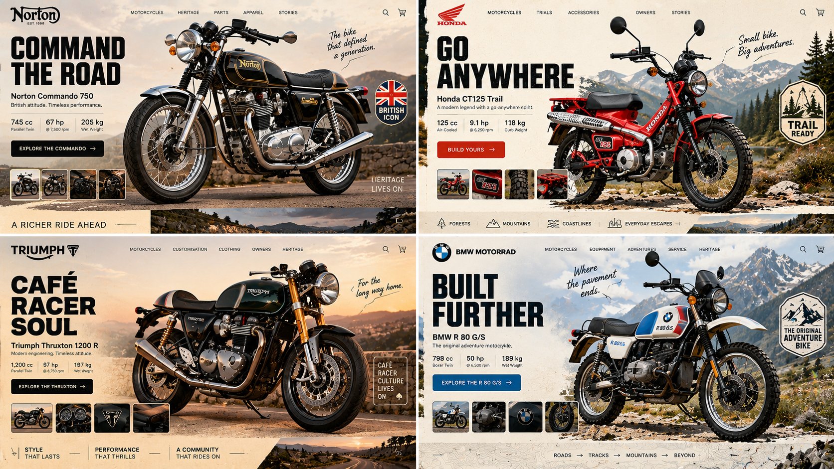
16:9, 2x2 grid, do this for an unusual but real classic motorcycles INPUT = [ TOPIC / HERO_OBJECT / BRAND_TEMPERAMENT / VIEWPORT / GRAVITY_LAW ] Run HERO_PRODUCT_GRAVITY: TOPIC_DNA := infer the category from TOPIC alone — what's sold, who buys it, what its shelf looks like HERO_DNA := ONE photographic hero object, cut out, oversized, 30–40% of frame; real material response — specular on foil, matte on paper, subsurface scatter on skin or fruit BRAND_DNA := derive the palette FROM the object — 1 dominant, 1 accent pulled from a hue the object actually contains, 1 near-neutral ground LIGHT_ANCHOR := decide key light position ONCE (upper-left or upper-right); every shadow — object, cards, pills, floating confetti — falls the same direction at the same angle and softness GRAVITY_LAW := the hero is either GROUNDED (contact shadow touching a visible surface plane) or SUSPENDED (ambient occlusion beneath, blur growing with height) — never both, never floating with a hard cast shadow and no plane to cast it onto DEPTH_ORDER := ground wash < decorative rays/confetti < hero object < UI chrome. Nav, cart and buttons are ALWAYS in front, never occluded TYPE_LOGIC := one display face for the headline (heavy — pick condensed OR wide, not both), one neutral for everything else; headline ≤ 6 words, body renders as legible micro-type, never enlarged gibberish IMPERFECTION := exactly one element breaks its bounding box — a badge rotated 4–7°, a sticker overlapping the product silhouette, a stray mark in the gutter FRAME := desktop 16:10, 64–80px outer gutter; the bottom edge reveals the top 15% of the next section so the page reads as scrollable MOOD := appetite, immediacy, one unmistakable action Render: one screen where the product's own light governs every pixel of interface around it. Forbidden — objects: stock-photo humans, lorem blocks at display size, a second competing hero Forbidden — look: conflicting shadow directions, cut-out halo or chewed edges, cast shadows on flat 2D illustration, palette colors absent from the object, three type families, nav bar sitting behind the product
0
檢視詳情
GPT Image 2.5
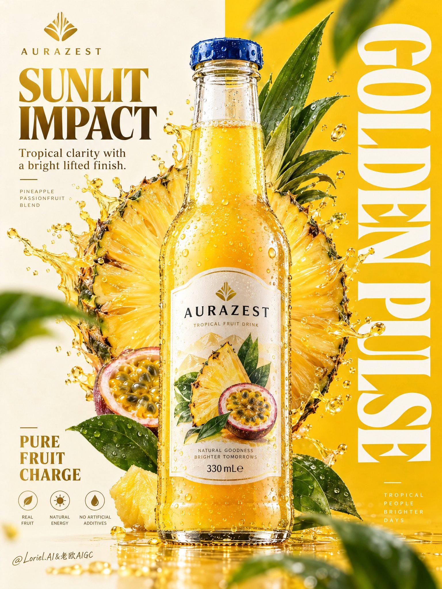
Create a premium vertical commercial poster for a fictional overseas fruit drink brand, "AURAZEST". Design it as a Cannes-level beverage ad where a hyper-real glass bottle is the absolute visual hero, fused with disciplined graphic poster design. Use a strict split composition: the left half is a refined warm-ivory information field, the right half a saturated solar-yellow brand field with a giant vertical typographic block. Position the hero bottle exactly across the central dividing line so it bridges both zones and controls the full hierarchy. The bottle is a chilled elegant glass bottle filled with luminous golden pineapple-passionfruit juice, with thick transparent glass, realistic refraction, a precise blue-metal cap, dense micro-condensation, varied tiny droplets, visible meniscus, crisp label print, and premium manufacturing detail. The front label must read exactly "AURAZEST". It should feel tactile, cold, collectible, and physically believable, carrying the strongest focal weight in the poster. Behind the bottle, build a large radiant fruit halo combining a pineapple cross-section with a more art-directed geometric fruit-core structure so it feels natural and iconic. The fruit disk sits slightly left of center behind the bottle, partially occluded, with juicy fiber detail, wet rind texture, bright translucency, and controlled splash arcs bursting outward. The splash must feel physically accurate yet graphically composed, with clear directional force, believable viscosity, suspended droplets, and no messy chaos. Add several fresh green leaves around the outer frame as rhythm accents, some softly blurred in the near foreground and some crisp in the midground, always supporting freshness and depth. Typography must be newly invented and fully art directed. In the top-left, place a minimalist emblem and the brand name "AURAZEST". Beneath it, set the headline "SUNLIT IMPACT", with the smaller line "Tropical clarity with a bright lifted finish." In the lower-left, place a compact benefit lockup: "PURE FRUIT CHARGE". Across the entire right panel, place a massive vertical white typographic block reading "GOLDEN PULSE". Typography should feel integrated into the poster architecture, elegant and precise, with clean spacing, balanced weight, and no collision with the bottle label or fruit core. Use a tightly controlled palette: 55% pineapple gold and radiant mango-yellow, 20% warm ivory and pale cream, 15% vivid botanical green, 10% deep amber shadow accents and cool blue cap contrast. Light the scene with a clean key from the upper left, luminous transmission through the juice, crisp specular edges on the bottle shoulders, soft reflected bounce from the pale background, and enough contrast to carve volume into the glass, fruit, and splash without muddy blacks or dirty haze. The finish should feel bright, premium, sharp, and globally campaign-ready. Materials must read with extreme clarity: translucent juice glow, fibrous juicy flesh, glossy wet rind, fresh waxy leaves, sparkling droplets, clean heavy glass, and sharp printed label edges. The poster should combine commercial product realism, fruit freshness, and curatorial graphic discipline in one unified system. Maintain correct bottle proportions, label readability, coherent splash physics, clean perspective, elegant negative space, and powerful retail-ad impact. Keep one single hero bottle only, product-first hierarchy, clean premium advertising realism, coherent fruit geometry, coherent droplet scale, plausible leaf perspective, and crisp typography. Avoid warped bottle shape, broken glass proportions, unreadable label text, accidental extra bottles, duplicated fruit slices, muddy shadows, dirty texture buildup, chaotic splashes, cheap font treatment, distorted vertical lettering, weak hierarchy, random clutter, off-theme decorative particles, accidental resemblance to existing real beverage brands, or style drift away from high-end commercial poster design.
0
檢視詳情
GPT Image 2.5
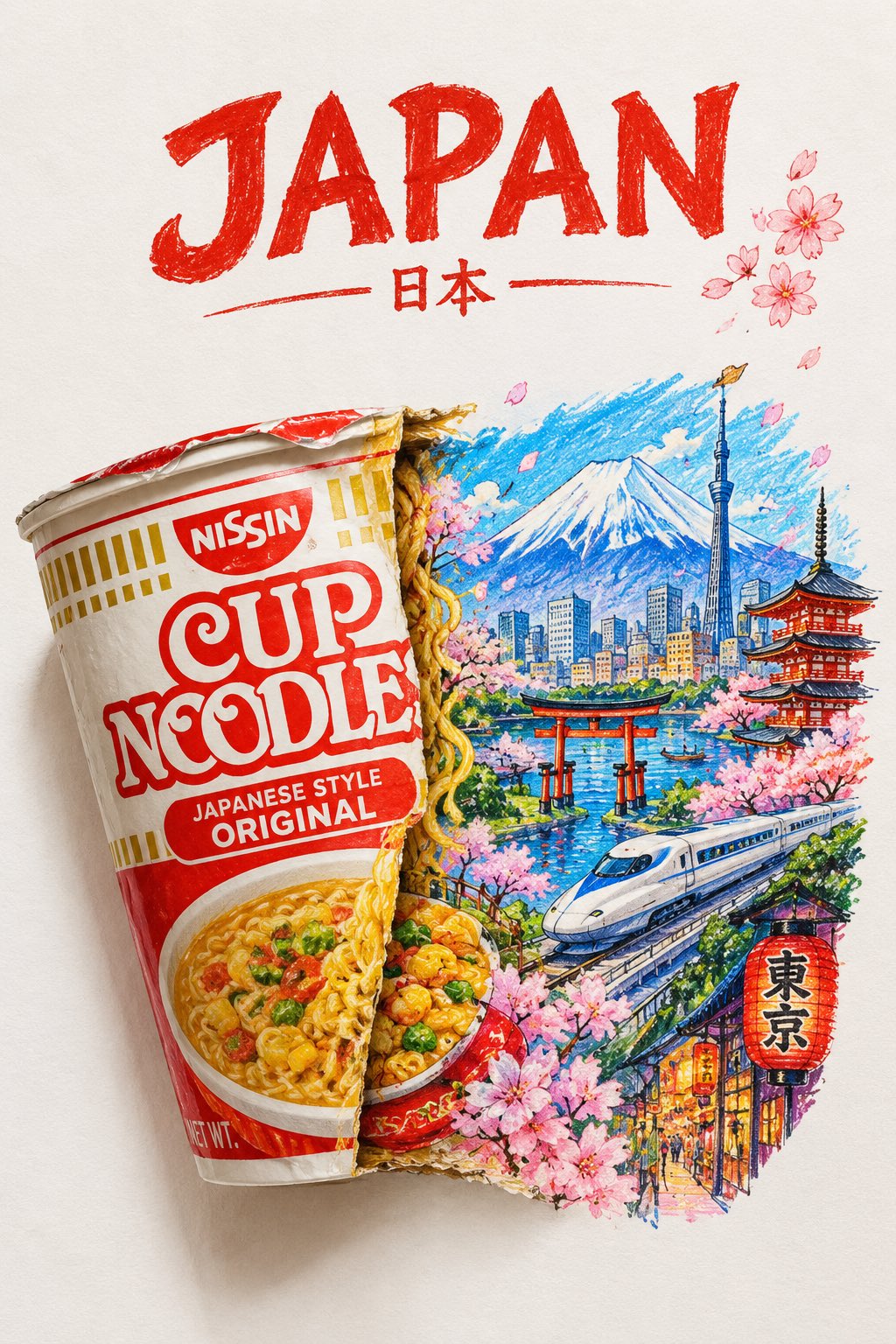
A striking top-down art photograph of a famous packaged food/snack from [COUNTRY], placed on a clean white sheet of paper. At the very top of the paper, write “[COUNTRY NAME]” in large, bold, beautiful typography. Directly underneath, place a realistic, colorful packet of “[FAMOUS FOOD/SNACK]” from that country. The packet is creatively split/opened down the center, and the inside artwork transforms into a vibrant miniature illustration of the country — featuring its most iconic landmark, architecture, landscape, cultural elements and recognizable local details. Keep the original food packet highly realistic with authentic-looking folds, crinkles, printed graphics and vivid colors, while the emerging country illustration uses expressive colored-pencil and wax-crayon strokes. White paper background, overhead composition, playful handmade imperfections, rich saturated colors, premium editorial art photography, extremely detailed, visually satisfying, viral social-media aesthetic.
1
檢視詳情
GPT Image 2.5
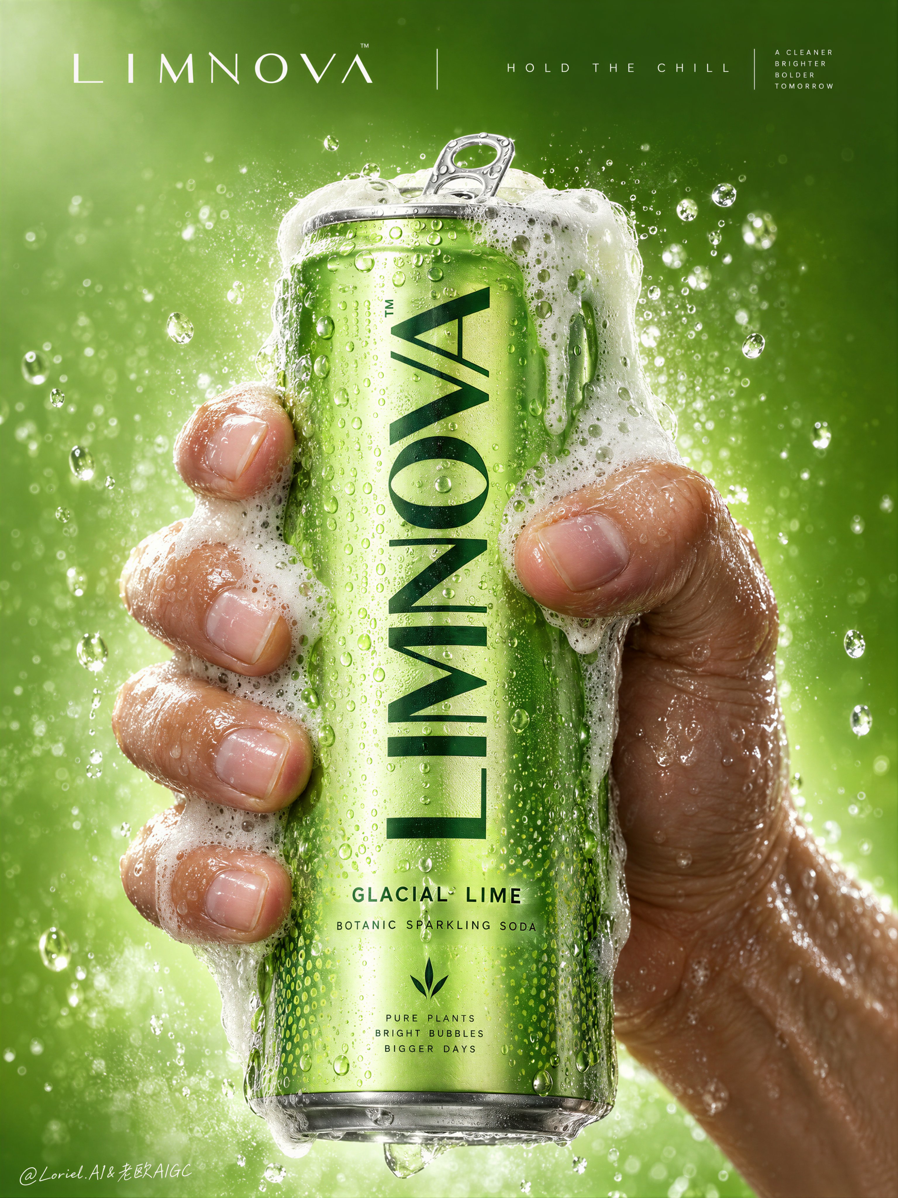
Create a Cannes-level commercial poster for fictional premium sparkling soda brand LIMNOVA, merging tactile product realism, pressure-driven human interaction, and ultra-clean gallery-grade graphic design into one unified hero image. The core concept is controlled release: a cold lime soda can gripped at peak tension, overflowing with foam and condensation, turning an ordinary beverage moment into a sculptural event of freshness, pressure, and desire. Use a vertical full-bleed poster in extreme close-up, rule-of-thirds disciplined but visually centralized. Preserve the exact structure: a single slim can dominates the center, held tightly by one wet human hand wrapping from the right and lower rear; dense foam crowns the top and spills down the can; broad negative space remains above for elegant brand typography. The hand, can, and foam should read as one compressed central mass, surrounded by a luminous citrus atmosphere with no extra props. The can must remain the undisputed focal point and fully legible. The subject is a hyperreal slim aluminum soda can in radiant glacial lime green, with crisp pull-tab geometry, subtle printed microtexture, dense condensation droplets, and refined premium branding. Use the fictional text “LIMNOVA” as the main vertical logo, “GLACIAL LIME” as the flavor line, and “BOTANIC SPARKLING SODA” as the descriptor. The identity should feel bold, contemporary, and luxury-clean, with strong custom letterforms and exact print clarity. The can should look manufacturable, collectible, and ice-cold. One realistic human hand grips the can firmly with correct five-finger anatomy, natural finger spacing, believable knuckle tension, realistic nail beds, subtle skin compression, and wet highlights. The grip communicates force and freshness, not aggression. Foam surges over the top rim and flows across the fingers and can in airy dense clusters, while suspended micro-droplets and faint carbonation mist activate the space. The can remains undeformed except for natural optical tension created by the grip and liquid pressure. No extra hands, no anatomy drift. Build a minimal studio field rather than a literal location. The background is a luminous acid-lime to chilled-chartreuse gradient with suspended droplets, vapor-like fizz haze, and a soft freshness halo around the product. Keep the space clean and abstract, letting the product, hand, and foam generate all depth. No fruit slices, no ice cubes, no bar setup, no clutter. The world should feel like a distilled atmosphere of citrus pressure and cold carbonation. Lighting is a premium studio setup with a bright frontal key, cool upper-left freshness lift, and narrow specular edge highlights on wet aluminum and skin. Palette hierarchy: 60% glacial lime and electric citrus green, 30% white foam and bright condensation highlights, 10% natural warm skin tone as tactile counterpoint. Contrast should be crisp yet soft-edged, with no dead blacks, dirty grey mud, or cartoon oversaturation. The emotional tone is icy, alive, compressed, clean, and addictive. Materials must feel extremely photoreal: sharp reflective aluminum edges, chilled metallic bloom, droplets merging into trails, subtle ink adhesion texture; foam that feels light, wet, aerated, and creamy with translucent bubble variation and convincing thickness at the rim and fingers; and a real, de-AI hand with accurate anatomy, realistic skin texture, natural moisture sheen, crease detail, true finger joints, and no swollen or fused forms. Apply restrained high-end commercial polish, keeping hero detail sharp and print-ready. Integrate a minimalist top header as a refined brand system, not ad clutter. Place “LIMNOVA” on one side of the top band and a secondary studio-style signature or edition mark on the other, separated by a thin elegant divider. If an extra micro-headline is used, keep it very restrained, such as “HOLD THE CHILL” or “PRESS THE FIZZ”, set small outside the can recognition zone. Typography must feel architected into the negative space, aligned with the product axis, and never heavy or crude. Output: a premium beverage poster with product-first hierarchy, hyper-clean execution, strong tactile realism, elegant negative space, and exact brand readability. No extra cans, no fruit garnish, no ice props, no chaotic splash overload, no warped can geometry, no broken tab, no malformed hand, no extra or merged fingers, no unreadable text, no muddy shadows, no large dead black blocks, no low-quality AI artifacts, no clutter, no style drift, and no resemblance to existing real soda branding.
1
檢視詳情
GPT Image 2.5
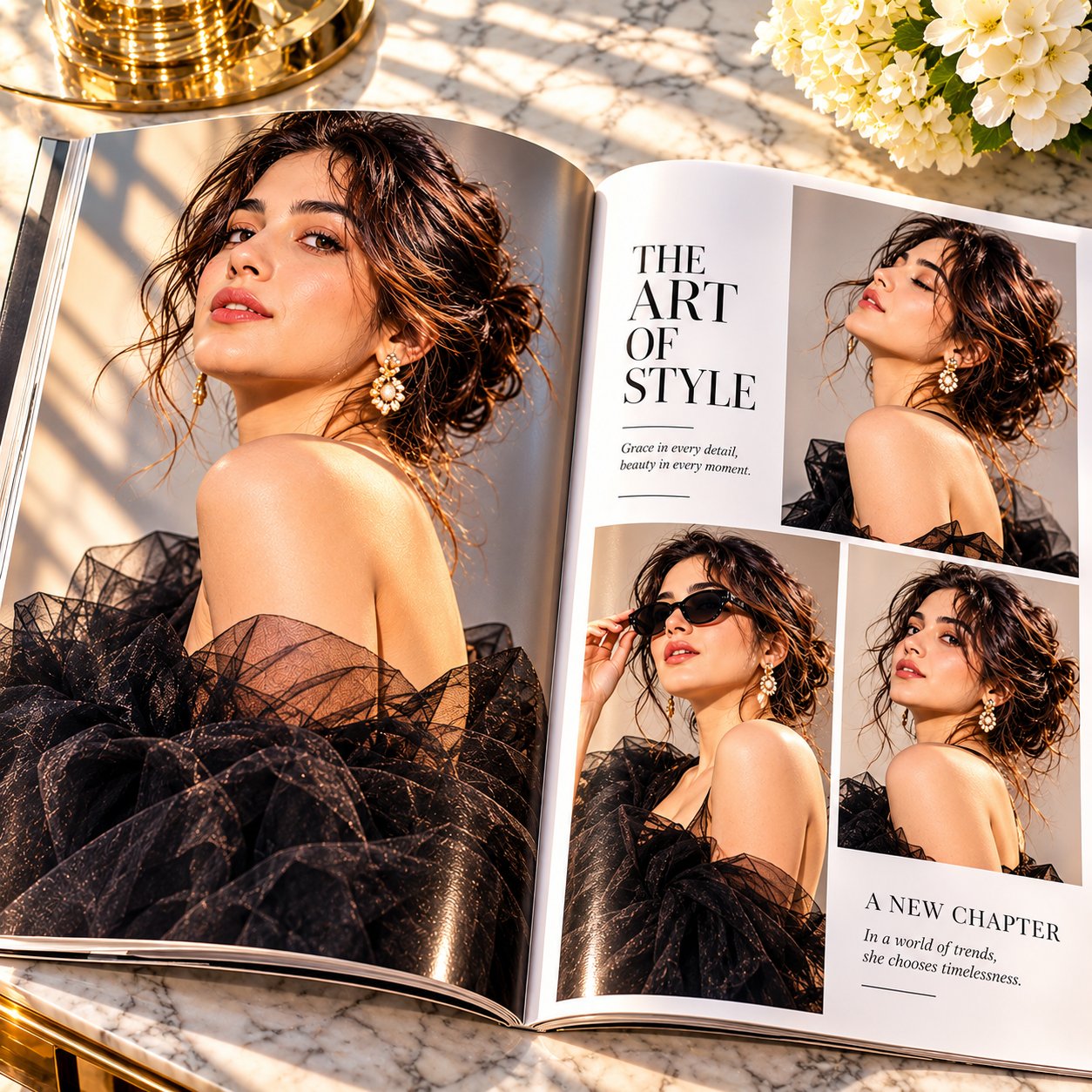
Aspect ratio 1:1. An open luxury fashion magazine resting on a premium marble table, featuring an elegant high-end editorial layout instead of ordinary photographs. The left page showcases one breathtaking full-page hero portrait, while the right page presents three beautifully arranged supporting fashion images with refined editorial typography, generous white space, premium print texture, subtle paper curvature, realistic page folds, and glossy magazine reflections. Absolutely no magazine brand names, logos, or recognizable mastheads. Keep typography minimal, sophisticated, and elegant. Bright, warm sunlight falls beautifully across the pages, creating rich defined shadows, enhanced contrast, luminous highlights, and a vibrant yet luxurious atmosphere. Brighter overall exposure with deeper blacks, crisp details, rich skin tones, and beautifully balanced highlights. Avoid dull, flat, or overly dark lighting. Inspired by high-end Italian fashion editorials and luxury Dior-style campaign photography. Ultra-realistic fashion editorial, premium glossy print finish, cinematic lighting, high contrast, photorealistic masterpiece.
0
檢視詳情
GPT Image 2.5
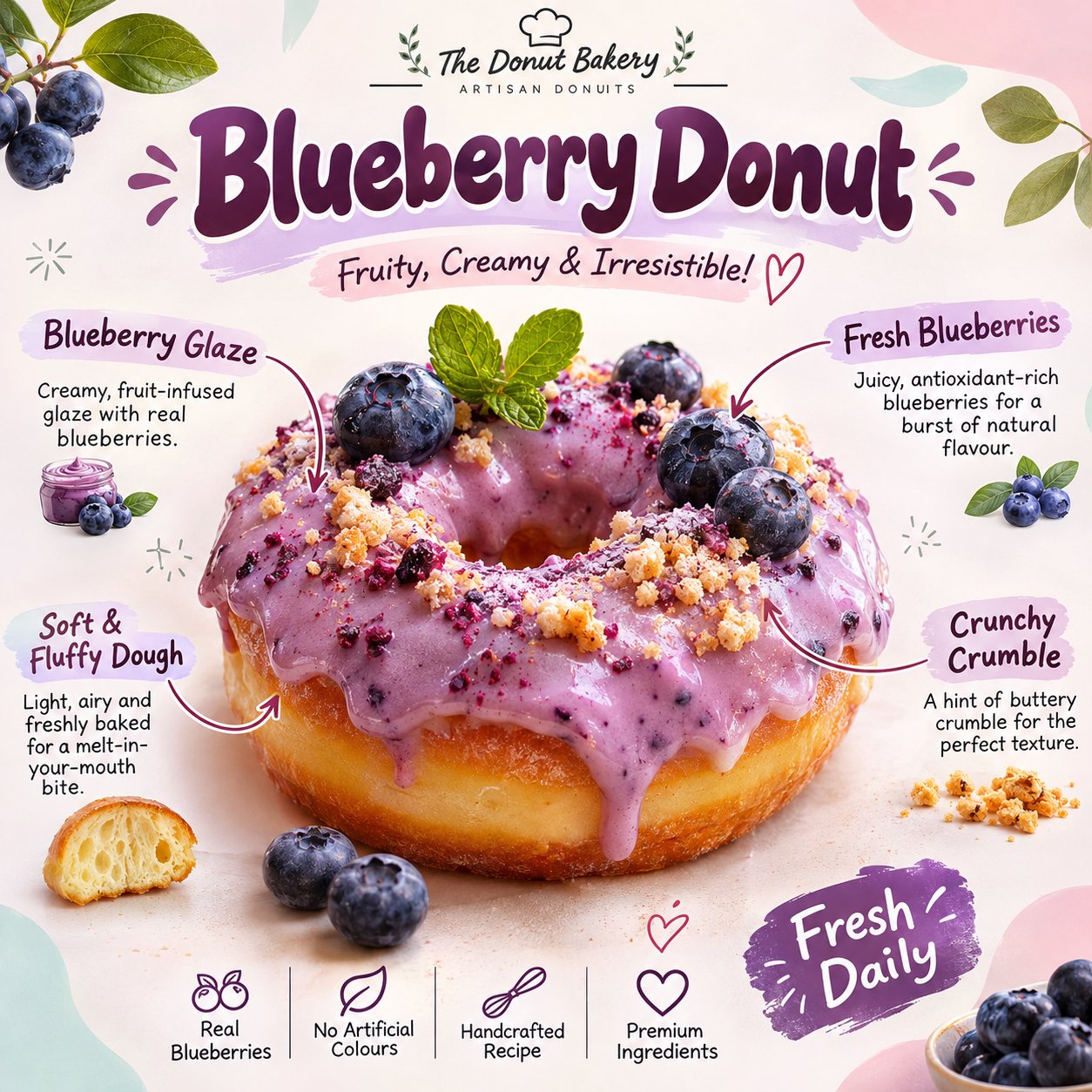
UNIVERSAL PROMPT - PASTEL GOURMET DONUT INFOGRAPHIC POSTER Create an ultra-realistic, beautifully designed gourmet donut promotional infographic poster featuring [DONUT FLAVOUR / THEME]. Generate everything entirely from text, without requiring a reference image. 1. MAIN SUBJECT Display one large, freshly baked, appetizing ring donut in the centre, topped with a generous, glossy, flavour-specific icing. Add realistic toppings such as fresh fruits, mint leaves, chocolate chips, sprinkles or other ingredients that complement the selected flavour. The donut should look incredibly delicious, with detailed golden-brown dough, soft texture, creamy icing, natural highlights and realistic food photography. 2. POSTER DESIGN Use a clean, playful pastel aesthetic with a warm white background, soft pink, mint green and baby-blue abstract corner shapes. Add delicate botanical illustrations, tiny decorative doodles, stars and subtle hand-drawn elements. 3. TYPOGRAPHY & INFORMATION At the top, display a large, bold, rounded headline featuring the donut flavour, followed by a short, playful tagline. Add small handwritten-style annotations around the donut, using elegant curved arrows to identify its ingredients and features. Include details such as: - Main icing or glaze - Fresh toppings - Dough texture - Special ingredients Add subtle promotional text such as "Fresh Daily" and a tiny bakery-style branding footer. 4. VISUAL QUALITY Premium commercial food photography, photorealistic textures, soft natural lighting, vibrant yet balanced pastel colours, beautiful composition, crisp typography, polished editorial infographic design. FORMAT: 1:1 square poster, high resolution, suitable for Instagram carousel posts. IMPORTANT: Automatically adapt the ingredients, icing colour, toppings, annotations, headline and tagline to the selected flavour. Ensure all text is correctly spelled, readable and professionally positioned. Each generated poster should have a consistent visual identity while featuring a distinctly different donut flavour.
0
檢視詳情
GPT Image 2.5
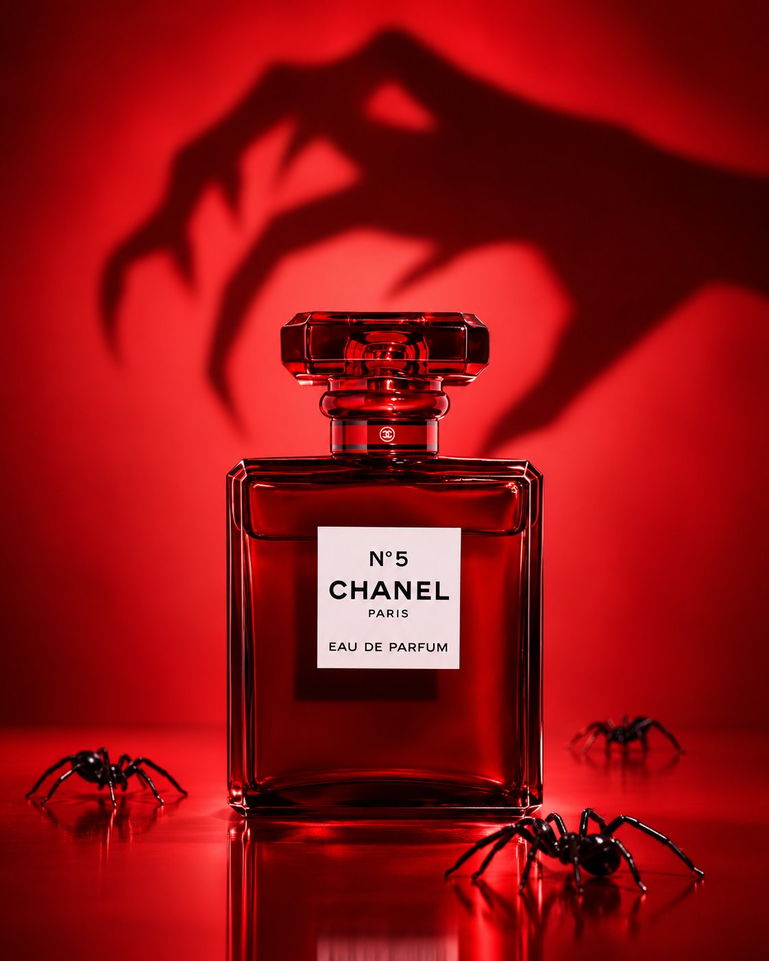
1- Create a hyper-realistic luxury Chanel No. 5 perfume advertisement in a deep red monochromatic theme. Place the ruby-red bottle on a glossy reflective surface, with a creepy witch-hand shadow featuring long, crooked fingers stretching behind it. Add realistic black spiders around the bottle. Dramatic cinematic lighting, rich crimson tones, luxury Halloween aesthetic, photorealistic product photography. No pink, no green, no visible witch. 2- Create a hyper-realistic luxury product photo featuring a deep red Chanel No. 5 perfume bottle in the foreground. Behind it, cast a large, dramatic witch shadow with a pointed hat, flowing cloak, outstretched claw-like fingers, and broomstick. Entire scene in rich crimson and blood-red tones, with cinematic lighting and a subtle reflective floor. The witch must appear only as a shadow, not a real person. No spiders, no extra objects. Premium Halloween perfume advertising, photorealistic, vertical 4:5 composition.
0
檢視詳情
Nano Banana 2.1
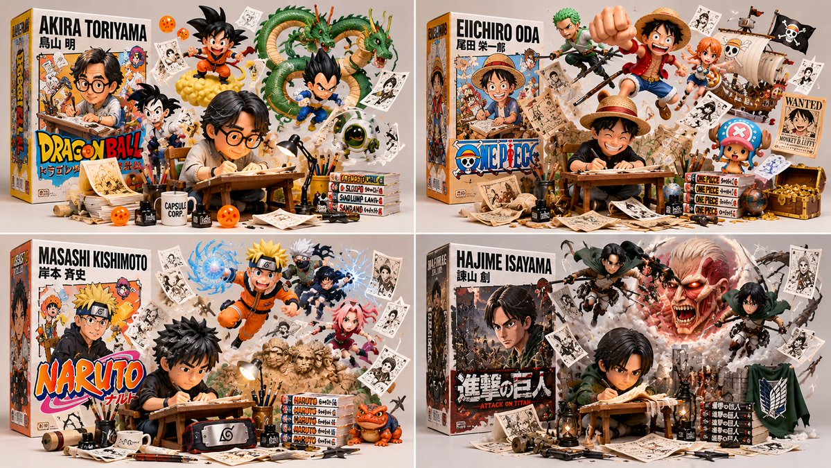
class CreatorToyBoxDiorama: def __init__(self, CREATOR): s = infer(CREATOR) # figure, box, escapees, artifacts, present self.s = s def render(self): return collectible_render( figure=vinyl_figure(self.s.figure, at=self.s.station, pose=WORKING), # B₁ box=retail_box(title=self.s.title, art=depicts(self.s.figure)), # B₂ escapees=[ burst_from(e, origin=self. s. box. art, into=SPACE, dynamic=True) for e in self.s.escapees ], # B₃ artifacts=suspended(self.s.artifacts, ground_contact=NONE), # B₄ studio=neutral_bg(soft_light=True, title_legible=True) ) # B₅ def verify(self, img): assert figure_at_craft(img) and toy_material(img.figure), "B₁: realistic/idle" assert box_present(img) and design_equal(img. box. art.figure, img.figure), "B₂: mismatch" assert len(img.escapees) >= 2 and all(origin_on(e, img .box. art) and body_outside(e, img. box) for e in img.escapees), "B₃: static on box" assert all(no_ground_contact(a) for a in img.artifacts), "B₄: resting props" assert neutral_bg(img) and legible(img . box.title) and collectible_quality(img), "B₅" CreatorToyBoxDiorama(CREATOR).render()
0
檢視詳情
GPT Image 2.5
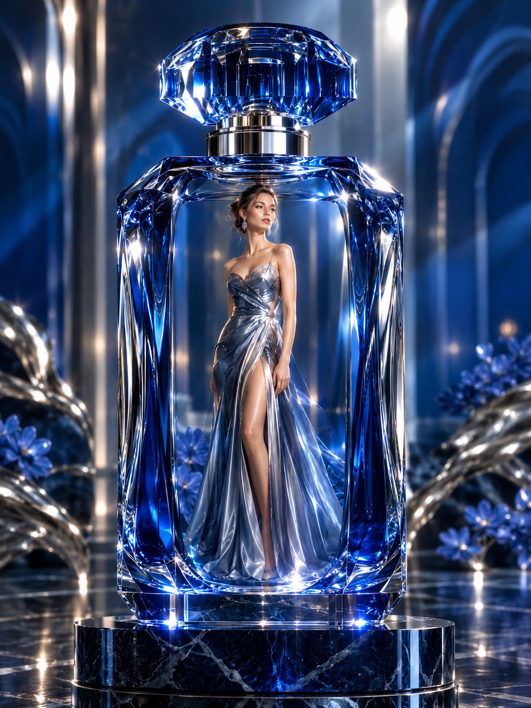
Create an extraordinary luxury perfume advertisement featuring a stunning European fashion model standing elegantly INSIDE an enormous transparent sapphire-blue crystal perfume bottle. The bottle is monumental, with thick sculpted glass walls, deep cobalt-blue edges, intricate diamond-cut facets, a polished liquid-silver metallic neck, and an oversized crystal stopper. The woman wears an exquisite flowing liquid-silver couture gown with delicate sapphire-blue highlights, realistic silk-metallic fabric, refined jewelry, and elegant high-fashion styling. Her natural facial features, realistic skin texture, graceful proportions, and confident expression are sharply detailed. Place the giant perfume bottle on a glossy midnight-blue marble pedestal with fine silver veins. Surround the scene with a sophisticated dark navy architectural interior, tall illuminated arches, cool white spotlights, subtle atmospheric mist, and delicate silver reflections across the polished floor. Brilliant light passes through the blue crystal, creating physically accurate refraction, caustics, realistic internal reflections, and sparkling silver highlights. Balanced contrast between deep sapphire shadows and luminous metallic silver, luxurious yet believable materials, refined composition, breathtaking visual depth, premium international perfume campaign, professional medium-format fashion photography, full-body model visible from head to toe, complete perfume bottle visible from stopper to base, perfectly integrated subject and environment, centered vertical composition, exceptionally crisp details, realistic glass transparency, elegant and expensive atmosphere, no artificial plastic appearance, no text, no watermark.
0
檢視詳情
GPT Image 2.5
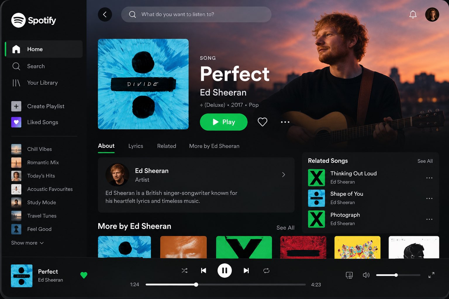
Create a high-fidelity, visually stunning app UI mockup for [APP NAME], inspired by the polished user experience of leading entertainment platforms such as Spotify and Netflix. Design a realistic, professional interface that looks like a finished product created by an expert UI/UX designer. The screen should immediately communicate the app’s purpose, feature its most important content, and make the primary action obvious. 1. App Identity & Layout App name: [APP NAME] Platform: [Mobile / Desktop / Tablet] Screen: Home / Dashboard Target audience: [TARGET AUDIENCE] Featured content: [SONG / ARTIST / MOVIE / K-DRAMA / SHOW] Visual direction: Clean, minimal, premium, modern, and cinematic. 2. Main Screen Composition Create a well-organized interface with: A recognizable app logo and navigation menu. A clear header with search, notifications, and profile controls where appropriate. A prominent featured-content section with beautiful, relevant artwork. The content title, creator or artist, genre, and a concise description. A highly visible primary action button, such as Play, Watch Now, or Explore. A secondary action such as Like, Save, or Add to List, where appropriate. Horizontally scrolling content cards for recommendations, popular items, or recently played content. A persistent bottom navigation or playback bar when appropriate for the platform. 3. Visual Design Use a sophisticated design system with: Carefully balanced spacing, alignment, and visual hierarchy. Crisp typography with clear distinctions between headings, descriptions, and metadata. Consistent margins, rounded cards, subtle shadows, and refined iconography. High-quality cinematic imagery or album artwork relevant to the featured content. A cohesive color palette inspired by the app’s identity. Realistic interface details, including progress bars, playback controls, active navigation states, and content thumbnails when relevant. 4. User Experience Make the screen intuitive, uncluttered, and believable. The user should instantly understand what is featured and how to interact with it. Keep the primary action prominent, secondary controls understated, and supporting content visually organized. 5. Rendering & Presentation Render the complete interface as a polished, high-resolution product mockup. Show the entire screen clearly, with sharp text, realistic UI components, accurate proportions, and professional lighting or device framing when suitable. The final result should feel like a premium, launch-ready entertainment app design—not a generic template, wireframe, poster, or collection of unrelated elements. Important: Preserve the supplied app name, labels, and content exactly. Do not invent prices, account details, ratings, statistics, or unsupported features. Prioritize usability, visual consistency, and a clear content hierarchy.
0
檢視詳情
GPT Image 2.5
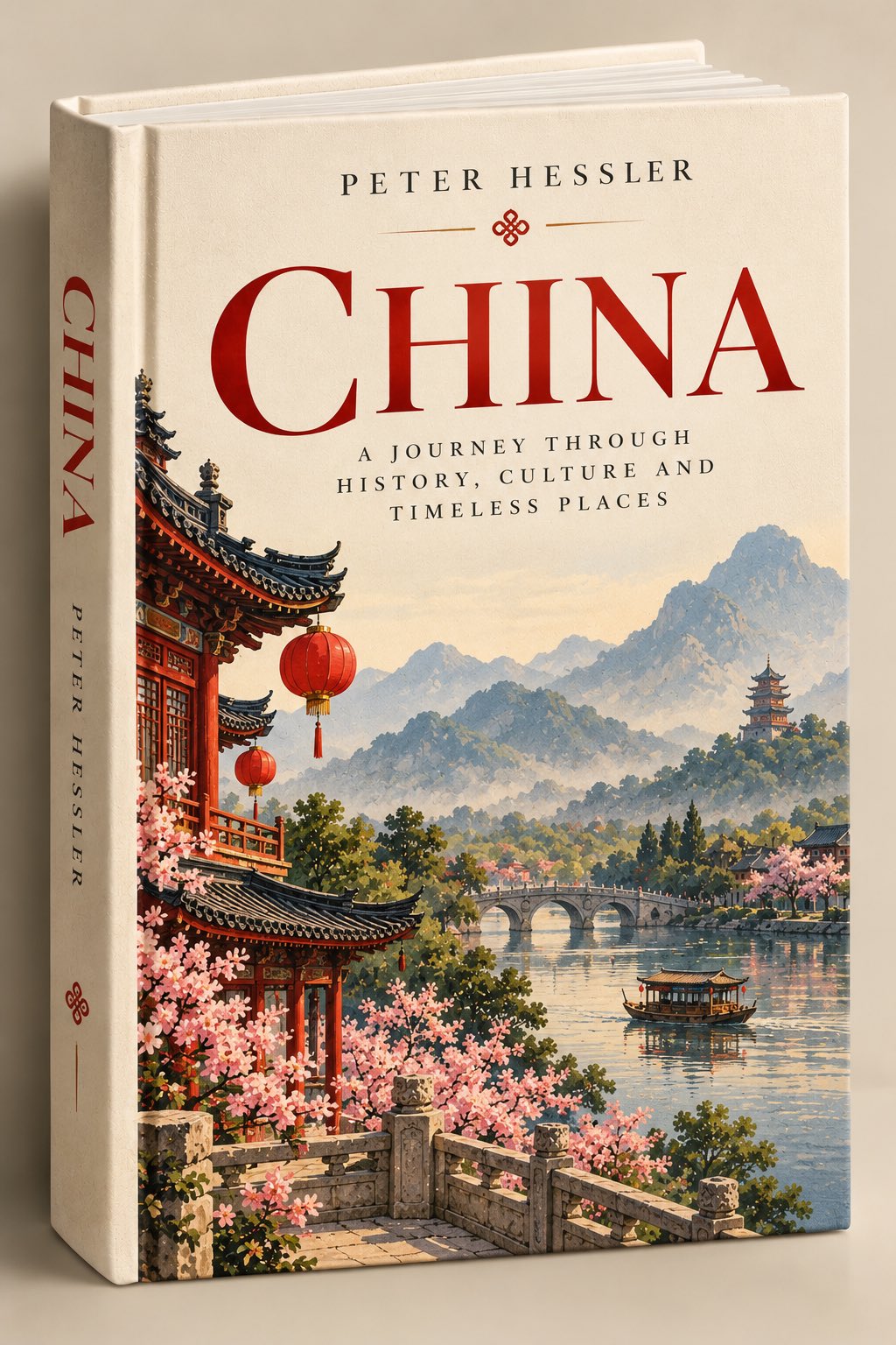
Create a premium, photorealistic 3D mockup of a beautifully designed hardcover travel book about [COUNTRY / CITY / DESTINATION], styled like a real, finished book ready to be picked up and opened. 1. Physical book presentation Show the book standing upright at a slight three-quarter angle against a warm, neutral beige studio background. Clearly display the front cover, visible spine, thick hardcover binding, subtly textured linen or matte paper finish, realistic page edges, gentle studio lighting, and a soft natural shadow. The book must look physically real, professionally published, and ready for a bookstore shelf — not like a flat poster. 2. Cover design Use a minimalist, elegant vintage-illustrated aesthetic with a warm ivory or cream background, refined serif typography, generous negative space, and a sophisticated editorial layout. At the top, display the name of a famous, real author associated with the destination, chosen appropriately for the book’s subject. Add a small, delicate ornamental emblem inspired by local culture. Place the destination name “[DESTINATION NAME]” prominently in large, elegant serif lettering. Use a tasteful color inspired by the destination, such as deep red, navy blue, forest green, or earthy terracotta. Below the main title, include the subtitle: “A JOURNEY THROUGH HISTORY, CULTURE AND TIMELESS PLACES” Keep the typography perfectly aligned, balanced, legible, and beautifully spaced. 3. Destination illustration Illustrate the lower portion of the front cover with a sophisticated, painterly vintage scene featuring the destination’s most recognizable landmarks, distinctive architecture, natural scenery, and subtle cultural details. Include only a carefully curated selection of iconic visual elements that immediately communicate the destination’s identity. Use delicate watercolor textures, muted natural colors, atmospheric depth, fine details, and the nostalgic charm of an illustrated travel book. The illustration should complement the typography rather than overwhelm it. Maintain ample clean space around the title and subtitle. 4. Spine design Make the spine clearly visible, with the destination name and author name arranged elegantly in readable serif typography. Add a small matching decorative emblem for a cohesive, professionally designed book series. 5. Art direction and quality Premium independent-publisher aesthetic, understated luxury, vintage travel illustration, textured cream book cloth, timeless typography, balanced composition, realistic hardcover proportions, subtle paper grain, warm editorial studio photography, soft shadows, crisp details, sophisticated color harmony. Important constraints: Maintain the same physical book angle, composition, typography hierarchy, background, and lighting across the entire collection. Change only the destination name, appropriate author, accent color, cultural emblem, and destination-specific illustration. The result must unmistakably look like a real, elegant hardcover book photographed in a studio, not a flat graphic, magazine cover, travel poster, or floating digital artwork.
0
檢視詳情
Nano Banana 2.1
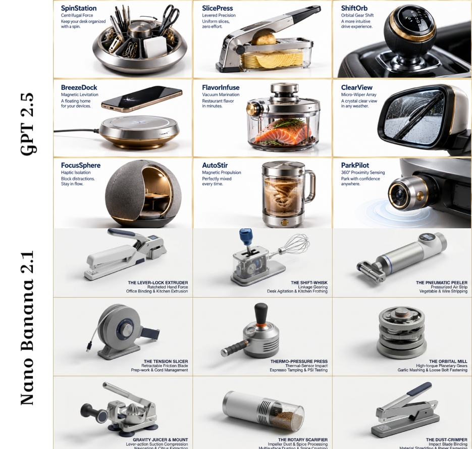
16:9, do this by picking a desk gadget, kitchen gadget, and car gadget: Instructions PHASE 1 PROMPT: Analyze these [OBJECT 1], [OBJECT 2], [OBJECT 3] images. Extract: 1) Primary function, 2) Material DNA (metal/plastic ratio, texture), 3) Ergonomic signature (grip angle, weight distribution), 4) Mechanical principle, 5) Cultural association. Output as structured JSON. PHASE 2 PROMPT: Create a 3x3 grid of photorealistic product renderings on a pristine white background. Each cell must be a hyper-realistic 3D concept that fuses elements from the previous analysis. For each invention, add minimalist navy blue text in Helvetica Neue: [Invention Name], [Core Mechanism], [Use Case]. Style: Dieter Rams meets Dyson - clean, technical, premium. Include subtle shadows and a 1px gold border on each cell. Make inventions absurd yet plausible (e.g., "Acoustic Peeler: uses sound waves to strip vegetables").
0
檢視詳情
GPT Image 2.5
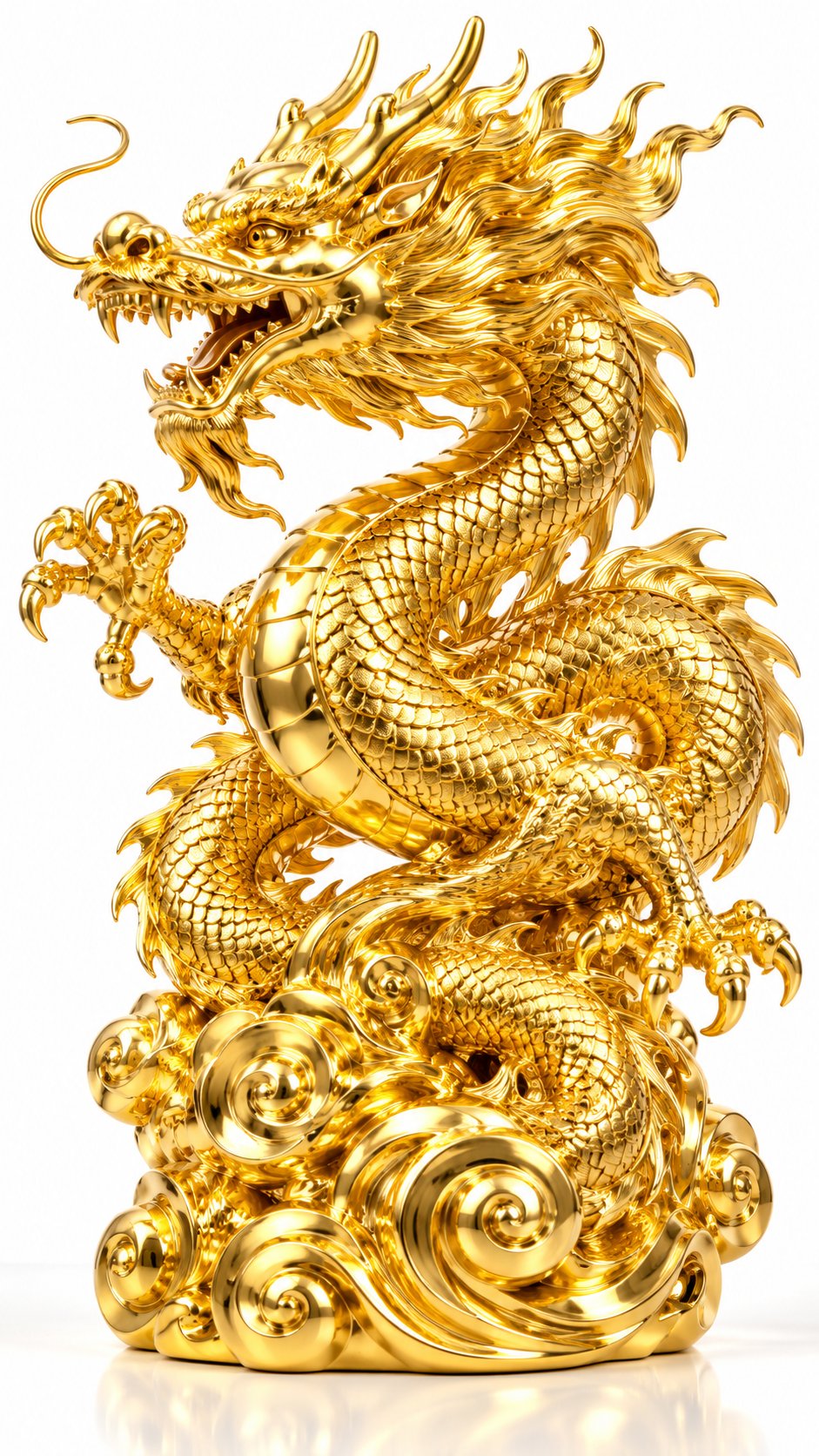
黄金质感展示,竖幅9:16,照片级写实3D渲染,8K超高清,奢华物体可视化。Photorealistic 3D render: pure gold object with exquisite golden texture and metallic luster, studio lighting with clean white background. 【物体属性】 - 类型:自动检测物体形态 - 形态:逼真自然形态得以保留 - 材质:纯金(24K黄金质感) - 表面:抛光处理/拉丝纹理/磨砂质感(可选择) - 反射:高镜面反射,清晰环境映射 - 金属特性:黄金特有的温暖光泽、延展性视觉、沉重质感 【黄金质感细节】 - 主色调:纯金色(#FFD700 到 #DAA520 渐变) - 高光效果:镜面高光、金属光泽、焦散效果 - 反射特性:温暖金色反射,环境映射清晰 - 表面纹理: * 抛光面:如镜面般光滑,反射周围环境 * 拉丝纹:细密平行线条,呈现工业美感 * 磨砂面:柔和散射,减少镜面反射 * 锤揲纹:手工锤击纹理,呈现工艺感 - 边缘处理:锐利边缘呈现明亮高光,圆角呈现柔和过渡 【颜色与光线】 - 主色调:纯金色(warm gold #FFD700) - 次色调:深金色阴影(#B8860B) - 高光:亮金色镜面反射(#FFF8DC) - 照明设置: * 工作室三点照明 * 主光:柔和白色光源,45度角照射 * 补光:填充阴影区域,保留细节 * 轮廓光:勾勒物体边缘,增强立体感 * 背景:纯白或浅灰渐变,突出黄金主体 - 焦散效果:黄金表面反射光线形成温暖光斑 【风格】 - 艺术风格: * 照片级写实3D渲染 * 黄金质感展示 * 奢华物体可视化 - 设计语言: * 精密金属建模 * 珠宝式渲染 * 光学深度与金属光泽 * 温暖色调与奢华感 【技术细节】 - 渲染引擎:Blender Cycles / Cinema 4D + Redshift/Octane - 渲染技术: * 基于物理的渲染(PBR) * 光线追踪 * 全局光照 * 金属材质着色器(Metallic Workflow) - 材质参数: * Metallic(金属度):1.0(纯金属) * Roughness(粗糙度):0.1-0.3(根据表面处理调整) * Specular(镜面反射):0.9-1.0 * IOR(折射率):不适用(金属不透明) - 分辨率:超高分辨率(4K-8K) - 后期处理: * 柔和光晕增强金属光泽 * 增强反光对比度 * 色彩饱和度微调,保持黄金温暖色调 * 锐化细节,突出表面纹理 【提示模板】 一张{物体}的3D渲染图像,由纯金(24K黄金)制成,表面呈现{抛光/拉丝/磨砂/锤揲}处理。它反射出温暖的金色光泽,镜面高光闪耀,置于干净的工作室背景上,融合了写实感与奢华设计。黄金的沉重质感与温暖色调完美呈现,每一处细节都展现贵金属的珍贵与美丽。 负面GPT image Prompt: 宝石, 水晶, 钻石, 珠宝镶嵌, 彩色宝石, 低分辨率, 模糊, 塑料质感, 哑光, 无光泽, 冷色调, 银色, 铬合金, 工作室背景杂乱, 过度曝光, 欠曝, 失真反射, 不自然阴影, 卡通风格, 插画风格, 手绘风格
0
檢視詳情
Nano Banana 2.1
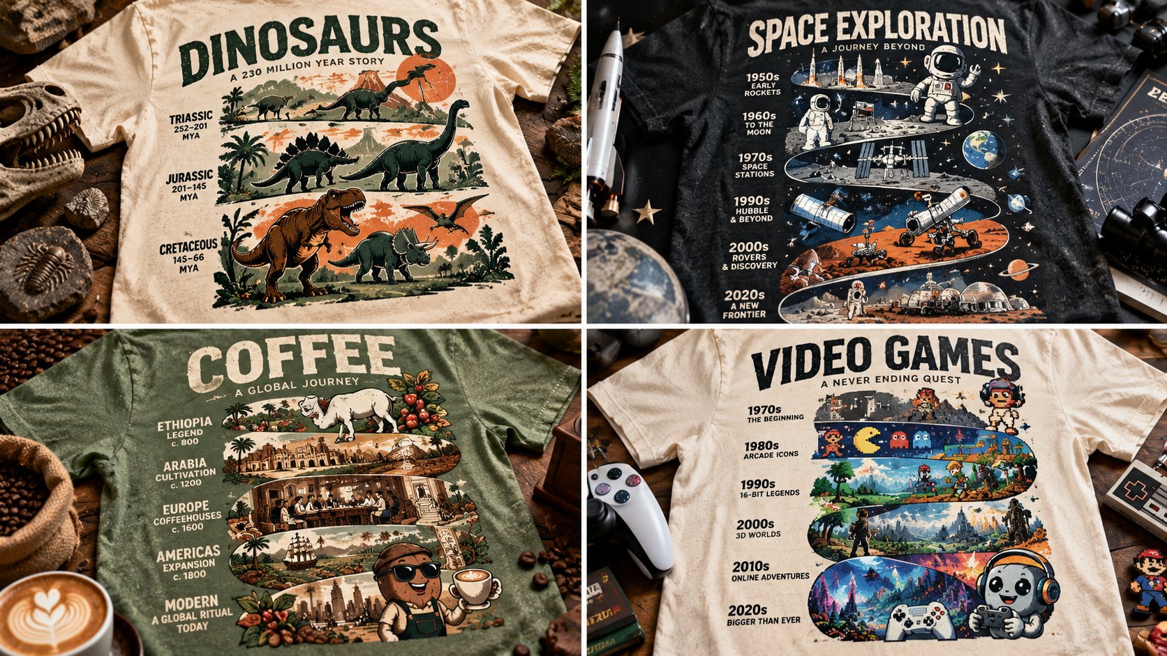
WITH input(topic) AS (VALUES (:TOPIC)), spec AS (SELECT chronological_eras(topic) er, mascot(topic) ma, spine_word(topic) sp, two_inks(topic) ik FROM input) SELECT tee_mockup(totem=>stack(er, ma, sp), inks=>ik, negative=>0.5, garment=>fabric_realism(weave=>TRUE)) AS totem_timeline_tee FROM spec -- T₁: CHECK ( tiers chronological AND connected silhouette ) -- T₂: CHECK ( mascot present AND spine legible ) -- T₃: CHECK ( two inks AND negative ≈ 0.5 ) -- T₄: CHECK ( garment mockup with weave ) -- T₅: CHECK ( era cues match years )
0
檢視詳情
GPT Image 2.5
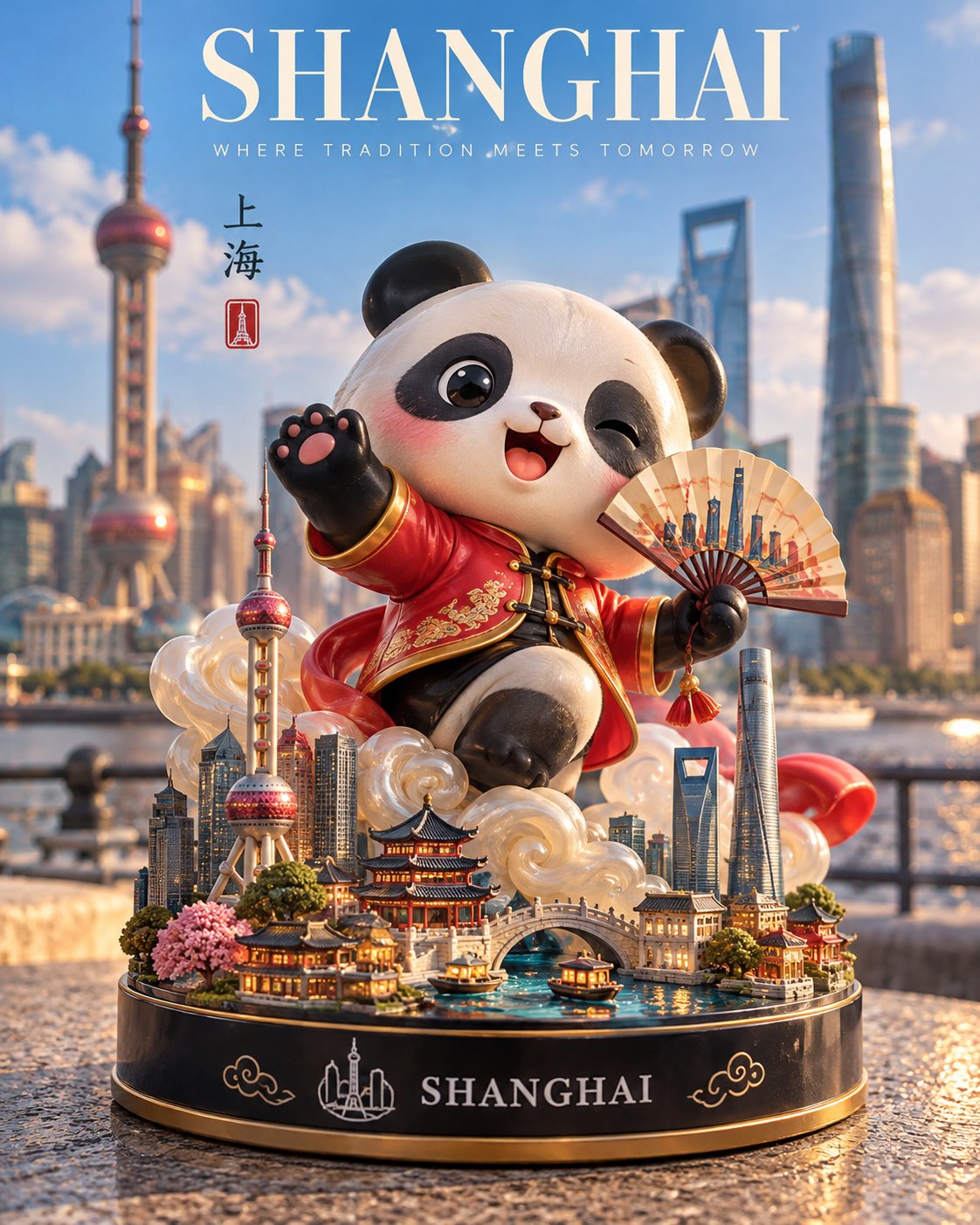
Create a premium 4:5 vertical 3D designer-toy collectible inspired by [COUNTRY / CITY / DESTINATION]. CHARACTER: Transform the destination’s most iconic symbol, mascot, or landmark into a cute, stylized vinyl figurine. Give it distinctive local features, a playful pose, an expressive face, and a smooth glossy finish. Add a signature sculptural effect inspired by the location, such as flowing water, swirling clouds, sparkling energy, or another culturally relevant element. DISPLAY BASE: Place the figurine on a polished circular base featuring miniature versions of the destination’s most recognizable landmarks, tiny trees, and carefully sculpted local details. Add “[DESTINATION]” in clean white lettering on the front, accompanied by a simple emblem inspired by the location. SETTING: Photograph the collectible outdoors in an authentic, recognizable location, with the real landmark or cityscape softly blurred in the background. Include a tasteful promotional banner reading “[DESTINATION SLOGAN]” and place the toy on a natural surface that complements the setting. LIGHTING & MATERIALS: Bright natural daylight, soft realistic shadows, detailed reflections, polished vinyl, tactile sculpted surfaces, and crisp miniature craftsmanship. STYLE: High-end designer-toy photography meets premium travel-souvenir advertising. Vibrant, joyful, imaginative, and professionally art-directed. Automatically select a fitting character design, signature effect, miniature landmarks, emblem, and background based on the destination. Avoid generic characters, inaccurate landmarks, clutter, people in focus, excessive text, watermarks, and logos. FORMAT: Strict 4:5 vertical composition.
0
檢視詳情
GPT Image 2.5
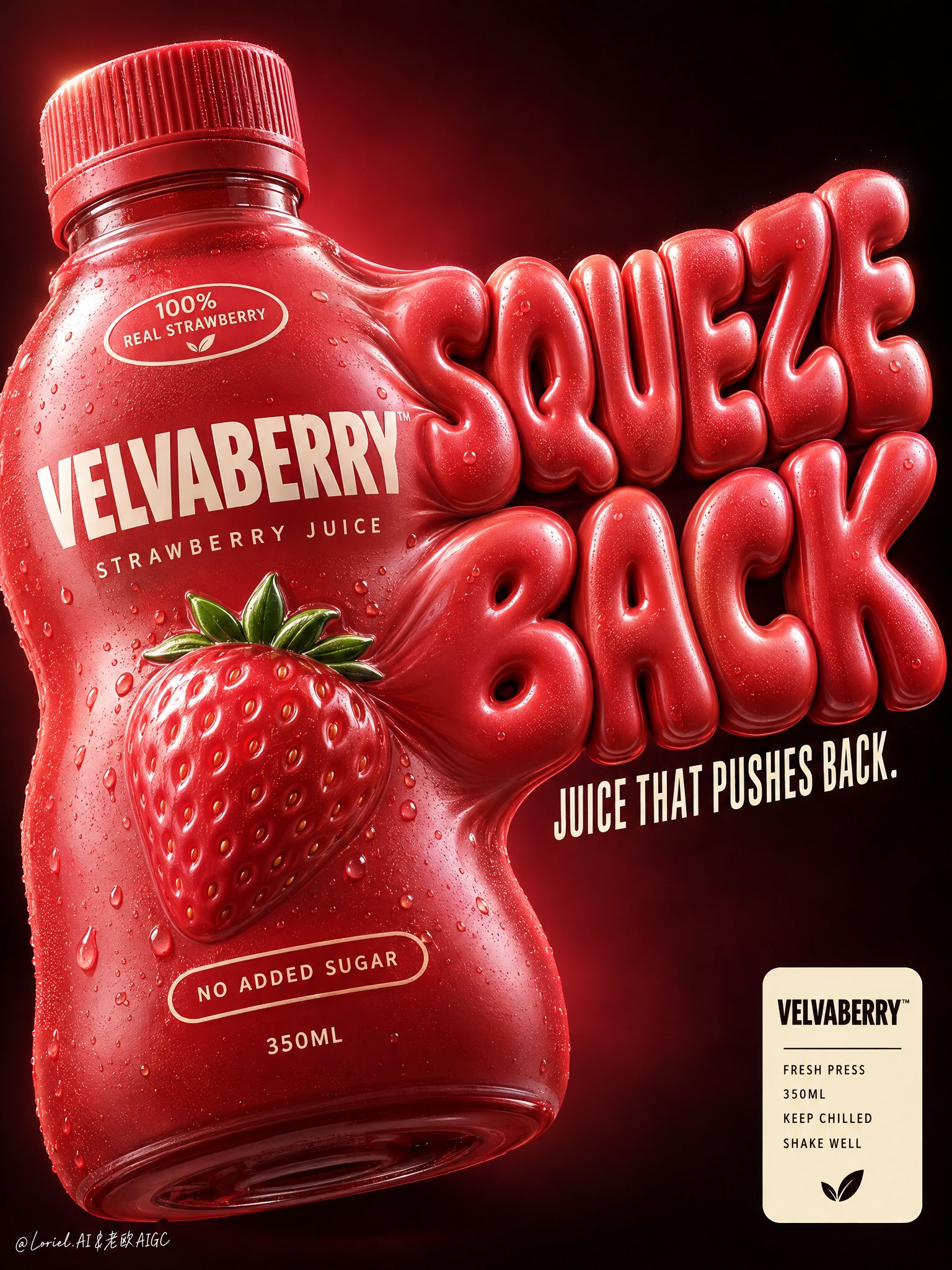
Create a premium vertical commercial poster for a fictional overseas juice brand, "VELVABERRY". Design it as a Cannes-level product-first beverage ad where one strawberry juice bottle becomes both the hero package and the engine of the graphic system. The bottle must look soft, overfilled, and under delicious internal pressure, visually inflating into giant sculptural typography that bursts outward from its right side. The result should feel bold, playful, tactile, and highly branded, with clean luxury execution. Use a close-up low-to-mid angle product composition against a deep black-to-burgundy gradient background with a concentrated crimson glow behind the product. Place one oversized bottle in the left-center foreground, slightly tilted, occupying most of the left half. The bottle body visibly swells and stretches toward the right, seamlessly transforming into a huge inflated slogan built from the same pressurized material language. Keep the lower-right reserved for a compact official info badge, and preserve enough negative space around the top and right edge for the enlarged typographic mass to breathe. The bottle remains the heaviest object even as the typography expands from it. The hero bottle is a short rounded squeeze-style juice bottle with a ribbed cap, made of soft-touch semi-gloss plastic in saturated strawberry red with subtle berry-coral undertones. It should look elastic and pressurized, with believable volume tension, smooth stretched curves, and controlled deformation, never melted or broken. The front branding must read exactly: "VELVABERRY" "STRAWBERRY JUICE" Add a small shoulder badge: "100% REAL STRAWBERRY" Add a lower badge: "NO ADDED SUGAR" Add the volume mark: "350ML" At the center, include one premium embossed strawberry icon with a tiny fresh green crown integrated into the label system. On the right side, create an enormous inflated 3D slogan physically extruded from the bottle wall: "SQUEEZE BACK" The letters must feel swollen, juicy, soft, and pressure-filled, with the same strawberry-red material identity as the bottle. Beneath it, in narrow elegant cream-white condensed type, place: "JUICE THAT PUSHES BACK." The slogan should feel like a direct continuation of the package form, not a separate graphic layer. Use strong commercial key lighting from upper left with clean highlight control on the cap ridges, bottle shoulders, embossed strawberry icon, and inflated letter surfaces. Add subtle right-edge separation light to keep the expanded typography crisp against the dark field. Build a disciplined palette: 50% strawberry red and berry coral, 25% deep burgundy-black background, 15% cream-white typography and badge accents, 10% tiny green fruit details and soft warm highlight bloom. Increase local contrast on the bottle bulge, cap texture, embossed icon, and inflated typography while avoiding muddy reds, dirty gradients, dead black holes, or cheap plastic shine. Render everything with elite FMCG poster realism: soft-touch semi-gloss plastic, crisp printed branding, pressure-stretched packaging curvature, embossed fruit emblem, ribbed cap detail, subtle micro-specular rolloff, and inflated typography with believable material continuity from the bottle body. The finish should feel like premium beverage branding fused with playful industrial design and high-end poster sculpture. In the lower-right corner, add a compact cream badge panel with: "VELVABERRY" "FRESH PRESS" "350ML" "KEEP CHILLED" "SHAKE WELL" This badge must feel official, minimal, and premium, balancing the expressive oversized slogan above. Premium vertical product poster, exact single-bottle hero, product-first hierarchy, bottle-to-typography fusion, dark luxury background, highly readable branding, and unified commercial finish. Maintain coherent bottle geometry, believable package inflation, crisp legible text, elegant negative space, and strong retail-ad impact. Avoid extra bottles, warped unreadable lettering, melted plastic artifacts, random fruit clutter, messy splashes, chaotic props, cartoon cheapness, muddy color, distorted cap geometry, accidental resemblance to any real beverage brand, or any loss of the bottle as the dominant hero.
0
檢視詳情
GPT Image 2.5
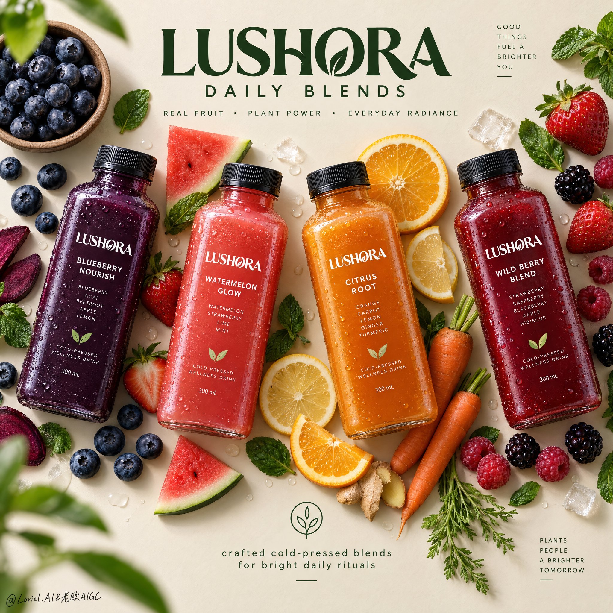
Create a Cannes-level top-down commercial poster for a fictional overseas cold-pressed wellness drink brand, "LUSHORA". Design a clean premium flat-lay on a warm matte oat-cream background, with four hyper-real chilled square bottles arranged in a refined diagonal rhythm across the frame. Fuse premium grocery advertising, editorial food styling, and contemporary exhibition-poster discipline. Keep the bottles as the absolute visual heroes, while fruit, vegetable, and leaf elements form a controlled perimeter frame that supports freshness, flavor identity, and spatial rhythm without clutter. Use a straight overhead camera with precise poster geometry. Arrange four bottles with slight angle variation for elegance and motion: deep indigo-purple on the left, vivid coral-red left-center, glowing amber-orange right-center, and rich berry-crimson on the right. Preserve strong negative space at the upper center for the master brand mark and at the lower center for a minimal information lockup. The layout should feel balanced, crisp, modern, and campaign-ready. Each bottle must feel tactile, cold, and commercially believable: thick clear PET or glass walls, realistic cap threading, matte black caps, micro-condensation, varied droplets, visible liquid density, subtle refraction, and sharp premium labels. The labels must read exactly "LUSHORA". Flavor lineup: "BLUEBERRY NOURISH", "WATERMELON GLOW", "CITRUS ROOT", and "WILD BERRY BLEND". The packaging should look globally branded, elegant, healthy, shelf-ready, with consistent hierarchy and clear typography. Build a flavor halo with highly realistic ingredients placed with curatorial restraint: blueberries in a small natural bowl, loose berries, strawberries with leafy tops, sliced oranges, lemon rounds, raspberries, blackberries, mint leaves, and a few carrot elements for the citrus-root bottle. Keep ingredients visually grouped near their corresponding bottle without messy clusters. Add a few sliced and whole pieces for contrast. Some leaves and berries may sit near the edges as subtle framing accents, with one or two elements softly defocused for shallow depth, while the bottles stay perfectly crisp. Lighting should be soft premium studio daylight from the upper left, with clean shadow falloff and gentle grounding beneath every bottle and ingredient. Use a controlled palette: 45% warm oat, cream, and sand neutrals; 35% vivid fruit colors from indigo, coral, amber, and crimson liquids; 20% botanical greens and fresh citrus highlights. Increase local contrast on bottle shoulders, droplets, fruit flesh, citrus translucency, berry skins, and mint veins so the image feels bright, tactile, and luxurious. Avoid dull greys, muddy shadows, and heavy black patches. Materials must read with exquisite clarity: cold slick bottle surfaces, clean label print, soft matte caps, translucent citrus pulp, juicy strawberry flesh, powdery blueberry bloom, glossy berry skins, fresh mint veining, and slightly fibrous carrot texture. The finish should feel like premium health-beverage campaign art: minimal but abundant, bright but controlled, natural but highly designed, with freshness, wellness, appetite appeal, and modern retail sophistication. Typography must be newly invented and art directed into the composition. At the upper center, place a bold premium custom logotype: "LUSHORA DAILY BLENDS". Beneath it, in smaller clean sans serif: "REAL FRUIT • PLANT POWER • EVERYDAY RADIANCE". At the lower center, add a minimal lockup with a small clean icon and the line "crafted cold-pressed blends for bright daily rituals". Use deep botanical green typography so it feels calm, premium, and naturally integrated with the ingredients. Keep all type elegant, readable, and clear of product labels. The final image should unify emotional freshness, material richness, and graphic restraint into an international design-poster campaign. Maintain exact four-bottle hierarchy, coherent scale, realistic ingredient-to-flavor logic, clean spacing, crisp labels, premium advertising realism, and top-tier visual discipline. Avoid extra bottles, duplicated fruit, warped packaging, unreadable text, sloppy garnish clutter, broken bottle perspective, muddy background, cheap typography, excessive decorative particles, weak hierarchy, dead black shadows, or drift away from premium fresh wellness beverage advertising.
0
檢視詳情
GPT Image 2.5
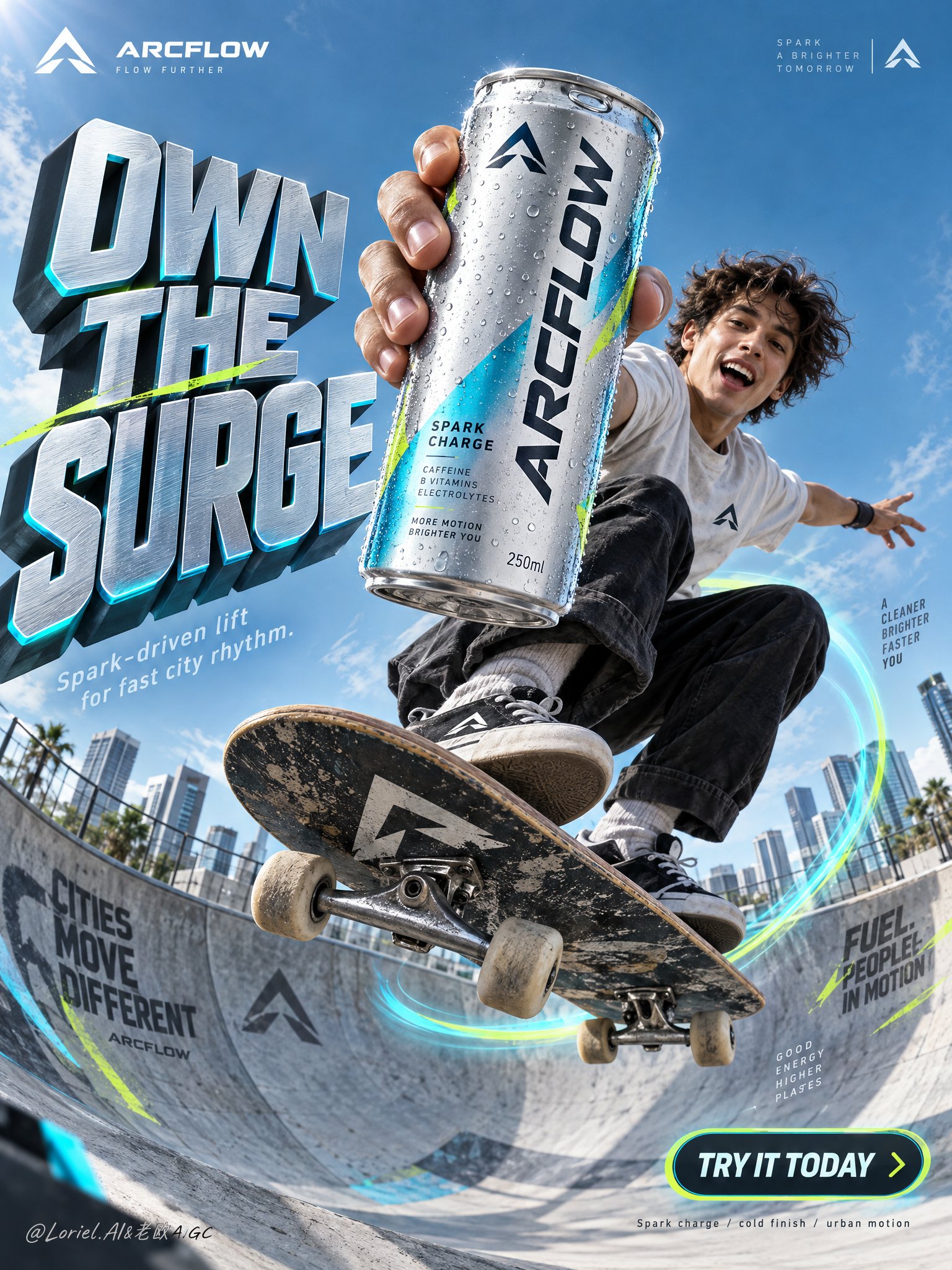
Create a premium vertical commercial poster for a fictional overseas functional sparkling drink brand, "ARCFLOW". Fuse a real physical beverage can with high-concept urban action ad language, keeping the product as the absolute visual leader. Build the scene around a frozen skateboard jump in a modern concrete bowl, with the can thrust closest to the lens and dominating the composition while the athlete and environment amplify its energy without competing. Use an ultra-low-angle wide commercial lens from inside the bowl, looking upward into a clean open sky. Preserve a poster architecture with a massive sculptural headline block on the left, the athlete and hero can aligned along the center-right axis, luminous motion arcs wrapping the board trajectory, small official brand marks in the upper corners, and a rounded CTA badge in the lower right. Keep strong negative space in the upper background so the title and product silhouette stay instantly readable. The can must appear larger than the athlete’s face and occupy the strongest focal zone. The hero product is a hyper-real 250ml can of ARCFLOW Spark Charge in brushed silver aluminum with electric cyan accents, acid-lime micro details, and a deep graphite logo lockup. The surface shows realistic condensation droplets, crisp pull-tab geometry, subtle edge reflections, premium label sharpness, and tactile coated-metal finish. The exact front text must read "ARCFLOW". Add a small minimalist symbol logo in the top corners, reduced, elegant, and globally branded. A young skater is captured at the peak of a jump above the bowl in a compact crouched pose, one arm aggressively extending the can toward camera, the other stretched outward for balance. The skateboard cuts diagonally through the lower middle with believable tilt, visible trucks and wheels, and physically correct foot pressure. Body mechanics must feel athletic and grounded, with coherent center of gravity, convincing grip, natural clothing tension, and correct hand anatomy. The athlete’s expression is exhilarated and alive, but the product remains dominant. Set the action in a clean urban skate bowl with refined wall graphics, smooth concrete curvature, and soft-focus city blocks in the far background. Replace playful clutter with a disciplined tech-sport visual language: only a few angular branded shards and sleek directional graphic fragments near the lens. Depth should layer clearly: near-lens graphic accents, hero can and skater in the mid-foreground, bowl and motion ring in the midground, architecture and sky in the background. Use bright directional daylight from the upper left with crisp highlights on the can rim, condensation, face, limbs, shoes, and board edges. Add subtle cyan reflected light from the bowl and motion trails to enrich shadows without flattening form. Build a 60/30/10 palette: 60% cool sky blue and silver-cyan atmosphere, 30% graphite and deep neutral structure, 10% acid lime accents. Increase light-shadow separation to sculpt volume in the can and skateboard, while avoiding dirty blacks, dead shadows, haze, or oversaturated chaos. Render everything with elite commercial realism. The can must feel manufactured and touchable: brushed aluminum, coated print, varied droplets, soft specular roll-off, real seam lines, and precise tab indentation. The skateboard shows believable grip texture, layered wood edge, metal truck reflections, and slightly worn wheels. Concrete has fine grain and controlled mural overspray. Clothing feels light, breathable, and sunlit. The image should read as a synthesis of luxury product photography, sports advertising, and award-level graphic poster design. Create all typography as newly invented art-directed copy integrated into the composition flow. Main left headline: "OWN THE SURGE". Secondary line below: "Spark-driven lift for fast city rhythm." Lower-right rounded badge: "TRY IT TODAY". Very small bottom technical note: "Spark charge / cold finish / urban motion". Typography should be sculptural, high-impact, cleanly spaced, and fused with the environment, using cool metallic silver faces, cyan edge glow, graphite side planes, and subtle lime accents. Keep all text away from the can label and the athlete’s face. Vertical ad-poster composition, product-first hierarchy, physically believable frozen action, clean premium commercial execution, no copied slogans, no real person names, no unrelated props, no clutter, no sticker collage, no generic stock-ad feeling. Maintain sharp packaging readability, correct can proportions, coherent skateboard geometry, correct fingers and joints, a single clean hero product, unified style language, elegant layout rhythm, and disciplined negative space. Avoid duplicated limbs, malformed hands, warped board shape, floating objects without support logic, unreadable label text, chaotic type placement, distorted logo, muddy grading, dirty blacks, accidental extra cans, cheap font treatment, cartoon drift, painterly drift, overdecorated particles, and broken spatial perspective.
0
檢視詳情
GPT Image 2.5
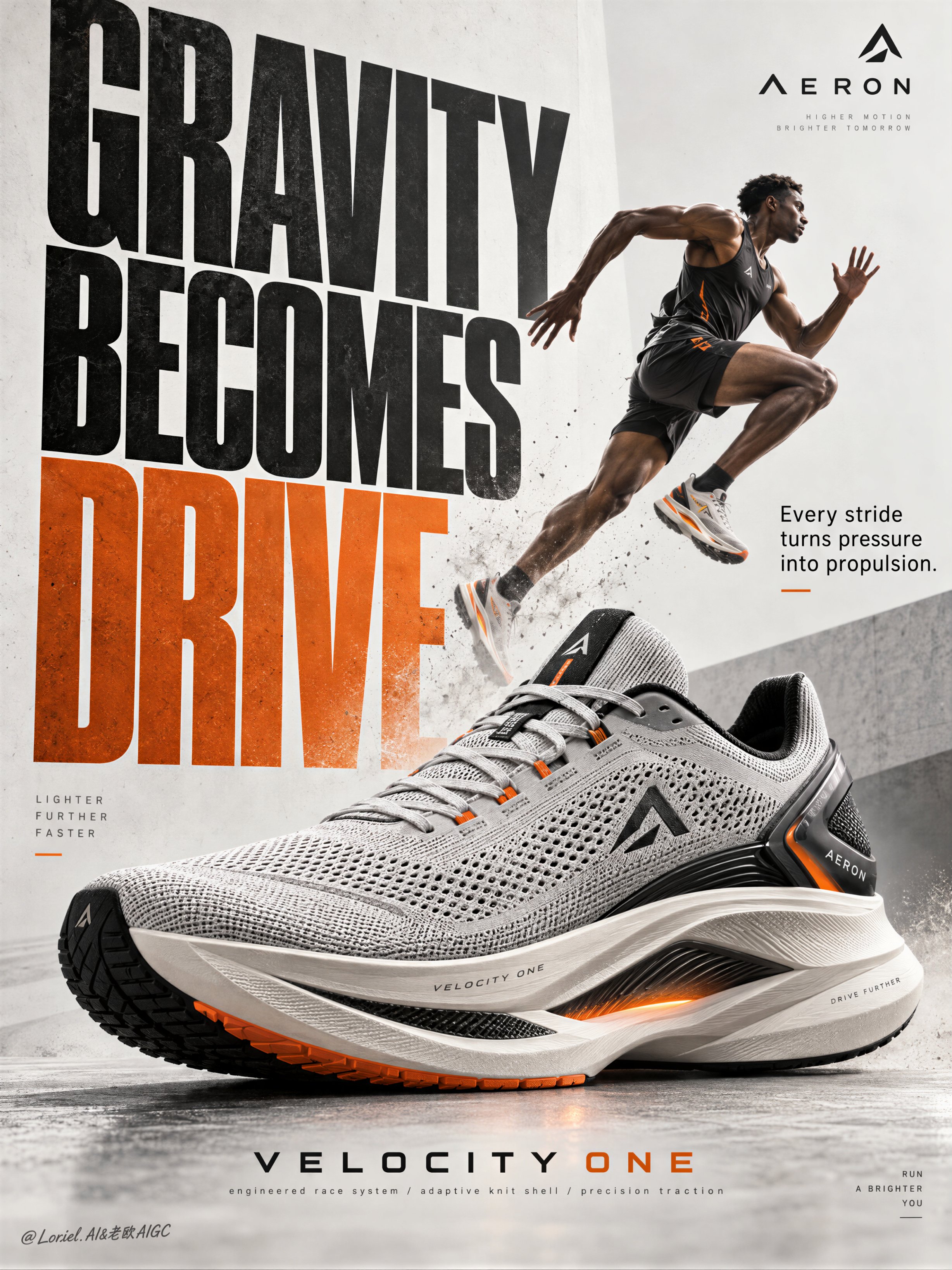
Create a Cannes-level poster ad for fictional premium performance footwear brand AERON, combining narrative athletic tension, engineered material realism, and minimalist curatorial graphic design in one unified image. Build the poster around one hyperreal hero sneaker as the absolute visual anchor, fused with monumental typography and one motion-driven athlete accent, translating speed, pressure, balance, and release into a clean but forceful commercial image. Use a vertical full-bleed poster with strict poster-design logic and rule of thirds inside a typographic architecture. Preserve the exact structure: oversized condensed letters, large controlled negative space, strong scale contrast, and one figure intersecting the type field. The hero sneaker dominates the middle-to-lower center in a three-quarter side profile, large enough to control the composition. Behind and partly around it, stack a monumental vertical title column as a graphic wall, with one secondary text block and one minimal brand zone creating rhythmic pauses. The image must feel editorial, sharply weighted, and highly legible from distance. The product is the fictional AERON VELOCITY ONE, a premium race trainer rendered as a real commercial object: engineered knit upper, ventilated mesh zones, tension-wrapped lacing, molded heel frame, sculpted superfoam midsole, carbon-response plate suggestion, segmented traction rubber, subtle reflective trims, and a minimal geometric logo mark. Preserve accurate footwear anatomy, believable manufacturing precision, realistic seam logic, crisp edge definition, authentic sole thickness, and premium industrial finish. Introduce one secondary athlete as a kinetic narrative accent rather than the hero: a lean elite runner captured in suspended stride, body diagonally stretched upward through the typography, with one knee lifted, one leg extended, arms naturally counterbalancing motion, and gaze focused forward. The athlete remains smaller than the shoe and functions as a motion vector. Anatomy must be correct, fingers normal and separated, limbs proportionate, gravity believable, posture elegant, and cast shadow physically consistent. The athlete should feel like a frozen instant of breakthrough, not a decorative sticker. Use an abstract poster-space environment rather than a literal location: a refined mineral white and pale concrete-grey field with subtle paper grain, faint tonal falloff, and soft spatial depth created through overlap, scale, and controlled shadows. No clutter, no random props, no useless particles. If motion energy is needed, suggest it through directional water mist, soft sole dust, or aerodynamic blur traces tightly integrated around the product and athlete, always clean and intentional. Lighting is a coherent studio-commercial setup: soft frontal key light from upper left, low-intensity side fill from camera right, restrained rim separation on the shoe edges, and delicate shadow pooling beneath athlete and product to anchor them. If the frame risks looking flat, increase tonal contrast through gentle chiaroscuro rather than harsh black blocks. Palette: 60% mineral white, pale concrete grey, and soft paper ivory; 30% deep charcoal, graphite, and asphalt black; 10% kinetic burnt orange shifting toward signal amber. The orange should energize the main typography and one micro-accent on the product or layout. Materials must feel hyperreal and tactile: dry engineered knit texture, micro-perforated mesh clarity, semi-matte polymer supports, subtle rubber sheen, precise embossed logo details, clean reflective trim response, and realistic sole geometry. Typography should feel like premium editorial print integrated into the space, with crisp matte ink edges, refined overlap, and elegant depth through shadow and layering. Add faint contemporary print grain and controlled photographic sharpness, keeping the product recognition zones razor clear while softer surrounding areas preserve sophistication. Use only English and original advertising copy. Main title: “GRAVITY BECOMES DRIVE”. Support line: “Every stride turns pressure into propulsion.” Brand mark: “AERON”. Model line: “VELOCITY ONE”. Micro information: “engineered race system / adaptive knit shell / precision traction”. Set the oversized condensed sans-serif title vertically behind and alongside the athlete and shoe, with selected letter cropping for tension; place the support line in a smaller clean sans-serif block near the mid-right; keep the brand mark minimal near the top edge; align model line and micro information near the lower margin with disciplined spacing, elegant hierarchy, and safe margins. Typography must avoid the product recognition zone and harmonize with the lighting environment. Output: a polished, hyperreal, commercially deployable poster where the product remains unquestionably dominant, the athlete intensifies motion, and the typography becomes structural design. The result must feel sharp, premium, clean, and contemporary, with no visual mud, dead black patches, layout clutter, unreadable text blocks, malformed anatomy, extra or fused fingers, broken limbs, distorted footwear proportions, unstable perspective, inconsistent shadows, dirty textures, or style drift. No real person names, no existing brand names, and no invented packaging claims beyond what is visually supported.
0
檢視詳情
GPT Image 2.5
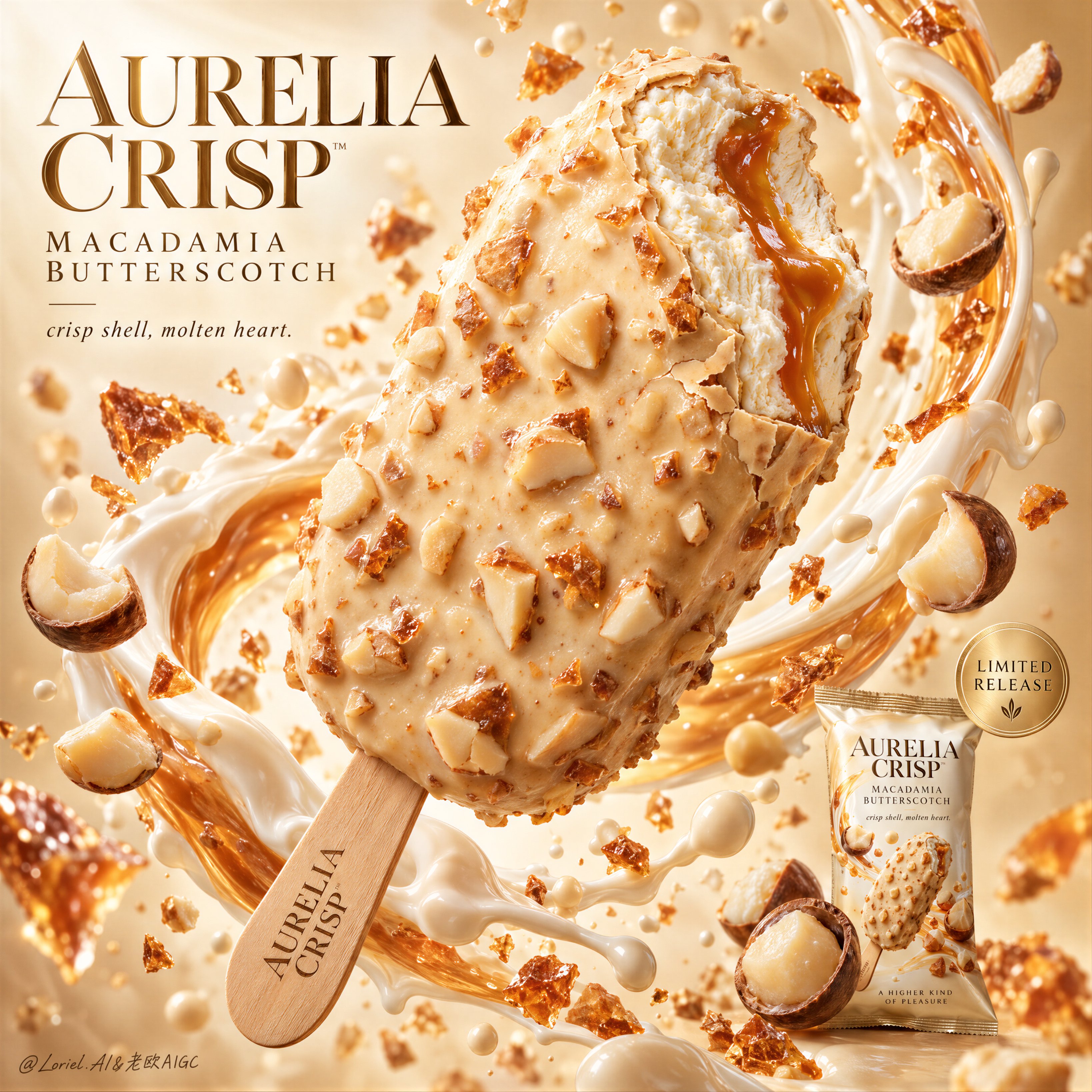
Create a Cannes-level commercial dessert poster for fictional luxury ice cream bar brand AURELIA CRISP, merging indulgent food realism, sculptural liquid motion, and gallery-clean advertising design into one unified hero image. The core concept is suspended decadence: a single bitten macadamia-butterscotch ice cream bar floats as the central icon, wrapped by a controlled arc of cream, caramel gloss, and airborne nut fragments. The product must remain the absolute visual leader. Use a vertical full-bleed poster with a close-up hero dessert shot, staged diagonally from lower left to upper right. Preserve the exact structure: one oversized floating bar at center, a surrounding crescent of creamy splash behind and around it, floating macadamia halves and crunchy fragments across foreground and background, a refined headline block in the upper left, and a small secondary package shot with release seal in the lower right. The bitten tip must face the viewer enough to expose the interior clearly. The layout should feel explosive yet controlled, rich yet minimal, luxurious yet instantly readable. Design a premium coated ice cream bar with a pale champagne-ivory shell infused with macadamia chunks and butterscotch brittle. A single bite is taken from the upper front edge, revealing dense velvety vanilla-toned ice cream with a molten amber butterscotch ribbon running through the center. The shell should feel crisp, slightly thick, and luxuriously irregular, with delicate fracture lines around the bite edge and embedded nut relief across the surface. The stick is clean light wood, refined, and subtly branded with the fictional mark AURELIA CRISP. The hero product must feel edible, tactile, expensive, and impeccably finished. Build an abstract premium dessert studio field with a luminous warm ivory-to-butterscotch gradient background, airy and bright but not flat. A silk-like ring of milk cream and caramelized dairy splash curves behind the bar, creating enclosure and motion while preserving hierarchy. Macadamia kernels, broken nut halves, crisp caramel shards, and fine cream droplets occupy layered depths around the hero object. Keep all elements clean, intentional, and spacious. No table, no hands, no clutter, no extra props. Lighting is bright luxury studio light with a soft frontal key, delicate upper-left glow, and refined specular shaping along the shell texture, bitten interior, and syrup core. Palette hierarchy: 60% ivory cream, pale vanilla, and macadamia beige; 30% champagne caramel, butterscotch amber, and soft gold; 10% toasted nut brown, warm wood, and subtle shadow accents. Maintain high brightness, creamy contrast, and precise edge separation. No muddy beige, no dead white blowout, no dirty shadows. The emotional tone is velvety, crisp, radiant, collectible, and indulgent. Materials must feel extremely photoreal: crunchy nut topology, subtle gloss variation, tiny coating ripples, and believable shell thickness; fine creamy ice crystal softness in the bitten interior without looking frozen-solid or plastic; a viscous glossy butterscotch ribbon; macadamia pieces with dry matte interiors, slightly satin outer surfaces, and realistic color variation; and a thick silky cream splash with coherent physical flow. The packaging in the lower right should be a small but sharp premium packshot with matching palette logic and precise label print. Integrate premium English typography into the poster architecture. In the upper left, place a sculpted headline block reading “AURELIA CRISP / MACADAMIA BUTTERSCOTCH”, using an elegant couture-inspired serif or high-contrast editorial type system with generous spacing. Below it, add the restrained phrase “crisp shell, molten heart.” In the lower right, near the secondary packshot, place a subtle circular champagne-gold seal with concise microcopy such as “limited release”. Typography must feel light, art-directed, and embedded into the motion flow, never heavy or intrusive. Output: a full-bleed premium dessert poster with product-first hierarchy, ultra-clean execution, hyperreal edible texture, elegant graphic rhythm, sharp packaging support, and high-end commercial readability. Avoid extra bars, malformed nuts, duplicated fragments, chaotic splash overload, collapsed melting, plastic-looking coating, unreadable packaging text, warped bite anatomy, dead highlights, muddy cream haze, low-grade AI texture, stock-poster genericity, overdecorated luxury cliches, or resemblance to existing real ice cream branding.
0
檢視詳情