
LogoAhaPrompt
  • 提示詞
  • 精選
  • 模型
  • AI 反推
  • 定價
  • 投稿
  • 部落格
AhaPrompt

圖片、影片、音訊 AI 提示詞庫

探索

  • 全部提示詞
  • 精選提示詞
  • 圖片提示詞
  • 影片提示詞
  • 音訊提示詞
  • AI 模型

工具

  • AI 反推工作臺
  • 圖片反推提示詞
  • 影片反推提示詞

資源

  • 定價方案
  • 投稿提示詞
  • 部落格

版權所有 © 2026 AhaPrompt 保留所有權利。

隱私政策條款與條件退款政策版權申訴 / DMCA
首頁AI 提示詞庫AI 圖片提示詞LUSHORA 冷压饮品俯拍海报
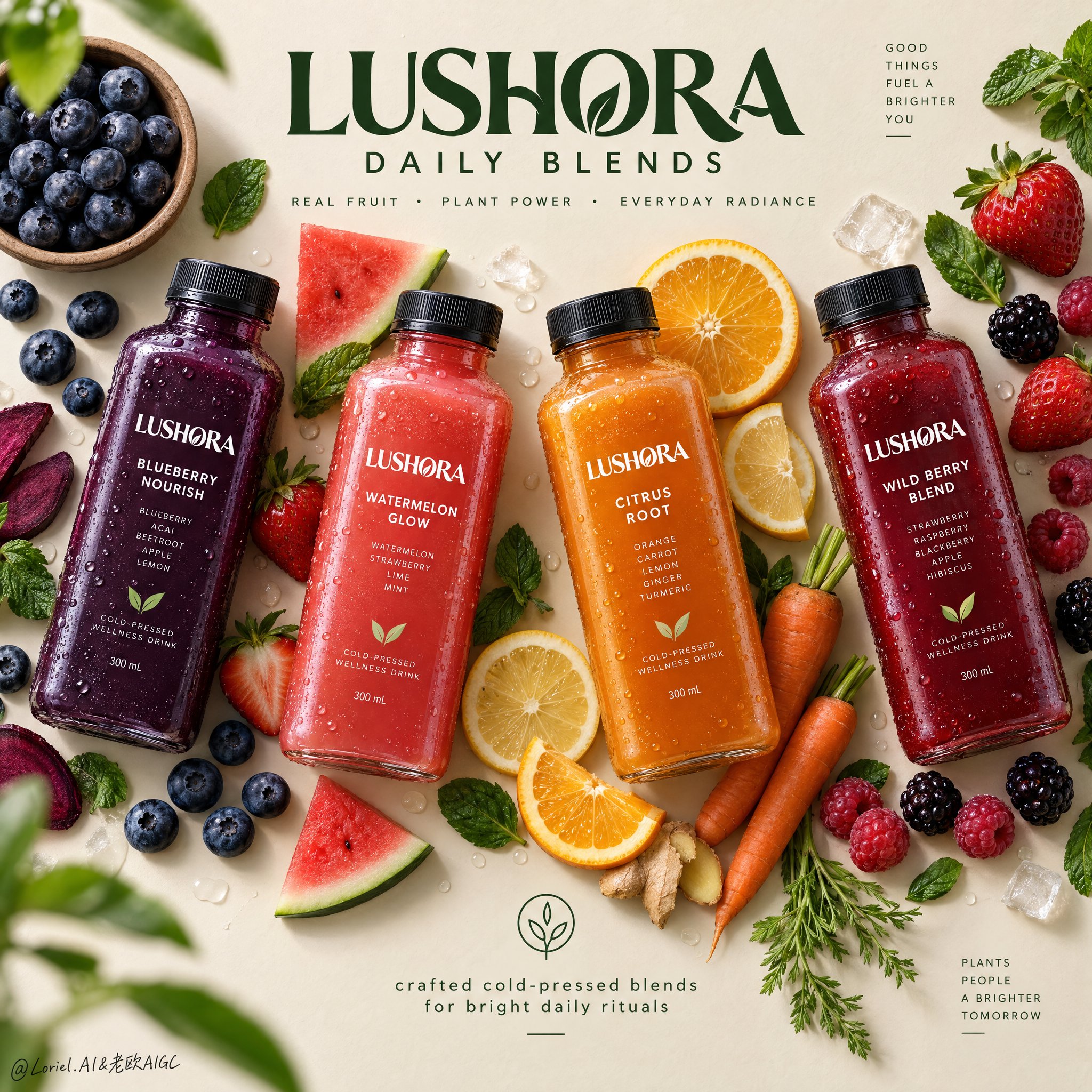
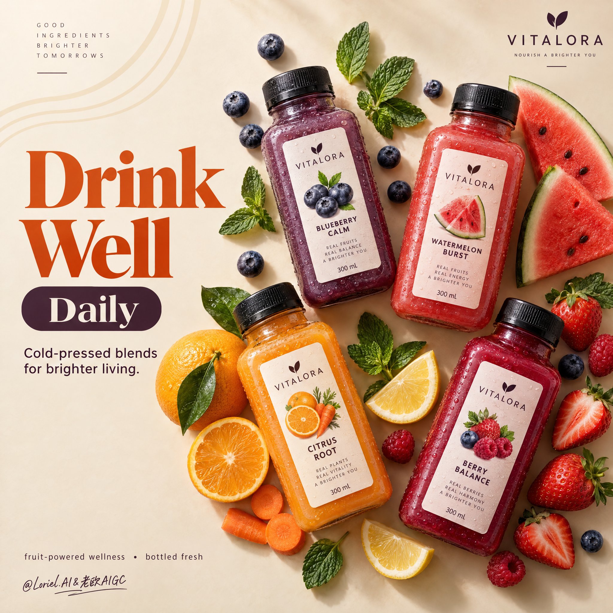
LUSHORA 冷压饮品俯拍海报 — AI image prompt — GPT Image 2.5 — Product Photography, Advertising, Minimalist - 1
LUSHORA 冷压饮品俯拍海报 — AI image prompt — GPT Image 2.5 — Product Photography, Advertising, Minimalist - 2

LUSHORA 冷压饮品俯拍海报

OpenAIGPT Image 2.5OpenAIimage

为虚构的海外冷压健康饮品品牌“LUSHORA”创作一张戛纳级别的俯视商业海报。在温暖的哑光燕麦奶油色背景上设计一个干净的高级平铺构图,四瓶超写实冰镇方形瓶以精致的对角线节奏排列于画面中。融合高端食品杂货广告、编辑式食物造型与当代展览海报的严谨感。让瓶子成为绝对的视觉主角,同时水果、蔬菜和叶片元素构成受控的外围框架,在不显杂乱的前提下支撑新鲜感、风味识别与空间节奏。 使用精确的海报几何构图和正上方俯拍机位。四瓶以轻微角度变化排列,营造优雅与动感:左侧为深靛紫色,左中为鲜亮珊瑚红,右中为发光琥珀橙,右侧为浓郁浆果绯红。在上方中央保留强烈留白,用于主品牌标识;在下方中央保留留白,用于极简信息锁定组合。整体布局应感觉平衡、利落、现代,并可直接用于广告投放。 每瓶都必须具有触感、冰凉感和商业可信度:厚实的透明PET或玻璃瓶壁、真实的瓶盖螺纹、哑光黑色瓶盖、微冷凝水、大小不一的水滴、可见的液体浓度、细微折射,以及锐利的高级标签。标签必须准确写为“LUSHORA”。口味系列为:“BLUEBERRY NOURISH”、“WATERMELON GLOW”、“CITRUS ROOT”和“WILD BERRY BLEND”。包装应看起来具备全球品牌感、优雅、健康、可直接上架,并具有一致的层级与清晰字体。 围绕每瓶构建风味光环,以策展般的克制摆放高度写实的原料:小号天然碗中的蓝莓、散落浆果、带叶草莓、切片橙子、柠檬圆片、覆盆子、黑莓、薄荷叶,以及少量胡萝卜元素用于柑橘根茎瓶。让原料在视觉上靠近对应瓶子分组,但不要形成凌乱堆叠。加入一些切片与整颗元素以形成对比。部分叶片和浆果可位于边缘附近,作为微妙的框景点缀,其中一两个元素可轻微失焦以营造浅景深,而瓶子保持完全锐利。 光线应为来自左上方的柔和高级影棚日光,阴影过渡干净,并在每个瓶子和原料下方形成轻柔落地感。使用受控调色:45%温暖燕麦、奶油和沙色中性色;35%来自靛紫、珊瑚、琥珀和绯红液体的鲜艳水果色;20%植物绿色与新鲜柑橘高光。增强瓶肩、水滴、果肉、柑橘半透明感、浆果表皮和薄荷叶脉的局部对比,使画面明亮、有触感且奢华。避免暗淡灰色、浑浊阴影和沉重黑块。 材质必须呈现得极其清晰:冰冷光滑的瓶身表面、干净的标签印刷、柔哑光瓶盖、半透明柑橘果肉、多汁草莓果肉、带粉霜的蓝莓、光泽浆果表皮、清新薄荷叶脉,以及略带纤维感的胡萝卜质地。最终效果应像高端健康饮品广告艺术:极简却丰盛,明亮却克制,自然却高度设计化,兼具新鲜感、健康感、食欲吸引力与现代零售精致感。 字体必须全新设计并艺术指导融入构图。在上方中央放置醒目的高级定制标志字:“LUSHORA DAILY BLENDS”。其下以更小的干净无衬线字体写:“REAL FRUIT • PLANT POWER • EVERYDAY RADIANCE”。在下方中央加入极简锁定组合,配一个小而干净的图标和一行文字“crafted cold-pressed blends for bright daily rituals”。使用深植物绿色字体,使其感觉平静、高级,并自然融入原料之中。所有文字都应优雅、易读,并与产品标签保持清晰区分。 最终图像应将情感上的新鲜感、材质丰富度与图形克制统一为一张国际设计海报广告。保持精确的四瓶层级、一致比例、真实的原料与风味逻辑、干净间距、清晰标签、高级广告写实感和顶级视觉纪律。避免额外瓶子、重复水果、包装变形、不可读文字、草率装饰堆砌、错误瓶身透视、浑浊背景、廉价字体、过度装饰颗粒、薄弱层级、死黑阴影,或偏离高端新鲜健康饮品广告方向。

詳細資訊
类型
AI 圖片提示詞
畫面比例
1:1
更新於
2026年10月12日
分類
Product PhotographyAdvertisingMinimalist
Source

如何使用這條提示詞

  1. 1點選上方複製按鈕,複製完整提示詞。
  2. 2開啟 OpenAI 的 GPT Image 2.5,或任何風格相近的圖片生成工具。
  3. 3貼上提示詞,替換主體和風格關鍵詞,改成你想要的畫面。
  4. 4按示例參數(1:1 · Product Photography · Advertising · Minimalist)生成,再小步迭代——措辭的細微變化會顯著影響結果。

常見問題

這張圖片是用哪個 AI 模型生成的?

本圖由 OpenAI 的 GPT Image 2.5 生成,頁面上的提示詞就是生成它的原始文字。

這條提示詞用了哪些參數?

示例由 GPT Image 2.5 生成,參數:1:1 · Product Photography · Advertising · Minimalist。沿用這些參數可獲得最接近的效果。

怎樣才能生成相似的效果?

先原樣複製提示詞,只替換主體、保留風格/光影/構圖關鍵詞,多生成幾次——每次輸出都會有差異。

可以修改這條提示詞嗎?

當然可以。提示詞最適合作為起點——調整描述詞、寬高比或風格標籤,做出屬於你自己的作品。
更多 GPT Image 2.5 提示詞

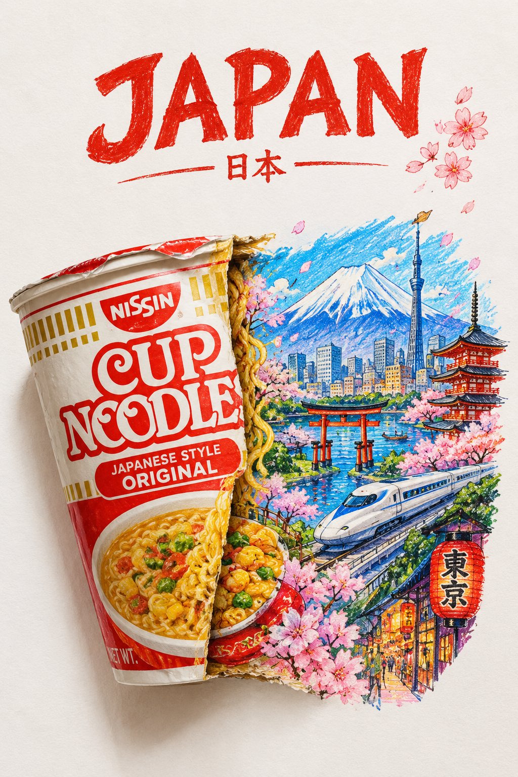
A striking top-down art photograph of a famous packaged food/snack from [COUNTRY], placed on a clean — AI image prompt — GPT Image 2.5
OpenAIGPT Image 2.5
A striking top-down art photograph of a famous packaged food/snack from [COUNTRY], placed on a clean white sheet of paper. At the very top of the paper, write “[COUNTRY NAME]” in large, bold, beautiful typography. Directly underneath, place a realistic, colorful packet of “[FAMOUS FOOD/SNACK]” from that country. The packet is creatively split/opened down the center, and the inside artwork transforms into a vibrant miniature illustration of the country — featuring its most iconic landmark, architecture, landscape, cultural elements and recognizable local details. Keep the original food packet highly realistic with authentic-looking folds, crinkles, printed graphics and vivid colors, while the emerging country illustration uses expressive colored-pencil and wax-crayon strokes. White paper background, overhead composition, playful handmade imperfections, rich saturated colors, premium editorial art photography, extremely detailed, visually satisfying, viral social-media aesthetic.
檢視詳情
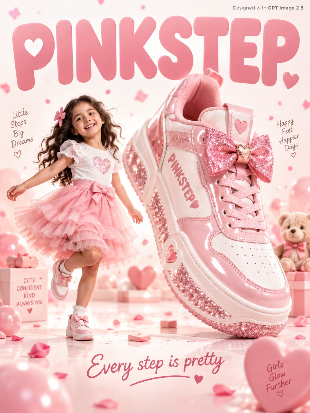
A sweet fun kids footwear advertisement poster. An adorable young girl age 7 with a big smile in a s — AI image prompt — GPT Image 2.5
OpenAIGPT Image 2.5
A sweet fun kids footwear advertisement poster. An adorable young girl age 7 with a big smile in a soft pink tulle skirt and white top skips joyfully beside a giant pink and white sneaker 3x her height with a glittery sole and bow detail on the tongue, "PINKSTEP" written in soft rose font on the sneaker side. Warm white and blush pink gradient studio background with soft pink confetti petals and tiny hearts floating gently. Friendly rounded soft typography "PINKSTEP" in blush pink filling the warm white background. Tagline bottom in rose: "Every step is pretty." Small text top-right corner reads "Designed with GPT Image 2.5" in grey. Photorealistic, sweet kids footwear commercial, soft warm white pink studio lighting.
檢視詳情
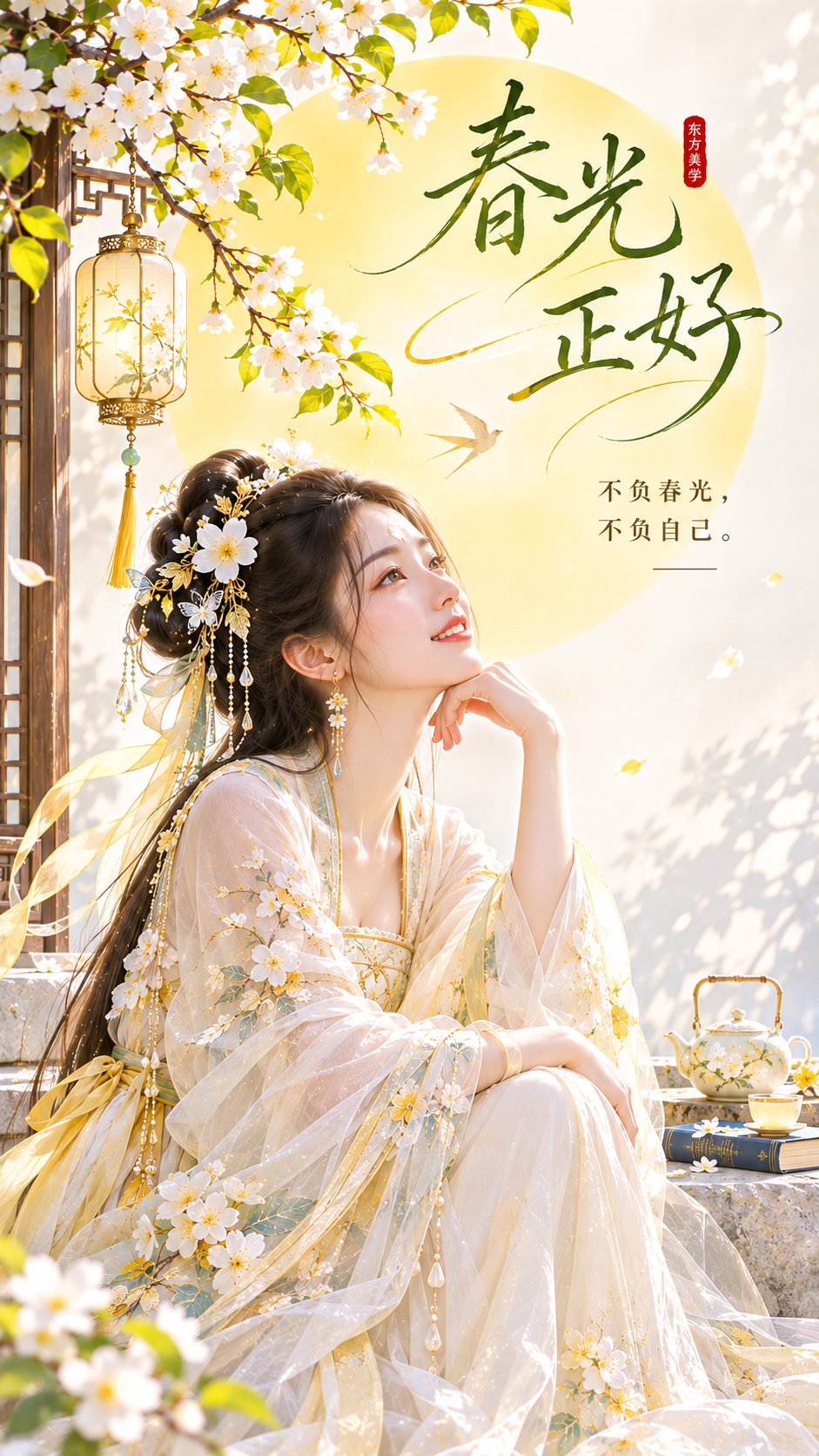
春光正好。

主题方向:东方禅意极简封面海报
风格分支:女性审美明快型
主体内容:一位古风女子坐在画面下方偏一侧的矮凳上,微微抬头看向远处
情绪母题:松弛、明朗、轻治愈
场景与意象:象牙白背景、柠檬黄 — AI image prompt — GPT Image 2.5
OpenAIGPT Image 2.5
春光正好。 主题方向:东方禅意极简封面海报 风格分支:女性审美明快型 主体内容:一位古风女子坐在画面下方偏一侧的矮凳上,微微抬头看向远处 情绪母题:松弛、明朗、轻治愈 场景与意象:象牙白背景、柠檬黄色圆形日光、女子、少量浅灰地面投影 构图与空间:9:16竖版构图,圆形日光位于中上部偏中位置形成视觉岛,人物位于下方偏侧,日光周围和上方保留标题空间 色彩控制:象牙白作为整体高明度基底,柠檬黄只用于圆形日光和少量暖反光,人物服装建议浅米白或淡奶黄;避免整体发黄 光线与质感:明亮柔光,背景纯净,边缘清楚,干净平面海报感 画幅比例:9:16 补充要求:标题可围绕圆形日光排布,整体像小红书爆款封面,明快但不刺眼
檢視詳情
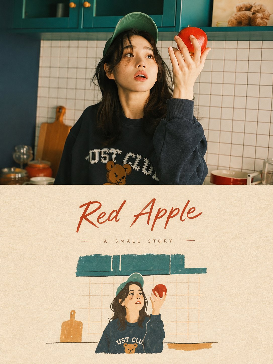
Transform the uploaded photos into an individual, high-end design poster. Do not combine multiple im — AI image prompt — GPT Image 2.5
OpenAIGPT Image 2.5
Transform the uploaded photos into an individual, high-end design poster. Do not combine multiple images; output each photo as a separate, standalone piece. Use a vertical {argument name="aspect ratio" default="3:4"} format, with the upper and lower sections divided strictly 1:1, each occupying 50% of the total composition. The upper section should retain the original photograph—preserving its core structure, authentic texture, natural lighting, and original color atmosphere—while applying subtle, high-end photographic color grading to evoke the aesthetic of magazine photography or art publications. To fit the frame, you may naturally extend the sky, ground, or environmental background, provided that the main subject remains undistorted and unaltered. The lower section should distill the most recognizable elements of the subject—its silhouette, posture, and narrative context—into a minimalist, hand-drawn, paper-textured cover illustration. Strip away complex details, retaining only the most essential visual features. Use delicate, slightly unsteady hand-drawn lines combined with a few distinct, flat-applied acrylic color blocks to represent the subject, ensuring it remains instantly identifiable. The subject should be small and concentrated—occupying approximately {argument name="subject proportion" default="10%–20%"} of the lower section—surrounded by ample negative space. The background should resemble rough or light-colored paper, with only minimal lines or color planes to suggest the environment. The color palette should be derived from the original photo and condensed into no more than four primary colors. These color blocks should be bold, solid, and restrained, incorporating textures like paper grain, visible brushstrokes, and slightly irregular edges. Lines should define the structure, while color blocks should establish the subject. Avoid styles such as colored pencil, crayon, watercolor washes, pure line art, complex realism, heavy oil-painting textures, slick digital illustrations, or 3D-rendered effects. You may incorporate a small amount of concise text—such as titles, keywords, subject names, locations, years, serial numbers, or short phrases—tailored to the content of each photo (not limited to urban themes). The typography should be sparse and restrained, blending naturally with the negative space and illustration to evoke the aesthetic of an art book cover, an independent publication, or a children’s picture book. The overall visual aesthetic features small subjects, ample negative space, a high degree of distillation, and strong recognizability. It conveys a sense of tranquility, childlike charm, and ease—evoking a poetic, sophisticated quality while steering clear of the look typical of commercial cartoons, e-commerce imagery, or generic templates.
檢視詳情
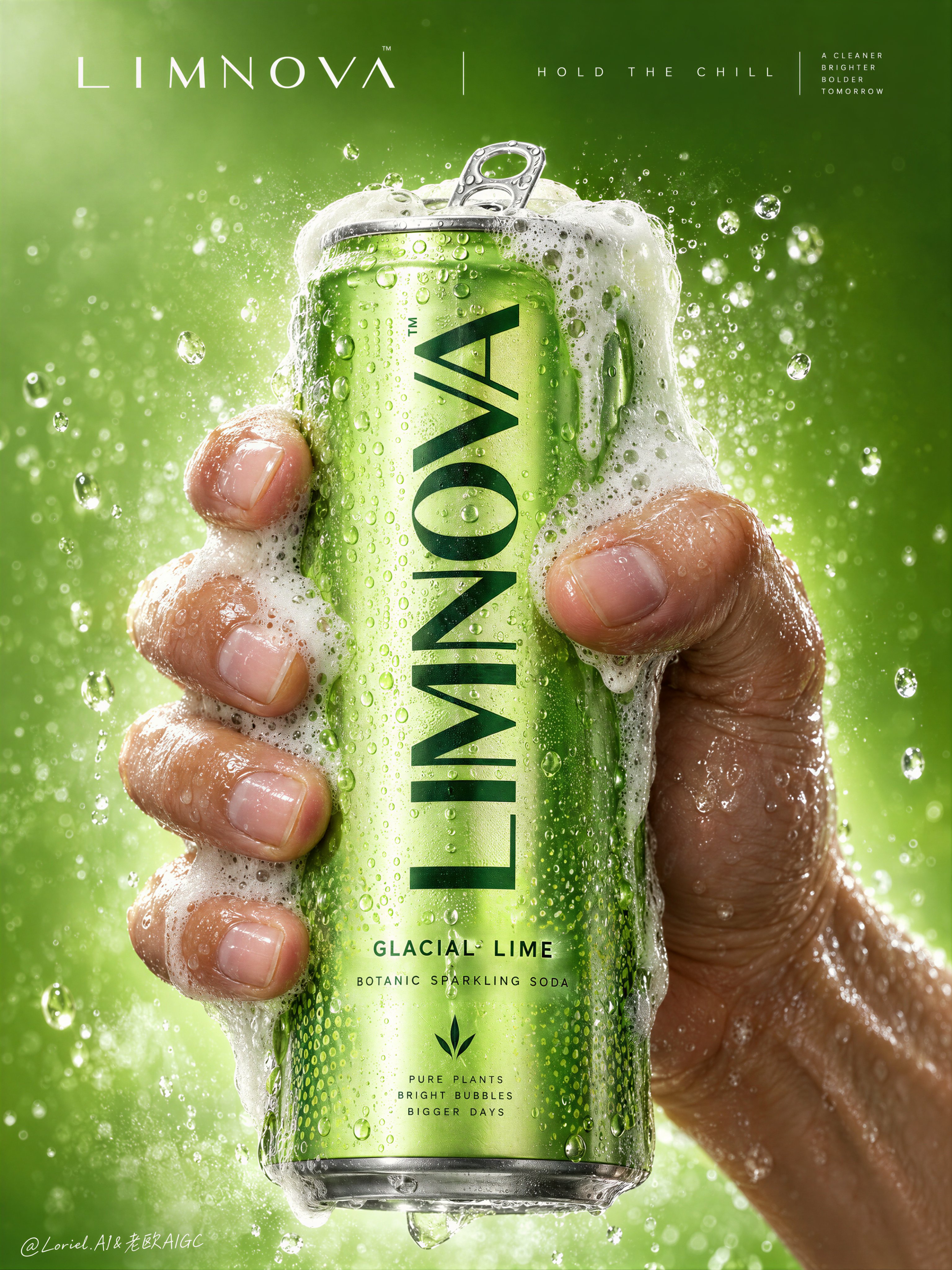
Create a Cannes-level commercial poster for fictional premium sparkling soda brand LIMNOVA, merging  — AI image prompt — GPT Image 2.5
OpenAIGPT Image 2.5
Create a Cannes-level commercial poster for fictional premium sparkling soda brand LIMNOVA, merging tactile product realism, pressure-driven human interaction, and ultra-clean gallery-grade graphic design into one unified hero image. The core concept is controlled release: a cold lime soda can gripped at peak tension, overflowing with foam and condensation, turning an ordinary beverage moment into a sculptural event of freshness, pressure, and desire. Use a vertical full-bleed poster in extreme close-up, rule-of-thirds disciplined but visually centralized. Preserve the exact structure: a single slim can dominates the center, held tightly by one wet human hand wrapping from the right and lower rear; dense foam crowns the top and spills down the can; broad negative space remains above for elegant brand typography. The hand, can, and foam should read as one compressed central mass, surrounded by a luminous citrus atmosphere with no extra props. The can must remain the undisputed focal point and fully legible. The subject is a hyperreal slim aluminum soda can in radiant glacial lime green, with crisp pull-tab geometry, subtle printed microtexture, dense condensation droplets, and refined premium branding. Use the fictional text “LIMNOVA” as the main vertical logo, “GLACIAL LIME” as the flavor line, and “BOTANIC SPARKLING SODA” as the descriptor. The identity should feel bold, contemporary, and luxury-clean, with strong custom letterforms and exact print clarity. The can should look manufacturable, collectible, and ice-cold. One realistic human hand grips the can firmly with correct five-finger anatomy, natural finger spacing, believable knuckle tension, realistic nail beds, subtle skin compression, and wet highlights. The grip communicates force and freshness, not aggression. Foam surges over the top rim and flows across the fingers and can in airy dense clusters, while suspended micro-droplets and faint carbonation mist activate the space. The can remains undeformed except for natural optical tension created by the grip and liquid pressure. No extra hands, no anatomy drift. Build a minimal studio field rather than a literal location. The background is a luminous acid-lime to chilled-chartreuse gradient with suspended droplets, vapor-like fizz haze, and a soft freshness halo around the product. Keep the space clean and abstract, letting the product, hand, and foam generate all depth. No fruit slices, no ice cubes, no bar setup, no clutter. The world should feel like a distilled atmosphere of citrus pressure and cold carbonation. Lighting is a premium studio setup with a bright frontal key, cool upper-left freshness lift, and narrow specular edge highlights on wet aluminum and skin. Palette hierarchy: 60% glacial lime and electric citrus green, 30% white foam and bright condensation highlights, 10% natural warm skin tone as tactile counterpoint. Contrast should be crisp yet soft-edged, with no dead blacks, dirty grey mud, or cartoon oversaturation. The emotional tone is icy, alive, compressed, clean, and addictive. Materials must feel extremely photoreal: sharp reflective aluminum edges, chilled metallic bloom, droplets merging into trails, subtle ink adhesion texture; foam that feels light, wet, aerated, and creamy with translucent bubble variation and convincing thickness at the rim and fingers; and a real, de-AI hand with accurate anatomy, realistic skin texture, natural moisture sheen, crease detail, true finger joints, and no swollen or fused forms. Apply restrained high-end commercial polish, keeping hero detail sharp and print-ready. Integrate a minimalist top header as a refined brand system, not ad clutter. Place “LIMNOVA” on one side of the top band and a secondary studio-style signature or edition mark on the other, separated by a thin elegant divider. If an extra micro-headline is used, keep it very restrained, such as “HOLD THE CHILL” or “PRESS THE FIZZ”, set small outside the can recognition zone. Typography must feel architected into the negative space, aligned with the product axis, and never heavy or crude. Output: a premium beverage poster with product-first hierarchy, hyper-clean execution, strong tactile realism, elegant negative space, and exact brand readability. No extra cans, no fruit garnish, no ice props, no chaotic splash overload, no warped can geometry, no broken tab, no malformed hand, no extra or merged fingers, no unreadable text, no muddy shadows, no large dead black blocks, no low-quality AI artifacts, no clutter, no style drift, and no resemblance to existing real soda branding.
檢視詳情
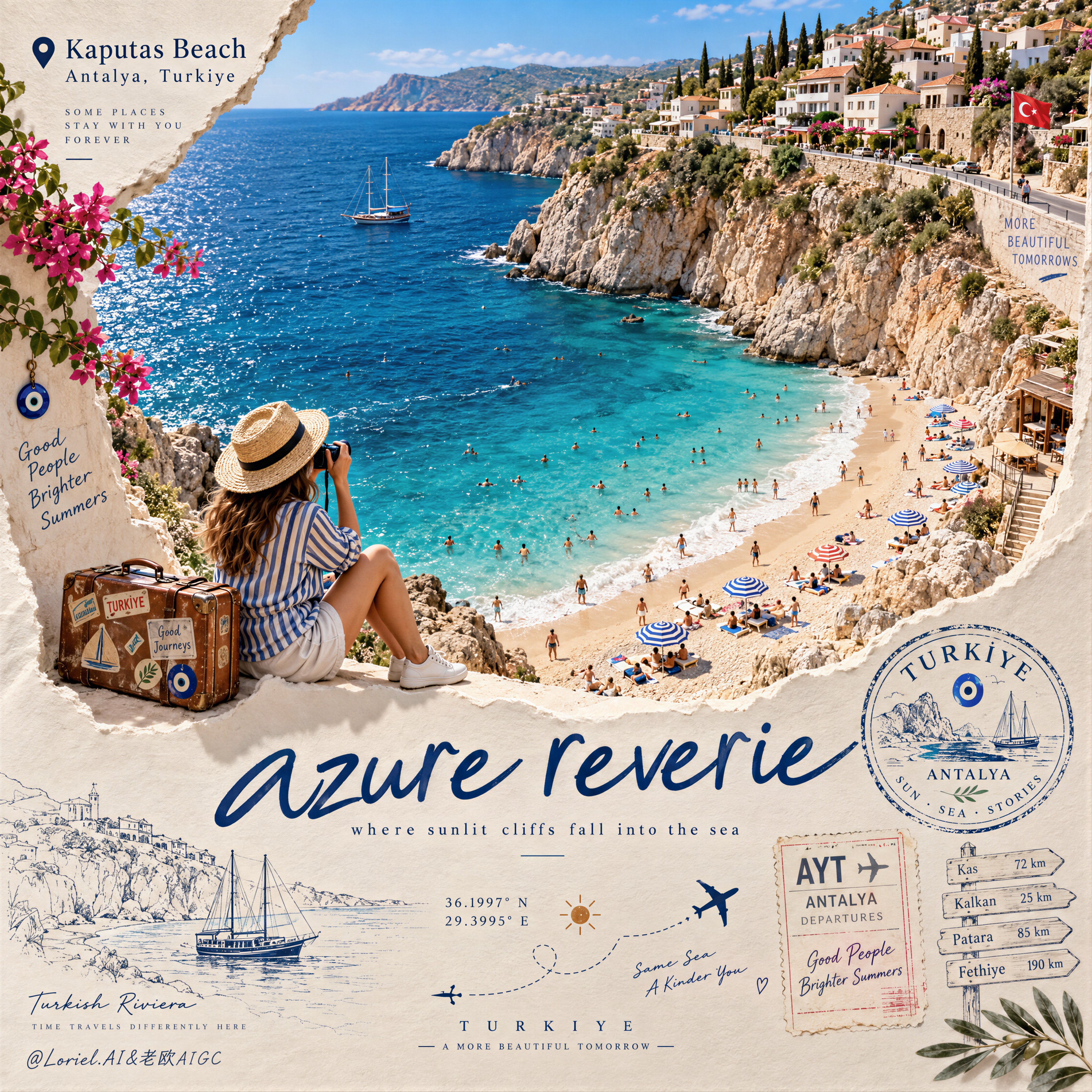
Create a Cannes-level travel destination advertising poster for TURKIYE, preserving the exact struct — AI image prompt — GPT Image 2.5
OpenAIGPT Image 2.5
Create a Cannes-level travel destination advertising poster for TURKIYE, preserving the exact structural logic of a premium paper-sculpture tourism print while merging emotional summer atmosphere with forensic material realism. The composition is vertical and built around one large curved torn-paper window that reveals a luminous handcrafted miniature view of KAPUTAS BEACH, ANTALYA, TURKIYE, while the lower foreground remains a refined cream paper field carrying elegant destination typography, travel stamps, route sketches, coordinates, and curated tourism graphics. The final image must feel like a collector-grade Mediterranean travel memory object: tactile, sun-warmed, cinematic, and exquisitely constructed. Hero destination scene: inside the curved paper opening, reveal a radiant turquoise cove embraced by pale limestone cliffs and a gently arcing golden beach. Show layered Mediterranean water bands shifting from pale aqua near the shore to saturated teal and deep azure farther out, with delicate repeating wave lines and bright foam edges rolling onto the sand. Populate the beach with tiny yet believable sunbathers, swimmers, striped parasols, towels, and scattered leisure details, all proportionally correct and integrated into the scene. Along the upper horizon, build a densely stepped hillside of whitewashed and pastel coastal houses, terracotta roofs, boutique balconies, cypress trees, and warm stone terraces, arranged like a refined miniature Mediterranean village. The entire destination window must feel like a luxury handcrafted 3D diorama enhanced with highly realistic micro-surface detail. Narrative foreground: on the lower edge of the cutout, place one seated miniature traveler figure as an emotional invitation into the destination. The traveler wears elegant striped resort clothing, a straw hat, white sneakers, and holds a camera, beside a small vintage suitcase covered in tasteful travel stickers. The anatomy, hands, posture, and clothing folds must be natural and correct. This figure should feel quietly alive, as if pausing at the threshold of memory, adding warmth and human scale without competing with the destination itself. Typography and editorial layout: preserve the same poster rhythm as the reference. At the upper left, place a small map-pin icon followed by “Kaputas Beach” and beneath it “Antalya, Turkiye” in refined editorial type. On the lower paper field, place one large flowing handwritten English title in deep Mediterranean blue, such as “azure reverie”, followed by a small subtitle like “where sunlit cliffs fall into the sea”. Distribute a few highly curated travel graphics across the lower area: one circular passport-style destination stamp, one boarding-pass or visa-stamp element, one dotted flight-path doodle with tiny airplane icons, precise latitude-longitude coordinates, a small sun glyph, a fine-line coastal sketch, and one discreet signpost marking nearby destinations. All typography must feel elegant, airy, and graphically integrated, never generic, heavy, or cluttered. Turkey-specific accents: add subtle premium local cues with restraint. Integrate a tiny evil-eye motif into one stamp or baggage sticker, a delicate line illustration of a gulet sailboat or coastal architectural silhouette in the lower graphics, and visual cues that suggest refined Turkish Riviera identity without becoming folkloric or overloaded. Everything should feel international, luxurious, and compositionally clean. Atmosphere: the poster should carry the sensation of late-morning Mediterranean light, salt in the air, and the emotional softness of an unforgettable summer coast remembered through beautifully crafted paper. The sea must feel alive and breezy, the sky fresh and expansive, and the destination window should radiate optimism, escape, and warmth. The image should feel like a tactile travel keepsake elevated into a world-class advertising object. Material realism: emphasize thick layered paper edges, crisp cut contours, matte card texture, embossed shadow transitions, tiny architectural facade details, miniature umbrellas, foam ridges, cliff stratification, printed stamp ink, luggage leather grain, sticker gloss, clothing fabric weave, and precise micro-scale beach props. The sea should have dimensional depth without losing the handcrafted paper language. The paper opening must cast believable soft shadows onto the lower field, and every surface should read as physically buildable, premium, and photographically convincing. Lighting: use bright Mediterranean daylight from the upper left with soft clean shadows that enhance the paper relief and miniature depth. The waves, parasols, rooftops, cliffs, and traveler should receive warm, luminous highlights. The lower paper field remains softly lit with subtle shadowing from the cut edge, stamps, and seated figure, producing a polished museum-quality commercial finish. Avoid harsh contrast, dull flatness, or dirty shadow masses. Color hierarchy: 60% luminous turquoise, aqua, pale sand, sun-bleached ivory, and clear coastal sky blue; 30% terracotta roof tones, limestone beige, sage-green foliage, and soft neutral ink tones; 10% deep navy typography, warm suitcase browns, and small accent colors from parasols and travel graphics. The palette must feel fresh, upscale, joyful, and unmistakably Mediterranean. Design intent: the final image must preserve the reference’s exact logic of a
檢視詳情
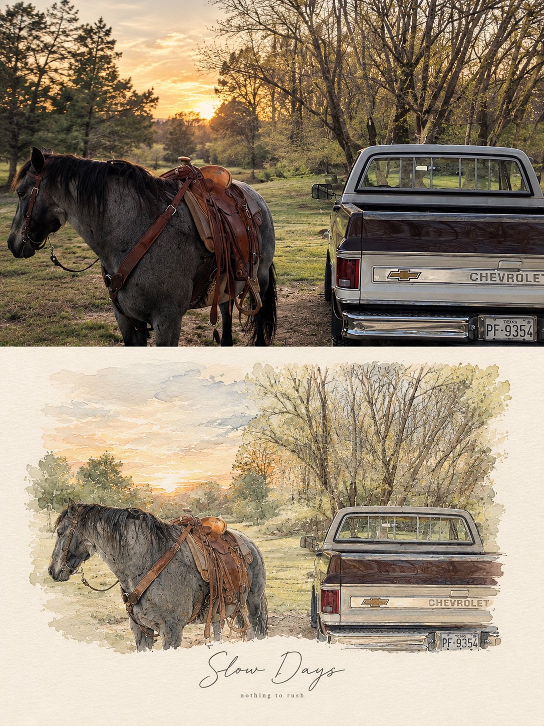
Create a refined, high-end PHOTO + MINIMAL WATERCOLOR VIGNETTE artwork based entirely on the uploade — AI image prompt — GPT Image 2.5
OpenAIGPT Image 2.5
Create a refined, high-end PHOTO + MINIMAL WATERCOLOR VIGNETTE artwork based entirely on the uploaded photograph. Use the photograph as the only visual reference and preserve the exact subject, composition, environment, clothing, objects, lighting, colors, and mood. FORMAT: Vertical 3:4 editorial composition. TOP SECTION — ORIGINAL PHOTOGRAPH: Place the original photograph in the upper 55–60% of the canvas. Keep it photorealistic and naturally detailed. Do not alter the identity, pose, proportions, objects, architecture, scenery, or important visual details. Give it a subtle premium editorial photography finish with natural cinematic light and gentle tonal balance. BOTTOM SECTION — HAND-PAINTED INTERPRETATION: Transform the same exact scene into a delicate minimal watercolor and fine-ink illustration. Recreate the main subject, pose, perspective, key objects, and recognizable background elements from the photograph. Use loose watercolor washes, subtle pencil/ink outlines, imperfect hand-painted edges, soft paper texture, and restrained pastel tones. Keep the illustration airy, elegant, and slightly imperfect rather than digitally polished. The illustration should feel like a fashion/lifestyle magazine sketchbook page, with plenty of clean negative space and a warm off-white textured paper background. Do not introduce new subjects or details. TYPOGRAPHY: Add a short elegant handwritten brush-script phrase underneath or integrated naturally into the illustrated section, similar to a premium lifestyle editorial poster. Underneath it, add a tiny minimalist lowercase serif/sans-serif subtitle. Typography should be subtle, sophisticated, thin, and balanced with the artwork. AESTHETIC: Scandinavian editorial design, quiet luxury, nostalgic travel journal, soft watercolor, delicate ink drawing, handmade paper texture, muted natural palette, sophisticated minimalism, emotional storytelling, premium art-book layout. IMPORTANT: The photograph and illustration must clearly represent the same exact moment and scene. No collage of unrelated images, no dramatic redesign, no excessive watercolor, no cartoon appearance, no heavy outlines, no saturated colors, no clutter. Output: photorealistic upper section + matching delicate watercolor illustration below, seamless premium editorial composition, vertical 3:4, high detail. For different photos, just change the text phrase Examples: •Good Days — a kinder me •Better Together — same window, same silence •Little Moments — worth remembering •Slow Days — nothing to rush •Somewhere Quiet — just for a while •Golden Hours — softly remembered
檢視詳情
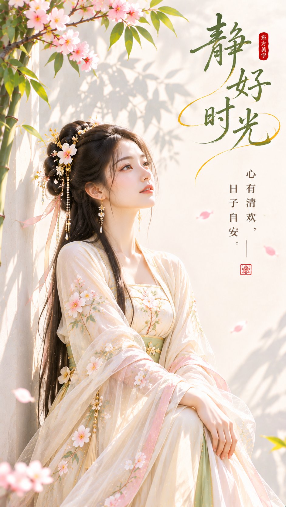
9:16竖版,东方禅意极简女性封面海报,现代新中式审美,明亮、通透、柔和、精致,高颜值女性向封面。

一位24–27岁的成年东方女性,精致柔和的鹅蛋脸,清亮杏眼,淡妆,白皙自然肤质。深棕黑色长发半盘发 — AI image prompt — GPT Image 2.5
OpenAIGPT Image 2.5
9:16竖版,东方禅意极简女性封面海报,现代新中式审美,明亮、通透、柔和、精致,高颜值女性向封面。 一位24–27岁的成年东方女性,精致柔和的鹅蛋脸,清亮杏眼,淡妆,白皙自然肤质。深棕黑色长发半盘发,少量白花与浅金发簪点缀。 人物坐在暖白墙边,身体轻微侧转,双腿自然收拢,一只手自然搭在膝盖上,另一只手轻放前方,微微抬头望向右上方,神情安静、松弛、温柔。肩颈、手臂、手腕和手指结构自然协调。 人物穿珍珠白与浅杏色古风襦裙,外罩轻薄宽袖纱衣,局部带少量桃粉花枝与浅绿叶片刺绣,服装轻盈精致但不过度华丽。 背景为大面积暖白墙面,左侧少量竹枝与竹影,少量桃粉花瓣飘落。人物位于中下部偏左,占画面高度约60%,右上方保留大面积连续留白用于标题。 色彩控制:暖白为主基底,青竹绿只用于竹叶与少量服饰细节,桃粉只用于花瓣点睛,浅金只用于发饰;颜色各自归位,禁止整图粉绿化、发灰、发黄。 明亮自然侧光,竹影清晰,人物面部柔亮,发丝和薄纱有轻微轮廓光,整体干净、通透、有呼吸感。 留白处加入东方艺术标题: 「静好时光」 副文案: 「心有清欢,日子自安。」 搭配一枚小型朱红印章。 负面约束:不要人物比例异常,不要肩臂反转,不要多手多指,不要手指畸形,不要网红脸,不要灰雾,不要脏黄,不要复杂背景,不要满屏花朵。
檢視詳情
瀏覽全部 GPT Image 2.5 提示詞探索AI 圖片提示詞