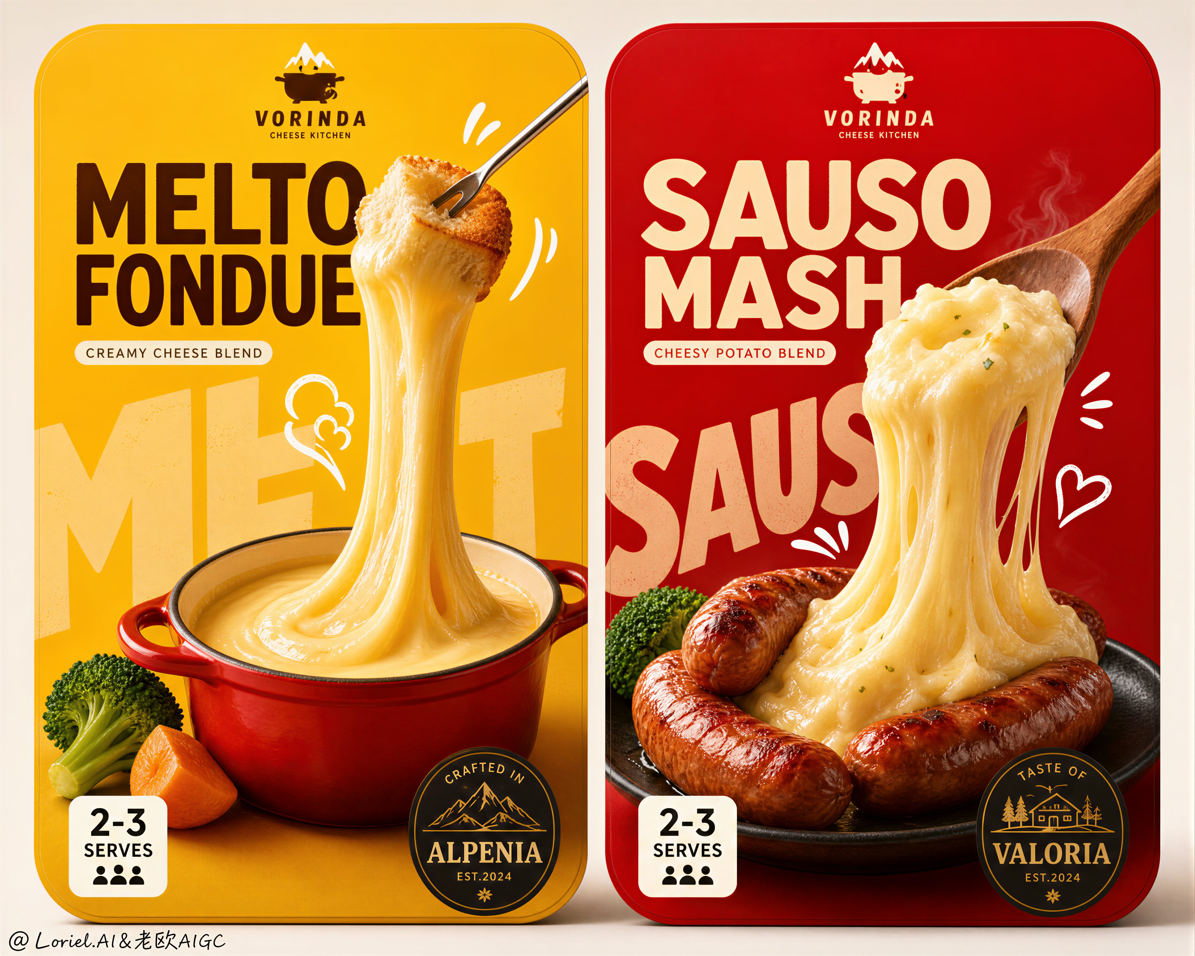
Premium Dual-Package Cheese Campaign Key Visual
 GPT Image 2OpenAIimage
Create an ultra-premium dual-package food campaign key visual showing two side-by-side retail package fronts for a gourmet cheese product line, designed with stronger visual impact, sharper product-symbol memory, and a more international flagship FMCG aesthetic. Preserve the original structural logic exactly: two rounded-rectangle package panels placed next to each other on a clean neutral background, each package following the same branding system but built around a different hero food scene. The left package uses a powerful molten-cheese yellow field and centers on a fondue concept; the right package uses a rich heated red field and centers on a sausage-and-cheese mash concept. Both package fronts must feel bold, shelf-dominant, highly appetizing, instantly legible, and launch-ready for a world-class premium supermarket brand. Push the impact strongly while also applying Transit and Port refinement: simplify the page, reduce unnecessary small information, make the food larger, make the cheese pull more dramatic, strengthen the color-block contrast, and compress each package into a few unforgettable super symbols. The left package should read immediately as “yellow field + red pot + giant molten cheese ribbon”; the right package should read immediately as “red field + browned sausages + lifted creamy cheese mass.” The image must feel cleaner, more expensive, and more iconic than an ordinary package mockup. Left package: a vivid deep golden-yellow background with a small premium red fondue pot placed low-center, filled with glossy thick melted cheese. A slim fork lifts a bread cube high above the pot, creating an exaggerated but physically believable vertical cheese pull that stretches smoothly down into the pot like a sculptural ribbon. Add only a few supporting ingredients, such as one broccoli floret and one or two warm vegetable accents, kept tightly clustered so the composition remains clean. Behind the food, place oversized pale background typography as a graphic block, partially obscured by the cheese and pot. Add a few small white hand-drawn doodle marks near the fork and cheese pull to amplify heat and motion. Right package: a rich premium red background with several browned sausages grouped near center-lower area on a dark plate. A wooden spoon lifts a dense creamy mound of cheese mashed potato upward, forming a heavy elastic flowing cheese mass that droops back toward the sausages with strong appetizing tension. Add only minimal green garnish like one or two broccoli accents to keep balance. Behind the food, place oversized pale background typography as a large compositional block, partially hidden by the spoon and cheese mass. Add a few restrained white doodle marks to reinforce warmth and deliciousness. Typography and branding must feel like a highly polished Japanese-inspired FMCG packaging system, but use only newly invented wording and fictional branding. No copied text. Use a small brand mark at the top, one large bold main product name in the upper center, one compact subtitle, one small serving badge block near the lower left, and one dark round or oval taste-origin medallion near the lower right. Keep type bold, rounded, friendly, and shelf-powerful, but with cleaner spacing and more premium hierarchy than ordinary mass-market packaging. Style: premium packaging design, realistic gourmet food photography, playful hand-drawn graphic integration, Japanese convenience-food sophistication, international flagship FMCG art direction, Cannes-level product branding. The hand-drawn style must be perfectly fused with the food and typography rather than feeling pasted on. Lighting should be soft frontal studio lighting with precise highlights on the cheese, subtle grounded shadows, excellent food volume, and crisp print-ready edges. Materials must feel highly edible and tactile: glossy molten cheese, soft bread texture, browned sausage skin, creamy mashed potato density, fresh broccoli surface, matte printed packaging, and clean flat background fields. Color system: saturated cheese yellow, warm cream, vivid premium red, deep sausage brown, broccoli green, white doodle accents, dark medallions, and pale oversized background type. Strong hierarchy, strong appetite appeal, high contrast, clean negative space, and maximum retail recognition. No copied brand names, no copied Japanese text, no watermark, no existing logos, no messy composition, no low-detail food, no broken cheese physics, no plastic-looking cheese, no random props, no dirty shadows, no black blotches, no overcrowded typography, no chaotic doodles, no weak shelf impact.
Details
- Type
- AI Image Prompts
- Aspect Ratio
- 4096:3277
- Updated
- Aug 19, 2026
How to use this prompt
- 1Copy the full prompt with the copy button above.
- 2Open GPT Image 2 by OpenAI, or any image generator with a similar style range.
- 3Paste the prompt, then swap the subject and style keywords to match your idea.
- 4Match the example's settings (4096:3277 · Product Photography · Advertising · Food), then iterate — small wording changes shift the output a lot.
Frequently asked questions
Which AI model generated this image?
This image was generated with GPT Image 2 by OpenAI. The prompt on this page is the exact text used to create it.
What settings does this prompt use?
The example was generated with GPT Image 2 using: 4096:3277 · Product Photography · Advertising · Food. Reusing these settings gives the closest match.
How do I get similar results?
Copy the prompt as-is first, then replace only the subject while keeping the style, lighting, and composition keywords. Generate a few variations — outputs differ between runs.
Can I modify this prompt?
Yes. Prompts work best as starting points — adjust descriptors, aspect ratio, or style tags to make the output your own.