LogoAhaPrompt
  • Prompts
  • Featured
  • Models
  • Submit
  • Blog
AhaPromptAhaPrompt

AI Prompts for Images, Video & Audio — Every Model, One Library

Built withLogoNEXTY.DEV
Explore
  • All Prompts
  • Featured Prompts
  • Image Prompts
  • Video Prompts
  • Audio Prompts
  • AI Models
  • Submit a Prompt
  • Blog
Languages
  • English
  • 中文
  • 日本語
  • 한국어

Copyright © 2026 AhaPrompt All rights reserved.

Privacy PolicyTerms of Service
HomeAI Prompt LibraryAI Image PromptsVintage Travel Magazine Editorial Poster
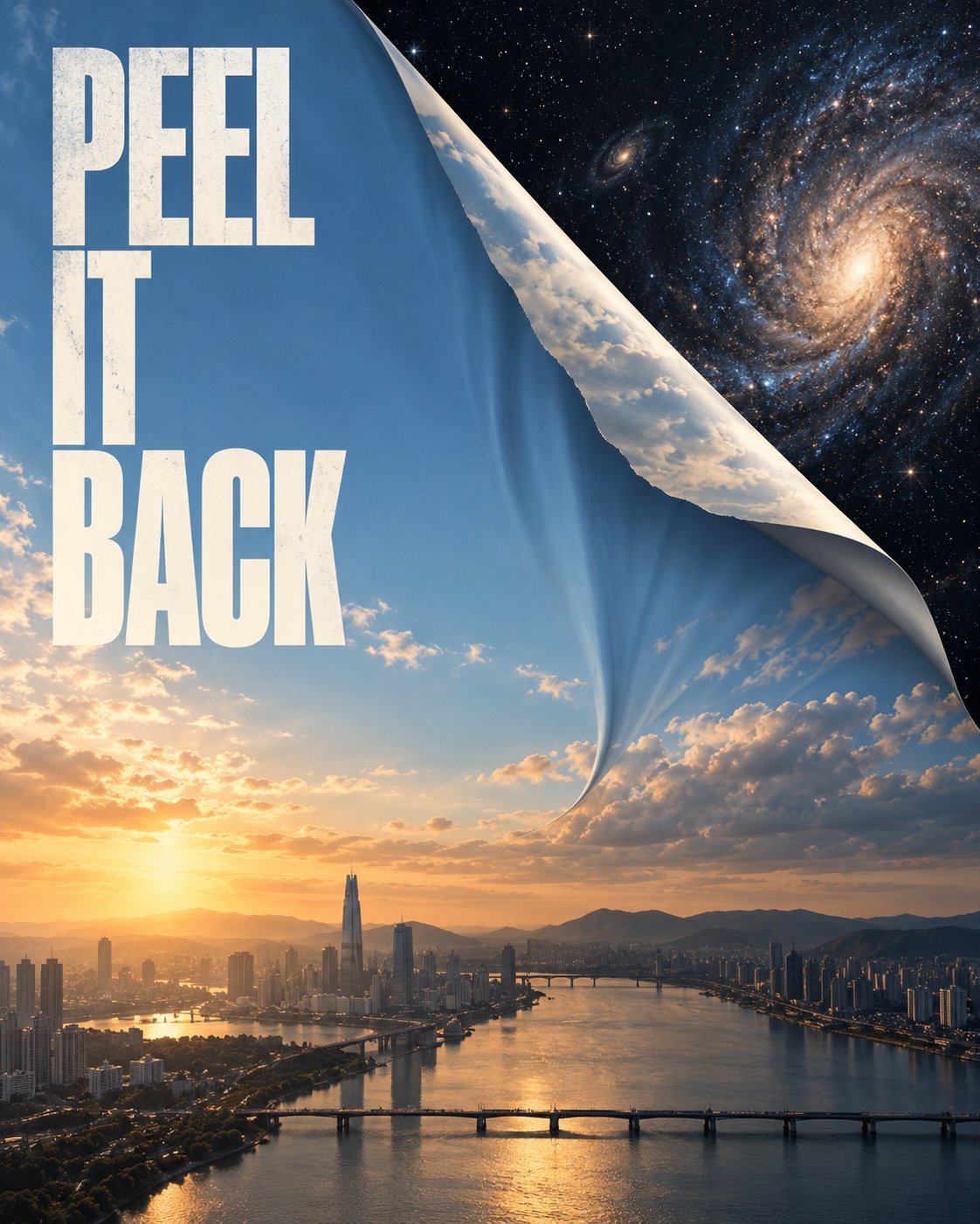
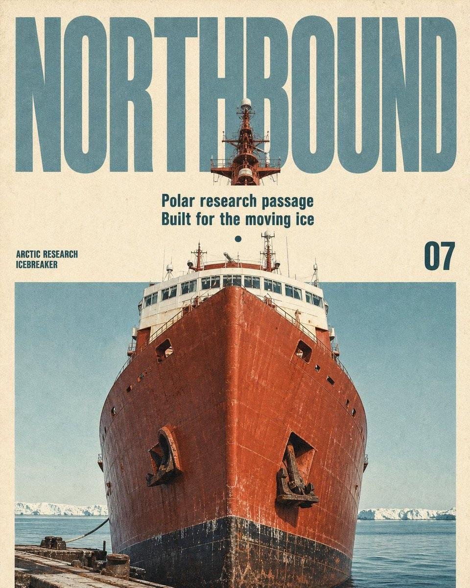
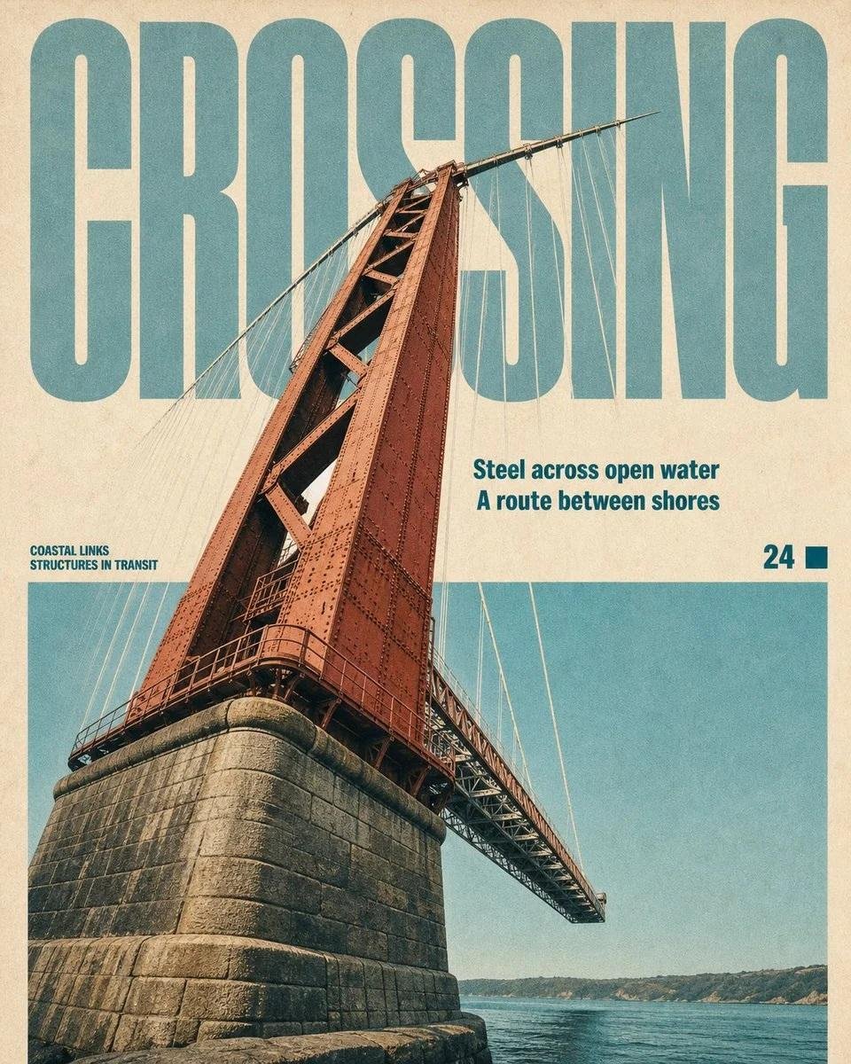
Vintage Travel Magazine Editorial Poster — AI image prompt — GPT Image 2 — Vintage, Poster - 1

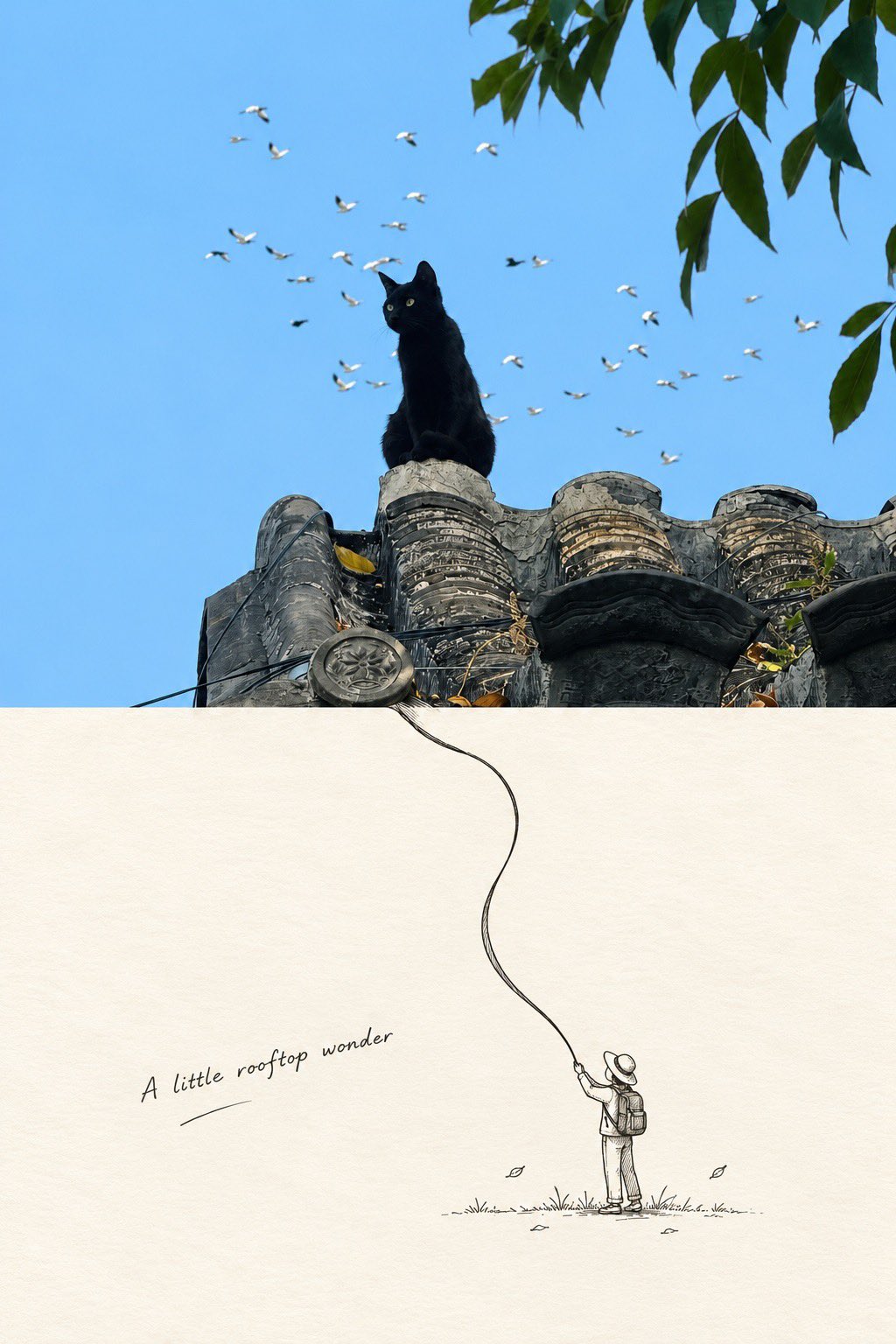
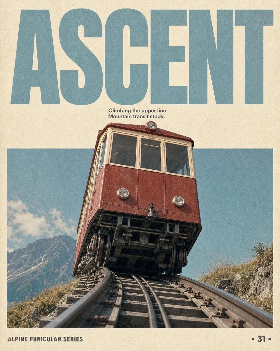
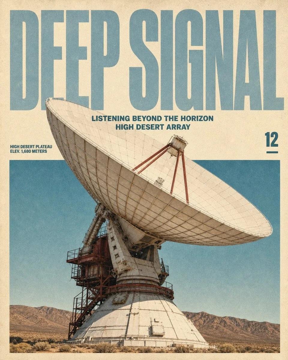
Vintage Travel Magazine Editorial Poster — AI image prompt — GPT Image 2 — Vintage, Poster - 2
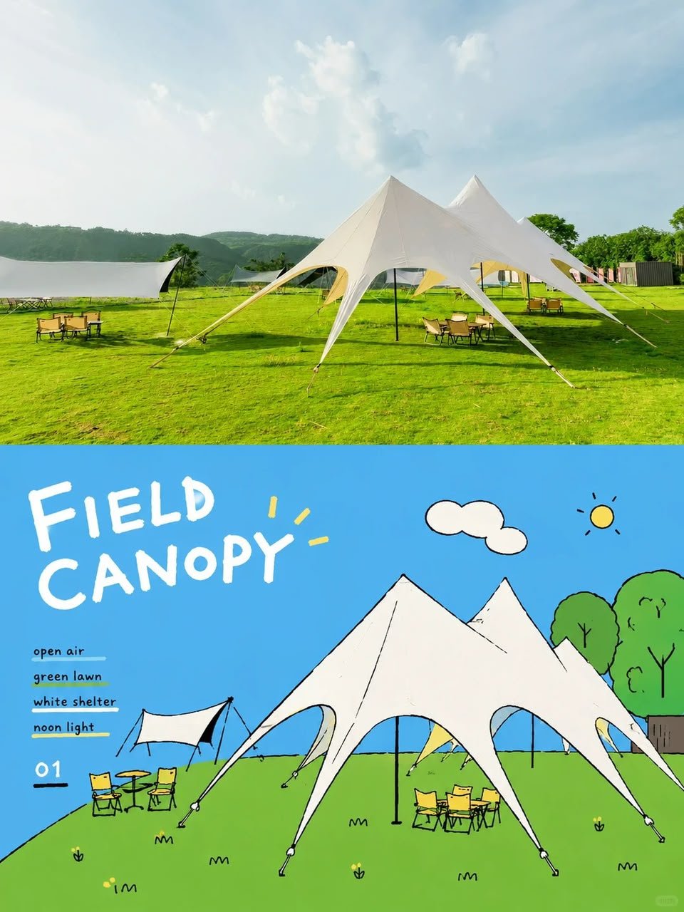
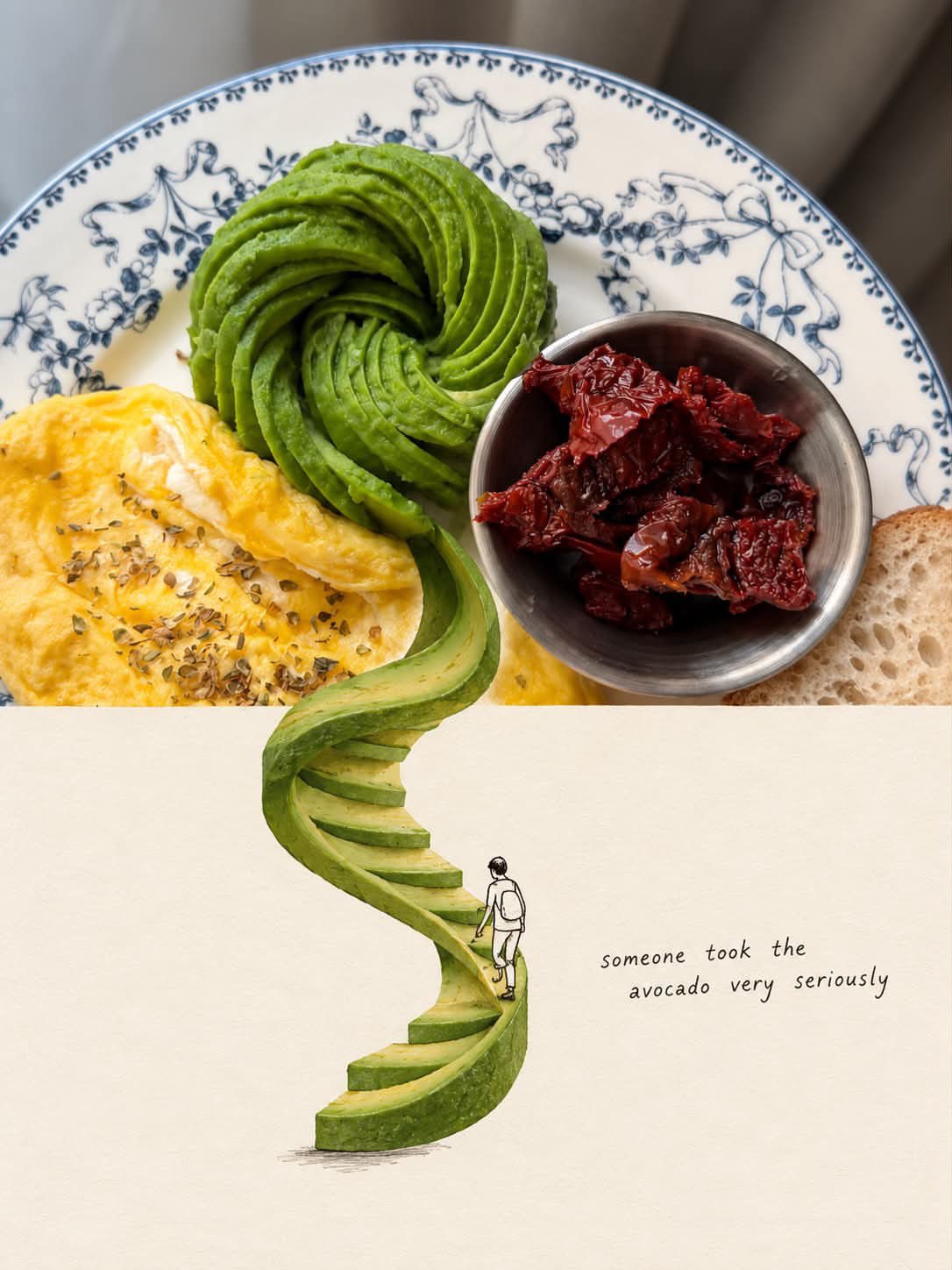
Vintage Travel Magazine Editorial Poster — AI image prompt — GPT Image 2 — Vintage, Poster - 3
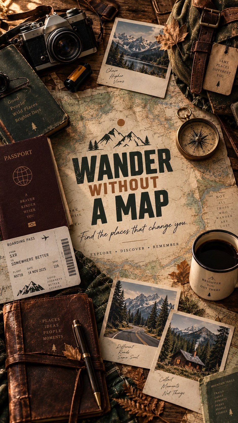
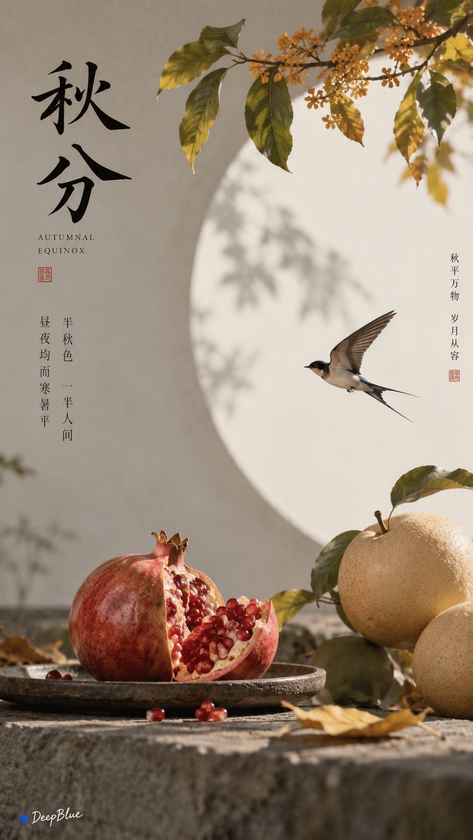
Vintage Travel Magazine Editorial Poster — AI image prompt — GPT Image 2 — Vintage, Poster - 4

Vintage Travel Magazine Editorial Poster

OpenAIGPT Image 2OpenAIimage

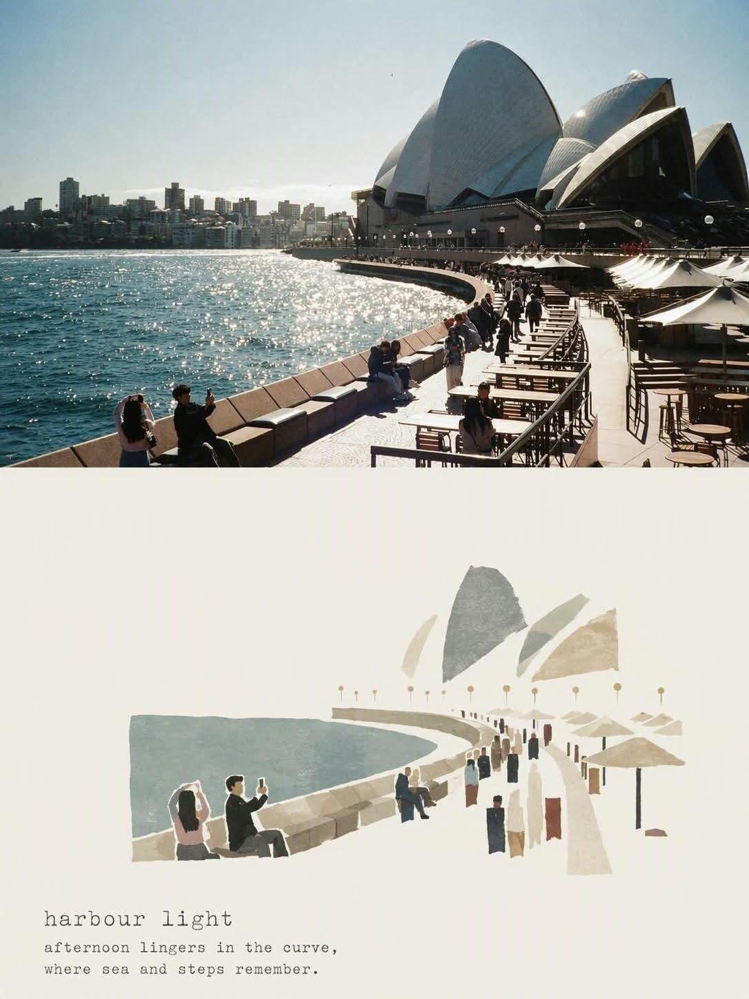
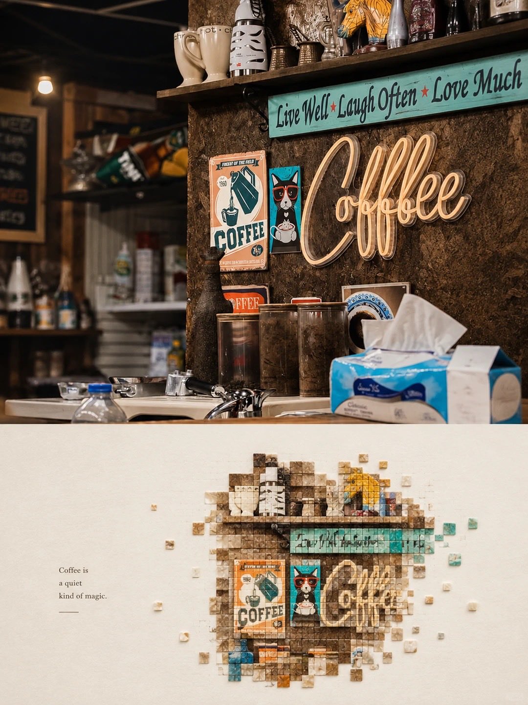
Create a vintage editorial travel-magazine poster inspired by mid-century transportation and engineering publications. Feature a monumental [SUBJECT] as the main photographic subject, captured from a dramatic low-angle perspective with strong geometric composition and clean architectural lines. Use a large condensed bold uppercase headline “[TITLE]” occupying the upper portion of the page, partially interacting with or framing the subject. Add a smaller refined subtitle beneath it: “[SHORT DESCRIPTIVE TAGLINE]”. Include small editorial labels, technical-style captions, a page number, and minimal typographic details around the image. Visual style: authentic 1960s–1970s vintage print design, retro industrial travel magazine, muted teal blue, faded rust red, warm cream paper, subtle olive accents, slightly desaturated photography, natural sunlight, realistic film grain, halftone texture, aged paper fibers, gentle ink imperfections, soft faded edges, archival printed-photo appearance. Strong negative space, balanced Swiss-inspired editorial layout, bold typography, sophisticated museum-book aesthetic, highly detailed subject photography, realistic proportions, clean hierarchy, nostalgic but premium. Keep the layout consistent across a series: cream background, oversized blue headline, centered main image, small dark-teal informational text, restrained red/rust accents, page number in the corner, authentic vintage magazine print texture. Vertical 4:5 composition, crisp details, high-resolution editorial poster.

Details
Type
AI Image Prompts
Aspect Ratio
4:5
Updated
Aug 23, 2026
Category
VintagePoster
Source

How to use this prompt

  1. 1Copy the full prompt with the copy button above.
  2. 2Open GPT Image 2 by OpenAI, or any image generator with a similar style range.
  3. 3Paste the prompt, then swap the subject and style keywords to match your idea.
  4. 4Match the example's settings (4:5 · Vintage · Poster), then iterate — small wording changes shift the output a lot.

Frequently asked questions

Which AI model generated this image?

This image was generated with GPT Image 2 by OpenAI. The prompt on this page is the exact text used to create it.

What settings does this prompt use?

The example was generated with GPT Image 2 using: 4:5 · Vintage · Poster. Reusing these settings gives the closest match.

How do I get similar results?

Copy the prompt as-is first, then replace only the subject while keeping the style, lighting, and composition keywords. Generate a few variations — outputs differ between runs.

Can I modify this prompt?

Yes. Prompts work best as starting points — adjust descriptors, aspect ratio, or style tags to make the output your own.
More GPT Image 2 prompts

Create a premium vertical 4:5 travel poster for [COUNTRY], illustrated as one elegant continuous han — AI image prompt — GPT Image 2
PosterVintage
OpenAIGPT Image 2
Create a premium vertical 4:5 travel poster for [COUNTRY], illustrated as one elegant continuous hand-drawn line-art composition. Instead of placing landmarks separately, make them flow organically into one another, as if the entire country was drawn in a single uninterrupted travel sketch. Combine the country’s most recognizable architecture, landscapes, culture, food, transportation, nature, and tiny everyday details into one beautifully balanced scene. Use bold black ink outlines, delicate cross-hatching, playful imperfect hand-drawn details, subtle vintage-poster typography, and a mostly warm off-white paper background. Add only 2–3 signature accent colors inspired by the country. Include: One dominant iconic landmark A second architectural landmark subtly integrated into the skyline A famous natural landscape in the background Local transportation Traditional clothing or cultural detail A recognizable food or drink Small street-life moments Birds, clouds, plants and tiny decorative elements Handwritten labels pointing to selected elements At the top, use a large playful hand-lettered title: “[COUNTRY]” Below it, add a tiny elegant subtitle: “A little world to discover” Make the composition feel collected, whimsical, editorial, nostalgic and handcrafted, like a beautifully illustrated travel journal rather than a generic tourist poster. Avoid photorealism, gradients, 3D rendering and excessive colors. Clean white space around the illustration, highly detailed ink work, charming imperfections, premium stationery aesthetic, screen-print texture, sophisticated yet playful.
Details
Create a premium illustrated travel postcard for {{CITY_NAME}} in a refined Japanese tourism-magazin — AI image prompt — GPT Image 2
Poster
OpenAIGPT Image 2
Create a premium illustrated travel postcard for {{CITY_NAME}} in a refined Japanese tourism-magazine aesthetic. Automatically research and determine the city’s country, local-language name, most iconic landmark, authentic surrounding environment, distinctive local architecture, geography, vegetation, transportation, and secondary visual details. The landmark must be geographically accurate and instantly recognizable. Visual style: elegant Japanese travel editorial illustration, handcrafted layered paper collage combined with delicate gouache and watercolor textures, sophisticated Japanese tourism brochure aesthetic, calm and poetic atmosphere, refined composition, tactile matte paper, subtle handmade edges, soft physical paper shadows, delicate atmospheric depth. Composition: premium postcard. Use a cinematic elevated viewpoint with the iconic landmark as the main focal point. Surround it with accurately styled local buildings, streets, waterfronts, hills, mountains, parks, or other authentic geographic elements appropriate to the city. Keep the upper portion spacious with generous negative space for typography. Color palette: soft powder blue, warm ivory, cream, muted sage, dusty green, pale beige, soft gray, restrained terracotta. Low-to-medium saturation, gentle tonal transitions, no harsh contrast. Architecture: precise and believable local architecture with carefully simplified shapes, accurate proportions, characteristic materials and rooflines. Avoid generic buildings and random skyscrapers. People: include only a few tiny simplified paper-cut travelers and pedestrians naturally interacting with the environment—walking, sightseeing, sitting, or looking toward the landmark. They should provide scale without becoming the focus. Nature: delicate layered foliage, subtle trees, grasses and regional vegetation appropriate to the city. Add water, mountains, coastline, rivers, or other geographic features only when genuinely associated with the location. Typography: place elegant minimalist Japanese editorial typography in the upper-left with generous spacing: - CITY NAME — large uppercase geometric sans-serif - LOCAL CITY NAME · COUNTRY/REGION — small refined sans-serif - PRIMARY LANDMARK — small uppercase text with wide letter spacing Typography should feel integrated into the artwork, not like an overlay. Lighting: soft natural daytime light, slightly hazy atmosphere, gentle matte highlights, subtle layered shadows, peaceful and nostalgic mood. Material: high-quality matte art paper, fine tactile grain, layered paper construction, delicate watercolor pigment variation, slightly imperfect handcrafted cut edges, premium offset-print character. Camera feel: 40–50mm equivalent, natural perspective, minimal distortion, strong foreground/midground/background separation, carefully art-directed travel photography composition translated into an illustration. Overall mood: quiet, elegant, contemplative, authentic, sophisticated Japanese travel magazine, collectible destination postcard, premium tourism campaign quality. Avoid: photorealistic photography, CGI, plastic rendering, flat vector art, anime, cartoon caricature, generic skyline, inaccurate landmark, fictional architecture, geographically impossible scenery, duplicated buildings, excessive people, oversized people, neon colors, oversaturation, harsh black shadows, glossy surfaces, clutter, excessive outlines, random text, misspelled typography, watermark, logo, border, frame, UI elements. Generate the entire scene dynamically from {{CITY_NAME}} while maintaining this exact refined Japanese tourism-magazine visual identity.
Details
Create a refined editorial travel poster illustration of TAIPEI, inspired by vintage modernist trave — AI image prompt — GPT Image 2
MinimalistCityscapeVintage
OpenAIGPT Image 2
Create a refined editorial travel poster illustration of TAIPEI, inspired by vintage modernist travel art. Show Taipei 101 as the dominant landmark rising above a layered city skyline, with the National Chiang Kai-shek Memorial Hall in the foreground, traditional Taiwanese architecture, lush trees, distant green mountains, elegant bridges, and a calm blue river or waterfront. Use a sophisticated geometric collage composition with overlapping arches, rectangles, circles, stepped architectural shapes, and subtle paper-texture overlays. Muted pastel palette of powder blue, cream, warm terracotta, dusty coral, sage green, and deep navy. Minimalist hand-painted illustration, slightly grainy vintage print texture, soft natural daylight, clean architectural lines, balanced negative space, sophisticated European travel-poster aesthetic, nostalgic yet contemporary, highly detailed but uncluttered. Place the title “TAIPEI” centered at the top in thin, widely spaced uppercase typography. Vertical 4:5 composition, premium art-print quality, elegant, cohesive, no photorealism, no gradients, no excessive text.
Details
Premium minimalist flat-vector travel poster for [CITY_NAME], 3:4 vertical format.

Design an origin — AI image prompt — GPT Image 2
MinimalistPoster
OpenAIGPT Image 2
Premium minimalist flat-vector travel poster for [CITY_NAME], 3:4 vertical format. Design an original, sophisticated travel poster that captures the authentic visual personality of [CITY_NAME]. The composition must feel purpose-built for this city rather than following a reusable template. CITY IDENTITY First interpret the unique visual character of [CITY_NAME] and build the scene around these five elements: 1. A recognizable landmark, architectural feature, or skyline element. 2. A distinctive local way of moving through the city. 3. One subtle everyday lifestyle moment. 4. A native plant, landscape, or environmental characteristic. 5. A composition and viewpoint that naturally belongs to the city. The overall scene structure must change from city to city. Do not repeatedly use the same object positions or visual formula. Possible compositions include: harbor viewpoint, narrow historic lane, riverside garden, coastal path, elevated city overlook, lively market passage, tram avenue, ferry terminal, botanical setting, heritage square, beach promenade, cultural plaza, or skyline terrace. Choose whichever composition best represents [CITY_NAME]. TYPOGRAPHY Place “[CITY_NAME]” in the upper-left area with generous clean negative space. Add one short, sophisticated English tagline inspired by the atmosphere of the city. Typography should feel understated, editorial, spacious, and premium. Never allow text to dominate the artwork. VISUAL HIERARCHY Use one iconic landmark or architectural feature as the main focal point. Support it with only 2–4 carefully selected local elements. Every added detail should strengthen the sense of place. Avoid landmark collections or postcard-style collages. Keep the scene visually quiet and intentional. PEOPLE Include only 3–6 small-scale figures. Give each person a believable activity connected to local life, such as: walking through a historic lane, cycling, waiting for public transport, sketching architecture, boarding a ferry, reading outdoors, taking a quiet photograph, carrying beach equipment, browsing a market, or jogging beside the water. Avoid crowds and avoid making any single person the main character. Figures should integrate naturally into the environment. LOCAL CHARACTER Use city-specific elements only when they genuinely fit [CITY_NAME]: - local transportation - architecture - street furniture - vegetation - small signs or wayfinding - local food references - recreational activities - pavement markings - cultural details Transport and signage should remain subtle. Instead of always using a large signboard, incorporate details naturally through a small transit marker, station clock, ferry information panel, bike symbol, painted road marking, beach flag, or understated metro icon. ART DIRECTION Japanese stationery-inspired aesthetic, luxury sticker illustration, premium commercial vector artwork, modern editorial travel branding, clean delicate outlines, uniform line weight, simple geometric forms, flat-color illustration, soft shapes, balanced visual rhythm, high-end minimalist postcard design. COLOR SYSTEM Build the atmosphere primarily with: pale powder blue, soft sky blue, mist blue, and cool airy blues. Balance these with: warm ivory, cream, soft beige, muted sage, gray-green, and understated architectural neutrals. Use dusty rose or muted blush only for tiny visual accents such as flowers, clothing details, small signs, awnings, or decorative objects. Colors should remain soft, sophisticated, slightly desaturated, and cohesive. MOOD Fresh, airy, peaceful, refined, contemporary, elegant. The final artwork should feel like a premium boutique travel postcard or luxury lifestyle brand illustration, with generous breathing room and a relaxed sense of place. IMPORTANT QUALITY RULES Every city must have its own visual identity. Change the camera angle, scene structure, landmark placement, foreground treatment, and supporting details according to the city's character. Do not simply replace [CITY_NAME] inside an existing composition. NEGATIVE PROMPT No photorealism. No realism. No watercolor. No painterly brushwork. No gradients. No heavy shadows. No dramatic cinematic lighting. No paper texture. No excessive detail. No cluttered background. No landmark collage. No crowded streets. No oversized characters. No dominant hero character. No repetitive café composition. No fixed signboard position. No identical foreground treatment. No generic tourist-poster formula. No copied layout from another city. No unnecessary decorative elements.
Details
Create a premium vertical aspect ratio 4:5 travel poster for [COUNTRY], illustrated as one elegant c — AI image prompt — GPT Image 2
PosterVintage
OpenAIGPT Image 2
Create a premium vertical aspect ratio 4:5 travel poster for [COUNTRY], illustrated as one elegant continuous hand-drawn line-art composition. Instead of placing landmarks separately, make them flow organically into one another, as if the entire country was drawn in a single uninterrupted travel sketch. Combine the country’s most recognizable architecture, landscapes, culture, food, transportation, nature, and tiny everyday details into one beautifully balanced scene. Use bold black ink outlines, delicate cross-hatching, playful imperfect hand-drawn details, subtle vintage-poster typography, and a mostly warm off-white paper background. Add only 2–3 signature accent colors inspired by the country. Include: One dominant iconic landmark A second architectural landmark subtly integrated into the skyline A famous natural landscape in the background Local transportation Traditional clothing or cultural detail A recognizable food or drink Small street-life moments Birds, clouds, plants and tiny decorative elements Handwritten labels pointing to selected elements At the top, use a large playful hand-lettered title: “[COUNTRY]” Below it, add a tiny elegant subtitle: “A little world to discover” Make the composition feel collected, whimsical, editorial, nostalgic and handcrafted, like a beautifully illustrated travel journal rather than a generic tourist poster. Avoid photorealism, gradients, 3D rendering and excessive colors. Clean white space around the illustration, highly detailed ink work, charming imperfections, premium stationery aesthetic, screen-print texture, sophisticated yet playful.
Details
Rubber Stamp Travel Field Notes Poster — Natural Realism Version

Create a separate “Rubber Stamp Tr — AI image prompt — GPT Image 2
PosterRealisticNature
OpenAIGPT Image 2
Rubber Stamp Travel Field Notes Poster — Natural Realism Version Create a separate “Rubber Stamp Travel Field Notes Poster” for each photo I upload. Output each photo individually. Never create a collage or combine multiple photos. Use a 4:3 landscape composition with a natural visual transition between the original photograph on the left and the aged-paper field-note area on the right. Do not add an obvious dividing line. LEFT — ORIGINAL PHOTOGRAPH The left side should occupy roughly 58% of the frame. Keep the uploaded photograph visually authentic and recognizable. Preserve the original subject, perspective, terrain, architecture, plants, people, spatial relationships, natural light, shadows, textures, and overall atmosphere. Do not redesign or reinterpret the photograph. Only apply a very subtle editorial photo treatment: gentle tonal balancing, restrained color grading, slightly softened highlights, and extremely fine natural film grain. It should still look like a real photograph taken on location rather than an AI-generated image. Natural cropping is allowed if needed to fit the 4:3 layout, but do not stretch, distort, move, replace, or redraw the main subject. Avoid excessive sharpness, HDR effects, artificial clarity, cinematic color grading, or overly perfect details. RIGHT — AGED PAPER FIELD NOTES The right side should occupy roughly 42% of the frame. Use warm off-white, slightly aged paper with a believable physical texture. Include very subtle paper fibers, fine grain, faint handling marks, and a matte surface. Keep large areas completely unprinted. The paper should feel like a real sheet from an architect's travel notebook or field journal, not a designed poster background. Avoid overly strong stains, decorative textures, vintage filters, or artificial grunge. SMALL RUBBER STAMP Study the uploaded photograph and identify only the few visual features that make the location immediately recognizable. Reduce them into a compact, imperfect multi-color rubber stamp impression. Do not reproduce the photograph element by element. Simplify aggressively and retain only the most meaningful visual relationships: - distinctive architecture and silhouette - important roof, tower, dome, arch, or structural shape - mountain or terrain contours - shoreline or road direction - a few recognizable trees or vegetation forms - simplified settlement layers - one or two important foreground shapes when visually relevant Remove crowds, cars, dense windows, repetitive buildings, tiny vegetation, decorative objects, and insignificant background details. The result should look like something a traveler could have actually carved into a small rubber stamp, not a miniature illustration of the entire photograph. Place the stamp in the lower-middle portion of the right paper area, occupying approximately 30–38% of the right section's height. Keep generous blank paper around it. Do not enlarge it into a large illustration. STAMP COLOR & PRINT CHARACTER Extract approximately 2–4 muted spot colors naturally from the original photograph. Possible colors include: - carbon black - deep green - brick or muted red - ochre - slate blue - taupe or earthy brown Do not force these colors if the photograph suggests a different restrained palette. Each color should appear as a separate physical ink layer. Make the print feel genuinely handmade: - slightly uneven pressure - tiny gaps in the ink - dry areas - paper showing through - rough carved edges - irregular line thickness - small contour breaks - granular ink texture - faint ghosting - slight natural color-layer misregistration - subtle edge variation The imperfections should be small and believable, as if the stamp was pressed onto paper by hand. Avoid perfectly aligned digital layers, smooth vector edges, clean gradients, or artificially exaggerated distress. The stamp should look physically printed, not digitally illustrated. FIELD-NOTE TYPOGRAPHY Generate a small amount of text based only on the actual location and imagery in the photograph: Location — English name No. — Number Three short English keywords Gregorian calendar year Place the text below or beside the stamp within the available whitespace. Use a small, understated typewriter or archival field-note style. The typography should have very slight mechanical irregularity, as though typed or printed on an old field notebook. Keep it quiet and secondary to the photograph. Spell the location and all words correctly. Do not add slogans, brands, tourist phrases, decorative quotes, or unnecessary text. OVERALL REALISM The finished image should feel like a real travel photograph mounted beside a small handmade field stamp on an architect's personal notebook page. Prioritize subtle physical realism over visual perfection. The photograph should remain the strongest visual element. The stamp should feel like a small fragment of memory extracted from the photograph rather than a second illustration. Use restrained contrast, natural imperfections, believable paper texture, and slightly imperfect printing. The final result should feel quiet, tactile, documentary, collectible, and genuinely handmade. Avoid Obvious dividing lines, circular seals, postage-stamp borders, perforations, wax seals, sticker layouts, souvenir-card designs, generic travel templates, smooth vector logos, polished digital illustrations, cartoon styling, 3D rendering, plastic textures, glossy gradients, excessive saturation, HDR effects, excessive text, decorative clutter, overly clean geometry, perfectly aligned ink layers, dense miniature architecture, or any alteration/redrawing of the original photograph.
Details
Premium minimal flat-vector travel poster for [CITY_NAME], 3:4 vertical.

Create a fresh, airy, eleg — AI image prompt — GPT Image 2
CityscapeMinimalistPoster
OpenAIGPT Image 2
Premium minimal flat-vector travel poster for [CITY_NAME], 3:4 vertical. Create a fresh, airy, elegant city travel poster that feels uniquely designed for [CITY_NAME], not reused from another city. IMPORTANT COMPOSITION RULE: Before drawing, identify the unique “city DNA” of [CITY_NAME]: 1. one primary landmark or skyline feature, 2. one local movement or transport cue, 3. one everyday lifestyle moment, 4. one native plant / local environmental detail, 5. one spatial composition that fits this city specifically. Do NOT reuse the same layout formula across cities. Avoid defaulting to: - a shop always on the right, - a signboard always on the left, - people always sitting at a café table, - the same foreground flower bed, - the same lamppost position, - the same waterfront promenade composition. Each city must have a different scene structure, chosen from its real atmosphere: harbour lookout, laneway street, riverside park, beach walk, hilltop viewpoint, market corner, tram street, ferry quay, botanical garden, old town street, coastal boardwalk, cultural square, or skyline overlook. Typography: Place “[CITY_NAME]” in the upper-left with generous typography-safe negative space. Add one short refined English caption that matches the city mood. Keep the typography elegant, minimal, and premium. Scene adaptation: Automatically adapt the scene to [CITY_NAME]. Use one iconic primary landmark as the main visual anchor. Add only 2–4 supporting local details that truly belong to the city. Do not create a landmark collage. Do not overfill the background. People: Use only 3–6 small figures. Each person should perform a city-specific everyday action: walking, sketching, cycling, waiting for a tram, boarding a ferry, carrying a surfboard, taking a quiet photo, reading in a park, jogging by the water, browsing a small market. Avoid crowd scenes. Avoid one dominant hero character. People should feel naturally placed within the city, not copied from previous posters. Local details: Use local transport, signage, street furniture, plants, food, architecture, and leisure details only when they fit the city. Transport signs must not always appear as a large vertical signboard. They may appear subtly as a tram stop marker, ferry route board, station clock, bike lane symbol, beach patrol flag, small metro icon, or painted pavement mark. Style: Japanese stationery aesthetic, luxury sticker illustration, premium commercial flat-vector travel poster, clean thin outlines, consistent line weight, flat colors only, soft minimal shapes, calm editorial composition. Palette: Use pale powder blue, soft sky blue, and mist blue as the atmospheric base. Use warm cream, soft beige, sage green, and muted gray-green for architecture and nature. Use dusty rose or blush pink only as tiny accents on flowers, signs, awnings, clothing, or small decorative details. Keep the palette refined, toned-down, and high-end. Mood: fresh, minimal, elegant, calm, refined, high-end travel postcard, quiet lifestyle branding, open space, breathing room, relaxed local rhythm. Negative prompt: No realism. No watercolor. No painterly effects. No photorealism. No heavy shading. No gradients. No paper texture. No dense background. No repeated café-on-right layout. No repeated signboard-on-left layout. No generic tourist poster collage. No crowded street. No oversized people. No dramatic lighting.
Details
Title: BMW M4 Competition — Vintage Modernist Travel Poster

Create a refined editorial travel poste — AI image prompt — GPT Image 2
PosterVintage
OpenAIGPT Image 2
Title: BMW M4 Competition — Vintage Modernist Travel Poster Create a refined editorial travel poster illustration of the BMW M4 Competition, inspired by vintage modernist travel art. Show the BMW M4 Competition as the dominant subject in a dramatic three-quarter front view, positioned against a layered contemporary urban setting, with its iconic kidney grille, sculpted widebody proportions, aggressive aerodynamic details, sharp LED headlights, and performance-focused stance rendered with elegant graphic precision. Surround the car with sophisticated geometric architectural elements, modern city silhouettes, sweeping road curves, stylized bridges, distant mountains, and subtle environmental details. Use a sophisticated geometric collage composition with overlapping arches, rectangles, circles, stepped architectural shapes, angular shadows, and subtle paper-texture overlays. Muted premium palette of powder blue, cream, warm terracotta, dusty coral, sage green, charcoal, and deep navy, with restrained BMW-inspired blue accents. Minimalist hand-painted illustration, slightly grainy vintage print texture, soft natural daylight, clean automotive lines, balanced negative space, sophisticated European travel-poster aesthetic, nostalgic yet contemporary, highly detailed but uncluttered. Place the title “BMW M4 COMPETITION” centered at the top in thin, widely spaced uppercase typography. Vertical 4:5 composition, premium art-print quality, elegant, cohesive, no photorealism, no gradients, no excessive text.
Details
Browse all GPT Image 2 promptsExplore AI Image Prompts