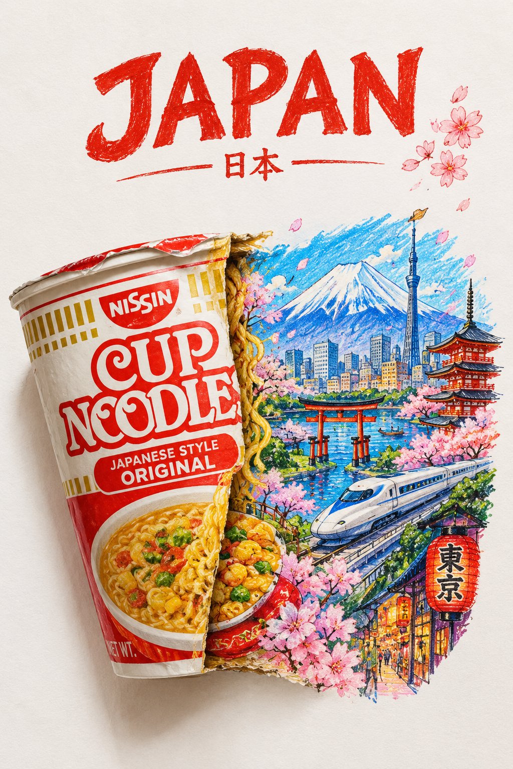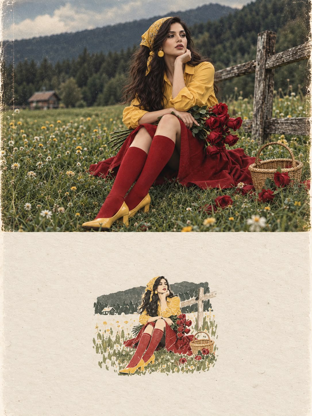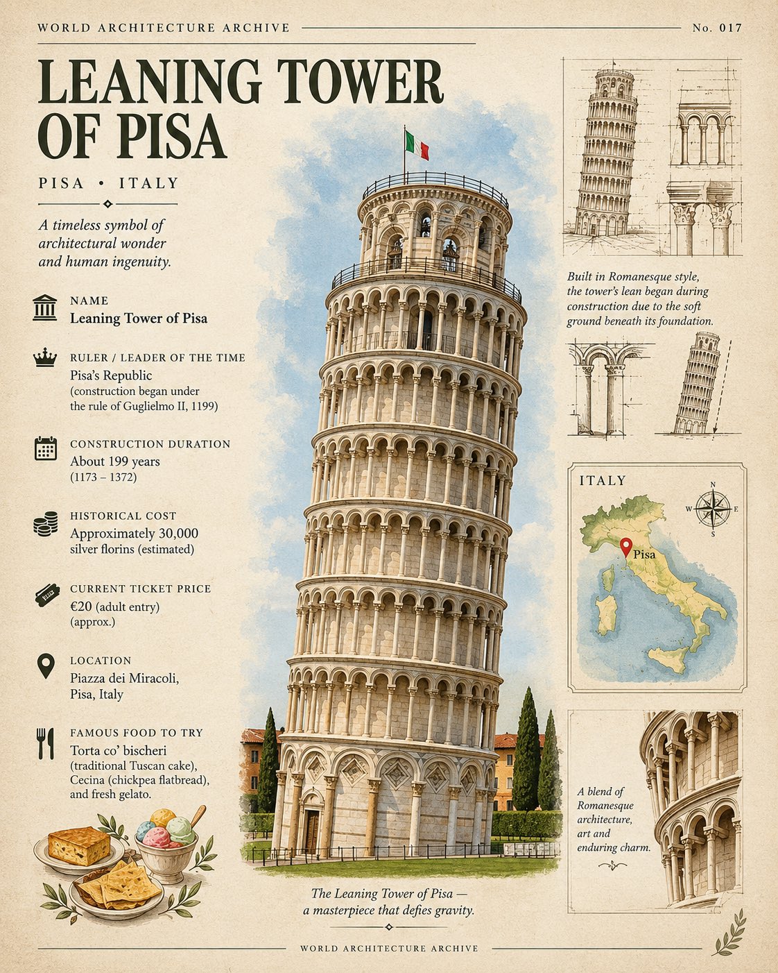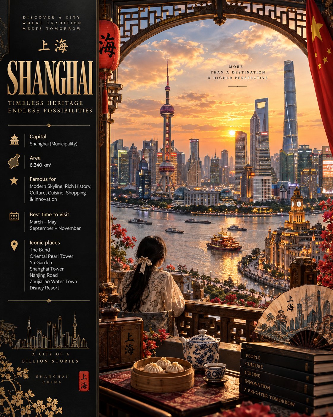
Typographic Sculpture Diptych Poster
 GPT Image 2.5OpenAIimage
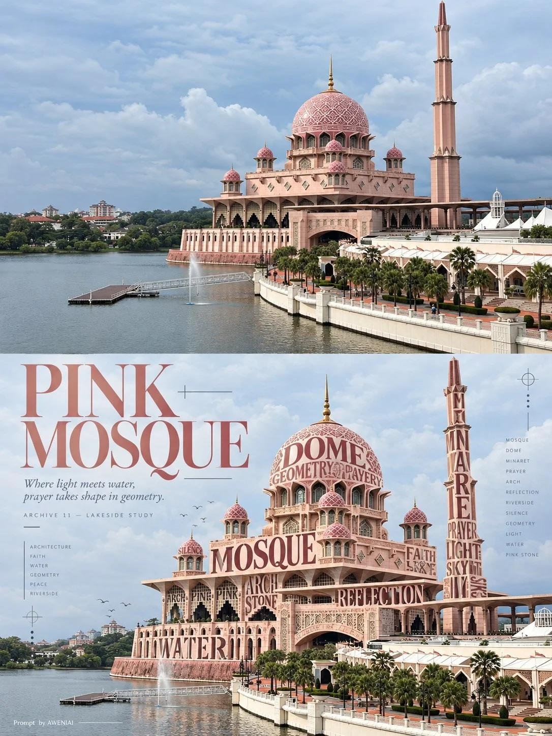
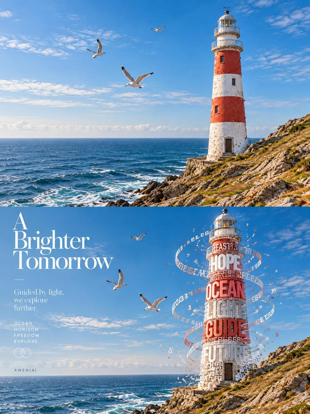
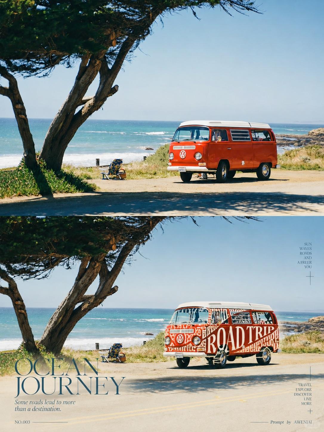
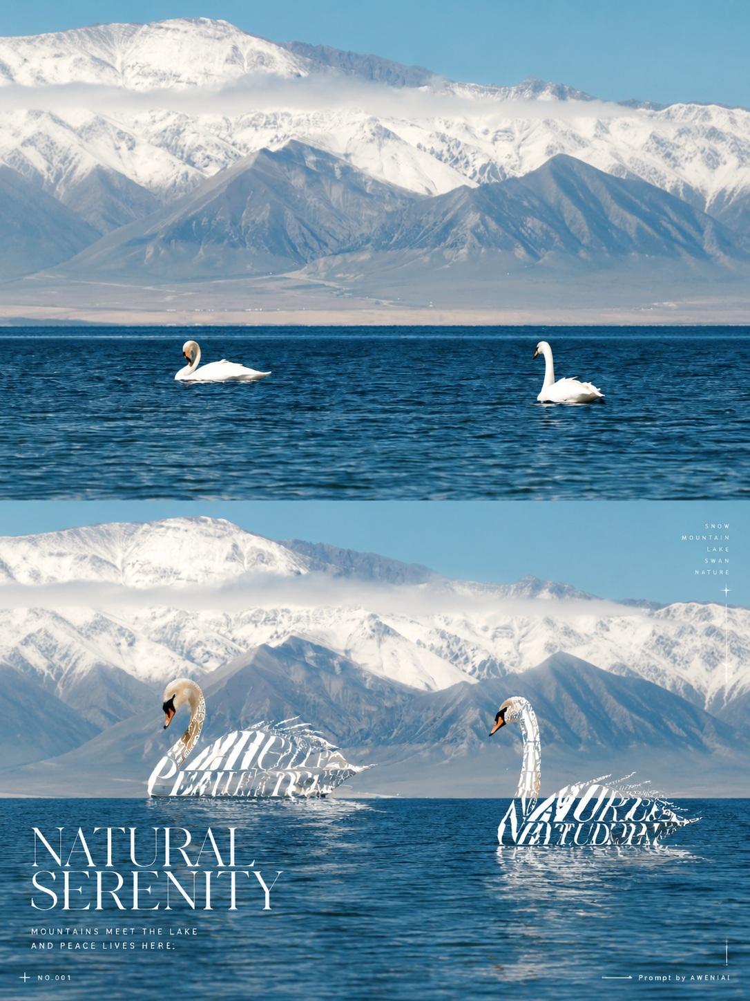
Transform each uploaded real photograph into a separate, independent 3:4 vertical experimental typography art diptych poster. Each photograph must be processed individually. Do not combine multiple images. The concept must adapt intelligently to any photographic subject. Overall Composition Divide the canvas into two perfectly equal horizontal sections, with an exact 50/50 split along the horizontal centerline. Both sections must occupy precisely half of the total canvas height. - No borders, cards, frames, or transition strips. - No newly designed elements may enter the upper half. - Maintain a seamless visual relationship between both halves. TOP HALF — Original Photography Preserve the original photograph with absolute fidelity. Maintain the subject's identity, number of subjects, silhouette, facial features, expression, posture, movement, materials, composition, perspective, background, original colors, and lighting. Permitted adjustments: - Very subtle photographic color grading. - Natural background extension when necessary to fill the canvas. Strict restrictions: - Never crop essential parts of the subject. - Never redraw, regenerate, or replace the subject. - Never introduce additional objects. - Never alter the original scene or its visual identity. - No typography, graphic elements, annotations, or decorative overlays. The original photograph must extend fully to the top, left, right, and central dividing edges. The entire upper half must remain purely photographic. BOTTOM HALF — Semantic Typography Sculpture Recreate the exact same photographic scene in the lower half, maintaining precise correspondence with the upper image in terms of subject placement, posture, proportions, perspective, spatial relationships, and original background. The defining artistic technique is typographic reconstruction through physical subtraction and replacement. First, analyze the subject's anatomy, structure, contours, and negative spaces. Identify suitable areas and physically remove approximately 25–60% of the subject's original photographic material. Allow the original background to become visible through these missing sections. Then reconstruct the removed portions using meaningful English words, short phrases, and individual letters that relate directly to the photographic subject. The typography must become an actual structural part of the subject, not text printed or pasted onto an intact photograph. Adapt this technique naturally to the photograph: - Clothing and fabric: typography follows folds, seams, and garment contours. - Animals: letters reconstruct sections of fur, feathers, or body contours. - Flowers and plants: typography replaces selected petals, leaves, or stems. - Mountains and landscapes: words follow slopes, ridgelines, and terrain. - Architecture: typography reconstructs selected facades, structural edges, and surfaces. - Objects: letters replace sections of cups, walls, vehicles, or other physical forms. Use your artistic judgment to determine the most visually compelling areas. Never apply a fixed template. Preserve the subject's essential recognition features and maintain believable physical connections between the remaining photographic elements and typographic structures. Typography as Physical Sculpture Shape the typography along the original object's curvature, geometry, and perspective. Create convincing three-dimensional structure through: - Variations in letter size and scale. - Contrasting font weights. - Controlled spacing and density. - Curved, rotated, and layered letterforms. - Selective overlapping and occlusion. - Perspective-aware positioning. - Carefully designed negative spaces. The letterforms must behave like tangible physical structures. Their strokes form the subject's missing material, while the gaps between letters reveal the original photographic background. Use 2–3 complementary typefaces selected from: - Delicate, high-contrast serif typography. - Condensed sans-serif typography. - Elegant italic or editorial display typography. Choose one dominant keyword that is accurate, meaningful, visually striking, and clearly legible. Extract the typography's color palette from the original photograph's dominant colors, ensuring sufficient contrast and visual harmony. Avoid plastic-looking 3D lettering, neon effects, heavy drop shadows, excessive extrusion, and meaningless or corrupted text. ART DIRECTION — Swiss Experimental Editorial Design Design the lower half as a sophisticated, masterfully art-directed Swiss experimental editorial composition. Use an asymmetric grid with five distinct levels of visual hierarchy. Hierarchy: 1. Primary focal point: The typographically reconstructed photographic subject. This must remain the dominant visual element. 2. Editorial headline: A bold, visually striking English title that complements the subject. 3. Poetic description: One or two concise, evocative sentences that add conceptual depth. 4. Micro archival information: A small, refined editorial reference number or classification. 5. Decorative graphic details: Minimal, precisely positioned visual accents. Possible graphic elements include: - Ultra-thin rules and lines. - Small geometric dots. - Crosshair registration marks. - Tiny directional arrows. - Vertical typography. - Minimal geometric symbols. - Subtle alignment markers. Create a confident balance between expressive typography and disciplined editorial structure. Use bold composition, precise alignment, generous negative space, and excellent readability. All graphic elements must remain within the lower half and must never obscure the reconstructed subject. Required Signature Include the following exact signature exactly once, positioned discreetly along the bottom edge or within the margins of the lower half: Prompt by AWENIAI Keep it small, elegant, and clearly reada
Details
- Type
- AI Image Prompts
- Aspect Ratio
- 3:4
- Updated
- Oct 31, 2026
Category
How to use this prompt
- 1Copy the full prompt with the copy button above.
- 2Open GPT Image 2.5 by OpenAI, or any image generator with a similar style range.
- 3Paste the prompt, then swap the subject and style keywords to match your idea.
- 4Match the example's settings (3:4 · Typography · Poster · Digital Art), then iterate — small wording changes shift the output a lot.
Frequently asked questions
Which AI model generated this image?
This image was generated with GPT Image 2.5 by OpenAI. The prompt on this page is the exact text used to create it.
What settings does this prompt use?
The example was generated with GPT Image 2.5 using: 3:4 · Typography · Poster · Digital Art. Reusing these settings gives the closest match.
How do I get similar results?
Copy the prompt as-is first, then replace only the subject while keeping the style, lighting, and composition keywords. Generate a few variations — outputs differ between runs.
Can I modify this prompt?
Yes. Prompts work best as starting points — adjust descriptors, aspect ratio, or style tags to make the output your own.