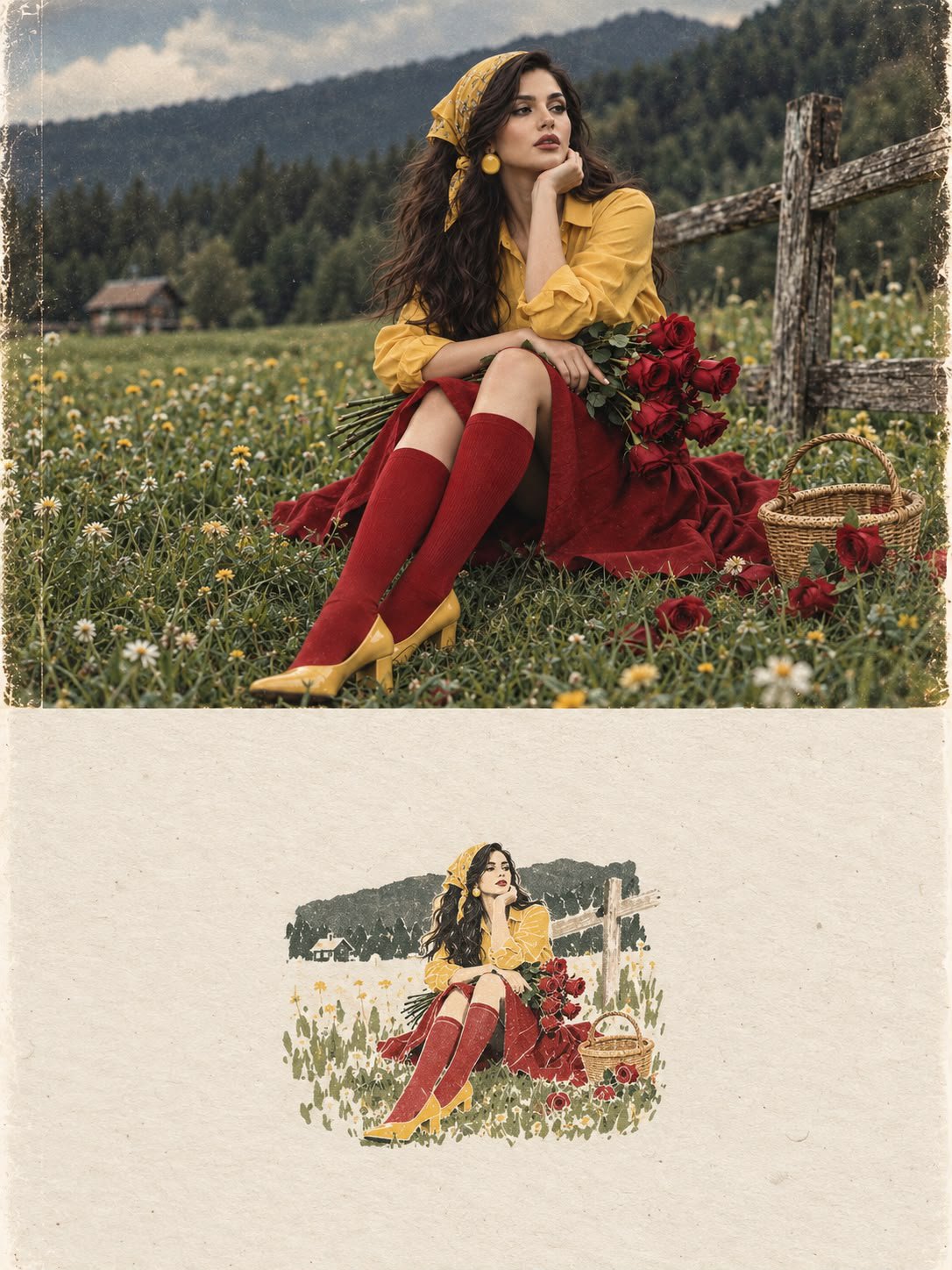
Split Editorial Photo and Handmade Art Poster
 GPT Image 2.5OpenAIimage
Create a sophisticated 3:4 vertical editorial art poster using the uploaded image as the primary visual reference. The composition must be divided into two perfectly balanced horizontal halves, with a precise 50/50 visual structure. UPPER 50% — ORIGINAL PHOTOGRAPH Place the reference photograph in the entire upper half. Keep it almost completely untouched. Preserve the exact: * facial identity and facial features * expression * hairstyle and hair length * skin tone and natural skin texture * body proportions * pose and posture * clothing and accessories * objects and environment * composition and perspective * lighting direction * colors and tonal relationships * photographic details and natural texture The photograph should still look like a real, authentic editorial photograph, with only subtle premium color grading and extremely restrained tonal refinement. Do not reinterpret, redraw, beautify, or stylize the photograph. LOWER 50% — HANDMADE ARTISTIC MEMORY Transform the main visual idea and recognizable elements of the photograph into a tiny, centered handmade-paper artwork. The artwork should occupy only approximately 10–20% of the entire lower half, leaving a large amount of intentional negative space around it. It should look as though an independent contemporary artist created a small visual memory of the photograph by hand. Use: * warm off-white handmade paper * subtle natural paper fibers * delicate imperfect ink-like outlines * simple flat acrylic-inspired shapes * organic, slightly uneven edges * restrained abstract simplification * visible handmade-print character * maximum 4 colors, carefully sampled from the original photograph * subtle variations in ink density * slightly imperfect registration and handmade imperfections Reduce the photograph into only its most recognizable visual elements. Do not reproduce every detail. The result should feel like a poetic visual memory rather than a literal miniature copy. The artwork must remain small, quiet, centered, and understated. TYPOGRAPHY Optional: add extremely minimal editorial typography only if it naturally enhances the composition. If typography is included, use: * very small scale * elegant contemporary editorial type * restrained spacing * subtle placement * no large headline * no commercial branding * no distracting text Typography must remain secondary to both the photograph and the miniature artwork. OVERALL ART DIRECTION The final composition should feel like a limited-edition independent contemporary art-book cover where the original photograph and its handmade artistic memory coexist within one carefully designed page. Visual references: contemporary art book, gallery editorial, quiet luxury, independent art publication, handmade print, refined minimalism, poetic negative space, museum catalog design, sophisticated editorial composition. The transition between the two halves should feel intentional and beautifully balanced, with a generous breathing space around the miniature artwork. IMPORTANT Do not make the lower artwork: * cartoonish * childish * watercolor * colored-pencil * 3D * glossy * photorealistic * overly digital * highly detailed * colorful * busy * commercial * decorative for its own sake Do not turn the entire image into an illustration. The upper half must remain a real photograph. The lower half must be a tiny handmade artistic interpretation. The contrast between photographic realism above and restrained handmade abstraction below is the central concept. Final format: 3:4 vertical, sophisticated contemporary editorial art poster, high-end print quality, precise 50/50 horizontal division.
Details
- Type
- AI Image Prompts
- Aspect Ratio
- 3:4
- Updated
- Sep 29, 2026
How to use this prompt
- 1Copy the full prompt with the copy button above.
- 2Open GPT Image 2.5 by OpenAI, or any image generator with a similar style range.
- 3Paste the prompt, then swap the subject and style keywords to match your idea.
- 4Match the example's settings (3:4 · Poster · Fashion · Portrait), then iterate — small wording changes shift the output a lot.
Frequently asked questions
Which AI model generated this image?
This image was generated with GPT Image 2.5 by OpenAI. The prompt on this page is the exact text used to create it.
What settings does this prompt use?
The example was generated with GPT Image 2.5 using: 3:4 · Poster · Fashion · Portrait. Reusing these settings gives the closest match.
How do I get similar results?
Copy the prompt as-is first, then replace only the subject while keeping the style, lighting, and composition keywords. Generate a few variations — outputs differ between runs.
Can I modify this prompt?
Yes. Prompts work best as starting points — adjust descriptors, aspect ratio, or style tags to make the output your own.
![Create a premium vertical 4:5 editorial travel poster for [COUNTRY], where the outline of the countr — AI image prompt — GPT Image 2.5](https://cdn.ahaprompt.app/harvest-media/import-1789369064970-j9jipe.jpg)
![Create a sophisticated, dreamy editorial magazine cover titled “[COUNTRY NAME] — A COUNTRY IN ONE DR — AI image prompt — GPT Image 2.5](https://cdn.ahaprompt.app/harvest-media/import-1789368946131-xefjx1.jpg)
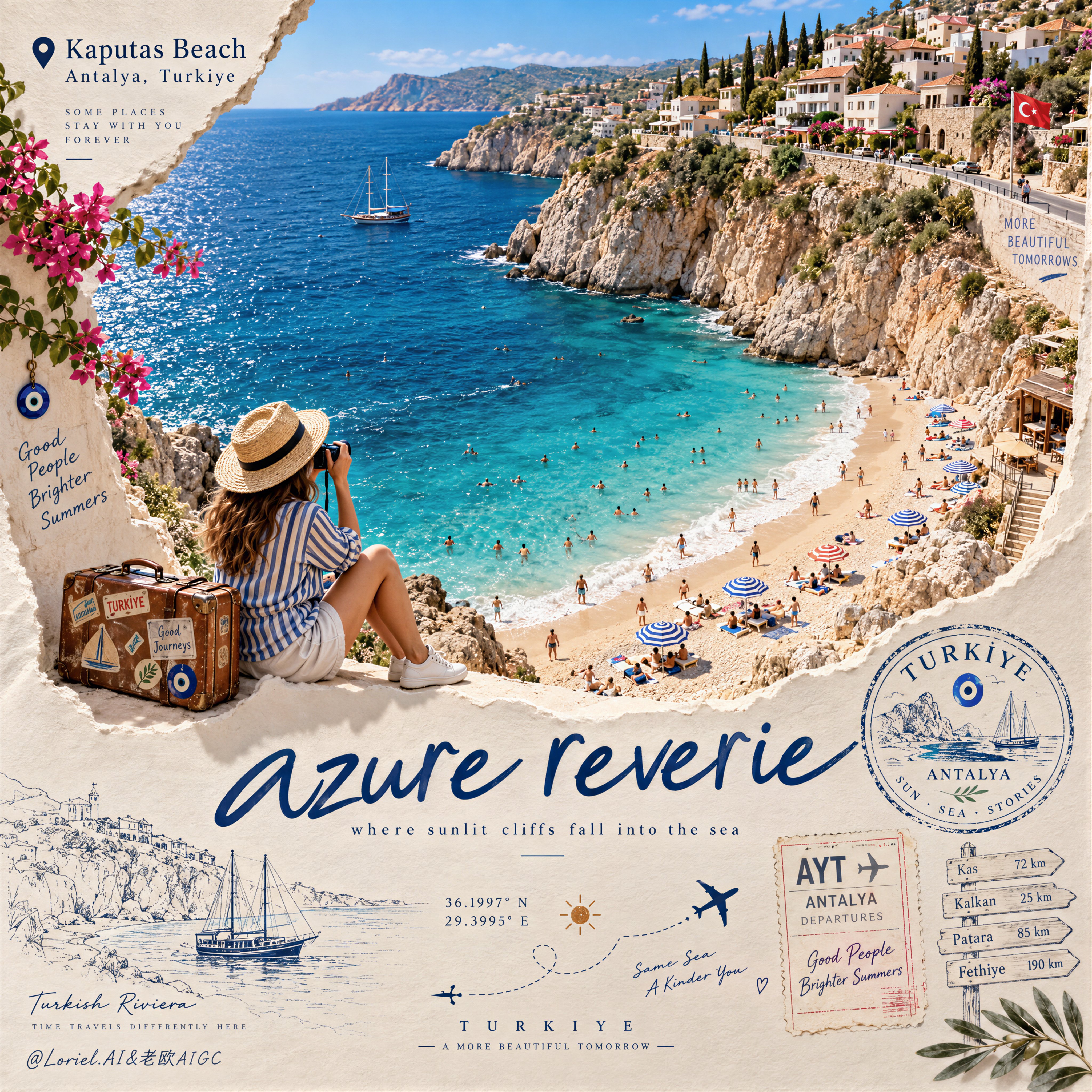
![Create a premium educational travel poster featuring [STRUCTURE NAME], one of the world’s most famou — AI image prompt — GPT Image 2.5](https://cdn.ahaprompt.app/harvest-media/import-1789369131185-x1iuzs.jpg)
![Create a premium cinematic luxury tourism poster for [COUNTRY / DESTINATION] in a STRICT 4:5 vertica — AI image prompt — GPT Image 2.5](https://cdn.ahaprompt.app/harvest-media/import-1789369001673-dctuvc.jpg)