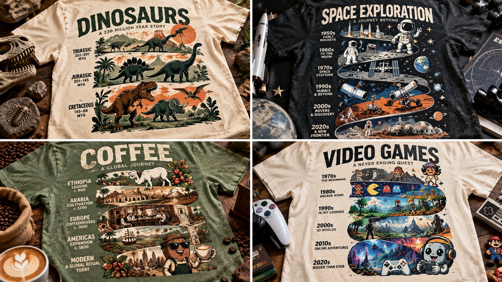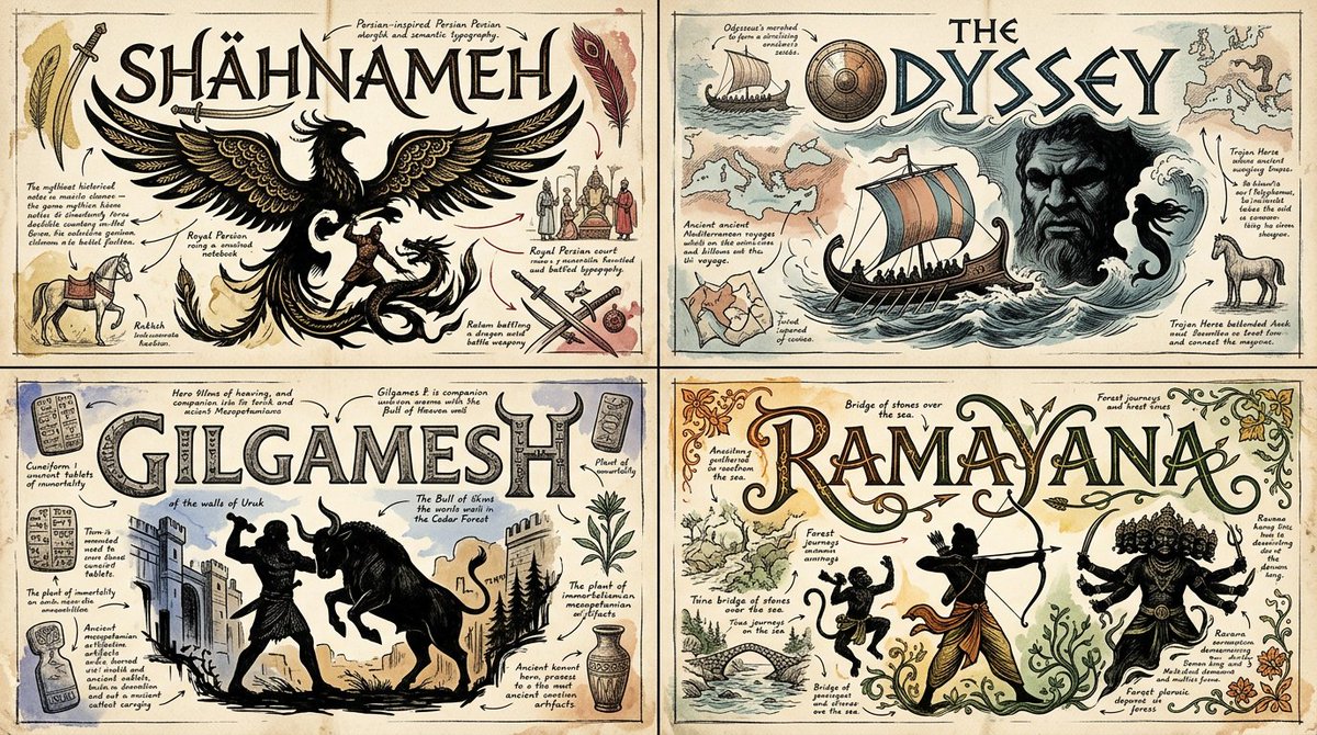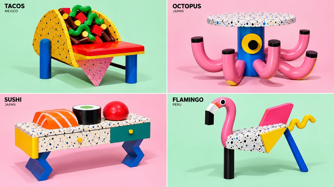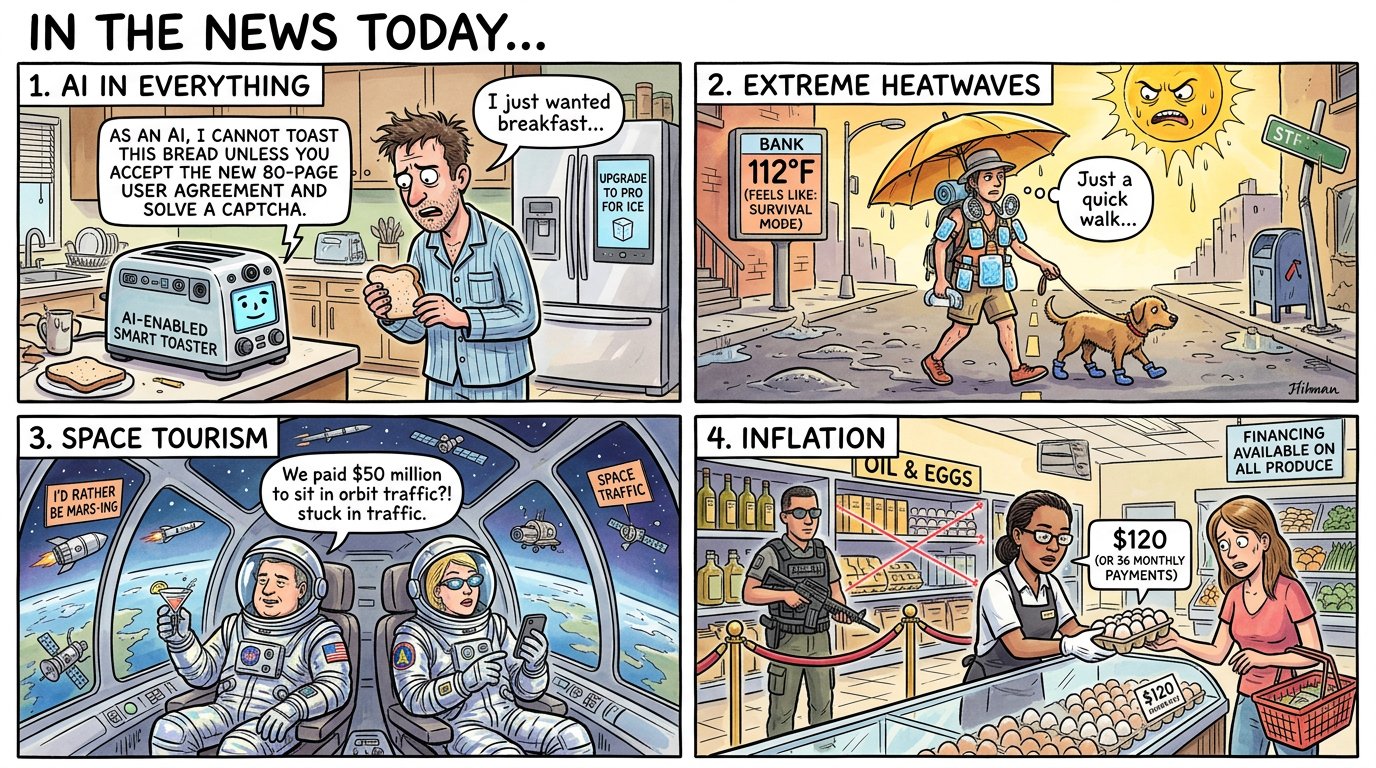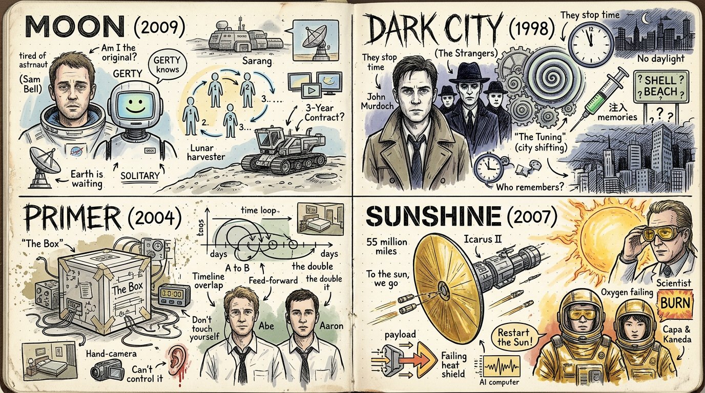
Sci-fi movies sketchbook doodle grid
2x2 grid, 16:9, do this for 4 under rated sci-fi movies: Style = { MEDIUM: Hand-drawn sketchbook spread, visual biography map, notebook doodle infographic, scrapbook-style idea journal. SURFACE: Open cream notebook pages, dotted-grid paper, worn page edges, slight paper grain, soft archival texture. LINEWORK: Black ink pen drawing, loose crosshatching, hand-lettered labels, imperfect doodle outlines, energetic sketch marks. COLOR: Mostly monochrome ink with sparse watercolor or marker accents in muted peach, pale blue, soft yellow, faded red, dusty green, and warm beige. COMPOSITION: Dense two-page spread filled with portraits, icons, inventions, arrows, symbols, timelines, labels, speech bubbles, diagrams, and memory fragments. TYPOGRAPHY: Casual handwritten titles, labels, notes, arrows, underlines, callouts, small captions, and playful emphasis marks. MOOD: Curious, biographical, inventive, educational, intimate, nostalgic, messy-but-organized, and highly inspectable. - Convert the subject into a hand-drawn notebook spread that explains its life, history, system, mythology, process, or cultural impact. - Preserve the subject’s core identity, but break it into many small doodled moments, icons, milestones, influences, tools, places, quotes, diagrams, and symbolic objects. - Replace polished realism with black ink sketch lines, hatching, dotted texture, handwritten notes, and small imperfect doodles. - Convert major events, features, powers, products, traits, discoveries, or transformations into illustrated callouts connected by arrows and winding paths. - Reinterpret relationships and timelines as visual flow: arrows, loops, roads, spirals, gears, maps, banners, labels, and notebook annotations. - Convert important people, creatures, objects, locations, ideas, or components into small portrait doodles, simplified icons, diagrams, badges, and comic-like vignettes. - Use sparse color only to highlight key areas, not to fully render the whole image. - Place everything across an open notebook or journal spread so the page itself becomes the environment. - Let the result feel like someone obsessively studied the subject and filled a sketchbook with everything important about it. - Use a two-page open notebook layout when possible. - Place the largest focal image, portrait, object, logo, or main symbol on one side. - Fill the surrounding space with smaller doodles, arrows, captions, miniature diagrams, and symbolic references. - Use the opposite page for a roadmap, process flow, timeline, ecosystem, invention chain, or idea network. - Keep the composition dense but navigable: clusters should feel intentionally grouped. - Leave small pockets of breathing room so the page does not become visual noise. - Use hand-drawn icons for abstract ideas. - Use arrows and motion paths to show progress, influence, causality, or transformation. - Use spirals, gears, lightbulbs, clouds, stars, hearts, boxes, banners, speech bubbles, and small symbols where they support the subject. - Turn complex objects into simplified sketchbook diagrams. - Let small imperfections, uneven line weight, and casual mark-making remain visible. - Every doodle should feel related to the subject, not random decoration. - Use handwritten labels, not clean digital type. - Mix small captions, large casual headings, arrows, short notes, and underlined phrases. - Keep text short and punchy. - Use labels to explain icons, milestones, relationships, or key concepts. - Allow playful missive-like notes, but avoid long paragraphs. - If exact text is not provided, infer concise subject-relevant labels and diagram notes. - Keep black ink dominant. - Use faded pastel accents sparingly for emphasis. - Favor muted watercolor fills, marker washes, and lightly tinted areas. - Avoid full-color rendering, neon palettes, glossy gradients, or saturated cartoon color. - Let cream paper and black linework define the main visual identity. - Render as a physical sketchbook page photographed or scanned. - Use visible paper texture, notebook fold, subtle page wear, and dotted-grid background. - Use crosshatching and line density for shading instead of digital gradients. - Keep drawings loose but legible. - Make the image rewarding to inspect closely, with many tiny connected ideas. - Balance educational clarity with personal sketchbook charm. - Open sketchbook biography-map aesthetic. - Dense black-ink doodles, handwritten notes, arrows, icons, portraits, diagrams, and sparse muted color accents. - Feels like a personal research journal, creative mind map, invention history, or illustrated life story. - Informative, nostalgic, playful, handmade, and highly inspectable. - Avoid photorealism. - Avoid clean corporate infographic styling. - Avoid glossy 3D, toy, clay, plush, anime, or low-poly rendering. - Avoid overly polished vector art. - Avoid empty minimal pages. - Avoid random unrelated doodles. - Avoid dense unreadable text blocks. - Avoid bright saturated full-color poster treatment. - Avoid perfect symmetry; preserve lively notebook spontaneity. }
Details
- Type
- AI Image Prompts
- Aspect Ratio
- 43:24
- Updated
- Oct 21, 2026
Category
How to use this prompt
- 1Copy the full prompt with the copy button above.
- 2Open Nano Banana 2.1 by Google, or any image generator with a similar style range.
- 3Paste the prompt, then swap the subject and style keywords to match your idea.
- 4Match the example's settings (43:24 · Watercolor · Vintage · Sketch), then iterate — small wording changes shift the output a lot.
Frequently asked questions
Which AI model generated this image?
This image was generated with Nano Banana 2.1 by Google. The prompt on this page is the exact text used to create it.
What settings does this prompt use?
The example was generated with Nano Banana 2.1 using: 43:24 · Watercolor · Vintage · Sketch. Reusing these settings gives the closest match.
How do I get similar results?
Copy the prompt as-is first, then replace only the subject while keeping the style, lighting, and composition keywords. Generate a few variations — outputs differ between runs.
Can I modify this prompt?
Yes. Prompts work best as starting points — adjust descriptors, aspect ratio, or style tags to make the output your own.