LogoAhaPrompt
  • Prompts
  • Featured
  • Models
  • Submit
  • Blog
AhaPromptAhaPrompt

AI Prompts for Images, Video & Audio — Every Model, One Library

Built withLogoNEXTY.DEV
Explore
  • All Prompts
  • Featured Prompts
  • Image Prompts
  • Video Prompts
  • Audio Prompts
  • AI Models
  • Submit a Prompt
  • Blog
Languages
  • English
  • 中文
  • 日本語
  • 한국어

Copyright © 2026 AhaPrompt All rights reserved.

Privacy PolicyTerms of Service
HomeAI Prompt LibraryAI Image PromptsMemphis Group Food Furniture Grid
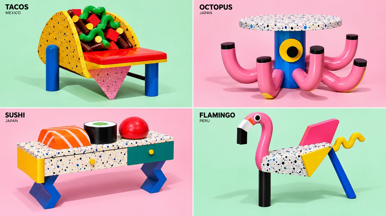
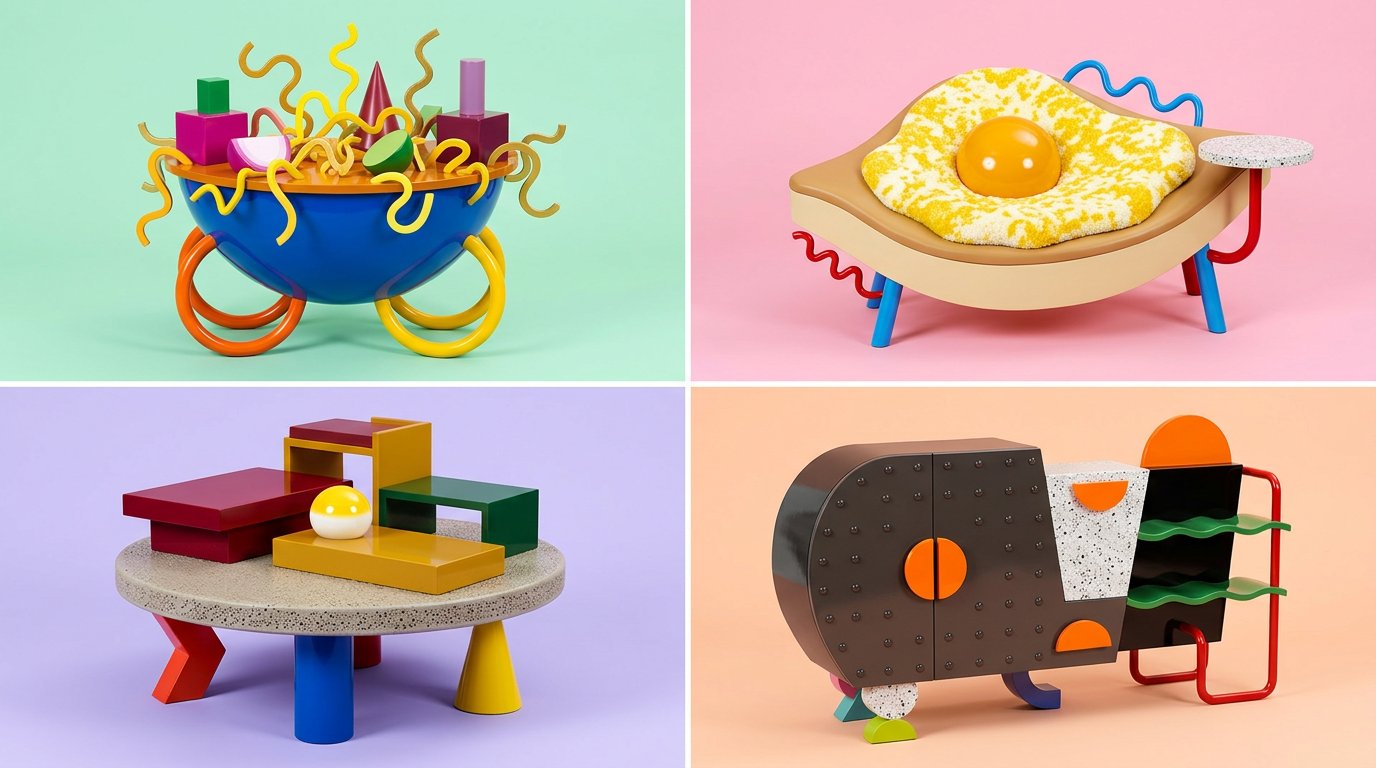
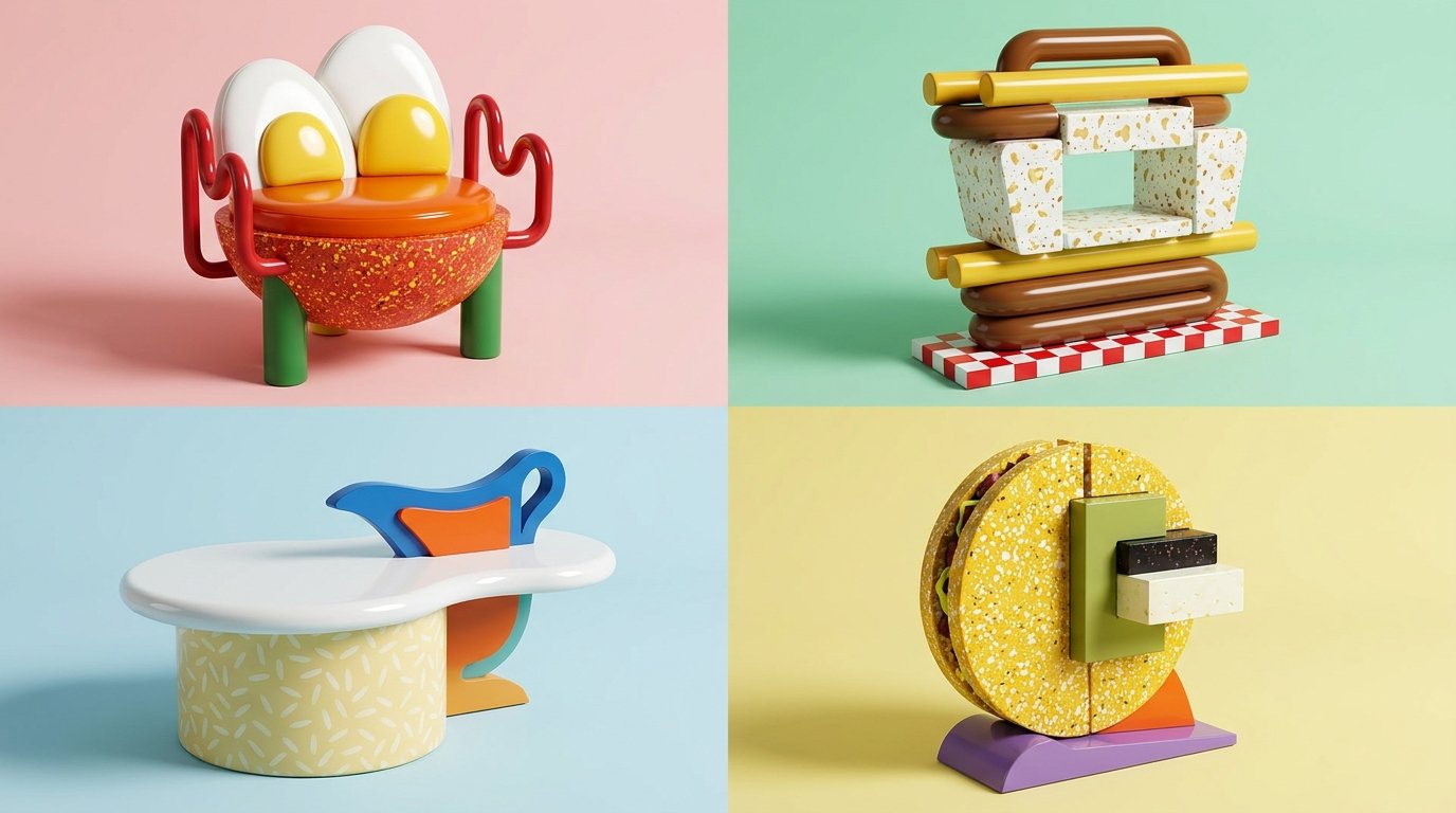
Memphis Group Food Furniture Grid — AI image prompt — Nano Banana 2.1 — Pop Art, 3D Render, Vintage - 1

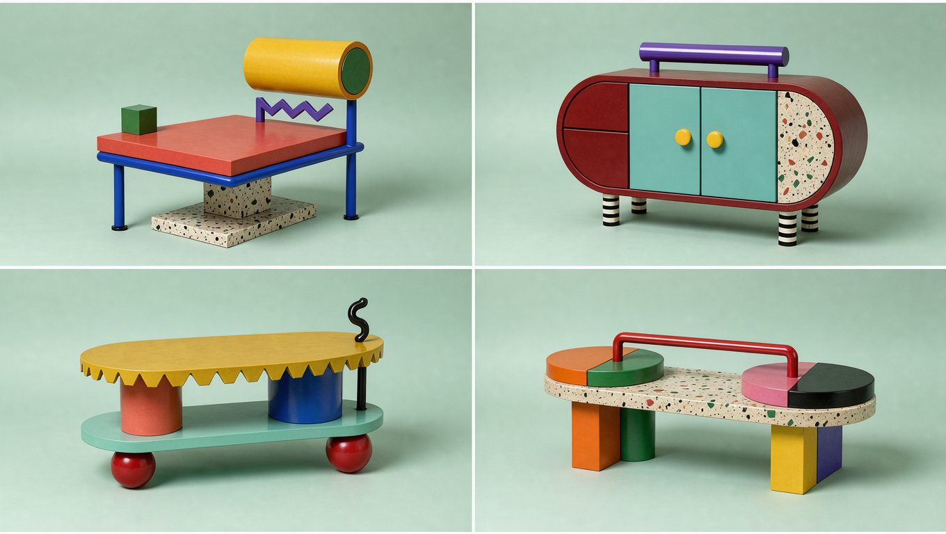
Memphis Group Food Furniture Grid — AI image prompt — Nano Banana 2.1 — Pop Art, 3D Render, Vintage - 2
Memphis Group Food Furniture Grid — AI image prompt — Nano Banana 2.1 — Pop Art, 3D Render, Vintage - 3
Memphis Group Food Furniture Grid — AI image prompt — Nano Banana 2.1 — Pop Art, 3D Render, Vintage - 4

Memphis Group Food Furniture Grid

GoogleNano Banana 2.1Googleimage

2x2 grid, do this for 4 underrated international dishes, 16:9 INPUT: [ANIMAL / MODERN GADGET / FOOD] SYSTEM: Render the input as a piece of 1980s Memphis Group designer furniture. Infer the geometric primitive logic, bold clashing colors, terrazzo patterns, and playful asymmetry. SEMANTIC SOLVE: MEMPHIS_AUTOPSY = (INFER(geometry FROM primary shapes + thick cylinders + squiggly accents + asymmetrical balance) ::5) + (INFER(materials FROM glossy laminates + speckled terrazzo + painted wood + tubular steel) ::4) + (INFER(design_psychology FROM anti-minimalism + 80s pop-art rebellion + joyful absurdity) ::4) - (muted colors + realistic object shapes + traditional woodwork) ::-4 COMPOSITION: The input completely abstracted into a bizarre but functional-looking piece of avant-garde 80s furniture. Set against a clean pastel pink or mint green studio backdrop. STYLE DNA: Ettore Sottsass design ::0.40 1980s Memphis Milano ::0.30 C4D abstract architecture ::0.20 hard studio flash photography ::0.10 OUTPUT: Bold, vibrant, structurally fascinating, crisp edges, highly graphic and shareable. NEGATIVE: no vintage grain, no messy rooms, no glowing neon, no natural organic shapes, no boring gray palettes.

Details
Type
AI Image Prompts
Aspect Ratio
84:47
Updated
Oct 13, 2026
Category
Pop Art3D RenderVintage
Source

How to use this prompt

  1. 1Copy the full prompt with the copy button above.
  2. 2Open Nano Banana 2.1 by Google, or any image generator with a similar style range.
  3. 3Paste the prompt, then swap the subject and style keywords to match your idea.
  4. 4Match the example's settings (84:47 · Pop Art · 3D Render · Vintage), then iterate — small wording changes shift the output a lot.

Frequently asked questions

Which AI model generated this image?

This image was generated with Nano Banana 2.1 by Google. The prompt on this page is the exact text used to create it.

What settings does this prompt use?

The example was generated with Nano Banana 2.1 using: 84:47 · Pop Art · 3D Render · Vintage. Reusing these settings gives the closest match.

How do I get similar results?

Copy the prompt as-is first, then replace only the subject while keeping the style, lighting, and composition keywords. Generate a few variations — outputs differ between runs.

Can I modify this prompt?

Yes. Prompts work best as starting points — adjust descriptors, aspect ratio, or style tags to make the output your own.
More Nano Banana 2.1 prompts

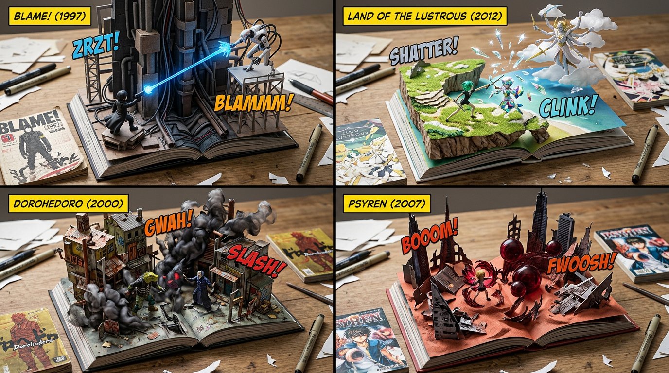
2x2 grid, 16:9, do this for underrated manga  that most people don't know about: SELECT * FROM Macro — AI image prompt — Nano Banana 2.1
GoogleNano Banana 2.1
2x2 grid, 16:9, do this for underrated manga that most people don't know about: SELECT * FROM Macro_PopUp_Comics WHERE franchise = '[COMIC_SERIES]' AND publication_era = '[YEAR]' AND ground_plane = 'Wooden_Desk_Surface' AND foundational_assets = ARRAY[ 'Open_Hardcover_Book_Laying_Flat', 'Vintage_Flat_Comic_Book_Issue_Laying_Nearby' ] AND structural_3D_extrusion = ( SELECT iconic_battleground FROM Lore_DB WHERE series = '[COMIC_SERIES]' FORMAT AS '3D_Environment_Emerging_From_Paper_Pages' ) AND character_assets = ( SELECT heroes, villains, powers FROM Lore_DB WHERE series = '[COMIC_SERIES]' AND era = '[YEAR]' FORMAT AS '3D_Vinyl_Action_Figures_With_Translucent_Resin_Power_FX' ) AND typographic_overlays = ARRAY[ 'Floating_3D_Plastic_Text_"[SFX_TEXT]"', 'Floating_Flat_Yellow_Title_Box_Top_Corner' ];
Details
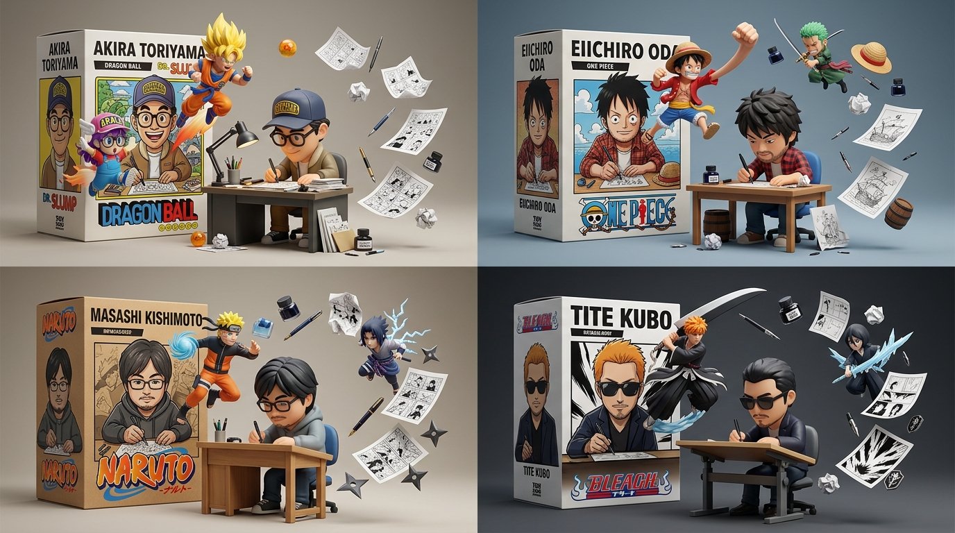
2x2 grid, 16:9, do this for 4 famous manga: B₁  CREATOR FIGURE AT CRAFT (master)   a stylized 3D fig — AI image prompt — Nano Banana 2.1
GoogleNano Banana 2.1
2x2 grid, 16:9, do this for 4 famous manga: B₁ CREATOR FIGURE AT CRAFT (master) a stylized 3D figurine of the creator at their craft station (drafting desk, pen, tablet, typewriter) in a focused working pose; toy/vinyl material. ¬B₁ = no figure / realistic human / idle figure / no craft station. B₂ OWN PACKAGING IN COMPOSITION the creator's retail box — title + box art depicting the creator — present in‑frame as a set piece; figure and box art share the same character design. ¬B₂ = no box / box unrelated / box art ≠ figure. B₃ CREATIONS ESCAPE THE BOX the works the creator made (characters/creatures/panels) burst OUT of the box art into 3D space in dynamic poses; ≥2 escapees. ¬B₃ = creations static on the box / no escape / creations unrelated to the creator. B₄ CRAFT ARTIFACTS ORBIT floating artifacts of the craft (pages/panels, ink bottles, erasers, crumpled drafts, sprites) suspended around, implying a stopped moment. ¬B₄ = no artifacts / artifacts resting on ground / unrelated props. B₅ STUDIO TOY PRESENTATION clean neutral studio background, soft light, collectible‑figure render quality, legible box title. ¬B₅ = busy background / flat render / illegible title / harsh light. η HONEST TOY vinyl/plastic sheen, box print texture, panel linework legible. FORBIDDEN = realistic human · no box · box art mismatch · static creations · no escape · no artifacts · busy bg · illegible title · flat render
Details
2x2 grid, 16:9, do this for 4 under rated sci-fi movies: Style = {
  
  MEDIUM: Hand-drawn sketchboo — AI image prompt — Nano Banana 2.1
GoogleNano Banana 2.1
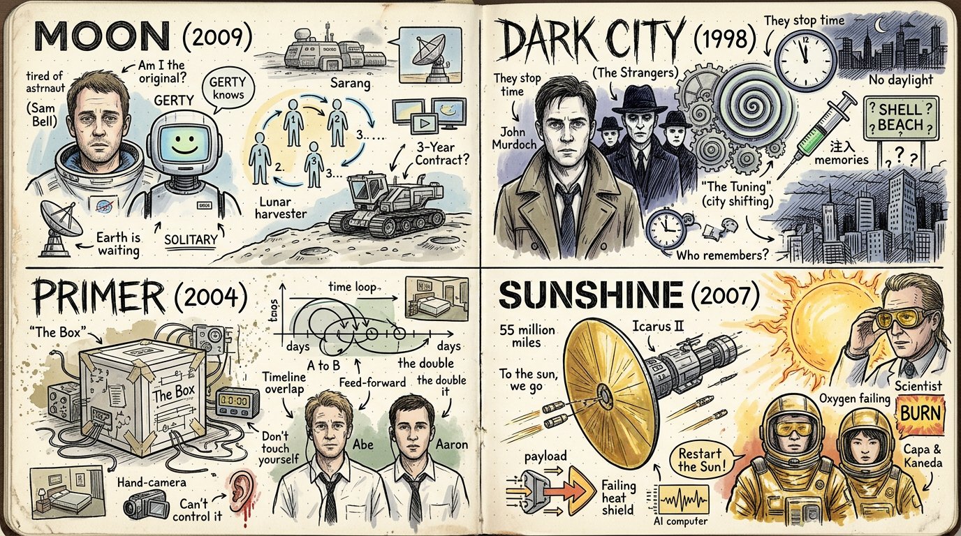
2x2 grid, 16:9, do this for 4 under rated sci-fi movies: Style = { MEDIUM: Hand-drawn sketchbook spread, visual biography map, notebook doodle infographic, scrapbook-style idea journal. SURFACE: Open cream notebook pages, dotted-grid paper, worn page edges, slight paper grain, soft archival texture. LINEWORK: Black ink pen drawing, loose crosshatching, hand-lettered labels, imperfect doodle outlines, energetic sketch marks. COLOR: Mostly monochrome ink with sparse watercolor or marker accents in muted peach, pale blue, soft yellow, faded red, dusty green, and warm beige. COMPOSITION: Dense two-page spread filled with portraits, icons, inventions, arrows, symbols, timelines, labels, speech bubbles, diagrams, and memory fragments. TYPOGRAPHY: Casual handwritten titles, labels, notes, arrows, underlines, callouts, small captions, and playful emphasis marks. MOOD: Curious, biographical, inventive, educational, intimate, nostalgic, messy-but-organized, and highly inspectable. - Convert the subject into a hand-drawn notebook spread that explains its life, history, system, mythology, process, or cultural impact. - Preserve the subject’s core identity, but break it into many small doodled moments, icons, milestones, influences, tools, places, quotes, diagrams, and symbolic objects. - Replace polished realism with black ink sketch lines, hatching, dotted texture, handwritten notes, and small imperfect doodles. - Convert major events, features, powers, products, traits, discoveries, or transformations into illustrated callouts connected by arrows and winding paths. - Reinterpret relationships and timelines as visual flow: arrows, loops, roads, spirals, gears, maps, banners, labels, and notebook annotations. - Convert important people, creatures, objects, locations, ideas, or components into small portrait doodles, simplified icons, diagrams, badges, and comic-like vignettes. - Use sparse color only to highlight key areas, not to fully render the whole image. - Place everything across an open notebook or journal spread so the page itself becomes the environment. - Let the result feel like someone obsessively studied the subject and filled a sketchbook with everything important about it. - Use a two-page open notebook layout when possible. - Place the largest focal image, portrait, object, logo, or main symbol on one side. - Fill the surrounding space with smaller doodles, arrows, captions, miniature diagrams, and symbolic references. - Use the opposite page for a roadmap, process flow, timeline, ecosystem, invention chain, or idea network. - Keep the composition dense but navigable: clusters should feel intentionally grouped. - Leave small pockets of breathing room so the page does not become visual noise. - Use hand-drawn icons for abstract ideas. - Use arrows and motion paths to show progress, influence, causality, or transformation. - Use spirals, gears, lightbulbs, clouds, stars, hearts, boxes, banners, speech bubbles, and small symbols where they support the subject. - Turn complex objects into simplified sketchbook diagrams. - Let small imperfections, uneven line weight, and casual mark-making remain visible. - Every doodle should feel related to the subject, not random decoration. - Use handwritten labels, not clean digital type. - Mix small captions, large casual headings, arrows, short notes, and underlined phrases. - Keep text short and punchy. - Use labels to explain icons, milestones, relationships, or key concepts. - Allow playful missive-like notes, but avoid long paragraphs. - If exact text is not provided, infer concise subject-relevant labels and diagram notes. - Keep black ink dominant. - Use faded pastel accents sparingly for emphasis. - Favor muted watercolor fills, marker washes, and lightly tinted areas. - Avoid full-color rendering, neon palettes, glossy gradients, or saturated cartoon color. - Let cream paper and black linework define the main visual identity. - Render as a physical sketchbook page photographed or scanned. - Use visible paper texture, notebook fold, subtle page wear, and dotted-grid background. - Use crosshatching and line density for shading instead of digital gradients. - Keep drawings loose but legible. - Make the image rewarding to inspect closely, with many tiny connected ideas. - Balance educational clarity with personal sketchbook charm. - Open sketchbook biography-map aesthetic. - Dense black-ink doodles, handwritten notes, arrows, icons, portraits, diagrams, and sparse muted color accents. - Feels like a personal research journal, creative mind map, invention history, or illustrated life story. - Informative, nostalgic, playful, handmade, and highly inspectable. - Avoid photorealism. - Avoid clean corporate infographic styling. - Avoid glossy 3D, toy, clay, plush, anime, or low-poly rendering. - Avoid overly polished vector art. - Avoid empty minimal pages. - Avoid random unrelated doodles. - Avoid dense unreadable text blocks. - Avoid bright saturated full-color poster treatment. - Avoid perfect symmetry; preserve lively notebook spontaneity. }
Details
2x2 grid, 16:9, do this for 4 international classics like Shahnameh: INPUT = "$SUBJECT"

STYLE_DNA = — AI image prompt — Nano Banana 2.1
GoogleNano Banana 2.1
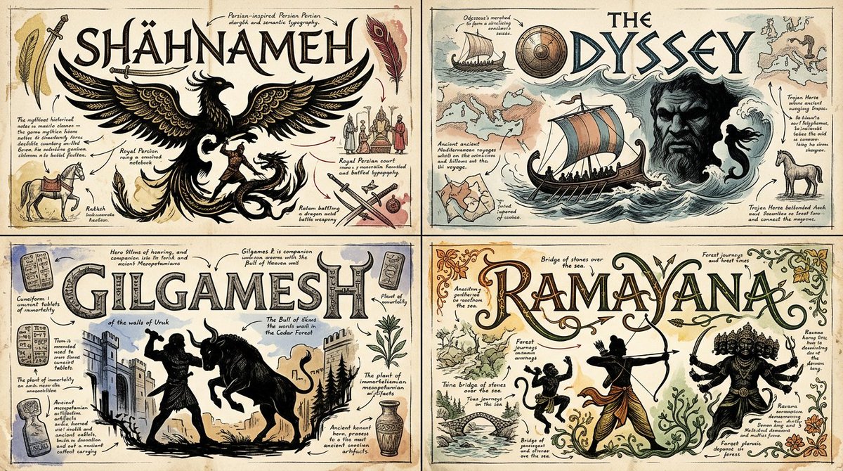
2x2 grid, 16:9, do this for 4 international classics like Shahnameh: INPUT = "$SUBJECT" STYLE_DNA = { "ILLUSTRATED_NOTEBOOK": { "medium": "aged ivory paper + editorial ink illustration", "marks": [ "fine black outlines", "crosshatched portraits", "muted hand-colored drawings", "scribbled arrows", "miniature explanatory doodles", "handwritten captions" ], "composition": "information flows through connected visual discoveries" }, "SEMANTIC_TYPOGRAPHY": { "medium": "bespoke vector-like calligram", "structure": [ "letterforms contain symbols", "letters morph into recognizable objects", "typographic strokes encode meaning", "organic and geometric letterform fusion", "color communicates conceptual character" ], "principle": "the word visually demonstrates its meaning" }, "MYTHIC_SILHOUETTE": { "medium": "high-contrast black-and-white emblem", "structure": [ "heroic silhouettes", "negative-space integration", "flowing ornamental forms", "symbolic animals or figures when relevant", "elegant literary typography" ], "principle": "image and lettering share one silhouette" } } def extract_semantic_dna(subject): return { "identity": infer_recognizable_identity(subject), "narrative": infer_meaningful_story(subject), "symbols": infer_authentic_visual_associations(subject), "geometry": infer_iconic_shapes(subject), "personality": infer_emotional_character(subject), "relationships": infer_semantic_connections(subject) } def construct_calligram(subject, dna): word = choose_primary_label(subject) candidates = generate_letterform_transformations( text=word, symbols=dna["symbols"], geometry=dna["geometry"] ) return optimize( candidates, objective={ "legibility": 0.40, "semantic_relevance": 0.30, "visual_elegance": 0.20, "originality": 0.10 }, preserve_letter_order=True, preserve_recognizable_word=True ) def illustrate_knowledge(dna): return create_ink_drawings( hero=dna["identity"], companions=select_meaningful_symbols(dna["symbols"]), connections=dna["relationships"], drawing_style="antique editorial sketchbook", detail="small but inspectable" ) def fuse_silhouettes(calligram, dna): return integrate_negative_space( main_word=calligram, visual_symbols=dna["geometry"], methods=[ "shared outlines", "figure-ground reversal", "letter-object morphing", "contour continuation", "internal silhouette cutouts" ], avoid="forced illegible letter distortion" ) def generate_artwork(subject): dna = extract_semantic_dna(subject) calligram = construct_calligram(subject, dna) knowledge = illustrate_knowledge(dna) emblem = fuse_silhouettes(calligram, dna) return compose( dominant_form=emblem, secondary_elements=knowledge, narrative_flow=infer_best_connector(dna), typographic_system={ "display": "expressive semantic calligram", "supporting": "elegant illustrated labels", "microtext": "restrained handwritten notes" }, material="cream archival paper and black ink", accents=infer_semantically_meaningful_colors(subject), complexity="high internal intelligence, clean overall silhouette", output="one integrated visual identity artwork" ) RESULT = generate_artwork(INPUT) CONSTRAINTS: - Do not hard-code a person, invention, myth, or historical era. - Do not add unrelated decorative symbols. - Preserve accurate spelling and readable lettering. - Use literal imagery only when semantically justified. - Favor clever figure-ground transformations over visual clutter. - Keep the overall composition coherent as one artwork.
Details
WITH input(topic) AS (VALUES (:TOPIC)),
spec AS (SELECT chronological_eras(topic) er, mascot(topic)  — AI image prompt — Nano Banana 2.1
GoogleNano Banana 2.1
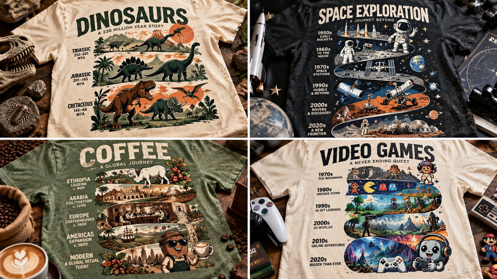
WITH input(topic) AS (VALUES (:TOPIC)), spec AS (SELECT chronological_eras(topic) er, mascot(topic) ma, spine_word(topic) sp, two_inks(topic) ik FROM input) SELECT tee_mockup(totem=>stack(er, ma, sp), inks=>ik, negative=>0.5, garment=>fabric_realism(weave=>TRUE)) AS totem_timeline_tee FROM spec -- T₁: CHECK ( tiers chronological AND connected silhouette ) -- T₂: CHECK ( mascot present AND spine legible ) -- T₃: CHECK ( two inks AND negative ≈ 0.5 ) -- T₄: CHECK ( garment mockup with weave ) -- T₅: CHECK ( era cues match years )
Details
2x2 grid, 16:9, do this for 4 famous scientists: CONCEPT ANCHOR 1:
"Experimental geometric wordmark  — AI image prompt — Nano Banana 2.1
GoogleNano Banana 2.1
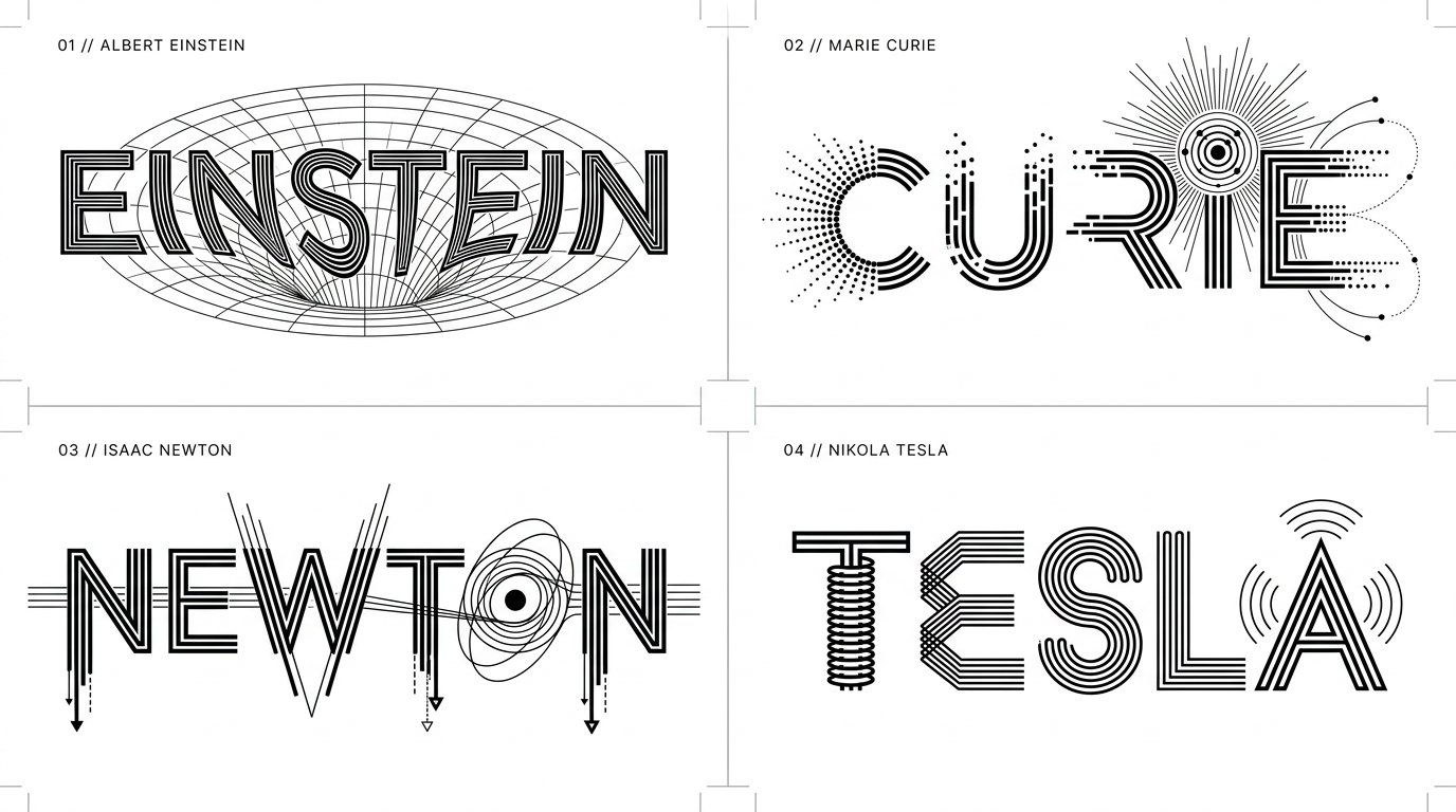
2x2 grid, 16:9, do this for 4 famous scientists: CONCEPT ANCHOR 1: "Experimental geometric wordmark — custom-built uppercase letterforms, monoline geometry, alternating thick and thin strokes, deliberately interrupted character segments, mechanically precise shapes, optical alignment, architectural negative space." :: CONCEPT ANCHOR 2: "Semantic symbol typography — recognizable visual symbols integrated directly into the anatomy of letters, including modified counters, transformed stems, symbolic crossbars, illustrative terminals, and conceptual ligatures." :: CONCEPT ANCHOR 3: "Vintage scientific and engineering lettering — parallel technical lines, concentric rings, rotational diagrams, rhythmic stroke repetition, exploded mechanical shapes, technical-drawing precision, scientific schematic clarity." :: CONCEPT ANCHOR 4: "Swiss modernist minimalist identity — immaculate white background, pure black graphic elements, striking negative space, precisely controlled typography, asymmetrical visual balance, intellectually playful reduction." INSTRUCTION: Find the precise visual intersection of these four concepts. Ignore the literal technological terminology and subject matter in the references. Extract only their visual design DNA. Create an extraordinary experimental typographic wordmark for $ SUBJECT. The letters must become an intelligent visual expression of the subject's defining meaning. This is not ordinary text decorated with icons. The word itself must transform into a symbolic piece of visual engineering. SUBJECT ANALYSIS: First determine: 1. The most recognizable word or short phrase representing $ SUBJECT. 2. Its strongest defining visual characteristic. 3. Its dominant conceptual properties. 4. Three to five relevant visual symbols. 5. The geometric behaviors that best communicate the subject. 6. Which letters offer the most promising opportunities for transformation. SEMANTIC TRANSFORMATION: If the subject represents: MOTION: Use directional strokes, displacement, repeated contours, kinetic breaks, and rhythmic geometry. NATURE: Translate growth, branching, organic repetition, and environmental forms into letter anatomy. SCIENCE: Use scientific geometry, orbital paths, schematic forms, diagrams, and precision linework. MUSIC: Incorporate visual rhythm, wave structures, oscillations, and musical relationships. ARCHITECTURE: Transform stems and counters into arches, structural supports, beams, and architectural voids. TECHNOLOGY: Use mechanical precision, circuitry, modular systems, communication patterns, or interface geometry. EMOTION: Use spatial tension, expansion, compression, contrast, distortion, or expressive continuity. HISTORY: Use carefully selected era-specific geometric or typographic influences. ABSTRACT CONCEPTS: Invent a meaningful visual metaphor and translate it into letter construction. OTHER SUBJECTS: Infer a unique transformation appropriate to the subject's actual meaning. LETTERFORM CONSTRUCTION: Start with a custom geometric uppercase wordmark. Transform selected characters through: - parallel stroke multiplication - interrupted or fragmented stems - negative-space symbols - custom ligatures - extended horizontal bars - geometric letter substitutions - contour-line repetition - directional stroke bending - optical illusion effects - embedded subject-specific pictograms - carefully controlled line thickness - mathematical relationships between shapes Preserve character recognition. At least two characters should exhibit meaningful custom transformations. Every transformation must serve the concept rather than exist as decoration. COMPOSITION: Present ONE unified wordmark centered within a generous white canvas. Use a horizontal composition for longer names. Use a compact stacked lockup when the text naturally benefits from multiple lines. Allow selected characters to extend beyond the standard letter height when necessary. Maintain carefully balanced optical spacing. Let negative space contribute as much as the black geometry. VISUAL STYLE: - pure black lettering - clean white background - high-contrast vector-like precision - crisp geometric contours - controlled thin parallel lines - variable stroke density - subject-driven symbolic elements - elegant modular structure - visually clever typographic surprises STRICT RULES: No unnecessary illustrations. No photographic objects. No gradients. No 3D extrusion. No decorative backgrounds. No mockups. No unrelated symbols. No default electrical motifs. Do not sacrifice readability for cleverness. OUTPUT: A visually ingenious minimalist typographic identity for $ SUBJECT where the wordmark itself becomes a symbolic machine, diagram, sculpture, or optical expression of the subject. Elegant from far away. Surprisingly intelligent up close. Immediately recognizable. Distinctly original.
Details
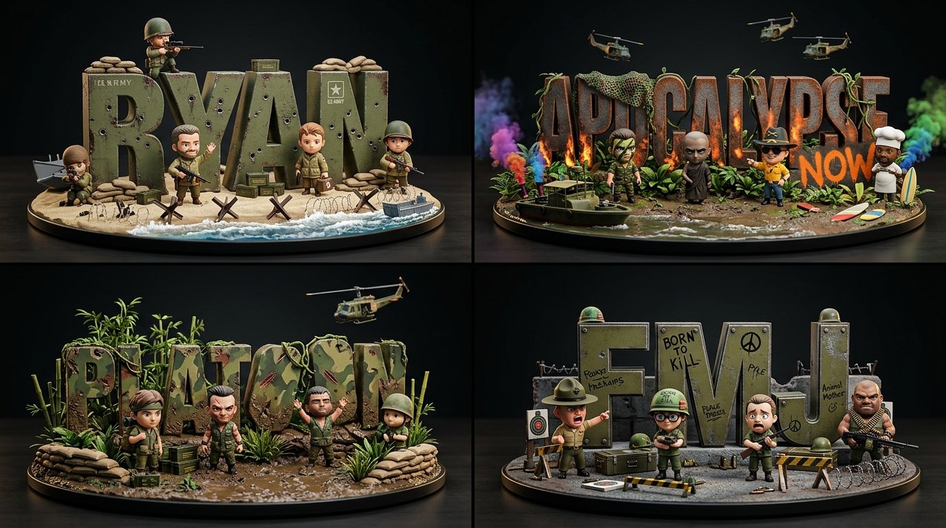
2x2 grid, 16:9, do this for 4 famous war movies: class ChibiWordCrewDiorama:
    def __init__(self,  — AI image prompt — Nano Banana 2.1
GoogleNano Banana 2.1
2x2 grid, 16:9, do this for 4 famous war movies: class ChibiWordCrewDiorama: def __init__(self, topic): self.topic = topic self.word = derive_short_display_word(topic) self.crew = infer_topic_archetypes( topic, count="adaptive 3..7" ) self.letter_material = infer_material_dna(topic) self.palette = infer_color_palette(topic) self.props = infer_miniature_props(topic) self.wardrobe = infer_collectible_outfits(topic) self.poses = infer_playful_interactions(topic) def typography(self): return { "text": self.word, "form": "oversized freestanding block letters", "material": self.letter_material, "surface": "topic-derived wear, stickers, paint, dents, patches, seams, marks" } def figures(self): return [ { "role": archetype, "pose": infer_pose_for_role(archetype), "outfit": infer_outfit_for_role(archetype, self.topic), "prop": infer_prop_for_role(archetype, self.topic), "expression": infer_expression_for_role(archetype) } for archetype in self.crew ] def render(self): return """ Render as a premium chibi collectible word-diorama: oversized tactile typography, cute expressive crew figures, tiny props, dark studio lighting, shallow toy-photography depth. """
Details
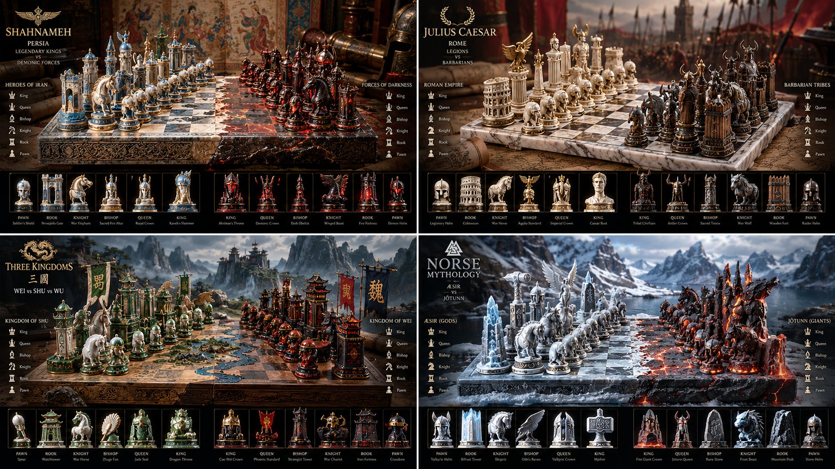
Input Variable: [INSERT FANDOM OR RIVALRY HERE] (e.g., Jedi vs Sith, Marvel vs DC, Horde vs Alliance — AI image prompt — Nano Banana 2.1
GoogleNano Banana 2.1
Input Variable: [INSERT FANDOM OR RIVALRY HERE] (e.g., Jedi vs Sith, Marvel vs DC, Horde vs Alliance) System Instruction: Generate a hyper-realistic, isometric 3D render of a "Collector's Edition Chess Set." Use the following logic: 1. Faction Analysis: Faction A (White/Left): Identify the protagonists. Define their "Core Aesthetic" (e.g., Organic, Round, Blue/Green). Faction B (Black/Right): Identify the antagonists. Define their "Core Aesthetic" (e.g., Industrial, Sharp, Red/Purple). The Board: The surface must represent the terrain where they battle (e.g., Grass vs. Charred Earth; Marble vs. Obsidian). 2. The Pieces (The Artifact Rule): DO NOT GENERATE CHARACTERS. Do not make tiny action figures. Abstract Totems: The pieces must be Stylized Artifacts representing the faction. Pawns: Their signature grunt weapon or symbol (e.g., Clone Trooper Helmets vs. Droid Heads; Kunai vs. Shuriken). Rooks/Bishops: Iconic architecture or heavy weaponry (e.g., Towers of Gondor vs. Barad-dûr). Knights: The "Beast" or "Vehicle" of that faction (e.g., X-Wing vs. TIE Fighter; Chocobo vs. Magitek Armor). King/Queen: The symbol of leadership (e.g., The Iron Throne vs. The Crown; A specific hilt of a legendary sword). 3. Visual Syntax: Materials: Render the pieces in "Premium Materials" appropriate to the lore. (e.g., Jedi = Chrome & Plasteel; Sith = Corroded Iron & Red Kyber Crystal). Effect: A magical/energy particle effect flares at the center of the board where the two sides meet. Lighting: Cinematic, dramatic "God Rays" illuminating the center interaction. 4. Technical Specs: Camera: Isometric, Macro. Render: Unreal Engine 5 style, Ray-tracing enabled, "Merchandise Photography" aesthetic. Output: 1:1 Aspect Ratio, 8k Resolution.
Details
Browse all Nano Banana 2.1 promptsExplore AI Image Prompts