Premium Minimalist City Travel Poster
 GPT Image 2OpenAIimage
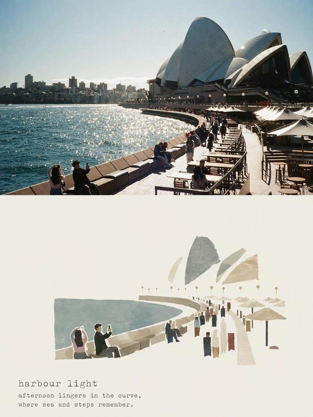
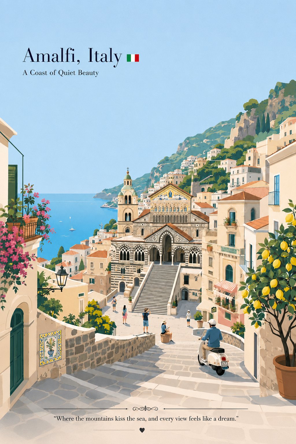
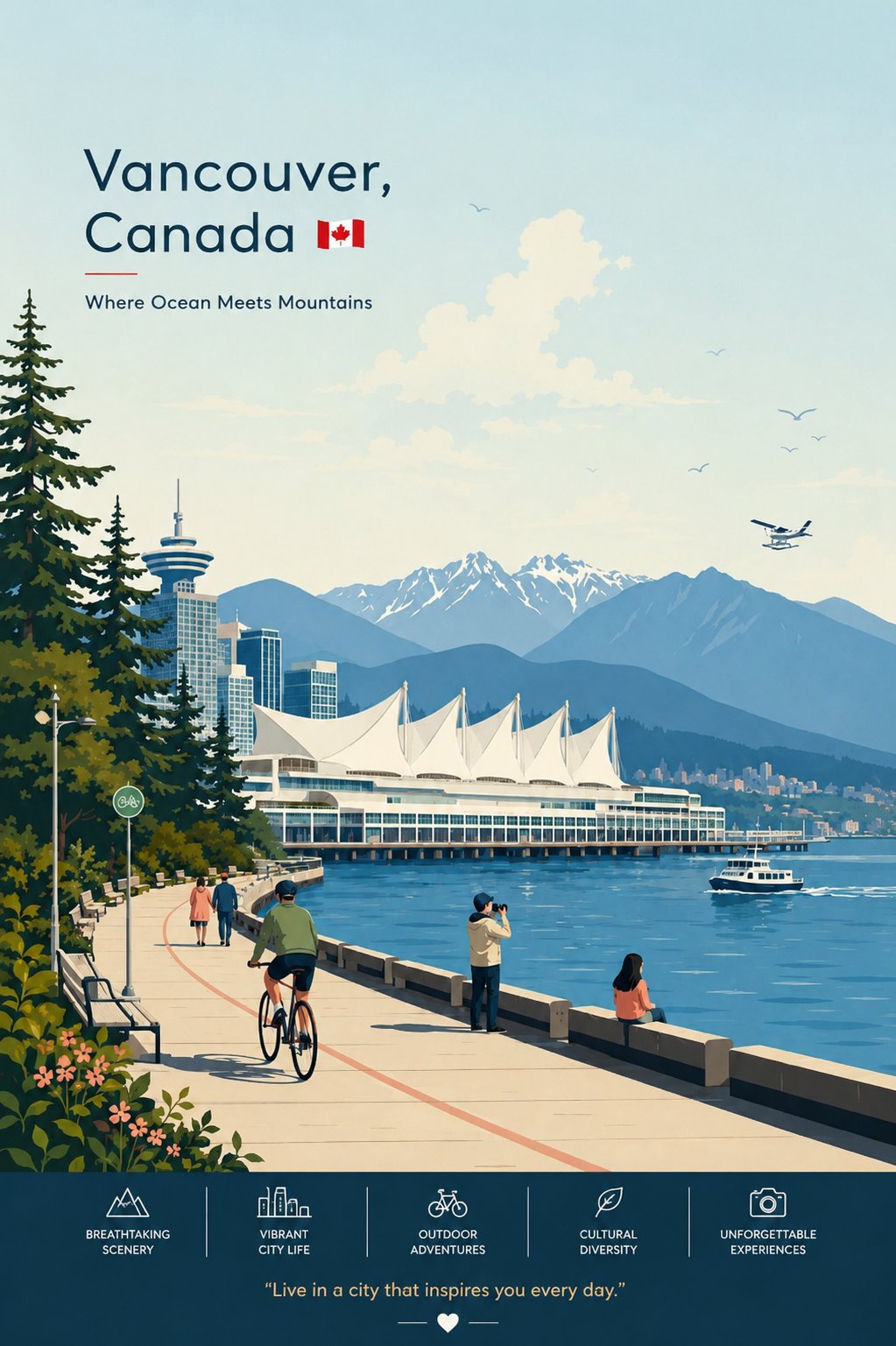
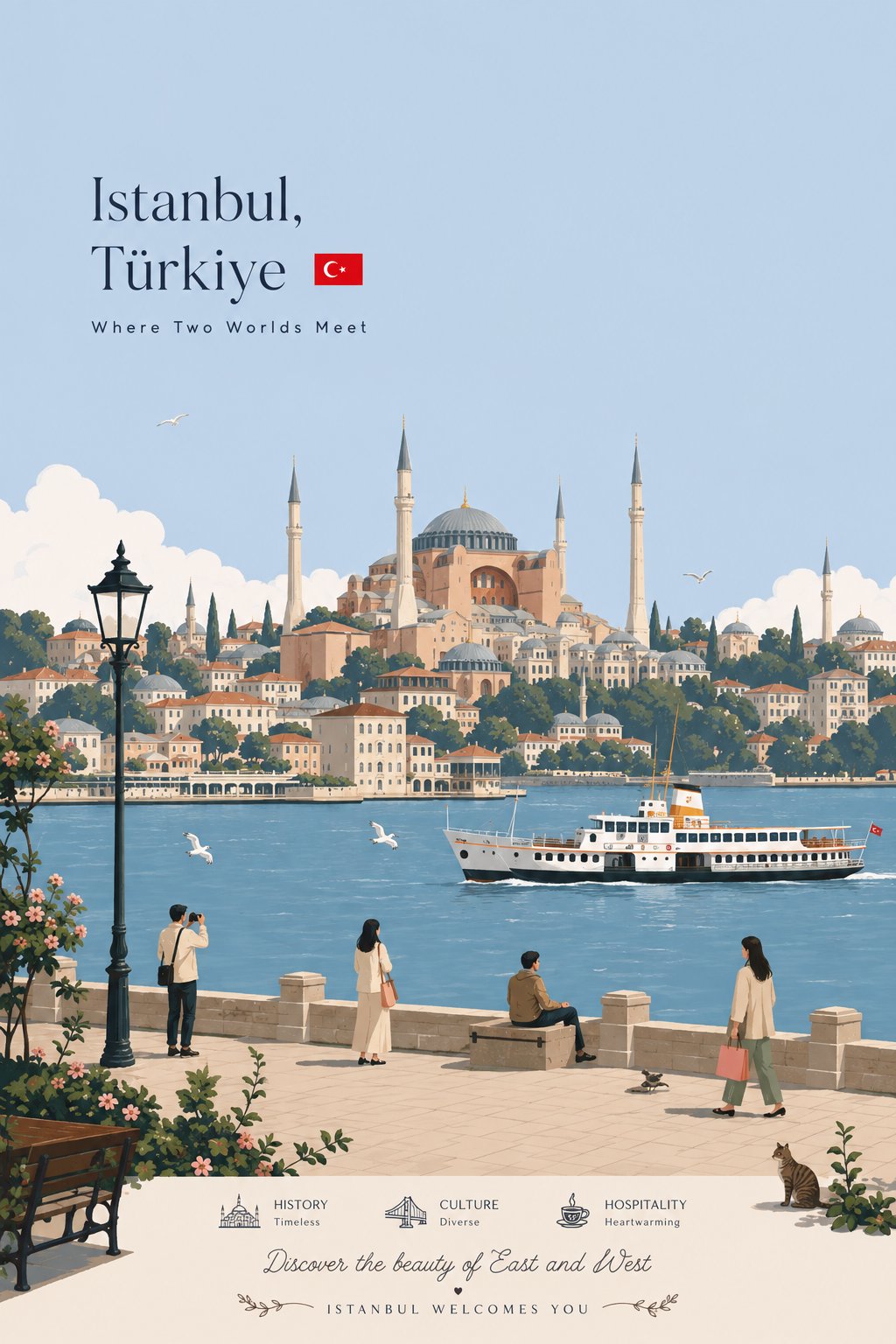
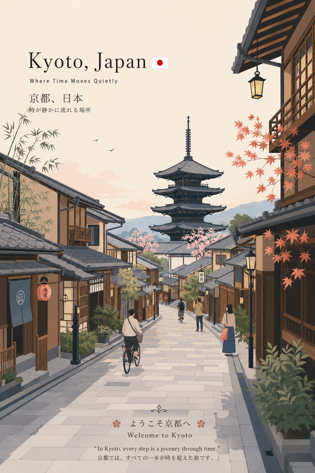
Premium minimalist flat-vector travel poster for [CITY_NAME], 3:4 vertical format. Create an original, elegant travel poster that reflects the authentic visual personality and atmosphere of [CITY_NAME]. The composition should feel specially designed for this city instead of looking like a repeated or generic travel template. CITY IDENTITY First understand the distinctive visual character of [CITY_NAME] and construct the scene around these five elements: 1. A recognizable landmark, architectural detail, or important skyline feature. 2. A characteristic local method of transportation or movement. 3. One subtle everyday lifestyle moment that feels authentic to the city. 4. A native plant, natural landscape, coastline, river, mountain, or environmental feature. 5. A viewpoint and composition that naturally belong to the geography and identity of the city. The complete scene arrangement should vary from city to city. Do not repeatedly use identical object placement or the same visual formula. Possible compositions include: harbor viewpoint, historic narrow street, riverside garden, coastal walkway, elevated city overlook, lively market passage, tram-lined avenue, ferry terminal, botanical setting, heritage square, beach promenade, cultural plaza, or skyline terrace. Choose whichever composition most naturally represents [CITY_NAME]. TYPOGRAPHY Place “[CITY_NAME]” in the upper-left area with generous, clean negative space. Add one short, sophisticated English tagline inspired by the atmosphere, culture, or character of the city. Typography should remain understated, editorial, spacious, and premium. Never let the text overpower the artwork. VISUAL HIERARCHY Use one iconic landmark or architectural element as the primary focal point. Support it with only 2–4 carefully chosen local elements. Every additional detail should reinforce the identity and sense of place. Avoid collections of landmarks or postcard-style collages. Keep the artwork visually calm, selective, and intentional. PEOPLE Include only 3–6 small-scale figures. Give each person a believable activity connected to local life, such as: walking through a historic lane, cycling, waiting for public transport, sketching architecture, boarding a ferry, reading outdoors, taking a quiet photograph, carrying beach equipment, browsing a local market, or jogging beside the water. Avoid crowds and avoid making one individual the main character. Figures should blend naturally into the environment. LOCAL CHARACTER Use city-specific elements only when they genuinely fit [CITY_NAME]: - local transportation - architecture - street furniture - vegetation - small signs or wayfinding - local food references - recreational activities - pavement markings - cultural details Transport and signage should remain subtle. Instead of repeatedly using a large signboard, incorporate details naturally through a small transit marker, station clock, ferry information panel, bike symbol, painted road marking, beach flag, or understated metro icon. ART DIRECTION Japanese stationery-inspired aesthetic, luxury sticker illustration, premium commercial vector artwork, modern editorial travel branding, clean delicate outlines, consistent line weight, simple geometric forms, flat-color illustration, soft rounded shapes, balanced visual rhythm, high-end minimalist postcard design. COLOR SYSTEM Build the atmosphere primarily with: pale powder blue, soft sky blue, mist blue, and cool airy blue tones. Balance these with: warm ivory, cream, soft beige, muted sage, gray-green, and understated architectural neutrals. Use dusty rose or muted blush only for tiny visual accents such as flowers, clothing details, small signs, awnings, or decorative objects. Colors should stay soft, sophisticated, slightly desaturated, and visually harmonious. MOOD Fresh, airy, peaceful, refined, contemporary, elegant. The final artwork should feel like a premium boutique travel postcard or luxury lifestyle brand illustration, with generous breathing room and a relaxed, authentic sense of place. IMPORTANT QUALITY RULES Every city must maintain its own distinctive visual identity. Change the camera angle, scene structure, landmark placement, foreground treatment, and supporting details according to the individual character of the city. Do not simply replace [CITY_NAME] inside an existing composition. NEGATIVE PROMPT No photorealism. No realistic photography. No watercolor. No painterly brushwork. No gradients. No heavy shadows. No dramatic cinematic lighting. No paper texture. No excessive detail. No cluttered background. No landmark collage. No crowded streets. No oversized characters. No dominant hero character. No repetitive café composition. No fixed signboard position. No identical foreground treatment. No generic tourist-poster formula. No copied layout from another city. No unnecessary decorative elements.
Details
- Type
- AI Image Prompts
- Aspect Ratio
- 2:3
- Updated
- Aug 25, 2026
Category
How to use this prompt
- 1Copy the full prompt with the copy button above.
- 2Open GPT Image 2 by OpenAI, or any image generator with a similar style range.
- 3Paste the prompt, then swap the subject and style keywords to match your idea.
- 4Match the example's settings (2:3 · Poster · Minimalist · Cityscape), then iterate — small wording changes shift the output a lot.
Frequently asked questions
Which AI model generated this image?
This image was generated with GPT Image 2 by OpenAI. The prompt on this page is the exact text used to create it.
What settings does this prompt use?
The example was generated with GPT Image 2 using: 2:3 · Poster · Minimalist · Cityscape. Reusing these settings gives the closest match.
How do I get similar results?
Copy the prompt as-is first, then replace only the subject while keeping the style, lighting, and composition keywords. Generate a few variations — outputs differ between runs.
Can I modify this prompt?
Yes. Prompts work best as starting points — adjust descriptors, aspect ratio, or style tags to make the output your own.