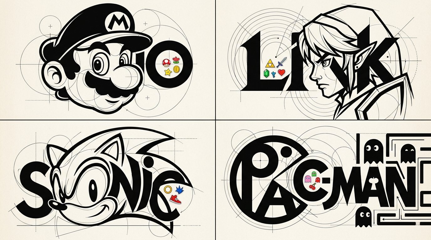
Living Letterform Caricature Game Posters

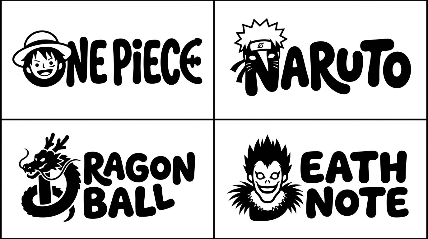
2x2 grid, 16:9, do this for 4 famous games: STYLE: LIVING LETTERFORM CARICATURES Create an experimental typographic character design of [SUBJECT] where recognizable anatomy and lettering become one unified graphic sculpture-like illustration. C₀ IDENTITY PRESERVATION Identify the subject's most recognizable physical features, including hairstyle silhouette, nose, eyes, jawline, eyebrows, and signature expression. Reconstruct these characteristics using geometric letterforms and controlled negative space. The viewer should recognize both the subject and the typographic construction. ¬C₀ = generic mascot face / unrelated character silhouette / completely abstract identity. C₁ TYPOGRAPHIC ANATOMY FUSION (master) Use the subject's name or recognizable initials as the primary structural foundation. Construct the head, hair, eyebrows, eyes, nose, mouth, and signature facial geometry through carefully manipulated typographic forms. Transform letter counters into eye shapes, rounded glyphs into facial masses, vertical stems into necks or structural elements, and curved strokes into hair or facial contours. Allow the letters and character features to share physical boundaries. The character and typography must feel inseparable rather than layered independently. ¬C₁ = portrait placed above a logo / unrelated typography / conventional wordmark / generic illustrated character. C₂ CONSTRUCTIVIST GEOMETRIC ENGINEERING Surround key forms with precise thin-line circles, overlapping arcs, tangent guides, crosshair marks, dotted construction paths, baseline grids, and small alignment points. Use dramatic contrasts between massive filled black typographic forms and delicate hairline geometric construction elements. Every guide should appear to explain how the character's visual geometry was constructed. ¬C₂ = random decorative circles / excessive technical clutter / inconsistent alignment / meaningless geometry. C₃ MICRO-STICKER INTERRUPTIONS Introduce isolated concentrations of small colorful cartoon stickers inside selected letter counters, along typographic edges, or within intentional negative spaces. Stickers should reference the subject's personality, career, recognizable accessories, or visual identity. Keep approximately 80–90% of the overall composition monochromatic, with sticker accents creating surprising pockets of color. Sticker illustrations should use bold outlines, simple expressive faces, and compact shapes. ¬C₃ = full-page sticker wallpaper / stickers covering the face / unrelated doodles / random colorful decoration. C₄ GRAPHIC MINIMALISM + CONTROLLED COLOR Primary palette: pure black and warm white. Use one or two subject-adaptive accent colors within the sticker clusters. Typography should use exceptionally heavy geometric letterforms, clean sharp edges, strong negative space, and selective high-contrast curved structures. Background remains clean and pale. ¬C₄ = full rainbow palette / photoreal textures / 3D material shaders / glossy effects / elaborate gradients. C₅ EXPERIMENTAL IDENTITY POSTER Square or portrait editorial composition. Make the fused character-wordmark occupy most of the image. Preserve generous white space around the central construction. Integrate delicate registration geometry without obscuring the primary lettering. The final artwork should function both as a recognizable character illustration and a distinctive experimental identity mark. ¬C₅ = ordinary portrait / dense stickerbomb background / realistic scenery / conventional logo placement. η HONEST GRAPHIC RENDER Precisely engineered curves, confident typography, mathematically inspired geometry, clever facial abstraction, seamless letter-character integration, clean high-contrast shapes, and crisp print quality. FORBIDDEN = ordinary text under a portrait · generic icon · excessive color · random stickers · unrelated geometric symbols · photorealism · generic cartoon avatar · 3D CGI · watermarks.
Details
- Type
- AI Image Prompts
- Aspect Ratio
- 43:24
- Updated
- Nov 21, 2026
Category
How to use this prompt
- 1Copy the full prompt with the copy button above.
- 2Open Nano Banana 2.1 by Google, or any image generator with a similar style range.
- 3Paste the prompt, then swap the subject and style keywords to match your idea.
- 4Match the example's settings (43:24 · Typography · Poster · Digital Art), then iterate — small wording changes shift the output a lot.
Frequently asked questions
Which AI model generated this image?
This image was generated with Nano Banana 2.1 by Google. The prompt on this page is the exact text used to create it.
What settings does this prompt use?
The example was generated with Nano Banana 2.1 using: 43:24 · Typography · Poster · Digital Art. Reusing these settings gives the closest match.
How do I get similar results?
Copy the prompt as-is first, then replace only the subject while keeping the style, lighting, and composition keywords. Generate a few variations — outputs differ between runs.
Can I modify this prompt?
Yes. Prompts work best as starting points — adjust descriptors, aspect ratio, or style tags to make the output your own.