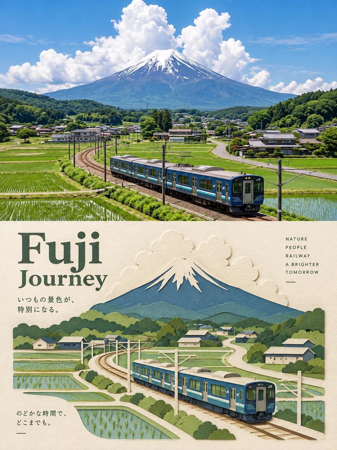
Editorial Split Photo Paper-Cut Poster
 GPT Image 2OpenAIimage
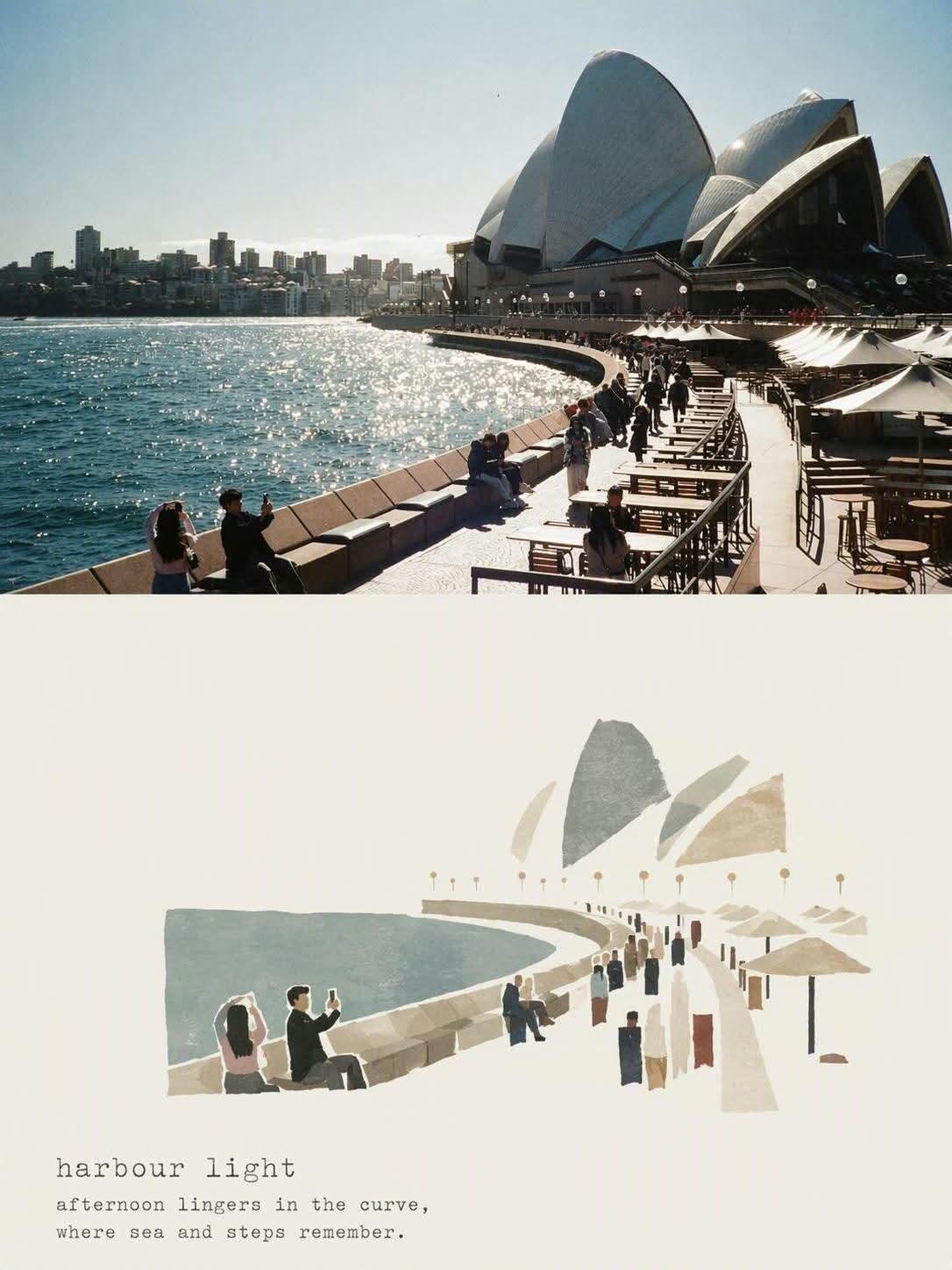
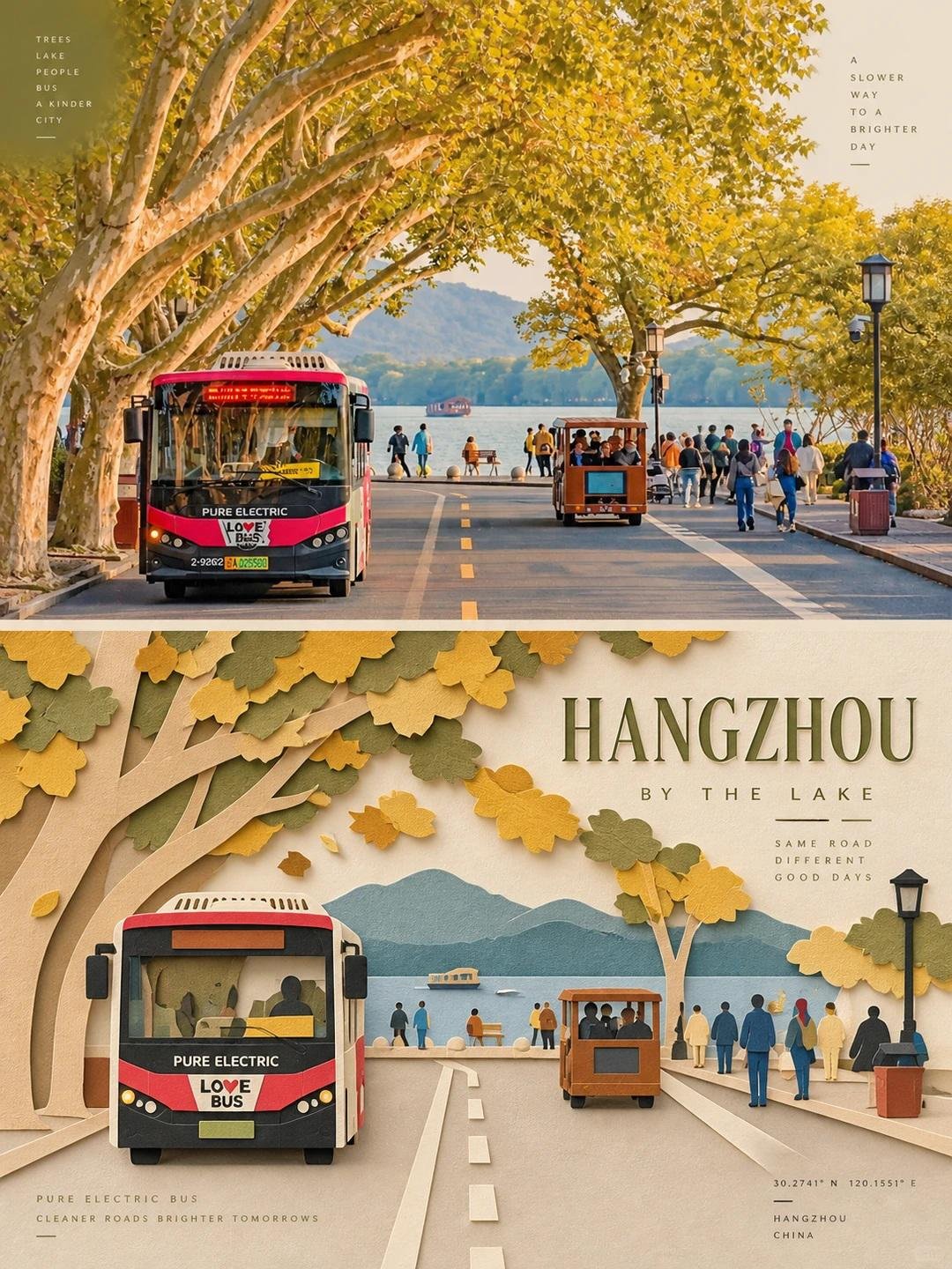
Create one independent editorial-style poster for each uploaded photo. Do not make a collage. Process and output each photo separately. Use a strict 3:4 vertical composition, divided horizontally into two exactly equal sections, each occupying 50% of the canvas. TOP HALF — ORIGINAL PHOTOGRAPH Preserve the original photo. Keep the main subject unchanged while retaining its realistic texture, natural lighting, and original color atmosphere. Apply only subtle editorial-grade color correction to create the refined feel of an art magazine, independent publication, or exhibition photography. To fit the composition, you may gently extend the sky, ground, or surrounding environmental background, but do not stretch, distort, or alter the main subject. BOTTOM HALF — LAYERED PAPER CUT / PAPER ART REINTERPRETATION Reinterpret the most recognizable subject, silhouette, pose, and spatial relationships from the photo as a minimalist layered paper-cut / paper-art composition. Use one primary subject as the visual anchor. Do not mechanically reproduce every detail. Instead, reconstruct the key silhouette, proportions, and structure through folding, cutting, layering, and overlapping. Transform only a few supporting environmental elements into foreground, midground, and background paper layers. Use scale contrast, negative space, clean alignment, and front-to-back layering to make the subject immediately recognizable while maintaining a restrained editorial composition. COLOR & MATERIAL Extract the most distinctive and recognizable colors from the original photo, then reduce them into a limited and harmonious paper-art palette. Use warm ivory or light-colored paper as the base, supported by a small amount of stronger accent colors, darker structural tones, soft transitional layer colors, and very limited highlights. The material should resemble high-quality matte cardstock, with subtle visible paper fibers, clean cut edges, and soft contact shadows under natural diffused lighting. Emphasize the tactile quality of real handcrafted paper art. Avoid glossy plastic-like 3D effects, cheap craft-paper aesthetics, neon colors, and overly saturated or complex gradients. EDITORIAL TYPOGRAPHY SYSTEM Add a refined editorial typography system. Based on the identity, location, action, material, emotion, or symbolic meaning of the subject, create one short main title. Add 2–4 groups of smaller supporting text. These may include object names, location information, numbers, sequence markers, coordinate-like numbers, direction words, status words, material descriptions, classification labels, or a very short poetic phrase. Do not use any year or date. The main title should convey emotion and identity, while the smaller text should add rhythm, structure, and refinement. TYPOGRAPHY INTEGRATION Integrate the typography naturally into the composition so that it interacts with the paper-cut forms. Arrange text along paper-layer edges, subject contours, geometric axes, or areas of negative space. Use horizontal or vertical typesetting, rotated text, generous letter spacing, edge alignment, corner placement, cross-section layouts, embedded typography, or partially overlapped text. The main title may have a subtle paper-cut or folded-paper quality, while the supporting text should remain thin, modern, restrained, and precise. The final result should feel elegant, tactile, balanced, art-directed, and distinctly editorial.
Details
- Type
- AI Image Prompts
- Aspect Ratio
- 3:4
- Updated
- Sep 18, 2026
Category
How to use this prompt
- 1Copy the full prompt with the copy button above.
- 2Open GPT Image 2 by OpenAI, or any image generator with a similar style range.
- 3Paste the prompt, then swap the subject and style keywords to match your idea.
- 4Match the example's settings (3:4 · Poster · Digital Art · Minimalist), then iterate — small wording changes shift the output a lot.
Frequently asked questions
Which AI model generated this image?
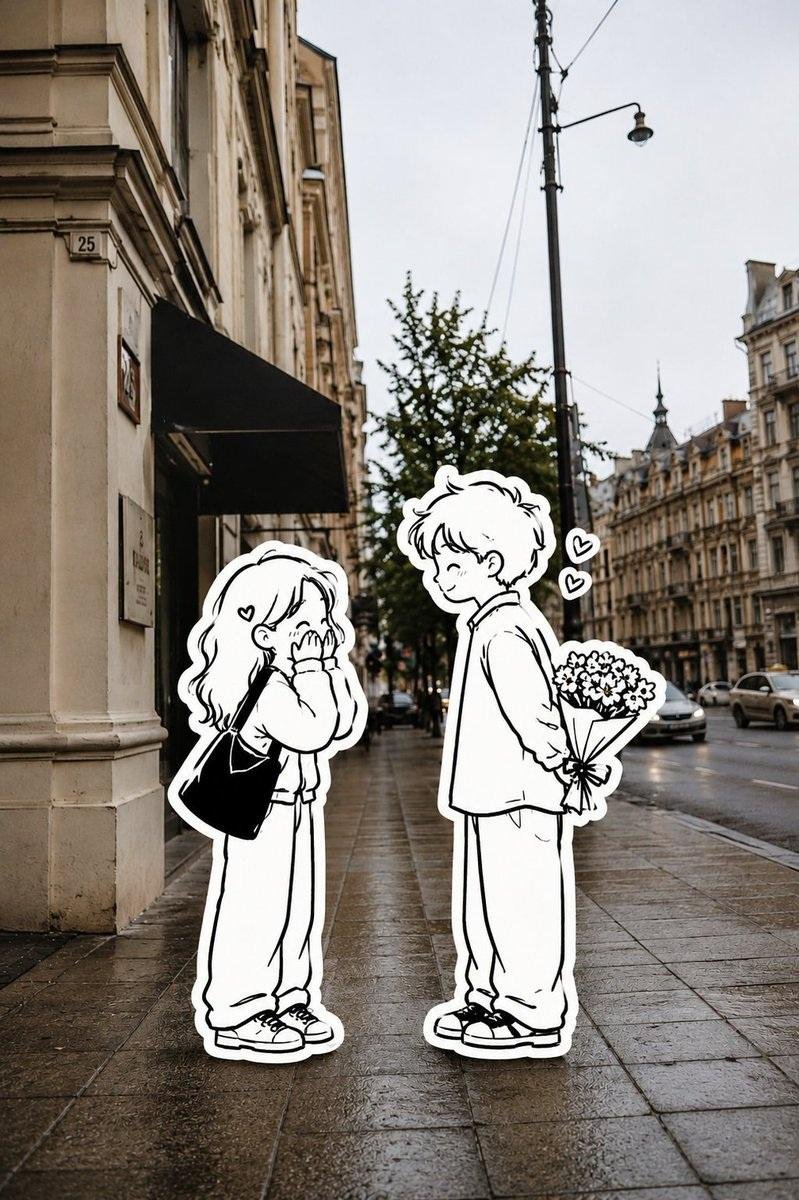
This image was generated with GPT Image 2 by OpenAI. The prompt on this page is the exact text used to create it.
What settings does this prompt use?
The example was generated with GPT Image 2 using: 3:4 · Poster · Digital Art · Minimalist. Reusing these settings gives the closest match.
How do I get similar results?
Copy the prompt as-is first, then replace only the subject while keeping the style, lighting, and composition keywords. Generate a few variations — outputs differ between runs.
Can I modify this prompt?
Yes. Prompts work best as starting points — adjust descriptors, aspect ratio, or style tags to make the output your own.
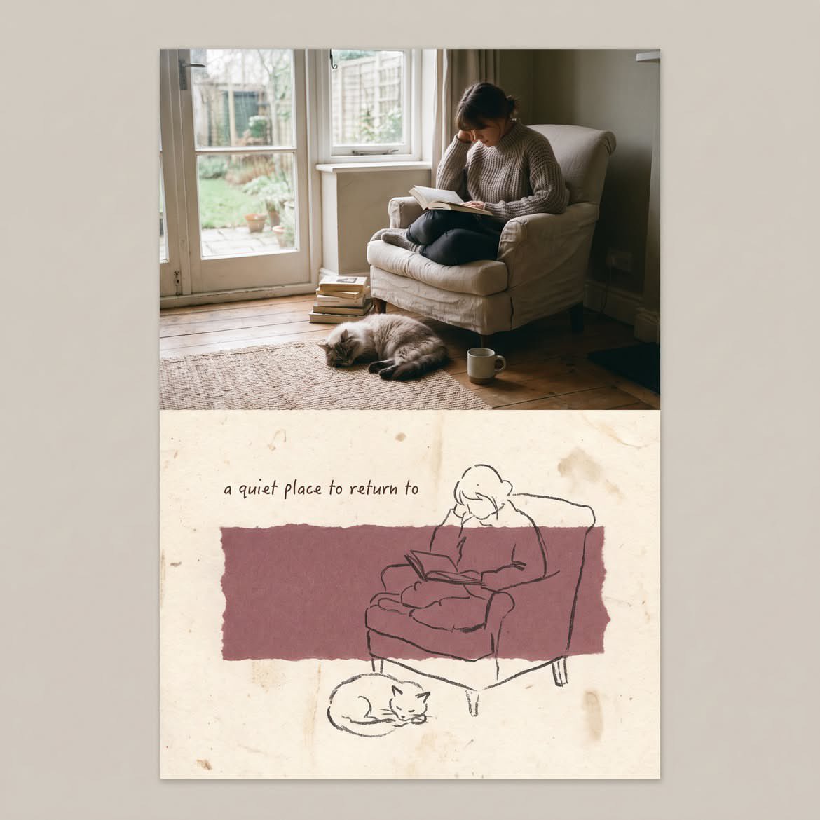
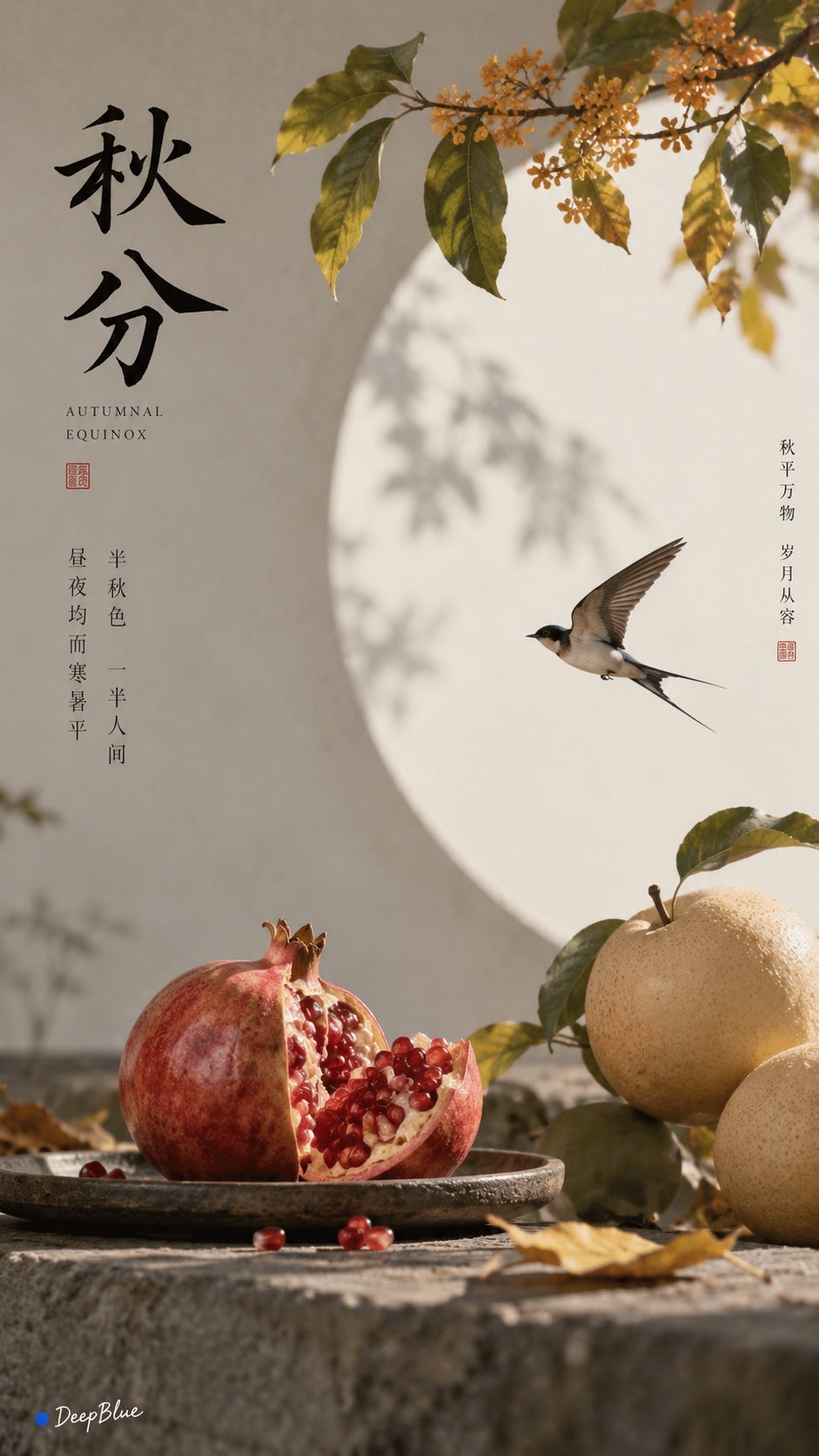
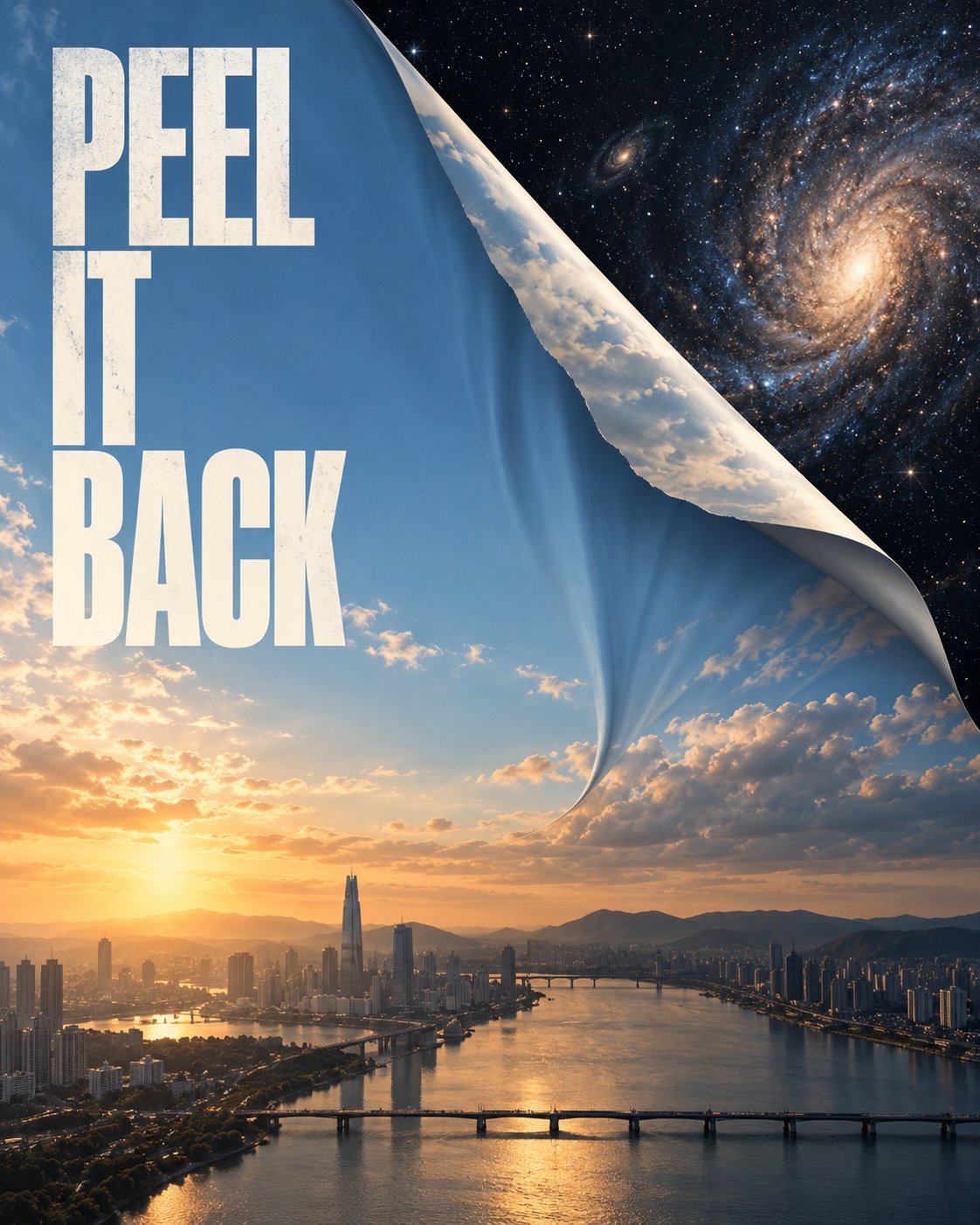
![Create a beautiful artistic illustration of [COUNTRY] represented through its national bird, [NATION — AI image prompt — GPT Image 2](https://cdn.ahaprompt.app/harvest-media/import-1788917968096-4tdbpo.jpg)