Botanical Ink and Color-Block Photo Illustration
 GPT Image 2.5OpenAIimage
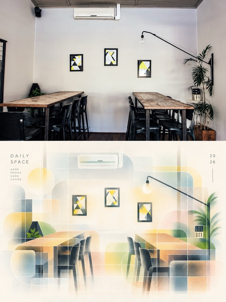
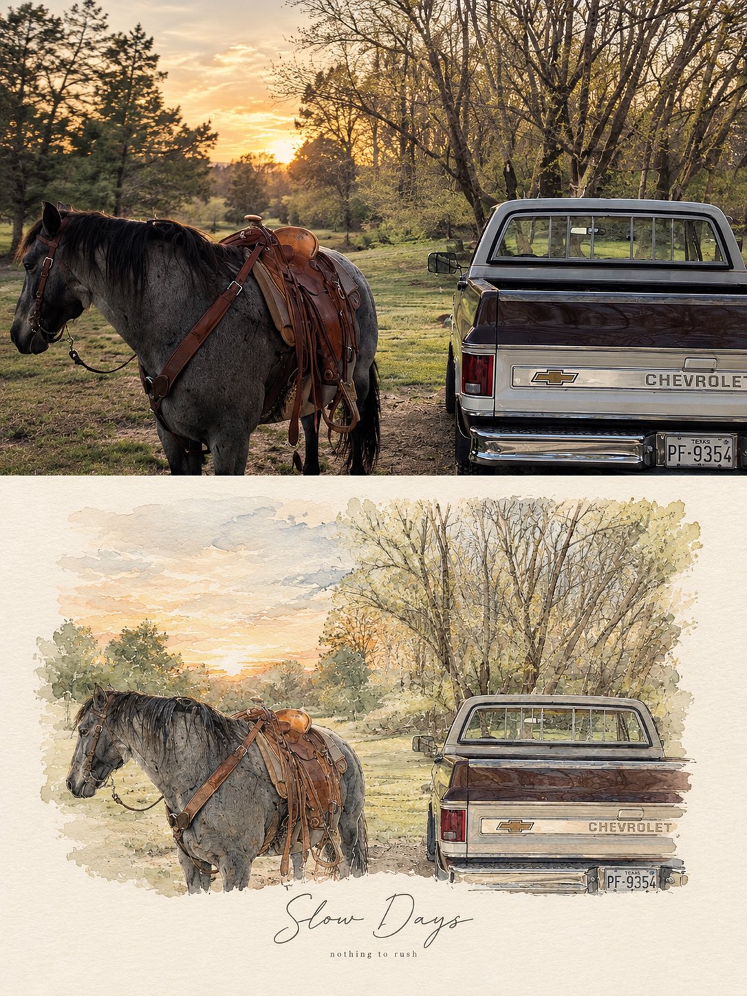
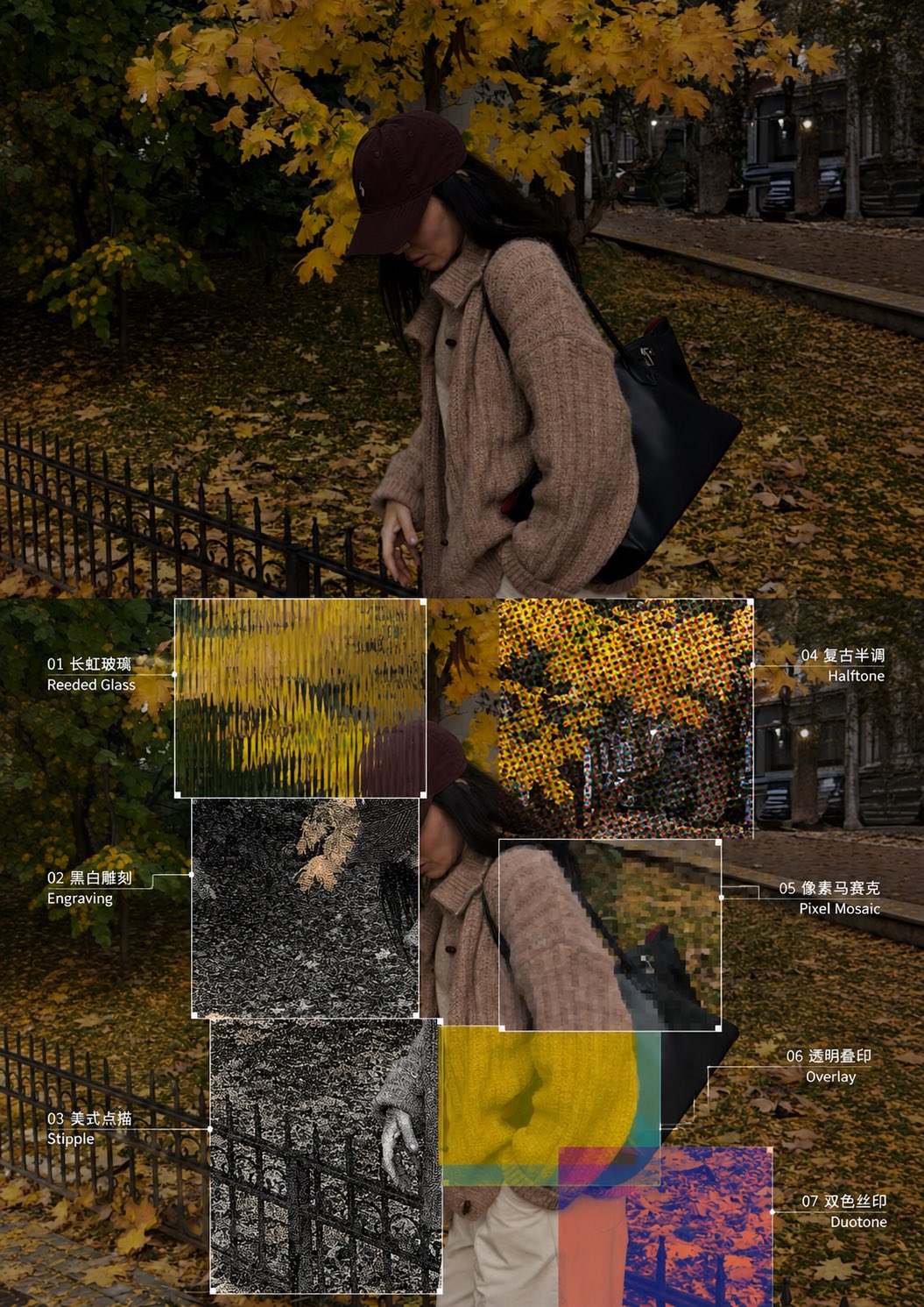
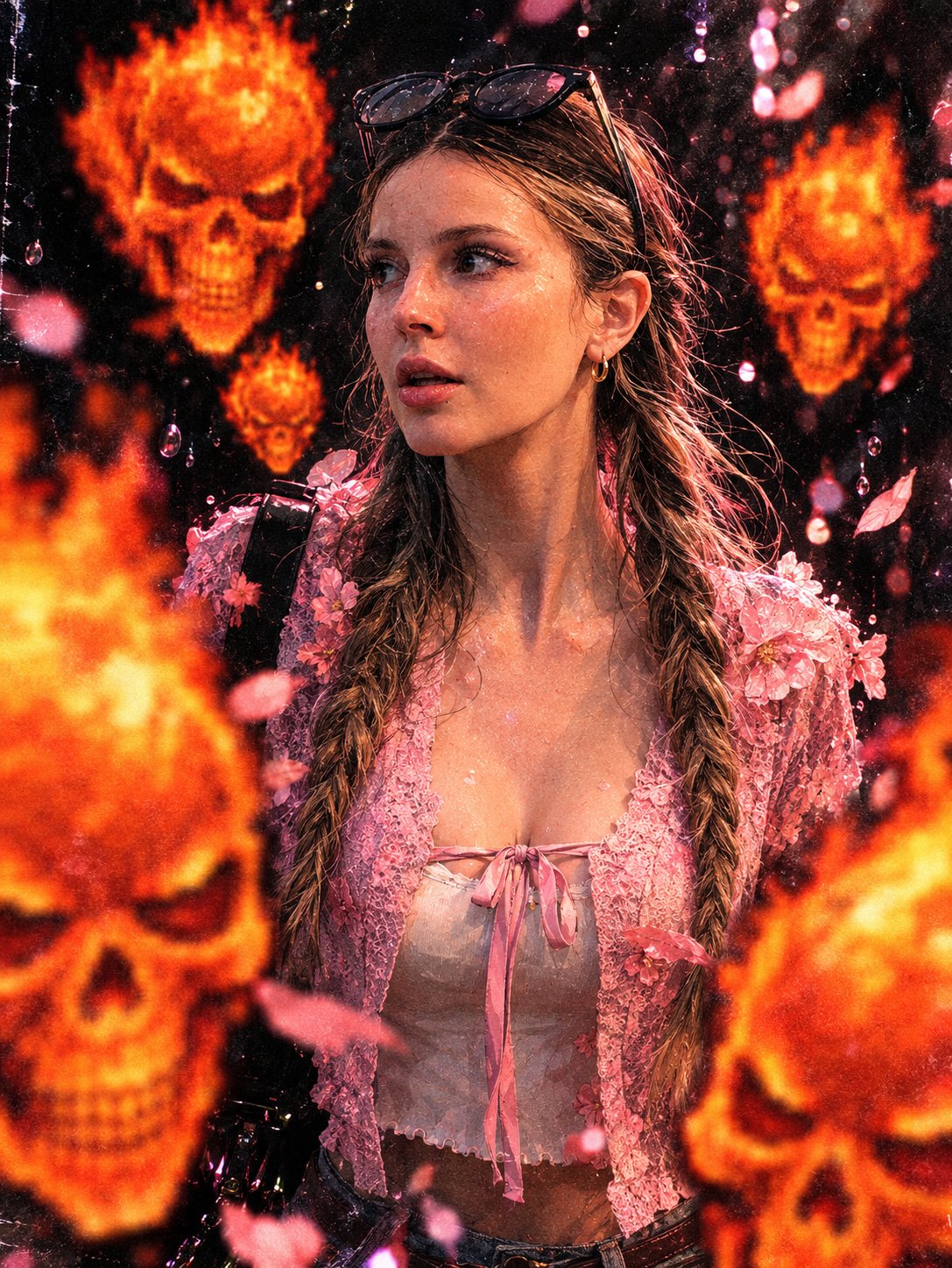
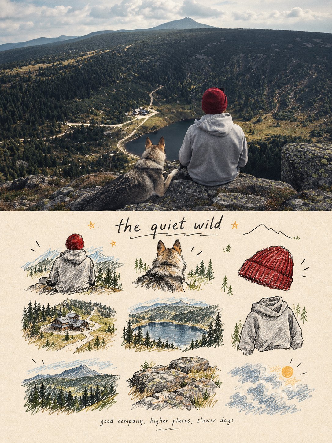
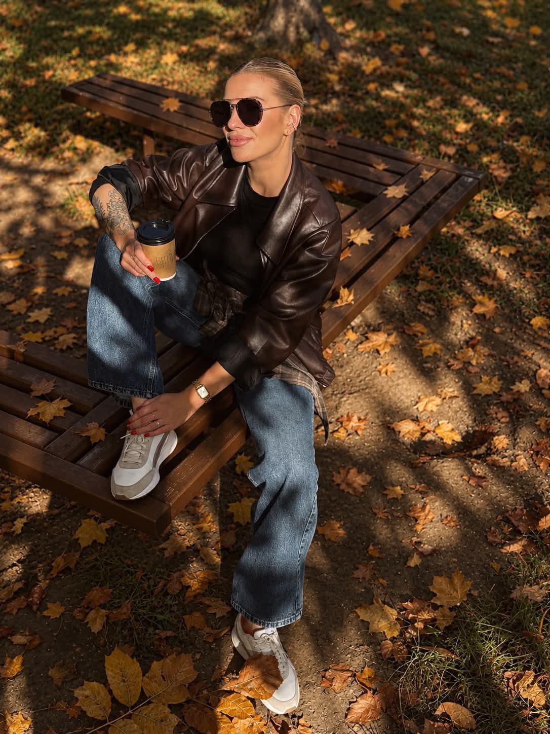
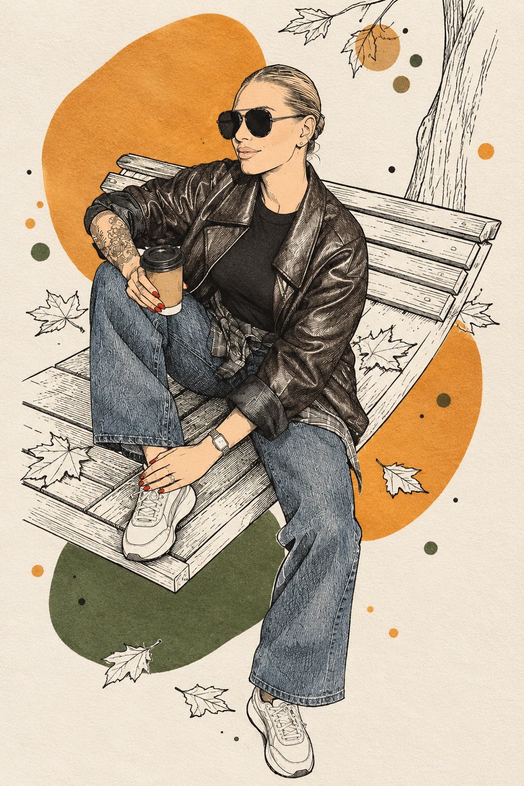
PHOTO → BOTANICAL INK & COLOR-BLOCK ILLUSTRATION Transform the uploaded photo into a stylish hand-drawn illustration inspired by botanical ink sketching combined with bold abstract color fields. Redraw the entire image. 100% illustration, 0% photography. PRESERVE THE ORIGINAL: Keep the original composition, main subject, pose, proportions, recognizable facial features if a person is present, hairstyle, clothing silhouette and important objects. Do not change the identity or basic structure of the scene. STYLE: Reinterpret the photo using a striking contrast between: • very fine black ink linework • delicate botanical-style contour drawing • large flat organic color shapes • small scattered color dots and rounded patches • generous untouched warm-white paper The illustration should feel handmade, artistic and slightly imperfect, like a drawing created with a fine black fineliner and broad marker strokes in a spiral sketchbook. LINEWORK: Draw the main subject primarily with thin, elegant black lines. Use flowing contour lines and fine parallel hatching to describe form, shadows, hair, clothing folds and important details. Avoid realistic rendering and smooth digital shading. Some areas should contain intricate black linework while others remain almost completely empty. COLOR PALETTE — CRITICAL: Analyze the uploaded photo and extract its most visually characteristic colors. Choose: • 2 dominant colors from the original image • 1 contrasting or complementary accent color derived naturally from the photo Use ONLY these selected colors together with black ink and warm white paper. Do not copy every color from the photograph. COLOR BLOCKS: Place large irregular organic color fields behind, around and occasionally partially across the subject. The shapes should look loosely hand-painted with broad markers: rounded blobs, imperfect circles, asymmetric patches and softly geometric forms. Do NOT precisely fill objects with color. Instead, allow the color blocks and black drawing to overlap independently, creating an intentional screen-print / sketchbook effect. Add a few much smaller colored dots or patches around the composition to create rhythm and balance. SUBJECT: The subject must remain clearly recognizable from the original photo, but translated completely into this graphic language. If a person is present, preserve recognizable facial proportions and characteristic features through economical black linework rather than realism. Use fewer lines on the face so it stays clean and readable. BACKGROUND: Strongly simplify the original background. Do not reproduce every background detail. Translate only a few important environmental elements into delicate black outlines. Replace most of the background with warm-white negative space and abstract color fields derived from the original photograph. COMPOSITION: Create an airy, asymmetric composition. Let some black contours extend beyond the color blocks. Let some colored shapes disappear behind the subject. Allow occasional color to cross the linework. The result should feel deliberately imperfect rather than digitally precise. PAPER: Warm white, slightly textured heavyweight sketchbook paper. Subtle visible paper grain. FINAL LOOK: modern botanical ink illustration, fine black fineliner, bold marker color blocks, limited photo-derived palette, organic abstract shapes, delicate hatching, lots of negative space, handmade sketchbook aesthetic, graphic but elegant, recognizable original subject. AVOID: photorealism, realistic digital painting, 3D rendering, smooth gradients, watercolor washes, colored outlines, overly detailed backgrounds, full-frame color, perfect geometric shapes, generic floral decorations, random colors unrelated to the uploaded photo, dense detail covering the entire image.
Details
- Type
- AI Image Prompts
- Aspect Ratio
- 3:4
- Updated
- Oct 13, 2026
Category
How to use this prompt
- 1Copy the full prompt with the copy button above.
- 2Open GPT Image 2.5 by OpenAI, or any image generator with a similar style range.
- 3Paste the prompt, then swap the subject and style keywords to match your idea.
- 4Match the example's settings (3:4 · Abstract · Digital Art · Minimalist), then iterate — small wording changes shift the output a lot.
Frequently asked questions
Which AI model generated this image?
This image was generated with GPT Image 2.5 by OpenAI. The prompt on this page is the exact text used to create it.
What settings does this prompt use?
The example was generated with GPT Image 2.5 using: 3:4 · Abstract · Digital Art · Minimalist. Reusing these settings gives the closest match.
How do I get similar results?
Copy the prompt as-is first, then replace only the subject while keeping the style, lighting, and composition keywords. Generate a few variations — outputs differ between runs.
Can I modify this prompt?
Yes. Prompts work best as starting points — adjust descriptors, aspect ratio, or style tags to make the output your own.