由 OpenAI 出品

GPT Image 2.6 提示詞

OpenAI 最快的图像模型——比 Images 2.5 快 50%,新增循环 GIF、SVG 矢量输出,以及只动目标区域、其余原样保留的编辑。
image
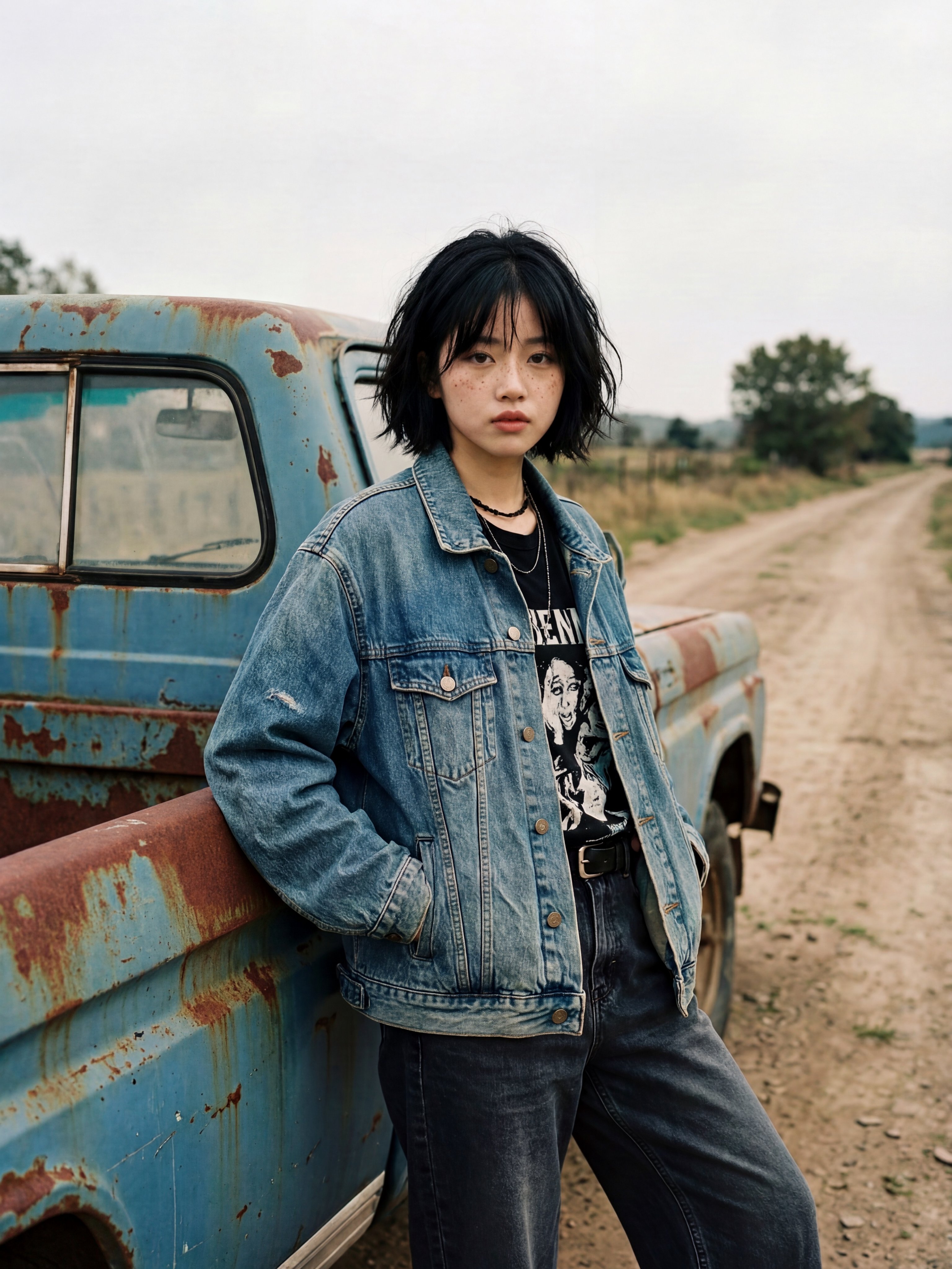
Create an ultra-realistic 8K editorial fashion photograph of a young European woman standing casually beside an old, weathered vintage pickup truck on a deserted countryside dirt road. Character appearance: A young European woman with pale natural skin, delicate facial features, subtle freckles, deep brown eyes, and a short messy black bob haircut with soft, uneven bangs. Her expression is calm, slightly serious, effortless and natural. Outfit: An oversized faded blue denim jacket with worn fabric and realistic stitching, a black vintage graphic band T-shirt underneath, layered black necklaces, a black belt, and loose dark charcoal jeans. Both hands casually tucked into the jacket pockets. Pose and composition: She is leaning her back and hip against the side of an old rusty light-blue pickup truck, standing with one leg slightly bent. Her body is angled naturally while her face looks directly toward the camera. Capture her from approximately mid-thigh upward, with the truck occupying the left side of the frame. Environment: A quiet rural countryside setting with an old dirt road extending into the distance, dry grass, scattered trees, and an overcast pale grey sky. The pickup truck has faded blue paint, visible rust patches, dusty windows, and authentic vintage wear. Photography style: Authentic 35mm analog film photography, early 2000s European indie-film aesthetic, muted earthy colors, soft natural overcast daylight, subtle film grain, realistic skin texture, natural imperfections, soft shadows, documentary-style composition, slightly imperfect candid framing. Image quality: Extremely photorealistic, 8K ultra-high resolution, finely detailed facial features, individual hair strands, realistic denim texture, authentic rust and weathering, professional photography, sharp subject focus, natural depth of field. Important: Preserve realistic human anatomy and natural proportions. No beauty filters, no artificial skin smoothing, no exaggerated makeup, no illustration, no CGI, no text overlays, no watermark. Vertical 3:4 portrait composition.
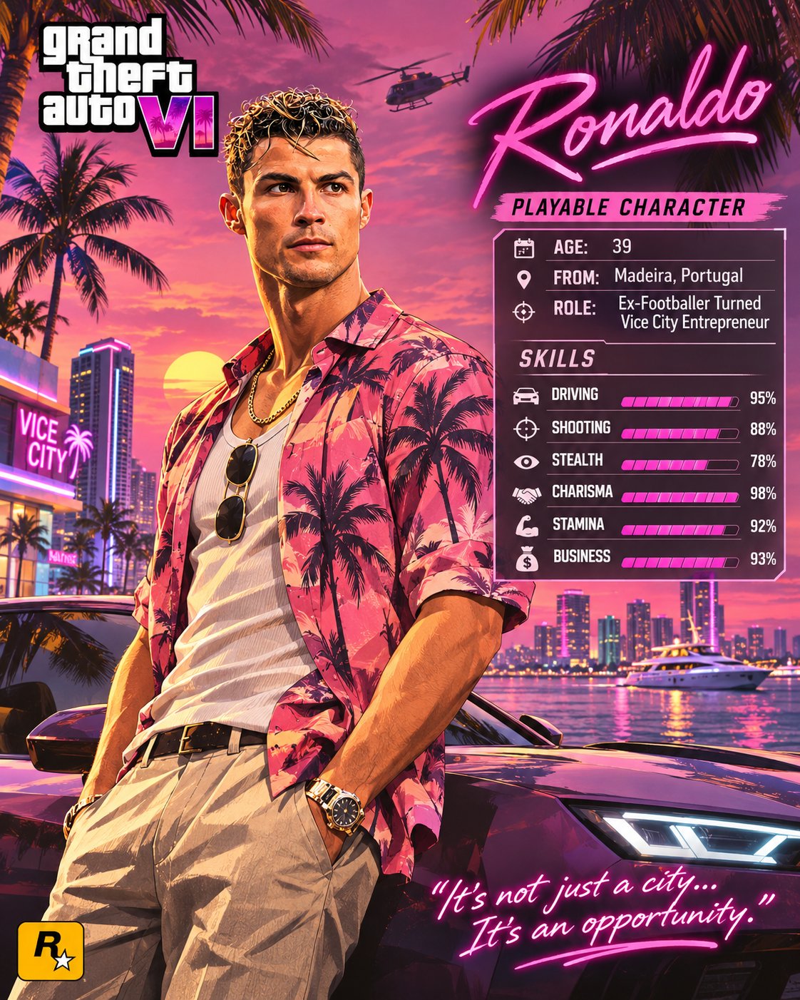
GTA VI | PERSONALIZED PLAYABLE CHARACTER POSTER Transform the person in the uploaded reference photo into a stunning, ultra-detailed Grand Theft Auto VI-inspired character poster, designed like an official Vice City character introduction screen. Preserve the person's recognizable facial identity, hairstyle, skin tone and natural features while adapting their appearance into GTA VI's signature illustrated, semi-realistic promotional artwork style. SCENE & BACKGROUND: Place the character in a vibrant Vice City-inspired tropical environment featuring a beautiful sunset, palm trees, luxury cars, waterfront views, modern skyscrapers and subtle cinematic details. CHARACTER DESIGN: Give the person a stylish outfit that suits their personality, with a confident natural pose and expressive attitude. Use rich colors, dramatic lighting, detailed textures and polished Rockstar-inspired artwork aesthetics. POSTER LAYOUT: - Top corner: Bold Grand Theft Auto VI-inspired logo. - Opposite corner: Character's name in elegant neon-pink typography. - Side panel: PLAYABLE CHARACTER with customizable details: - Age - From - Role - Skills with visual progress bars (Driving, Shooting, Stealth, Charisma and other suitable abilities). - Bottom corner: A short, stylish character quote in neon handwritten typography. - Include a small gaming-inspired emblem near the bottom. IMPORTANT: Automatically personalize the character name, profile, role, outfit and quote based on the uploaded person wherever appropriate. Keep all text clean, correctly spelled and readable. FINAL STYLE: Premium GTA VI promotional poster, cinematic Vice City atmosphere, vibrant pink and purple sunset palette, sophisticated character illustration, crisp details, balanced composition and professional graphic design. FORMAT: 4:5 vertical poster, high resolution, no watermark.
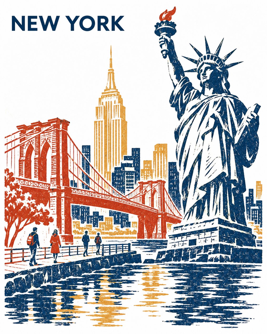
COLLECTIBLE THREE-COLOR REDUCTION LINOCUT | CITY TRAVEL POSTER Create a striking, collectible three-color reduction linocut travel poster featuring [CITY NAME], printed vertically in a 4:5 aspect ratio on pristine, pure-white paper. COMPOSITION & ARCHITECTURE Make [PRIMARY LANDMARK] the dominant focal point. Select two additional instantly recognizable landmarks from [CITY NAME], ensuring their architectural forms create a compelling visual contrast. Bring all three landmarks together along one continuous waterfront, artistically reimagining their geographical positions while preserving their authentic silhouettes, architectural proportions and defining details. Use an asymmetric, low three-quarter perspective. Ground every structure in a believable waterfront environment with convincing foundations, bridges and architectural connections. Establish a unified horizontal visual flow through varied building heights, intentional spacing and subtle overlaps. Maintain a balanced, organic composition. Avoid conventional skyline arrangements, stacked architectural tiers or disconnected floating structures. Include exactly four tiny contemporary pedestrians along the waterfront to introduce scale, atmosphere and subtle human presence. PRINTMAKING & COLOUR PALETTE Use exactly three destination-inspired ink colours, carefully selected to reflect the city's character, architecture and atmosphere. Embrace authentic reduction linocut aesthetics: - Bold, sculptural carved shapes and confident silhouettes. - Rhythmic white negative-space cuts revealing the texture of the paper. - Organic, slightly irregular hand-carved edges. - Subtle variations in ink density and uneven pressure, suggesting traditional block printing. - Strong contrasts between deep architectural shadows and luminous unprinted areas. - Waterfront reflections simplified into expressive, broken horizontal marks. The finished artwork should feel like an authentic, artisan-produced limited-edition print rather than a digitally generated illustration. TYPOGRAPHY & LAYOUT Position the text "[CITY NAME]" discreetly in the upper-left corner. Use a clean, SUIT-style uppercase sans-serif typeface in Regular or Medium weight, with restrained letter spacing and generous surrounding white space. Keep the typography minimal, sophisticated and secondary to the artwork. FINAL ART DIRECTION A refined collectible destination poster combining traditional Japanese-inspired reduction printmaking, contemporary graphic design and distinctive architectural illustration. Prioritize strong composition, architectural authenticity, elegant negative space, carefully controlled colour separation and timeless visual appeal. STRICT RESTRICTIONS: No additional text, captions, inscriptions, decorative lettering, logos, borders, signatures or watermarks. Exactly three ink colours, four pedestrians and one continuous waterfront composition.
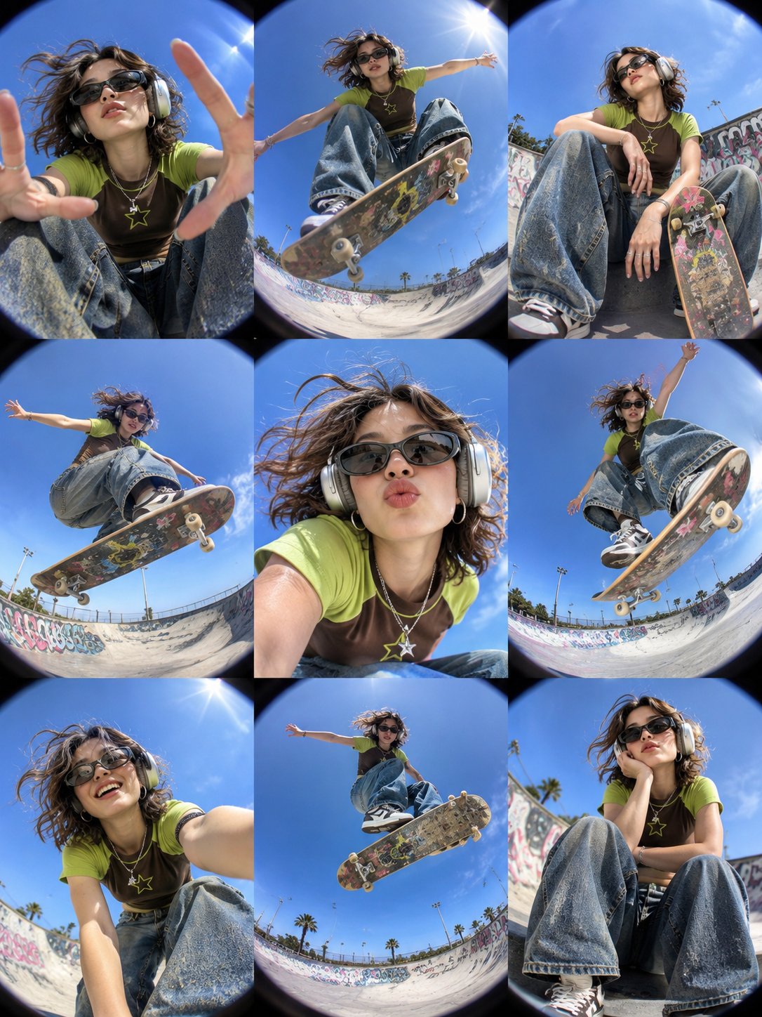
Create an ultra-realistic 3×3 photo collage featuring the same stylish young woman in nine different skateboarding poses, maintaining consistent facial identity, hairstyle, outfit, and accessories across all nine frames. Subject: A cool Y2K-inspired skater girl with shoulder-length tousled brown hair, wearing black sporty sunglasses, silver over-ear headphones, small hoop earrings, layered silver necklaces, and a star pendant. Outfit: Brown and lime-green raglan graphic T-shirt, oversized baggy blue denim jeans, and chunky black-and-white skateboarding sneakers. Location: An outdoor urban skatepark with a large curved concrete bowl, colorful graffiti-covered walls, metal railings, distant palm trees, and a beautiful clear blue sky under bright afternoon sunlight. Composition: A perfectly aligned 3×3 grid collage containing nine individual photographs. Every panel features the same girl with a different pose, camera angle, and expression. Nine Different Frames: 1. Extreme Close-Up: Looking directly down into the fisheye camera, reaching both hands toward the lens while sitting on her skateboard. 2. Mid-Air Trick: Performing a high skateboard jump above the camera, with the skateboard underside prominently visible and arms stretched outward. 3. Relaxed Skate Pose: Sitting casually inside the skatepark bowl with one knee raised and her skateboard resting beside her. 4. Flying Skateboard: Captured from an extreme ground-level angle while performing an impressive aerial trick, with her sneakers and skateboard dominating the foreground. 5. Portrait Close-Up: Leaning toward the camera with a playful expression, slightly puckered lips, sunglasses, headphones, and windblown hair. 6. High Jump Action: Performing a dynamic mid-air skateboard trick with one arm raised, bent knees, and the board tilted toward the lens. 7. Candid Selfie: Smiling naturally while leaning close to the camera, with one arm extended toward the lens. 8. Skateboard Jump: Captured from directly underneath as she floats above the camera with the skateboard clearly visible against the blue sky. 9. Casual Portrait: Sitting comfortably on the concrete skatepark ramp, resting her cheek against one hand with a relaxed, confident expression. Photography Style: Extreme circular fisheye lens, ultra-wide-angle distortion, dramatic low-angle photography, dynamic forced perspective, authentic 1990s and early 2000s skate magazine aesthetic, Y2K street fashion editorial, candid expressions, energetic action photography, natural sunlight, realistic shadows, detailed denim textures, natural skin texture, slight analog film grain, and vibrant colors. Important Details: - Exactly nine photographs arranged in a clean 3×3 grid. - Same girl, face, hairstyle, outfit, headphones, and accessories in every frame. - Each panel must have a unique pose and camera composition. - Skateboard must look realistic with visible wheels, trucks, grip tape, and graphic underside. - Bright blue sky and concrete skatepark environment throughout. - No text, no captions, no watermarks, no extra panels. Aspect Ratio: 3:4 portrait collage. Quality: Ultra-photorealistic, high resolution, professional skateboarding editorial photography.
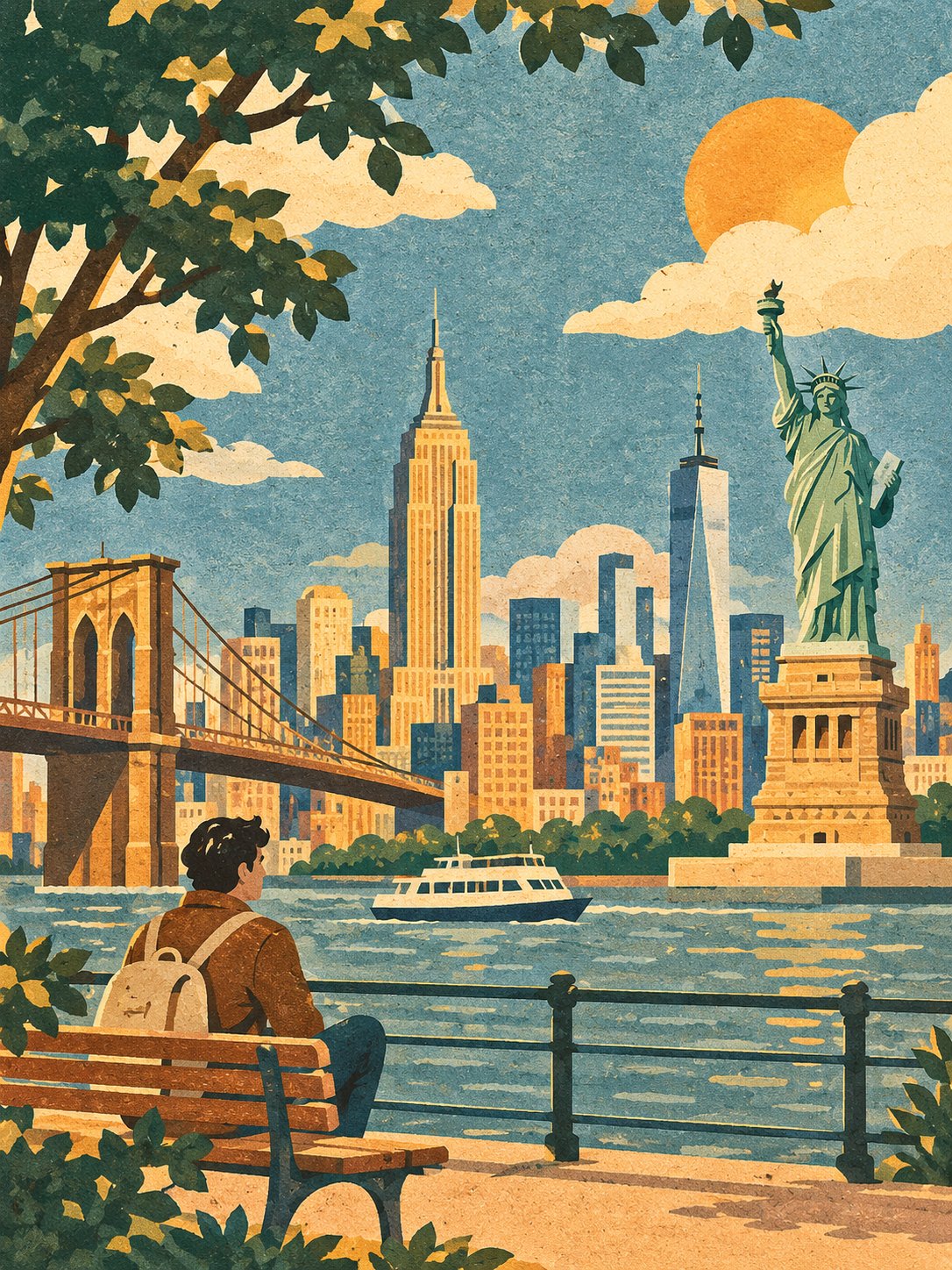
WARM VINTAGE FLAT ILLUSTRATION | TEXTURED PAPER ART Create a beautiful, sophisticated flat illustration of [SUBJECT / SCENE / LOCATION] in a warm vintage storybook aesthetic. Interpret the entered subject creatively while maintaining its recognizable identity, essential features, natural proportions, and defining details. Build an appealing composition with thoughtfully arranged elements and a clear visual hierarchy. ILLUSTRATION STYLE Use large, bold, simplified color shapes resembling layered cut-paper artwork. Apply matte, opaque colors inspired by gouache painting and vintage screen printing. Add subtle, fine-grain texture throughout, creating the appearance of artwork printed on textured paper. Avoid heavy outlines. Define shapes through contrasting color areas, with slightly irregular, organic edges and a handcrafted appearance. COLOR PALETTE Use a harmonious, slightly muted vintage palette featuring dusty blue, peach beige, deep forest green, warm ivory, earthy brown, and occasional mustard-yellow accents. Use solid, clearly defined color shapes for shadows. Maintain subtle depth without gradients, realistic reflections, or glossy finishes. COMPOSITION AND DETAILS Arrange the subject and surrounding elements naturally, creating a balanced, visually engaging composition. Simplify architecture, objects, vegetation, furniture, and other details into clean geometric and organic shapes. If people are present, illustrate them using simple silhouettes, minimal facial features, and flat colors. Preserve recognizable characteristics without unnecessary realism. Every element should feel cohesive and belong to the same illustrated world. FINAL AESTHETIC The finished artwork should resemble a sophisticated European travel poster combined with a beautifully illustrated children's storybook. Make it elegant, nostalgic, warm, minimal, and visually distinctive. OUTPUT REQUIREMENTS - Aspect ratio: 3:4 portrait. - Consistent paper grain and matte printed texture. - Strong composition and recognizable subject. - No photorealism, 3D rendering, anime, watercolor bleeding, or thick black outlines. - No unnecessary text, borders, UI elements, or decorative clutter. Overall style: Warm vintage flat illustration, screen-printed color blocks, organic cut-paper shapes, and subtle tactile paper texture.
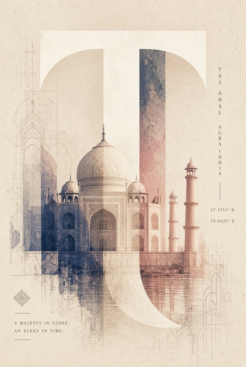
Create an exceptionally sophisticated, contemporary architectural art poster featuring [LANDMARK NAME], [CITY], [COUNTRY]. 1. GIANT TYPOGRAPHIC COMPOSITION Feature one enormous, oversized uppercase letter associated with the destination name as the central graphic element. The letter should dominate the composition, extending almost across the entire poster. Use bold, elegant, geometric typography with distinctive curves and negative spaces. 2. LANDMARK INTEGRATION Seamlessly integrate a highly detailed architectural photograph or realistic architectural illustration of [LANDMARK NAME] into and across the oversized letter. The landmark should appear to emerge from the typography, partially overlap its boundaries and interact naturally with its shape. Preserve the landmark’s authentic architectural details, proportions and recognisable silhouette. Create an artistic double-exposure effect where the architecture and typography become one unified visual composition. 3. DISTINCTIVE COLOUR TREATMENT Choose a unique colour palette inspired by the destination’s cultural identity, national colours and architectural character. Use two or three contrasting colours within the oversized typography. Apply translucent colour overlays across selected sections of the landmark, creating a beautiful combination of architectural photography, coloured light and graphic shapes. Every new destination must receive a different colour combination. Never repeat palettes. 4. TEXTURE & BACKGROUND Use a warm ivory, soft white or subtle textured paper background. Introduce delicate architectural sketch marks, distressed ink textures, faded photographic grain and subtle print imperfections around the central composition. Keep the surrounding space clean and uncluttered. 5. EDITORIAL TYPOGRAPHY Include the following information: [LANDMARK NAME] [CITY NAME] [COUNTRY NAME] Add small vertical typography along one side, geographical coordinates and a subtle destination-inspired tagline. Use sophisticated editorial typography with carefully balanced spacing. 6. ART DIRECTION Luxury architectural editorial design, experimental typography, architectural double exposure, contemporary Swiss graphic design, oversized letterforms, cinematic monochromatic photography, translucent colour blocking and minimalist gallery poster aesthetics. 7. FINAL PRESENTATION Create a visually striking, intellectual and artistic collectible landmark poster. The architecture must remain recognisable while becoming an integral part of the oversized letter. Vertical 4:5 composition, premium art-print quality, exceptional visual balance and sophisticated negative space. Avoid ordinary travel-poster layouts, decorative clutter, excessive colours and generic typography.
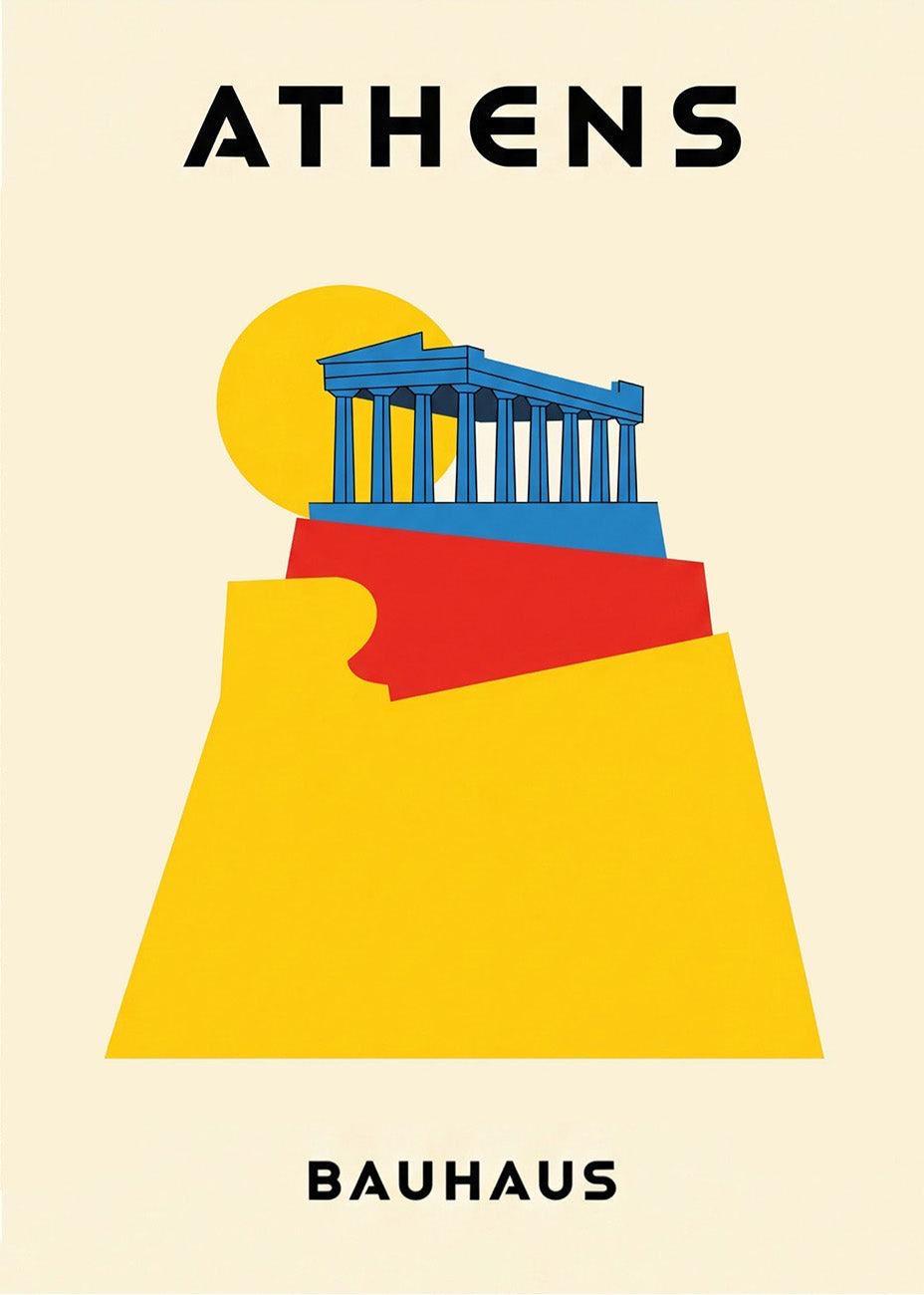
Create an exceptionally beautiful, ultra-minimalist Bauhaus-inspired architectural travel poster featuring [LANDMARK NAME], [CITY], [COUNTRY]. 1. ICONIC ARCHITECTURAL SILHOUETTE Feature the destination’s most recognisable landmark as the central artistic subject. Preserve its authentic architectural identity and instantly recognisable silhouette. Simplify the structure into clean geometric lines, rectangles, circles, triangles and elegant architectural proportions. Use minimal details to communicate the landmark’s character. Make the architecture appear as though it has been constructed from carefully arranged geometric paper cutouts. Avoid photorealism, excessive details and complicated textures. 2. GEOMETRIC ARTISTIC COMPOSITION Build the entire poster around a striking arrangement of oversized geometric shapes. Large semicircles and circles representing the sun or moon. Bold rectangular architectural foundations. Angular trapezoids and triangular landscape forms. Layered geometric platforms supporting the landmark. Carefully overlapping shapes creating depth. Simple curved forms and architectural abstractions. Use only shapes that complement the landmark’s natural structure. 3. UNIQUE DESTINATION-INSPIRED COLOURS This is the most important part of the collection. Create a completely different 4–6 colour palette for every destination. Choose colours inspired by the destination’s architecture, history, cultural identity and natural surroundings. Use bold primary or complementary colours, balanced with warm ivory or soft neutral backgrounds. Never repeat the same colour combinations between destinations. 4. MINIMALIST GRAPHIC STYLE Flat vector illustration. Solid colour blocks. Crisp architectural outlines. Strong geometric contrast. Subtle vintage paper texture. Perfectly controlled negative space. Clean, sophisticated modernist aesthetic. No gradients unless absolutely necessary. No unnecessary decorative elements. 5. TYPOGRAPHY AND LAYOUT At the top, display the destination name in oversized, bold, uppercase geometric sans-serif typography. [DESTINATION NAME] At the bottom, add a small artistic caption: [COUNTRY] Include a discreet design movement label such as BAUHAUS. Keep the typography exceptionally clean, balanced and beautifully spaced. 6. SIGNATURE ART DIRECTION Inspired by original Bauhaus graphic design, Swiss modernism, mid-century travel advertising and minimalist architectural illustration. The poster must look like a timeless collectible from an international design exhibition. The composition should be instantly recognisable even from a distance. Portrait 2:3 aspect ratio. Warm ivory background. No borders, no photographs, no people, no flowers, no leaves, no watermarks and no unnecessary text.
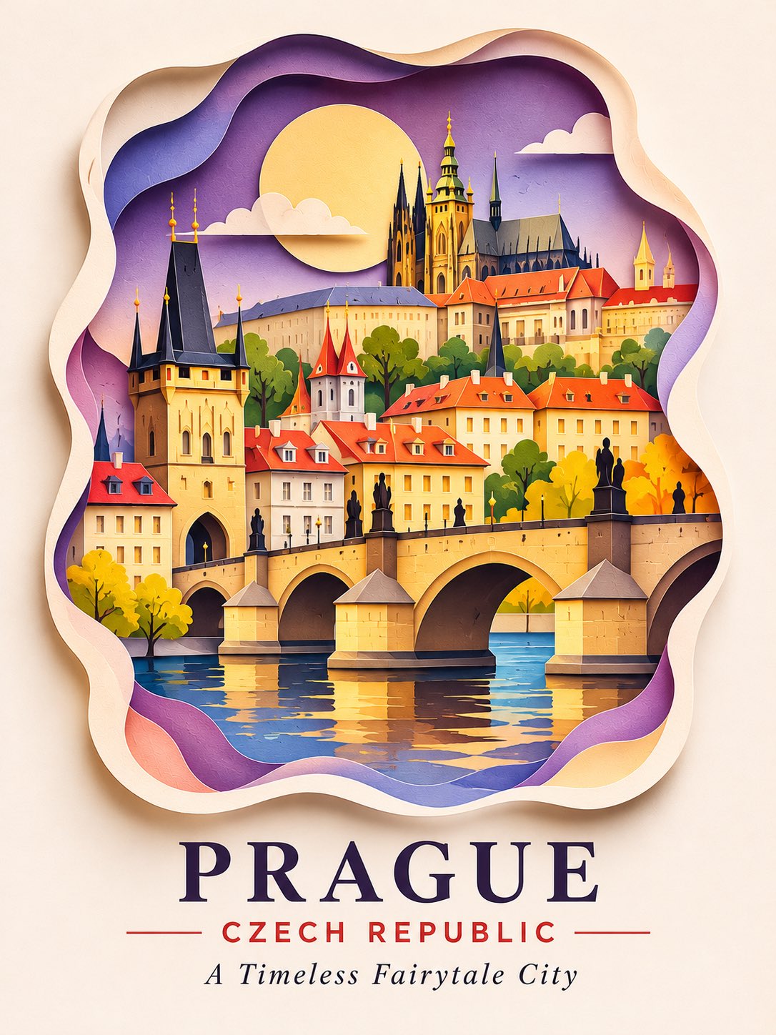
Create an extraordinarily beautiful 3D layered paper-cut architectural travel poster featuring [LANDMARK NAME], [CITY], [COUNTRY]. Transform the destination into an enchanting miniature architectural world, crafted entirely from intricately layered, sculpted and cut coloured paper. 1. CENTRAL ARCHITECTURAL SCENE Feature the destination’s most iconic landmark as the main attraction. Preserve its authentic and recognisable architectural identity. Recreate buildings using multiple layers of carefully cut paper. Include distinctive rooftops, windows, arches, towers, domes, bridges or architectural details specific to the destination. Arrange smaller surrounding buildings to create a charming miniature cityscape. Make the entire scene resemble a beautifully handcrafted architectural diorama. 2. LAYERED PAPER LANDSCAPE Build an extraordinary three-dimensional environment. Flowing paper-cut hills and sculpted mountains. Layered rivers, lakes, coastlines or ocean waves where appropriate. Curved bridges, winding pathways and miniature staircases. Overlapping paper clouds, hills and architectural backgrounds. Intricate foreground elements framing the composition. Beautiful irregular paper-cut edges surrounding the scene. Every layer should have visible depth, delicate edges and realistic cast shadows. 3. UNIQUE DESTINATION DETAILS Include small architectural and cultural elements that make each destination instantly recognisable. Select details according to the location rather than repeating the same decorations. 4. DESTINATION-SPECIFIC COLOUR PALETTE Create a completely original colour identity for every destination. Use 6–9 harmonious shades inspired by its architecture, culture, landscape and atmosphere. Combine rich colours, soft pastels, contrasting paper layers and carefully selected neutral tones. Never repeat the same palette between different destinations. 5. THREE-DIMENSIONAL PAPER ART Authentic handmade paper-cut aesthetic. Multiple overlapping cardstock layers. Sculpted paper architecture. Delicate folded and curved paper details. Visible paper thickness. Soft realistic shadows between layers. Beautiful tactile textures. Intricate miniature craftsmanship. Gentle studio lighting. The artwork must look like a real handcrafted paper sculpture photographed professionally, not a flat illustration or plastic 3D render. 6. DISTINCTIVE POSTER COMPOSITION Place the entire architectural scene inside an elegant irregular organic paper-cut frame. Use a balanced vertical composition with: Large miniature architectural scene in the centre. Beautiful layered foreground. Subtle surrounding negative space. Soft neutral background. Realistic depth and dimensional shadows. 7. MINIMAL TYPOGRAPHY Below the artwork, write: [CITY / DESTINATION NAME] [COUNTRY] Add one short, elegant poetic tagline of approximately 3–6 words inspired by the destination. Use elegant uppercase modern typography for the destination name and a delicate refined serif font for the tagline. Keep typography minimal, correctly spelled and beautifully positioned. 8. FINAL ART DIRECTION A breathtaking fusion of miniature architecture, layered paper sculpture, handcrafted papercraft, whimsical storytelling and premium contemporary travel poster design. Extremely intricate craftsmanship, sophisticated colour harmony, realistic paper shadows, beautiful depth, exquisite architectural details and museum-quality presentation. Portrait 2:3 composition. No watermark, no unnecessary text, no photorealistic buildings, no plastic appearance.
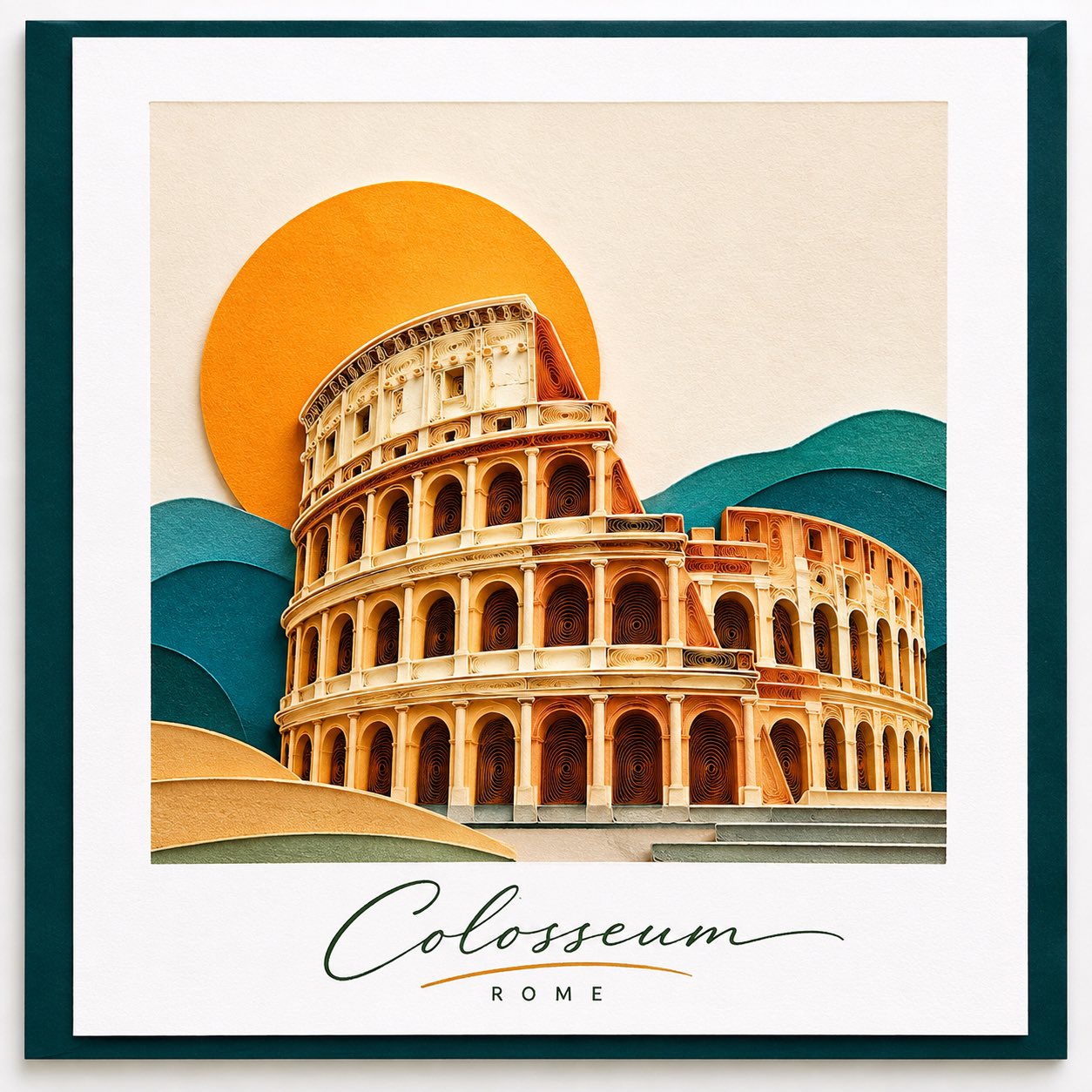
Create an exceptionally beautiful, sophisticated 3D paper-quilling architectural artwork featuring [LANDMARK NAME], [CITY], [COUNTRY], inspired by the reference image. 1. CENTRAL LANDMARK Feature one iconic landmark as the dominant subject. Preserve its authentic architectural silhouette and recognisable details. Recreate the architecture using intricate rolled-paper strips, delicate paper coils and carefully arranged quilled shapes. Give the structure beautiful raised, sculptural dimensions. Make the landmark appear handcrafted from individually shaped and assembled paper. 2. MINIMALIST GEOMETRIC LANDSCAPE Surround the landmark with a simple, elegant abstract landscape. Large circular sun or moon behind the architecture. Layered geometric mountains and hills. Simple curved foreground shapes. Minimal architectural platforms or steps. Clean overlapping paper layers. No unnecessary decorative elements. Keep the landscape flat and geometric while making the landmark richly detailed through paper quilling. 3. SIGNATURE PAPER-QUILLING TECHNIQUE This is the defining feature. Intricately rolled and curled paper strips. Fine spiral coils and delicate loops. Precisely arranged parallel paper lines. Raised paper edges and visible thickness. Beautifully sculpted architectural curves. Realistic miniature paper craftsmanship. Subtle natural shadows between individual paper pieces. The quilling should be most detailed on the landmark, while the surrounding landscape remains clean and minimal. 4. UNIQUE COLOUR IDENTITY Choose a completely different colour palette for every destination. Use 4–6 coordinated colours inspired by the landmark’s architecture, culture and surroundings. Change the colours of: Landmark paper coils. Background sun. Geometric mountains. Foreground landscape. Supporting paper details. Avoid repeating colour combinations across destinations. 5. PRESENTATION AND LAYOUT Square or near-square central artwork. Soft, pale neutral background. Generous white space around the composition. Elegant white mounting paper. Deep navy or destination-inspired contrasting outer mat. Realistic soft shadows. Professional gallery-style presentation. Front-facing, perfectly balanced composition. 6. HANDWRITTEN TYPOGRAPHY Write the actual landmark name beneath the artwork. [LANDMARK NAME] Use a beautiful, natural handwritten script font, as though the name has been personally written by an artist with a fine calligraphy pen. Keep the lettering elegant, slightly flowing and artistic. Do not use bold block letters or mechanical typography. 7. FINAL ART DIRECTION Premium handmade paper-quilling artwork, minimalist architectural illustration, geometric landscape design, intricate paper sculpture, tactile cardstock texture and sophisticated gallery presentation. The result should look like a real handcrafted paper artwork photographed in a professional art studio. No photographic architecture, no plastic 3D appearance, no flowers, no unnecessary leaves, no watermark, no extra text.
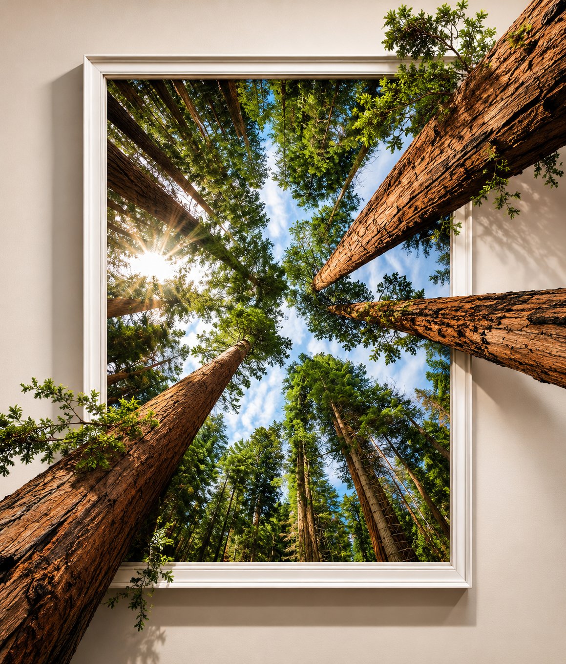
SURREAL 3D POP-OUT PHOTOGRAPHY | FRAMED NATURE ART Create a stunning, photorealistic 3D pop-out artwork featuring [YOUR SUBJECT / OBJECT / LANDSCAPE / SCENE], transforming an ordinary framed photograph into an extraordinary three-dimensional illusion. COMPOSITION & ART DIRECTION Show a beautifully framed photograph mounted on a minimal, warm ivory or off-white wall. The central subject should dramatically break through the boundaries of the picture frame, extending outward into the real world with an impressive 3D trompe-l'œil effect. Create a seamless transition between the flat photograph and the three-dimensional elements. For example, tree trunks, branches, roots, flowers, roads, or other natural elements should visibly emerge beyond the frame, creating realistic depth and dimension. VISUAL STYLE & DETAILS Use ultra-realistic textures, intricate surface details, natural colours, cinematic lighting, and believable perspective. Add subtle cast shadows behind and beneath the protruding elements to enhance the physical depth illusion. Keep the inner photograph visually rich, while the extended 3D subject appears sculptural and tangible. PRESENTATION & QUALITY Minimalist gallery-style composition, elegant white framing, clean neutral background, sophisticated fine-art photography aesthetic, realistic depth of field, professional art direction, ultra-detailed 3D rendering, photorealistic quality, and a visually striking forced-perspective illusion. IMPORTANT: The artwork must look like a real photograph physically escaping its frame, not a simple 3D object placed in front of a picture. Maintain a clean composition with the pop-out effect as the main attraction.
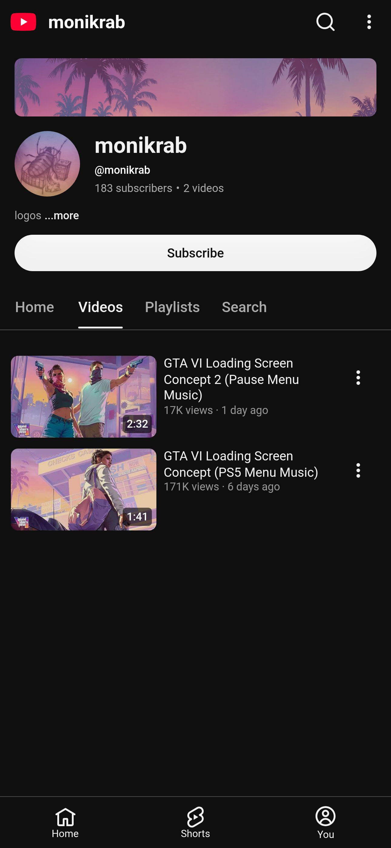
A 1920x1080, 60 fps "fan concept" of a game's real boot and loading screens, made to look like what you would actually see on a console before the game starts: a fake boot sequence, the logo build, then a slow cycle of full-screen illustrated loading-screen art over menu music. It is calm, polished and hypnotic: no voice, no captions, no fast cuts. The art: one consistent illustrated look across every screen, in the style the franchise's own loading screens use (for a crime-sandbox world: painterly cel-shaded comic illustration, heavy outlines, flat colour blocks with soft gradients, a pastel sunset palette of pink #F2A6C8, violet #8E6CC9, peach #FFC9A3 and teal #4FB3B0, low-angle hero poses, big sky, signage and palm silhouettes). Each screen is one character or a duo in a strong pose in a specific location of that world, with props that tell a story (a duffel bag of cash, a map on a table, a getaway car). On every art screen: the game's logo small in the bottom-left corner (about 9% of the width, 40 px in from the edges), a small spinning loader in the bottom-right (a 28 px arc, one turn every 1.2 s), and a faint "FAN CONCEPT" label in the top-left at 12% opacity. Banned: AI art that looks like AI (plastic skin, melted hands, gibberish signage, six fingers), photo-real renders, text inside the art that is not legible, real people's faces, the publisher's own art or logo used as if official, any shot that is perfectly still, hard cuts between art screens, and anything that says or implies it is official. Length: 1:40-2:30, cut to the music, with the art holds landing on its phrases. The opener (0-26 s) is the moment people remember. Build it shot by shot: 0-0.8 s: black with faint analog static and a dim purple vignette. 0.8-4.2 s, the tape: the static melts into a slow-flowing liquid-marble texture (like a CRT showing water caustics) that drifts from deep blue to violet to pink and back, with 2 px scanlines, rolling chroma noise and a slight barrel warp. At the top-left (x 2.5%, y 4%), a tiny pink mono cursor blinks twice, then types "> LOAD "VI"" (your title's short name) one character every 0.22-0.32 s, slightly uneven like a person typing, with the cursor blinking after the last character. 4.2-5.6 s, the glitch: the screen flashes cyan, the marble tears into blocky datamosh smears, the title mark flashes in for 3-4 frames as a ghost double-exposed over a polaroid-style postcard of the world's most famous place, then dust, film scratches and a green-yellow speckle burst, a red-orange light-leak whip pan across the frame, and a hard cut to pure black on a sound hit. 5.6-6.5 s: black, silence or just room tone. 6.5-15 s, the studio card: your own studio-style logo (a rounded square with a letter mark, about 4% of the frame wide, dead centre) fades in grey over 0.8 s, a warm orange-to-pink neon rim sweeps once round its edge with a soft bloom on a music hit around 10-11 s, it settles white with a thin pink outline, holds, and fades out by 15 s. Optional: two screens of tiny legal-style text, 3 s each, that you write yourself. 15-19 s: black; over the last 2 s the black lifts to a near-black slate #1D2029. 19-26 s, the title build: the title mark draws itself in from its outline (a neon stroke in pink #FF7AD9 and orange #FFB066 traced along the shape top to bottom over 1.5 s with a glow), the inside fills dark plum #2A1640, then a vertical gradient rises through it from violet #6B3FD8 to hot pink #FF5FB7 to sunset orange #FFB35C over 2 s with a chrome sheen sweeping across once, and finally the words of the full title stamp in on top in white with a dark outline, one word every 0.25 s, with a tiny settle bounce. Hold 1 s, then dip to black into the first art screen. 26 s to the end, the loading cycle: 10-16 art screens of 6-9 s each, every one on a slow move (a push-in of 3-6% or a lateral drift of 2-3% of the width over the hold) and joined by a 0.6-1 s dip through black; every 4th screen is a duo or a group shot for variety, and one in the middle is a wide landscape of the world with no characters. The corner logo and loader stay on throughout. Last 6 s: the art fades to black, the loader keeps spinning alone for 2 s, then the "> LOAD COMPLETE" line types in and cuts to black on the last note.
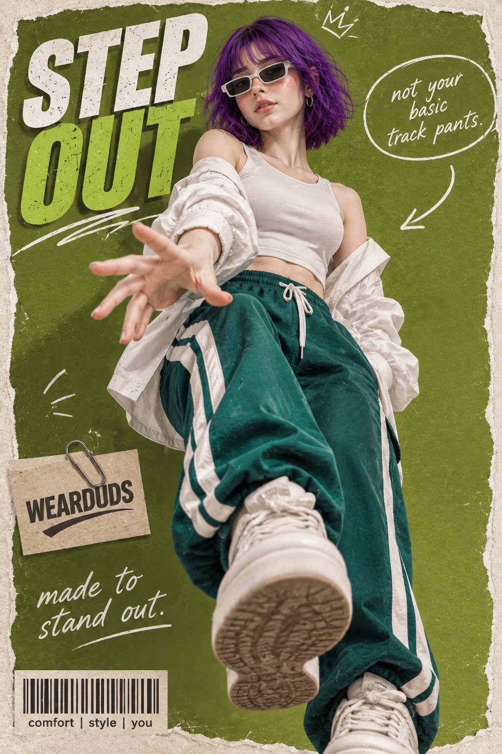
Create a hyper-realistic 3D pop-out fashion poster featuring the same young adult female character from the reference image, preserving her signature vivid violet-purple chin-length bob with soft straight bangs, fair porcelain skin, natural freckles across her nose and cheeks, hazel/light-brown almond-shaped eyes, delicate facial features, glossy lips, and slim physique. Show her breaking out of a magazine poster frame in a dynamic low-angle full-body pose. One arm reaches forward toward the camera with an open hand while one leg is lifted prominently toward the viewer, creating an impressive 3D perspective effect. She wears a white crop top, an oversized white shirt loosely falling off her shoulders, high-waisted teal-green track pants with thick white side stripes, chunky white platform sneakers, slim white-framed retro sunglasses, and small hoop earrings. The background features a bright olive-green textured poster design with torn-paper edges and bold typography reading "STEP OUT" in large white and green letters. Add a handwritten speech bubble saying "not your basic track pants." with an arrow, a paperclip-pinned brand label reading "WEARDUDS", and the tagline "made to stand out." alongside a barcode graphic and the text "comfort | style | you". Use bright punchy studio lighting, high contrast, realistic shadows, dramatic perspective, detailed clothing textures, natural skin rendering, cinematic depth, premium Y2K sporty streetwear advertising aesthetic, photorealistic, ultra-detailed 8K, professional fashion campaign quality.
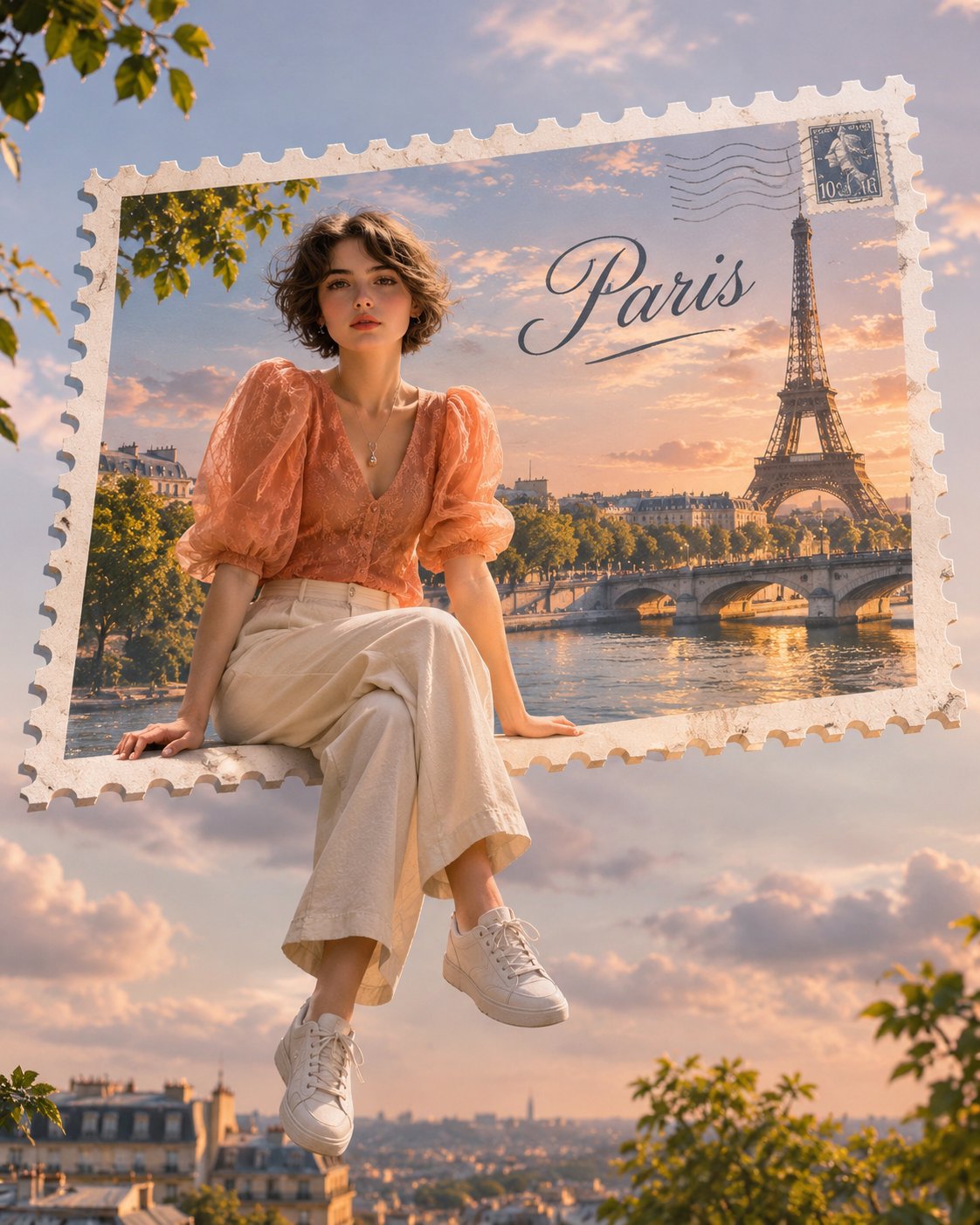
DREAMLIKE FLOATING TRAVEL POSTCARD | SURREAL PHOTOGRAPHY CONCEPT Transform [UPLOAD YOUR PHOTO / PERSON] into a breathtaking, dreamy travel photograph set in [DESTINATION / CITY NAME]. Create a surreal yet photorealistic composition where the person appears naturally sitting or floating in mid-air, emerging from a beautiful vintage postage-stamp-shaped travel postcard. The postcard should feature a miniature scenic photograph of the destination, framed with authentic perforated white stamp edges and the destination name elegantly written inside. BACKGROUND: Use a breathtaking, location-specific landscape featuring recognizable scenery, mountains, lakes, forests, rooftops, misty valleys, coastal views, or iconic landmarks. Add atmospheric depth, soft morning mist, beautiful golden-hour lighting, and cinematic colors. SUBJECT INTEGRATION: Preserve the person's original facial identity, hairstyle, clothing, and recognizable features. Position them sitting casually on the edge of the floating postcard, with their legs naturally dangling outside the frame. Create a convincing 3D floating illusion with realistic proportions, natural shadows, and seamless compositing. ART DIRECTION: Dreamy travel editorial photography, nostalgic European postcard aesthetics, whimsical surrealism, miniature-world illusion, soft cinematic color grading, atmospheric depth, delicate details, and professional travel magazine photography. IMPORTANT: The postcard must look like a real physical postage stamp floating in the scene. The person must appear to interact naturally with it, not simply pasted onto the background. Keep the destination name clearly readable. Avoid extra text, watermarks, distorted anatomy, or artificial-looking edges. OUTPUT: Ultra-realistic, visually captivating travel artwork, vertical 4:5 composition, high resolution, professional photographic quality.
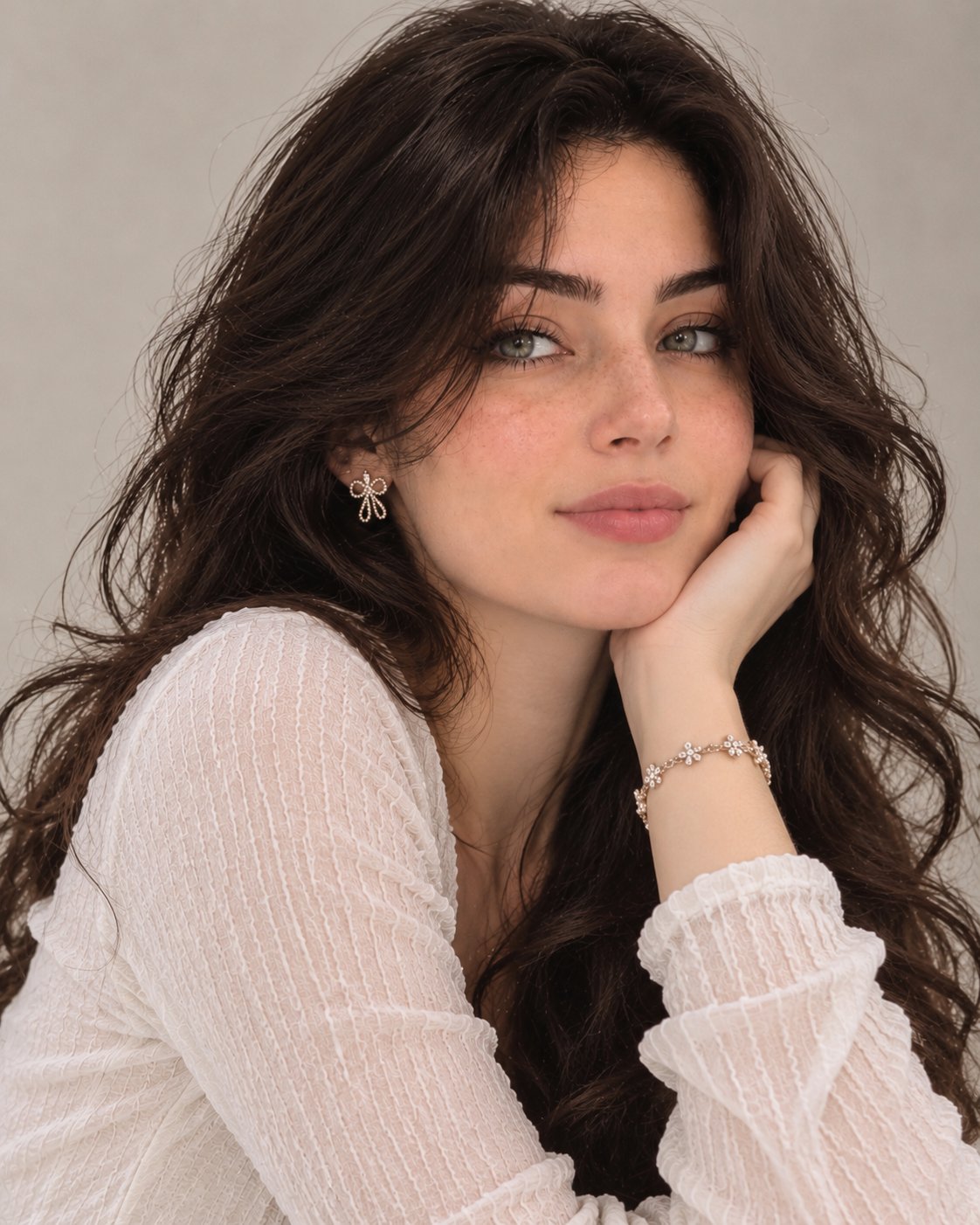
TWO-POSE EDITORIAL PORTRAIT SERIES.. Use the two uploaded images as the SEQUENCE 1 — ELEGANT CLOSE-UP POSE Create a stunning, ultra-realistic close-up portrait. The woman gently rests her cheek against one hand, with her elbow naturally positioned. Her head is slightly tilted, and she looks directly into the camera with a soft, confident expression and a subtle smile. Her beautiful wavy hair falls naturally around both shoulders. Capture delicate facial details, realistic skin texture, and naturally expressive eyes. SEQUENCE 2 — EFFORTLESS HAIR POSE Create a second individual portrait of the exact same woman. She gently raises one hand and runs her fingers through her voluminous hair, slightly tilting her head while looking directly into the camera. Her expression is effortlessly charming, confident, and feminine. Allow some natural hair strands to fall around her face. Keep the pose relaxed and editorial, like a candid moment captured by a professional fashion photographer. VISUAL STYLE & ENVIRONMENT - Plain warm beige or soft grey background. - No furniture, no props, no extra objects. - Soft natural studio lighting. - Premium European editorial photography aesthetic. - Professional DSLR photography. - 85mm portrait lens, shallow depth of field. - Natural skin texture, realistic hair strands and fine details. - Soft cinematic color grading. - Elegant, sophisticated and photorealistic finish. STRICT CONSISTENCY RULES 1. Both images must feature exactly the same woman. 2. Do not modify her facial identity or facial proportions. 3. Keep the exact same outfit and accessories. 4. Keep the same hairstyle, makeup, lighting and background. 5. Only change the pose, camera angle and natural facial expression. 6. Generate two separate portrait images, never a collage or a 3×3 grid. 7. Avoid artificial skin smoothing, excessive makeup, distorted hands and unrealistic facial features. FINAL RESULT: Two exceptionally beautiful, natural-looking, high-end editorial portraits that look like authentic professional photographs rather than AI-generated images.
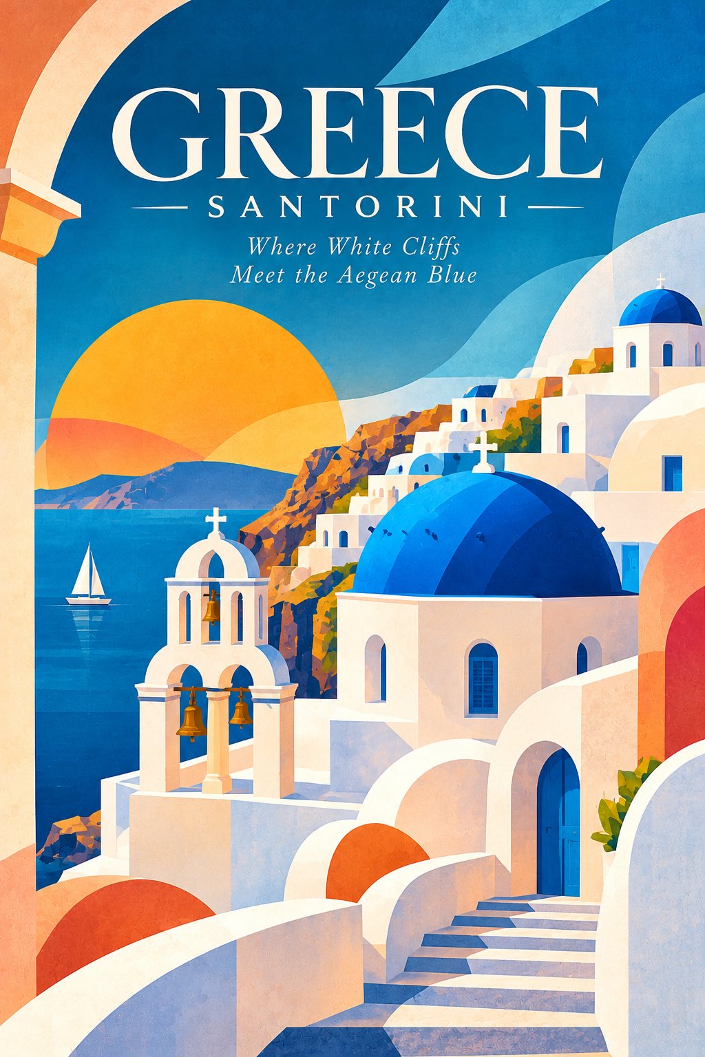
Create an exceptionally beautiful, sophisticated minimalist geometric architectural travel poster featuring [LANDMARK NAME], [CITY], [COUNTRY]. 1. CENTRAL ARCHITECTURAL SUBJECT Feature the iconic landmark as the dominant central attraction. Illustrate its recognisable architectural structure using simplified geometric shapes, clean silhouettes, elegant curves and carefully constructed flat-colour forms. Preserve the landmark’s distinctive architectural identity, proportions and signature details. Transform complex architectural details into beautifully simplified artistic elements. Integrate the architecture naturally into the surrounding abstract landscape. 2. ORGANIC GEOMETRIC LANDSCAPE Create an imaginative environment using a combination of abstract geometric and organic forms. Oversized circles, semicircles and curved shapes representing the sun and moon. Flowing hills, layered mountains and abstract landscape formations. Architectural arches, rectangular frames and sculptural platforms. Overlapping organic shapes creating beautiful depth and dimension. Simplified trees, water bodies, pathways and natural elements. Large geometric foreground elements framing the landmark. Every shape should feel intentional, balanced and artistically connected. 3. DISTINCTIVE COMPOSITION Create a visually striking composition inspired by contemporary Swiss graphic design, Bauhaus principles and modern editorial illustration. Strong central architectural arrangement. Beautiful interaction between positive and negative space. Layered foreground, middle ground and background. Oversized abstract forms framing the architecture. Elegant asymmetrical balance. Bold shapes with carefully controlled proportions. Avoid unnecessary details and visual clutter. 4. UNIQUE DESTINATION COLOUR PALETTE Develop a completely distinctive colour identity inspired by the destination’s cultural character, architecture and natural environment. Use approximately 5–7 carefully coordinated colours. Combine bold contrasting tones with sophisticated muted shades, warm neutrals and occasional unexpected accents. Every destination must receive its own original palette. Never repeat colour combinations across the collection. 5. COLOUR AND SHAPE INTERACTION Use large areas of solid colour, subtle overlapping forms and beautifully controlled tonal transitions. Crisp, clean edges. Smooth organic curves. Flat graphic illustration. Subtle paper-grain texture. Minimal gradients used selectively. Beautiful colour blocking. No excessive photorealism or 3D effects. 6. POSTER TYPOGRAPHY Include sophisticated editorial typography. Main title: [DESTINATION NAME] Secondary text: [COUNTRY] Add a small poetic tagline inspired by the destination. Use elegant oversized contemporary serif or refined modern sans-serif typography. Typography should feel like an integral part of the composition rather than an afterthought. 7. FINAL ART DIRECTION A beautiful fusion of minimalist architecture, organic geometry, contemporary graphic design, modernist illustration and premium international travel poster aesthetics. The finished artwork should feel timeless, intelligent, artistic, visually memorable and suitable for a prestigious design exhibition. Museum-quality graphic composition, exceptional colour harmony, clean silhouettes, refined details and sophisticated visual storytelling. Portrait 2:3 format. No borders, no watermark, no unnecessary text. Preserve the authentic recognisable identity of the landmark.
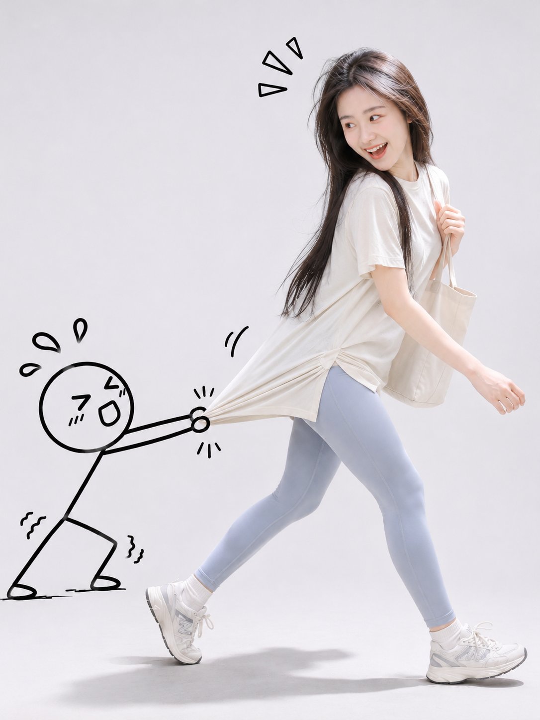
以用户上传的人物照片为唯一人物参考,创作一张充满趣味与创意的「真人摄影 × 二维手绘涂鸦」混合媒介时尚写真。 【人物还原】 准确保留上传照片中人物的面部特征、五官比例、脸型、发型、发色、肤色、年龄感与个人气质,确保生成的人物与原照片具有高度一致的身份辨识度。优先保留原照片中的服装款式、配色及穿搭特点,不随意改变人物容貌或服饰风格。 【创意互动】 以真实人物与黑色手绘火柴小人的趣味互动作为画面核心。 人物位于画面中间偏右,以自然活泼、富有动感的姿势向右前方迈步,身体微微前倾,一条腿向前迈出,另一条腿自然向后延伸。人物回头望向身后的手绘小人,露出开心大笑、俏皮惊讶或略带无奈的生动表情,呈现充满故事感的抓拍瞬间。 画面左侧出现一个由黑色粗线条绘制的可爱简笔画小人,圆形脑袋、简单五官、细线条四肢,表情滑稽有趣。 小人双手用力拉住真实人物的衣角、衣袖或随身包袋,身体后仰,双腿弯曲,摆出拼命阻止人物离开的滑稽姿态。根据人物实际服装与配饰自动选择最自然的互动位置。 强调真实的互动效果:小人的手准确抓住真实衣物或配饰,衣服受到拉力产生自然的拉伸变形、褶皱和张力,二维手绘线条与真实摄影主体在接触位置精确衔接,营造手绘角色真实参与人物动作的视觉错觉。 【手绘风格】 采用极简、可爱、幽默的黑色马克笔手绘涂鸦风格。线条略带自然的手绘不规则感,粗细适中,形象扁平化,不添加立体阴影、复杂纹理或真实材质。 在人物和小人周围点缀少量手绘感叹号、汗滴、动作线、爱心或俏皮符号,强化互动情绪。涂鸦自然融入构图,不遮挡人物面部。 【场景与构图】 极简浅灰白色摄影棚,无缝纯净背景,地面带有柔和真实的接触阴影。 采用3:4竖版全身构图,真实人物集中在画面右侧,手绘小人位于左侧,两者通过拉扯动作形成清晰的视觉联系。人物与小人完整入镜,双脚清晰可见,画面周围保留适当留白,整体清爽、简洁、富有设计感。 【摄影与质感】 专业商业时尚摄影,柔和均匀的摄影棚漫射光,人物皮肤纹理真实自然,头发细节清晰,服装纤维与褶皱真实细腻,动作自然生动,色彩明亮柔和。 真人部分呈现高分辨率照片级写实效果,手绘部分保持纯粹的二维黑色涂鸦质感,两种视觉语言形成鲜明而和谐的对比。 整体氛围轻松、俏皮、可爱、富有幽默感,具有社交媒体创意时尚写真的视觉吸引力。 无文字、无水印、无复杂背景、无多余卡通人物。
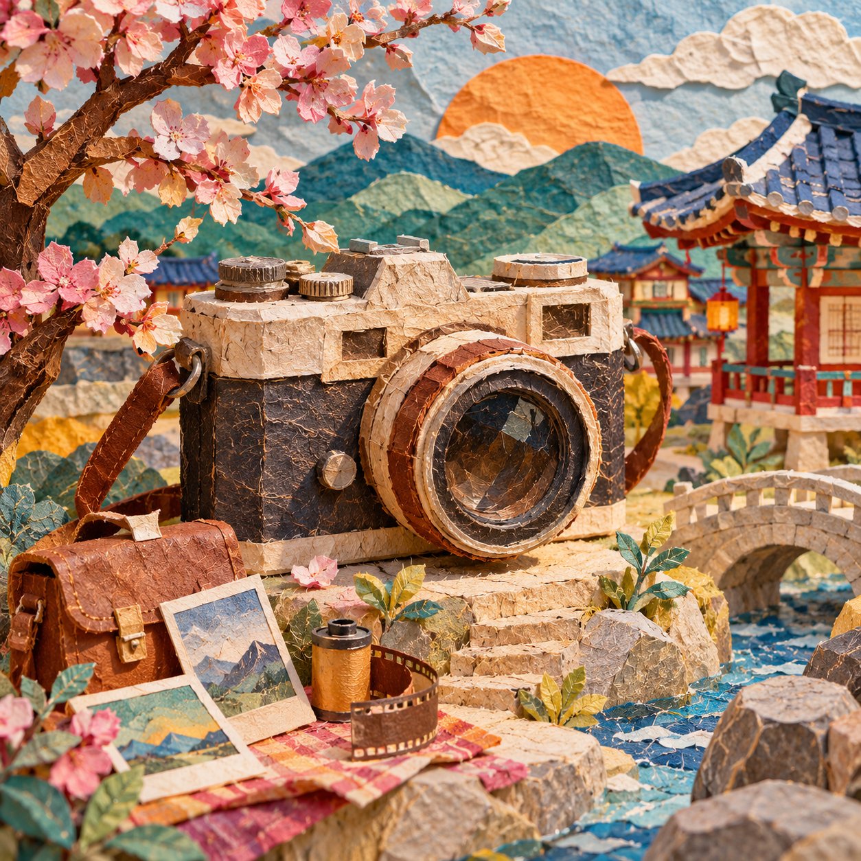
KOREAN HANJI PAPER ART | WHIMSICAL 3D MINIATURE DIORAMA Create a beautiful, highly detailed, handcrafted 3D paper-art illustration featuring [TYPE YOUR SUBJECT / OBJECT / CITY / SCENE], reimagined through the traditional Korean Hanji paper-art aesthetic. ART DIRECTION & VISUAL STYLE Transform the entire scene into an imaginative miniature world made from layered Korean Hanji paper. Use authentic handmade paper textures, visible delicate fibres, subtle wrinkles, torn edges, embossed details and carefully cut paper elements. Combine traditional Korean visual heritage with contemporary lifestyle, architecture and modern objects. The result should feel like a sophisticated fusion of Korean folk art, paper sculpture and playful contemporary design. COMPOSITION & STORYTELLING Build a rich, three-dimensional miniature environment around the main subject. Make the primary subject instantly recognizable and visually dominant. Surround it with thoughtfully selected supporting elements that complement the subject. Incorporate traditional Korean architectural details, colourful urban surroundings, decorative patterns, miniature props and unexpected creative combinations wherever appropriate. Create a visually engaging composition with convincing depth, overlapping paper layers, realistic miniature proportions and carefully arranged foreground, middle ground and background. MATERIALS & TEXTURES - Traditional Korean Hanji paper with visible natural fibres. - Layered and sculpted paper architecture. - Intricate cut-paper ornaments and embossed details. - Soft handmade imperfections and tactile surfaces. - Rich paper-cut textures with dimensional shadows. - Handmade miniature objects with convincing physical construction. COLOUR & LIGHTING Use a vibrant yet harmonious palette of warm terracotta, turquoise, cobalt blue, mustard yellow, coral, cream and earthy browns. Introduce beautiful atmospheric lighting, soft directional sunlight, gentle shadows and subtle highlights that emphasize the layered paper construction. FINAL AESTHETIC The finished artwork should resemble an exceptionally crafted miniature paper sculpture photographed in a professional studio. Blend whimsical storytelling, Korean cultural identity, contemporary creativity and premium editorial illustration. Ultra-detailed, tactile, colourful, imaginative, visually balanced, handcrafted 3D paper diorama. Every element must appear constructed from real Hanji paper rather than digitally painted or rendered plastic. FORMAT: Square 1:1 composition. No text, captions, typography, watermarks or logos.
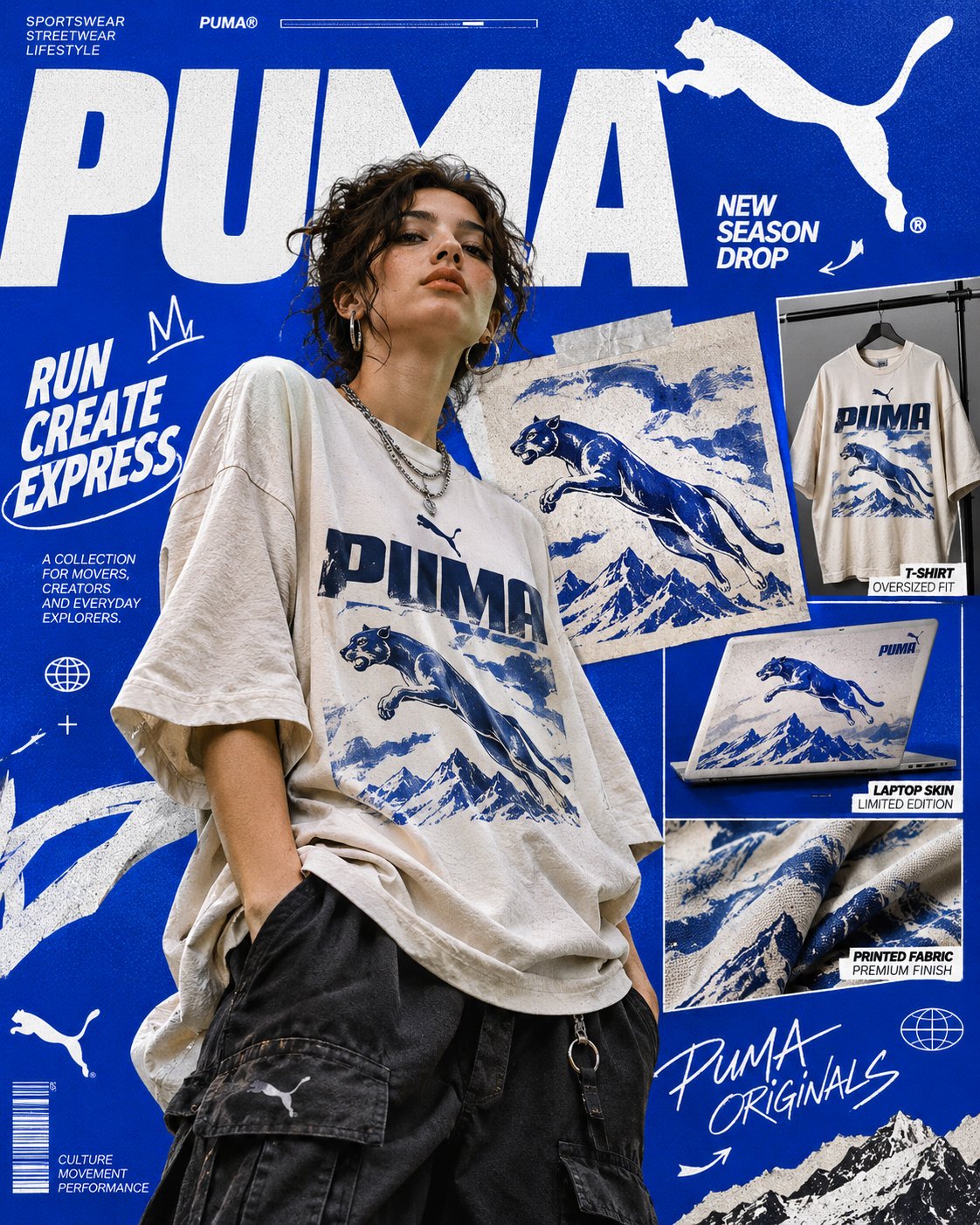
BOLD EDITORIAL STREETWEAR CAMPAIGN | GRAPHIC DESIGN & PEACE ART Create a striking, high-fashion editorial advertising poster for [BRAND / CAMPAIGN / CONCEPT], blending contemporary streetwear photography with oversized typography, artistic graphics, and commercial product presentation. COMPOSITION & PHOTOGRAPHY Feature a stylish young adult model in a relaxed, confident pose, wearing an oversized graphic T-shirt featuring [YOUR ARTWORK / DESIGN], layered with contemporary streetwear pieces. Use natural-looking editorial photography, dynamic styling, realistic fabric textures, and a bold fashion-magazine aesthetic. GRAPHIC DESIGN & LAYOUT Build a vibrant electric-blue background with oversized white typography, overlapping headlines, curved connecting lines, small informational labels, decorative symbols, and hand-drawn illustrations. Arrange the composition like a premium independent fashion magazine cover mixed with a creative advertising campaign. PRODUCT SHOWCASE Display the featured artwork across multiple products, including a T-shirt, laptop, printed fabric, and large close-up graphic panel. Ensure the original artwork remains visually consistent across every product. VISUAL STYLE & FINISH Use strong visual hierarchy, asymmetrical layouts, layered elements, crisp cutout photography, bold contrast, playful graphic details, and sophisticated editorial art direction. Combine modern streetwear culture with experimental Swiss-inspired graphic design. The final result should look like an authentic, professionally art-directed fashion campaign: energetic, youthful, visually rich, highly detailed, and instantly eye-catching. Vertical 4:5 composition, ultra-sharp, premium commercial poster quality.
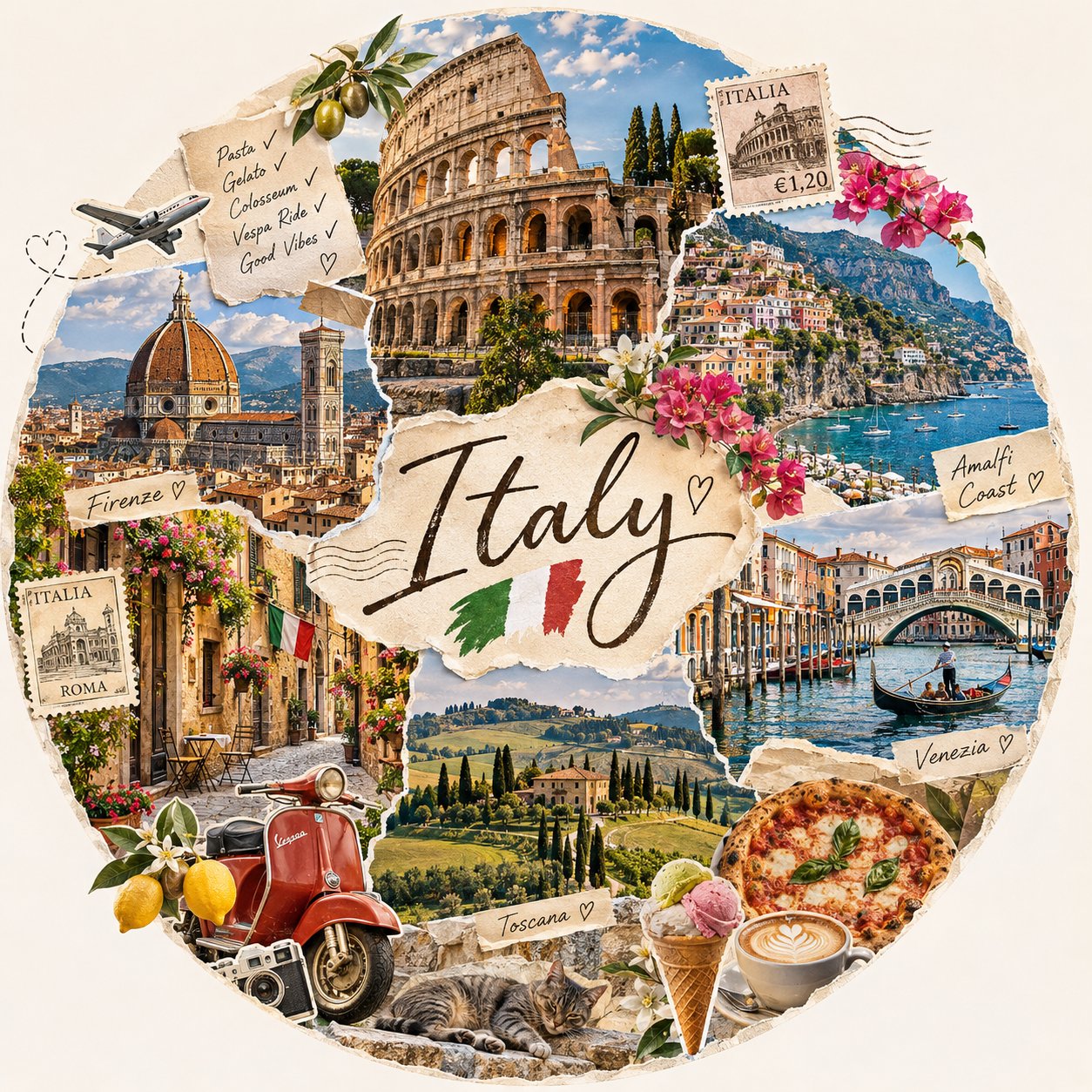
Create a beautiful, highly detailed travel-inspired scrapbook collage featuring [YOUR DESTINATION / COUNTRY / CITY / THEME], designed as an elegant circular composition on a clean, warm ivory background. COMPOSITION & VISUAL STYLE Build a large, perfectly balanced circular collage filled with multiple overlapping, realistic photographs showcasing the destination's most iconic landmarks, beautiful landscapes, architecture, local culture, street scenes, and signature food. Arrange the photographs like carefully layered vintage travel magazine cutouts, with subtle torn-paper edges and natural transitions. DESIGN DETAILS Place the destination name prominently in the centre using elegant handwritten cursive typography. Incorporate small decorative elements such as the country's flag, vintage postage stamps, miniature airplane illustrations with dotted flight paths, tiny hearts, handwritten travel notes, botanical leaves, flowers, and playful travel doodles. COLOUR & AESTHETIC Use a soft, sophisticated palette of warm cream, muted pastels, natural greens, gentle blues, and sunlit photographic tones. Add subtle paper textures, delicate shadows, and fine hand-drawn outlines to create a charming, handcrafted editorial appearance. FINAL PRESENTATION Keep the entire circular artwork clearly visible, centred, and surrounded by generous ivory negative space. Maintain a polished, cohesive composition with realistic photography and artistic scrapbook layering. Every destination should have its own unique visual identity while retaining the same elegant aesthetic. Aspect ratio: 1:1. Quality: Ultra-detailed, high-resolution, premium editorial design.
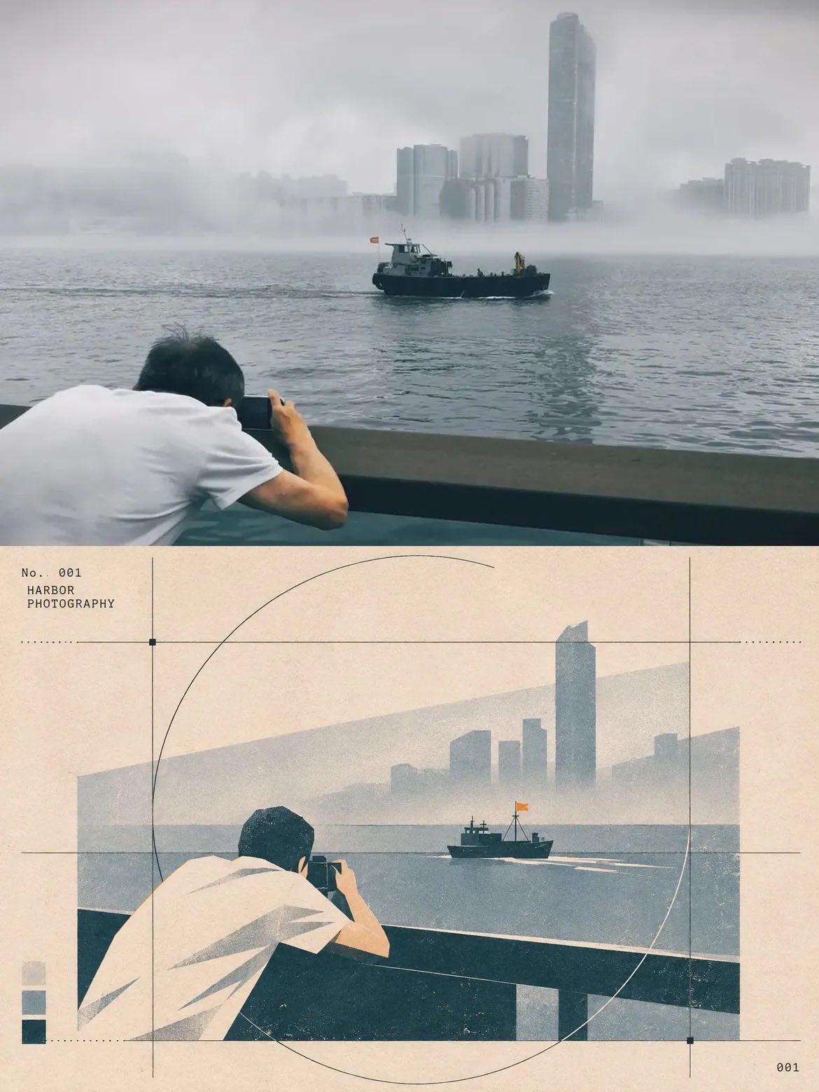
Transform the uploaded reference photograph into a sophisticated vintage editorial photography poster, following the exact visual aesthetic of the provided examples. Create a vertical 2:3 split-layout composition. Place the original photograph in the upper half, preserving its original colors, subject, camera angle, perspective, framing, and details. In the lower half, recreate the exact same scene as a minimalist, geometric, vintage-inspired 2D illustration. Use a refined Swiss graphic design and Bauhaus-inspired editorial aesthetic. Apply a muted, earthy color palette featuring warm beige, cream, charcoal black, dusty grey, muted blue-grey, and subtle brown tones. Simplify the subjects and surroundings into clean geometric shapes, bold silhouettes, angular forms, and flat color blocks while maintaining the original scene's composition and recognizable details. Add a subtle aged paper texture, fine grain, distressed vintage print effects, and slightly faded ink. Incorporate delicate graphic design elements such as thin circular arcs, vertical and horizontal alignment guides, intersecting lines, dotted lines, small square markers, and minimal geometric grids around the illustrated scene. Include small editorial typography in a typewriter-style font, with a numbered photographic series label in the upper-left corner of the illustrated section. Add a small sequence number in the bottom-right corner and a minimal three-color palette swatch along the lower-left edge. Maintain generous negative space, precise alignment, balanced proportions, and an elegant museum-quality art direction. IMPORTANT: Preserve the original photograph in the upper section without changing the scene. The lower illustration must represent the exact same photograph, including the same subjects, positions, perspective, architecture, objects, and background. Do not introduce new elements or change the original composition. Overall aesthetic: vintage photography journal, Swiss editorial graphic design, minimalist architectural illustration, retro art direction, sophisticated print design, and timeless visual storytelling. High resolution, crisp details, vertical poster format.

關於 GPT Image 2.6

GPT Image 2.6 是 OpenAI 的图像生成模型,也是 Images 2.5 的直接继任者。最显眼的变化是速度——OpenAI 称其生成速度比 2.5 快 50%——但更有意思的是输出形态的扩展:同一条提示词,现在可以拿回一张静态图、一段循环 GIF,或一份矢量 SVG。

真正让 2.6 在生产环境站稳脚跟的是编辑能力。区域标记让你指向要改的那一块、其余部分保持原样;独立的复杂度控制决定渲染前做多少规划——快速局部修改变低,密集排版和多个物体互相作用的场景调高。角色、产品与品牌细节在反复多轮编辑中能保持一致。

因为它在落笔前先做规划,提示词依然最好写成设计需求文档:主体、布局、精确文案、约束条件。上方画廊收录了经过验证的 GPT Image 2.6 提示词及真实输出,你可以直接复制一个已经跑通的结构,而不必从头推导。

如何寫好 GPT Image 2.6 提示詞

  1. 1写需求文档,不要堆关键词:主体、布局、精确文字、约束。GPT Image 2.6 在渲染前先规划场景,你写下的每条要求都是它能自检的清单项。
  2. 2做 GIF 时要导演循环,而不只是描述某一帧:说清什么在动、什么不动、运动如何回到起点、一个循环应该持续多久。
  3. 3只有画面由形状构成时才要 SVG——图标、logo、扁平插画、示意图。照片级质感属于位图,矢量化追踪会把它简化掉。
  4. 4编辑时先指出区域和改动,再说明什么不能动:「只改招牌;人物、光线和背景保持不变」。区域标记回报最高的地方,正是你把边界说清楚。
  5. 5让规划强度匹配任务。密集文字、多栏排版、多个物体互动值得更多规划;只改一个元素则相反。结果跑偏时,指出哪一部分偏了,简报其余部分逐字保留。
  6. 6精确文案放引号里:写着「营业到深夜」的招牌、印着「打工人专用」的马克杯。文字渲染是它可靠的强项,引号内的字符串能熬过那些会把转述文字改花的编辑。

常見問題

GPT Image 2.6 相比 2.5 有什么新东西?

更快的生成速度、循环 GIF 输出、矢量 SVG 导出、区域标记编辑,以及一个独立的复杂度控制来决定渲染前做多少场景规划。API 提供两个变体:偏速度的 Flare 与偏细节的 Sunburst。

GPT Image 2.6 能生成动态 GIF 吗?

能。用提示词或草图要求一段循环动画,描述什么在动、循环如何闭合,它就会返回可直接分享的 GIF。它面向短循环——吉祥物、产品旋转、表情包、小段叙事——而不是长视频。

怎样只改画面的一部分而不动其余部分?

指向要改的区域,并明确说出边界:「只改这块招牌,人脸、光线和背景保持原样」。2.6 对未编辑区域的保留远好于早期版本,但把「什么必须不变」写出来,编辑才真正可控。

在哪里可以使用 GPT Image 2.6?

ChatGPT 和 Codex 的各档订阅均可使用,开发者可走 OpenAI API。从本页复制任意提示词粘贴过去,替换成你自己的主体或文案即可。