Maggi Billboard FMCG Campaign

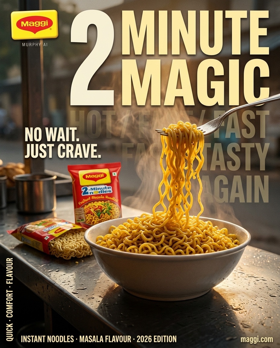
MAGGI® — “2 MINUTE MAGIC” AGENCY-GRADE CINEMATIC FMCG BILLBOARD CAMPAIGN FORMAT: Premium FMCG Key Visual / Outdoor Advertising Billboard ASPECT RATIO: 4:5 Portrait RESOLUTION: Ultra-high-resolution 8K, print-ready detail VISUAL STYLE: Hyper-realistic commercial food photography, premium Indian FMCG advertising, large-format editorial art direction CAMERA: ARRI Alexa Mini LF visual character, 35mm anamorphic perspective, controlled low-angle composition ART DIRECTION: Murphy AI CORE CREATIVE IDEA: Transform an ordinary bowl of Maggi into an irresistible moment of instant gratification. The visual should communicate speed, warmth, familiarity, and intense food craving in a single frame. The noodles are the hero; the typography becomes a monumental graphic element integrated into the photographic environment. The final result must feel like a professionally art-directed global billboard campaign, not a generic AI-generated food poster. 01 — HERO SCENE & ENVIRONMENT A cinematic Indian roadside chai-and-snack stall at first light, captured immediately after a light drizzle. The setting feels authentic, atmospheric, and unexpectedly premium. A dark, rain-dampened stainless-steel counter occupies the foreground, reflecting the warm amber glow of the rising sun. At the exact center of the composition sits a generous ceramic bowl filled with freshly prepared Maggi Masala noodles. The noodles retain their unmistakable thin, curly structure, coated in a rich golden-yellow masala sheen with subtle orange seasoning, delicate oil highlights, and realistic moisture. A stainless-steel fork enters from the upper-right quadrant, lifting a substantial bundle of noodles in a dramatic upward arc. Individual strands separate naturally, forming intricate overlapping curves with physically believable weight, tension, and gravity. Some strands remain connected to the bowl, creating a continuous visual path that directs the eye from the food toward the headline. Thick, freshly released steam rises from the bowl in distinct translucent layers. Warm sunlight penetrates the vapor, creating luminous golden edges and subtle volumetric depth without obscuring the food. A few microscopic droplets of masala-coated moisture catch the backlight near the lifted noodles. Keep the action restrained and appetizing; no exaggerated splashes or artificial floating ingredients. 02 — PRODUCT HERO & PACKAGING ACCURACY Position one upright, sealed Maggi Masala Noodles packet behind the bowl, slightly left of center. Place a second, partially opened packet beside it, with the uncooked noodle cake visibly emerging from its original packaging. The packaging must remain physically plausible, with realistic plastic-film reflections, natural folds, accurate packet proportions, and legible branding. Use authentic Maggi packaging references wherever supplied. Preserve the original red-and-yellow brand identity, logo proportions, product naming, and packaging artwork. Do not invent additional product claims, redesign the logo, or generate counterfeit-looking package text. The bowl remains the largest physical object in the foreground. The packets provide immediate brand recognition without competing with the noodles. Any distant stall objects must be secondary, softly defocused, and free of distracting signage. 03 — COMPOSITION & VISUAL HIERARCHY Build the frame using a carefully controlled three-plane composition. FOREGROUND: The reflective counter, the bowl, individual noodle strands, and subtle moisture details. Razor-sharp food texture with premium commercial styling. MIDGROUND: The Maggi packaging, fork, and ascending noodle movement. The fork and noodle strands form the principal diagonal leading line. BACKGROUND: A quiet, early-morning Indian street with shuttered storefronts, indistinct architectural silhouettes, distant atmospheric haze, and restrained practical lights. Use a low camera position close to counter height. Keep the bowl visually substantial and the lifted noodles silhouetted against a brighter area of steam and sunrise. Reserve a clean, dark-to-warm gradient in the upper-middle and right portions of the frame for the primary headline. Typography must remain readable at billboard viewing distance. The composition should feel bold and asymmetrical, with deliberate negative space rather than excessive decorative elements. 04 — PRIMARY BILLBOARD TYPOGRAPHY MAIN HEADLINE: “2 MINUTE MAGIC” Set in monumental, ultra-bold condensed sans-serif typography with custom optical spacing, tight kerning, and precise alignment. The headline occupies the central upper half of the poster, extending across the composition without covering the bowl or the critical noodle silhouette. Use warm ivory or pale butter-yellow lettering with selective deep-red accents. Introduce subtle dimensional separation through controlled shadowing and atmospheric integration, never through excessive bevels, extrusion, or artificial 3D effects. The numeral “2” should be the dominant typographic anchor. “MINUTE” creates a strong horizontal block, while “MAGIC” delivers the final visual impact. The typography should feel engineered for a high-visibility Times Square-scale advertising installation: immediate comprehension, powerful contrast, and unmistakable hierarchy. 05 — SECONDARY TYPOGRAPHIC SYSTEM BACKGROUND TYPOGRAPHY: “HOT / FAST / TASTY / AGAIN” Repeat this phrase as oversized, low-opacity typographic layers receding into the background. Use progressively reduced contrast and carefully controlled perspective to create depth. The words must sit behind the physical subject, with portions naturally disappearing into the atmospheric haze. Maintain sufficient separation from the main headline. MID-LEFT SUPPORTING COPY: “NO WAIT. JUST CRAVE.” Set in bold condensed uppercase lettering, smaller than the headline but strong enough to read at a glance. Position it w
Details
- Type
- AI Image Prompts
- Aspect Ratio
- 29:36
- Updated
- Oct 13, 2026
Category
How to use this prompt
- 1Copy the full prompt with the copy button above.
- 2Open Nano Banana 2.1 by Google, or any image generator with a similar style range.
- 3Paste the prompt, then swap the subject and style keywords to match your idea.
- 4Match the example's settings (29:36 · Cinematic · Advertising · Food), then iterate — small wording changes shift the output a lot.
Frequently asked questions
Which AI model generated this image?
This image was generated with Nano Banana 2.1 by Google. The prompt on this page is the exact text used to create it.
What settings does this prompt use?
The example was generated with Nano Banana 2.1 using: 29:36 · Cinematic · Advertising · Food. Reusing these settings gives the closest match.
How do I get similar results?
Copy the prompt as-is first, then replace only the subject while keeping the style, lighting, and composition keywords. Generate a few variations — outputs differ between runs.
Can I modify this prompt?
Yes. Prompts work best as starting points — adjust descriptors, aspect ratio, or style tags to make the output your own.