H&M New Uniform Fashion Poster
 Nano BananaGoogleimage
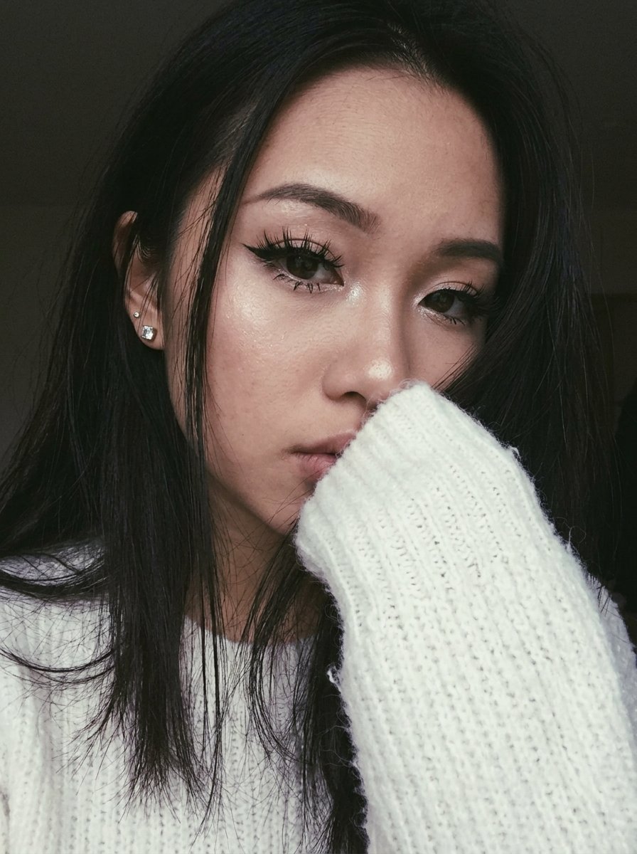
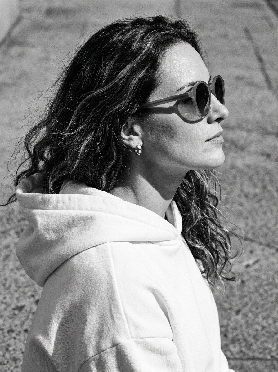
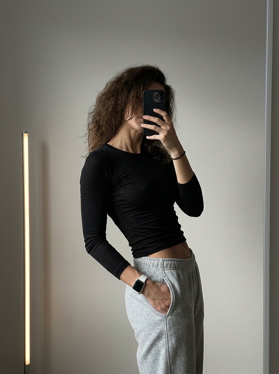
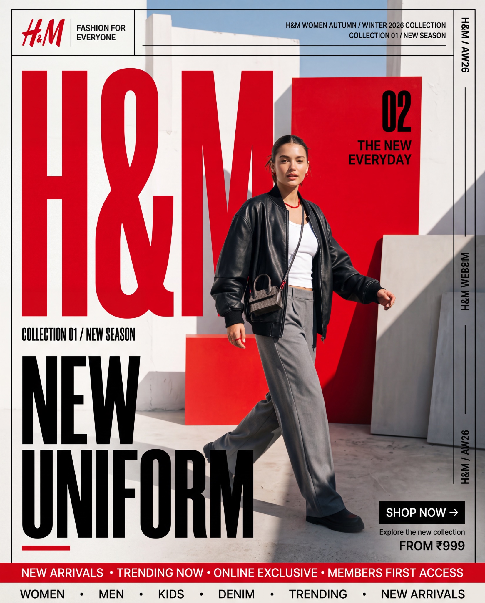
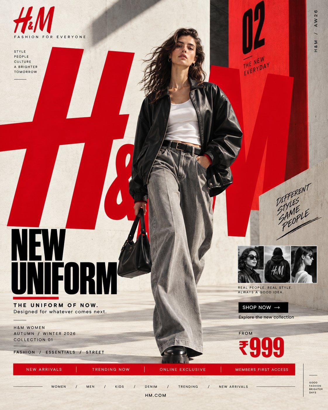
H&M — “NEW UNIFORM” I researched H&M’s current brand/visual system first. The strongest identifiable elements are H&M red + black/white, a bold fashion-led typographic system, dramatic in-the-moment photography, and H&M’s own type family. H&M’s published style guide specifically emphasizes dramatic contrast, captivating in-the-moment/action photography, while its typography system uses IBM Plex Sans for supporting copy and a condensed headline face for impact. H&M also maintains proprietary fonts including HMSans, HMSerif, HM Amperserif and HMMove. So unlike the MANGO direction, this should be more energetic, graphic, youthful and high-contrast rather than Mediterranean/minimal. ⸻ PROMPT — H&M “NEW UNIFORM” FORMAT Ultra-Premium H&M Fashion SMM Promotional Poster Vertical 4:5 Instagram Hero Creative Global Fashion Retail Campaign Contemporary Fashion Advertising Commercial Fashion Graphic Design Agency-Level Art Direction Behance Front Page Quality 8K UHD Hyper-Realistic Fashion × Graphic Design × Street Culture Fusion High-Impact Visual Communication Zero AI Slop Zero Generic Fast-Fashion Advertising Zero Catalogue Aesthetic Zero Luxury-Copycat Aesthetic ⸻ CORE STRATEGY This is not simply a clothing advertisement. This is H&M turned into a visual statement. The campaign should communicate: fashion moves fast. culture moves faster. H&M should feel: accessible + expressive + contemporary + youthful + global + confident. The visual language should combine: H&M fashion campaign × editorial magazine × street-culture poster × high-fashion graphic design × digital-first social advertising The result should feel unmistakably H&M, not Zara, Mango, COS or a generic luxury fashion brand. H&M’s own published style direction emphasizes dramatic contrast and in-the-moment photography, so the photography should feel alive rather than static. ⸻ CAMPAIGN IDEA “NEW UNIFORM” Forget traditional uniforms. This is: THE UNIFORM OF NOW. The clothes represent the constantly changing identity of a new generation. One day: minimal. Next day: street. Next: tailored. Next: experimental. H&M becomes the wardrobe that keeps up. The campaign message: THE UNIFORM CHANGES. YOU DON’T HAVE TO. ⸻ MASTER VISUAL Create an enormous typographic structure reading: H&M The typography should occupy approximately 60–70% of the entire composition. But unlike the MANGO concept, the H&M typography should feel: bold compressed graphic energetic slightly disruptive The giant H&M lettering can be: partially cropped, stacked, repeated, layered, hidden behind the model, intersected by red graphic blocks, cut by diagonal photographic frames, and pushed beyond the canvas. The typography should feel like a physical poster installation, not simple text. ⸻ HERO SUBJECT Young female fashion model. Contemporary global fashion appearance. Natural skin texture. Strong expressive face. Minimal but polished makeup. Confident expression. No artificial influencer smile. No exaggerated luxury pose. The model should feel like someone who actually belongs in the city. Youthful. Self-assured. Energetic. Culturally aware. ⸻ WARDROBE Create a contemporary H&M fashion look. HERO LOOK Oversized black leather-effect bomber jacket. Crisp white fitted tank. Relaxed wide-leg grey trousers. Chunky black footwear. Small silver jewelry. Structured mini shoulder bag. Subtle red accessory detail. Layered styling. The clothing should feel: accessible fashion elevated through styling. Not couture. Not runway costume. Not quiet luxury. Not excessive branding. The clothes should look genuinely wearable. ⸻ POSE / MOVEMENT The model is captured mid-stride. One foot forward. Jacket moving naturally. Hair slightly moving. Body turned approximately 15 degrees. Direct eye contact. One hand adjusting the jacket. Other hand relaxed. The image should feel like a moment captured rather than a pose performed. This directly aligns with H&M’s published preference for dramatic, in-the-moment/action-oriented imagery. ⸻ COMPOSITION TYPOGRAPHY 60–70% MODEL 20–25% GRAPHIC / PROMOTIONAL INFORMATION 10–15% Visual hierarchy: H&M ↓ NEW UNIFORM ↓ MODEL ↓ COLLECTION INFORMATION ↓ CTA Create strong visual tension between the model and typography. The model should partially cover the giant letters. ⸻ H&M COLOR SYSTEM PRIMARY H&M RED Strong saturated red. Use approximately: #E50010 as the primary visual reference. BLACK #000000 Used for: typography, fashion, graphic blocks, borders, micro typography. WHITE #FFFFFF Used for: negative space, copy, graphic panels, background areas. The recognizable H&M visual palette is strongly associated with red, black and white. ⸻ COLOR RATIO 60% White / light neutral 20% Black 15% H&M Red 5% photographic natural tones The red should be strategic, not flooding the entire poster. Use red as a visual trigger. Red graphic rectangle. Red typography. Red edge strip. Red accessory. Red CTA. The eye should naturally travel toward the red elements. ⸻ BACKGROUND Create a contemporary urban studio environment. White architectural walls. Concrete floor. Large geometric panels. Sharp sunlight. Hard shadows. One massive H&M red architectural block. Black graphic planes. Subtle paper/poster texture. The environment should feel halfway between: fashion studio and urban billboard installation. No recognizable city. No distracting scenery. No luxury hotel. No generic streetwear alley. The graphic environment itself should create the H&M world. ⸻ GRAPHIC DESIGN SYSTEM Create an aggressive but controlled editorial grid. Use: bold horizontal rules, vertical lines, red rectangles, black blocks, oversized numerals, micro typography, cropped type, collection codes, thin borders, small directional arrows, photographic crop windows. Introduce a subtle poster-within-poster system. For example: a small secondary campaign image appears inside a red fra
Details
- Type
- AI Image Prompts
- Aspect Ratio
- 825:1024
- Updated
- Oct 9, 2026
Category
How to use this prompt
- 1Copy the full prompt with the copy button above.
- 2Open Nano Banana by Google, or any image generator with a similar style range.
- 3Paste the prompt, then swap the subject and style keywords to match your idea.
- 4Match the example's settings (825:1024 · Poster · Advertising · Fashion), then iterate — small wording changes shift the output a lot.
Frequently asked questions
Which AI model generated this image?
This image was generated with Nano Banana by Google. The prompt on this page is the exact text used to create it.
What settings does this prompt use?
The example was generated with Nano Banana using: 825:1024 · Poster · Advertising · Fashion. Reusing these settings gives the closest match.
How do I get similar results?
Copy the prompt as-is first, then replace only the subject while keeping the style, lighting, and composition keywords. Generate a few variations — outputs differ between runs.
Can I modify this prompt?
Yes. Prompts work best as starting points — adjust descriptors, aspect ratio, or style tags to make the output your own.