LogoAhaPrompt
  • Prompts
  • Featured
  • Models
  • Submit
  • Blog
AhaPromptAhaPrompt

AI Prompts for Images, Video & Audio — Every Model, One Library

Built withLogoNEXTY.DEV
Explore
  • All Prompts
  • Featured Prompts
  • Image Prompts
  • Video Prompts
  • Audio Prompts
  • AI Models
  • Submit a Prompt
  • Blog
Languages
  • English
  • 中文
  • 日本語
  • 한국어

Copyright © 2026 AhaPrompt All rights reserved.

Privacy PolicyTerms of Service
HomeAI Prompt LibraryAI Image PromptsNoodori Noodle Puff Poster Ad
Noodori Noodle Puff Poster Ad — AI image prompt — GPT Image 2.5 — Product Photography, Advertising, Food

Noodori Noodle Puff Poster Ad

OpenAIGPT Image 2.5OpenAIimage

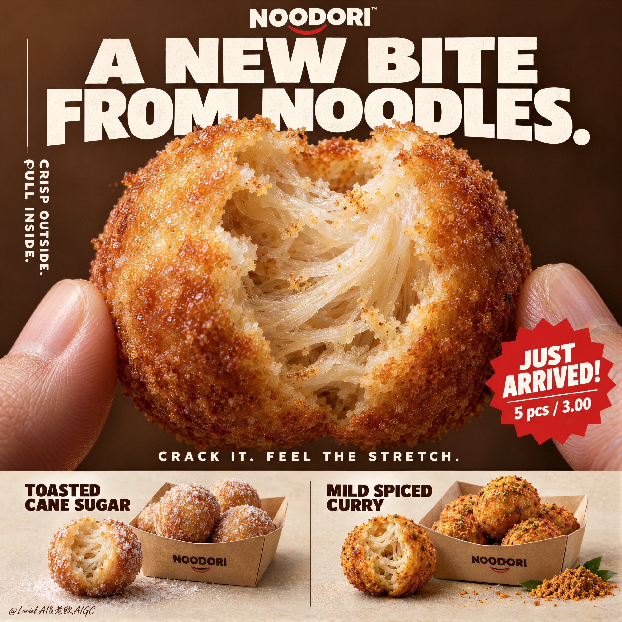
A hyper-real premium poster advertisement for a fictional snack brand called NOODORI, designed in an Orbit-plus-Port direction: a bold product-launch key visual with one monumental macro food hero, highly controlled graphic typography, and a refined lower product strip. The core product is a fried noodle-dough snack ball called "Noodle Puff", presented as an ultra-real edible object with intense tactile realism and a surprising internal structure. One giant bitten snack ball dominates the center of the frame, delicately held between two natural human fingertips entering from the lower left and lower right edges. The bite opening reveals an airy fibrous interior with visible noodle-like stretch, layered starch threads, and a soft elastic pull inside a thin crisp golden shell. The product is the absolute visual hero. Framing and composition: vertical poster layout, strong central macro composition, oversized hero product cropped large enough to feel immediate and almost architectural. Keep the upper field as a warm chestnut-brown poster plane with large white typographic mass, a cleaner vertical support text column on the left, one sharp promotional badge on the lower right of the hero area, and a highly disciplined product information strip running across the bottom. Preserve the original retail-poster logic, but reduce noise and make the entire page more sculptural, gallery-like, and premium. The fingers act only as scale and human interaction cues, never competing with the food. Product design: the hero snack is a perfectly round fried noodle puff with a thin blistered golden crust, subtle fried granularity, light oil sheen, and a naturally torn bite edge exposing a mochi-like noodle matrix inside. The interior should feel surprising, soft, and layered rather than bread-like. In the bottom product strip, present two flavor variants in a clean side-by-side system: one pale sugar-dusted version and one deeper warm curry-spiced version. Each flavor sits beside a simple folded kraft takeaway tray with a few neatly arranged full snack balls. The lower strip must feel tidy, retail-ready, and secondary to the hero bite. Lighting and color: soft but directional premium food lighting from upper front-right, gentle warm fill from the left, crisp readability inside the torn interior, elegant highlights on the crust, and subtle shadows under the bottom flavor presentations. Build stronger light-dark separation than a typical snack poster so the shell volume, interior fibers, and headline typography gain sculptural force. Palette balance: 60% chestnut brown, toasted amber, and warm golden crust; 30% creamy ivory interior and kraft-paper neutrals; 10% saturated red promotion accents and spice-yellow flavor notes. No muddy browns, no dead black patches, no greasy over-darkness. Materials and finish: hyper-real food photography fused with premium Japanese-style poster design. Show crisp fried crust grain, delicate starch translucency in the inner layers, realistic soft tear fibers, matte paper tray texture, natural fingertip skin texture, and clean print-like typography integration. The final finish should feel like a Cannes-level convenience-food launch poster: tactile, surprising, minimal yet commercially explosive. Typography: all visible copy in English only, highly art-directed and integrated into the poster. Top brand mark reads exactly: "NOODORI". Main headline at the top reads exactly: "A NEW BITE FROM NOODLES." Left vertical support line reads exactly: "CRISP OUTSIDE. PULL INSIDE." Small excitement line above the bottom strip reads exactly: "CRACK IT. FEEL THE STRETCH." Promotional burst on the lower right of the hero area reads exactly: "JUST ARRIVED!" and beneath it exactly: "5 pcs / 3.00". In the bottom strip, the left flavor label reads exactly: "TOASTED CANE SUGAR" and the right flavor label reads exactly: "MILD SPICED CURRY". Typography should be bold, soft-edged, graphic, and beautifully spaced, with large white forms against the brown field and restrained red accents. Output and constraints: polished premium snack poster, product-first hierarchy, no copied source text, no real brand names, no extra props, no cluttered background scene, no people beyond the partial fingertips. Keep the hands anatomically correct with natural finger joints and correct finger count. Keep the hero snack spherical and believable, the bite natural, the lower strip orderly, and the overall page clean and high-end. Avoid fused fingers, swollen joints, broken snack geometry, messy crumb explosions, excessive oil, warped trays, duplicated snack balls, unreadable text, plastic-looking crust, oversharpening, AI gibberish text, muddy color cast, or drift away from premium commercial food realism.

Details
Type
AI Image Prompts
Aspect Ratio
1:1
Updated
Sep 21, 2026
Category
Product PhotographyAdvertisingFood
Source

How to use this prompt

  1. 1Copy the full prompt with the copy button above.
  2. 2Open GPT Image 2.5 by OpenAI, or any image generator with a similar style range.
  3. 3Paste the prompt, then swap the subject and style keywords to match your idea.
  4. 4Match the example's settings (1:1 · Product Photography · Advertising · Food), then iterate — small wording changes shift the output a lot.

Frequently asked questions

Which AI model generated this image?

This image was generated with GPT Image 2.5 by OpenAI. The prompt on this page is the exact text used to create it.

What settings does this prompt use?

The example was generated with GPT Image 2.5 using: 1:1 · Product Photography · Advertising · Food. Reusing these settings gives the closest match.

How do I get similar results?

Copy the prompt as-is first, then replace only the subject while keeping the style, lighting, and composition keywords. Generate a few variations — outputs differ between runs.

Can I modify this prompt?

Yes. Prompts work best as starting points — adjust descriptors, aspect ratio, or style tags to make the output your own.
More GPT Image 2.5 prompts

Create a Cannes-level travel destination advertising poster for TURKIYE, preserving the exact struct — AI image prompt — GPT Image 2.5
OpenAIGPT Image 2.5
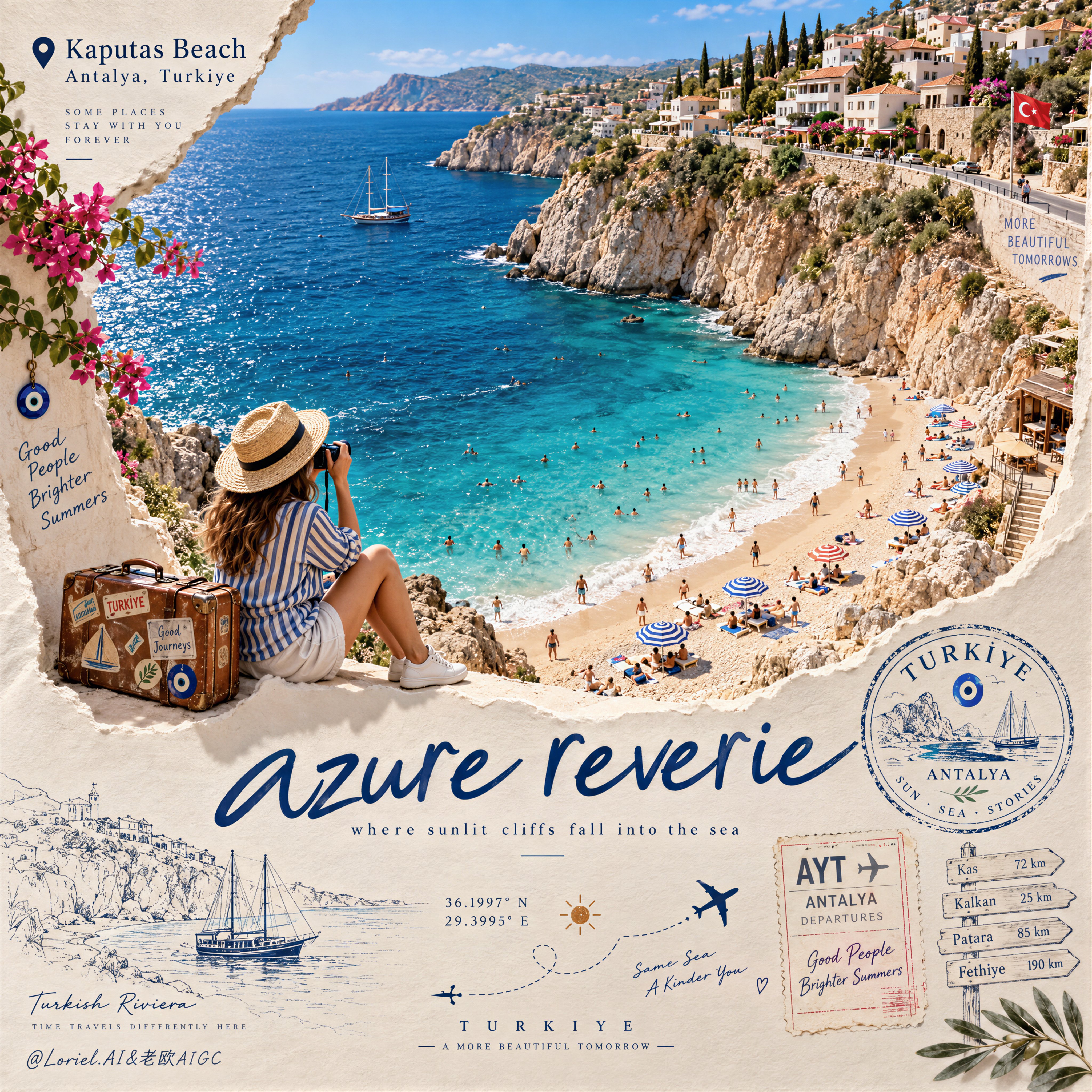
Create a Cannes-level travel destination advertising poster for TURKIYE, preserving the exact structural logic of a premium paper-sculpture tourism print while merging emotional summer atmosphere with forensic material realism. The composition is vertical and built around one large curved torn-paper window that reveals a luminous handcrafted miniature view of KAPUTAS BEACH, ANTALYA, TURKIYE, while the lower foreground remains a refined cream paper field carrying elegant destination typography, travel stamps, route sketches, coordinates, and curated tourism graphics. The final image must feel like a collector-grade Mediterranean travel memory object: tactile, sun-warmed, cinematic, and exquisitely constructed. Hero destination scene: inside the curved paper opening, reveal a radiant turquoise cove embraced by pale limestone cliffs and a gently arcing golden beach. Show layered Mediterranean water bands shifting from pale aqua near the shore to saturated teal and deep azure farther out, with delicate repeating wave lines and bright foam edges rolling onto the sand. Populate the beach with tiny yet believable sunbathers, swimmers, striped parasols, towels, and scattered leisure details, all proportionally correct and integrated into the scene. Along the upper horizon, build a densely stepped hillside of whitewashed and pastel coastal houses, terracotta roofs, boutique balconies, cypress trees, and warm stone terraces, arranged like a refined miniature Mediterranean village. The entire destination window must feel like a luxury handcrafted 3D diorama enhanced with highly realistic micro-surface detail. Narrative foreground: on the lower edge of the cutout, place one seated miniature traveler figure as an emotional invitation into the destination. The traveler wears elegant striped resort clothing, a straw hat, white sneakers, and holds a camera, beside a small vintage suitcase covered in tasteful travel stickers. The anatomy, hands, posture, and clothing folds must be natural and correct. This figure should feel quietly alive, as if pausing at the threshold of memory, adding warmth and human scale without competing with the destination itself. Typography and editorial layout: preserve the same poster rhythm as the reference. At the upper left, place a small map-pin icon followed by “Kaputas Beach” and beneath it “Antalya, Turkiye” in refined editorial type. On the lower paper field, place one large flowing handwritten English title in deep Mediterranean blue, such as “azure reverie”, followed by a small subtitle like “where sunlit cliffs fall into the sea”. Distribute a few highly curated travel graphics across the lower area: one circular passport-style destination stamp, one boarding-pass or visa-stamp element, one dotted flight-path doodle with tiny airplane icons, precise latitude-longitude coordinates, a small sun glyph, a fine-line coastal sketch, and one discreet signpost marking nearby destinations. All typography must feel elegant, airy, and graphically integrated, never generic, heavy, or cluttered. Turkey-specific accents: add subtle premium local cues with restraint. Integrate a tiny evil-eye motif into one stamp or baggage sticker, a delicate line illustration of a gulet sailboat or coastal architectural silhouette in the lower graphics, and visual cues that suggest refined Turkish Riviera identity without becoming folkloric or overloaded. Everything should feel international, luxurious, and compositionally clean. Atmosphere: the poster should carry the sensation of late-morning Mediterranean light, salt in the air, and the emotional softness of an unforgettable summer coast remembered through beautifully crafted paper. The sea must feel alive and breezy, the sky fresh and expansive, and the destination window should radiate optimism, escape, and warmth. The image should feel like a tactile travel keepsake elevated into a world-class advertising object. Material realism: emphasize thick layered paper edges, crisp cut contours, matte card texture, embossed shadow transitions, tiny architectural facade details, miniature umbrellas, foam ridges, cliff stratification, printed stamp ink, luggage leather grain, sticker gloss, clothing fabric weave, and precise micro-scale beach props. The sea should have dimensional depth without losing the handcrafted paper language. The paper opening must cast believable soft shadows onto the lower field, and every surface should read as physically buildable, premium, and photographically convincing. Lighting: use bright Mediterranean daylight from the upper left with soft clean shadows that enhance the paper relief and miniature depth. The waves, parasols, rooftops, cliffs, and traveler should receive warm, luminous highlights. The lower paper field remains softly lit with subtle shadowing from the cut edge, stamps, and seated figure, producing a polished museum-quality commercial finish. Avoid harsh contrast, dull flatness, or dirty shadow masses. Color hierarchy: 60% luminous turquoise, aqua, pale sand, sun-bleached ivory, and clear coastal sky blue; 30% terracotta roof tones, limestone beige, sage-green foliage, and soft neutral ink tones; 10% deep navy typography, warm suitcase browns, and small accent colors from parasols and travel graphics. The palette must feel fresh, upscale, joyful, and unmistakably Mediterranean. Design intent: the final image must preserve the reference’s exact logic of a
Details
A hyper-real premium beverage poster advertisement for a fictional tropical drink brand called PALMO — AI image prompt — GPT Image 2.5
OpenAIGPT Image 2.5
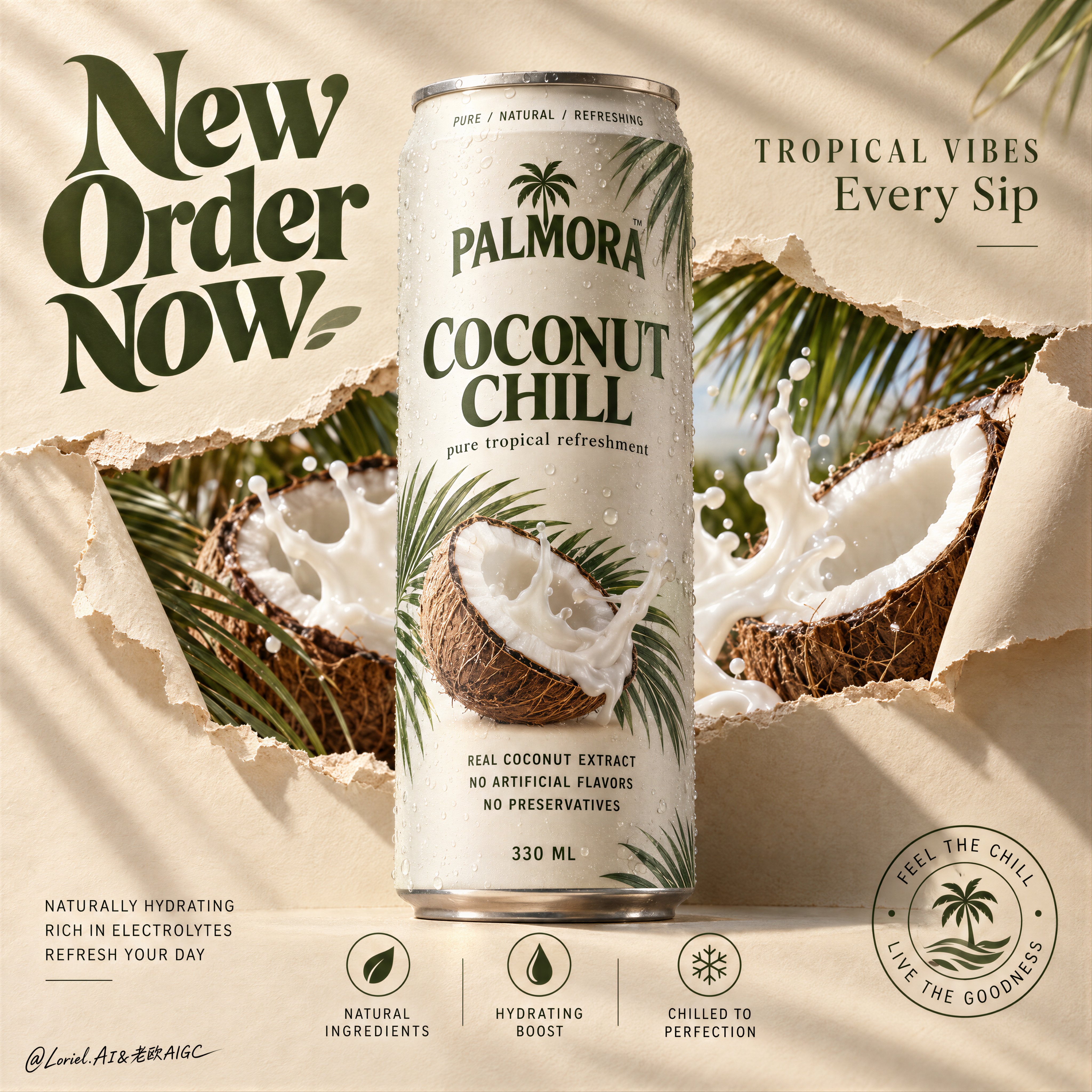
A hyper-real premium beverage poster advertisement for a fictional tropical drink brand called PALMORA, designed as a clean Orbit-plus-Port key visual where the real can remains the absolute hero and the supporting world is reduced into elegant, high-impact structural layers. A tall slim beverage can stands perfectly centered and upright against a warm sand-beige paper backdrop, front-facing and dominant. The can is chilled with fine condensation, subtle aluminum texture, and crisp premium print design. Behind and partially around the can, the paper surface appears torn open in a controlled horizontal rupture, revealing a vivid inner tropical layer of split coconuts, creamy coconut splash, and palm fronds. The tear feels designed rather than chaotic, like a branded reveal window cut through the surface. Framing and composition: vertical poster layout, strict central hierarchy, oversized hero can in the middle, broad negative space in the upper-left for a large graphic headline, smaller premium copy in the upper-right, and a minimal icon-information system aligned along the lower area. Keep the can silhouette untouched and clearly readable. The torn-paper reveal should sit behind the can as a sculptural horizontal band, with curled paper edges on the left and right creating depth and tactile material contrast. Preserve the reference logic of central product, torn reveal, large graphic headline, and bottom icon strip, but simplify and refine every peripheral element for a more curated poster feel. Product design: create a premium tropical coconut drink can with a matte off-white body, deep olive-green brand typography, soft warm-grey metal rim, natural condensation droplets, and a restrained botanical print system featuring palm leaf shadows and one clean coconut visual. Main front label reads exactly: "COCONUT CHILL". Small top ring text reads exactly: "PURE / NATURAL / REFRESHING". Subline beneath the main title reads exactly: "pure tropical refreshment". Ingredient copy in the lower body reads exactly: "REAL COCONUT EXTRACT", "NO ARTIFICIAL FLAVORS", "NO PRESERVATIVES". Bottom volume mark reads exactly: "330 ML". The can must feel globally market-ready, tactile, and beautifully branded. Reveal layer and supporting elements: inside the torn-paper opening, show hyper-real split coconuts with fibrous brown shells, bright white flesh, and dynamic but controlled coconut milk splash forms. Add a few palm fronds entering from the top-right and lower-left edges, but keep them sparse and elegant. This inner reveal should feel like a distilled tropical world, not a cluttered collage. The splash and coconuts must support the can, never overpower it. Keep the overall sensation fresh, breezy, creamy, and premium. Lighting and color: soft directional commercial key light from upper left, warm natural fill from front, subtle shadows cast by palm leaves across the paper background, and refined highlight roll-off on the can body and splash edges. Palette balance: 60% warm sand-beige paper and off-white can body, 30% coconut brown and creamy white splash, 10% olive green typography and botanical accents. Build enough contrast so the can volume, paper tear edges, and coconut textures feel dimensional, while avoiding muddy neutrals or dead shadow patches. Materials and finish: hyper-real product photography fused with tactile paper-set design. Show soft matte paper fibers and curled torn edges, realistic chilled aluminum, tiny condensation beads, fibrous coconut husk detail, smooth white coconut flesh, glossy milk splash, and clean print fidelity on the can. The final image should feel like a Cannes-level beverage launch campaign: minimal, tactile, tropical, and sharply art-directed. Typography: all visible ad copy in English only, integrated into the poster as premium graphic design. Upper-left oversized graphic headline reads exactly: "New Order Now" in a bold retro-organic display style, large and sculptural. Upper-right premium tagline reads exactly: "TROPICAL VIBES" and beneath it exactly: "Every Sip". Lower-left small support copy reads exactly: "NATURALLY HYDRATING", "RICH IN ELECTROLYTES", "REFRESH YOUR DAY". Bottom-center icon labels read exactly: "NATURAL INGREDIENTS", "HYDRATING BOOST", "CHILLED TO PERFECTION". Lower-right circular seal reads exactly: "FEEL THE CHILL / LIVE THE GOODNESS". Keep typography art-directed, spacious, and harmonized with the can branding, always clear of the core product silhouette. Output and constraints: polished premium beverage poster, product-first composition, no copied original brand names, no people, no unrelated props, no cluttered tropical overload. Keep the can geometry correct, typography crisp, tear edges believable, coconut anatomy realistic, splash physics controlled, and the overall visual language calm, premium, and clean. Avoid warped can proportions, unreadable label text, excessive palm leaves, muddy beige cast, dirty whites, chaotic splashes, broken paper physics, cheap stock-ad aesthetics, AI gibberish text, or drift away from high-end commercial realism.
Details
2x2 grid, 16:9, do this for 4 fortune 500 comapnies: CONCEPT ANCHOR 1: "City transformed by a physic — AI image prompt — GPT Image 2.5
OpenAIGPT Image 2.5
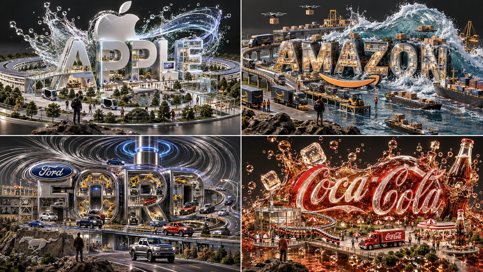
2x2 grid, 16:9, do this for 4 fortune 500 comapnies: CONCEPT ANCHOR 1: "City transformed by a physical force — skyline shaped into wave, whirlpool, splash, drip, pressure burst, molten flow, or suspended liquid architecture" :: CONCEPT ANCHOR 2: "Miniature civilization wordmark — giant subject name acts as infrastructure, with roads, tiny workers, vehicles, parks, ports, and buildings arranged around it" :: CONCEPT ANCHOR 3: "Luxury object render — dark neutral background, macro clarity, sharp shadows, realistic miniature materials, high-end concept model finish" INSTRUCTION: Render $ SUBJECT as if its entire identity has been sculpted by one dramatic elemental force. STYLE RULES: - Choose one dominant force based on the subject’s spirit: wave, vortex, gravity fold, flame, sandstorm, crystal bloom, fog bank, magnetic field, liquid metal, glass splash, moss growth, paper curl, smoke plume, or data stream. - Convert $ SUBJECT into a city-like miniature ecosystem caught inside that force. - Convert the subject’s name into large physical architecture integrated into the sculpture. - Make the letters readable but partially shaped by the force: eroded, flowing, folded, dripping, crystalline, melting, stacked, flooded, or levitating. - Build tiny subject-relevant details across the scene: vehicles, people, tools, bridges, signals, signs, interiors, gardens, docks, cranes, screens, tunnels, or monuments. - Use realistic material behavior: wet shine, glass refraction, stone fracture, mist, particles, foam, metallic reflections, glowing lights. - Add one tiny viewer beneath or beside the object to create awe and scale. - Keep the image cinematic, premium, surreal, and highly inspectable. OUTPUT: A viral miniature world where $ SUBJECT becomes a physical skyline-wordmark sculpture transformed by a dramatic elemental force.
Details
GUCCI SUNGLASSES — “THE NEW CLASSIC”

4:5 vertical premium poster, 8K, bold commercial layout × Ital — AI image prompt — GPT Image 2.5
OpenAIGPT Image 2.5
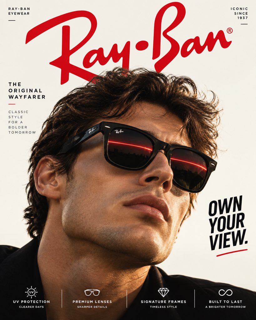
GUCCI SUNGLASSES — “THE NEW CLASSIC” 4:5 vertical premium poster, 8K, bold commercial layout × Italian fashion editorial × photorealistic luxury advertising 🧠 CORE IDEA: “SEE IT YOUR WAY.” 🎬 LAYOUT: BACKGROUND BLOCK: Solid deep Gucci emerald green with no environment, no scenery, no texture Clean luxury studio field with controlled directional shadows GIANT TYPOGRAPHY: “GUCCI” bold oversized serif typography, cropped behind the subject 👤 SUBJECT: Young adult fashion model wearing oversized Gucci sunglasses extreme close-up editorial portrait slightly turned toward camera natural skin texture, realistic hair and expression sunglasses perfectly sharp and dominant 🕶️ PRODUCT + CONCEPTUAL TWIST: Gucci sunglasses remain completely photorealistic → The lenses carry a precise emerald-and-gold light reflection inspired by luxury jewelry: thin golden highlight crossing both lenses realistic curved-glass reflection subtle optical distortion crisp acetate frame details restrained metallic highlights The reflection visually connects the sunglasses to Gucci’s luxury craftsmanship without adding any physical objects. ✨ GRAPHIC ELEMENTS: subtle gold measurement lines tiny editorial annotations minimal geometric marks refined gold accents clean studio shadow ✍️ TEXT SYSTEM: Top pill: “GUCCI EYEWEAR” Small text: “Made in Italy” BOTTOM FEATURE STRIP: Premium Acetate UV Protection Signature Details Italian Craftsmanship ANTI-SLOP DIRECTION: No buildings, no landscapes, no clouds, no floating objects, no holograms, no excessive gold effects, no random props, no distorted face, no plastic skin, no exaggerated surrealism. Authentic luxury eyewear proportions, realistic lens reflections, natural skin texture, controlled editorial lighting, sophisticated typography, restrained composition, high-fashion campaign photography.
Details
A sweet fun kids footwear advertisement poster. An adorable young girl age 7 with a big smile in a s — AI image prompt — GPT Image 2.5
OpenAIGPT Image 2.5
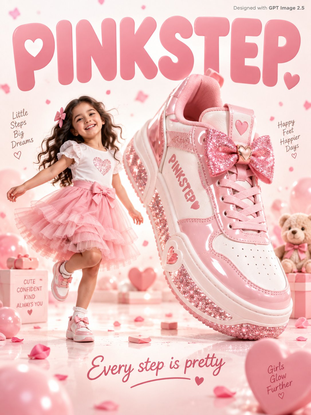
A sweet fun kids footwear advertisement poster. An adorable young girl age 7 with a big smile in a soft pink tulle skirt and white top skips joyfully beside a giant pink and white sneaker 3x her height with a glittery sole and bow detail on the tongue, "PINKSTEP" written in soft rose font on the sneaker side. Warm white and blush pink gradient studio background with soft pink confetti petals and tiny hearts floating gently. Friendly rounded soft typography "PINKSTEP" in blush pink filling the warm white background. Tagline bottom in rose: "Every step is pretty." Small text top-right corner reads "Designed with GPT Image 2.5" in grey. Photorealistic, sweet kids footwear commercial, soft warm white pink studio lighting.
Details
A hyper-real premium dessert poster for a fictional international ice cream brand called BERRY VEIL, — AI image prompt — GPT Image 2.5
OpenAIGPT Image 2.5
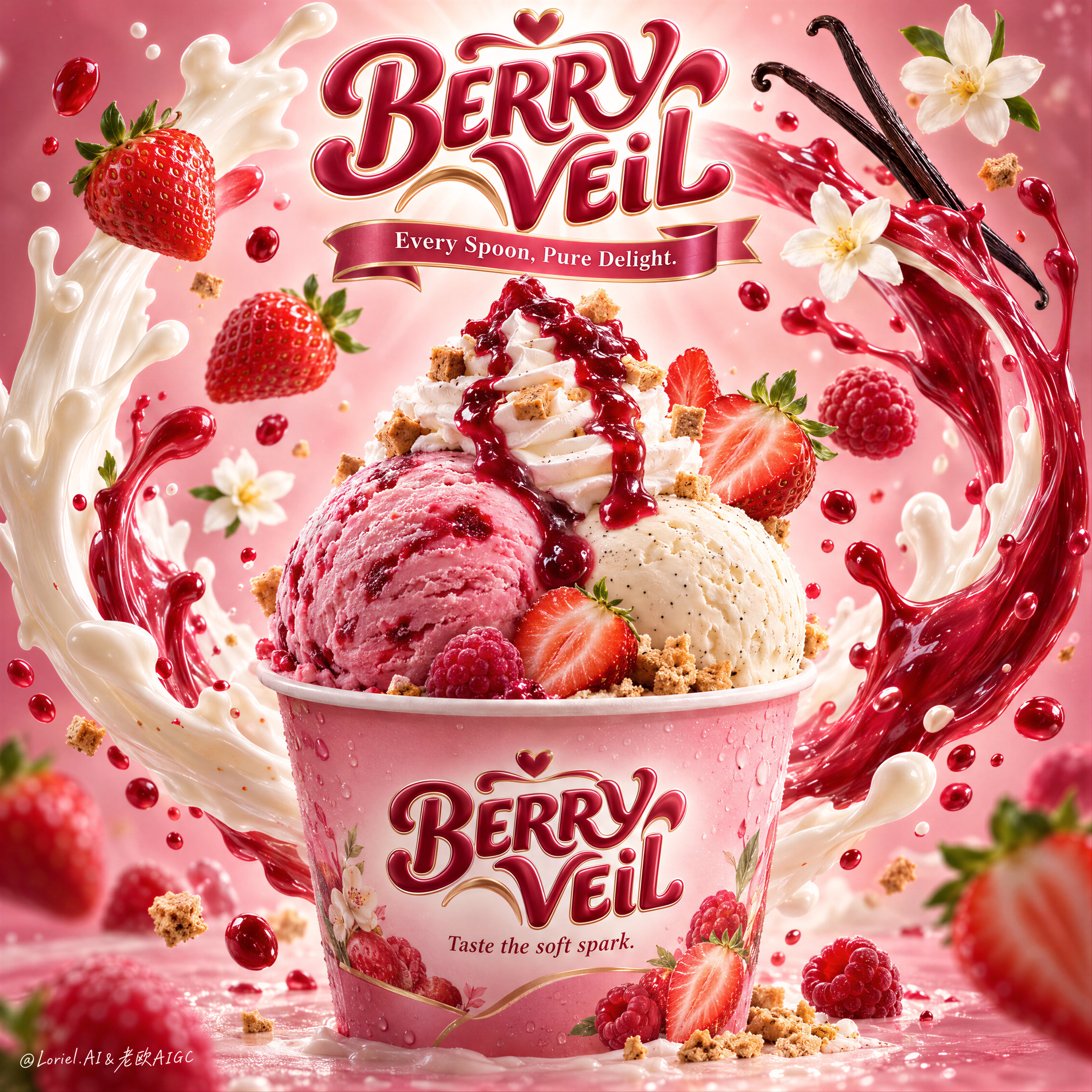
A hyper-real premium dessert poster for a fictional international ice cream brand called BERRY VEIL, refined in an Orbit-plus-Transit direction where the original hero structure stays intact but the flavor world becomes stronger, clearer, and more series-ready. A branded pink dessert cup sits in the lower center as the absolute hero, holding two large scoops of ice cream: one lush strawberry-raspberry pink scoop and one creamy vanilla-bean scoop, crowned by a tall whipped cream swirl and a glossy berry coulis cascade. The composition must feel brighter, richer, and more instantly appetizing than a standard strawberry dessert ad. Framing and composition: vertical poster layout, centered hero cup, sculptural brand crest floating at the top center, and two sweeping liquid arcs rising from both sides of the cup to form an elegant halo-like enclosure around the product. Preserve the current skeleton exactly: top logo, central cup, two large wrapping splash curves, and floating fruit and flavor cues in balanced orbit. Sharpen the hierarchy so the cup reads first, the scoops second, the liquid choreography third, and the floating ingredients fourth. Keep the product fully readable and visually dominant. Product design: the paper cup is premium, softly glossy, and tinted with a delicate berry-pink gradient, with subtle condensation and crisp printed branding. Front label text reads exactly: "BERRY VEIL". Beneath it, write exactly: "Taste the soft spark." The strawberry-raspberry scoop should feel creamier, juicier, and deeper in color than a basic strawberry scoop, with natural frozen fruit texture and a faint marbled richness. The vanilla-bean scoop should feel smooth, dense, and luxurious, with tiny vanilla specks visible. The whipped cream swirl must have clean, soft ridges and hold a dramatic ruby-red berry glaze. Scatter a few tiny crisp biscuit or caramelized crumble cubes around the cream and base for texture contrast. Flavor staging and spatial choreography: keep the same central splash system, but push the fruit language slightly toward a strawberry-raspberry hybrid direction for stronger flavor identity and series flexibility. Use several ripe strawberries with realistic seeds, cut faces, and fresh green tops, alongside one or two small raspberry-like berry notes or deeper red fruit accents. Two elegant vanilla pods curve in from the upper right, and two or three soft white blossom flowers remain as airy fragrance cues. The liquid arcs should stay physically plausible: one creamy white dairy splash and one vivid berry-red fruit splash intertwining around the cup in a smooth, upward motion, with smaller droplets suspended at varying depths. The splashes must frame the cup, never bury it. Lighting and color: luminous premium commercial lighting from upper center-front, soft wraparound fill, subtle rim accents on the scoop edges and cup rim, and a stronger radiant halo behind the top brand mark. Background grading transitions from bright blush cream in the center to richer strawberry-pink and rose-mauve toward the edges. Palette balance: 60% blush pink, milky white, and soft cream; 30% berry red and glossy coulis crimson; 10% vanilla black-brown, leaf green, and tiny golden crumble accents. Build more contrast and flavor saturation than before while keeping the overall frame elegant and premium. Materials and finish: hyper-real food photography fused with polished fantasy splash rendering. Show creamy frozen micro-texture, juicy fruit skin, realistic strawberry seed detail, glossy coulis viscosity, soft whipped cream ridges, paper cup texture, liquid translucency, and fine reflective droplets. Keep everything tactile, luminous, and premium, with no sticky clutter or messy over-rendering. The final result should feel like a Cannes-level FMCG dessert key visual: radiant, delicious, and easy to extend into a product line. Typography: all visible text in English only, integrated as premium confectionery branding. The floating top logo reads exactly: "BERRY VEIL" in a bold rounded custom script with a polished confectionery 3D finish. Beneath it, add a ribbon-style line reading exactly: "Every Spoon, Pure Delight." On the cup front, repeat exactly: "BERRY VEIL" and beneath it exactly: "Taste the soft spark." Typography must feel dimensional, sweet, and elegant, harmonizing with the pink-and-berry flavor system while staying clear of the scoop silhouette. Output and constraints: premium global ice cream advertising poster, product-first hierarchy, no people, no copied source text, no Chinese text, no extra unrelated props, no hand artifacts, no cluttered table styling. Keep scoop forms natural and rounded, cup geometry correct, splash arcs believable, strawberries anatomically clean, vanilla pods elegant, and text crisp and readable. Avoid scoop collapse, muddy pinks, dirty whites, plastic-looking cream, chaotic splash overload, duplicated fruit clusters, gibberish text, warped cup perspective, dead black patches, and drift away from high-end photoreal dessert advertising.
Details
A hyper-real premium Asian noodle poster advertisement for a fictional restaurant brand called XINVE — AI image prompt — GPT Image 2.5
OpenAIGPT Image 2.5
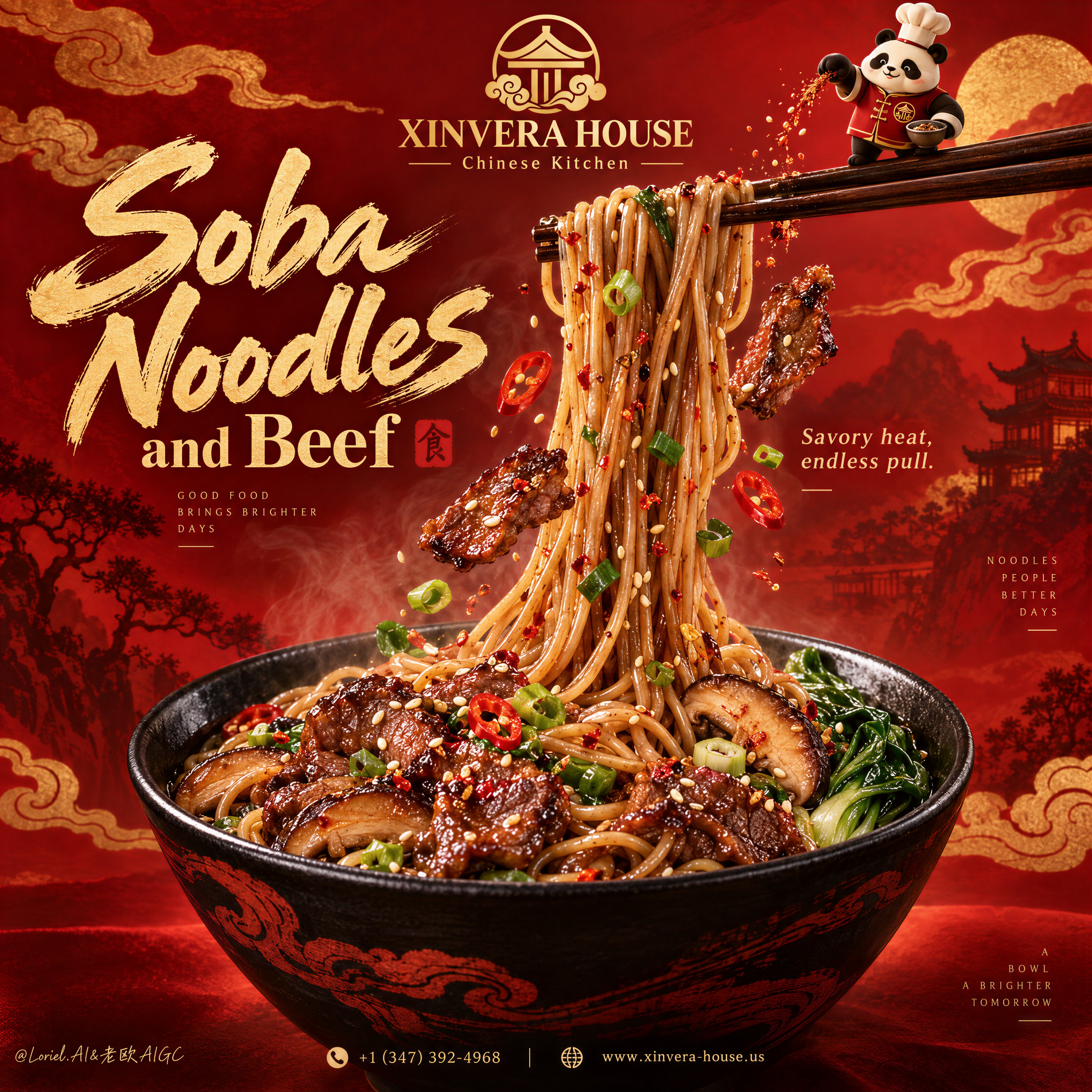
A hyper-real premium Asian noodle poster advertisement for a fictional restaurant brand called XINVERA HOUSE, designed as a flagship red-and-gold commercial key visual where product impact, series flexibility, and curated brand polish are fused into one unified composition. The absolute hero is a large black ceramic bowl of glossy beef soba noodles placed in the lower center, while a dramatic bundle of noodles is lifted vertically upward by dark wooden chopsticks near the upper right, creating the main force line of the poster. The lifted noodles must feel springy, weighted, silky, and richly seasoned, forming a strong visual cascade from the bowl into the upper brand zone. The overall structure preserves a bold Chinese festive poster logic: a premium gold emblem and brand mark at the top center, a large expressive dish title on the upper left, the noodle lift traveling through the middle, a richly filled bowl grounding the bottom, and a tiny brand mascot near the chopsticks adding character without stealing focus. The red background should be built from layered tonal fields rather than flat color: deep crimson, vermilion, ember orange, and subtle cloud-scroll forms arranged in a more refined, graphic, flagship manner. The design must feel more controlled and more premium than a typical restaurant flyer, with clear hierarchy and broad breathing room. Food design: the bowl contains premium soba noodles coated in a savory soy-chili glaze, mixed with caramelized beef slices, shiitake mushroom slices, bright scallions, red chili rings, leafy greens, sesame seeds, and a restrained dusting of spice. The beef should appear juicy, lacquered, tender, and slightly charred at the edges. The noodles must feel like the main appetite trigger, with believable strand tension, varied spacing, and natural clumping where gravity pulls them together. Around the lifted noodle stream, suspend a few highly controlled floating ingredients: one or two beef slices, a few chili rings, scallion rounds, sesame seeds, and tiny spice flecks. The bowl should be a matte-to-satin black ceramic vessel with elegant dark-red wave or brush motifs, rich and tactile but not overly ornate. Brand system and series logic: this poster should feel like the master key visual for a food brand system that can later adapt to black pepper beef noodles, garlic soy ramen, spicy miso udon, or citrus chili soba without changing the fundamental composition. Build the current version as the strongest core edition: beef soba with red-gold heat and festive richness. At the top center place an elegant gold emblem with the brand name exactly: "XINVERA HOUSE". Beneath it place the descriptor exactly: "Chinese Kitchen". The tiny illustrated mascot stands on the chopsticks near the top right, sprinkling seasoning into the noodle lift. The mascot should be a clean, premium, simplified brand asset, charming and iconic, not childish. Typography: all visible text in English only, art-directed and spatially integrated. Main dish headline on the upper left reads exactly: "Soba Noodles". Supporting line beneath it reads exactly: "and Beef". Add a small flavor descriptor near the lifted noodles reading exactly: "Savory heat, endless pull." At the bottom footer line add exactly: "+1 (347) 392-4968" and "https://t.co/5lqqumtnBZ". Typography should combine a luxurious brush-like script for the main dish name with a more refined high-contrast display style for secondary lines. The type must feel premium, energetic, and beautifully balanced with the bowl and noodle silhouette. Lighting and color: warm premium commercial food lighting with a soft key from upper front-right, gentle fill from the left, clean specular highlights on the noodle strands, rich gloss on the beef, and controlled separation between the bowl and the red backdrop. Palette balance: 60% deep crimson, vermilion, and warm red-orange field; 30% soy-brown noodles, black ceramic, and golden beef glaze; 10% green scallions, pale sesame highlights, and chili-red punctuation. Increase contrast enough to give the noodles and bowl sculptural authority while keeping the background luxurious and clean. Materials and finish: hyper-real food advertising photography fused with polished festive poster graphics. Show noodle gloss, lacquered beef texture, ceramic bowl sheen, mushroom moisture, sesame detail, faint steam warmth, and premium print-level finish. The image should feel like a Cannes-level restaurant flagship campaign: rich, bold, brandable, craveable, and elegant. Output and constraints: premium noodle-brand poster, food-first hierarchy, no copied source text, no real brand names, no real people, no cluttered props, no extra tableware, no messy particles. Keep noodle geometry natural, beef slices believable, bowl perspective correct, floating garnishes restrained, mascot simple and clean, typography crisp, and the red-gold system luxurious. Avoid malformed noodles, greasy muddy sauce, warped bowl shape, unreadable text, broken mascot anatomy, overbusy background graphics, AI gibberish text, dead shadows, and any drift away from high-end commercial food realism.
Details
Create an ultra-premium VELORA FIZZ — “LET FRESHNESS TAKE OVER” advertising poster.

Format: Vertica — AI image prompt — GPT Image 2.5
OpenAIGPT Image 2.5
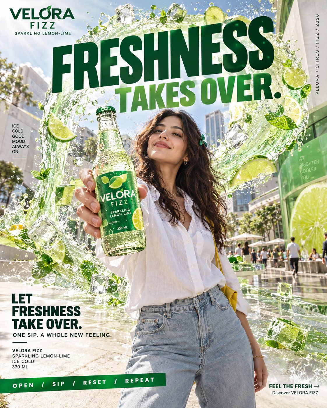
Create an ultra-premium VELORA FIZZ — “LET FRESHNESS TAKE OVER” advertising poster. Format: Vertical 4:5, 8K UHD, hyper-realistic commercial photography, cinematic editorial design. SCENE: A beautiful young adult woman with long wavy dark-brown hair, warm light-medium skin, and natural features relaxes at a modern outdoor urban café on a bright summer afternoon. She wears an oversized white shirt, light-wash relaxed denim, white sneakers, and a green hair clip. She drinks an ice-cold VELORA FIZZ bottle, surrounded by refreshing citrus energy. PRODUCT: Transparent glass bottle with realistic condensation, sparkling lemon-lime soda, emerald-green label, lime-yellow accents, and clear branding: VELORA FIZZ SPARKLING LEMON-LIME 330 ML VISUAL CONCEPT: A graceful translucent wave of sparkling citrus liquid flows behind the woman, containing realistic ice cubes, lime slices, mint leaves, bubbles, and water droplets. The wave blends naturally with the café environment, creating a refreshing surreal transformation. Realistic fluid physics, glass refraction, natural sunlight, and authentic skin texture. DESIGN: Premium international beverage campaign with emerald green, citrus yellow, white, and natural urban tones. Bold geometric typography, clean spacing, graphic lines, and modern editorial layout. TEXT: VELORA FIZZ — SPARKLING LEMON-LIME GOOD DRINKS. BRIGHTER DAYS. LET FRESHNESS TAKE OVER. ONE SIP. A WHOLE NEW FEELING. OPEN / SIP / RESET / REPEAT FEEL THE FRESH → Discover VELORA FIZZ CAMERA: ARRI Alexa Mini LF aesthetic, 35mm cinema lens, slightly low angle, natural summer lighting, moderate depth of field, realistic shadows, detailed product photography, subtle film grain. AVOID: Plastic skin, distorted text, excessive CGI, generic soda advertising, clutter, artificial colors, and copied existing beverage branding. Make it feel like a high-budget global advertising campaign.
Details
Browse all GPT Image 2.5 promptsExplore AI Image Prompts