LogoAhaPrompt
  • Prompts
  • Featured
  • Models
  • Submit
  • Blog
AhaPromptAhaPrompt

AI Prompts for Images, Video & Audio — Every Model, One Library

Built withLogoNEXTY.DEV
Explore
  • All Prompts
  • Featured Prompts
  • Image Prompts
  • Video Prompts
  • Audio Prompts
  • AI Models
  • Submit a Prompt
  • Blog
Languages
  • English
  • 中文
  • 日本語
  • 한국어

Copyright © 2026 AhaPrompt All rights reserved.

Privacy PolicyTerms of Service
HomeAI Prompt LibraryAI Image PromptsApple iPhone Duo Promotional Poster
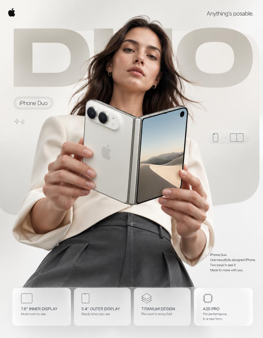
Apple iPhone Duo Promotional Poster — AI image prompt — GPT Image 2.5 — Product Photography, Advertising, Minimalist - 1
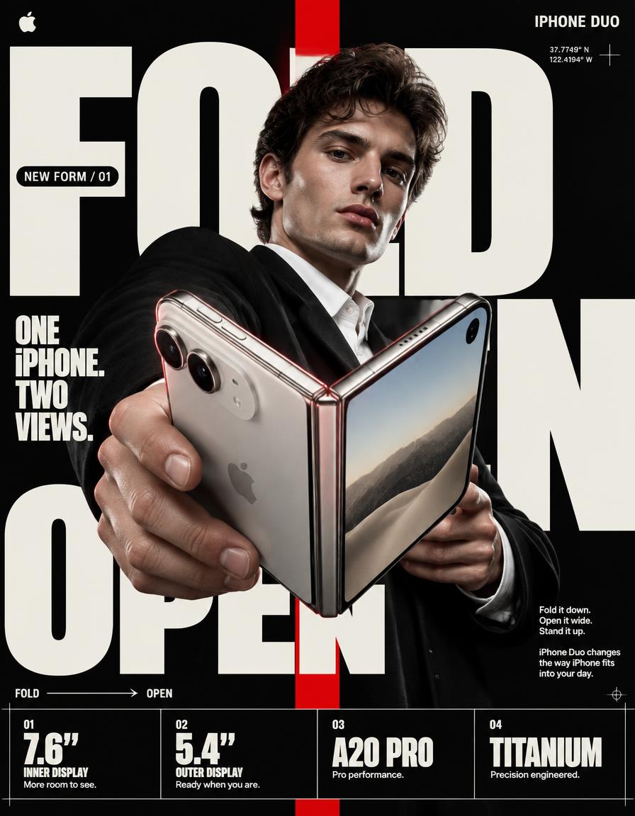
Apple iPhone Duo Promotional Poster — AI image prompt — GPT Image 2.5 — Product Photography, Advertising, Minimalist - 2

Apple iPhone Duo Promotional Poster

OpenAIGPT Image 2.5OpenAIimage

4:5 vertical premium smartphone campaign poster, ultra-high resolution (8K), global OOH + digital + social ready Style: Apple-level art direction × contemporary product photography × bold editorial composition × hyper-real commercial photography 🧠 CORE INTENT: “ANYTHING’S POSABLE.” One iPhone. More ways to see it. More ways to use it. More ways to make it yours. Effortless flexibility. Physical intelligence. One device that adapts to the moment. 🎬 SCENE COMPOSITION: BACKGROUND: Pure matte white architectural studio environment with a dominant oversized rounded rectangle block in ultra-soft warm silver gradient (top-left → bottom-right illumination) The background block creates a subtle dimensional stage behind the subject and product. GIANT TYPOGRAPHY (BACKGROUND LAYER): “DUO” * ultra-bold geometric sans-serif * stretched wide kerning * partially cropped by frame edges * soft shadow depth * color: very light warm grey * subtle embossed / debossed effect * typography positioned behind the subject and product * large enough to function as an architectural graphic element 👤 SUBJECT (HUMAN ELEMENT): Female model, clean contemporary editorial look, Apple-style casting * neutral expression * confident, calm, effortless * natural skin texture * hair: natural flow, slightly wind-touched * minimal makeup * understated styling OUTFIT: → sculptural off-white tailored top → deep graphite trousers → minimal accessories → no visible branding → sophisticated contemporary styling POSE: * Shot from slightly low angle (hero perspective) * Body slightly angled toward camera * One hand holding iPhone Duo in its compact closed configuration * Other hand lightly supporting the device as it opens * iPhone Duo positioned prominently between viewer and subject * Face aligned toward viewer * direct eye contact * relaxed posture * pose communicates control rather than excitement 📱 PRODUCT (HERO FOCUS): DEVICE: iPhone Duo FINISH: Premium titanium finish with physically accurate metallic surface response POSITION: Extreme foreground (forced perspective) Slightly rotated toward camera to reveal the thin profile, hinge construction and display relationship The device must remain the dominant visual object. PRODUCT CONFIGURATION: iPhone Duo shown transitioning from compact outer-display mode into its expansive unfolded configuration. One continuous physical device. No impossible geometry. No duplicated products. No floating components. DETAILING: * ultra-thin titanium frame * precision hinge construction * seamless folding display * extremely thin bezels * hyper-sharp camera system * lens reflections physically accurate * brushed titanium edge highlights * subtle micro-scratches * realistic fingerprints / material response kept extremely subtle * Apple logo centered with restrained reflective gloss * physically accurate display reflections * realistic hinge shadow and contact points The unfolded display should feel expansive and architectural rather than simply “larger.” REFLECTION: * soft studio reflection across titanium edges * subtle screen reflections * controlled highlight around hinge * micro light bloom around metallic edges ✨ LIGHTING SYSTEM: MAIN LIGHT: Soft studio key light (front-left) → smooth skin tones → clean product highlights → controlled white-to-silver transitions RIM LIGHT: Cool-white edge light from right → enhances phone silhouette → separates titanium edges from white background → reveals the thinness of the device ACCENT LIGHT: Very subtle warm-silver glow from background architectural block SHADOW: Soft drop shadow beneath subject + phone Soft contact shadow around hinge (no harsh contrast) 🎨 COLOR SYSTEM: * Primary: clean Apple white * Secondary: titanium silver / warm metallic grey * Accent: subtle graphite * Background: warm neutral white * Contrast: deep micro-shadows No over-saturation. No neon. No unnecessary color effects. Controlled premium palette. ✨ GRAPHIC ELEMENTS: * Minimal sparkle icons ✦ (2 only) * One subtle translucent UI pill floating near the unfolded display * Thin technical construction line following the phone’s folding axis * Very subtle grain for realism * Minimal geometric indicators showing the transition between closed and open states All graphic elements remain secondary to the product. ✍️ TYPOGRAPHY SYSTEM: TOP LEFT: Apple logo (black, small, clean) TOP RIGHT: “Anything’s posable.” (thin sans-serif) MID LEFT (pill): “iPhone Duo” CENTER DOMINANT: “DUO” (background type) BOTTOM RIGHT (body text): Small paragraph: “iPhone Duo. One beautifully designed iPhone. Two ways to see it. Made to move with you.” 📊 FEATURE STRIP (BOTTOM GRID): 4 rounded cards (glass-white panels): 1. 7.6″ INNER DISPLAY “More room to see.” 2. 5.4″ OUTER DISPLAY “Ready when you are.” 3. TITANIUM DESIGN “Precision in every fold.” 4. A20 PRO “Pro performance. In a new form.” Icons minimal line style. Cards must feel integrated into the poster rather than appearing as a generic technology specification panel. 📐 COMPOSITION GRID: * Top: brand + statement * Mid: subject + product (dominant) * Background: giant “DUO” typography layer * Bottom: feature modules Strong vertical hierarchy. The product overlaps the background typography. The model creates secondary depth behind the phone. Eye flow: Face → Phone → Hinge → “DUO” → Features The iPhone Duo must remain the first visual priority. 🎥 CAMERA SPECS: * ARRI Alexa Mini LF * 50mm premium anamorphic lens * shallow depth of field around subject * product maintained in extremely high optical clarity * HDR rendering * ultra-real skin + titanium material detail * subtle lens distortion for realism * physically accurate reflections * controlled cinematic highlight roll-off * realistic depth separation * premium commercial product photography Slightly low camera position for a subtle hero perspecti

Details
Type
AI Image Prompts
Aspect Ratio
7:9
Updated
Sep 11, 2026
Category
Product PhotographyAdvertisingMinimalist
Source

How to use this prompt

  1. 1Copy the full prompt with the copy button above.
  2. 2Open GPT Image 2.5 by OpenAI, or any image generator with a similar style range.
  3. 3Paste the prompt, then swap the subject and style keywords to match your idea.
  4. 4Match the example's settings (7:9 · Product Photography · Advertising · Minimalist), then iterate — small wording changes shift the output a lot.

Frequently asked questions

Which AI model generated this image?

This image was generated with GPT Image 2.5 by OpenAI. The prompt on this page is the exact text used to create it.

What settings does this prompt use?

The example was generated with GPT Image 2.5 using: 7:9 · Product Photography · Advertising · Minimalist. Reusing these settings gives the closest match.

How do I get similar results?

Copy the prompt as-is first, then replace only the subject while keeping the style, lighting, and composition keywords. Generate a few variations — outputs differ between runs.

Can I modify this prompt?

Yes. Prompts work best as starting points — adjust descriptors, aspect ratio, or style tags to make the output your own.
More GPT Image 2.5 prompts

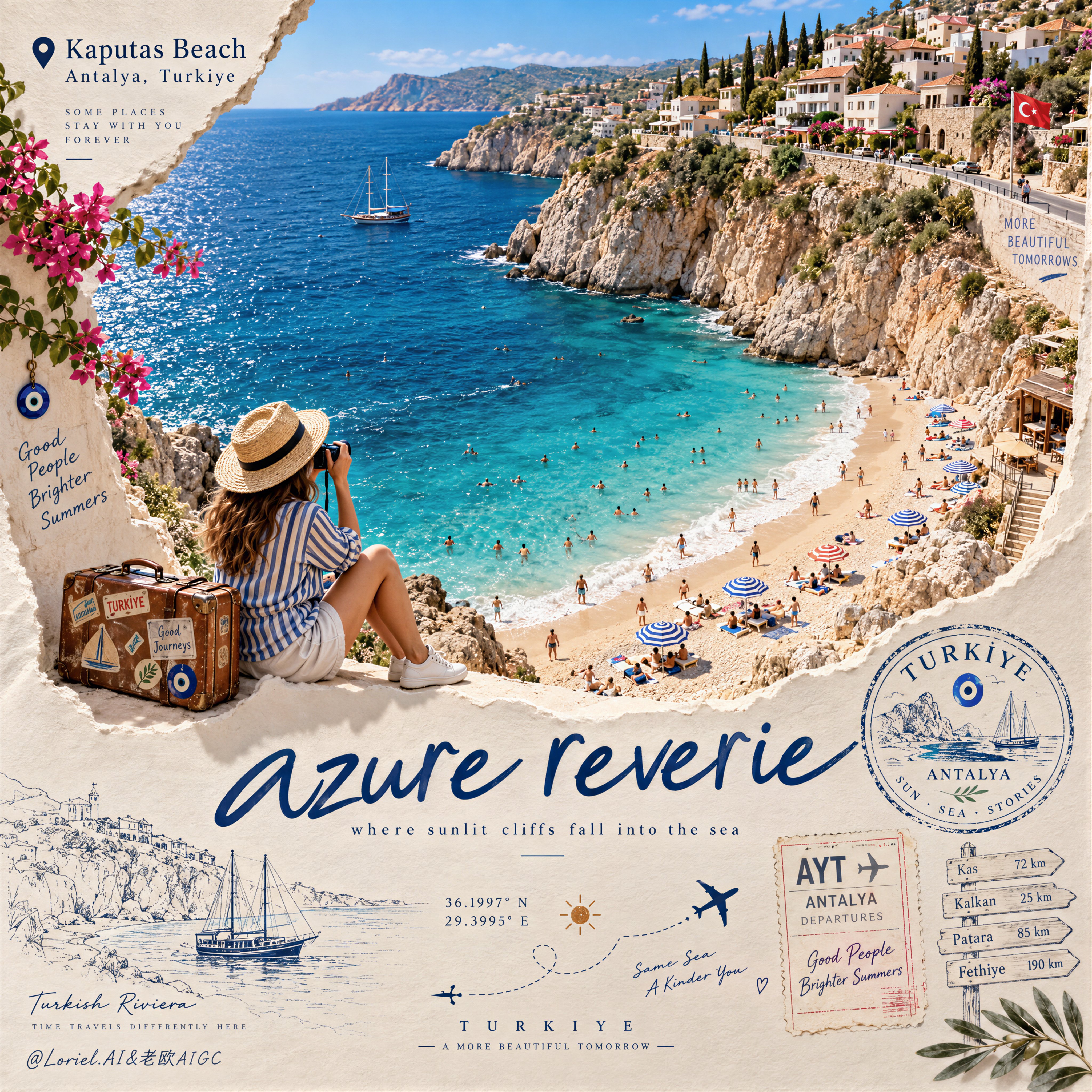
Create a Cannes-level travel destination advertising poster for TURKIYE, preserving the exact struct — AI image prompt — GPT Image 2.5
OpenAIGPT Image 2.5
Create a Cannes-level travel destination advertising poster for TURKIYE, preserving the exact structural logic of a premium paper-sculpture tourism print while merging emotional summer atmosphere with forensic material realism. The composition is vertical and built around one large curved torn-paper window that reveals a luminous handcrafted miniature view of KAPUTAS BEACH, ANTALYA, TURKIYE, while the lower foreground remains a refined cream paper field carrying elegant destination typography, travel stamps, route sketches, coordinates, and curated tourism graphics. The final image must feel like a collector-grade Mediterranean travel memory object: tactile, sun-warmed, cinematic, and exquisitely constructed. Hero destination scene: inside the curved paper opening, reveal a radiant turquoise cove embraced by pale limestone cliffs and a gently arcing golden beach. Show layered Mediterranean water bands shifting from pale aqua near the shore to saturated teal and deep azure farther out, with delicate repeating wave lines and bright foam edges rolling onto the sand. Populate the beach with tiny yet believable sunbathers, swimmers, striped parasols, towels, and scattered leisure details, all proportionally correct and integrated into the scene. Along the upper horizon, build a densely stepped hillside of whitewashed and pastel coastal houses, terracotta roofs, boutique balconies, cypress trees, and warm stone terraces, arranged like a refined miniature Mediterranean village. The entire destination window must feel like a luxury handcrafted 3D diorama enhanced with highly realistic micro-surface detail. Narrative foreground: on the lower edge of the cutout, place one seated miniature traveler figure as an emotional invitation into the destination. The traveler wears elegant striped resort clothing, a straw hat, white sneakers, and holds a camera, beside a small vintage suitcase covered in tasteful travel stickers. The anatomy, hands, posture, and clothing folds must be natural and correct. This figure should feel quietly alive, as if pausing at the threshold of memory, adding warmth and human scale without competing with the destination itself. Typography and editorial layout: preserve the same poster rhythm as the reference. At the upper left, place a small map-pin icon followed by “Kaputas Beach” and beneath it “Antalya, Turkiye” in refined editorial type. On the lower paper field, place one large flowing handwritten English title in deep Mediterranean blue, such as “azure reverie”, followed by a small subtitle like “where sunlit cliffs fall into the sea”. Distribute a few highly curated travel graphics across the lower area: one circular passport-style destination stamp, one boarding-pass or visa-stamp element, one dotted flight-path doodle with tiny airplane icons, precise latitude-longitude coordinates, a small sun glyph, a fine-line coastal sketch, and one discreet signpost marking nearby destinations. All typography must feel elegant, airy, and graphically integrated, never generic, heavy, or cluttered. Turkey-specific accents: add subtle premium local cues with restraint. Integrate a tiny evil-eye motif into one stamp or baggage sticker, a delicate line illustration of a gulet sailboat or coastal architectural silhouette in the lower graphics, and visual cues that suggest refined Turkish Riviera identity without becoming folkloric or overloaded. Everything should feel international, luxurious, and compositionally clean. Atmosphere: the poster should carry the sensation of late-morning Mediterranean light, salt in the air, and the emotional softness of an unforgettable summer coast remembered through beautifully crafted paper. The sea must feel alive and breezy, the sky fresh and expansive, and the destination window should radiate optimism, escape, and warmth. The image should feel like a tactile travel keepsake elevated into a world-class advertising object. Material realism: emphasize thick layered paper edges, crisp cut contours, matte card texture, embossed shadow transitions, tiny architectural facade details, miniature umbrellas, foam ridges, cliff stratification, printed stamp ink, luggage leather grain, sticker gloss, clothing fabric weave, and precise micro-scale beach props. The sea should have dimensional depth without losing the handcrafted paper language. The paper opening must cast believable soft shadows onto the lower field, and every surface should read as physically buildable, premium, and photographically convincing. Lighting: use bright Mediterranean daylight from the upper left with soft clean shadows that enhance the paper relief and miniature depth. The waves, parasols, rooftops, cliffs, and traveler should receive warm, luminous highlights. The lower paper field remains softly lit with subtle shadowing from the cut edge, stamps, and seated figure, producing a polished museum-quality commercial finish. Avoid harsh contrast, dull flatness, or dirty shadow masses. Color hierarchy: 60% luminous turquoise, aqua, pale sand, sun-bleached ivory, and clear coastal sky blue; 30% terracotta roof tones, limestone beige, sage-green foliage, and soft neutral ink tones; 10% deep navy typography, warm suitcase browns, and small accent colors from parasols and travel graphics. The palette must feel fresh, upscale, joyful, and unmistakably Mediterranean. Design intent: the final image must preserve the reference’s exact logic of a
Details
Create a standalone 3:4 vertical contemporary risograph-style art poster based on the original photo — AI image prompt — GPT Image 2.5
OpenAIGPT Image 2.5
Create a standalone 3:4 vertical contemporary risograph-style art poster based on the original photograph. Preserve the woman's silhouette, facial character so the scene remains immediately recognizable. Use bold simplified shapes, rough ink edges, visible risograph grain, slight color misregistration, imperfect printing and handmade texture. Background should be warm cream paper with extensive negative space. Reduce the entire image to only four colors: navy blue, warm cream, mustard yellow and muted red. Keep the composition clean and graphic with the woman and motorcycle forming one strong central illustration. Add only tiny understated editorial text if needed. Aesthetic: Japanese design magazine, independent art print, vintage motorsport poster, sophisticated and collectible.
Details
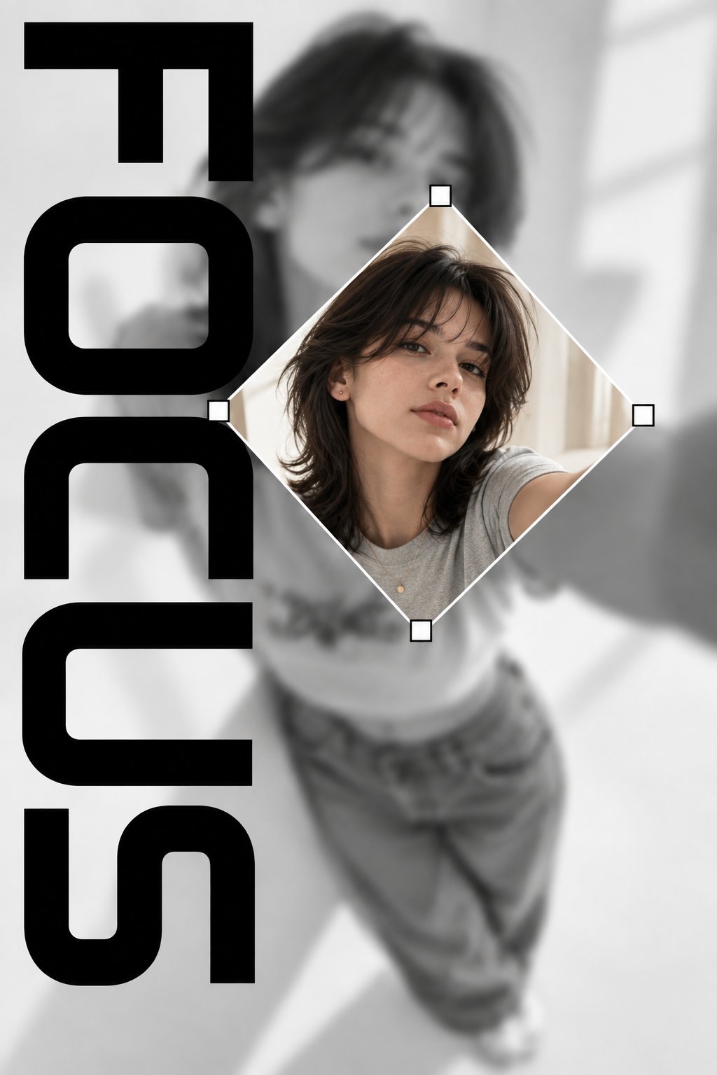
Create a vertical 2:3 editorial-style graphic poster with a minimalist black-and-white aesthetic. Us — AI image prompt — GPT Image 2.5
OpenAIGPT Image 2.5
Create a vertical 2:3 editorial-style graphic poster with a minimalist black-and-white aesthetic. Use a blurred grayscale background featuring a young woman taking a selfie, with her face and upper body softly out of focus. In the center, place a sharp, full-color diamond-shaped photo of the same woman, slightly rotated, with a thin white border and small white square handles at each corner, resembling a graphic design crop tool. Add the word FOCUS in large, bold, black geometric typography arranged vertically along the left side, with oversized letters partially cropped by the edges. The word FOCUS should be the only text in the entire design. Use a clean white and light-gray background, strong contrast, modern fashion magazine composition, subtle shadows, balanced negative space, realistic photography, and a premium contemporary graphic design aesthetic. No other words, captions, logos, barcodes, symbols, or decorative text. Focus entirely on the word FOCUS and the central portrait.
Details
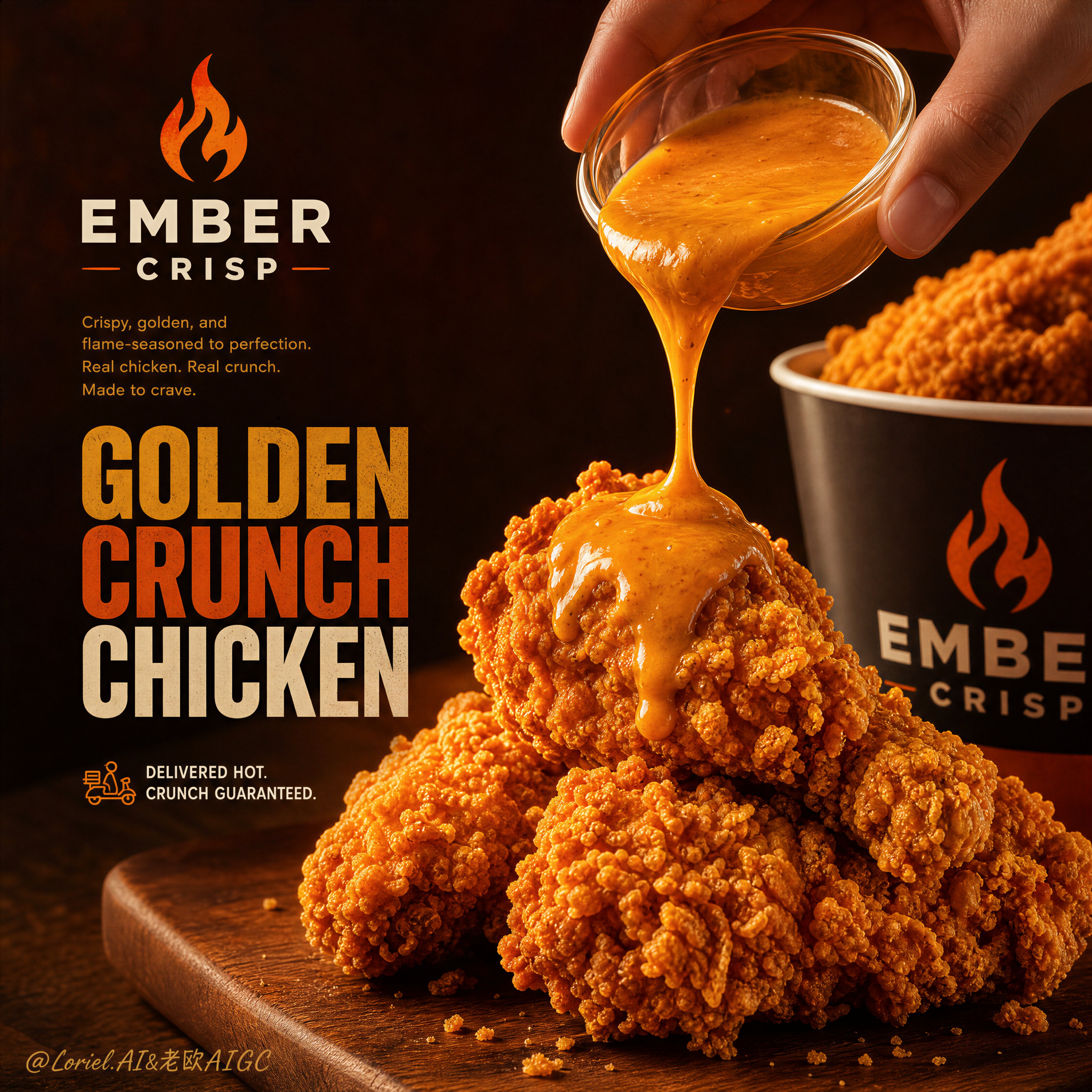
Create a Cannes-level ultra-premium fried chicken advertising poster for a fictional fast-casual bra — AI image prompt — GPT Image 2.5
OpenAIGPT Image 2.5
Create a Cannes-level ultra-premium fried chicken advertising poster for a fictional fast-casual brand called EMBER CRISP, merging Transit material precision with Port graphic restraint while strictly preserving the reference image’s commercial skeleton: a refined brand-signature zone in the upper left, one compact supporting copy block beneath it, one bold stacked headline in the center-left, a hero fried-chicken arrangement on a wooden board in the lower foreground, a branded bucket in the right midground, and a dramatic sauce pour descending from a hand entering from the upper right. The fried chicken must remain the absolute visual leader, and the overall poster should feel cleaner, sharper, and more premium than the reference. Core composition: use a vertical poster with the main fried-chicken pile placed on a wooden serving board in the lower center foreground, cropped large enough to dominate the frame. One adult human hand enters from the upper right holding a small clear glass sauce cup, pouring a thick orange-gold sauce in a single controlled stream onto the top chicken piece. The branded bucket sits behind and slightly to the right, partially cropped and softly secondary, adding packaging depth without competing with the hero food. On the left, keep a disciplined text architecture: one elegant brand mark, one short description block, one large stacked headline, and one minimal delivery/service note. Reduce all nonessential supporting graphics and keep the page breathing. Hero food design: portray elite premium fried chicken with highly tactile crunchy coating, irregular craggy breading, golden-orange crust variation, crisp flake lift, and juicy density beneath the shell. The top piece receiving sauce must feel intensely appetizing, with the sauce pooling and spreading naturally over the hot textured crust. The bucket pieces in the background should remain believable, crisp, and warm, but visually subordinate. Transit material precision: push all food surfaces to world-class commercial realism. The crust must show tiny blistered flour ridges, browned edge variation, crumb scatter logic, and dry-crisp microtexture rather than greasy mush. The sauce must have believable viscosity, elastic pour tension, glossy fold lines, thickness variation along the stream, and a rich creamy body as it lands and gathers on the chicken. The clear sauce cup must show glass thickness, curved reflections, and liquid meniscus. The bucket should feel like real printed packaging with clean finish, subtle matte-gloss behavior, and believable cylindrical form. The hand must have correct anatomy, elegant finger articulation, realistic nail beds, soft skin transitions, and precise contact with the cup. Port restraint: simplify the layout into a stronger, cleaner campaign image. Keep only the most necessary text hierarchy on the left: brand mark, short copy, monumental title, and one compact service line. Remove any decorative clutter, excess icons, or secondary text noise. Let the large headline and the food action breathe against the warm background. The poster should feel closer to a premium restaurant campaign than a crowded takeaway flyer. Lighting and atmosphere: use rich warm commercial food lighting with a strong amber key, soft frontal reveal on the crust, and subtle back warmth separating the pouring sauce and foreground chicken from the darker field. The background should hold soft orange heat-bloom and restaurant-night atmosphere with restrained bokeh, but remain clean and minimal. Build contrast through sculptural light and delicious surface separation rather than visual noise. Typography and branding: invent elegant English-only campaign language. Use a refined flame-led symbol and the brand name “EMBER CRISP” in the upper-left brand zone. Beneath it, place a concise premium descriptor line. The large stacked headline in the center-left can read something like “GOLDEN CRUNCH CHICKEN” or a similarly forceful original phrase. Keep the delivery/service note compact and graphic. The typography must feel bold, art-directed, and commercially sharp, with higher-end spacing and less density than the reference. Color direction: build the poster around 60% deep amber, fried-gold, and burnt orange glow, 30% dark brown, wood, and soft black warmth, and 10% creamy sauce highlights and pale packaging accents. The palette should feel hot, addictive, premium, and late-evening appetizing. Rendering style: ultra-photoreal luxury fast-food advertising, premium fried chicken hero shot, controlled sauce pour, branded bucket secondary depth, Transit-grade food texture realism, Port-style restrained layout, cinematic warm glow, world-class commercial food art direction, 8k detail. Negative prompt: cheap fast-food flyer, greasy dirty chicken, weak product hierarchy, unreadable text, generic fonts, plastic sauce, broken hand anatomy, extra fingers, malformed fingers, low-detail crust, muddy orange lighting, cluttered layout, low-end packaging, chaotic splash, flat lighting, cartoon food rendering, bad bucket geometry, oversaturated neon orange, messy background, excessive copy density
Details
Soft Minimalism wallpaper-style landscape of [MAIN LANDSCAPE/SCENE], featuring [KEY NATURAL ELEMENTS — AI image prompt — GPT Image 2.5
OpenAIGPT Image 2.5
Soft Minimalism wallpaper-style landscape of [MAIN LANDSCAPE/SCENE], featuring [KEY NATURAL ELEMENTS], surrounded by [BACKGROUND ELEMENTS], with [WEATHER/ATMOSPHERE], a muted [COLOR PALETTE] palette, soft diffused [TIME OF DAY] lighting, smooth simplified organic forms, subtle shadows, gentle atmospheric depth, vast negative space, clean balanced composition, minimal details, calm and serene mood, elegant modern aesthetic, dreamy yet natural appearance, premium desktop wallpaper feel, no people, no text, 16:9
Details
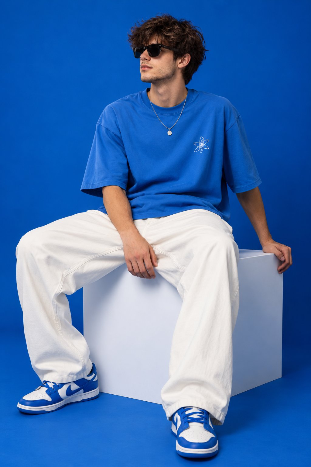
2:3 vertical streetwear editorial, young male model seated on a large white cube, legs positioned ap — AI image prompt — GPT Image 2.5
OpenAIGPT Image 2.5
2:3 vertical streetwear editorial, young male model seated on a large white cube, legs positioned apart, one hand resting beside him, wearing black sunglasses, oversized bright-blue T-shirt, very loose white trousers, blue-white sneakers. Solid cobalt-blue studio background and floor. Sony A7R V, 50mm lens, f/4, eye-level perspective, soft diffused lighting, subtle shadow, realistic skin texture, natural proportions, detailed cotton fabric, crisp premium streetwear photography with strong color-blocker composition.
Details
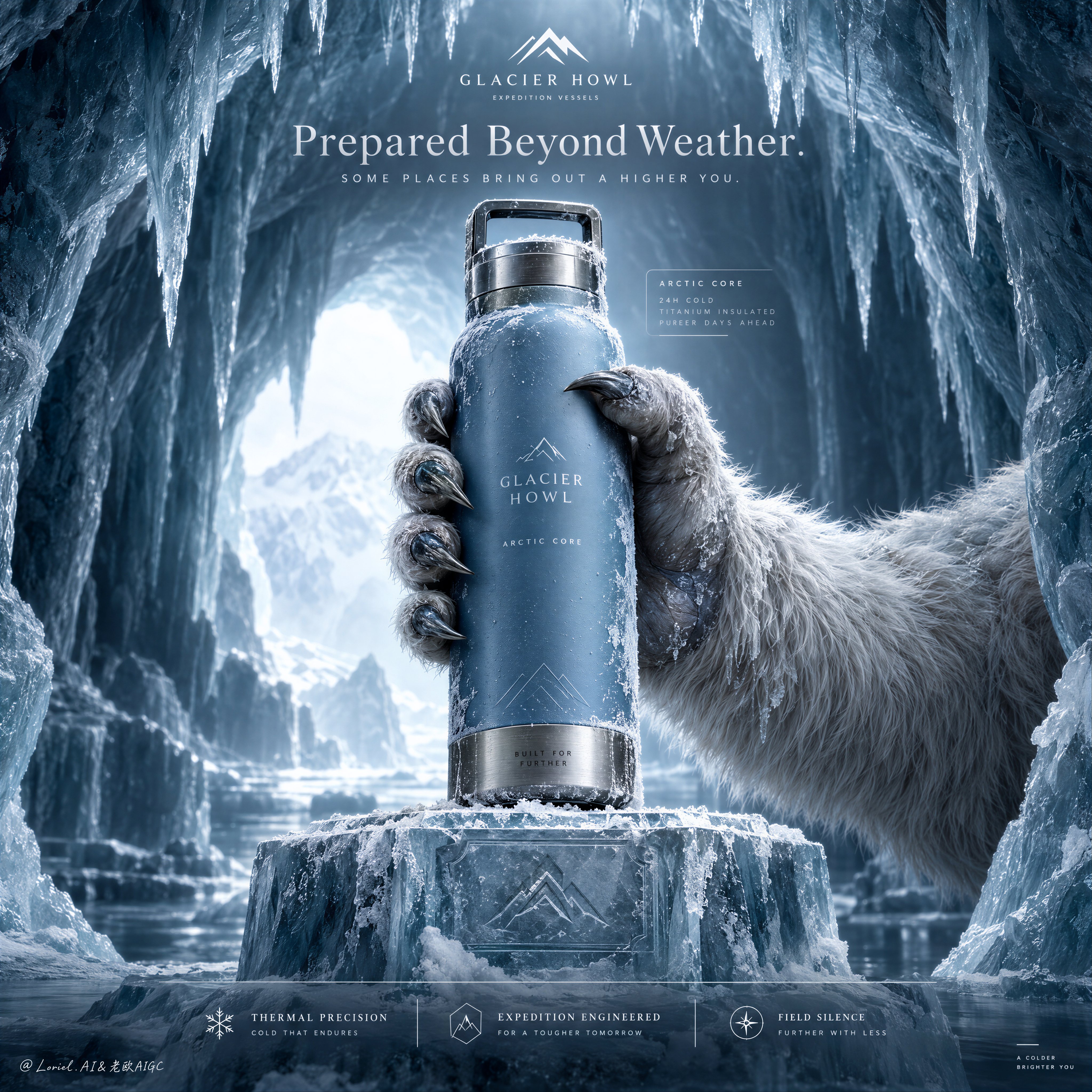
Create a Cannes-level ultra-premium outdoor hydration advertising poster for a fictional expedition  — AI image prompt — GPT Image 2.5
OpenAIGPT Image 2.5
Create a Cannes-level ultra-premium outdoor hydration advertising poster for a fictional expedition vessel house called GLACIER HOWL, preserving the exact structural logic of a frozen cave hero-shot campaign while merging forensic material realism with a colder, quieter, more elevated emotional register. The composition is vertical and symmetrical in feeling: an arctic ice cavern frames the image from above and both sides, a single luxury insulated bottle is held in the center by one frost-covered guardian-like polar beast hand, the bottle rises above a carved ice pedestal, a restrained top headline zone crowns the frame, and a minimal lower editorial information band anchors the composition. The final image must feel like mythic polar luxury, not mainstream ecommerce. Core composition: place the viewer inside a glacial chamber shaped like a natural cathedral. The ice cave curves inward from left and right, with elongated icicles descending from the ceiling and a pale cold opening glowing softly in the deep background. In the center foreground, one monumental ice pedestal rises from the frozen floor with crisp planar edges and subtle carved markings. From the right side, a large arctic beast hand enters and grips the bottle upright with deliberate control, slightly angled but visually stable, presenting it toward the viewer. The bottle must remain the absolute visual authority. Remove all unnecessary clutter, keeping the environment spacious, quiet, and sculptural. Product design: invent a signature vessel for GLACIER HOWL with a dense matte glacier-blue body, a brushed titanium base and lid, an integrated rectangular carry loop, and extremely minimal built-in branding. The surface carries refined frost bloom, delicate ice crystallization, dry cold condensation, and pristine premium finish without wear. The label area should contain only discreet integrated text such as “GLACIER HOWL” and “ARCTIC CORE”, typeset with elegant restraint. The object must feel engineered, collectible, and expensive, like a polar survival instrument refined into a design icon. Orbit atmosphere: the emotional tone should suggest an arctic sanctum guarded by ancient cold. The cave is not hostile or chaotic; it is silent, reverent, and rarefied. The distant blue-white light feels almost sacred, as if the object has been revealed inside a frozen ceremonial chamber. The beast hand reads less as aggression and more as custodianship, a mythic offering from the landscape itself. The frame should communicate control, stillness, endurance, and quiet power. Transit realism: render every material transition with physical precision. Emphasize the matte powder-coated bottle skin, the fine brushed directionality of titanium, edge highlights on the carry loop, frost microcrystals at the cap seam, pressure contact where clawed fingers compress against the bottle, semi-wet fur strands clumped by freezing moisture, keratin claw texture with iced tips, translucent subsurface glow in the ice cave walls, and crisp icicle tapering. The pedestal should show dense frozen mass, surface abrasion, shallow snow dust, and subtle engraved insignia. Every surface must feel photographically exact and commercially retouched to a world-class standard. Creature-hand realism: the gripping hand must feel believable, premium, and anatomically resolved. Show thick pale winter fur transitioning into cold blue-grey skin around the digits, strong knuckle mass, correct joint articulation, and claws that are sharp but not grotesque. The gesture is firm and elegant, with credible contact pressure and natural spacing between the digits. No deformity, no extra fingers, no fantasy exaggeration, no cartoon beast styling. Lighting: use an ultra-controlled cold lighting setup. A diffused blue-white backlight enters from the distant cave opening, shaping the ice chamber with gentle atmospheric depth. A restrained premium key light isolates the bottle and the gripping hand, producing the cleanest highlights in the frame. The metal edges receive crisp cool reflections, the matte body shows smooth tonal rolloff, the frost sparkles remain sparse and refined, and the cave walls stay subdued. Avoid theatrical flare, harsh contrast, or noisy particle glitter. The brightest region should stay around the bottle and upper cave core, allowing the rest of the frame to fall into elegant cold gradients. Typography and layout logic: preserve the top and bottom information architecture, but refine it into luxury editorial form. At the top center, place one minimal logo block, then a single English headline such as “Prepared Beyond Weather.” or “Cold, Mastered.” with one short supporting line beneath it in elegant restrained typography. Eliminate aggressive sales language. Near the bottle, if needed, include only one very subtle translucent feature card with micro-scale type. At the bottom, use a low-density three-part editorial strip with concise descriptors like “Thermal Precision”, “Expedition Engineered”, and “Field Silence”. The entire graphic layer must feel integrated, sparse, and expensive. Color hierarchy: 60% glacial cyan, frozen mist white, pale ice blue, and luminous cold air; 30% deep teal shadow, steel-titanium grey, muted fur neutral, and cavern blue-black depth; 10% saturated glacier-blue from the bottle and small silver-white specular accents. The palette must be desaturate
Details
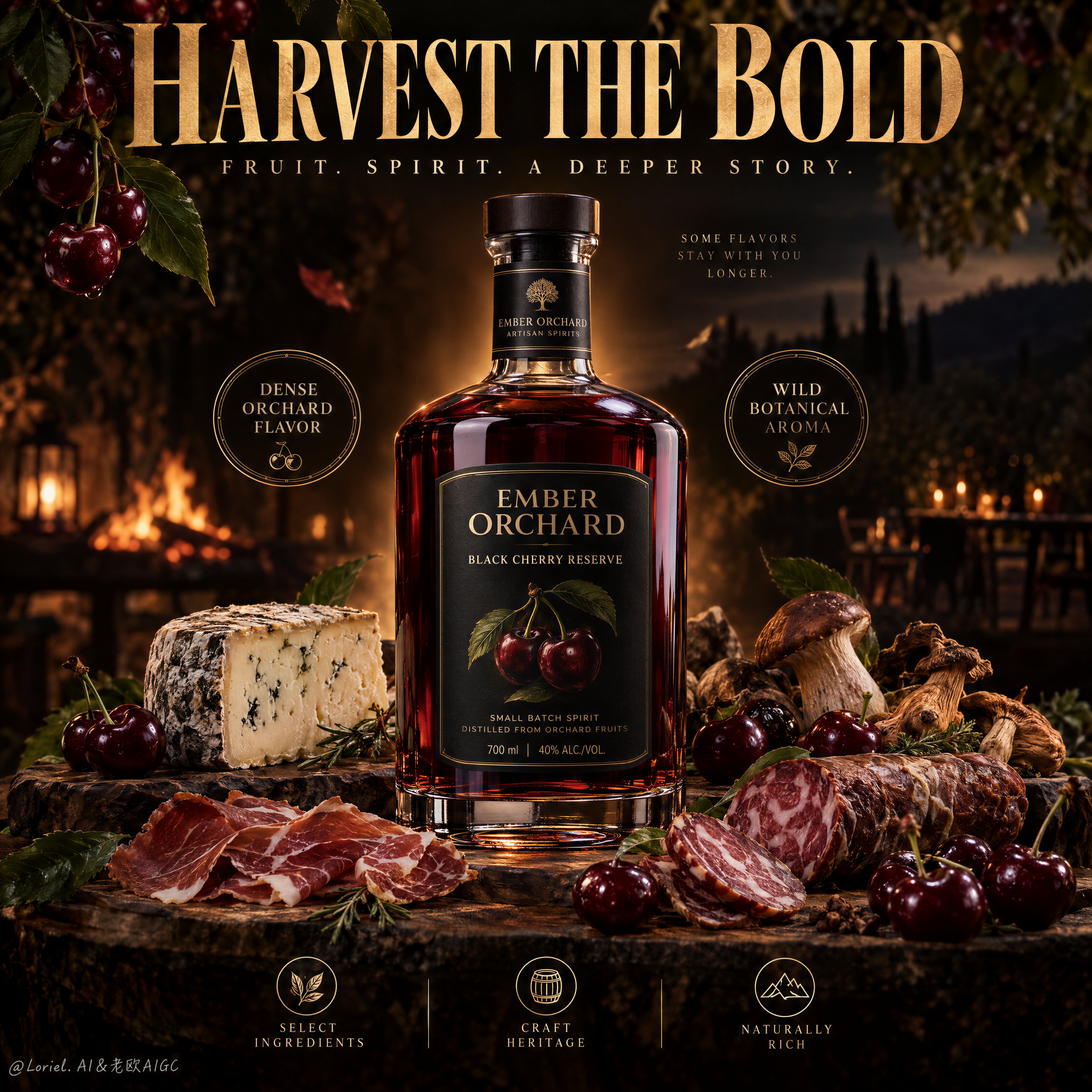
Create a Cannes-level ultra-premium gourmet food and spirit advertising poster for a fictional artis — AI image prompt — GPT Image 2.5
OpenAIGPT Image 2.5
Create a Cannes-level ultra-premium gourmet food and spirit advertising poster for a fictional artisanal house called EMBER ORCHARD, preserving the exact structural logic of a bold dark culinary campaign while merging narrative atmosphere, forensic food realism, and curatorial restraint. The composition is vertical and highly disciplined: one oversized headline block dominates the top, one central cherry spirit bottle stands as the visual core, two elegant circular quality seals flank the bottle, and a reduced but luxurious foreground spread of gourmet pairings anchors the lower third. The final image must feel richer, quieter, and more sophisticated than a standard rustic food advertisement. Core composition: use a deep black-brown background with subtle orchard darkness and selective floating accents. At the top, place one large original English headline in layered premium typography, with a main phrase such as “HARVEST THE BOLD” and a restrained supporting line beneath it, integrated like a luxury editorial poster. In the middle, position one dark cherry-infused spirit bottle upright and slightly forward, surrounded by a controlled warm amber aura that separates it from the darkness. On the left and right of the bottle, place two minimal circular seal graphics with concise statements such as “Dense Orchard Flavor” and “Wild Botanical Aroma.” Reduce all nonessential clutter so the composition breathes with confidence. Orbit atmosphere: the poster should feel like a midnight orchard feast preserved in memory. Floating cherries, leaves, and faint golden ribbons should appear as rare sensory traces rather than decorative overload, as if flavor, smoke, and fruit aroma are suspended in still night air. The emotional tone must be intimate, deep, and elegant, suggesting a quiet harvest ritual by firelight rather than loud abundance. Transit realism: render every material with commercial-grade precision. The bottle must show thick clear glass, heavy shoulders, precise curvature, crisp label edges, and a deep mahogany-black cherry liquid with subtle ruby transmission near the highlights. The cherries should display taut glossy skin, soft translucency at the edges, and believable stem attachment. The cheese should reveal natural rind pores, herb flecks, and creamy cut-surface texture. The cured meats must show fine marbling, casing tension, and slight oil sheen. The dried mushrooms should carry wrinkled, papery folds and woody texture. Leaves, herbs, wood, and spice particles must all read as physically real and photographically exact. Port restraint: simplify the lower still life into a more curated arrangement. Keep one central cheese form, one refined cluster of cured meats, one smoked or dried meat accent, a compact dried mushroom element, several woodland mushrooms, and a limited scattering of cherries and green leaves. Avoid market-stall excess. At the bottom, retain only a restrained three-part editorial icon strip with concise descriptors such as “Select Ingredients”, “Craft Heritage”, and “Naturally Rich”. Let negative space and hierarchy create luxury. Hero product design: create a collectible bottle for EMBER ORCHARD with a dark premium label, elegant serif branding, and a product name such as “Black Cherry Reserve” or “Wild Orchard Elixir”. The cap and neck should feel refined and gift-worthy, with subtle metallic or matte-black detailing. The front label may include a small cherry emblem or still-life motif, but it must remain minimal and expensive. The bottle is the unquestioned hero and must visually dominate all surrounding pairings. Lighting: use a highly controlled low-key lighting setup. A warm rear glow defines the bottle silhouette and gives the liquid inner life, while a soft front-upper key light shapes the foreground foods with rich but restrained contrast. The highlights on glass, cherries, meat, cheese, and mushrooms should be precise and selective. Keep the background dark but breathable, with no dead black masses and no noisy sparkle clutter. The brightest zones should remain around the bottle shoulders, selected fruit highlights, and the front edges of the pairings. Typography and graphic discipline: all text must be original, elegant, and compositionally integrated. Use one dominant top headline, one smaller subline, two side seals, and one restrained bottom icon strip. No supermarket flyer language, no discount cues, no overbuilt claims, no copied wording from the reference. The entire poster should read as international, award-level food branding. Color hierarchy: 60% black-brown, deep cherry red, and orchard-night shadow tones; 30% warm amber-gold highlights, roasted wood, mushroom brown, and cured-meat mahogany; 10% fresh green leaf accents and subtle cream-toned typographic contrast. The palette must feel luxurious, edible, and controlled. Design intent: the final poster must preserve the exact impact logic of a giant top-title campaign, central bottle hero, flanking flavor/aroma seals, and gourmet pairing spread below, while merging Orbit atmosphere, Transit realism, and Port minimal curation into one resolved luxury campaign image. The bottle remains the commercial center. Everything else exists to intensify flavor mythology, craftsmanship, and desire. Rendering style: ultra-photoreal luxury gourmet advertising, dark orchard editorial campaign, premium spirit-and-pairing poster, cinematic ha
Details
Browse all GPT Image 2.5 promptsExplore AI Image Prompts