
LogoAhaPrompt
  • 提示詞
  • 精選
  • 模型
  • AI 反推
  • 定價
  • 投稿
  • 部落格
AhaPrompt

圖片、影片、音訊 AI 提示詞庫

探索

  • 全部提示詞
  • 精選提示詞
  • 圖片提示詞
  • 影片提示詞
  • 音訊提示詞
  • AI 模型

工具

  • AI 反推工作臺
  • 圖片反推提示詞
  • 影片反推提示詞

資源

  • 定價方案
  • 投稿提示詞
  • 部落格

版權所有 © 2026 AhaPrompt 保留所有權利。

隱私政策條款與條件退款政策版權申訴 / DMCA
首頁AI 提示詞庫AI 圖片提示詞职业领域复古字标网格
职业领域复古字标网格 — AI image prompt — Nano Banana 2.1 — Typography, Infographic, Poster

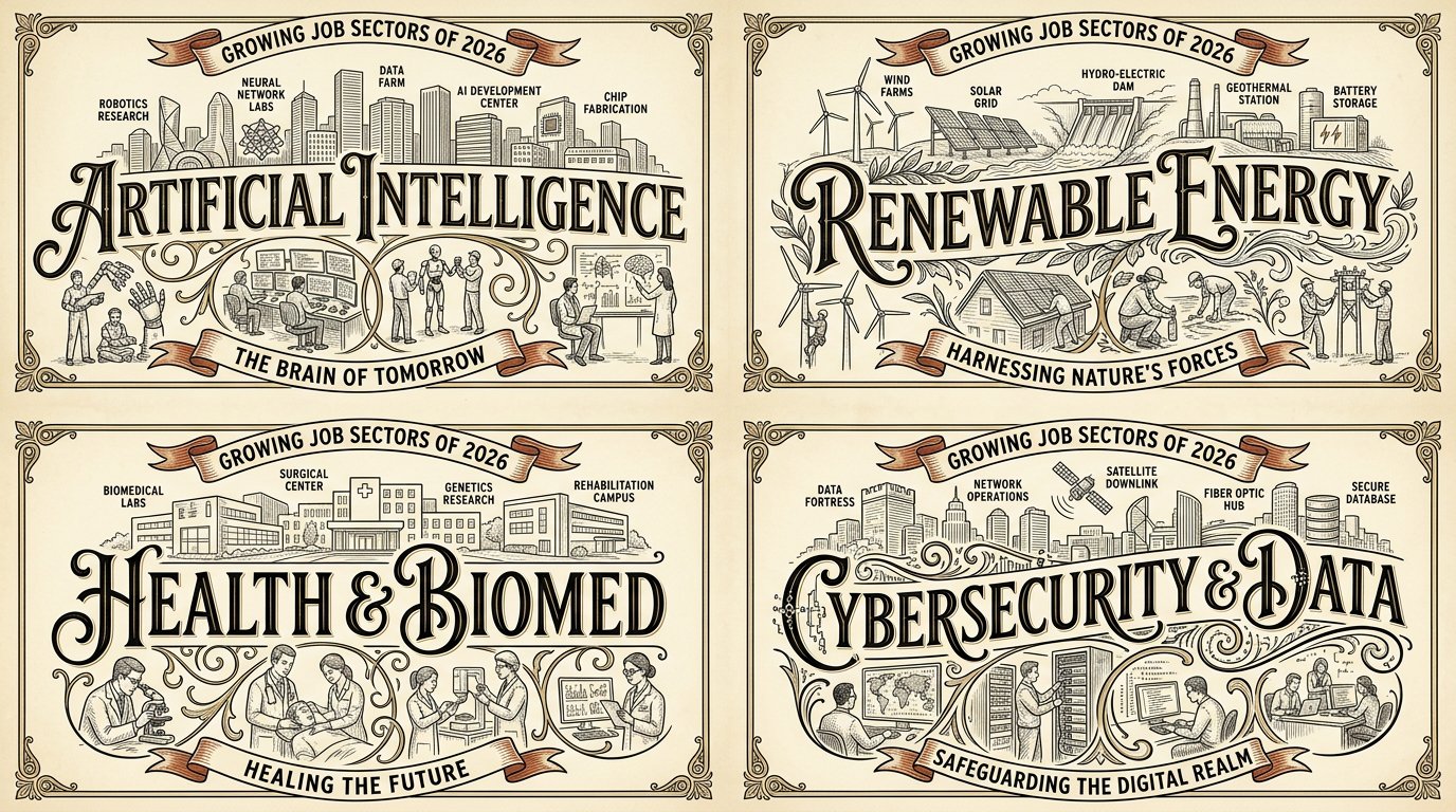
职业领域复古字标网格

GoogleNano Banana 2.1Googleimage

2x2网格,16:9,为2026年4个增长中的行业分别执行以下内容:W₁ 字标脊线(主控) 地点/主题名称以巨型装饰性字体横贯中央,作为构图脊线;字母承载场景(上方地标,下方生活)。 ¬W₁ = 小标题 / 标题分离于顶部 / 普通无衬线体。 W₂ 上方带标注的地标天际线 该地点标志性地标的线描天际线位于字标之上/上方,并附有小标签标注名称。 ¬W₂ = 无天际线 / 无标注 / 错误地标 / 天际线位于文字下方。 W₃ 下方街景小品 该地点典型生活的小型场景小品(咖啡馆顾客、画家、舞者、楼梯)位于字标下方/周围,通过字母的花饰/装饰线条融入。 ¬W₃ = 无小品 / 小品漂浮分离 / 泛化人物。 W₄ 时代/说明饰带 承载该地点时代或标语的弧形饰带/横幅说明。 ¬W₄ = 无饰带 / 平直现代标语框 / 占位文本。 W₅ 复古限定色板 + 线稿 奶油底色上的精细墨线线条艺术,搭配限定色板(黑色 + 金色/棕褐色 + 一种点缀色,如红色);复古印刷质感。 ¬W₅ = 全彩 / 照片写实 / 渐变 / 深色底。 η 诚实线条 一致的精细线条粗细,细腻排线,干净字形搭配装饰性花饰。 禁止 = 小/分离标题 · 普通无衬线体 · 无天际线 · 无标注地标 · 无小品 · 分离小品 · 无饰带 · 全彩 · 照片写实 · 深色底 · 占位文本

詳細資訊
类型
AI 圖片提示詞
畫面比例
43:24
更新於
2026年10月22日
分類
TypographyInfographicPoster
Source

如何使用這條提示詞

  1. 1點選上方複製按鈕,複製完整提示詞。
  2. 2開啟 Google 的 Nano Banana 2.1,或任何風格相近的圖片生成工具。
  3. 3貼上提示詞,替換主體和風格關鍵詞,改成你想要的畫面。
  4. 4按示例參數(43:24 · Typography · Infographic · Poster)生成,再小步迭代——措辭的細微變化會顯著影響結果。

常見問題

這張圖片是用哪個 AI 模型生成的?

本圖由 Google 的 Nano Banana 2.1 生成,頁面上的提示詞就是生成它的原始文字。

這條提示詞用了哪些參數?

示例由 Nano Banana 2.1 生成,參數:43:24 · Typography · Infographic · Poster。沿用這些參數可獲得最接近的效果。

怎樣才能生成相似的效果?

先原樣複製提示詞,只替換主體、保留風格/光影/構圖關鍵詞,多生成幾次——每次輸出都會有差異。

可以修改這條提示詞嗎?

當然可以。提示詞最適合作為起點——調整描述詞、寬高比或風格標籤,做出屬於你自己的作品。
更多 Nano Banana 2.1 提示詞

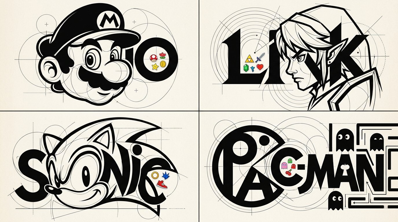
2x2 grid, 16:9, do this for 4 famous games:
STYLE: LIVING LETTERFORM CARICATURES

Create an experime — AI image prompt — Nano Banana 2.1
GoogleNano Banana 2.1
2x2 grid, 16:9, do this for 4 famous games: STYLE: LIVING LETTERFORM CARICATURES Create an experimental typographic character design of [SUBJECT] where recognizable anatomy and lettering become one unified graphic sculpture-like illustration. C₀ IDENTITY PRESERVATION Identify the subject's most recognizable physical features, including hairstyle silhouette, nose, eyes, jawline, eyebrows, and signature expression. Reconstruct these characteristics using geometric letterforms and controlled negative space. The viewer should recognize both the subject and the typographic construction. ¬C₀ = generic mascot face / unrelated character silhouette / completely abstract identity. C₁ TYPOGRAPHIC ANATOMY FUSION (master) Use the subject's name or recognizable initials as the primary structural foundation. Construct the head, hair, eyebrows, eyes, nose, mouth, and signature facial geometry through carefully manipulated typographic forms. Transform letter counters into eye shapes, rounded glyphs into facial masses, vertical stems into necks or structural elements, and curved strokes into hair or facial contours. Allow the letters and character features to share physical boundaries. The character and typography must feel inseparable rather than layered independently. ¬C₁ = portrait placed above a logo / unrelated typography / conventional wordmark / generic illustrated character. C₂ CONSTRUCTIVIST GEOMETRIC ENGINEERING Surround key forms with precise thin-line circles, overlapping arcs, tangent guides, crosshair marks, dotted construction paths, baseline grids, and small alignment points. Use dramatic contrasts between massive filled black typographic forms and delicate hairline geometric construction elements. Every guide should appear to explain how the character's visual geometry was constructed. ¬C₂ = random decorative circles / excessive technical clutter / inconsistent alignment / meaningless geometry. C₃ MICRO-STICKER INTERRUPTIONS Introduce isolated concentrations of small colorful cartoon stickers inside selected letter counters, along typographic edges, or within intentional negative spaces. Stickers should reference the subject's personality, career, recognizable accessories, or visual identity. Keep approximately 80–90% of the overall composition monochromatic, with sticker accents creating surprising pockets of color. Sticker illustrations should use bold outlines, simple expressive faces, and compact shapes. ¬C₃ = full-page sticker wallpaper / stickers covering the face / unrelated doodles / random colorful decoration. C₄ GRAPHIC MINIMALISM + CONTROLLED COLOR Primary palette: pure black and warm white. Use one or two subject-adaptive accent colors within the sticker clusters. Typography should use exceptionally heavy geometric letterforms, clean sharp edges, strong negative space, and selective high-contrast curved structures. Background remains clean and pale. ¬C₄ = full rainbow palette / photoreal textures / 3D material shaders / glossy effects / elaborate gradients. C₅ EXPERIMENTAL IDENTITY POSTER Square or portrait editorial composition. Make the fused character-wordmark occupy most of the image. Preserve generous white space around the central construction. Integrate delicate registration geometry without obscuring the primary lettering. The final artwork should function both as a recognizable character illustration and a distinctive experimental identity mark. ¬C₅ = ordinary portrait / dense stickerbomb background / realistic scenery / conventional logo placement. η HONEST GRAPHIC RENDER Precisely engineered curves, confident typography, mathematically inspired geometry, clever facial abstraction, seamless letter-character integration, clean high-contrast shapes, and crisp print quality. FORBIDDEN = ordinary text under a portrait · generic icon · excessive color · random stickers · unrelated geometric symbols · photorealism · generic cartoon avatar · 3D CGI · watermarks.
檢視詳情
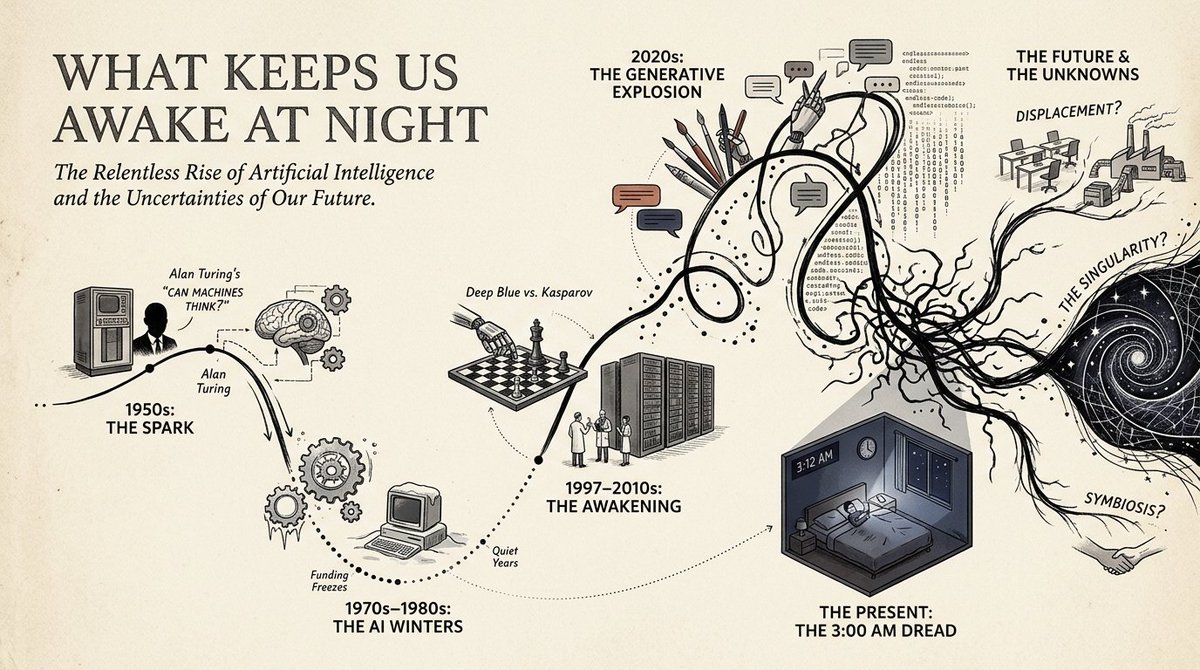
16:9, do this for a topic that keeps us awake at night: in this style= {

CORE IDEA:
Transform the s — AI image prompt — Nano Banana 2.1
GoogleNano Banana 2.1
16:9, do this for a topic that keeps us awake at night: in this style= { CORE IDEA: Transform the subject into a chronological visual journey where a single wandering line travels through time, branching into illustrated milestones, cultural scenes, human moments, and symbolic turning points. MEDIUM: Editorial infographic × historical poster illustration × narrative timeline × miniature visual storytelling. BACKGROUND: Warm ivory or lightly textured archival paper. PALETTE: Mostly black, cream, muted gray, and one or two restrained accent families inferred from the subject. Important milestones may receive stronger localized color. TIMELINE: A continuous hand-drawn path flows horizontally or diagonally across the composition. The path may: loop, dip, accelerate, split, reconnect, flatten, or become chaotic according to the subject’s actual development. MILESTONES: Major stages become illustrated nodes attached to the line. Each node may contain: a person, profession, invention, object, event, environment, symbol, cultural artifact, breakthrough, setback, or transformation. - Analyze the subject and infer its most meaningful chronological stages rather than dividing time evenly. Convert the subject’s progression into one expressive continuous path whose shape reflects momentum, uncertainty, disruption, growth, decline, or reinvention. Reinterpret major milestones as compact illustrated vignettes placed above or below the path. Use simplified human figures, objects, architecture, tools, symbols, or environments to make each milestone immediately understandable. Convert abstract changes into visual path behavior: uncertainty → loops and knots, acceleration → steep directional movement, stability → long clean segments, disruption → sudden breaks or drops, divergence → branching routes, convergence → reconnecting paths. Use dotted vertical connectors to link timeline points with their illustrated scenes. Let early periods feel simpler and later periods become visually denser when the subject naturally grows in complexity. If the subject has competing trajectories, show multiple temporary paths before returning to one dominant storyline. Preserve substantial negative space so the journey remains readable rather than becoming a collage. Simplified editorial figures. Bold silhouettes mixed with minimal line drawing. Small architectural scenes. Iconic objects rather than detailed realism. Clear visual metaphors. Occasional large symbolic illustrations anchoring major transitions. PRIMARY: large subject title or concept. SECONDARY: milestone dates, eras, phases, or sequence markers. TERTIARY: very short explanatory phrases. VISUAL: the timeline and illustrations must communicate the story even if all secondary text disappears. Use one dominant timeline across the full composition. Alternate visual nodes above and below it. Reserve one end of the composition for the current or culminating state. Allow one particularly important milestone to become much larger than surrounding nodes. Keep text aligned to a disciplined editorial grid. - Intelligent narrative infographic. - Historical journey poster. - Human-centered, analytical, and visually approachable. - Feels like a magazine feature, museum wall graphic, and illustrated timeline combined. - Avoid generic evenly spaced timelines. - Avoid turning every event into the same-sized icon. - Avoid dense paragraphs. - Avoid meaningless decorative line movement. - Avoid purely corporate infographic aesthetics. - Avoid identical color intensity across every era. }
檢視詳情
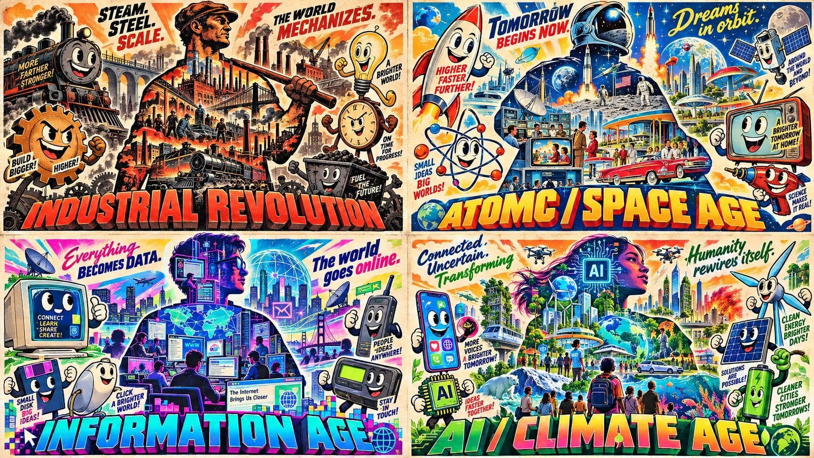
2x2 grid, 16:9, do this for 4 eras that defined modern humanity: S₁ CHARACTER SILHOUETTE FILLED WITH — AI image prompt — Nano Banana 2.1
GoogleNano Banana 2.1
2x2 grid, 16:9, do this for 4 eras that defined modern humanity: S₁ CHARACTER SILHOUETTE FILLED WITH SCENES (master) a central character silhouette whose interior is filled with scenes from the topic/era (city, sunset, objects, people); the silhouette IS the era. ¬S₁ = no silhouette / empty silhouette / scenes outside. S₂ ANTHROPOMORPHIZED OBJECTS WITH era's main emotion appropriate FACES surrounding the silhouette, 3–6 objects from the era with smiley faces and expressive eyes (cassette, phone, car, food, tool); each object is a character. ¬S₂ = no objects / no smiley faces / realistic objects / generic props. S₃ GIANT 3D TYPOGRAPHY + TAGLINES giant bold 3D title at the bottom naming the era/topic; taglines above the silhouette or panels; legible, retro style. ¬S₃ = small type / no 3D / no taglines / modern font. S SATURATED RETRO PALETTE saturated colors (neon pink, electric blue, sunset orange, lime green) on cream; retro poster feel; bold shapes. ¬S₄ = muted / grayscale / modern minimal / dark ground. S₅ MULTI‑PANEL OR COMPOSITIONAL DENSITY either a multi-panel layout (4 panels like Image 55) or a single dense composition with the silhouette + objects + title filling the frame; no empty space. ¬S₅ = sparse / single object / empty frame. η HONEST RETRO bold shapes, saturated fills, retro typography, poster texture. FORBIDDEN = no silhouette · empty silhouette · no smiley objects · small type · no 3D · muted palette · sparse · empty frame
檢視詳情
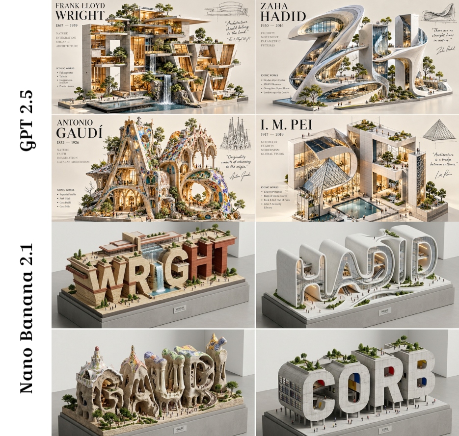
2x2 grid, 16:9, do this for 4 legendary architects: CLASSIFY(input) → {
  domain:      isometric_3D  — AI image prompt — Nano Banana 2.1
GoogleNano Banana 2.1
2x2 grid, 16:9, do this for 4 legendary architects: CLASSIFY(input) → { domain: isometric_3D × typographic_sculpture × architectural_diorama × brand_pavilion intent: elevate + inhabit + miniaturize (the "monumental letterform as habitable space") audience: brand identity directors, architectural visualizers, premium product designers platform: 1:1 or 4:5 high-res 3D render, flagship campaign hero, collectible digital art complexity: extreme (requires strict dual-scale management, volumetric boolean typography, luxury material physics, and pristine showroom photometrics) } CORE DESIGN LAWS : ⚠ THE LETTER IS THE BUILDING. THE OUTSIDE IS MINIMAL. THE INSIDE IS RICH. • Form: The `{{SUBJECT}}` is transformed into monumental, freestanding 3D typography or an emblematic silhouette. • Topology: The letterforms act as architecture. Cutaways, terraces, atriums, and galleries are embedded inside. • Scale Duality: Monumental exterior (macro) vs. Miniature interior (micro). Tiny humans and trees define the immense scale. • Materiality: Luxury modern. Matte white concrete, glass curtain walls, brushed aluminum, pale stone. • Lighting: Premium showroom. Soft studio daylight, crisp edges, gentle ambient occlusion, recessed interior LEDs. • Vibe: Futuristic, refined, aspirational. "Flagship campus" energy. Zero grunge, zero toy aesthetics. SEMANTIC_VARIABLES (AI infers from {{SUBJECT}}): {{SUBJECT}} → [e.g., "AERO", "LUMEN", "NEXUS", or a brand emblem] {{TYPOLOGY}} → The base 3D letterforms or emblematic mass {{INTERIOR_PROGRAM}}→ [e.g., Sunken galleries, cantilevered terraces, glass atriums] {{MICRO_ELEMENTS}} → Tiny scale figures, miniature planters, digital kiosks, sleek benches {{ACCENT_PALETTE}} → Restrained natural greens + 1 inferred brand accent color {{LIGHTING_RIG}} → Soft studio daylight + warm interior accent pools
檢視詳情
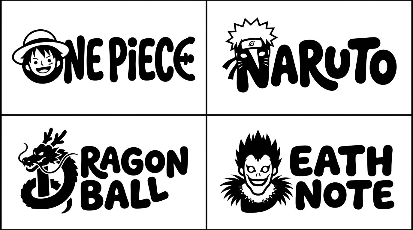
2x2 grid, 16:9, do this for 4 famous manga : Act as a generative rendering engine executing Typograp — AI image prompt — Nano Banana 2.1
GoogleNano Banana 2.1
2x2 grid, 16:9, do this for 4 famous manga : Act as a generative rendering engine executing TypographicMascotRender(SUBJECT). word = text("$subject") clean_remainder = set_type(word[1:], family="playful, bold, rounded monoline", metrics="bouncy baseline") mutant_glyph = deform_glyph(word[0], mapping=adaptive_map(word[0], signature_form($ subject)), add_details=negative_space_eyes) render(compose(clean_remainder, mutant_glyph), inks=ONE_BLACK, ground=PURE_WHITE) Invariants: The first letter must perfectly morph into the silhouette of the $ subject via its own anatomy (e.g., ascenders become necks/tails, bowls become bodies). The remaining letters must share the exact same stroke weight and organic, blobby aesthetic. Use negative space for eyes. Forbidden: No color, no gradients, no realistic textures, no whole-word mutations, no decorated remainder letters. Flat 2D vector style.
檢視詳情
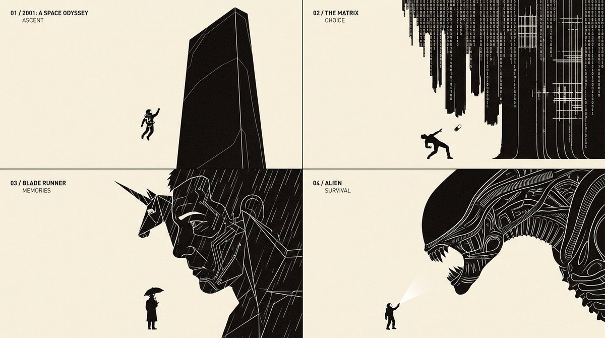
2x2 grid, 16:9, do this for 4 famous scifi movies: class UniversalEditorialMetaphor:

    def __init — AI image prompt — Nano Banana 2.1
GoogleNano Banana 2.1
2x2 grid, 16:9, do this for 4 famous scifi movies: class UniversalEditorialMetaphor: def __init__(self, topic): self.topic = topic self.semantics = infer_semantic_structure(topic) self.thesis = infer_visual_thesis(topic) self.mood = infer_editorial_tone(topic) self.metaphors = generate_candidate_metaphors( topic, count=12 ) self. best_metaphor = self. select_best_metaphor() def select_best_metaphor(self): return max( self.metaphors, key=lambda m: 0.35 * semantic_accuracy(m) + 0.25 * conceptual_originality(m) + 0.25 * visual_clarity(m) + 0.15 * silhouette_strength(m) ) def visual_actors(self): return { "primary": infer_dominant_form( self. best_metaphor ), "secondary": infer_consequence_or_partner( self. best_metaphor ), "interaction": infer_decisive_action( self. best_metaphor ) } def composition(self): return { "geometry": "asymmetric", "primary_scale": "monumental", "secondary_scale": "small", "camera": "flat editorial orthographic", "cropping": "dramatic boundary intrusion", "negative_space": "dominant", "focal_point": "physical interaction" } def typography(self): return { "heading": derive_chapter_title(self.topic), "embedded_word": infer_single_action_label_if_needed( self.topic ), "density": "minimal" } def render_style(self): return { "background": "warm ivory", "foreground": "near-black", "interior_lines": "fine white contours", "shadows": None, "gradients": None, "texture": "minimal editorial print", "format": "wide conceptual illustration" } def render(self): return compose( actors=self.visual_actors(), metaphor=self. best_metaphor, layout=self.composition(), typography=self.typography(), style=self.render_style() ) FINAL_IMAGE = UniversalEditorialMetaphor( topic="[TOPIC]" ).render()
檢視詳情
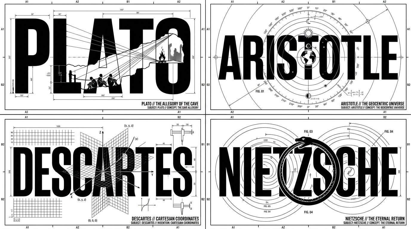
2x2 grid, 16:9, do this for 4 famous philosophers: class Engineering_Blueprint_Logo:
    def __init_ — AI image prompt — Nano Banana 2.1
GoogleNano Banana 2.1
2x2 grid, 16:9, do this for 4 famous philosophers: class Engineering_Blueprint_Logo: def __init__(self, subject="[NAME]", invention="[INVENTION/CONCEPT]"): self.canvas = "Pure white background, 1-bit monochrome black ink graphic design" self.layout_engine = "AI_INFER(Determine if the layout should be Orbital, Vertical, or Horizontal based on the physics of the invention)" def generate_schematic(self): # AI INFERENCE: Deduce the heavy typography typography = f"Massive, bold, sans-serif block letters spelling '{subject}'. The text structure aligns with the {self.layout_engine}." # The Splicing Illusion cutout = f"A flat, minimalist silhouette of {invention} slices directly through the typography. Where it overlaps the black text, it is drawn in pure white negative space." # The Hairline Details drafting_marks = "Hundreds of razor-thin (0.25pt) technical lines, crosshairs, orbital arcs, and measurement nodes intersecting the letters." return [typography, cutout, drafting_marks, self.canvas] # EXECUTE: Render as a flawless, scalable vector logo. The contrast between thick letterforms and delicate drafting lines is paramount.
檢視詳情
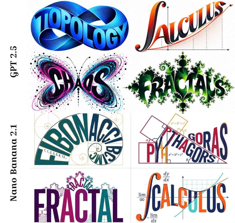
2x2 grid, 16:9, do this 4 math topics,   A clever, striking typographic illustration on a pure white — AI image prompt — Nano Banana 2.1
GoogleNano Banana 2.1
2x2 grid, 16:9, do this 4 math topics, A clever, striking typographic illustration on a pure white background::5 The Typography: The word "[WORD/CONCEPT]" written in massive, bold font. The letters stretch, bend, and warp to perfectly form the physical shape of AI_INFER(a symbol representing the word)::5 The Details: AI_INFER(Highly stylized textures, flowing ribbons, ink splatters, or mechanical parts seamlessly blending into the letters)::4 The Palette: AI_INFER(A bold, thematic color scheme fitting the concept), high contrast, graphic design, vector art style::4 Style: Award-winning typography, Dribbble shot, logo design, gestalt illusion::3 3D render, messy, illegible, text overlay, unreadable, photography::-4
檢視詳情
瀏覽全部 Nano Banana 2.1 提示詞探索AI 圖片提示詞