Three-Color Linocut City Travel Poster
 GPT Image 2.6OpenAIimage
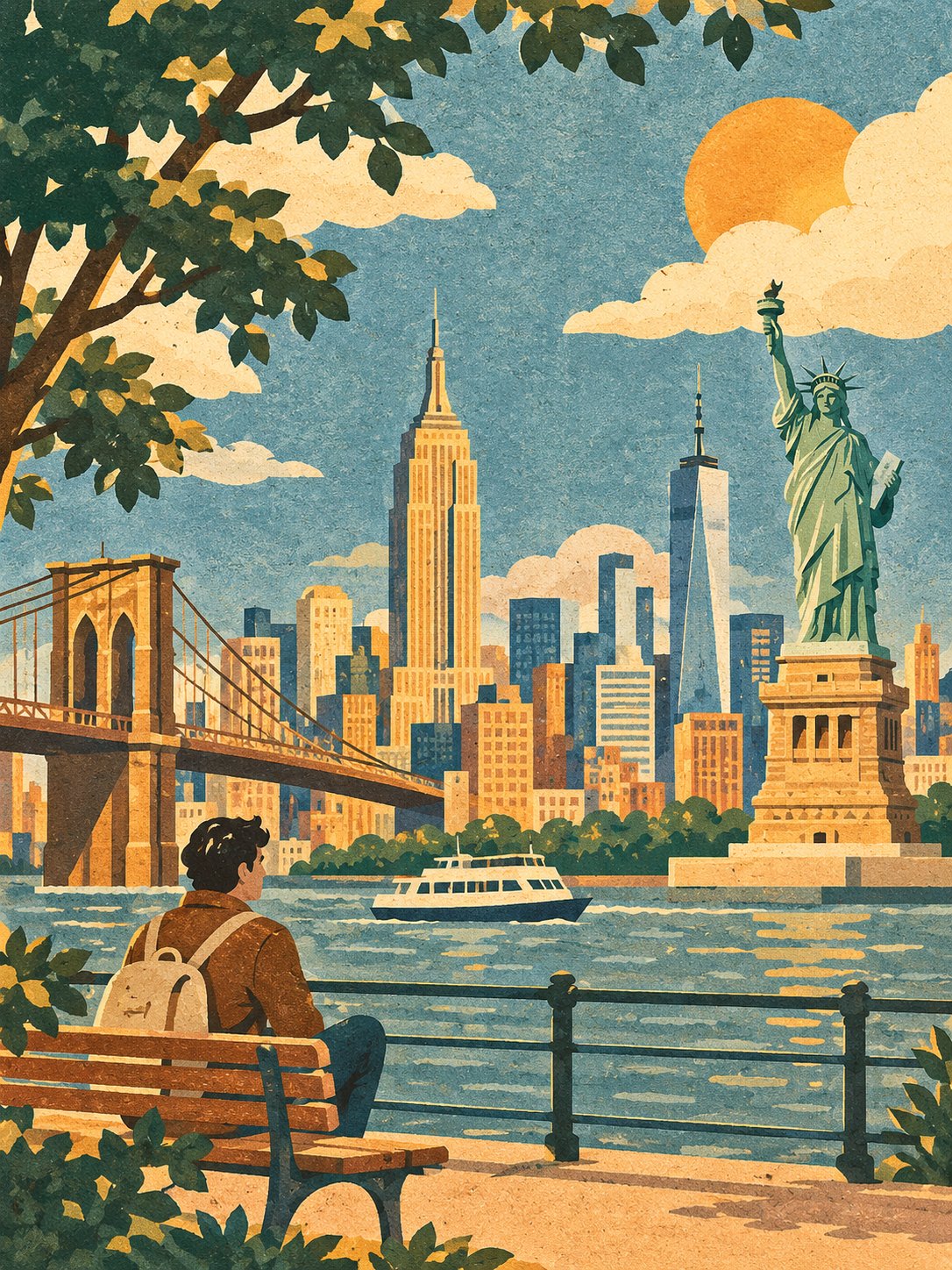
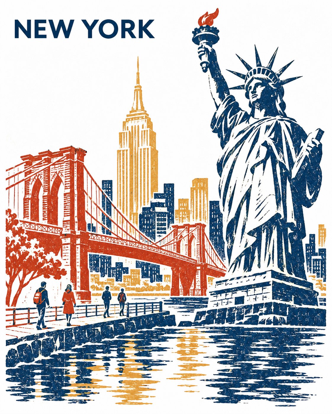
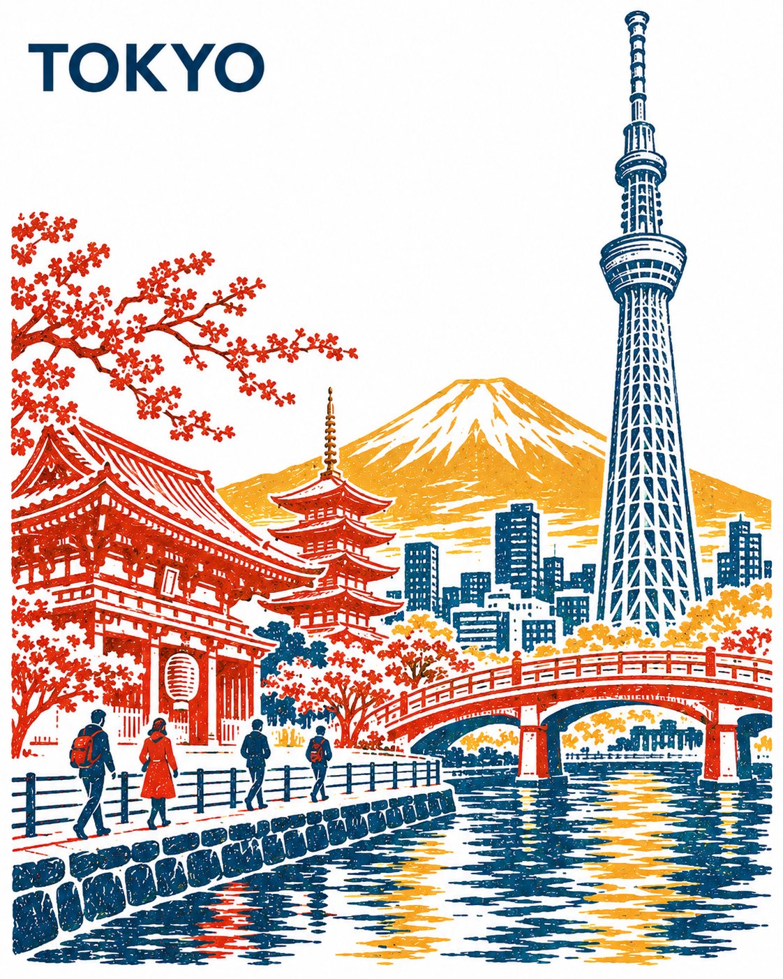
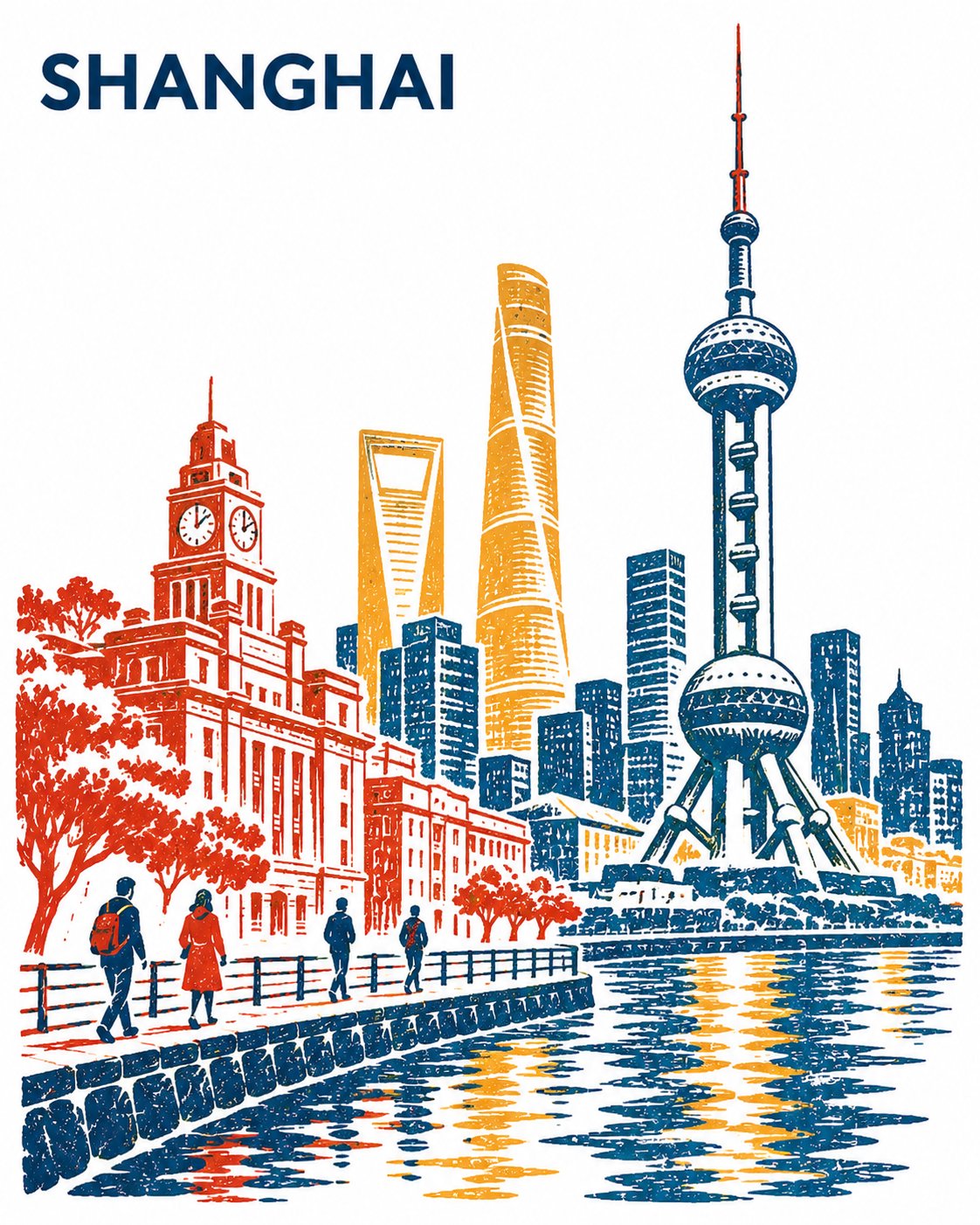
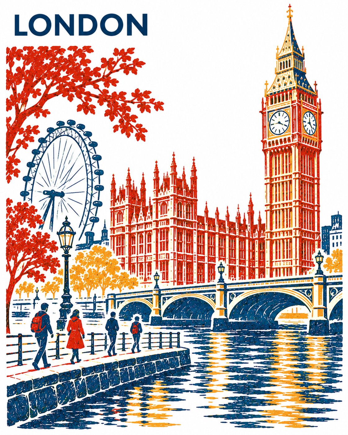
COLLECTIBLE THREE-COLOR REDUCTION LINOCUT | CITY TRAVEL POSTER Create a striking, collectible three-color reduction linocut travel poster featuring [CITY NAME], printed vertically in a 4:5 aspect ratio on pristine, pure-white paper. COMPOSITION & ARCHITECTURE Make [PRIMARY LANDMARK] the dominant focal point. Select two additional instantly recognizable landmarks from [CITY NAME], ensuring their architectural forms create a compelling visual contrast. Bring all three landmarks together along one continuous waterfront, artistically reimagining their geographical positions while preserving their authentic silhouettes, architectural proportions and defining details. Use an asymmetric, low three-quarter perspective. Ground every structure in a believable waterfront environment with convincing foundations, bridges and architectural connections. Establish a unified horizontal visual flow through varied building heights, intentional spacing and subtle overlaps. Maintain a balanced, organic composition. Avoid conventional skyline arrangements, stacked architectural tiers or disconnected floating structures. Include exactly four tiny contemporary pedestrians along the waterfront to introduce scale, atmosphere and subtle human presence. PRINTMAKING & COLOUR PALETTE Use exactly three destination-inspired ink colours, carefully selected to reflect the city's character, architecture and atmosphere. Embrace authentic reduction linocut aesthetics: - Bold, sculptural carved shapes and confident silhouettes. - Rhythmic white negative-space cuts revealing the texture of the paper. - Organic, slightly irregular hand-carved edges. - Subtle variations in ink density and uneven pressure, suggesting traditional block printing. - Strong contrasts between deep architectural shadows and luminous unprinted areas. - Waterfront reflections simplified into expressive, broken horizontal marks. The finished artwork should feel like an authentic, artisan-produced limited-edition print rather than a digitally generated illustration. TYPOGRAPHY & LAYOUT Position the text "[CITY NAME]" discreetly in the upper-left corner. Use a clean, SUIT-style uppercase sans-serif typeface in Regular or Medium weight, with restrained letter spacing and generous surrounding white space. Keep the typography minimal, sophisticated and secondary to the artwork. FINAL ART DIRECTION A refined collectible destination poster combining traditional Japanese-inspired reduction printmaking, contemporary graphic design and distinctive architectural illustration. Prioritize strong composition, architectural authenticity, elegant negative space, carefully controlled colour separation and timeless visual appeal. STRICT RESTRICTIONS: No additional text, captions, inscriptions, decorative lettering, logos, borders, signatures or watermarks. Exactly three ink colours, four pedestrians and one continuous waterfront composition.
Details
- Type
- AI Image Prompts
- Aspect Ratio
- 561:701
- Updated
- Nov 17, 2026
How to use this prompt
- 1Copy the full prompt with the copy button above.
- 2Open GPT Image 2.6 by OpenAI, or any image generator with a similar style range.
- 3Paste the prompt, then swap the subject and style keywords to match your idea.
- 4Match the example's settings (561:701 · Poster · Vintage · Cityscape), then iterate — small wording changes shift the output a lot.
Frequently asked questions
Which AI model generated this image?
This image was generated with GPT Image 2.6 by OpenAI. The prompt on this page is the exact text used to create it.
What settings does this prompt use?
The example was generated with GPT Image 2.6 using: 561:701 · Poster · Vintage · Cityscape. Reusing these settings gives the closest match.
How do I get similar results?
Copy the prompt as-is first, then replace only the subject while keeping the style, lighting, and composition keywords. Generate a few variations — outputs differ between runs.
Can I modify this prompt?
Yes. Prompts work best as starting points — adjust descriptors, aspect ratio, or style tags to make the output your own.