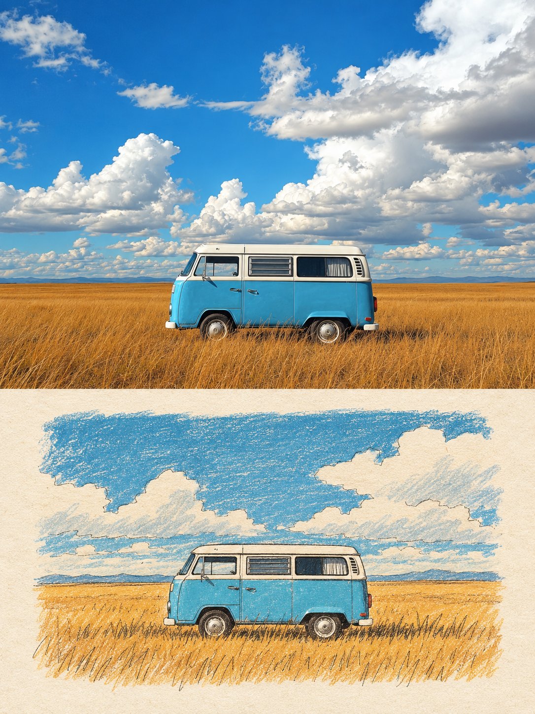
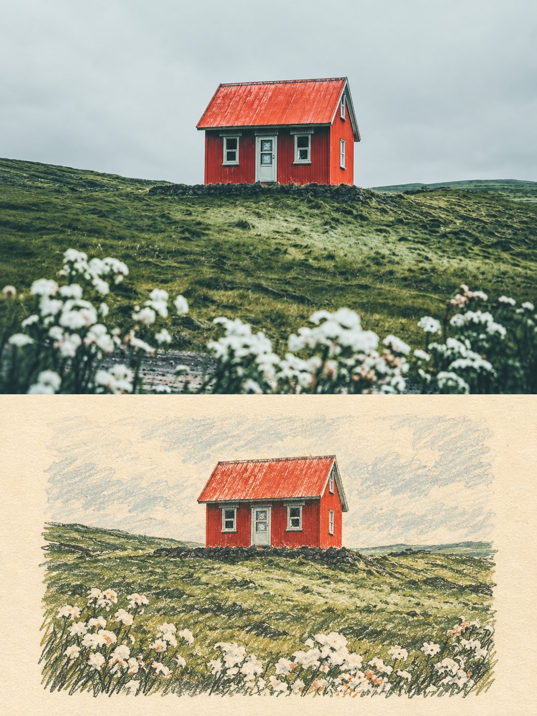
Photo and Naive Illustration Memory Card
 GPT Image 2.5OpenAIimage
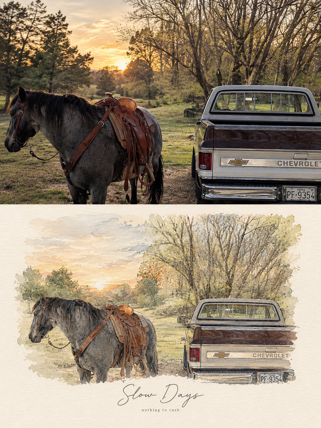
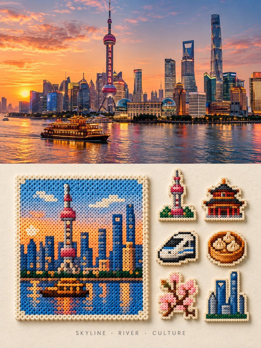
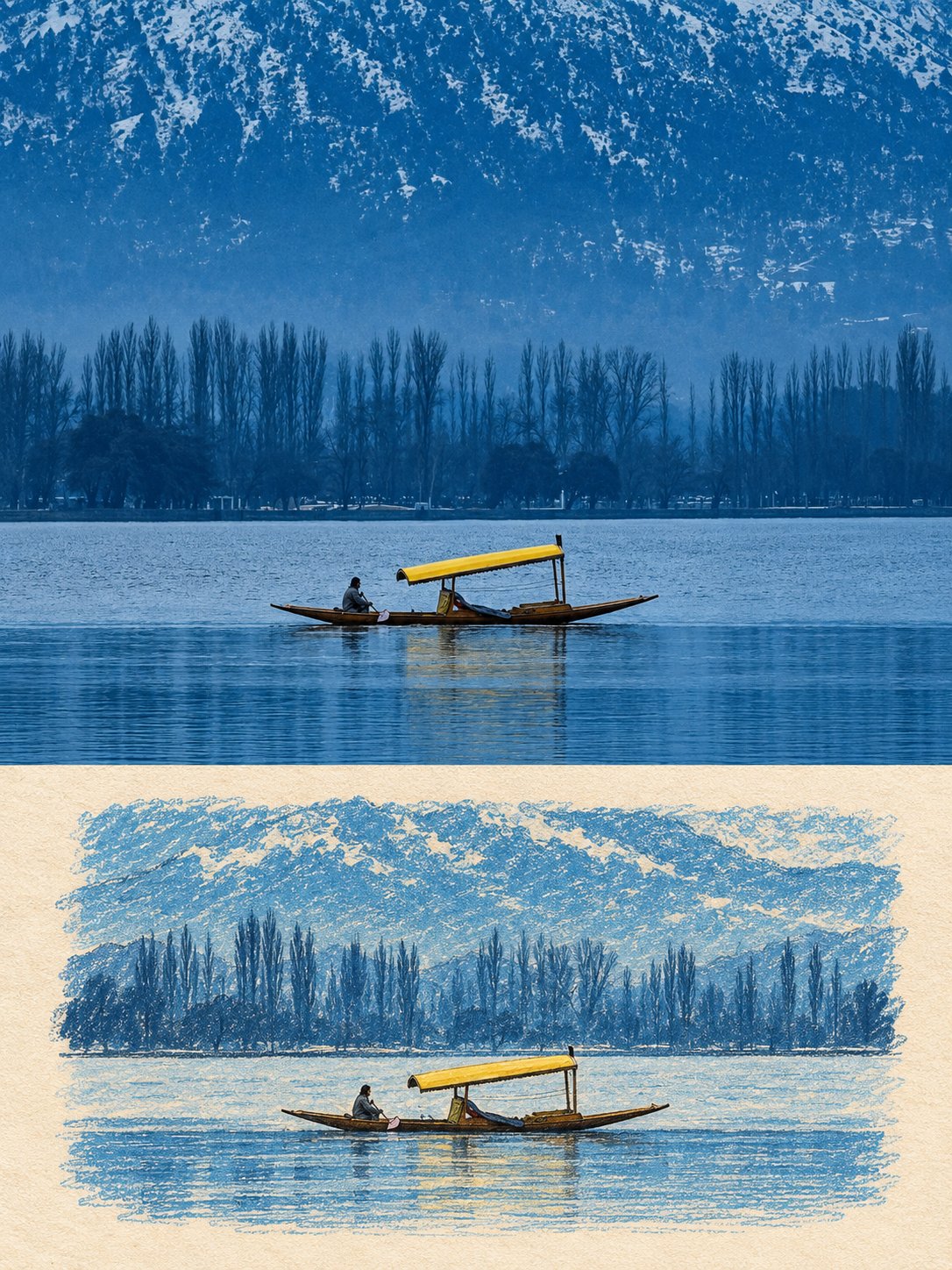
Use the uploaded photo as the only content source. Create a vertical 3:4 “real photo + minimal illustration” memory card based entirely on that image. Preserve the main subjects, subject count, pose, viewpoint, spatial relationships, and overall scene logic. Do not redesign the source or add unrelated content. Layout Split the card into two horizontal sections, about 50% top and 50% bottom. The top half keeps the uploaded photo with photographic texture. Crop naturally to fit, but do not stretch, mirror, rearrange, or alter the main subjects. Keep natural lighting, real materials, and the original color mood, with subtle editorial grading. The lower half uses a warm ivory handmade-paper background and shows a centered horizontal illustration of the same scene. The illustration occupies about 63-67% of the lower width, with generous blank space around it. Scene Translation In the lower illustration, preserve the most recognizable subjects, major structures, important objects, viewpoint, depth, relative scale, and key positions from the source. Remove tiny clutter, fine photographic texture, reflections, and complex shadows. Simplify the scene into slightly awkward geometric color blocks and thin hand-drawn lines. People and animals, when present, remain identifiable through silhouette, pose, hair or fur shape, clothing color, and placement, but facial detail may be reduced. Outlines may wobble, break, shift, or misalign slightly while the scene stays recognizable. Illustration Style Use restrained naive editorial drawing with soft geometric simplification and handmade quality. Combine thin sketchy linework with flat shapes. The lower scene should feel calm, clean, slightly imperfect, and visually reduced rather than technically precise. Avoid realistic rendering. Color Extract 4-6 representative colors from the uploaded photo and reinterpret them as a soft low-saturation palette. Use muted tones derived from the source, with flat fills and enough contrast to separate major subjects and scene layers. No complex gradients, glossy highlights, or heavy 3D modeling. Texture Blend crayon, pastel, screen-print, and old-book illustration qualities. Keep paper show-through, fine grain, slight pigment unevenness, worn edges, and subtle off-register shifts. The result should feel like an independent editorial illustration printed on aged paper: warm, quiet, nostalgic, and collectible. Typography Below the illustration, you may include exactly two short English lines related to the scene, mood, place, or moment. Use a small vintage serif font, left-aligned. If clean readable text cannot be rendered, leave the area blank. No other readable text. Cleanup Remove phone UI, subtitles, screenshot traces, and interface elements when present. Do not invent missing scenery or decorative props. Negative No major layout change, no added or missing primary subjects, no photoreal painting, no polished watercolor, no anime, no manga, no vector clip-art, no oil paint, no impasto, no 3D, no logo, no watermark, no black border, no UI, no unrelated decoration. Vertical 3:4 split card · photo top / naive illustration bottom · aged paper texture
Details
- Type
- AI Image Prompts
- Aspect Ratio
- 3:4
- Updated
- Sep 29, 2026
Category
How to use this prompt
- 1Copy the full prompt with the copy button above.
- 2Open GPT Image 2.5 by OpenAI, or any image generator with a similar style range.
- 3Paste the prompt, then swap the subject and style keywords to match your idea.
- 4Match the example's settings (3:4 · Digital Art · Vintage · Minimalist), then iterate — small wording changes shift the output a lot.
Frequently asked questions
Which AI model generated this image?
This image was generated with GPT Image 2.5 by OpenAI. The prompt on this page is the exact text used to create it.
What settings does this prompt use?
The example was generated with GPT Image 2.5 using: 3:4 · Digital Art · Vintage · Minimalist. Reusing these settings gives the closest match.
How do I get similar results?
Copy the prompt as-is first, then replace only the subject while keeping the style, lighting, and composition keywords. Generate a few variations — outputs differ between runs.
Can I modify this prompt?
Yes. Prompts work best as starting points — adjust descriptors, aspect ratio, or style tags to make the output your own.
![Create a premium cinematic luxury tourism poster for [COUNTRY / DESTINATION] in a STRICT 4:5 vertica — AI image prompt — GPT Image 2.5](https://cdn.ahaprompt.app/harvest-media/import-1789369001673-dctuvc.jpg)
![Create a premium contemporary editorial art poster for [LOCATION] in a playful Japanese design-ZINE — AI image prompt — GPT Image 2.5](https://cdn.ahaprompt.app/harvest-media/import-1789139846025-v6z310.jpg)
![Create a sophisticated, dreamy editorial magazine cover titled “[COUNTRY NAME] — A COUNTRY IN ONE DR — AI image prompt — GPT Image 2.5](https://cdn.ahaprompt.app/harvest-media/import-1789368946131-xefjx1.jpg)