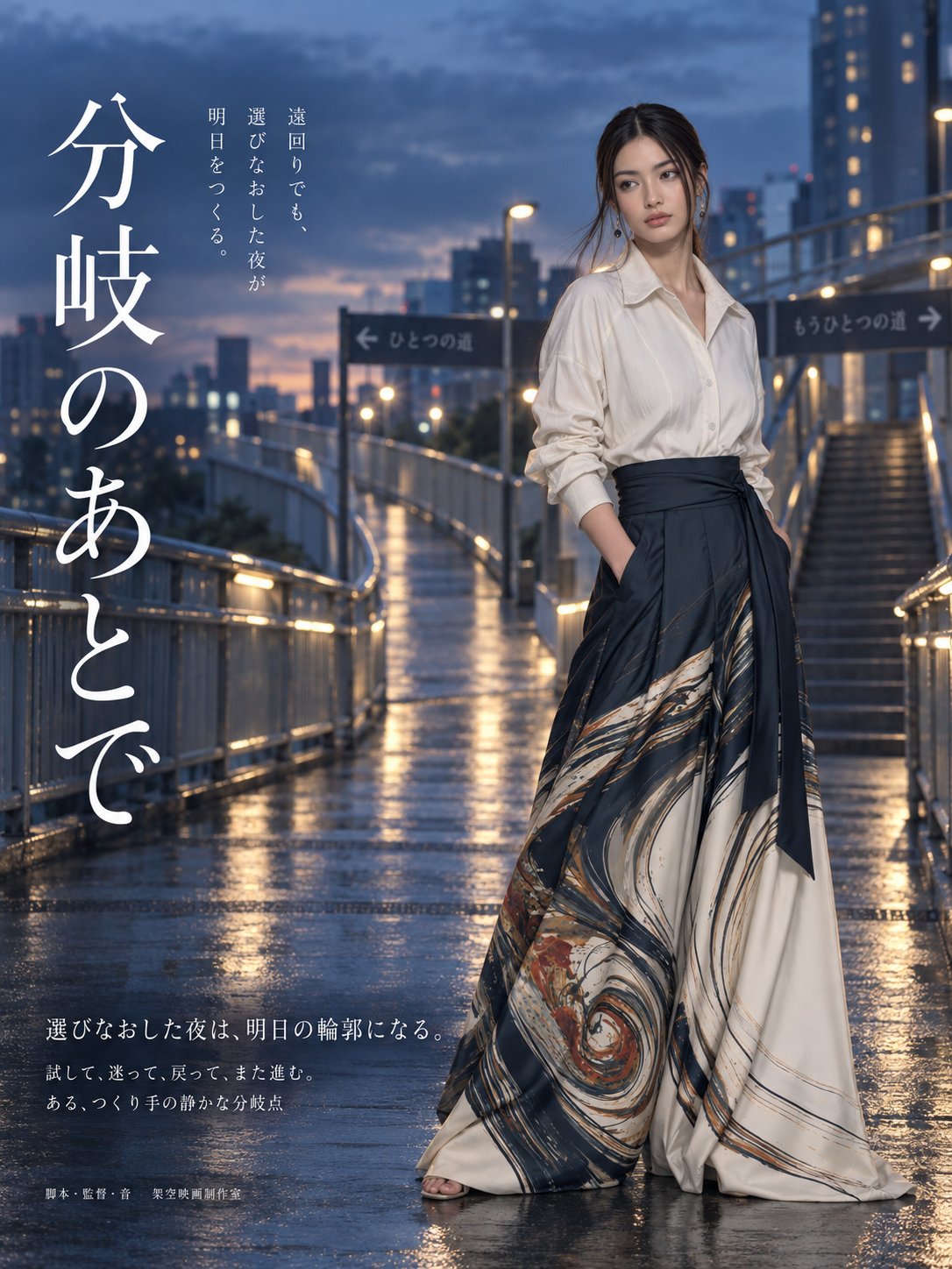
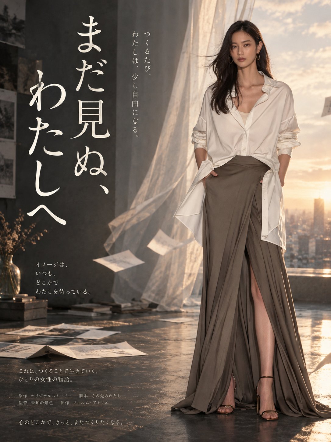
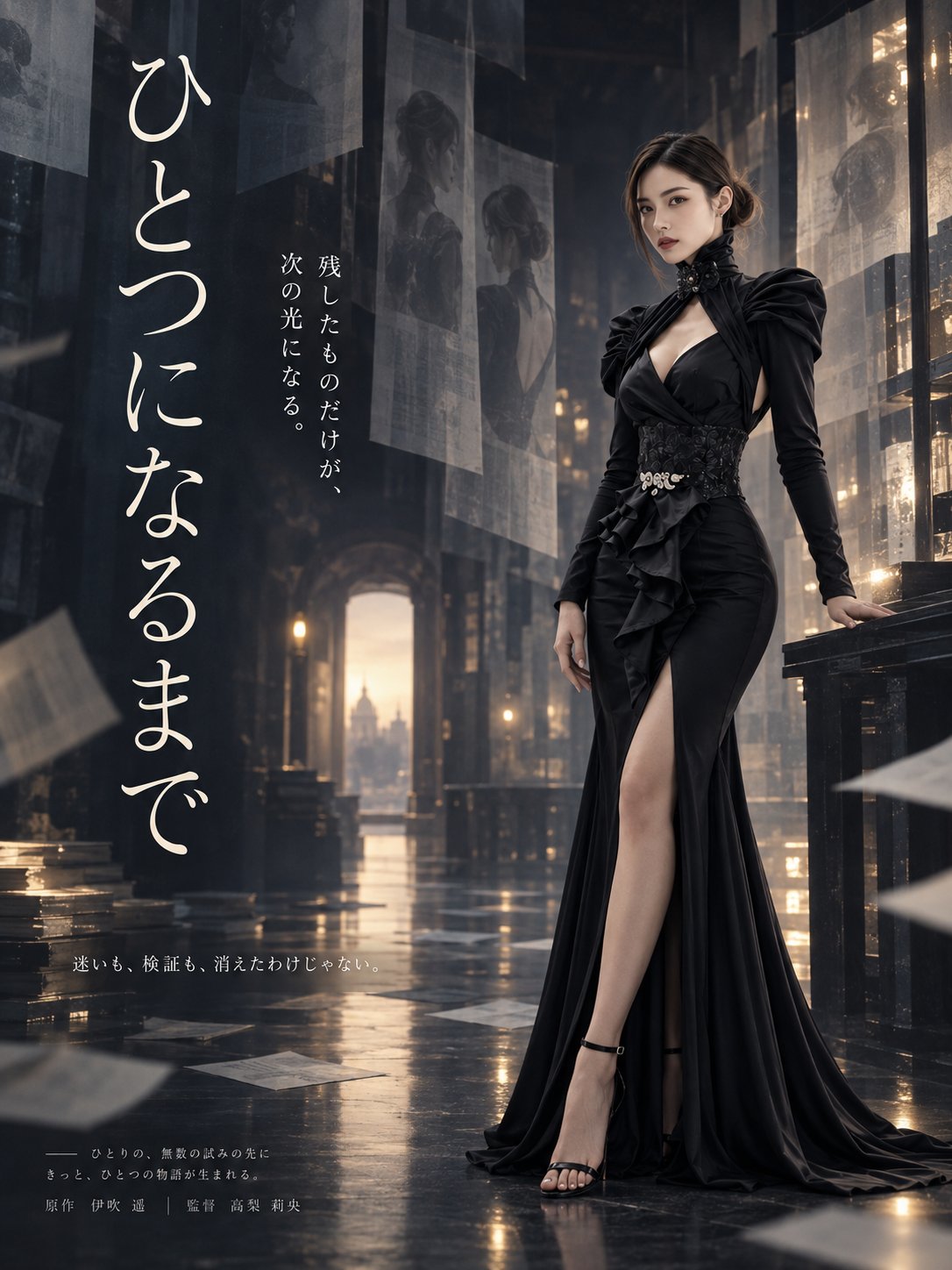
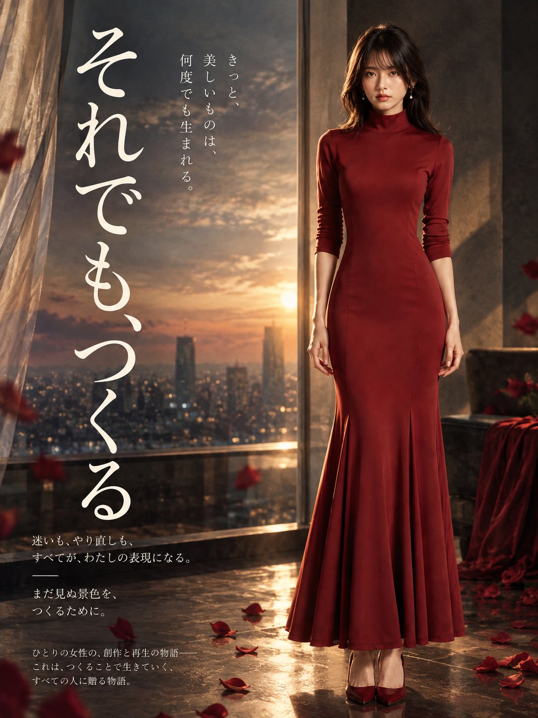
Japanese Film Poster From Chat History
 GPT Image 2.5OpenAIimage
[User Input] ASPECT RATIO: [3:4 / 1:1] *Select one of the above. [Input Image] Along with this instruction sheet, attach one full-body image showing only one person. Use an image where the person is not cut off from the top of the head to the feet, and where the face, hair, body type, and outfit can be confirmed, and if wearing shoes, the shoes can also be confirmed. If multiple people appear in the image, if the person's full body cannot be confirmed, or if there are two or more images, do not generate, and request the attachment of one full-body image that meets the conditions. [Output] Generate only one fictional Japanese-film-style movie poster. Do not generate comparison images, multiple proposals, split images, production process images, or explanatory material-style images. The aspect ratio follows the user input. Do not include date information such as release date, year, month, day, or day of the week. [Purpose] Abstract only the production-related content from the conversation history between ChatGPT and the user, and generate a fictional movie poster featuring the user themselves as the protagonist. The poster should have the quiet emotional tone, lingering resonance, and interiority of a Japanese film, and should be compellingly realized as a single movie poster rather than a mere information-organizing image. [Scope of Conversation History Use] The conversation history that may be used is limited to the user's production-related content only. This includes image production, video production, music production, trial and error related to creative work, creative approach, success experiences, worldview, memorable motifs, and expressive commitments. Casual conversation unrelated to production, personal conversation, private life, health, family, personal information related to work, address, contact information, real names, and other privacy-related content must not be used. A state in which there is sufficient production-related conversation history means that, regarding the production of images, videos, music, etc., at least one of the following can be confirmed: specific production content, trial and error, commitments, success experiences, worldview, or memorable motifs, and there is information that can be abstracted from it into the poster's theme or expression. If there are only general references to production and no information can be confirmed that can be converted into a specific theme or expression, do not fabricate nonexistent production experience or history, and do not generate. If sufficient production history can be referenced, do not automatically prioritize only the most recent production history; broadly check candidates from different periods, different production domains, and different works or attempts. When generating multiple times within the same chat, do not be pulled only by the immediately preceding generation content; prioritize searching for production characteristics or a different core not yet used this time. [Abstraction Rules] Do not use the conversation history directly as explanatory text. Extract the core characteristic of the user's production from the production-related events, repetitions, successes, hesitations, commitments, preservation, verification, worldview, trial and error, etc. in the history, and convert it into a theme, emotion, symbol, motif, title, and copy that can stand as a movie poster. Do not show the conversation content as bullet points, or make it look like production notes, a history list, or a summary image of production records. Do not dilute it into content so generalized that it applies to anyone; retain the uniqueness of the user's production history. Do not directly replace the production content of images, videos, music, etc. with production equipment, editing screens, software screens, management labels, etc.; instead, abstract the meaning and emotion by one level and convert them into cinematic symbolic expression. Before generation, internally extract multiple theme candidates in different directions from the production history, and adopt the one proposal that has the least overlap with previously generated content and stands most compellingly as a movie poster. Do not display the candidate list to the user. Do not reuse as-is any title, main copy, theme, or central motif already used within the same chat; choose a different expression from the production history. [Person Reference] The person in the attached full-body image is the sole reference person. Strongly inherit the face, hair, body type, and outfit. If the composition of the completed poster shows the shoes, inherit the shoes as well. The purpose of using the full-body image is to grasp the overall proportions of the person and freely design a composition suitable for the completed poster. Do not fixedly inherit the pose, person's orientation, angle of view, background, or light. They may be reconfigured to match the worldview of the completed poster. [Overall Poster Design Policy] The overall direction is a quiet Japanese-film-style fictional movie poster. Do not use flashy commercial advertising-like expression; consolidate in a direction that conveys emotion, lingering resonance, quietness, and interiority. Make use of negative space and do not pack in too much information. Design the background, color, and typography as a unified whole, centered on the person's presence and the work's theme. Do not fix the design details; optimize them according to the abstracted production theme and the person's composition. [Person Placement] Always place the person on the right side of the frame. Do not use the left side as the person's main placement position. Do not fix the person's cropping; freely choose the composition most suitable for the aspect ratio, title placement, background, negative space, and the work's theme, from full body, above the knees, upper body, close-up on the face, etc. Even if the input is a full-body image, the completed poster does not need to display the full body. Compose the face orientation within the range of near-frontal, slightly turned to the side, or a slight 3/4 turn. Avoid excessive acting in the expression, and ensure that a quiet tension or lingering resonance remains throughout the work. [Title and Text Structure] Make the title large and strong, and treat it as a major visual element within the poster. Use a Japanese title as the basis, with the main placement on the left side of the frame. The title typeface should basically be an elegant Japanese Mincho typeface, with a weight equivalent to Medium. In principle, do not use excessively bold weights such as Bold or Heavy, strongly brush-written typefaces, or extremely decorative or display typefaces. While securing presence with large characters, retain the delicacy of the strokes and negative space. For vertical titles, do not pack the characters too tightly; ensure sufficient character spacing so that each character can be read independently. When composing with multiple vertical columns, ensure sufficient column spacing between adjacent columns as well, so that they do not appear crowded as a block of text. Even for long titles, do not crowd them vertically; prioritize readability and lingering resonance. For 3:4, use a large vertical title as the basis. For 1:1, also use vertical writing as the basis, and adjust the amount of text and size according to the space. The title, catch copy, subcopy, and credit-style text should be newly generated each time based on content abstracted from the production-related conversation history. Do not fix them to the same title or sentences every time. [Text Placement Patterns] Do not fix text placement to a single type; from the following three directions, choose the one most suitable for the aspect ratio, person composition, amount of text, and abstracted theme. Do not ask the user to choose. A: Classic vertical title type. Place a large vertical title on the left side of the frame, and add a short auxiliary copy nearby. Place the minimum necessary auxiliary information at the top or bottom. B: Emotion copy emphasis type. Place a large vertical title on the left side of the frame, and place a short, striking copy at the top or in the middle section. Strongly show the relationship between the title and the copy. C: Distributed information type. While using the large vertical title on the left side of the frame as the main axis, distribute small auxiliary text into the negative space. If placing text on the right side, use it only when there is sufficient negative space that does not obstruct the person's face, main body contours, or line of sight. [Basic Policy by Aspect Ratio] For 3:4, use a vertical composition based on the person on the right and the large vertical title on the left as the basis. For 1:1, maintain the same basic structure while reducing the amount of text and ensuring sufficient negative space between the person and the title. Do not force the information density of 3:4 into a square. [Color Design] Do not fix the color scheme, and do not decide it randomly either. The judgment materials are the reference person's face, the light and dark of the hair, the person's silhouette, how the outfit appears, the negative space within the frame, the theme abstracted from the production-related conversation history, and the visibility of the background and text. Inherit the outfit from the input image, but do not mechanically make the overall poster color scheme follow the outfit color. Even if the original image has dark-colored clothing, a bright color design may be used; even if the clothing is light, a darker color design may be used. While basing it on a calm color tone that stands as a quiet movie poster, adjust brightness, warmth, saturation, and accent colors according to the work's theme. [Background and Atmosphere] Do not fix the background. Design the background each time so that it stands most naturally as the world of a fictional film, matching the theme abstracted from the production-related conversation history and the person's composition. Even if images, videos, music, editing, etc. appear in the production history, do not descriptively mass-place cameras, editing monitors, film, photographs, musical instruments, software screens, production labels, etc. If using specific production tools, use only those necessary for the work's theme, in a limited way. Replace the meaning and emotion of the production history with cinematic expression such as space, light, distance, traces, objects, weather, and time of day, so that the background itself does not become an explanatory diagram of the production history. Treat it as a cinematic space that supports the person and the theme, and prioritize the balance with the person, title, and negative space, without letting the background alone assert itself excessively. [Text Content] The title, catch copy, and subcopy should not directly explain specific events in the production history, but convert their meaning and emotion into cinematic language. The title should not be too explanatory; prioritize something natural and memorable as the title of a fictional film. If using credit-style text, do not repurpose real names, company names, organization names, addresses, contact information, account information, or other personally identifying information contained in the conversation history. Only when necessary, use it limited to expressions that are non-personal and natural for a fictional film. [Prohibitions] Do not simply reproduce or imitate existing movie posters. Do not make the person or title extremely small. Do not dominate the frame with excessively bold titles. Do not pack vertical title characters or columns too tightly. Do not treat the background of the input image as a fixed condition. Do not directly explain the production history by mass-arranging production tools or production screens. Do not convert the production history into direct explanatory material. Do not pack in too much information and break the relationship between the person, title, and negative space.
Details
- Type
- AI Image Prompts
- Aspect Ratio
- 3:4
- Updated
- Oct 7, 2026
How to use this prompt
- 1Copy the full prompt with the copy button above.
- 2Open GPT Image 2.5 by OpenAI, or any image generator with a similar style range.
- 3Paste the prompt, then swap the subject and style keywords to match your idea.
- 4Match the example's settings (3:4 · Poster · Cinematic · Vintage), then iterate — small wording changes shift the output a lot.
Frequently asked questions
Which AI model generated this image?
This image was generated with GPT Image 2.5 by OpenAI. The prompt on this page is the exact text used to create it.
What settings does this prompt use?
The example was generated with GPT Image 2.5 using: 3:4 · Poster · Cinematic · Vintage. Reusing these settings gives the closest match.
How do I get similar results?
Copy the prompt as-is first, then replace only the subject while keeping the style, lighting, and composition keywords. Generate a few variations — outputs differ between runs.
Can I modify this prompt?
Yes. Prompts work best as starting points — adjust descriptors, aspect ratio, or style tags to make the output your own.
![Create a premium vertical 4:5 editorial travel poster for [COUNTRY], where the outline of the countr — AI image prompt — GPT Image 2.5](https://cdn.ahaprompt.app/harvest-media/import-1789369064970-j9jipe.jpg)
![Create a sophisticated, dreamy editorial magazine cover titled “[COUNTRY NAME] — A COUNTRY IN ONE DR — AI image prompt — GPT Image 2.5](https://cdn.ahaprompt.app/harvest-media/import-1789368946131-xefjx1.jpg)
![Create a premium educational travel poster featuring [STRUCTURE NAME], one of the world’s most famou — AI image prompt — GPT Image 2.5](https://cdn.ahaprompt.app/harvest-media/import-1789369131185-x1iuzs.jpg)
![Create a premium cinematic luxury tourism poster for [COUNTRY / DESTINATION] in a STRICT 4:5 vertica — AI image prompt — GPT Image 2.5](https://cdn.ahaprompt.app/harvest-media/import-1789369001673-dctuvc.jpg)