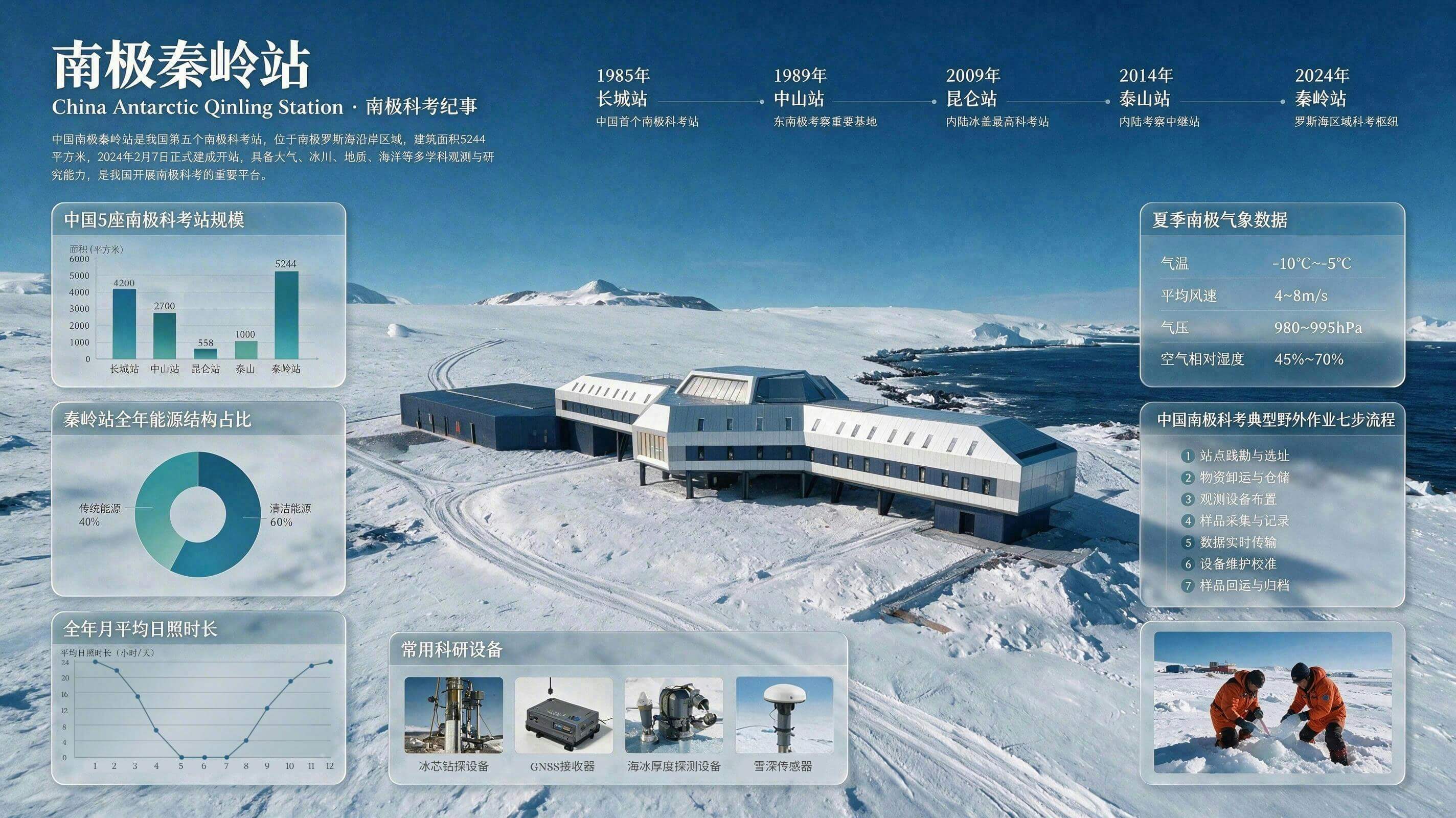
Antarctic Research at Qinling Station: A Comprehensive Infographic
 Seedream 5ByteDanceimage
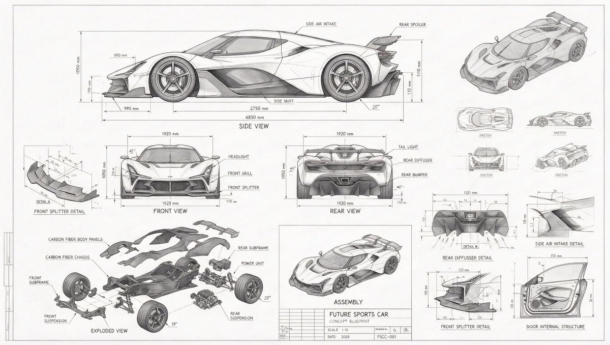
A visual infographic chronicling scientific research at Antarctica's Qinling Station. Place the main Qinling Station building at the center. Surround it with a timeline of research station development, a bar chart comparing the sizes of five research stations, a pie chart of the station's energy sources, and a line chart of monthly sunshine. Supplement this with realistic photos of research equipment, a summer weather panel, a seven-step fieldwork flowchart, and on-site sampling photography to showcase China's Antarctic research in a comprehensive way.
Details
- Type
- AI Image Prompts
- Aspect Ratio
- 89:50
- Updated
- Jul 8, 2026
Category
How to use this prompt
- 1Copy the full prompt with the copy button above.
- 2Open Seedream 5 by ByteDance, or any image generator with a similar style range.
- 3Paste the prompt, then swap the subject and style keywords to match your idea.
- 4Match the example's settings (89:50 · Cyberpunk · Architecture · Cityscape), then iterate — small wording changes shift the output a lot.
Frequently asked questions
Which AI model generated this image?
This image was generated with Seedream 5 by ByteDance. The prompt on this page is the exact text used to create it.
What settings does this prompt use?
The example was generated with Seedream 5 using: 89:50 · Cyberpunk · Architecture · Cityscape. Reusing these settings gives the closest match.
How do I get similar results?
Copy the prompt as-is first, then replace only the subject while keeping the style, lighting, and composition keywords. Generate a few variations — outputs differ between runs.
Can I modify this prompt?
Yes. Prompts work best as starting points — adjust descriptors, aspect ratio, or style tags to make the output your own.