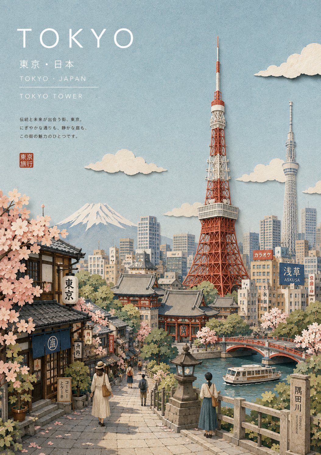
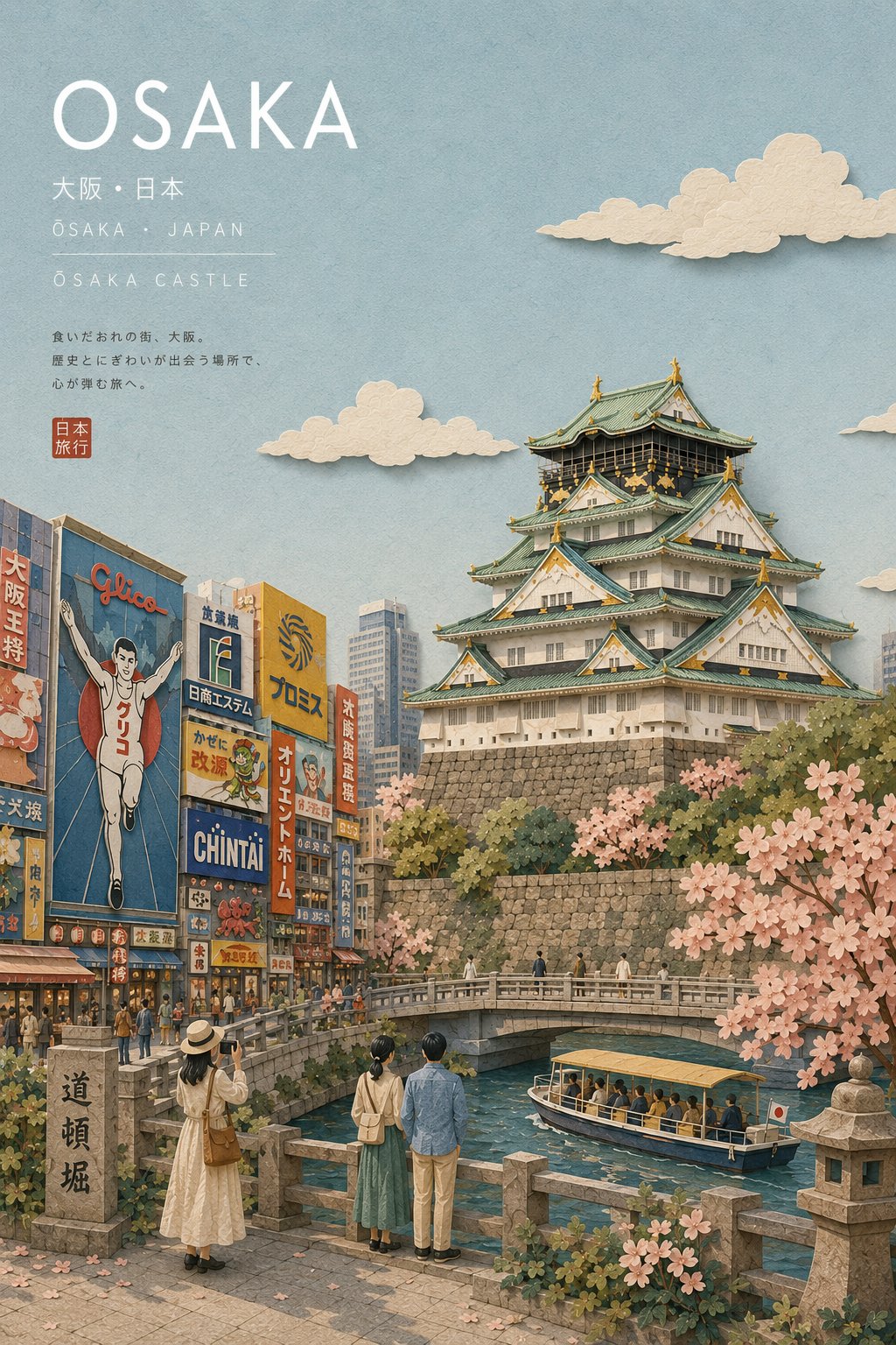
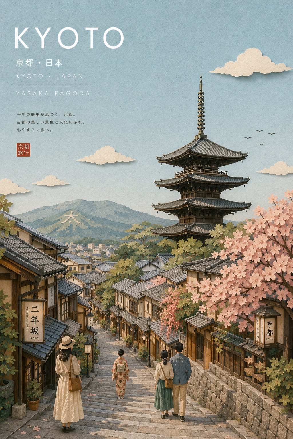
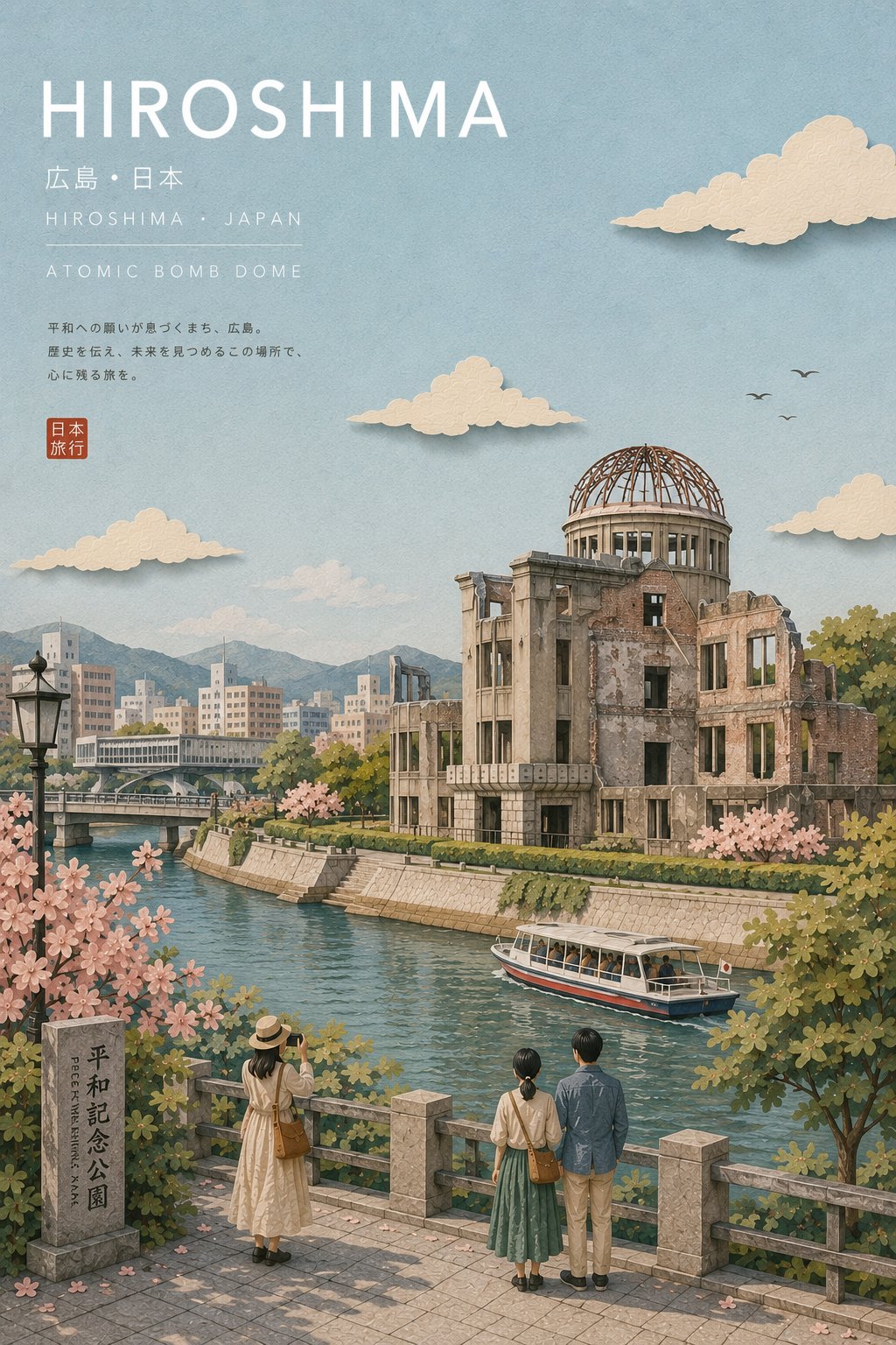



Create a premium illustrated travel postcard for {{CITY_NAME}} in a refined Japanese tourism-magazine aesthetic. Automatically research and determine the city’s country, local-language name, most iconic landmark, authentic surrounding environment, distinctive local architecture, geography, vegetation, transportation, and secondary visual details. The landmark must be geographically accurate and instantly recognizable. Visual style: elegant Japanese travel editorial illustration, handcrafted layered paper collage combined with delicate gouache and watercolor textures, sophisticated Japanese tourism brochure aesthetic, calm and poetic atmosphere, refined composition, tactile matte paper, subtle handmade edges, soft physical paper shadows, delicate atmospheric depth. Composition: premium postcard. Use a cinematic elevated viewpoint with the iconic landmark as the main focal point. Surround it with accurately styled local buildings, streets, waterfronts, hills, mountains, parks, or other authentic geographic elements appropriate to the city. Keep the upper portion spacious with generous negative space for typography. Color palette: soft powder blue, warm ivory, cream, muted sage, dusty green, pale beige, soft gray, restrained terracotta. Low-to-medium saturation, gentle tonal transitions, no harsh contrast. Architecture: precise and believable local architecture with carefully simplified shapes, accurate proportions, characteristic materials and rooflines. Avoid generic buildings and random skyscrapers. People: include only a few tiny simplified paper-cut travelers and pedestrians naturally interacting with the environment—walking, sightseeing, sitting, or looking toward the landmark. They should provide scale without becoming the focus. Nature: delicate layered foliage, subtle trees, grasses and regional vegetation appropriate to the city. Add water, mountains, coastline, rivers, or other geographic features only when genuinely associated with the location. Typography: place elegant minimalist Japanese editorial typography in the upper-left with generous spacing: - CITY NAME — large uppercase geometric sans-serif - LOCAL CITY NAME · COUNTRY/REGION — small refined sans-serif - PRIMARY LANDMARK — small uppercase text with wide letter spacing Typography should feel integrated into the artwork, not like an overlay. Lighting: soft natural daytime light, slightly hazy atmosphere, gentle matte highlights, subtle layered shadows, peaceful and nostalgic mood. Material: high-quality matte art paper, fine tactile grain, layered paper construction, delicate watercolor pigment variation, slightly imperfect handcrafted cut edges, premium offset-print character. Camera feel: 40–50mm equivalent, natural perspective, minimal distortion, strong foreground/midground/background separation, carefully art-directed travel photography composition translated into an illustration. Overall mood: quiet, elegant, contemplative, authentic, sophisticated Japanese travel magazine, collectible destination postcard, premium tourism campaign quality. Avoid: photorealistic photography, CGI, plastic rendering, flat vector art, anime, cartoon caricature, generic skyline, inaccurate landmark, fictional architecture, geographically impossible scenery, duplicated buildings, excessive people, oversized people, neon colors, oversaturation, harsh black shadows, glossy surfaces, clutter, excessive outlines, random text, misspelled typography, watermark, logo, border, frame, UI elements. Generate the entire scene dynamically from {{CITY_NAME}} while maintaining this exact refined Japanese tourism-magazine visual identity.
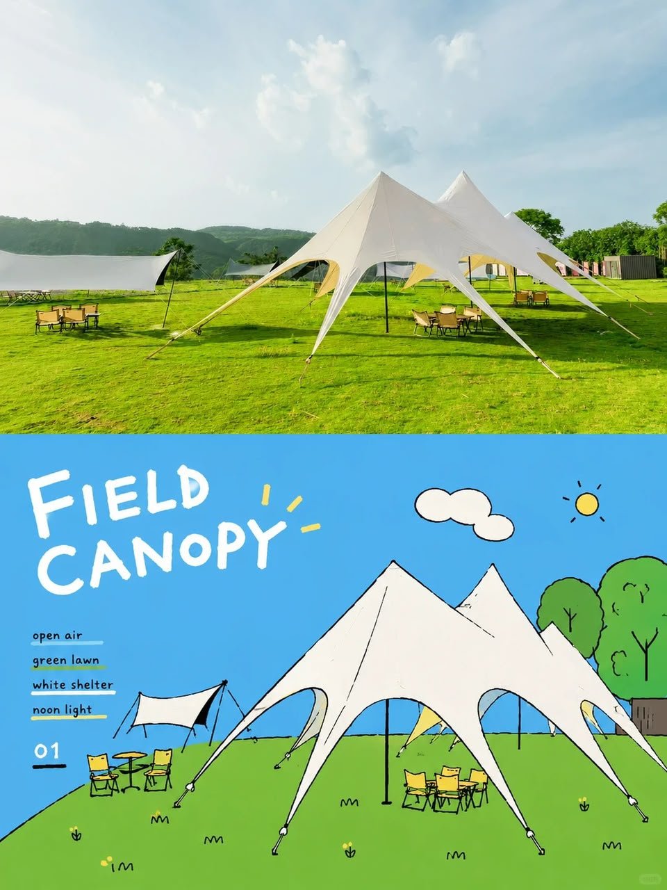
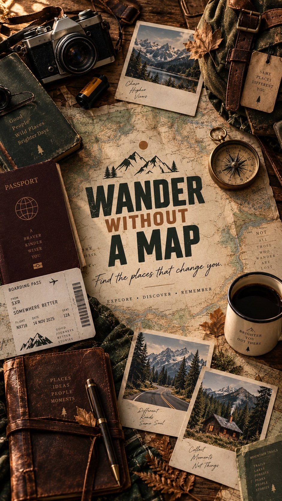
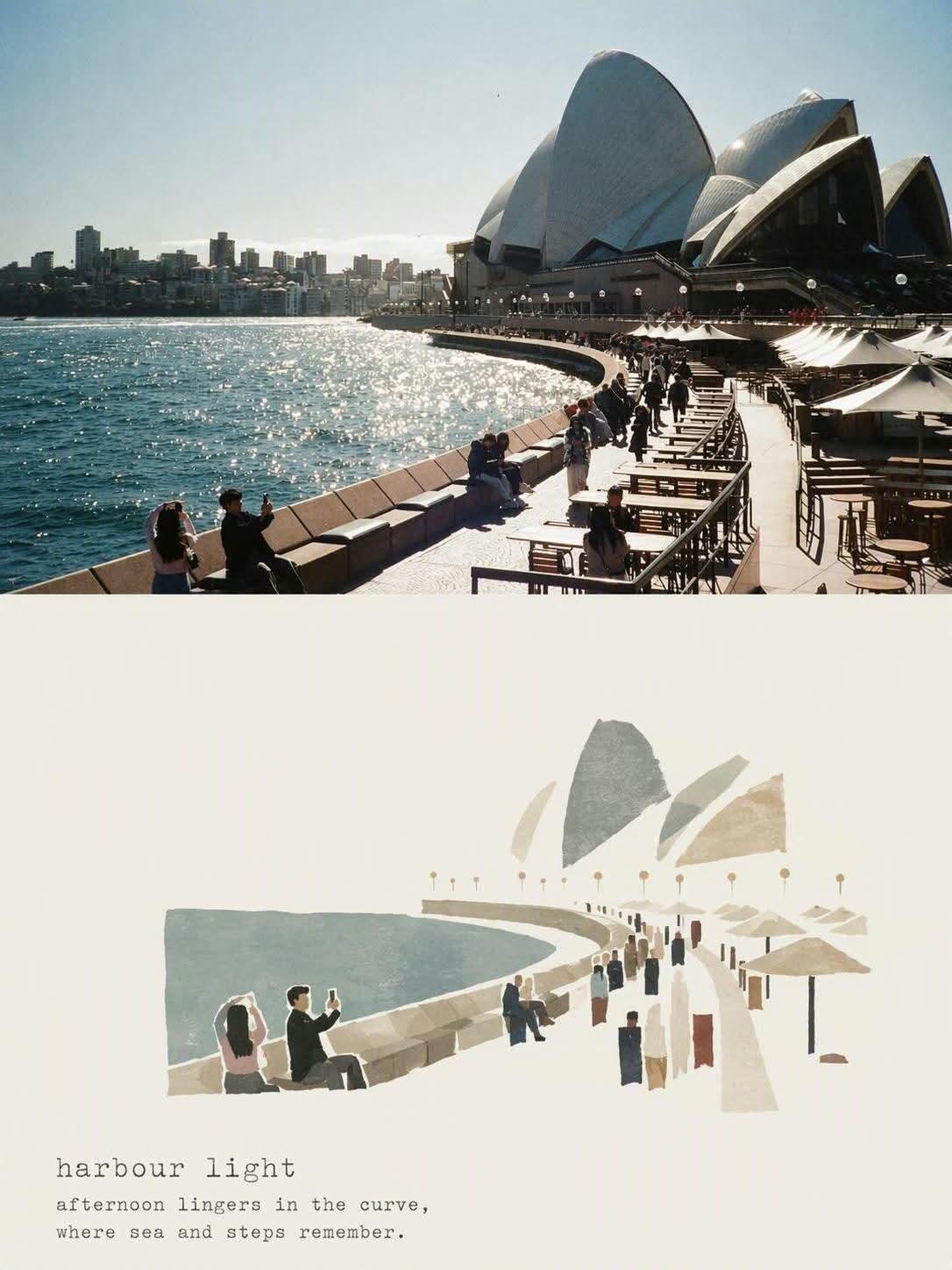
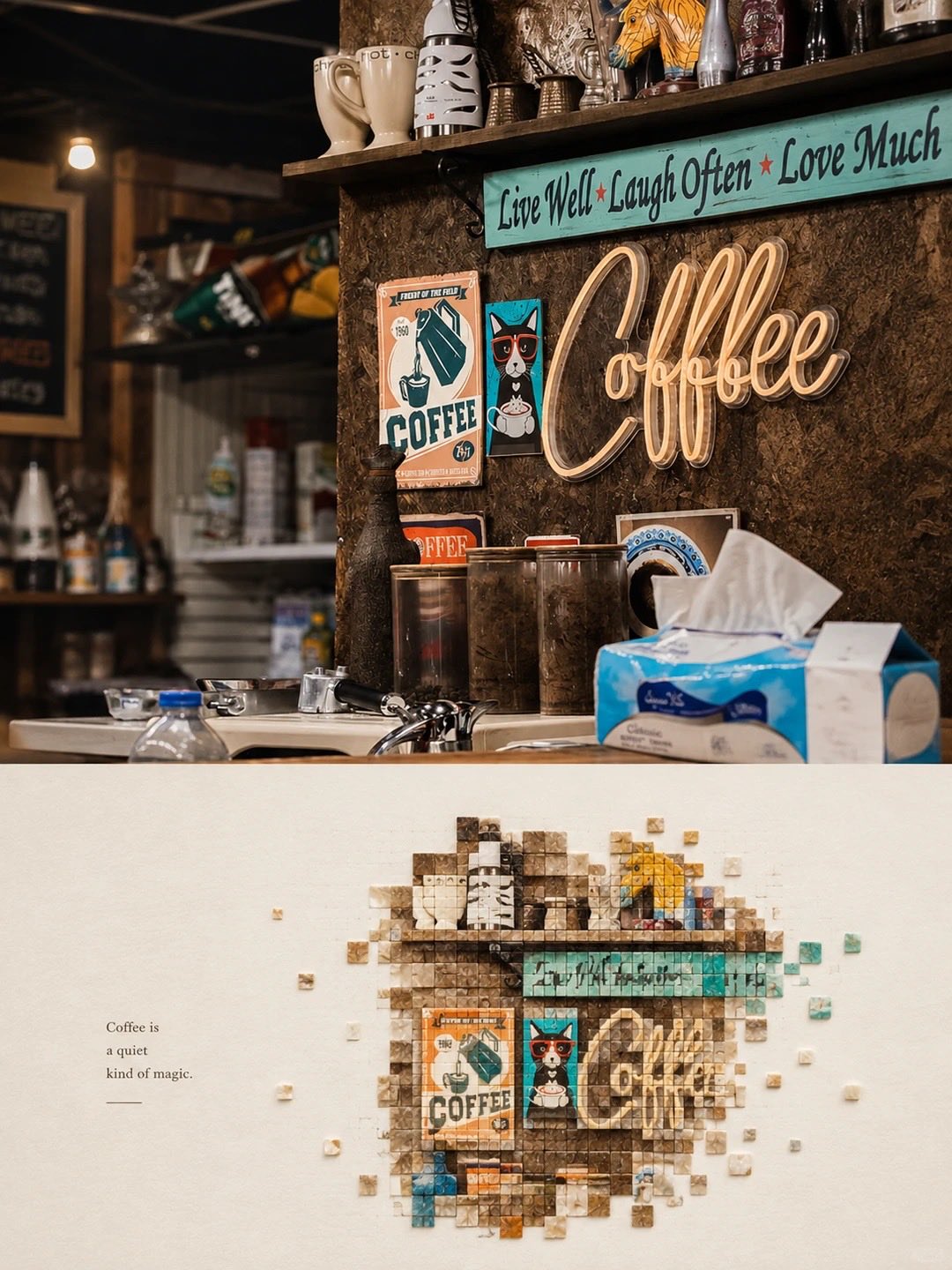
本图由 OpenAI 的 GPT Image 2 生成,页面上的提示词就是生成它的原始文本。
示例由 GPT Image 2 生成,参数:527:746 · Poster。沿用这些参数可获得最接近的效果。
先原样复制提示词,只替换主体、保留风格/光影/构图关键词,多生成几次——每次输出都会有差异。
当然可以。提示词最适合作为起点——调整描述词、宽高比或风格标签,做出属于你自己的作品。