
LogoAhaPrompt
  • 提示词
  • 精选
  • 模型
  • 投稿
  • 博客
AhaPromptAhaPrompt

图片、视频、音频 AI 提示词库

Built withLogoNEXTY.DEV
探索
  • 全部提示词
  • 精选提示词
  • 图片提示词
  • 视频提示词
  • 音频提示词
  • AI 模型
  • 投稿提示词
  • 博客
语言
  • English
  • 中文
  • 日本語
  • 한국어

版权所有 © 2026 AhaPrompt 保留所有权利。

隐私政策条款与条件
首页AI 提示词库AI 图片提示词手绘旅行海报
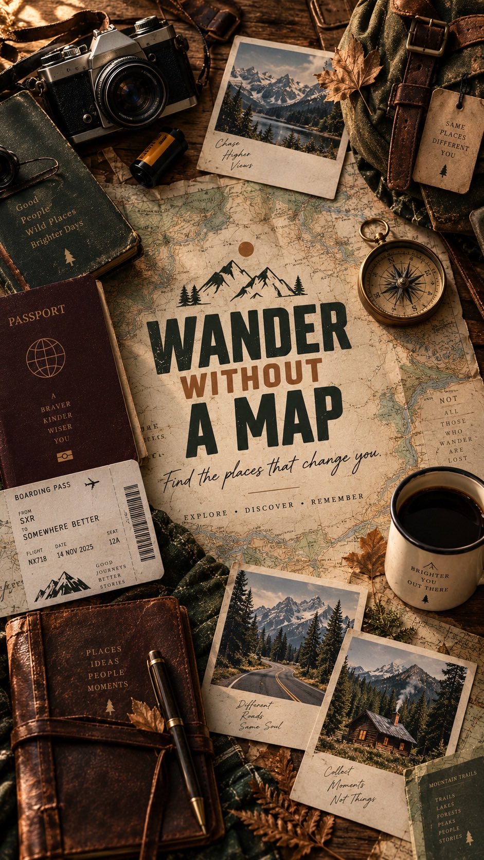
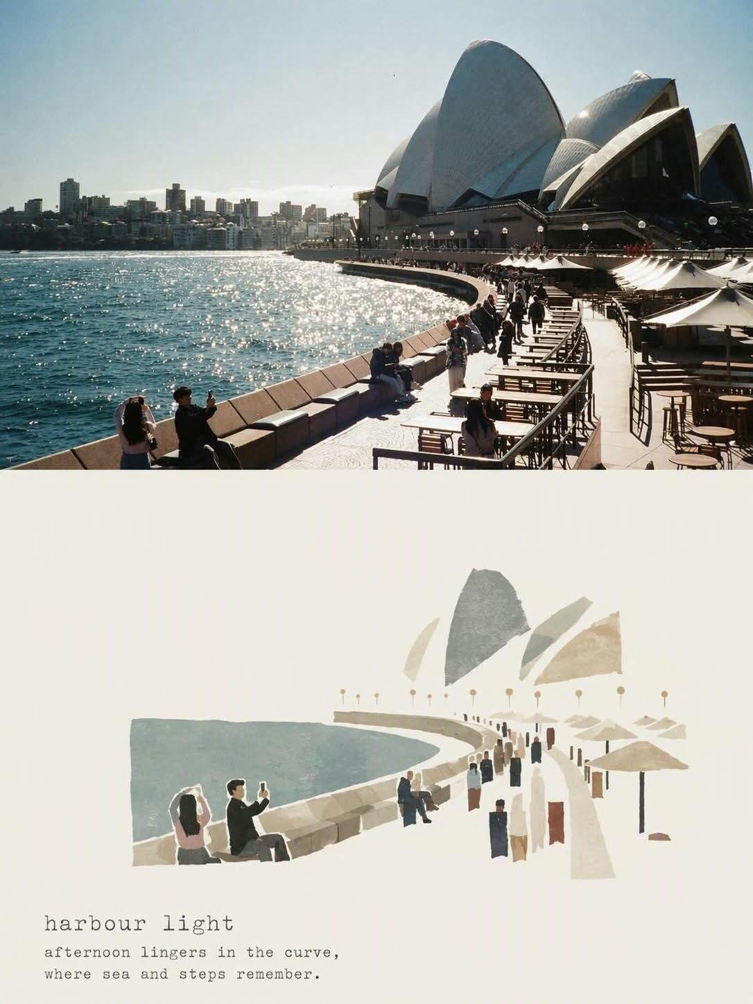
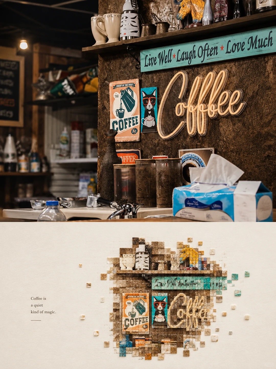
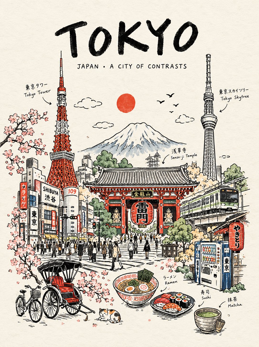
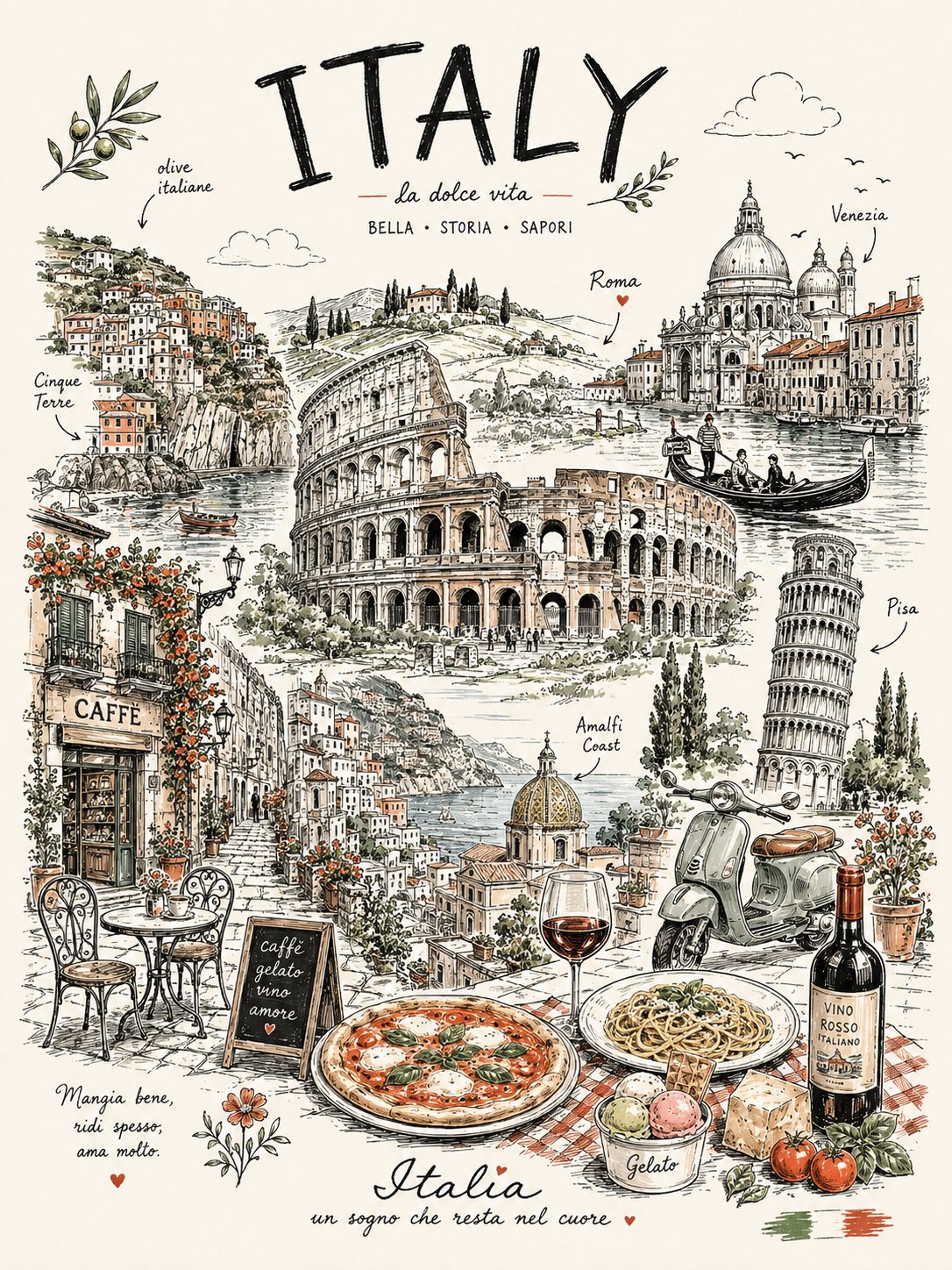
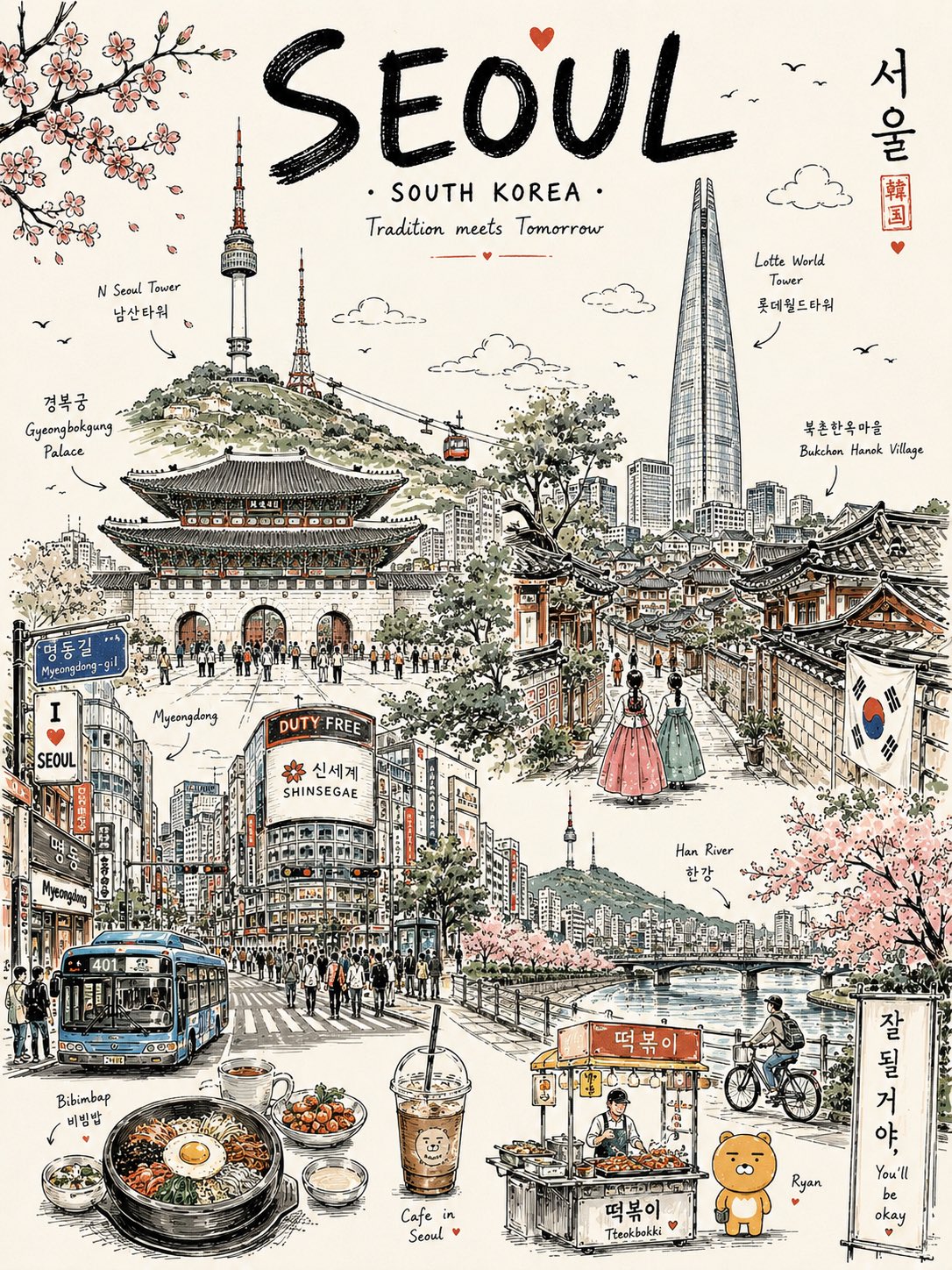
手绘旅行海报 — AI image prompt — GPT Image 2 — Poster, Vintage - 1
手绘旅行海报 — AI image prompt — GPT Image 2 — Poster, Vintage - 2
手绘旅行海报 — AI image prompt — GPT Image 2 — Poster, Vintage - 3

手绘旅行海报

OpenAIGPT Image 2OpenAIimage

Create a premium vertical 4:5 travel poster for [COUNTRY], illustrated as one elegant continuous hand-drawn line-art composition. Instead of placing landmarks separately, make them flow organically into one another, as if the entire country was drawn in a single uninterrupted travel sketch. Combine the country’s most recognizable architecture, landscapes, culture, food, transportation, nature, and tiny everyday details into one beautifully balanced scene. Use bold black ink outlines, delicate cross-hatching, playful imperfect hand-drawn details, subtle vintage-poster typography, and a mostly warm off-white paper background. Add only 2–3 signature accent colors inspired by the country. Include: One dominant iconic landmark A second architectural landmark subtly integrated into the skyline A famous natural landscape in the background Local transportation Traditional clothing or cultural detail A recognizable food or drink Small street-life moments Birds, clouds, plants and tiny decorative elements Handwritten labels pointing to selected elements At the top, use a large playful hand-lettered title: “[COUNTRY]” Below it, add a tiny elegant subtitle: “A little world to discover” Make the composition feel collected, whimsical, editorial, nostalgic and handcrafted, like a beautifully illustrated travel journal rather than a generic tourist poster. Avoid photorealism, gradients, 3D rendering and excessive colors. Clean white space around the illustration, highly detailed ink work, charming imperfections, premium stationery aesthetic, screen-print texture, sophisticated yet playful.

详细信息
类型
AI 图片提示词
画面比例
217:290
更新于
2026年8月25日
分类
PosterVintage
Source

如何使用这条提示词

  1. 1点击上方复制按钮,复制完整提示词。
  2. 2打开 OpenAI 的 GPT Image 2,或任何风格相近的图片生成工具。
  3. 3粘贴提示词,替换主体和风格关键词,改成你想要的画面。
  4. 4按示例参数(217:290 · Poster · Vintage)生成,再小步迭代——措辞的细微变化会显著影响结果。

常见问题

这张图片是用哪个 AI 模型生成的?

本图由 OpenAI 的 GPT Image 2 生成,页面上的提示词就是生成它的原始文本。

这条提示词用了哪些参数?

示例由 GPT Image 2 生成,参数:217:290 · Poster · Vintage。沿用这些参数可获得最接近的效果。

怎样才能生成相似的效果?

先原样复制提示词,只替换主体、保留风格/光影/构图关键词,多生成几次——每次输出都会有差异。

可以修改这条提示词吗?

当然可以。提示词最适合作为起点——调整描述词、宽高比或风格标签,做出属于你自己的作品。
更多 GPT Image 2 提示词

Create a premium vertical aspect ratio 4:5 travel poster for [COUNTRY], illustrated as one elegant c — AI image prompt — GPT Image 2
PosterVintage
OpenAIGPT Image 2
Create a premium vertical aspect ratio 4:5 travel poster for [COUNTRY], illustrated as one elegant continuous hand-drawn line-art composition. Instead of placing landmarks separately, make them flow organically into one another, as if the entire country was drawn in a single uninterrupted travel sketch. Combine the country’s most recognizable architecture, landscapes, culture, food, transportation, nature, and tiny everyday details into one beautifully balanced scene. Use bold black ink outlines, delicate cross-hatching, playful imperfect hand-drawn details, subtle vintage-poster typography, and a mostly warm off-white paper background. Add only 2–3 signature accent colors inspired by the country. Include: One dominant iconic landmark A second architectural landmark subtly integrated into the skyline A famous natural landscape in the background Local transportation Traditional clothing or cultural detail A recognizable food or drink Small street-life moments Birds, clouds, plants and tiny decorative elements Handwritten labels pointing to selected elements At the top, use a large playful hand-lettered title: “[COUNTRY]” Below it, add a tiny elegant subtitle: “A little world to discover” Make the composition feel collected, whimsical, editorial, nostalgic and handcrafted, like a beautifully illustrated travel journal rather than a generic tourist poster. Avoid photorealism, gradients, 3D rendering and excessive colors. Clean white space around the illustration, highly detailed ink work, charming imperfections, premium stationery aesthetic, screen-print texture, sophisticated yet playful.
查看详情
高级简约扁平矢量旅行海报,主题为[城市名],3:4竖版。

打造一张清新、通透、优雅的城市旅行海报,呈现专为[城市名]量身定制的独特设计感,而非套用其他城市的模板。

重要构图规则:
开始绘制前,先提 — AI image prompt — GPT Image 2
CityscapeMinimalistPoster
OpenAIGPT Image 2
高级简约扁平矢量旅行海报,主题为[城市名],3:4竖版。 打造一张清新、通透、优雅的城市旅行海报,呈现专为[城市名]量身定制的独特设计感,而非套用其他城市的模板。 重要构图规则: 开始绘制前,先提炼[城市名]独特的“城市基因”: 1. 一个核心地标或天际线特征, 2. 一种本地交通或出行元素, 3. 一个日常生活方式瞬间, 4. 一种本土植物或当地环境细节, 5. 一种专属于该城市的空间构图方式。 不得在不同城市间重复使用相同的版式公式。 避免默认套路: - 右侧永远是店铺, - 左侧永远是招牌, - 人物永远坐在咖啡馆桌边, - 前景永远是同样的花坛, - 路灯位置永远相同, - 滨水步道构图永远一致。 每座城市必须拥有不同的场景结构,取材于其真实氛围: 港口瞭望、巷弄街道、河滨公园、海滩漫步、山顶观景、市集一角、电车街道、渡轮码头、植物园、老城街巷、海岸栈道、文化广场或天际线远眺。 字体排印: 将“[城市名]”置于左上角,周围留出充足的字体安全负空间。 添加一句简短优雅的英文副标题,契合城市气质。 字体风格保持精致、简约、高级。 场景适配: 自动将场景适配至[城市名]。 以一个标志性核心地标作为主要视觉锚点。 仅添加2–4个真正属于该城市的辅助本地细节。 不得拼贴多个地标。 不得过度填充背景。 人物: 仅使用3–6个小尺寸人物。 每个人物应呈现具有城市特色的日常动作: 散步、写生、骑行、等电车、登渡轮、扛冲浪板、安静拍照、公园阅读、水边慢跑、逛小市集。 避免人群场景。 避免单一主角式英雄人物。 人物应自然融入城市环境中,而非从以往海报中复制粘贴。 本地细节: 仅在与城市契合时使用本地交通、标识、街道设施、植物、食物、建筑及休闲元素。 交通标识不必总是以大型竖式招牌出现。 可以微妙呈现为电车站牌、渡轮路线牌、车站时钟、自行车道标识、海滩巡逻旗、小型地铁图标或地面彩绘标记。 风格: 日式文具美学, 高端贴纸插画, 高级商业扁平矢量旅行海报, 干净细描边, 统一线条粗细, 纯扁平配色, 柔和极简造型, 沉静编辑式构图。 配色: 以淡粉蓝、柔天蓝、雾霾蓝作为氛围基调。 以暖奶油色、柔米色、鼠尾草绿、灰调豆绿用于建筑与自然元素。 以灰粉或淡粉仅作为花朵、招牌、遮阳篷、衣物或细小装饰的点缀色。 整体配色保持精致、低饱和、高级感。 氛围: 清新、极简、优雅、沉静、精致, 高端旅行明信片, 安静生活方式品牌感, 开阔空间、呼吸感、松弛的本地节奏。 负向提示: 无写实。 无水彩。 无绘画笔触。 无照片写实。 无厚重阴影。 无渐变。 无纸张纹理。 无密集背景。 无重复的右侧咖啡馆版式。 无重复的左侧招牌版式。 无通用游客海报拼贴。 无拥挤街道。 无超大人物。 无戏剧化光影。
查看详情
标题:宝马M4雷霆版——复古现代主义旅行海报

创作一幅精致的编辑风格旅行海报插画,以宝马M4雷霆版为主题,灵感源自复古现代主义旅行艺术。将宝马M4雷霆版作为画面主体,以富有戏剧性的前侧四分之三视角呈 — AI image prompt — GPT Image 2
PosterVintage
OpenAIGPT Image 2
标题:宝马M4雷霆版——复古现代主义旅行海报 创作一幅精致的编辑风格旅行海报插画,以宝马M4雷霆版为主题,灵感源自复古现代主义旅行艺术。将宝马M4雷霆版作为画面主体,以富有戏剧性的前侧四分之三视角呈现,置于层次丰富的当代都市背景之中,其标志性双肾格栅、雕塑感宽体比例、凌厉的空气动力学细节、锐利LED大灯以及性能导向的姿态,均以优雅的图形精度加以刻画。车身周围环绕精致的几何建筑元素、现代城市剪影、流畅的道路曲线、风格化桥梁、远山以及细腻的环境细节。采用精致的几何拼贴构图,融合交叠的拱形、矩形、圆形、阶梯状建筑造型、棱角分明的阴影以及细微的纸张纹理叠加。低饱和高级配色,包括粉蓝色、奶油色、暖陶土色、灰粉珊瑚色、鼠尾草绿、炭灰色与深藏蓝色,点缀克制的宝马风格蓝色强调色。极简手绘插画风格,略带颗粒感的复古印刷纹理,柔和自然日光,干净利落的车身线条,均衡的留白空间,精致的欧洲旅行海报美学,怀旧而现代,细节丰富却毫不杂乱。顶部居中放置标题“BMW M4 COMPETITION”,采用纤细、字距宽松的大写字体。竖版4:5构图,高级艺术微喷质感,优雅、统一,无写实照片感,无渐变,无过多文字。
查看详情
高级极简扁平矢量旅行海报,[城市名称],3:4竖版格式。

设计一幅原创且富有格调的旅行海报,捕捉[城市名称]真实而独特的视觉气质。画面构图必须为该城市量身打造,而非套用通用模板。

城市身份

首先 — AI image prompt — GPT Image 2
MinimalistPoster
OpenAIGPT Image 2
高级极简扁平矢量旅行海报,[城市名称],3:4竖版格式。 设计一幅原创且富有格调的旅行海报,捕捉[城市名称]真实而独特的视觉气质。画面构图必须为该城市量身打造,而非套用通用模板。 城市身份 首先解读[城市名称]独特的视觉性格,并围绕以下五个要素构建场景: 1. 一个可辨识的地标、建筑特征或天际线元素。 2. 一种独特的城市出行方式。 3. 一个细微的日常生活瞬间。 4. 一种本土植物、景观或环境特征。 5. 一种自然属于该城市的构图与视角。 整体场景结构必须随城市而变化,不得重复使用相同的物体位置或视觉公式。 可选构图包括: 港口视角、狭窄历史巷道、河畔花园、海岸步道、城市高处俯瞰、热闹的市集通道、电车大道、渡轮码头、植物园景致、遗产广场、海滨长廊、文化广场或天际线露台。 选择最能代表[城市名称]的构图。 字体设计 将“[城市名称]”置于左上区域,周围留出充足干净的负空间。 添加一句简短而优雅的英文标语,灵感源自该城市的气质。 字体风格应低调、编辑感强、疏朗开阔、质感高级。文字不得喧宾夺主。 视觉层级 以一个标志性地标或建筑特征作为主要视觉焦点。 仅辅以2–4个精心挑选的本地元素。每一个增加的细节都应强化场所感。 避免地标堆砌或明信片式拼贴。保持画面安静而有意图。 人物 仅包含3–6个小型人物。 赋予每个人物一个与当地生活相关的可信动作,例如: 穿行于历史巷道、骑行、等候公共交通、写生建筑、登船、户外阅读、安静拍照、携带海滩装备、逛市集或在水边慢跑。 避免人群,也避免让任何一个人物成为主角。人物应自然融入环境。 在地特色 仅当元素真正契合[城市名称]时,才使用城市专属细节: - 本地交通工具 - 建筑 - 街道设施 - 植被 - 小型标识或导视系统 - 本地美食元素 - 休闲活动 - 路面标线 - 文化细节 交通与标识应保持含蓄。不必总是使用大型招牌,而是通过小型公交站牌、车站时钟、渡轮信息面板、自行车符号、路面涂装、海滩旗帜或低调的地铁图标自然融入细节。 美术方向 日式文具美学, 高端贴纸插画, 高级商业矢量插画, 现代编辑风旅行品牌设计, 干净细腻的线条, 均匀统一的线宽, 简洁的几何形态, 平涂色彩插画, 柔和造型, 均衡的视觉节奏, 高端极简明信片设计。 色彩体系 以以下色彩为主构建氛围: 淡粉蓝、柔和天蓝、雾蓝、清透的空气感蓝色。 并以以下色彩平衡: 暖象牙白、奶油色、柔和米色、灰调鼠尾草绿、灰绿色、低调的建筑中性色。 仅在极小面积的点缀中使用灰粉或柔和腮红,如花朵、衣物细节、小型标识、遮阳篷或装饰物件。 整体色彩应柔和、精致、略带低饱和、和谐统一。 氛围 清新、通透、宁静、精致、当代、优雅。 最终作品应呈现高级精品旅行明信片或奢侈生活方式品牌插画的感觉,留有充足的呼吸空间和松弛的场所感。 重要质量准则 每座城市必须拥有独立的视觉身份。 根据城市性格调整机位角度、场景结构、地标位置、前景处理及辅助细节。 不得简单地在既有构图中替换[城市名称]。 负面提示 禁止写实摄影感。 禁止写实主义。 禁止水彩。 禁止绘画性笔触。 禁止渐变。 禁止厚重阴影。 禁止戏剧化电影光效。 禁止纸张纹理。 禁止过度细节。 禁止杂乱背景。 禁止地标拼贴。 禁止拥挤街道。 禁止过大人物。 禁止主导性主角。 禁止重复咖啡馆构图。 禁止固定招牌位置。 禁止相同前景处理。 禁止通用旅游海报公式。 禁止照搬其他城市布局。 禁止多余装饰元素。
查看详情
Create a premium illustrated travel postcard for {{CITY_NAME}} in a refined Japanese tourism-magazin — AI image prompt — GPT Image 2
Poster
OpenAIGPT Image 2
Create a premium illustrated travel postcard for {{CITY_NAME}} in a refined Japanese tourism-magazine aesthetic. Automatically research and determine the city’s country, local-language name, most iconic landmark, authentic surrounding environment, distinctive local architecture, geography, vegetation, transportation, and secondary visual details. The landmark must be geographically accurate and instantly recognizable. Visual style: elegant Japanese travel editorial illustration, handcrafted layered paper collage combined with delicate gouache and watercolor textures, sophisticated Japanese tourism brochure aesthetic, calm and poetic atmosphere, refined composition, tactile matte paper, subtle handmade edges, soft physical paper shadows, delicate atmospheric depth. Composition: premium postcard. Use a cinematic elevated viewpoint with the iconic landmark as the main focal point. Surround it with accurately styled local buildings, streets, waterfronts, hills, mountains, parks, or other authentic geographic elements appropriate to the city. Keep the upper portion spacious with generous negative space for typography. Color palette: soft powder blue, warm ivory, cream, muted sage, dusty green, pale beige, soft gray, restrained terracotta. Low-to-medium saturation, gentle tonal transitions, no harsh contrast. Architecture: precise and believable local architecture with carefully simplified shapes, accurate proportions, characteristic materials and rooflines. Avoid generic buildings and random skyscrapers. People: include only a few tiny simplified paper-cut travelers and pedestrians naturally interacting with the environment—walking, sightseeing, sitting, or looking toward the landmark. They should provide scale without becoming the focus. Nature: delicate layered foliage, subtle trees, grasses and regional vegetation appropriate to the city. Add water, mountains, coastline, rivers, or other geographic features only when genuinely associated with the location. Typography: place elegant minimalist Japanese editorial typography in the upper-left with generous spacing: - CITY NAME — large uppercase geometric sans-serif - LOCAL CITY NAME · COUNTRY/REGION — small refined sans-serif - PRIMARY LANDMARK — small uppercase text with wide letter spacing Typography should feel integrated into the artwork, not like an overlay. Lighting: soft natural daytime light, slightly hazy atmosphere, gentle matte highlights, subtle layered shadows, peaceful and nostalgic mood. Material: high-quality matte art paper, fine tactile grain, layered paper construction, delicate watercolor pigment variation, slightly imperfect handcrafted cut edges, premium offset-print character. Camera feel: 40–50mm equivalent, natural perspective, minimal distortion, strong foreground/midground/background separation, carefully art-directed travel photography composition translated into an illustration. Overall mood: quiet, elegant, contemplative, authentic, sophisticated Japanese travel magazine, collectible destination postcard, premium tourism campaign quality. Avoid: photorealistic photography, CGI, plastic rendering, flat vector art, anime, cartoon caricature, generic skyline, inaccurate landmark, fictional architecture, geographically impossible scenery, duplicated buildings, excessive people, oversized people, neon colors, oversaturation, harsh black shadows, glossy surfaces, clutter, excessive outlines, random text, misspelled typography, watermark, logo, border, frame, UI elements. Generate the entire scene dynamically from {{CITY_NAME}} while maintaining this exact refined Japanese tourism-magazine visual identity.
查看详情
Rubber Stamp Travel Field Notes Poster — Natural Realism Version

Create a separate “Rubber Stamp Tr — AI image prompt — GPT Image 2
PosterRealisticNature
OpenAIGPT Image 2
Rubber Stamp Travel Field Notes Poster — Natural Realism Version Create a separate “Rubber Stamp Travel Field Notes Poster” for each photo I upload. Output each photo individually. Never create a collage or combine multiple photos. Use a 4:3 landscape composition with a natural visual transition between the original photograph on the left and the aged-paper field-note area on the right. Do not add an obvious dividing line. LEFT — ORIGINAL PHOTOGRAPH The left side should occupy roughly 58% of the frame. Keep the uploaded photograph visually authentic and recognizable. Preserve the original subject, perspective, terrain, architecture, plants, people, spatial relationships, natural light, shadows, textures, and overall atmosphere. Do not redesign or reinterpret the photograph. Only apply a very subtle editorial photo treatment: gentle tonal balancing, restrained color grading, slightly softened highlights, and extremely fine natural film grain. It should still look like a real photograph taken on location rather than an AI-generated image. Natural cropping is allowed if needed to fit the 4:3 layout, but do not stretch, distort, move, replace, or redraw the main subject. Avoid excessive sharpness, HDR effects, artificial clarity, cinematic color grading, or overly perfect details. RIGHT — AGED PAPER FIELD NOTES The right side should occupy roughly 42% of the frame. Use warm off-white, slightly aged paper with a believable physical texture. Include very subtle paper fibers, fine grain, faint handling marks, and a matte surface. Keep large areas completely unprinted. The paper should feel like a real sheet from an architect's travel notebook or field journal, not a designed poster background. Avoid overly strong stains, decorative textures, vintage filters, or artificial grunge. SMALL RUBBER STAMP Study the uploaded photograph and identify only the few visual features that make the location immediately recognizable. Reduce them into a compact, imperfect multi-color rubber stamp impression. Do not reproduce the photograph element by element. Simplify aggressively and retain only the most meaningful visual relationships: - distinctive architecture and silhouette - important roof, tower, dome, arch, or structural shape - mountain or terrain contours - shoreline or road direction - a few recognizable trees or vegetation forms - simplified settlement layers - one or two important foreground shapes when visually relevant Remove crowds, cars, dense windows, repetitive buildings, tiny vegetation, decorative objects, and insignificant background details. The result should look like something a traveler could have actually carved into a small rubber stamp, not a miniature illustration of the entire photograph. Place the stamp in the lower-middle portion of the right paper area, occupying approximately 30–38% of the right section's height. Keep generous blank paper around it. Do not enlarge it into a large illustration. STAMP COLOR & PRINT CHARACTER Extract approximately 2–4 muted spot colors naturally from the original photograph. Possible colors include: - carbon black - deep green - brick or muted red - ochre - slate blue - taupe or earthy brown Do not force these colors if the photograph suggests a different restrained palette. Each color should appear as a separate physical ink layer. Make the print feel genuinely handmade: - slightly uneven pressure - tiny gaps in the ink - dry areas - paper showing through - rough carved edges - irregular line thickness - small contour breaks - granular ink texture - faint ghosting - slight natural color-layer misregistration - subtle edge variation The imperfections should be small and believable, as if the stamp was pressed onto paper by hand. Avoid perfectly aligned digital layers, smooth vector edges, clean gradients, or artificially exaggerated distress. The stamp should look physically printed, not digitally illustrated. FIELD-NOTE TYPOGRAPHY Generate a small amount of text based only on the actual location and imagery in the photograph: Location — English name No. — Number Three short English keywords Gregorian calendar year Place the text below or beside the stamp within the available whitespace. Use a small, understated typewriter or archival field-note style. The typography should have very slight mechanical irregularity, as though typed or printed on an old field notebook. Keep it quiet and secondary to the photograph. Spell the location and all words correctly. Do not add slogans, brands, tourist phrases, decorative quotes, or unnecessary text. OVERALL REALISM The finished image should feel like a real travel photograph mounted beside a small handmade field stamp on an architect's personal notebook page. Prioritize subtle physical realism over visual perfection. The photograph should remain the strongest visual element. The stamp should feel like a small fragment of memory extracted from the photograph rather than a second illustration. Use restrained contrast, natural imperfections, believable paper texture, and slightly imperfect printing. The final result should feel quiet, tactile, documentary, collectible, and genuinely handmade. Avoid Obvious dividing lines, circular seals, postage-stamp borders, perforations, wax seals, sticker layouts, souvenir-card designs, generic travel templates, smooth vector logos, polished digital illustrations, cartoon styling, 3D rendering, plastic textures, glossy gradients, excessive saturation, HDR effects, excessive text, decorative clutter, overly clean geometry, perfectly aligned ink layers, dense miniature architecture, or any alteration/redrawing of the original photograph.
查看详情
创作一幅精致的台北旅行海报插画,灵感来自复古现代主义旅行艺术。以台北101为地标主体,高耸于层叠的城市天际线之上,前景为国立中正纪念堂,融入传统台湾建筑、茂密树木、远山青翠、优雅桥梁,以及平静的蓝色河 — AI image prompt — GPT Image 2
MinimalistCityscapeVintage
OpenAIGPT Image 2
创作一幅精致的台北旅行海报插画,灵感来自复古现代主义旅行艺术。以台北101为地标主体,高耸于层叠的城市天际线之上,前景为国立中正纪念堂,融入传统台湾建筑、茂密树木、远山青翠、优雅桥梁,以及平静的蓝色河流或水岸。采用精致的几何拼贴构图,叠加拱形、矩形、圆形、阶梯式建筑造型,并辅以细腻的纸张纹理。柔和粉彩色调,包括浅蓝、奶油白、暖陶土色、灰粉珊瑚、鼠尾草绿与深藏蓝。极简手绘插画风格,略带颗粒感的复古印刷质感,柔和自然日光,干净的建筑线条,留白均衡,兼具精致欧洲旅行海报美学,怀旧而当代,细节丰富却不显杂乱。顶部居中放置标题“TAIPEI”,采用细体、宽字距的大写字体。竖版4:5构图,高级艺术微喷质感,优雅统一,无写实照片感,无渐变,无多余文字。
查看详情
创作一幅复古风格旅行杂志海报,灵感源自上世纪中叶的交通与工程类出版物。以一座纪念碑式的[SUBJECT]作为主要摄影主体,采用戏剧性的低角度视角拍摄,构图强调几何感,建筑线条干净利落。页面顶部使用大号 — AI image prompt — GPT Image 2
VintagePoster
OpenAIGPT Image 2
创作一幅复古风格旅行杂志海报,灵感源自上世纪中叶的交通与工程类出版物。以一座纪念碑式的[SUBJECT]作为主要摄影主体,采用戏剧性的低角度视角拍摄,构图强调几何感,建筑线条干净利落。页面顶部使用大号紧凑型粗体大写标题“[TITLE]”,与主体形成部分重叠或框景关系。标题下方辅以一行较小的精致副标题:“[SHORT DESCRIPTIVE TAGLINE]”。在图像周围加入小型编辑标注、技术风格说明文字、页码及少量排版细节。 视觉风格:真实的1960至1970年代复古印刷设计,复古工业旅行杂志感,柔和的蓝绿色、褪色的铁锈红、暖米色纸张、微妙的橄榄绿点缀,轻微去饱和的摄影画面,自然阳光,真实胶片颗粒,半调网纹质感,老化纸张纤维,轻微油墨瑕疵,柔和褪色边缘,档案级照片印刷外观。大量留白,瑞士风格编辑排版,平衡克制,粗体字型,精致博物馆书籍美学,高度细节化的主体摄影,比例真实,层级清晰,怀旧但高级。 保持系列版式统一:米色背景、超大蓝色标题、居中主图、小号深蓝绿色信息文字、克制的红/锈色点缀、角落页码、真实复古杂志印刷纹理。竖版4:5构图,细节清晰,高分辨率编辑级海报。
查看详情
浏览全部 GPT Image 2 提示词探索AI 图片提示词