
LogoAhaPrompt
  • 提示詞
  • 精選
  • 模型
  • AI 反推
  • 定價
  • 投稿
  • 部落格
AhaPrompt

圖片、影片、音訊 AI 提示詞庫

探索

  • 全部提示詞
  • 精選提示詞
  • 圖片提示詞
  • 影片提示詞
  • 音訊提示詞
  • AI 模型

工具

  • AI 反推工作臺
  • 圖片反推提示詞
  • 影片反推提示詞

資源

  • 定價方案
  • 投稿提示詞
  • 部落格

版權所有 © 2026 AhaPrompt 保留所有權利。

隱私政策條款與條件退款政策版權申訴 / DMCA
首頁AI 提示詞庫AI 圖片提示詞莓纱冰淇淋飞溅海报
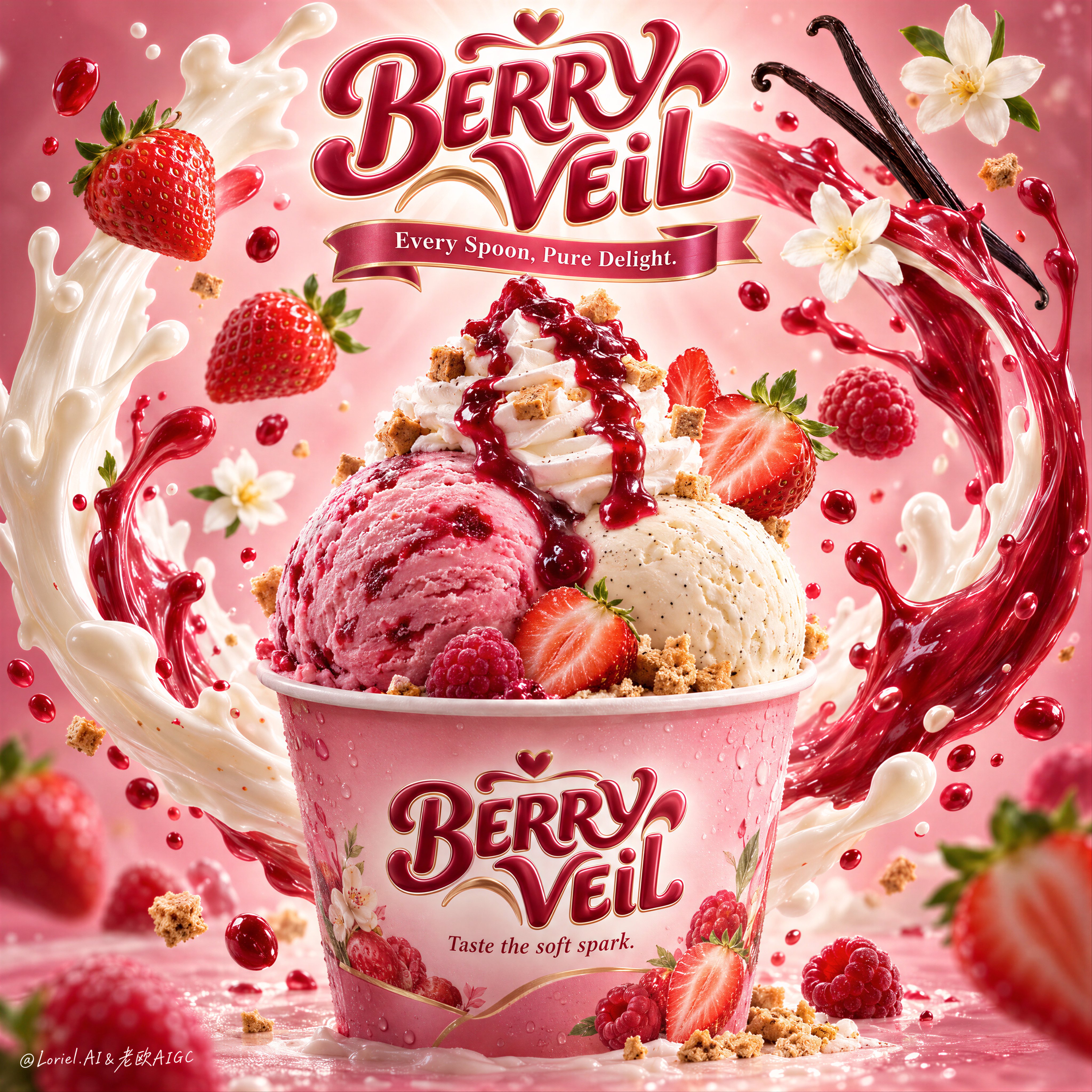
莓纱冰淇淋飞溅海报 — AI image prompt — GPT Image 2.5 — Poster, Advertising, Food

莓纱冰淇淋飞溅海报

OpenAIGPT Image 2.5OpenAIimage

一张超写实高级甜点海报,面向一个虚构的国际冰淇淋品牌,名为BERRY VEIL,以Orbit-plus-Transit方向精炼,在保留原始主视觉结构不变的同时,让风味世界更强烈、更清晰、更具系列化潜力。一个品牌化的粉色甜点杯位于下方中央作为绝对主角,盛着两大球冰淇淋:一球浓郁草莓-覆盆子粉色冰淇淋,一球奶油香草豆冰淇淋,顶部高耸的螺旋奶油和光泽莓果酱倾泻而下。构图必须比标准草莓甜点广告更明亮、更丰富、更令人瞬间产生食欲。 取景与构图:竖版海报布局,中央主角杯,雕塑感品牌徽章悬浮于顶部中央,两道扫掠式液体弧线从杯子两侧升起,形成优雅的光环状包围结构环绕产品。严格保留当前骨架:顶部标志、中央杯子、两道大型环绕飞溅曲线,以及平衡轨道中漂浮的水果和风味提示。强化层级,使杯子首先被看到,其次是冰淇淋球,第三是液体编排,第四是漂浮食材。保持产品完全可读且在视觉上占主导。 产品设计:纸杯高级、柔和光泽,带有精致的莓果粉色渐变色调,并有细微冷凝水珠和清晰印刷品牌标识。正面标签文字精确为:“BERRY VEIL”。其下精确写上:“Taste the soft spark.”草莓-覆盆子冰淇淋球应比基础草莓球更奶油化、更多汁、颜色更深,具有自然冷冻水果质感和淡淡的纹理丰富感。香草豆冰淇淋球应感觉顺滑、密实、奢华,可见细小香草籽。螺旋奶油必须具有干净、柔和的脊线,并承载戏剧性的宝石红莓果釉。在奶油和底部周围撒上几颗微小酥脆饼干或焦糖化碎块,以增加质感对比。 风味 staging 与空间编排:保留相同的中央飞溅系统,但将水果语言略微推向草莓-覆盆子混合方向,以获得更强的风味识别度和系列灵活性。使用几颗成熟草莓,具有逼真籽粒、切面和新鲜绿色顶部,并搭配一两个小型覆盆子状莓果提示或更深的红色水果点缀。两根优雅香草荚从右上方弯曲伸入,两三朵柔和白色花朵作为轻盈香气提示保留。液体弧线应保持物理上合理:一道奶油白色乳品飞溅和一道鲜艳莓果红色水果飞溅围绕杯子交织,以平滑向上的运动,并带有悬浮在不同深度的小液滴。飞溅必须框住杯子,绝不能淹没它。 灯光与色彩:明亮高级商业灯光来自中上前方,柔和环绕补光,冰淇淋球边缘和杯沿有细微轮廓光,顶部品牌标志后方有更强的辐射光晕。背景渐变从中央明亮腮红奶油色过渡到边缘更丰富的草莓粉和玫瑰紫灰。调色板平衡:60%腮红粉、乳白和柔和奶油色;30%莓果红和光泽酱汁深红;10%香草黑褐、叶绿和微小金色碎块点缀。比以前建立更多对比和风味饱和度,同时保持整体画面优雅高级。 材质与完成度:超写实食品摄影与精致奇幻飞溅渲染融合。展现奶油状冷冻微质感、多汁果皮、逼真草莓籽细节、光泽酱汁黏度、柔和奶油脊线、纸杯纹理、液体半透明感和精细反光液滴。保持一切可触、明亮、高级,没有黏腻杂乱或过度渲染。最终结果应感觉像戛纳级快消品甜点主视觉:光芒四射、美味诱人,并易于延展为产品线。 字体排版:所有可见文字仅使用英文,作为高级糖果品牌标识整合。悬浮顶部标志精确写着:“BERRY VEIL”,采用粗体圆润定制手写体,具有精致糖果3D完成效果。其下添加一条缎带风格文字,精确写着:“Every Spoon, Pure Delight.”在杯子正面,精确重复:“BERRY VEIL”,其下精确写上:“Taste the soft spark.”字体必须具有立体感、甜美且优雅,与粉色和莓果风味系统协调,同时避开冰淇淋球轮廓。 输出与限制:高级全球冰淇淋广告海报,产品优先层级,无人,无复制来源文字,无中文文字,无额外无关道具,无手部伪影,无杂乱桌面造型。保持冰淇淋球形态自然圆润,杯子几何正确,飞溅弧线可信,草莓解剖干净,香草荚优雅,文字清晰可读。避免冰淇淋球塌陷、浑浊粉色、脏白、塑料感奶油、混乱飞溅过载、重复水果簇、乱码文字、杯子透视扭曲、死黑斑块,以及偏离高端照片级写实甜点广告。

詳細資訊
类型
AI 圖片提示詞
畫面比例
1:1
更新於
2026年9月21日
分類
PosterAdvertisingFood
Source

如何使用這條提示詞

  1. 1點選上方複製按鈕,複製完整提示詞。
  2. 2開啟 OpenAI 的 GPT Image 2.5,或任何風格相近的圖片生成工具。
  3. 3貼上提示詞,替換主體和風格關鍵詞,改成你想要的畫面。
  4. 4按示例參數(1:1 · Poster · Advertising · Food)生成,再小步迭代——措辭的細微變化會顯著影響結果。

常見問題

這張圖片是用哪個 AI 模型生成的?

本圖由 OpenAI 的 GPT Image 2.5 生成,頁面上的提示詞就是生成它的原始文字。

這條提示詞用了哪些參數?

示例由 GPT Image 2.5 生成,參數:1:1 · Poster · Advertising · Food。沿用這些參數可獲得最接近的效果。

怎樣才能生成相似的效果?

先原樣複製提示詞,只替換主體、保留風格/光影/構圖關鍵詞,多生成幾次——每次輸出都會有差異。

可以修改這條提示詞嗎?

當然可以。提示詞最適合作為起點——調整描述詞、寬高比或風格標籤,做出屬於你自己的作品。
更多 GPT Image 2.5 提示詞

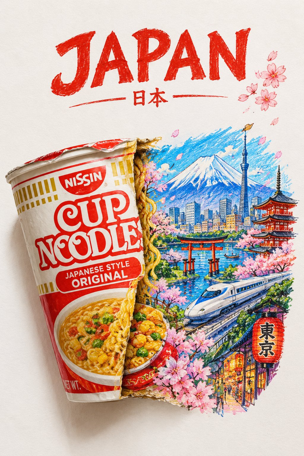
A striking top-down art photograph of a famous packaged food/snack from [COUNTRY], placed on a clean — AI image prompt — GPT Image 2.5
OpenAIGPT Image 2.5
A striking top-down art photograph of a famous packaged food/snack from [COUNTRY], placed on a clean white sheet of paper. At the very top of the paper, write “[COUNTRY NAME]” in large, bold, beautiful typography. Directly underneath, place a realistic, colorful packet of “[FAMOUS FOOD/SNACK]” from that country. The packet is creatively split/opened down the center, and the inside artwork transforms into a vibrant miniature illustration of the country — featuring its most iconic landmark, architecture, landscape, cultural elements and recognizable local details. Keep the original food packet highly realistic with authentic-looking folds, crinkles, printed graphics and vivid colors, while the emerging country illustration uses expressive colored-pencil and wax-crayon strokes. White paper background, overhead composition, playful handmade imperfections, rich saturated colors, premium editorial art photography, extremely detailed, visually satisfying, viral social-media aesthetic.
檢視詳情
Create a sophisticated 3:4 vertical editorial art poster using the uploaded image as the primary vis — AI image prompt — GPT Image 2.5
OpenAIGPT Image 2.5
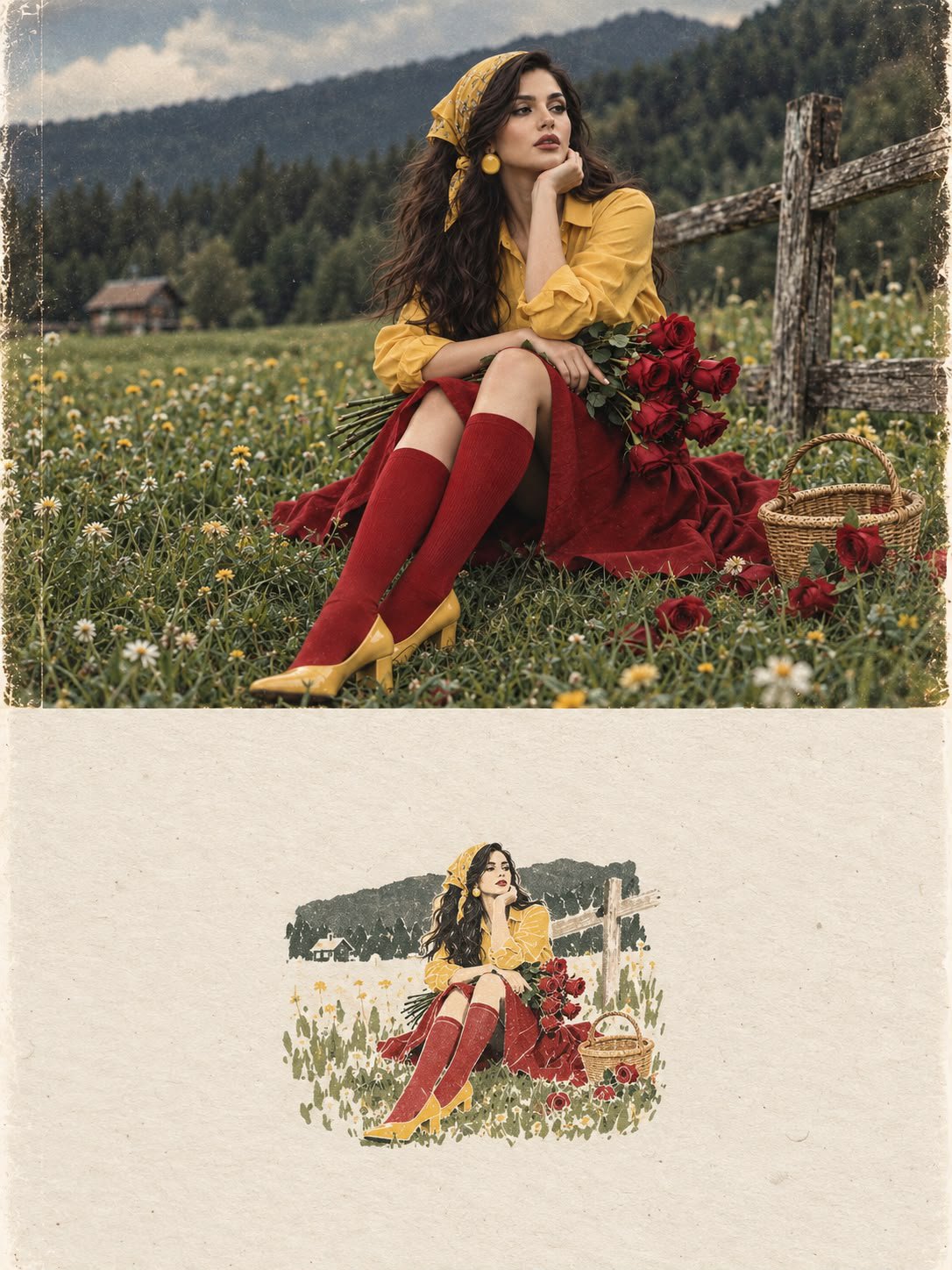
Create a sophisticated 3:4 vertical editorial art poster using the uploaded image as the primary visual reference. The composition must be divided into two perfectly balanced horizontal halves, with a precise 50/50 visual structure. UPPER 50% — ORIGINAL PHOTOGRAPH Place the reference photograph in the entire upper half. Keep it almost completely untouched. Preserve the exact: * facial identity and facial features * expression * hairstyle and hair length * skin tone and natural skin texture * body proportions * pose and posture * clothing and accessories * objects and environment * composition and perspective * lighting direction * colors and tonal relationships * photographic details and natural texture The photograph should still look like a real, authentic editorial photograph, with only subtle premium color grading and extremely restrained tonal refinement. Do not reinterpret, redraw, beautify, or stylize the photograph. LOWER 50% — HANDMADE ARTISTIC MEMORY Transform the main visual idea and recognizable elements of the photograph into a tiny, centered handmade-paper artwork. The artwork should occupy only approximately 10–20% of the entire lower half, leaving a large amount of intentional negative space around it. It should look as though an independent contemporary artist created a small visual memory of the photograph by hand. Use: * warm off-white handmade paper * subtle natural paper fibers * delicate imperfect ink-like outlines * simple flat acrylic-inspired shapes * organic, slightly uneven edges * restrained abstract simplification * visible handmade-print character * maximum 4 colors, carefully sampled from the original photograph * subtle variations in ink density * slightly imperfect registration and handmade imperfections Reduce the photograph into only its most recognizable visual elements. Do not reproduce every detail. The result should feel like a poetic visual memory rather than a literal miniature copy. The artwork must remain small, quiet, centered, and understated. TYPOGRAPHY Optional: add extremely minimal editorial typography only if it naturally enhances the composition. If typography is included, use: * very small scale * elegant contemporary editorial type * restrained spacing * subtle placement * no large headline * no commercial branding * no distracting text Typography must remain secondary to both the photograph and the miniature artwork. OVERALL ART DIRECTION The final composition should feel like a limited-edition independent contemporary art-book cover where the original photograph and its handmade artistic memory coexist within one carefully designed page. Visual references: contemporary art book, gallery editorial, quiet luxury, independent art publication, handmade print, refined minimalism, poetic negative space, museum catalog design, sophisticated editorial composition. The transition between the two halves should feel intentional and beautifully balanced, with a generous breathing space around the miniature artwork. IMPORTANT Do not make the lower artwork: * cartoonish * childish * watercolor * colored-pencil * 3D * glossy * photorealistic * overly digital * highly detailed * colorful * busy * commercial * decorative for its own sake Do not turn the entire image into an illustration. The upper half must remain a real photograph. The lower half must be a tiny handmade artistic interpretation. The contrast between photographic realism above and restrained handmade abstraction below is the central concept. Final format: 3:4 vertical, sophisticated contemporary editorial art poster, high-end print quality, precise 50/50 horizontal division.
檢視詳情
Create a premium educational travel poster featuring [STRUCTURE NAME], one of the world’s most famou — AI image prompt — GPT Image 2.5
OpenAIGPT Image 2.5
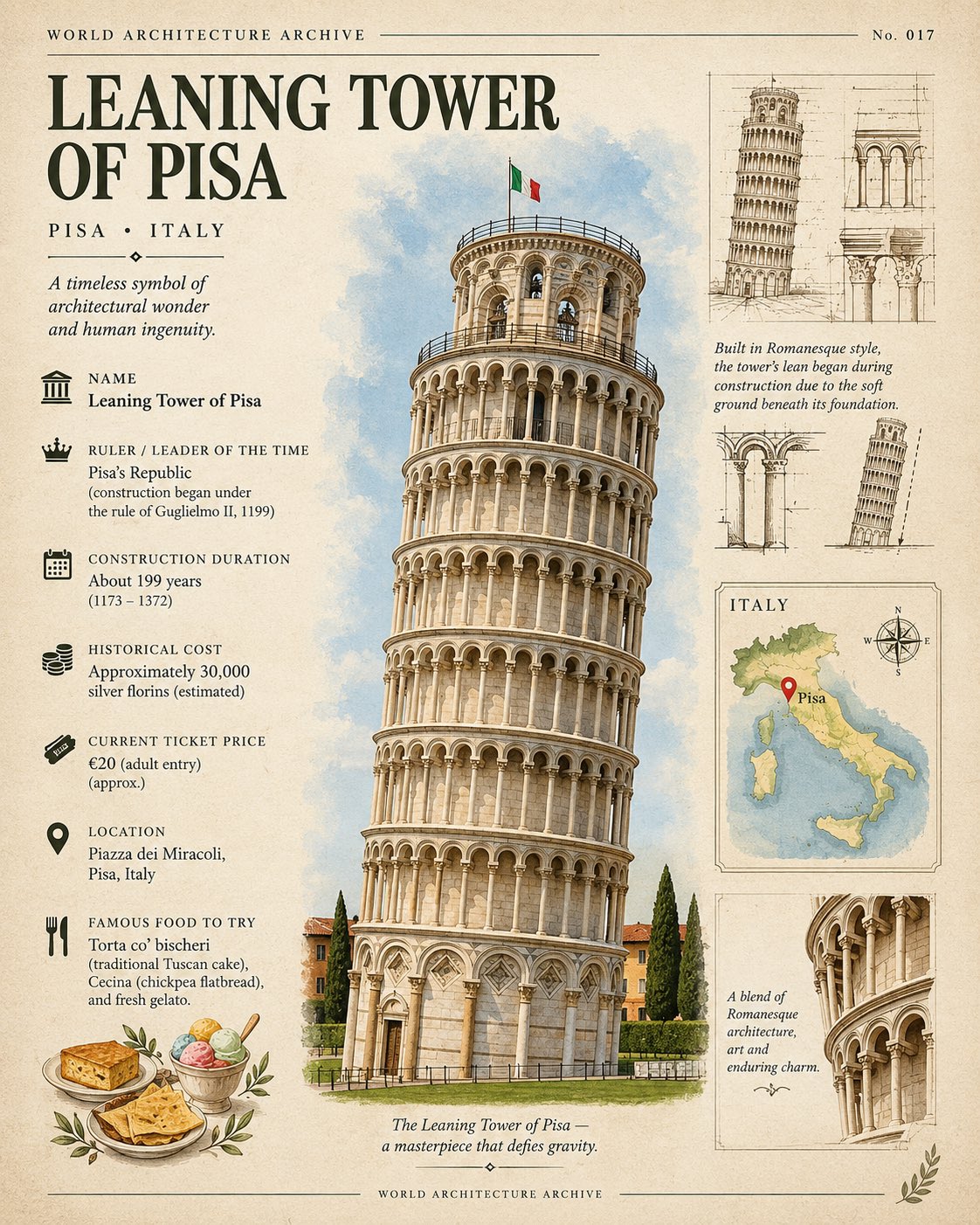
Create a premium educational travel poster featuring [STRUCTURE NAME], one of the world’s most famous architectural landmarks. Show a beautiful, highly detailed illustration or photorealistic miniature of the structure as the main focal point, surrounded by clean infographic-style information. Include these clearly arranged details: NAME: [Structure Name] RULER / LEADER OF THE TIME: [Ruler or leader] CONSTRUCTION DURATION: [Number of years / approximate duration] HISTORICAL COST: [Original construction cost, if known] CURRENT TICKET PRICE: [Current entry price] LOCATION: [City, Country] FAMOUS FOOD TO TRY: [1–3 famous local foods] Add small architectural sketches, construction details, a tiny location map, historical symbols, subtle decorative elements, and elegant infographic lines. Use a sophisticated museum archive + luxury travel magazine aesthetic with warm ivory paper, muted heritage colors, fine black typography, subtle vintage grain, and clean geometric layout. Make the structure large and dominant, with the information arranged neatly around it. Add a small “WORLD ARCHITECTURE ARCHIVE” label and a subtle historical catalog number. Style: elegant, educational, premium, collectible travel poster, highly detailed, clean composition, realistic textures, sophisticated typography. FORMAT: Vertical 4:5. Avoid: clutter, excessive text, unrelated landmarks, people, modern advertisements, and watermark.
檢視詳情
Create a premium cinematic luxury tourism poster for [COUNTRY / DESTINATION] in a STRICT 4:5 vertica — AI image prompt — GPT Image 2.5
OpenAIGPT Image 2.5
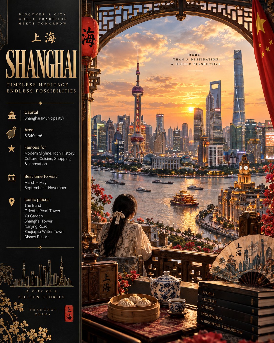
Create a premium cinematic luxury tourism poster for [COUNTRY / DESTINATION] in a STRICT 4:5 vertical format, designed like an official international tourism campaign. COMPOSITION Create a sophisticated editorial layout with a strong visual hierarchy. LEFT — INFORMATION PANEL A dark matte black/deep charcoal panel occupying approximately 30% of the width. [COUNTRY NAME] — large, elegant classical serif typography "[SHORT TAGLINE]" — refined secondary text Clean travel-information section using subtle icons and modern sans-serif typography: Capital: [CAPITAL] Area: [AREA] Famous for: [3–5 KEY CHARACTERISTICS] Best time to visit: [SEASON / MONTHS] Iconic places: [5–7 LOCATIONS] Use ivory, cream and muted gold typography with minimal geometric or authentic cultural motifs. Keep everything elegant, organized and highly readable. RIGHT — CINEMATIC DESTINATION SCENE Create a breathtaking ultra-realistic cinematic panoramic landscape that authentically represents [COUNTRY / DESTINATION]. Naturally integrate: Iconic city skyline and real, geographically appropriate landmarks Dramatic mountains, landscapes or natural formations River, lake, valley or coastline in the foreground Authentic local architecture and vegetation People in geographically and historically appropriate traditional clothing Appropriate native wildlife Traditional food, crafts and cultural objects A subtle national flag element Spectacular golden-hour sunset Frame the main landscape with a large ornate traditional arch or window, inspired specifically by the authentic architectural heritage of [COUNTRY]. Add tasteful foreground details such as carpets, crafts, instruments, food or architectural ornaments. Include one or two travelers/cultural figures, naturally posed in profile or from behind. LIGHTING & STYLE Golden-hour cinematic lighting, warm sunlight, volumetric rays, realistic shadows, atmospheric haze and strong depth. Combine ultra-realistic photography with premium cinematic concept art. Aim for a National Geographic-quality luxury travel campaign, high-end travel magazine aesthetic, epic scale, photorealistic textures, extremely detailed architecture and landscapes, natural colors and sophisticated warm cinematic grading. DESIGN Use a refined black, ivory, bronze and muted-gold palette. Maintain strong contrast between the dark information panel and luminous landscape. Keep the composition luxurious, balanced and uncluttered. Typography: classical serif for the destination name; clean modern sans-serif for information. Ensure all text is accurately spelled, legible and professionally arranged. AUTHENTICITY — CRITICAL Every cultural, architectural, environmental and historical element must be authentic to [COUNTRY / DESTINATION]. Do not mix cultures or landmarks from other countries. Do not invent recognizable landmarks. Maintain believable geography and natural relationships between all elements. Avoid distorted architecture, duplicated objects, malformed faces, extra limbs, unrealistic animals or artificial-looking environments. FINAL RESULT: A breathtaking, highly detailed 4:5 luxury tourism poster that seamlessly combines heritage, modernity, nature, architecture and national identity into one believable cinematic destination scene.
檢視詳情
Create a Cannes-level commercial poster for fictional premium sparkling soda brand LIMNOVA, merging  — AI image prompt — GPT Image 2.5
OpenAIGPT Image 2.5
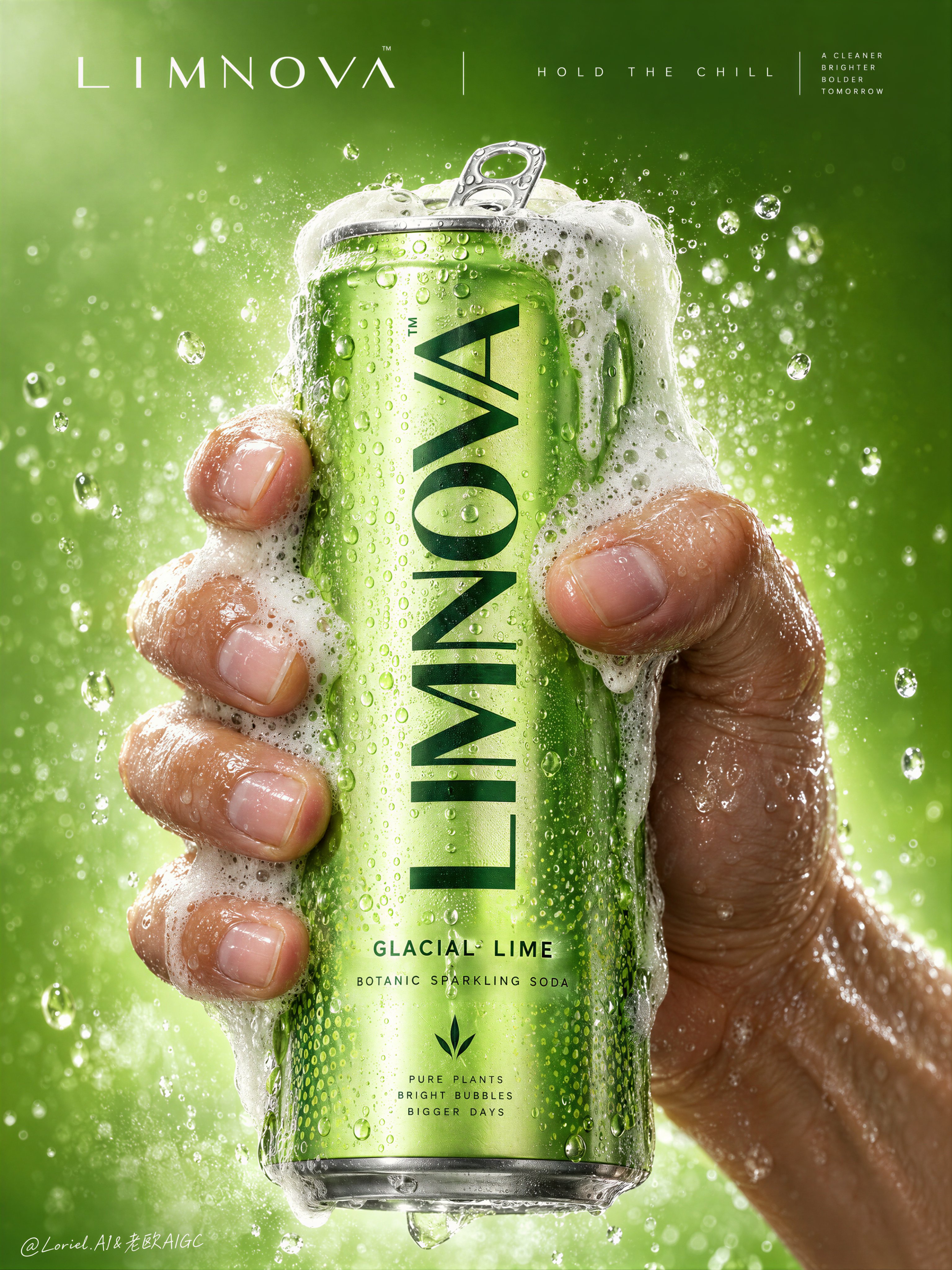
Create a Cannes-level commercial poster for fictional premium sparkling soda brand LIMNOVA, merging tactile product realism, pressure-driven human interaction, and ultra-clean gallery-grade graphic design into one unified hero image. The core concept is controlled release: a cold lime soda can gripped at peak tension, overflowing with foam and condensation, turning an ordinary beverage moment into a sculptural event of freshness, pressure, and desire. Use a vertical full-bleed poster in extreme close-up, rule-of-thirds disciplined but visually centralized. Preserve the exact structure: a single slim can dominates the center, held tightly by one wet human hand wrapping from the right and lower rear; dense foam crowns the top and spills down the can; broad negative space remains above for elegant brand typography. The hand, can, and foam should read as one compressed central mass, surrounded by a luminous citrus atmosphere with no extra props. The can must remain the undisputed focal point and fully legible. The subject is a hyperreal slim aluminum soda can in radiant glacial lime green, with crisp pull-tab geometry, subtle printed microtexture, dense condensation droplets, and refined premium branding. Use the fictional text “LIMNOVA” as the main vertical logo, “GLACIAL LIME” as the flavor line, and “BOTANIC SPARKLING SODA” as the descriptor. The identity should feel bold, contemporary, and luxury-clean, with strong custom letterforms and exact print clarity. The can should look manufacturable, collectible, and ice-cold. One realistic human hand grips the can firmly with correct five-finger anatomy, natural finger spacing, believable knuckle tension, realistic nail beds, subtle skin compression, and wet highlights. The grip communicates force and freshness, not aggression. Foam surges over the top rim and flows across the fingers and can in airy dense clusters, while suspended micro-droplets and faint carbonation mist activate the space. The can remains undeformed except for natural optical tension created by the grip and liquid pressure. No extra hands, no anatomy drift. Build a minimal studio field rather than a literal location. The background is a luminous acid-lime to chilled-chartreuse gradient with suspended droplets, vapor-like fizz haze, and a soft freshness halo around the product. Keep the space clean and abstract, letting the product, hand, and foam generate all depth. No fruit slices, no ice cubes, no bar setup, no clutter. The world should feel like a distilled atmosphere of citrus pressure and cold carbonation. Lighting is a premium studio setup with a bright frontal key, cool upper-left freshness lift, and narrow specular edge highlights on wet aluminum and skin. Palette hierarchy: 60% glacial lime and electric citrus green, 30% white foam and bright condensation highlights, 10% natural warm skin tone as tactile counterpoint. Contrast should be crisp yet soft-edged, with no dead blacks, dirty grey mud, or cartoon oversaturation. The emotional tone is icy, alive, compressed, clean, and addictive. Materials must feel extremely photoreal: sharp reflective aluminum edges, chilled metallic bloom, droplets merging into trails, subtle ink adhesion texture; foam that feels light, wet, aerated, and creamy with translucent bubble variation and convincing thickness at the rim and fingers; and a real, de-AI hand with accurate anatomy, realistic skin texture, natural moisture sheen, crease detail, true finger joints, and no swollen or fused forms. Apply restrained high-end commercial polish, keeping hero detail sharp and print-ready. Integrate a minimalist top header as a refined brand system, not ad clutter. Place “LIMNOVA” on one side of the top band and a secondary studio-style signature or edition mark on the other, separated by a thin elegant divider. If an extra micro-headline is used, keep it very restrained, such as “HOLD THE CHILL” or “PRESS THE FIZZ”, set small outside the can recognition zone. Typography must feel architected into the negative space, aligned with the product axis, and never heavy or crude. Output: a premium beverage poster with product-first hierarchy, hyper-clean execution, strong tactile realism, elegant negative space, and exact brand readability. No extra cans, no fruit garnish, no ice props, no chaotic splash overload, no warped can geometry, no broken tab, no malformed hand, no extra or merged fingers, no unreadable text, no muddy shadows, no large dead black blocks, no low-quality AI artifacts, no clutter, no style drift, and no resemblance to existing real soda branding.
檢視詳情
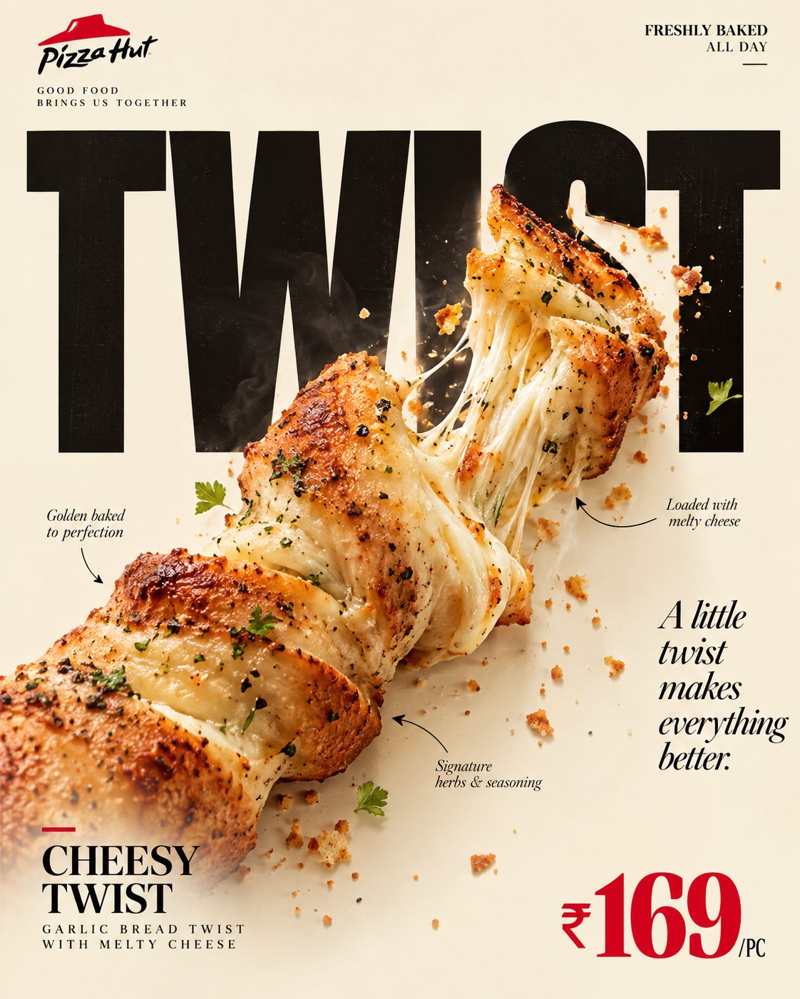
Create a premium editorial food poster, vertical 4:5.

Use a warm cream/ivory background, sophistica — AI image prompt — GPT Image 2.5
OpenAIGPT Image 2.5
Create a premium editorial food poster, vertical 4:5. Use a warm cream/ivory background, sophisticated magazine-style layout, generous negative space, black typography, natural food colors, and one accent color: [ACCENT COLOR]. CORE IDEA: Photorealistic [FOOD] physically interacts with a huge [HEADLINE] in one shared environment. Choose ONE mechanism — [DRIP / PUSH / POUR / WRAP / SNAP / PEEL]. The food must visibly reshape or affect specific letters through believable physics such as gravity, weight, tension, viscosity, or fracture. Untouched letters remain crisp, geometric, black, and fully readable. No generic 3D text, floating food, random distortion, or decorative overlap. LAYOUT: Top left: [BRAND NAME] + small tagline. Top right: [HOURS / PROMISE]. Center: massive [HEADLINE] in Heavy Grotesk, with the food interaction as the main focal point. Mid-right: short italic-serif quote. Bottom left: [PRODUCT NAME] + descriptor. Bottom right: [PRICE] in the accent color + unit. Add 2–3 thin annotation arrows highlighting realistic food details. FOOD: Ultra-realistic studio photography with authentic texture, moisture, crumbs, gloss, steam, garnish, and contact shadows. FINAL STYLE: Clever, tactile, minimal, luxurious, contemporary editorial advertising. The poster should be instantly understandable at thumbnail size: first glance = food + headline; second glance = how the food physically transforms the typography.
檢視詳情
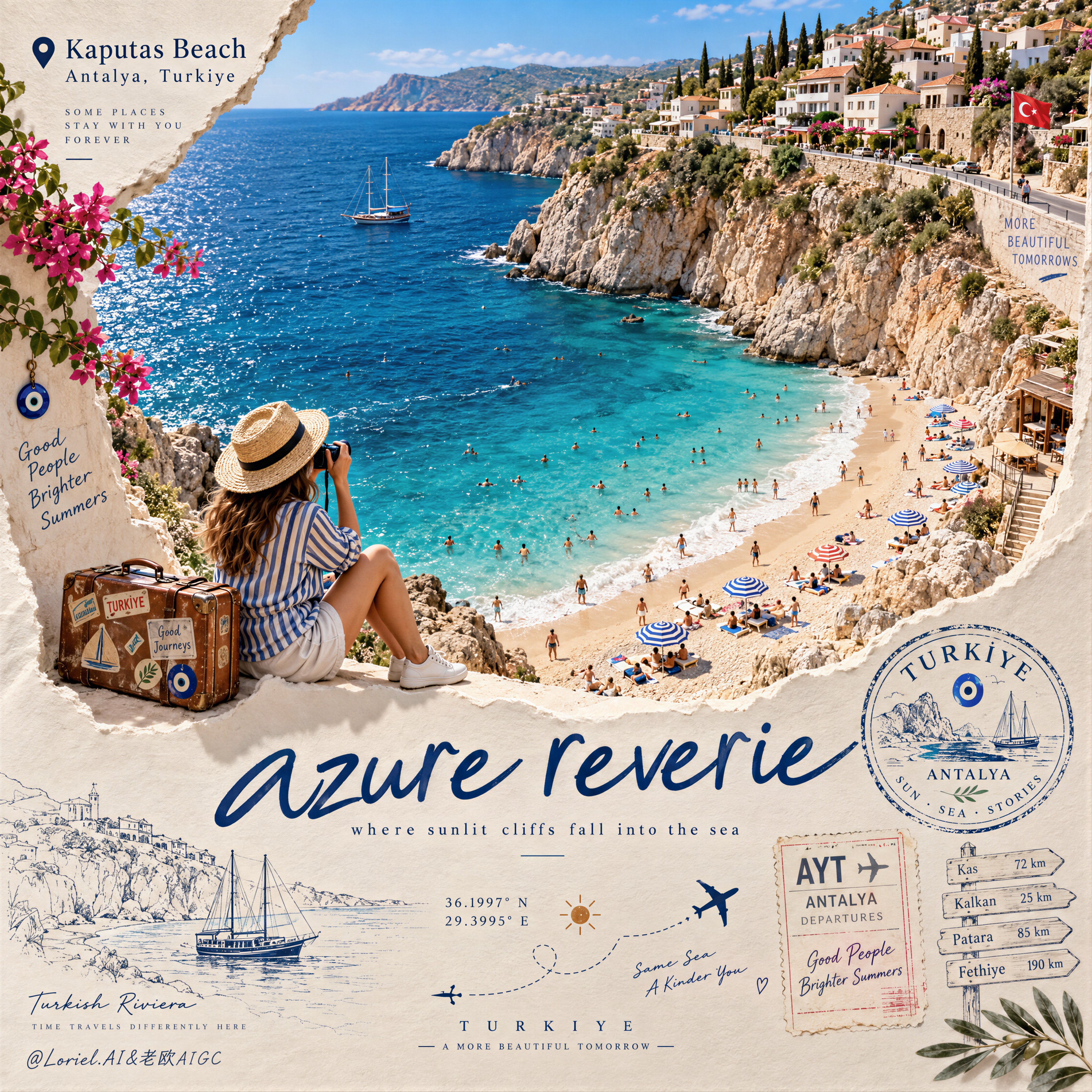
Create a Cannes-level travel destination advertising poster for TURKIYE, preserving the exact struct — AI image prompt — GPT Image 2.5
OpenAIGPT Image 2.5
Create a Cannes-level travel destination advertising poster for TURKIYE, preserving the exact structural logic of a premium paper-sculpture tourism print while merging emotional summer atmosphere with forensic material realism. The composition is vertical and built around one large curved torn-paper window that reveals a luminous handcrafted miniature view of KAPUTAS BEACH, ANTALYA, TURKIYE, while the lower foreground remains a refined cream paper field carrying elegant destination typography, travel stamps, route sketches, coordinates, and curated tourism graphics. The final image must feel like a collector-grade Mediterranean travel memory object: tactile, sun-warmed, cinematic, and exquisitely constructed. Hero destination scene: inside the curved paper opening, reveal a radiant turquoise cove embraced by pale limestone cliffs and a gently arcing golden beach. Show layered Mediterranean water bands shifting from pale aqua near the shore to saturated teal and deep azure farther out, with delicate repeating wave lines and bright foam edges rolling onto the sand. Populate the beach with tiny yet believable sunbathers, swimmers, striped parasols, towels, and scattered leisure details, all proportionally correct and integrated into the scene. Along the upper horizon, build a densely stepped hillside of whitewashed and pastel coastal houses, terracotta roofs, boutique balconies, cypress trees, and warm stone terraces, arranged like a refined miniature Mediterranean village. The entire destination window must feel like a luxury handcrafted 3D diorama enhanced with highly realistic micro-surface detail. Narrative foreground: on the lower edge of the cutout, place one seated miniature traveler figure as an emotional invitation into the destination. The traveler wears elegant striped resort clothing, a straw hat, white sneakers, and holds a camera, beside a small vintage suitcase covered in tasteful travel stickers. The anatomy, hands, posture, and clothing folds must be natural and correct. This figure should feel quietly alive, as if pausing at the threshold of memory, adding warmth and human scale without competing with the destination itself. Typography and editorial layout: preserve the same poster rhythm as the reference. At the upper left, place a small map-pin icon followed by “Kaputas Beach” and beneath it “Antalya, Turkiye” in refined editorial type. On the lower paper field, place one large flowing handwritten English title in deep Mediterranean blue, such as “azure reverie”, followed by a small subtitle like “where sunlit cliffs fall into the sea”. Distribute a few highly curated travel graphics across the lower area: one circular passport-style destination stamp, one boarding-pass or visa-stamp element, one dotted flight-path doodle with tiny airplane icons, precise latitude-longitude coordinates, a small sun glyph, a fine-line coastal sketch, and one discreet signpost marking nearby destinations. All typography must feel elegant, airy, and graphically integrated, never generic, heavy, or cluttered. Turkey-specific accents: add subtle premium local cues with restraint. Integrate a tiny evil-eye motif into one stamp or baggage sticker, a delicate line illustration of a gulet sailboat or coastal architectural silhouette in the lower graphics, and visual cues that suggest refined Turkish Riviera identity without becoming folkloric or overloaded. Everything should feel international, luxurious, and compositionally clean. Atmosphere: the poster should carry the sensation of late-morning Mediterranean light, salt in the air, and the emotional softness of an unforgettable summer coast remembered through beautifully crafted paper. The sea must feel alive and breezy, the sky fresh and expansive, and the destination window should radiate optimism, escape, and warmth. The image should feel like a tactile travel keepsake elevated into a world-class advertising object. Material realism: emphasize thick layered paper edges, crisp cut contours, matte card texture, embossed shadow transitions, tiny architectural facade details, miniature umbrellas, foam ridges, cliff stratification, printed stamp ink, luggage leather grain, sticker gloss, clothing fabric weave, and precise micro-scale beach props. The sea should have dimensional depth without losing the handcrafted paper language. The paper opening must cast believable soft shadows onto the lower field, and every surface should read as physically buildable, premium, and photographically convincing. Lighting: use bright Mediterranean daylight from the upper left with soft clean shadows that enhance the paper relief and miniature depth. The waves, parasols, rooftops, cliffs, and traveler should receive warm, luminous highlights. The lower paper field remains softly lit with subtle shadowing from the cut edge, stamps, and seated figure, producing a polished museum-quality commercial finish. Avoid harsh contrast, dull flatness, or dirty shadow masses. Color hierarchy: 60% luminous turquoise, aqua, pale sand, sun-bleached ivory, and clear coastal sky blue; 30% terracotta roof tones, limestone beige, sage-green foliage, and soft neutral ink tones; 10% deep navy typography, warm suitcase browns, and small accent colors from parasols and travel graphics. The palette must feel fresh, upscale, joyful, and unmistakably Mediterranean. Design intent: the final image must preserve the reference’s exact logic of a
檢視詳情
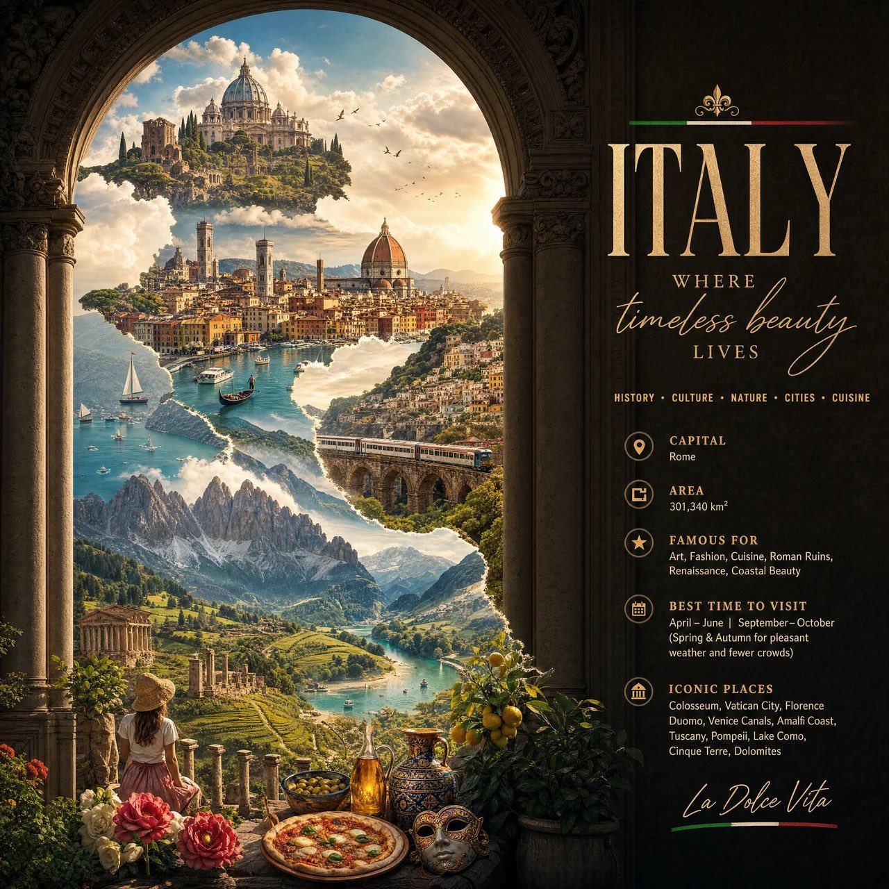
Create a premium vertical 4:5 editorial travel poster for [COUNTRY], where the outline of the countr — AI image prompt — GPT Image 2.5
OpenAIGPT Image 2.5
Create a premium vertical 4:5 editorial travel poster for [COUNTRY], where the outline of the country is formed organically from its landscapes, architecture, culture, and nature rather than using a normal map. Inside the country silhouette, create a seamless cinematic journey: * Top: iconic architecture emerging from clouds * Middle: famous city skyline + traditional buildings * Lower middle: dramatic natural landscape * Bottom: wildlife, local crafts, food, flowers, or cultural details * Small birds, boats, trains, or people can subtly connect the different scenes. Instead of decorative borders, use one continuous architectural element—an ancient arch, carved doorway, stone wall, temple corridor, bridge, or traditional pattern—that visually holds the composition together. On the side, use elegant editorial typography: [COUNTRY NAME] WHERE [SHORT POETIC PHRASE] HISTORY • CULTURE • NATURE • CITIES • CUISINE Add small details: CAPITAL AREA FAMOUS FOR BEST TIME TO VISIT ICONIC PLACES Use a “window into the country” concept: the country silhouette looks like a giant architectural doorway/window, and instead of showing separate boxes, the entire interior becomes one continuous surreal landscape.
檢視詳情
瀏覽全部 GPT Image 2.5 提示詞探索AI 圖片提示詞