
LogoAhaPrompt
  • 프롬프트
  • 엄선
  • 모델
  • 제출
  • 블로그
AhaPromptAhaPrompt

이미지·영상·오디오, 모든 주요 AI 모델을 아우르는 프롬프트 라이브러리

Built withLogoNEXTY.DEV
탐색
  • 전체 프롬프트
  • 엄선 프롬프트
  • 이미지 프롬프트
  • 영상 프롬프트
  • 오디오 프롬프트
  • AI 모델
  • 프롬프트 제출
  • 블로그
언어
  • English
  • 中文
  • 日本語
  • 한국어

Copyright © 2026 AhaPrompt All rights reserved.

개인정보 처리방침이용약관
홈AI 프롬프트 라이브러리AI 이미지 프롬프트미니멀 플랫 벡터 도시 여행 포스터
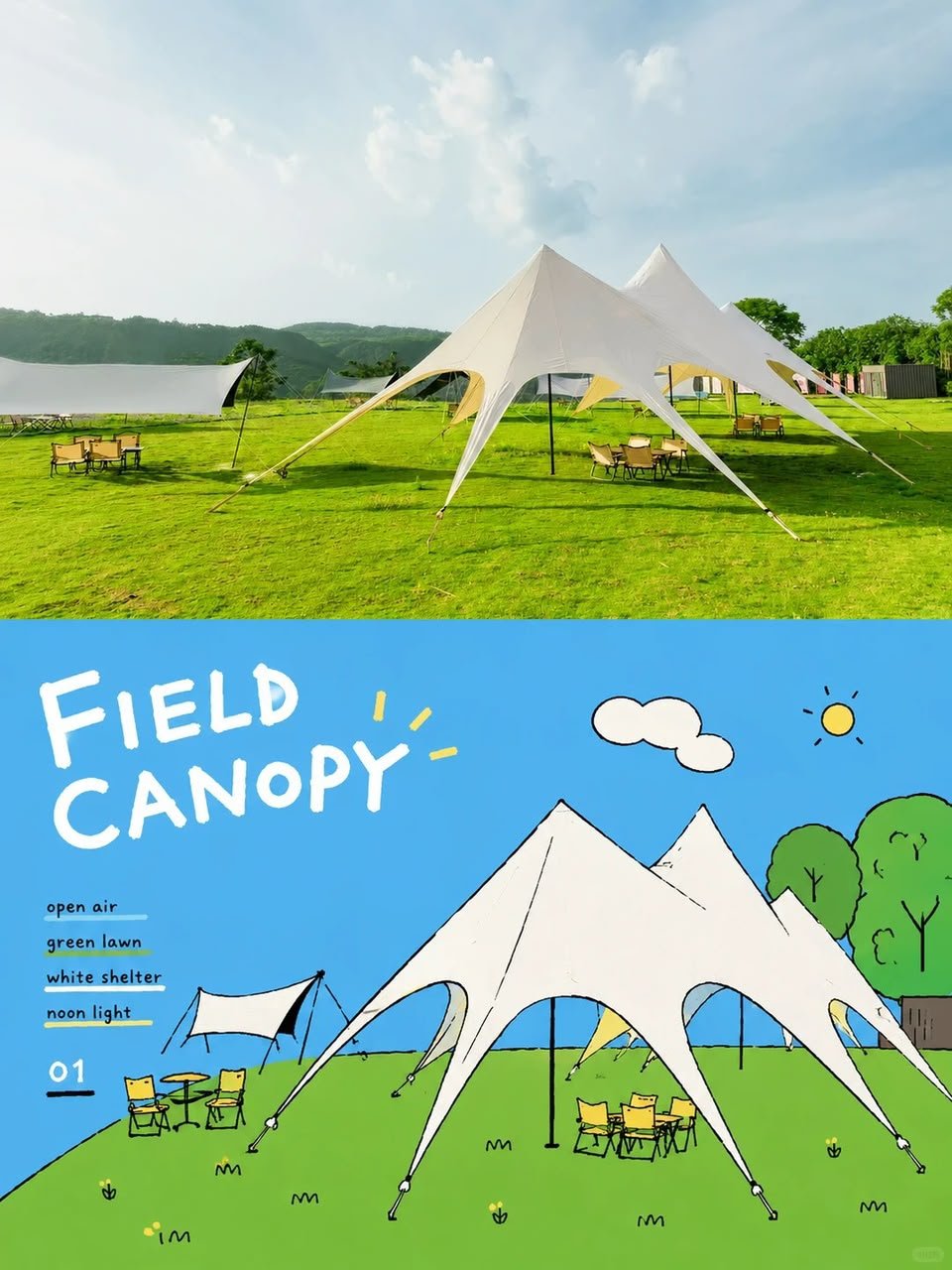
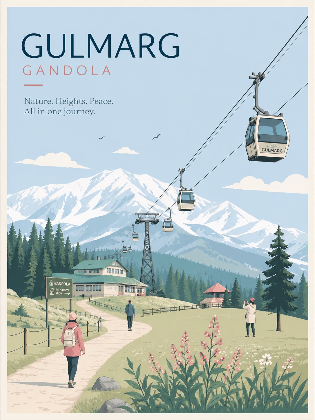
미니멀 플랫 벡터 도시 여행 포스터 — AI image prompt — GPT Image 2 — Cityscape, Minimalist, Poster - 1
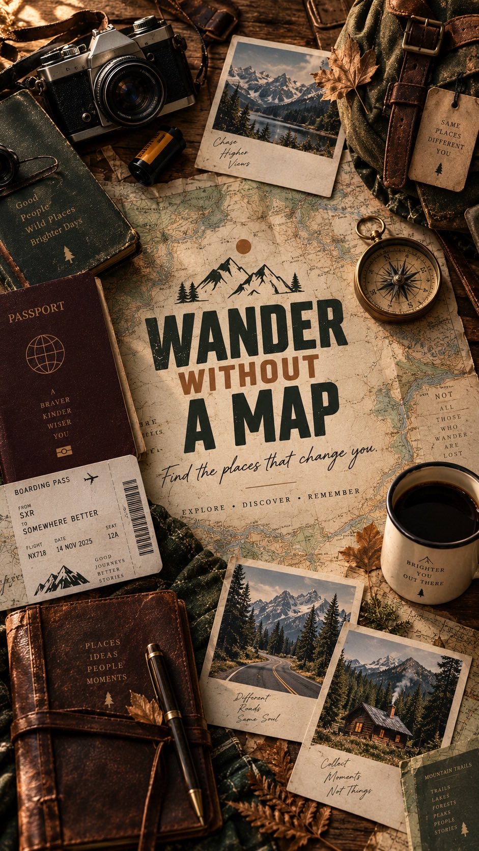
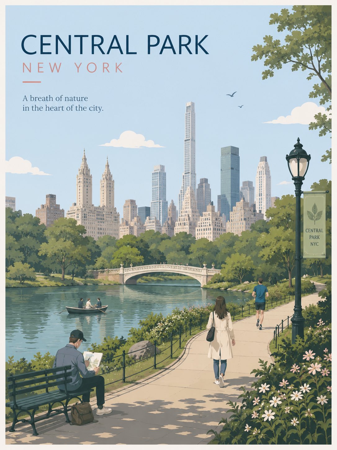
미니멀 플랫 벡터 도시 여행 포스터 — AI image prompt — GPT Image 2 — Cityscape, Minimalist, Poster - 2
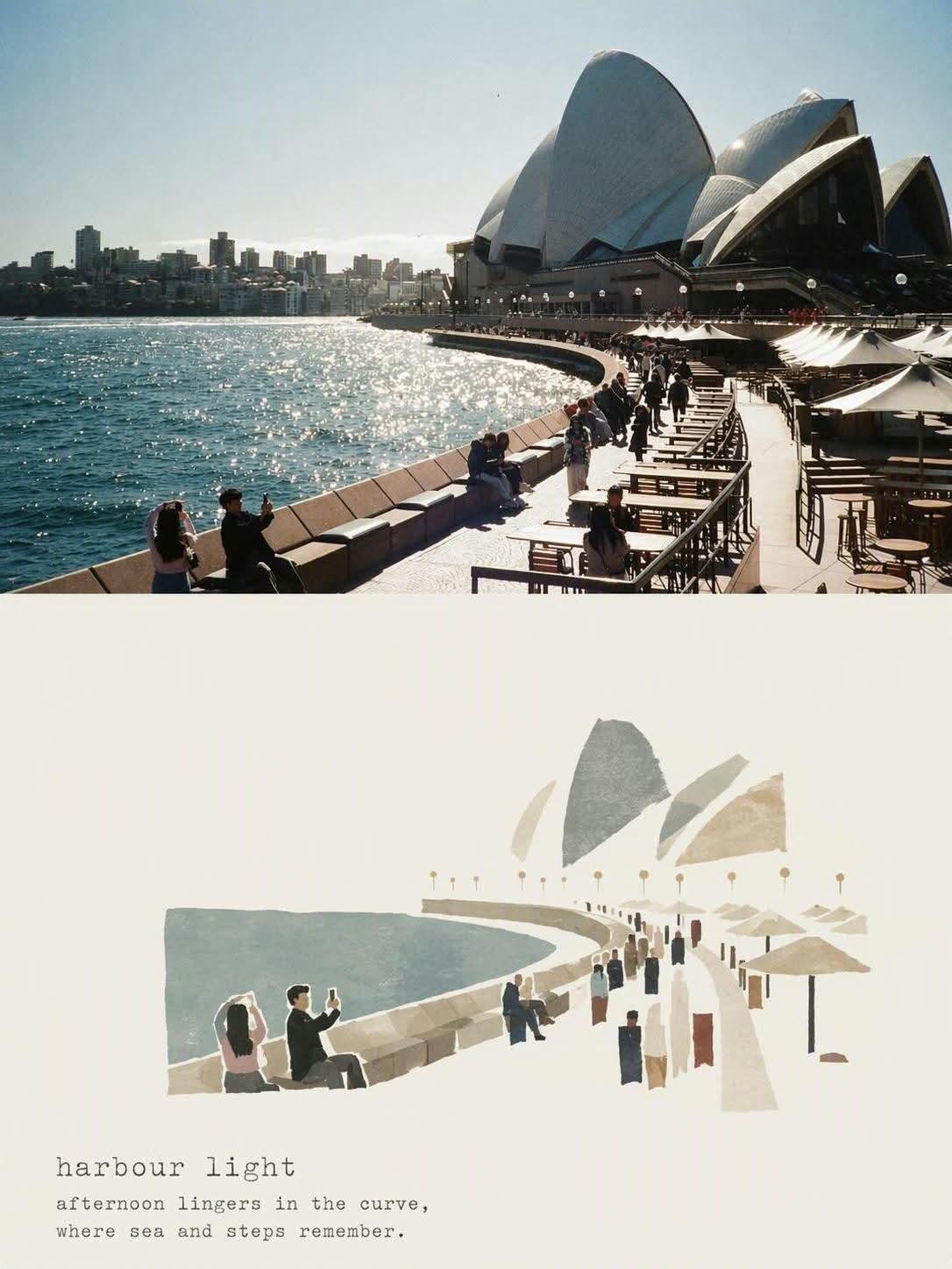
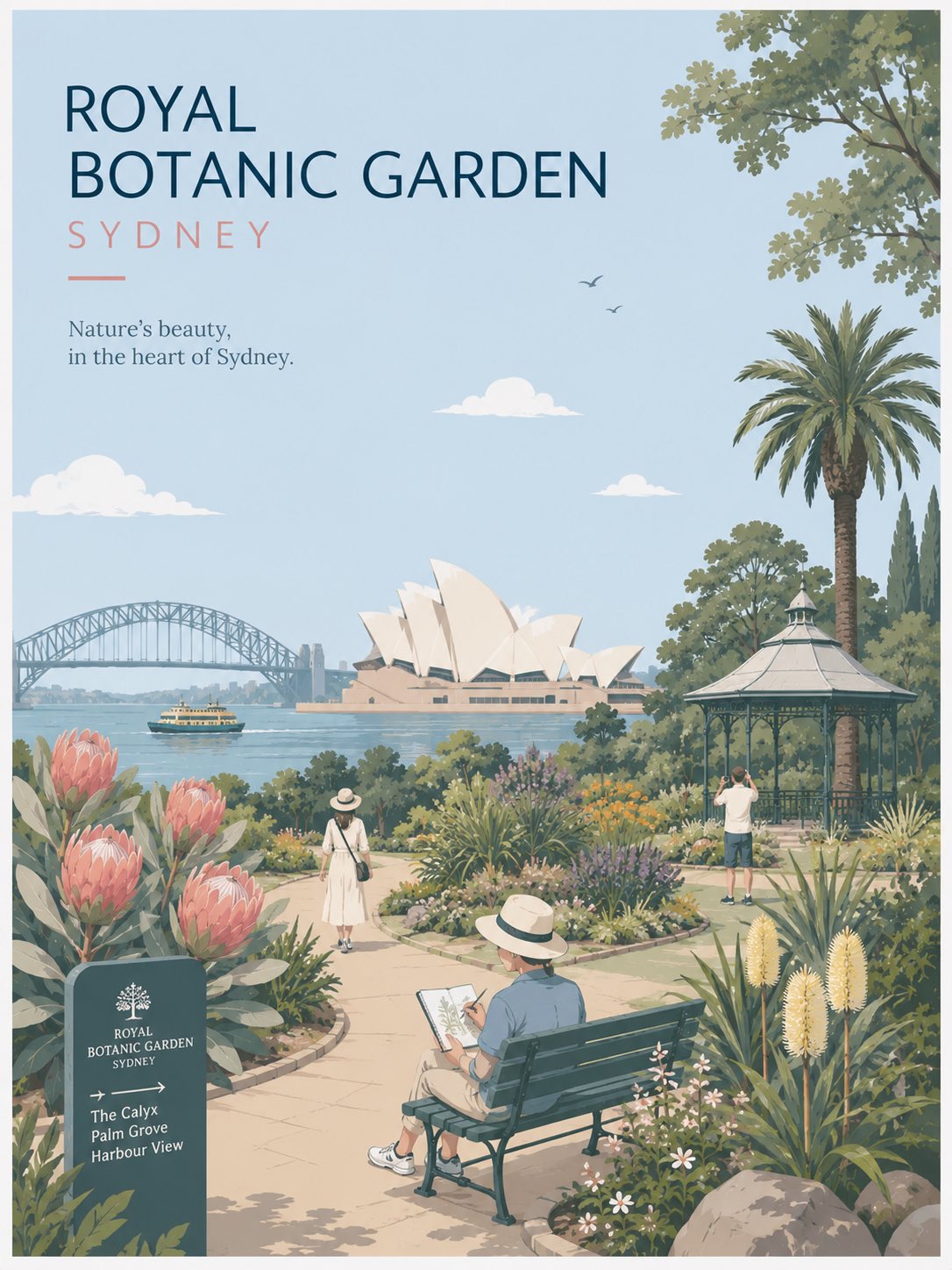
미니멀 플랫 벡터 도시 여행 포스터 — AI image prompt — GPT Image 2 — Cityscape, Minimalist, Poster - 3
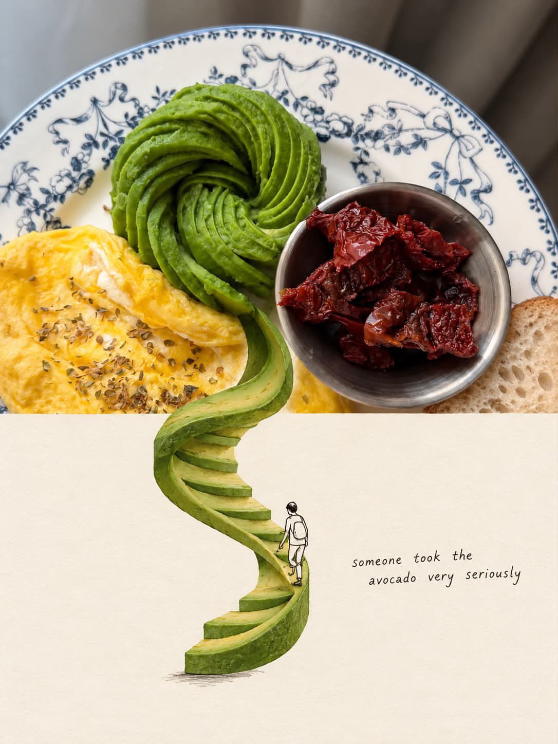
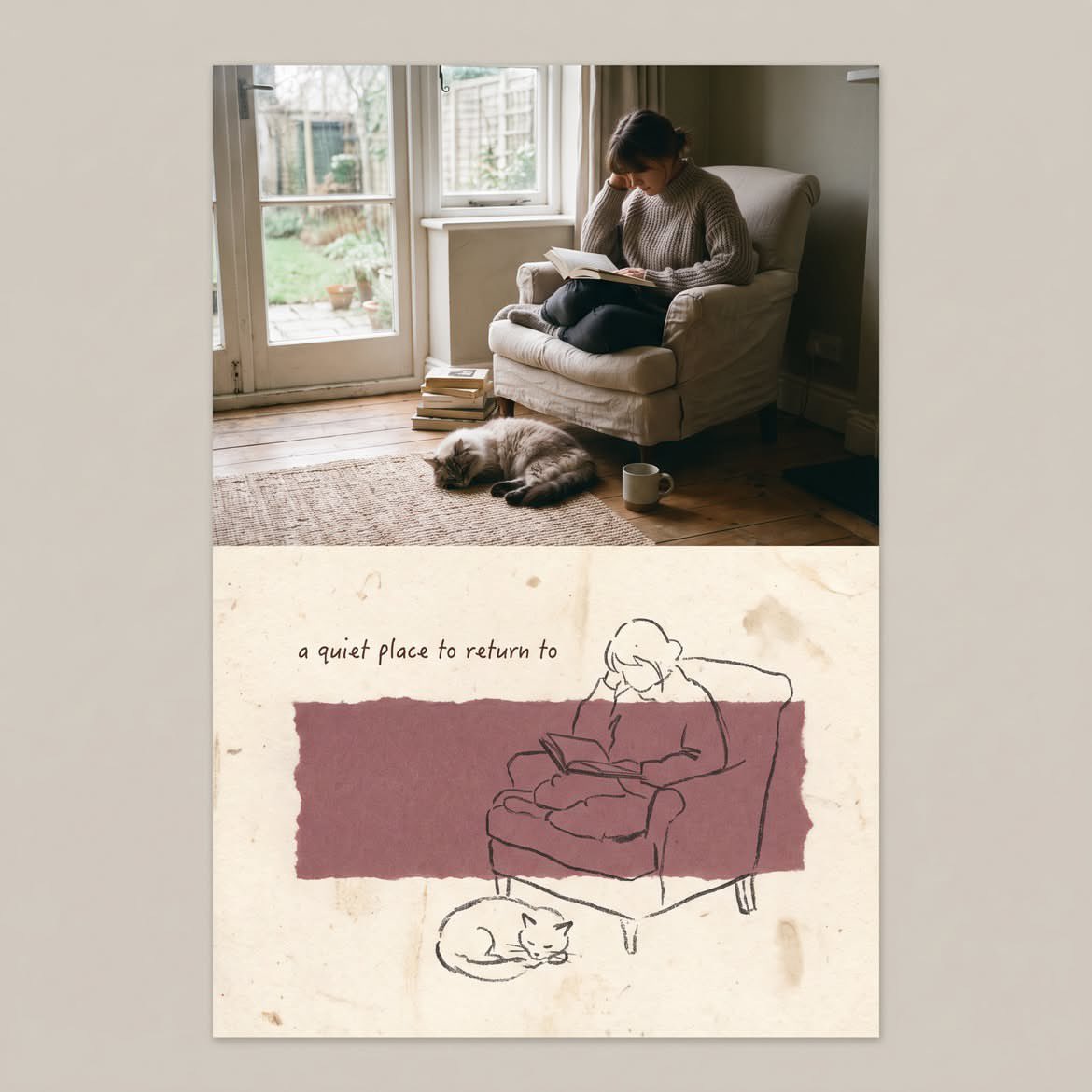
미니멀 플랫 벡터 도시 여행 포스터 — AI image prompt — GPT Image 2 — Cityscape, Minimalist, Poster - 4

미니멀 플랫 벡터 도시 여행 포스터

OpenAIGPT Image 2OpenAIimage

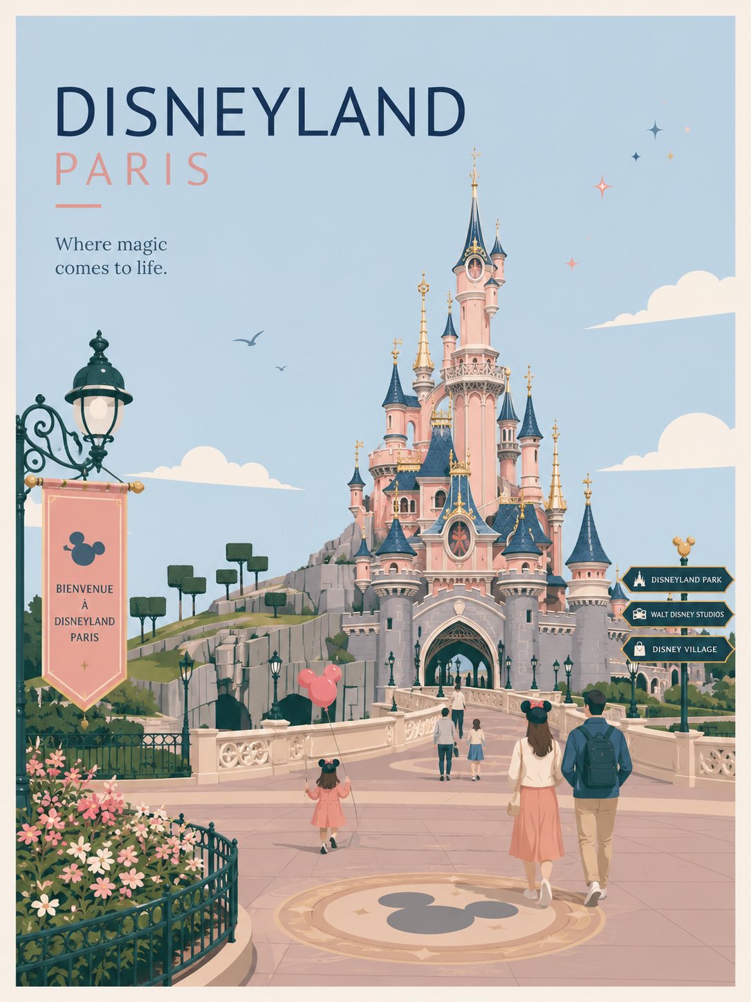
프리미엄 미니멀 플랫 벡터 여행 포스터, [CITY_NAME], 3:4 세로형. [CITY_NAME]만을 위해 특별히 디자인된, 신선하고 통풍이 잘되며 우아한 도시 여행 포스터를 제작하세요. 다른 도시에서 재사용된 것이 아닌, 그 도시만의 고유한 디자인이어야 합니다. 중요한 구도 규칙: 그리기 전에 [CITY_NAME]의 고유한 "도시 DNA"를 파악하세요: 1. 랜드마크 또는 스카이라인 특징 하나, 2. 지역 이동 수단 또는 교통 요소 하나, 3. 일상적인 라이프스타일 순간 하나, 4. 자생 식물 또는 지역 환경적 디테일 하나, 5. 이 도시에 특별히 맞는 공간적 구도 하나. 모든 도시에 동일한 레이아웃 공식을 재사용하지 마세요. 다음과 같은 기본 패턴을 피하세요: - 항상 오른쪽에 있는 상점, - 항상 왼쪽에 있는 간판, - 항상 카페 테이블에 앉아 있는 사람들, - 항상 동일한 전경 화단, - 항상 동일한 가로등 위치, - 항상 동일한 해변 산책로 구도. 각 도시는 실제 분위기에서 선택된 서로 다른 장면 구조를 가져야 합니다: 항구 전망대, 골목길, 강변 공원, 해변 산책로, 언덕 정상 전망, 시장 모퉁이, 트램 거리, 페리 부두, 식물원, 구시가지 거리, 해안 보드워크, 문화 광장, 또는 스카이라인 조망. 타이포그래피: "[CITY_NAME]"을 왼쪽 상단에 배치하고, 타이포그래피를 위한 넉넉한 여백을 확보하세요. 도시의 분위기에 맞는 짧고 세련된 영어 캡션을 하나 추가하세요. 타이포그래피는 우아하고, 미니멀하며, 프리미엄하게 유지하세요. 장면 적응: [CITY_NAME]에 맞게 장면을 자동으로 조정하세요. 상징적인 주요 랜드마크 하나를 메인 시각적 앵커로 사용하세요. 도시에 실제로 속한 2~4개의 보조 로컬 디테일만 추가하세요. 랜드마크 콜라주를 만들지 마세요. 배경을 과하게 채우지 마세요. 인물: 3~6명의 작은 인물만 사용하세요. 각 인물은 도시 특유의 일상적인 행동을 해야 합니다: 걷기, 스케치하기, 자전거 타기, 트램 기다리기, 페리 탑승하기, 서핑보드 들기, 조용히 사진 찍기, 공원에서 독서하기, 물가에서 조깅하기, 작은 시장 구경하기. 군중 장면을 피하세요. 지나치게 부각되는 단일 주인공 캐릭터를 피하세요. 인물은 이전 포스터에서 복사된 것이 아니라 도시 안에 자연스럽게 배치된 느낌이어야 합니다. 로컬 디테일: 지역 교통수단, 표지판, 거리 가구, 식물, 음식, 건축물, 여가 활동 디테일은 도시에 맞을 때만 사용하세요. 교통 표지판이 항상 대형 세로 간판으로 등장해서는 안 됩니다. 트램 정류장 표지판, 페리 노선도, 역 시계, 자전거 도로 표시, 해변 순찰 깃발, 작은 지하철 아이콘, 또는 도로 페인팅 표시처럼 은은하게 등장할 수 있습니다. 스타일: 일본 문구 미학, 럭셔리 스티커 일러스트레이션, 프리미엄 상업용 플랫 벡터 여행 포스터, 깔끔한 얇은 윤곽선, 일관된 선 굵기, 플랫 컬러만 사용, 부드러운 미니멀 형태, 차분한 에디토리얼 구도. 팔레트: 옅은 파우더 블루, 부드러운 스카이 블루, 미스트 블루를 분위기 있는 베이스로 사용하세요. 따뜻한 크림, 부드러운 베이지, 세이지 그린, 차분한 그레이그린을 건축물과 자연에 사용하세요. 더스티 로즈 또는 블러시 핑크는 꽃, 표지판, 차양, 의복, 또는 작은 장식 디테일에만 미세한 액센트로 사용하세요. 팔레트는 정제되고, 절제되며, 하이엔드하게 유지하세요. 무드: 신선함, 미니멀, 우아함, 차분함, 정제됨, 하이엔드 여행 엽서, 조용한 라이프스타일 브랜딩, 열린 공간, 여유로운 호흡, 편안한 로컬 리듬. 네거티브 프롬프트: 사실주의 금지. 수채화 금지. 회화적 효과 금지. 포토리얼리즘 금지. 과한 음영 금지. 그라데이션 금지. 종이 질감 금지. 빽빽한 배경 금지. 반복되는 오른쪽 카페 레이아웃 금지. 반복되는 왼쪽 간판 레이아웃 금지. 일반적인 관광 포스터 콜라주 금지. 붐비는 거리 금지. 과대한 인물 금지. 극적인 조명 금지.

상세 정보
유형
AI 이미지 프롬프트
종횡비
3:4
업데이트
2026. 8. 23.
카테고리
CityscapeMinimalistPoster
Source

이 프롬프트 사용 방법

  1. 1위의 복사 버튼으로 프롬프트 전문을 복사하세요.
  2. 2OpenAI의 GPT Image 2 또는 비슷한 스타일을 지원하는 이미지 생성 도구를 엽니다.
  3. 3프롬프트를 붙여넣고, 피사체와 스타일 키워드를 원하는 내용으로 바꿉니다.
  4. 4예시의 설정(3:4 · Cityscape · Minimalist · Poster)에 맞춰 생성한 뒤 조금씩 다듬으세요——작은 표현 차이가 결과를 크게 바꿉니다.

자주 묻는 질문

이 이미지는 어떤 AI 모델로 생성되었나요?

이 이미지는 OpenAI의 GPT Image 2로 생성되었습니다. 페이지의 프롬프트가 생성에 사용된 원문 그대로입니다.

이 프롬프트는 어떤 설정을 사용하나요?

예시는 GPT Image 2에서 다음 설정으로 생성되었습니다: 3:4 · Cityscape · Minimalist · Poster. 같은 설정을 사용하면 가장 비슷한 결과를 얻을 수 있습니다.

비슷한 결과를 얻으려면 어떻게 하나요?

먼저 프롬프트를 그대로 복사한 뒤, 스타일·조명·구도 키워드는 유지하고 피사체만 바꿔보세요. 출력은 매번 달라지므로 여러 번 생성해 고르는 것이 좋습니다.

이 프롬프트를 수정해도 되나요?

물론입니다. 프롬프트는 출발점으로 쓸 때 가장 효과적입니다——묘사어, 화면 비율, 스타일 태그를 조정해 나만의 작품을 만들어 보세요.
GPT Image 2 프롬프트 더 보기

Create a stylized editorial illustration based on the reference photo, transforming the real beach s — AI image prompt — GPT Image 2
MinimalistWatercolor
OpenAIGPT Image 2
Create a stylized editorial illustration based on the reference photo, transforming the real beach scene into a sophisticated hand-painted cut-paper travel artwork. Show two young women joyfully jumping above shallow ocean water, captured from a low, wide perspective. Preserve the original composition, body poses, clothing silhouettes, jumping motion, shoreline, distant tree-covered island, bright blue sky, and splashing water. Use a minimalist Japanese-inspired paper-cut illustration style with clean organic shapes, layered flat colors, subtle paper grain, soft shadows, and slightly imperfect handmade edges. Simplify the people into elegant illustrated figures while keeping their poses recognizable: one woman wearing a dark charcoal short-sleeve top and gray pleated skirt, the other wearing a black long-sleeve top and flowing white skirt. Their arms are raised naturally and their legs are bent backward mid-jump. Replace realistic textures with soft layered shapes: pale blue ocean, cream sandy shoreline, muted green coastal vegetation, warm beige highlights, and a clear powder-blue sky. Add simplified white water splashes beneath their feet and subtle distant islands and trees. The final image should feel like a premium Japanese travel magazine illustration / handcrafted paper collage, calm, nostalgic, artistic, and playful. Maintain generous negative space in the sky, balanced composition, soft pastel color palette, clean silhouettes, subtle depth from layered paper, delicate shadows, high-end editorial design, no photorealism, no 3D CGI, no excessive outlines, no clutter, no text. Vertical 4:5 composition, high resolution, polished illustration, visually faithful to the reference pose and framing.
상세 보기
Create a premium vertical aspect ratio 4:5 travel poster for [COUNTRY], illustrated as one elegant c — AI image prompt — GPT Image 2
PosterVintage
OpenAIGPT Image 2
Create a premium vertical aspect ratio 4:5 travel poster for [COUNTRY], illustrated as one elegant continuous hand-drawn line-art composition. Instead of placing landmarks separately, make them flow organically into one another, as if the entire country was drawn in a single uninterrupted travel sketch. Combine the country’s most recognizable architecture, landscapes, culture, food, transportation, nature, and tiny everyday details into one beautifully balanced scene. Use bold black ink outlines, delicate cross-hatching, playful imperfect hand-drawn details, subtle vintage-poster typography, and a mostly warm off-white paper background. Add only 2–3 signature accent colors inspired by the country. Include: One dominant iconic landmark A second architectural landmark subtly integrated into the skyline A famous natural landscape in the background Local transportation Traditional clothing or cultural detail A recognizable food or drink Small street-life moments Birds, clouds, plants and tiny decorative elements Handwritten labels pointing to selected elements At the top, use a large playful hand-lettered title: “[COUNTRY]” Below it, add a tiny elegant subtitle: “A little world to discover” Make the composition feel collected, whimsical, editorial, nostalgic and handcrafted, like a beautifully illustrated travel journal rather than a generic tourist poster. Avoid photorealism, gradients, 3D rendering and excessive colors. Clean white space around the illustration, highly detailed ink work, charming imperfections, premium stationery aesthetic, screen-print texture, sophisticated yet playful.
상세 보기
대만의 정제된 에디토리얼 트래블 포스터 일러스트레이션을 제작한다. 빈티지 모더니스트 트래블 아트에서 영감을 받았다. 타이베이 101을 층층이 쌓인 도시 스카이라인 위로 우뚝 솟은  — AI image prompt — GPT Image 2
MinimalistCityscapeVintage
OpenAIGPT Image 2
대만의 정제된 에디토리얼 트래블 포스터 일러스트레이션을 제작한다. 빈티지 모더니스트 트래블 아트에서 영감을 받았다. 타이베이 101을 층층이 쌓인 도시 스카이라인 위로 우뚝 솟은 랜드마크로 표현하고, 전경에는 국립 중정기념당, 전통 타이완 건축물, 울창한 나무, 먼 녹색 산, 우아한 다리, 잔잔한 푸른 강 또는 수변을 배치한다. 겹쳐진 아치, 직사각형, 원, 계단식 건축 형태, 은은한 종이 질감 오버레이를 활용한 정교한 기하학적 콜라주 구성을 사용한다. 파우더 블루, 크림, 따뜻한 테라코타, 더스티 코랄, 세이지 그린, 딥 네이비의 차분한 파스텔 팔레트를 사용한다. 미니멀한 핸드페인팅 일러스트레이션, 약간의 그레인 빈티지 프린트 질감, 부드러운 자연광, 깔끔한 건축적 라인, 균형 잡힌 여백, 정교한 유럽풍 트래블 포스터 미학, 향수를 불러일으키면서도 현대적이며, 매우 디테일하지만 군더더기 없이 표현한다. 상단 중앙에는 가늘고 넓게 자간을 둔 대문자 타이포그래피로 "TAIPEI" 제목을 배치한다. 세로 4:5 구성, 프리미엄 아트 프린트 품질, 우아하고 통일감 있으며, 포토리얼리즘 없음, 그라데이션 없음, 과도한 텍스트 없음.
상세 보기
제목: BMW M4 컴페티션 — 빈티지 모더니스트 트래블 포스터

BMW M4 컴페티션을 빈티지 모더니스트 트래블 아트에서 영감을 받은 세련된 에디토리얼 트래블 포스터 일러스트레이 — AI image prompt — GPT Image 2
PosterVintage
OpenAIGPT Image 2
제목: BMW M4 컴페티션 — 빈티지 모더니스트 트래블 포스터 BMW M4 컴페티션을 빈티지 모더니스트 트래블 아트에서 영감을 받은 세련된 에디토리얼 트래블 포스터 일러스트레이션으로 제작한다. BMW M4 컴페티션을 극적인 3/4 전면 뷰의 지배적인 주제로 배치하고, 레이어드된 현대적 도시 배경을 대비시켜 표현한다. 상징적인 키드니 그릴, 조각된 와이드바디 비율, 공격적인 공기역학 디테일, 날카로운 LED 헤드라이트, 퍼포먼스 중심의 자세를 우아한 그래픽 정밀도로 렌더링한다. 차량 주변에 정교한 기하학적 건축 요소, 현대 도시 실루엣, 유려한 도로 곡선, 양식화된 다리, 먼 산, 미묘한 환경 디테일을 배치한다. 중첩된 아치, 직사각형, 원, 계단형 건축 형태, 각진 그림자, 미세한 종이 질감 오버레이를 활용한 정교한 기하학적 콜라주 구성을 사용한다. 파우더 블루, 크림, 웜 테라코타, 더스티 코랄, 세이지 그린, 차콜, 딥 네이비의 절제된 프리미엄 팔레트에 BMW에서 영감을 받은 블루 액센트를 절제하여 사용한다. 미니멀한 핸드페인팅 일러스트레이션, 약간의 그레인 빈티지 프린트 질감, 부드러운 자연광, 깔끔한 자동차 라인, 균형 잡힌 네거티브 스페이스, 정교한 유러피언 트래블 포스터 미학, 향수 어린 동시에 현대적이며, 고도로 디테일하지만 군더더기 없다. "BMW M4 COMPETITION" 타이틀을 상단 중앙에 가늘고 넓게 자간을 둔 대문자 타이포그래피로 배치한다. 세로 4:5 구성, 프리미엄 아트 프린트 품질, 우아하고 응집력 있으며, 포토리얼리즘 없음, 그라데이션 없음, 과도한 텍스트 없음.
상세 보기
Create a premium vertical 4:5 travel poster for [COUNTRY], illustrated as one elegant continuous han — AI image prompt — GPT Image 2
PosterVintage
OpenAIGPT Image 2
Create a premium vertical 4:5 travel poster for [COUNTRY], illustrated as one elegant continuous hand-drawn line-art composition. Instead of placing landmarks separately, make them flow organically into one another, as if the entire country was drawn in a single uninterrupted travel sketch. Combine the country’s most recognizable architecture, landscapes, culture, food, transportation, nature, and tiny everyday details into one beautifully balanced scene. Use bold black ink outlines, delicate cross-hatching, playful imperfect hand-drawn details, subtle vintage-poster typography, and a mostly warm off-white paper background. Add only 2–3 signature accent colors inspired by the country. Include: One dominant iconic landmark A second architectural landmark subtly integrated into the skyline A famous natural landscape in the background Local transportation Traditional clothing or cultural detail A recognizable food or drink Small street-life moments Birds, clouds, plants and tiny decorative elements Handwritten labels pointing to selected elements At the top, use a large playful hand-lettered title: “[COUNTRY]” Below it, add a tiny elegant subtitle: “A little world to discover” Make the composition feel collected, whimsical, editorial, nostalgic and handcrafted, like a beautifully illustrated travel journal rather than a generic tourist poster. Avoid photorealism, gradients, 3D rendering and excessive colors. Clean white space around the illustration, highly detailed ink work, charming imperfections, premium stationery aesthetic, screen-print texture, sophisticated yet playful.
상세 보기
Create a premium illustrated travel postcard for {{CITY_NAME}} in a refined Japanese tourism-magazin — AI image prompt — GPT Image 2
Poster
OpenAIGPT Image 2
Create a premium illustrated travel postcard for {{CITY_NAME}} in a refined Japanese tourism-magazine aesthetic. Automatically research and determine the city’s country, local-language name, most iconic landmark, authentic surrounding environment, distinctive local architecture, geography, vegetation, transportation, and secondary visual details. The landmark must be geographically accurate and instantly recognizable. Visual style: elegant Japanese travel editorial illustration, handcrafted layered paper collage combined with delicate gouache and watercolor textures, sophisticated Japanese tourism brochure aesthetic, calm and poetic atmosphere, refined composition, tactile matte paper, subtle handmade edges, soft physical paper shadows, delicate atmospheric depth. Composition: premium postcard. Use a cinematic elevated viewpoint with the iconic landmark as the main focal point. Surround it with accurately styled local buildings, streets, waterfronts, hills, mountains, parks, or other authentic geographic elements appropriate to the city. Keep the upper portion spacious with generous negative space for typography. Color palette: soft powder blue, warm ivory, cream, muted sage, dusty green, pale beige, soft gray, restrained terracotta. Low-to-medium saturation, gentle tonal transitions, no harsh contrast. Architecture: precise and believable local architecture with carefully simplified shapes, accurate proportions, characteristic materials and rooflines. Avoid generic buildings and random skyscrapers. People: include only a few tiny simplified paper-cut travelers and pedestrians naturally interacting with the environment—walking, sightseeing, sitting, or looking toward the landmark. They should provide scale without becoming the focus. Nature: delicate layered foliage, subtle trees, grasses and regional vegetation appropriate to the city. Add water, mountains, coastline, rivers, or other geographic features only when genuinely associated with the location. Typography: place elegant minimalist Japanese editorial typography in the upper-left with generous spacing: - CITY NAME — large uppercase geometric sans-serif - LOCAL CITY NAME · COUNTRY/REGION — small refined sans-serif - PRIMARY LANDMARK — small uppercase text with wide letter spacing Typography should feel integrated into the artwork, not like an overlay. Lighting: soft natural daytime light, slightly hazy atmosphere, gentle matte highlights, subtle layered shadows, peaceful and nostalgic mood. Material: high-quality matte art paper, fine tactile grain, layered paper construction, delicate watercolor pigment variation, slightly imperfect handcrafted cut edges, premium offset-print character. Camera feel: 40–50mm equivalent, natural perspective, minimal distortion, strong foreground/midground/background separation, carefully art-directed travel photography composition translated into an illustration. Overall mood: quiet, elegant, contemplative, authentic, sophisticated Japanese travel magazine, collectible destination postcard, premium tourism campaign quality. Avoid: photorealistic photography, CGI, plastic rendering, flat vector art, anime, cartoon caricature, generic skyline, inaccurate landmark, fictional architecture, geographically impossible scenery, duplicated buildings, excessive people, oversized people, neon colors, oversaturation, harsh black shadows, glossy surfaces, clutter, excessive outlines, random text, misspelled typography, watermark, logo, border, frame, UI elements. Generate the entire scene dynamically from {{CITY_NAME}} while maintaining this exact refined Japanese tourism-magazine visual identity.
상세 보기
Rubber Stamp Travel Field Notes Poster — Natural Realism Version

Create a separate “Rubber Stamp Tr — AI image prompt — GPT Image 2
PosterRealisticNature
OpenAIGPT Image 2
Rubber Stamp Travel Field Notes Poster — Natural Realism Version Create a separate “Rubber Stamp Travel Field Notes Poster” for each photo I upload. Output each photo individually. Never create a collage or combine multiple photos. Use a 4:3 landscape composition with a natural visual transition between the original photograph on the left and the aged-paper field-note area on the right. Do not add an obvious dividing line. LEFT — ORIGINAL PHOTOGRAPH The left side should occupy roughly 58% of the frame. Keep the uploaded photograph visually authentic and recognizable. Preserve the original subject, perspective, terrain, architecture, plants, people, spatial relationships, natural light, shadows, textures, and overall atmosphere. Do not redesign or reinterpret the photograph. Only apply a very subtle editorial photo treatment: gentle tonal balancing, restrained color grading, slightly softened highlights, and extremely fine natural film grain. It should still look like a real photograph taken on location rather than an AI-generated image. Natural cropping is allowed if needed to fit the 4:3 layout, but do not stretch, distort, move, replace, or redraw the main subject. Avoid excessive sharpness, HDR effects, artificial clarity, cinematic color grading, or overly perfect details. RIGHT — AGED PAPER FIELD NOTES The right side should occupy roughly 42% of the frame. Use warm off-white, slightly aged paper with a believable physical texture. Include very subtle paper fibers, fine grain, faint handling marks, and a matte surface. Keep large areas completely unprinted. The paper should feel like a real sheet from an architect's travel notebook or field journal, not a designed poster background. Avoid overly strong stains, decorative textures, vintage filters, or artificial grunge. SMALL RUBBER STAMP Study the uploaded photograph and identify only the few visual features that make the location immediately recognizable. Reduce them into a compact, imperfect multi-color rubber stamp impression. Do not reproduce the photograph element by element. Simplify aggressively and retain only the most meaningful visual relationships: - distinctive architecture and silhouette - important roof, tower, dome, arch, or structural shape - mountain or terrain contours - shoreline or road direction - a few recognizable trees or vegetation forms - simplified settlement layers - one or two important foreground shapes when visually relevant Remove crowds, cars, dense windows, repetitive buildings, tiny vegetation, decorative objects, and insignificant background details. The result should look like something a traveler could have actually carved into a small rubber stamp, not a miniature illustration of the entire photograph. Place the stamp in the lower-middle portion of the right paper area, occupying approximately 30–38% of the right section's height. Keep generous blank paper around it. Do not enlarge it into a large illustration. STAMP COLOR & PRINT CHARACTER Extract approximately 2–4 muted spot colors naturally from the original photograph. Possible colors include: - carbon black - deep green - brick or muted red - ochre - slate blue - taupe or earthy brown Do not force these colors if the photograph suggests a different restrained palette. Each color should appear as a separate physical ink layer. Make the print feel genuinely handmade: - slightly uneven pressure - tiny gaps in the ink - dry areas - paper showing through - rough carved edges - irregular line thickness - small contour breaks - granular ink texture - faint ghosting - slight natural color-layer misregistration - subtle edge variation The imperfections should be small and believable, as if the stamp was pressed onto paper by hand. Avoid perfectly aligned digital layers, smooth vector edges, clean gradients, or artificially exaggerated distress. The stamp should look physically printed, not digitally illustrated. FIELD-NOTE TYPOGRAPHY Generate a small amount of text based only on the actual location and imagery in the photograph: Location — English name No. — Number Three short English keywords Gregorian calendar year Place the text below or beside the stamp within the available whitespace. Use a small, understated typewriter or archival field-note style. The typography should have very slight mechanical irregularity, as though typed or printed on an old field notebook. Keep it quiet and secondary to the photograph. Spell the location and all words correctly. Do not add slogans, brands, tourist phrases, decorative quotes, or unnecessary text. OVERALL REALISM The finished image should feel like a real travel photograph mounted beside a small handmade field stamp on an architect's personal notebook page. Prioritize subtle physical realism over visual perfection. The photograph should remain the strongest visual element. The stamp should feel like a small fragment of memory extracted from the photograph rather than a second illustration. Use restrained contrast, natural imperfections, believable paper texture, and slightly imperfect printing. The final result should feel quiet, tactile, documentary, collectible, and genuinely handmade. Avoid Obvious dividing lines, circular seals, postage-stamp borders, perforations, wax seals, sticker layouts, souvenir-card designs, generic travel templates, smooth vector logos, polished digital illustrations, cartoon styling, 3D rendering, plastic textures, glossy gradients, excessive saturation, HDR effects, excessive text, decorative clutter, overly clean geometry, perfectly aligned ink layers, dense miniature architecture, or any alteration/redrawing of the original photograph.
상세 보기
원본 장면, 구도, 시점, 건물, 거리, 사물, 조명, 그림자, 재질, 사진 질감을 정확히 유지한다. 인물만 미니멀한 흑백 손그림 스티커로 변경하되, 포즈, 동작, 비율, 의상 윤 — AI image prompt — GPT Image 2
MinimalistBlack & WhiteStreet Photography
OpenAIGPT Image 2
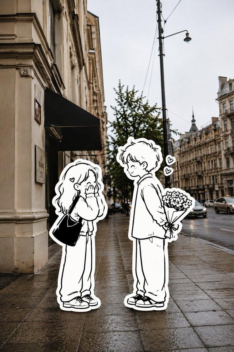
원본 장면, 구도, 시점, 건물, 거리, 사물, 조명, 그림자, 재질, 사진 질감을 정확히 유지한다. 인물만 미니멀한 흑백 손그림 스티커로 변경하되, 포즈, 동작, 비율, 의상 윤곽, 인원 수, 위치는 그대로 둔다. 거친 단선 일러스트레이션을 사용하며, 순수한 흑백만 사용하고 회색, 컬러, 그라데이션은 사용하지 않는다. 깔끔한 흰색 스티커 테두리를 포함한다. 사실적인 고해상도 사진 배경과 평면 2D 스케치 인물을 결합한 미니멀 그래피티/인스 에디토리얼 콜라주 스타일로 제작한다. 선명하고 디테일한 포토리얼리스틱 배경, 8K 룩. 화면 비율: 3:4 / 9:16.
상세 보기
GPT Image 2 프롬프트 전체 보기AI 이미지 프롬프트 둘러보기