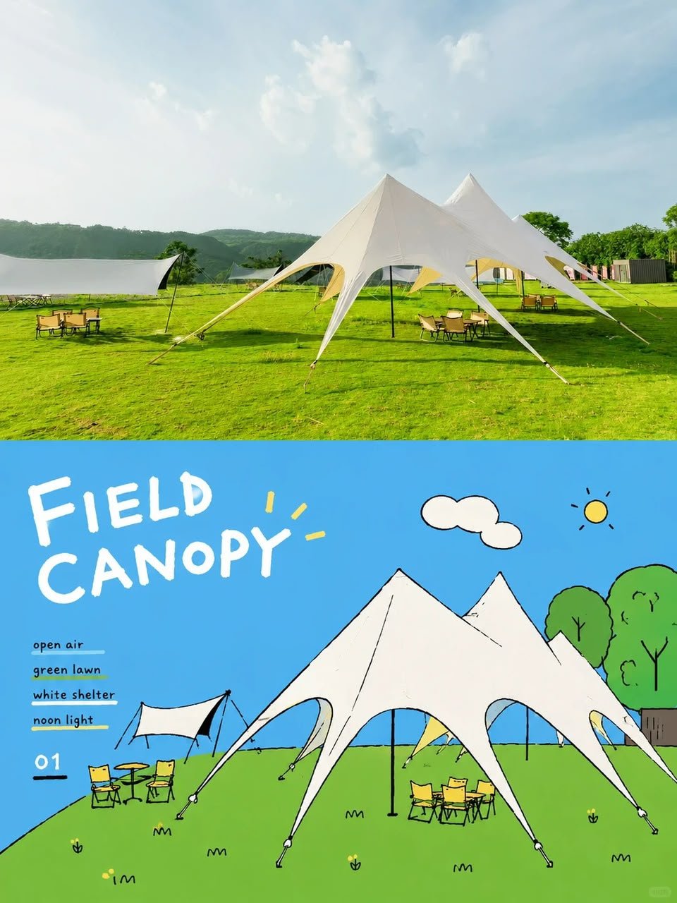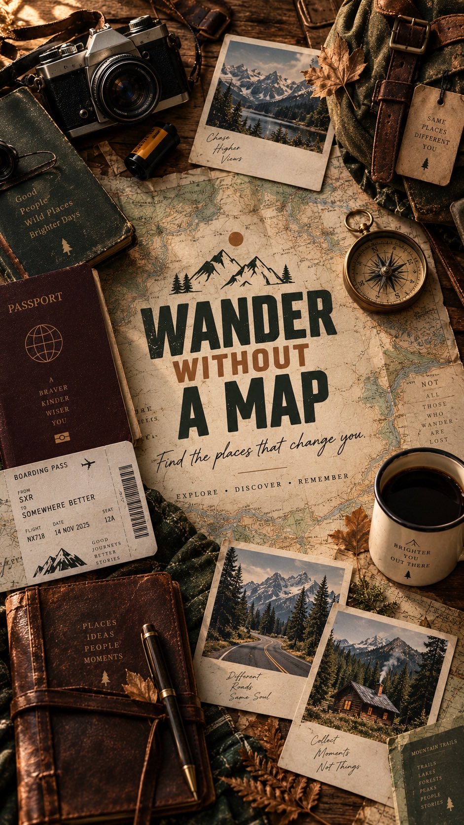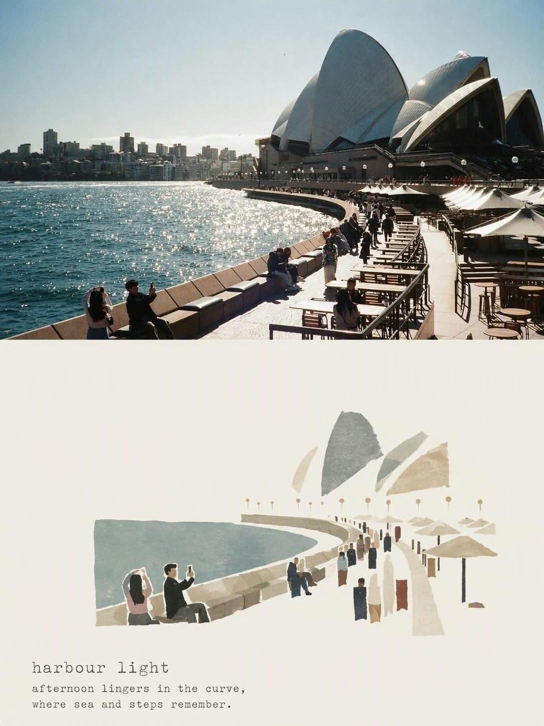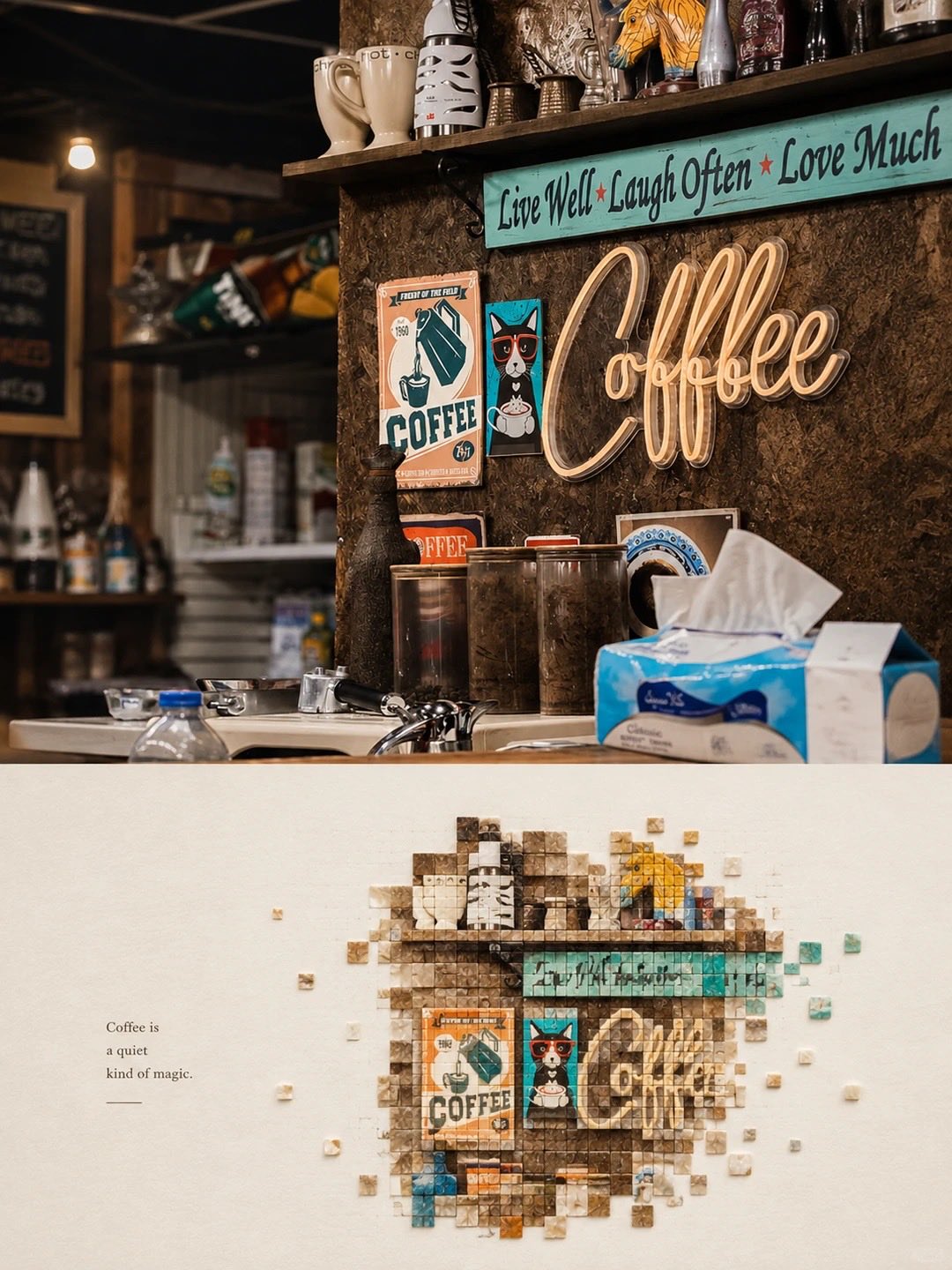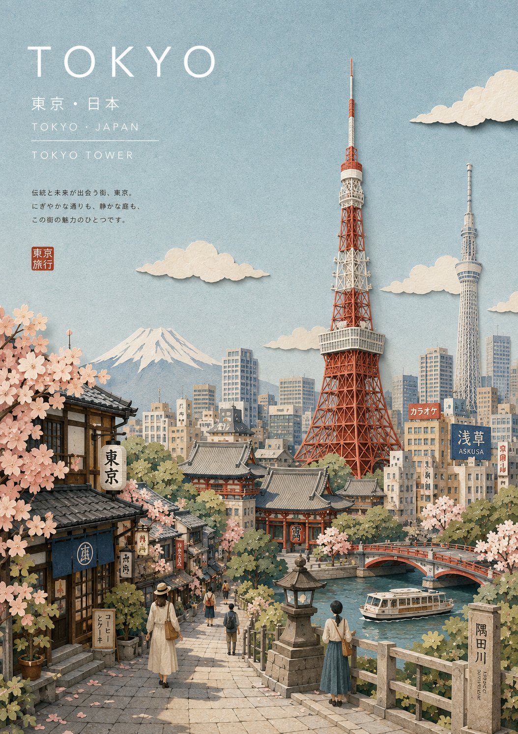
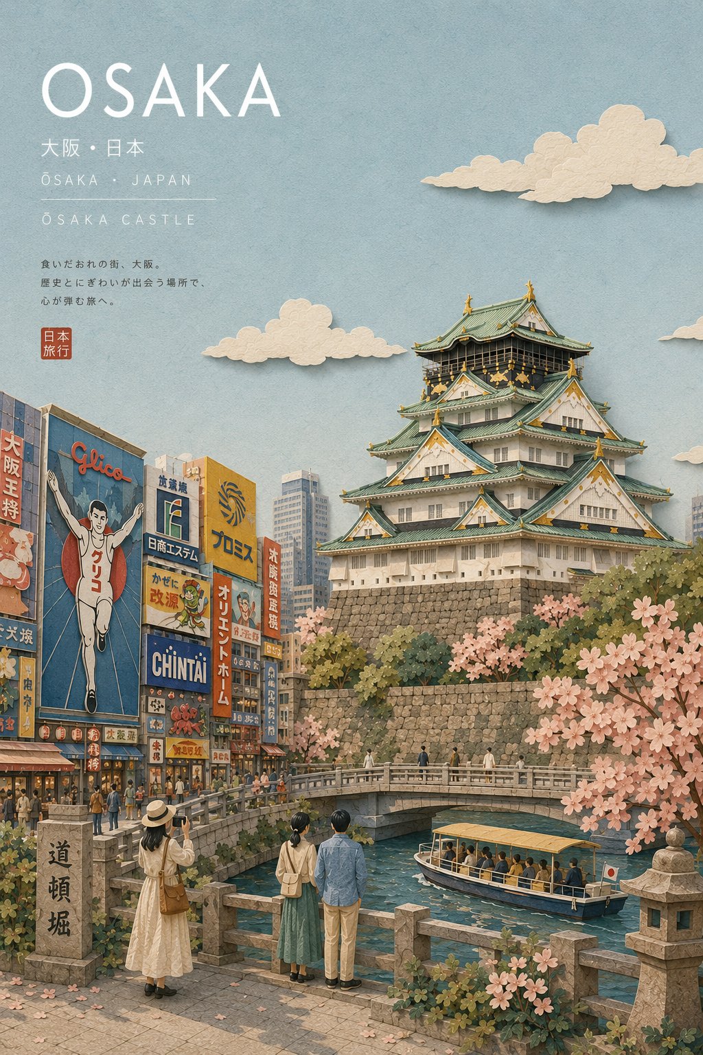
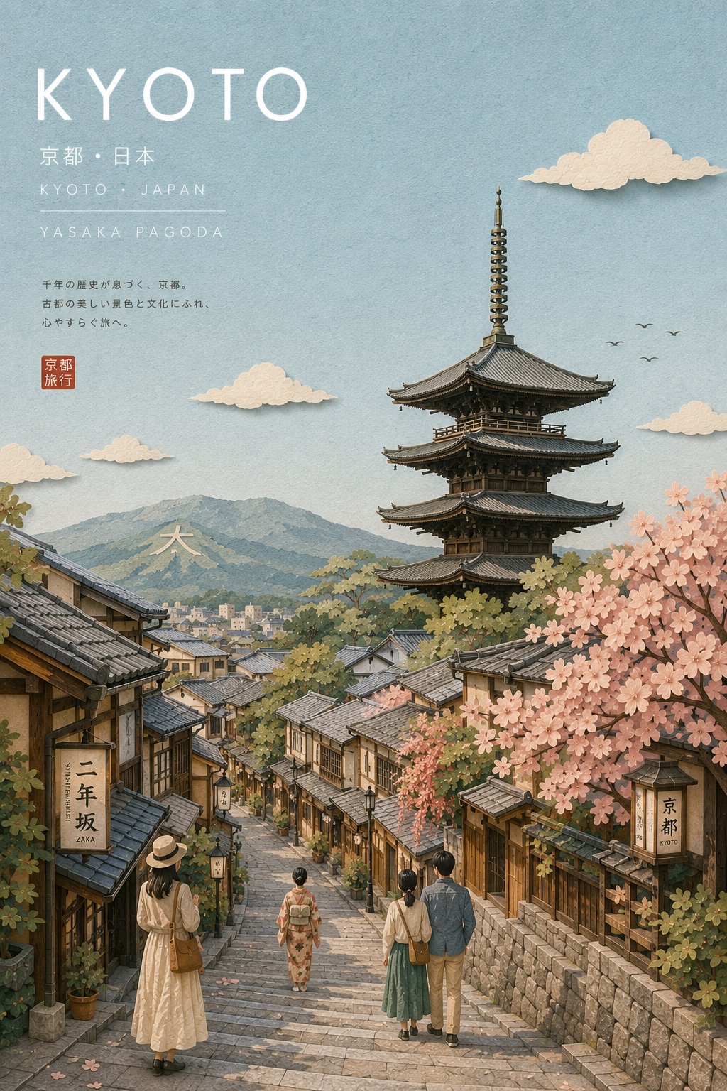
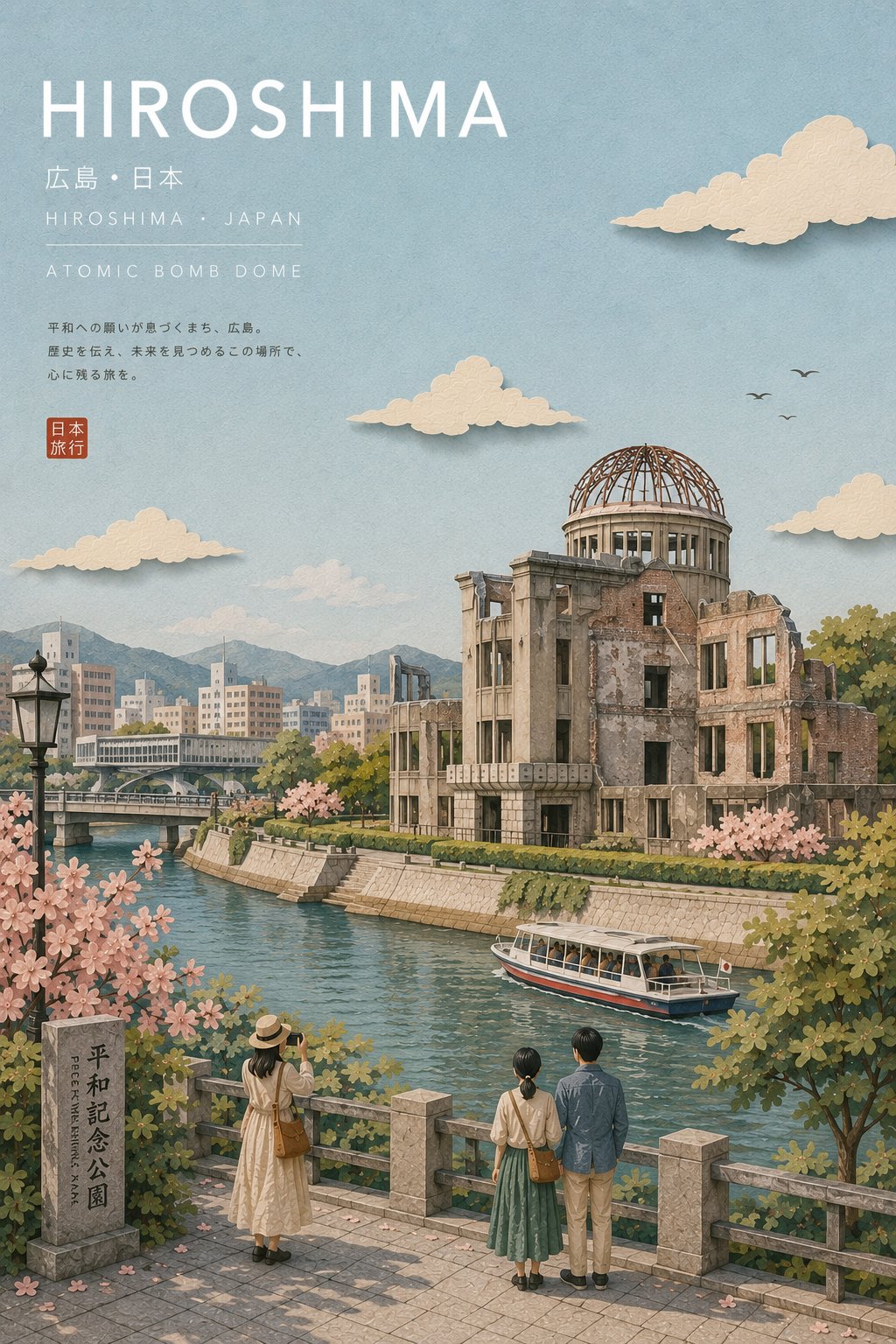
모든 도시 일본 관광 엽서
 GPT Image 2OpenAIimage
{{CITY_NAME}}을 위한 프리미엄 일러스트 여행 엽서를 정제된 일본 여행 잡지 미학으로 제작한다. 해당 도시의 국가, 현지 언어 표기명, 가장 상징적인 랜드마크, 주변 환경, 고유 건축 양식, 지리, 식생, 교통수단, 보조 시각적 디테일을 자동으로 조사하여 결정한다. 랜드마크는 지리적으로 정확하고 즉시 알아볼 수 있어야 한다. 비주얼 스타일: 우아한 일본 여행 에디토리얼 일러스트레이션, 수공예적 레이어드 페이퍼 콜라주와 섬세한 구아슈 및 수채화 텍스처의 결합, 정교한 일본 관광 브로슈어 미학, 차분하고 시적인 분위기, 세련된 구성, 촉감이 좋은 무광택 종이, 은은한 수제 모서리, 부드러운 물리적 종이 그림자, 섬세한 입체감. 구성: 프리미엄 엽서. 영화적 높은 시점에서 상징적 랜드마크를 주요 초점으로 배치한다. 주변을 도시에 맞는 정확한 스타일의 현지 건축물, 거리, 수변, 언덕, 산, 공원 또는 기타 실제 지리적 요소로 둘러싼다. 상단 부분은 타이포그래피를 위한 여유로운 네거티브 스페이스를 확보한다. 컬러 팔레트: 부드러운 파우더 블루, 따뜻한 아이보리, 크림, 차분한 세이지, 더스티 그린, 옅은 베이지, 소프트 그레이, 절제된 테라코타. 낮은~중간 채도, 부드러운 톤 전환, 강한 대비 없음. 건축: 정확하고 설득력 있는 현지 건축물. 신중하게 단순화된 형태, 정확한 비례, 특징적인 재료와 지붕선. 평범한 건물이나 무분별한 초고층 빌딩은 피한다. 인물: 환경과 자연스럽게 상호작용하는 아주 작은 단순화된 종이 오려붙이기 여행자와 보행자 몇 명만 포함한다—걷기, 관광, 앉기, 랜드마크 바라보기. 이들은 규모감을 제공하되 초점이 되지 않아야 한다. 자연: 섬세한 레이어드 단풍, 은은한 나무, 풀, 도시에 맞는 지역 식생. 물, 산, 해안선, 강 또는 기타 지리적 요소는 해당 장소와 실제로 연관된 경우에만 추가한다. 타이포그래피: 상단 왼쪽에 여유로운 자간으로 우아한 미니멀 일본 에디토리얼 타이포그래피를 배치한다: - 도시 이름 — 대문자 기하학적 산세리프 대형 - 현지 도시명 · 국가/지역 — 작은 세련된 산세리프 - 주요 랜드마크 — 넓은 자간의 소문자 대문자 텍스트 타이포그래피는 오버레이처럼 보이지 않고 아트워크에 통합된 느낌이어야 한다. 조명: 부드러운 자연 주간광, 약간의 아지랑이 분위기, 은은한 무광택 하이라이트, 미세한 레이어드 그림자, 평화롭고 향수 어린 무드. 소재: 고품질 무광택 아트지, 미세한 촉각적 입자, 레이어드 페이퍼 구조, 섬세한 수채화 안료 변화, 약간 불완전한 수공예 절단 모서리, 프리미엄 오프셋 인쇄 느낌. 카메라 느낌: 40–50mm 환산, 자연스러운 원근, 최소한의 왜곡, 강한 전경/중경/배경 분리, 신중한 아트 디렉션의 여행 사진 구성을 일러스트레이션으로 변환. 전체 무드: 조용하고, 우아하며, 사색적이고, 정통하며, 세련된 일본 여행 잡지, 소장 가치 있는 여행지 엽서, 프리미엄 관광 캠페인 품질. 피해야 할 것: 사진 리얼리즘, CGI, 플라스틱 렌더링, 평면 벡터 아트, 애니메이션, 만화 캐리커처, 일반적인 스카이라인, 부정확한 랜드마크, 허구적 건축물, 지리적으로 불가능한 풍경, 중복된 건물, 과도한 인물, 과대한 인물, 네온 컬러, 과포화, 거친 검은 그림자, 광택 표면, 어수선함, 과도한 윤곽선, 임의의 텍스트, 오타, 워터마크, 로고, 테두리, 프레임, UI 요소. {{CITY_NAME}}에서 전체 장면을 동적으로 생성하되 이 정제된 일본 여행 잡지 비주얼 아이덴티티를 정확히 유지한다.
상세 정보
- 종횡비
- 527:746
- 업데이트
- 2026. 8. 25.
카테고리
이 프롬프트 사용 방법
- 1위의 복사 버튼으로 프롬프트 전문을 복사하세요.
- 2OpenAI의 GPT Image 2 또는 비슷한 스타일을 지원하는 이미지 생성 도구를 엽니다.
- 3프롬프트를 붙여넣고, 피사체와 스타일 키워드를 원하는 내용으로 바꿉니다.
- 4예시의 설정(527:746 · Poster)에 맞춰 생성한 뒤 조금씩 다듬으세요——작은 표현 차이가 결과를 크게 바꿉니다.
자주 묻는 질문
이 이미지는 어떤 AI 모델로 생성되었나요?
이 이미지는 OpenAI의 GPT Image 2로 생성되었습니다. 페이지의 프롬프트가 생성에 사용된 원문 그대로입니다.
이 프롬프트는 어떤 설정을 사용하나요?
예시는 GPT Image 2에서 다음 설정으로 생성되었습니다: 527:746 · Poster. 같은 설정을 사용하면 가장 비슷한 결과를 얻을 수 있습니다.
비슷한 결과를 얻으려면 어떻게 하나요?
먼저 프롬프트를 그대로 복사한 뒤, 스타일·조명·구도 키워드는 유지하고 피사체만 바꿔보세요. 출력은 매번 달라지므로 여러 번 생성해 고르는 것이 좋습니다.
이 프롬프트를 수정해도 되나요?
물론입니다. 프롬프트는 출발점으로 쓸 때 가장 효과적입니다——묘사어, 화면 비율, 스타일 태그를 조정해 나만의 작품을 만들어 보세요.