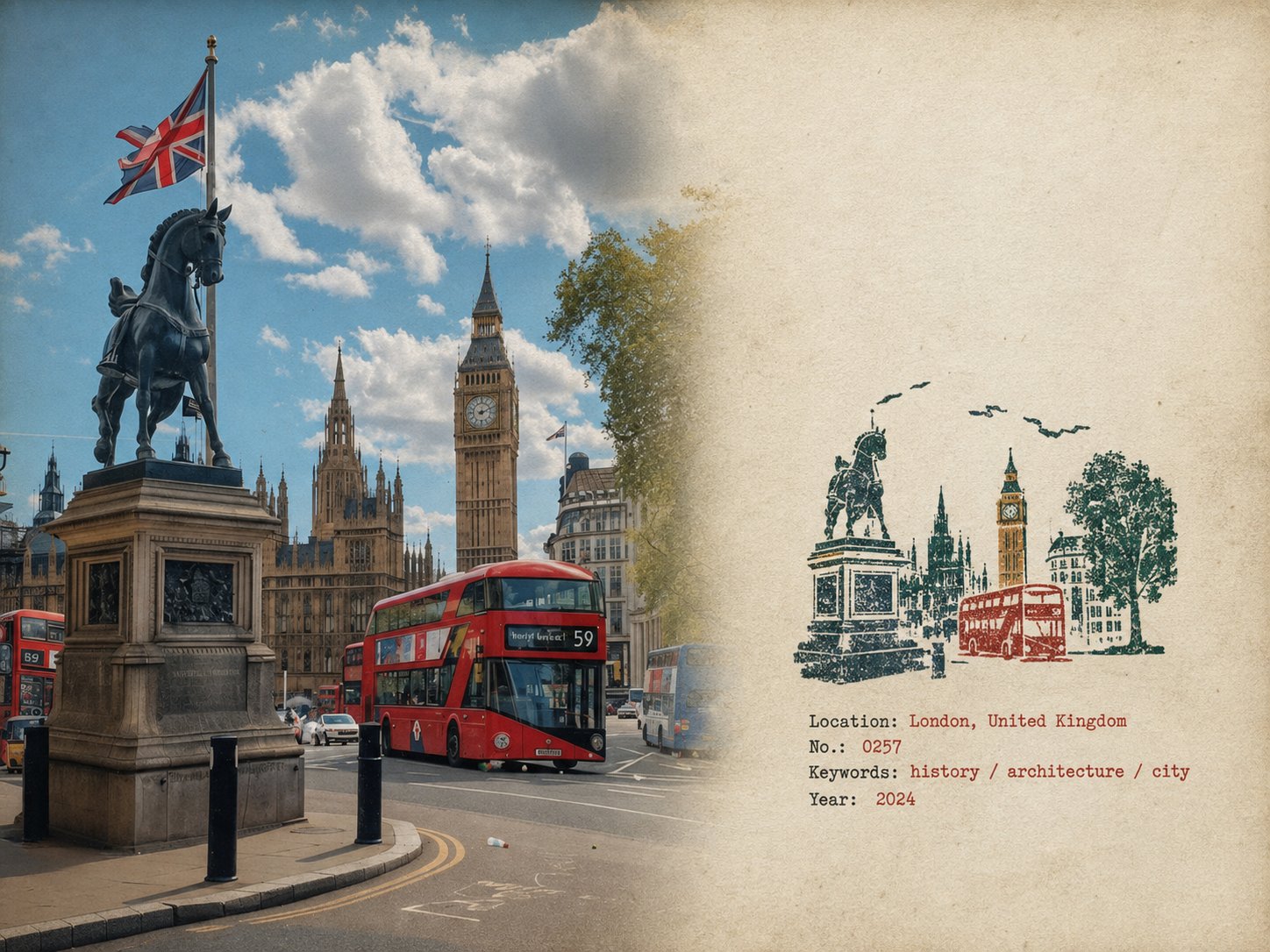
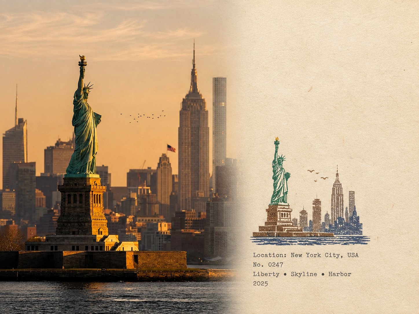
ゴム印トラベルフィールドノートポスター
 GPT Image 2OpenAIimage
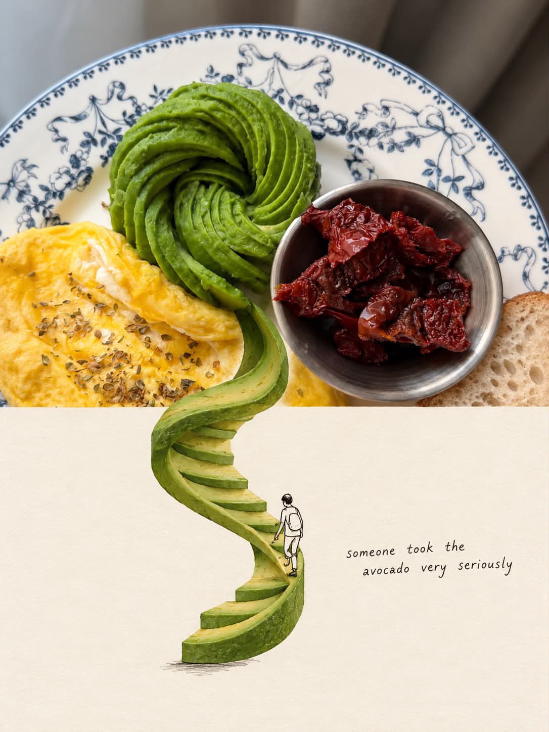
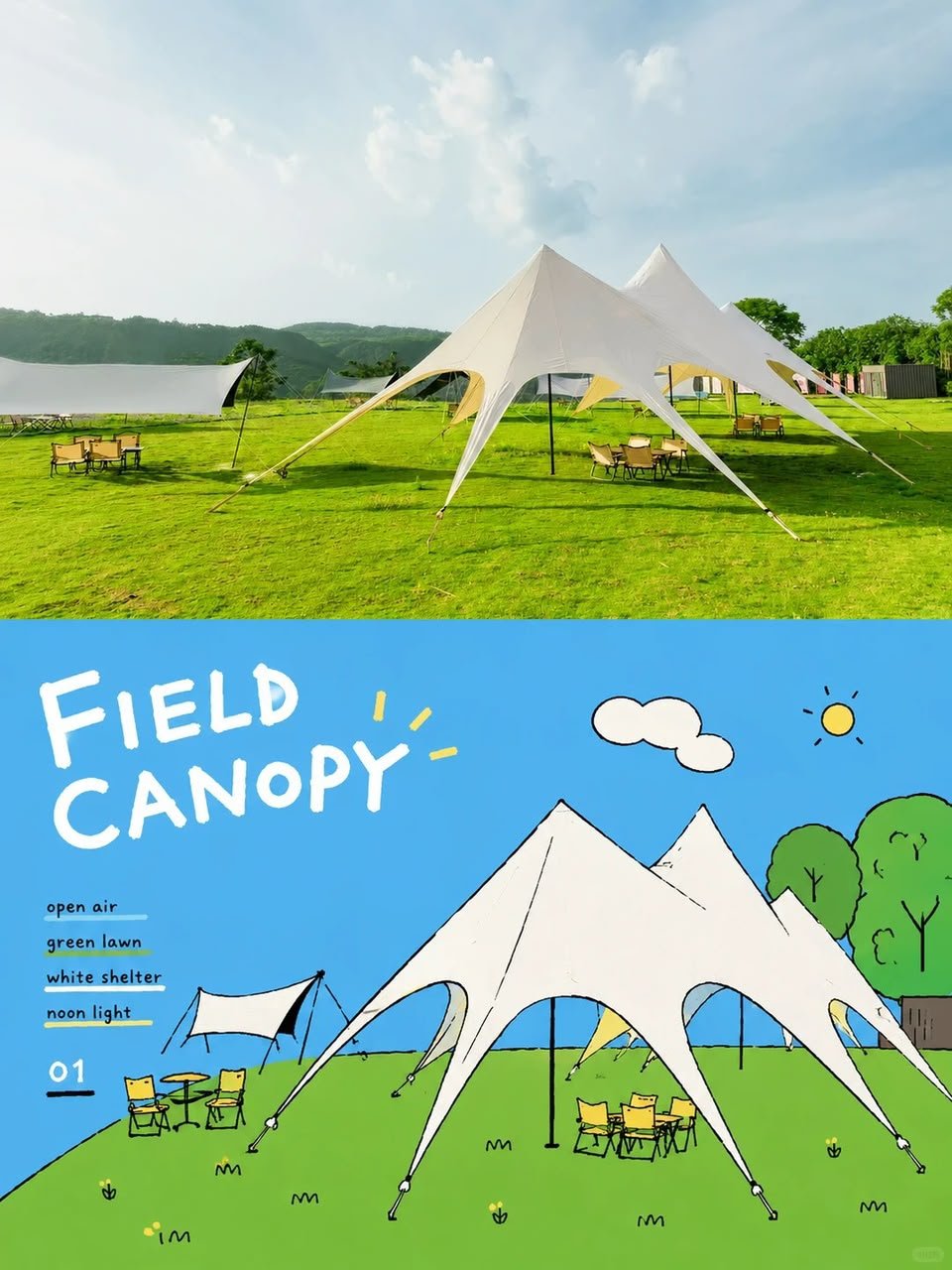
ゴム印トラベル・フィールドノート・ポスター — ナチュラル・リアリズム版 アップロードされた写真1枚ごとに、個別の「ゴム印トラベル・フィールドノート・ポスター」を作成する。各写真は個別に出力すること。コラージュや複数写真の合成は絶対にしないこと。 4:3の横長構図とし、左側の元写真と右側の経年紙フィールドノート領域の間は自然な視覚的遷移にする。明確な分割線は入れないこと。 左側 — 元写真 左側はフレームの約58%を占めること。 アップロードされた写真を視覚的に忠実かつ認識可能な状態に保つ。被写体、視点、地形、建築、植物、人物、空間関係、自然光、影、質感、全体的な雰囲気を維持すること。 写真を再設計したり再解釈したりしないこと。 ごく控えめな編集処理のみ施すこと: 穏やかなトーンバランス、抑制されたカラーグレーディング、やわらかくしたハイライト、極めて細かい自然なフィルムグレイン。AI生成画像ではなく、現地で撮影された本物の写真のように見えること。 4:3レイアウトに合わせるための自然なトリミングは許可するが、主要被写体を伸ばしたり、歪めたり、移動させたり、置き換えたり、描き直したりしないこと。 過度なシャープネス、HDR効果、人工的なクリア感、映画的なカラーグレーディング、完璧すぎるディテールは避けること。 右側 — 経年紙フィールドノート 右側はフレームの約42%を占めること。 温かみのあるオフホワイトで、わずかに経年変化した紙を使用し、信憑性のある物理的質感を持たせること。ごく微妙な紙繊維、細かいグレイン、かすかな手あと、マットな表面を含めること。 広い領域は完全に無印刷のままにすること。 紙は、デザインされたポスター背景ではなく、建築家のトラベルノートやフィールドジャーナルの実際の1枚のように感じられること。 過度なシミ、装飾的なテクスチャ、ヴィンテージフィルター、人工的なグランジは避けること。 小さなゴム印 アップロードされた写真を調査し、その場所を即座に認識可能にする視覚的特徴のみを特定すること。 それらをコンパクトで不完全なマルチカラーゴム印の印象に還元すること。 写真を要素ごとに再現しないこと。 積極的に簡略化し、最も意味のある視覚的関係のみを保持すること: - 特徴的な建築とシルエット - 重要な屋根、塔、ドーム、アーチ、または構造的形状 - 山や地形の輪郭 - 海岸線や道路の方向 - 認識可能な数本の樹木や植生の形状 - 簡略化された集落のレイヤー - 視覚的に関連する場合の1〜2つの重要な前景の形状 群衆、車、密集した窓、反復する建物、小さな植生、装飾的なオブジェクト、重要でない背景のディテールは除去すること。 結果は、旅行者が実際に小さなゴム印に彫ったもののように見えるべきであり、写真全体のミニチュアイラストレーションではないこと。 印は右側の紙領域の中央やや下に配置し、右側セクションの高さの約30〜38%を占めること。 周囲には十分な余白を確保すること。 大きなイラストレーションに拡大しないこと。 印の色と印刷の特徴 元写真から自然に抽出した約2〜4色の落ち着いたスポットカラーを使用すること。 使用可能な色は以下の通り: - カーボンブラック - ディープグリーン - レンガ色または落ち着いた赤 - オーカー - スレートブルー - トープまたはアースブラウン 写真が異なる抑制されたパレットを示唆する場合は、これらの色を無理に使用しないこと。 各色は独立した物理的なインク層として現れること。 印刷は真正な手作り感を出すこと: - わずかに不均一な圧力 - インクの小さな欠落 - かすれた部分 - 紙の地が見える部分 - 粗い彫刻のエッジ - 不規則な線の太さ - 小さな輪郭の途切れ - 粒状のインクテクスチャ - かすかなゴースト - わずかな自然な色層のズレ - 微妙なエッジのばらつき 不完全さは小さく信憑性のあるものであること。まるで印を手で紙に押したかのように。 完全に整列したデジタルレイヤー、滑らかなベクターエッジ、クリーンなグラデーション、人工的に誇張されたディストレスは避けること。 印はデジタルで描かれたものではなく、物理的に印刷されたように見えること。 フィールドノートのタイポグラフィ 写真内の実際の場所とイメージに基づいてのみ、少量のテキストを生成すること: ロケーション — 英語名 No. — 番号 3つの短い英語キーワード 西暦年 テキストは印の下または横の余白内に配置すること。 小さく控えめなタイプライターまたはアーカイブフィールドノートスタイルを使用すること。 タイポグラフィは、古いフィールドノートにタイプまたは印刷されたかのように、ごくわずかな機械的な不規則性を持つこと。 写真に対して控えめで二次的な存在にすること。 ロケーション名とすべての単語を正確に綴ること。 スローガン、ブランド、観光フレーズ、装飾的な引用、不要なテキストは追加しないこと。 全体的なリアリズム 完成画像は、建築家の個人ノートページに小さな手作りフィールドスタンプが添えられた、本物の旅行写真のように感じられること。 視覚的な完璧さよりも、微妙な物理的リアリズムを優先すること。 写真が最も強い視覚的要素であり続けること。 印は、写真から抽出された小さな記憶の断片のように感じられるべきであり、2つ目のイラストレーションではないこと。 抑制されたコントラスト、自然な不完全さ、信憑性のある紙のテクスチャ、わずかに不完全な印刷を使用すること。 最終結果は、静かで、触感的で、記録的で、収集価値があり、真正な手作り感のあるものにすること。 避けるべきこと 明確な分割線、円形のシール、切手の枠線、パーフォレーション、ワックスシール、ステッカーレイアウト、記念品カードデザイン、一般的な旅行テンプレート、滑らかなベクターロゴ、洗練されたデジタルイラストレーション、漫画スタイル、3Dレンダリング、プラスチック質感、光沢のあるグラデーション、過度な彩度、HDR効果、過剰なテキスト、装飾的なごちゃごちゃ、過度にクリーンな幾何学、完全に整列したインク層、密集したミニチュア建築、または元写真の変更・描き直し。
詳細情報
- タイプ
- AI 画像プロンプト
- アスペクト比
- 4:3
- 更新日
- 2026/08/25
このプロンプトの使い方
- 1上のコピーボタンでプロンプト全文をコピーします。
- 2OpenAI の GPT Image 2、または近いスタイルに対応した画像生成ツールを開きます。
- 3プロンプトを貼り付け、被写体やスタイルのキーワードを自分のイメージに置き換えます。
- 4作例の設定(4:3 · Nature · Poster · Realistic)に合わせて生成し、少しずつ調整を重ねます——わずかな言い回しの違いで結果が大きく変わります。
よくある質問
この画像はどの AI モデルで生成されましたか?
この画像は OpenAI の GPT Image 2 で生成されました。ページ上のプロンプトが、生成に使われた原文そのものです。
このプロンプトはどんな設定を使っていますか?
作例は GPT Image 2 で、次の設定で生成されました:4:3 · Nature · Poster · Realistic。同じ設定を使うと最も近い結果が得られます。
似た結果を得るにはどうすればいいですか?
まずプロンプトをそのままコピーし、スタイル・ライティング・構図のキーワードは残して被写体だけ置き換えます。出力は毎回変わるので、数回生成して選びましょう。
このプロンプトを改変してもいいですか?
もちろんです。プロンプトは出発点として使うのが最適——記述語やアスペクト比、スタイルタグを調整して、自分だけの作品に仕上げてください。