
LogoAhaPrompt
  • プロンプト
  • 厳選
  • モデル
  • 投稿
  • ブログ
AhaPromptAhaPrompt

画像・動画・音声を網羅、主要モデル全対応の AI プロンプトライブラリ

Built withLogoNEXTY.DEV
探す
  • すべてのプロンプト
  • 厳選プロンプト
  • 画像プロンプト
  • 動画プロンプト
  • 音声プロンプト
  • AI モデル
  • プロンプトを投稿
  • ブログ
言語
  • English
  • 中文
  • 日本語
  • 한국어

著作権所有 © 2026 AhaPrompt 全著作権保有。

プライバシーポリシー利用規約
ホームAI プロンプトライブラリAI 画像プロンプト手描きトラベルポスター
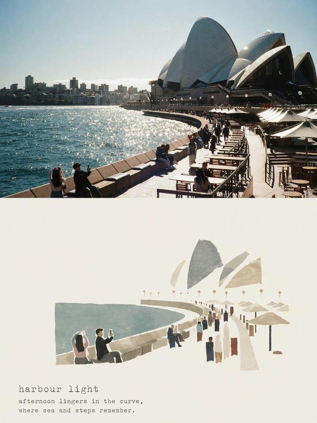
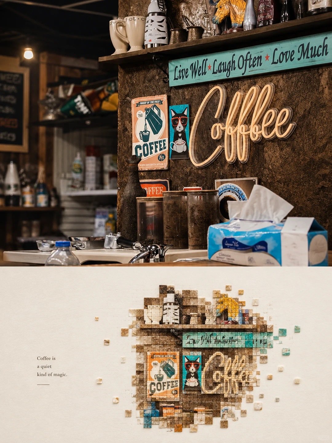
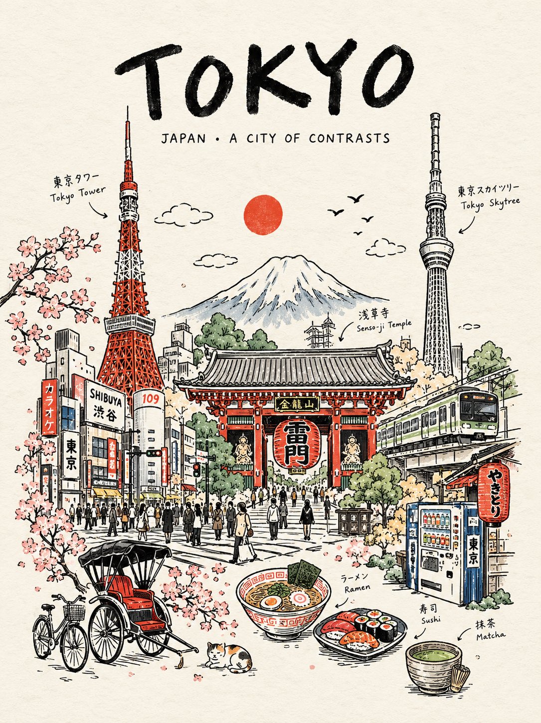
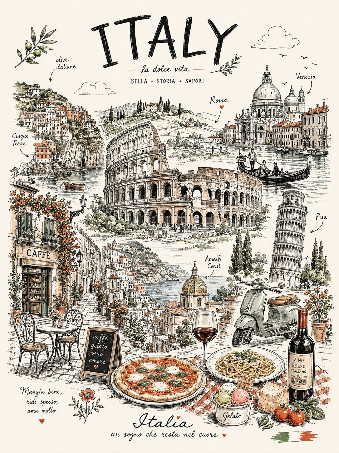
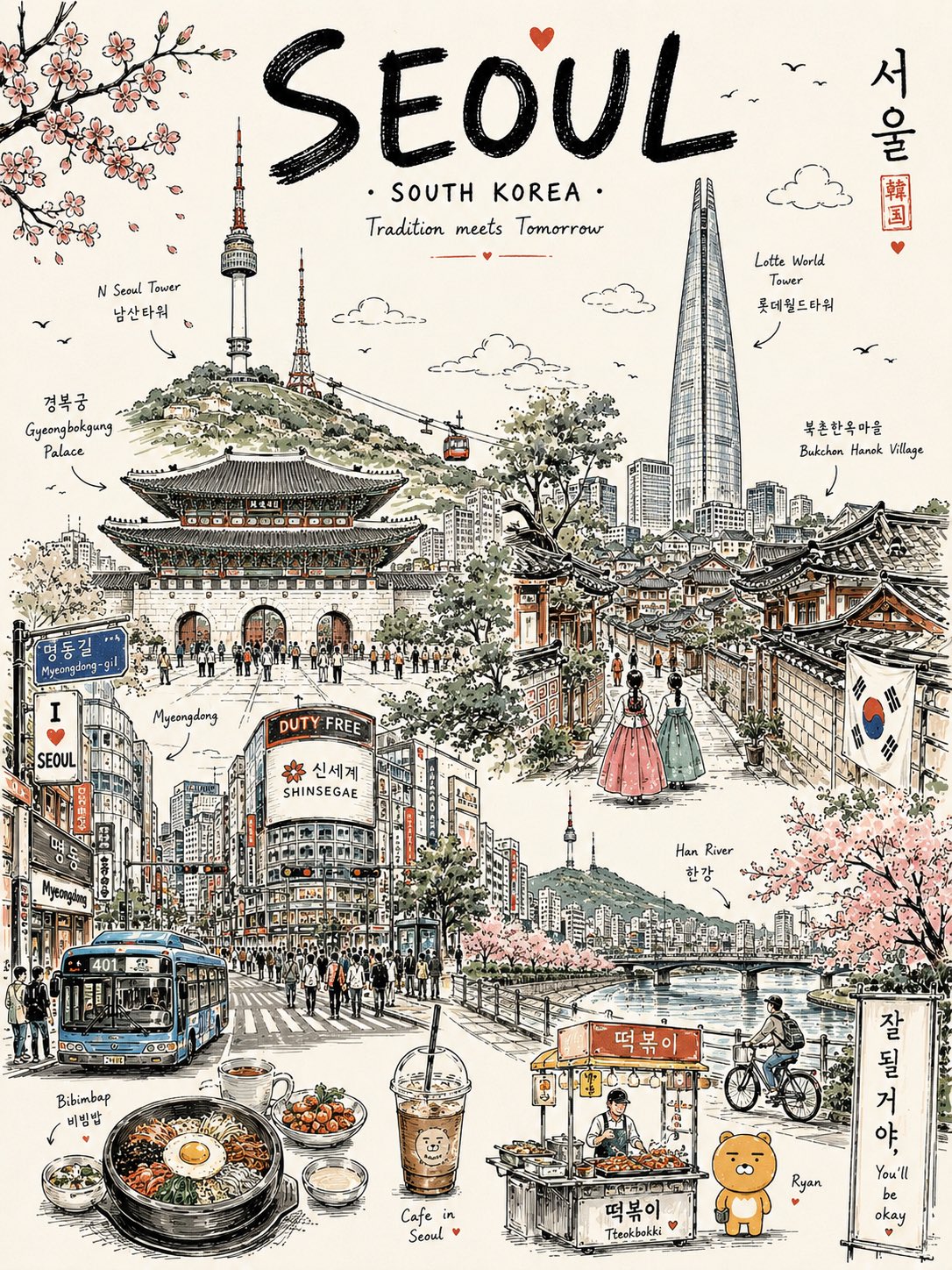
手描きトラベルポスター — AI image prompt — GPT Image 2 — Poster, Vintage - 1
手描きトラベルポスター — AI image prompt — GPT Image 2 — Poster, Vintage - 2
手描きトラベルポスター — AI image prompt — GPT Image 2 — Poster, Vintage - 3

手描きトラベルポスター

OpenAIGPT Image 2OpenAIimage

Create a premium vertical 4:5 travel poster for [COUNTRY], illustrated as one elegant continuous hand-drawn line-art composition. Instead of placing landmarks separately, make them flow organically into one another, as if the entire country was drawn in a single uninterrupted travel sketch. Combine the country’s most recognizable architecture, landscapes, culture, food, transportation, nature, and tiny everyday details into one beautifully balanced scene. Use bold black ink outlines, delicate cross-hatching, playful imperfect hand-drawn details, subtle vintage-poster typography, and a mostly warm off-white paper background. Add only 2–3 signature accent colors inspired by the country. Include: One dominant iconic landmark A second architectural landmark subtly integrated into the skyline A famous natural landscape in the background Local transportation Traditional clothing or cultural detail A recognizable food or drink Small street-life moments Birds, clouds, plants and tiny decorative elements Handwritten labels pointing to selected elements At the top, use a large playful hand-lettered title: “[COUNTRY]” Below it, add a tiny elegant subtitle: “A little world to discover” Make the composition feel collected, whimsical, editorial, nostalgic and handcrafted, like a beautifully illustrated travel journal rather than a generic tourist poster. Avoid photorealism, gradients, 3D rendering and excessive colors. Clean white space around the illustration, highly detailed ink work, charming imperfections, premium stationery aesthetic, screen-print texture, sophisticated yet playful.

詳細情報
タイプ
AI 画像プロンプト
アスペクト比
217:290
更新日
2026/08/25
カテゴリ
PosterVintage
Source

このプロンプトの使い方

  1. 1上のコピーボタンでプロンプト全文をコピーします。
  2. 2OpenAI の GPT Image 2、または近いスタイルに対応した画像生成ツールを開きます。
  3. 3プロンプトを貼り付け、被写体やスタイルのキーワードを自分のイメージに置き換えます。
  4. 4作例の設定(217:290 · Poster · Vintage)に合わせて生成し、少しずつ調整を重ねます——わずかな言い回しの違いで結果が大きく変わります。

よくある質問

この画像はどの AI モデルで生成されましたか?

この画像は OpenAI の GPT Image 2 で生成されました。ページ上のプロンプトが、生成に使われた原文そのものです。

このプロンプトはどんな設定を使っていますか?

作例は GPT Image 2 で、次の設定で生成されました:217:290 · Poster · Vintage。同じ設定を使うと最も近い結果が得られます。

似た結果を得るにはどうすればいいですか?

まずプロンプトをそのままコピーし、スタイル・ライティング・構図のキーワードは残して被写体だけ置き換えます。出力は毎回変わるので、数回生成して選びましょう。

このプロンプトを改変してもいいですか?

もちろんです。プロンプトは出発点として使うのが最適——記述語やアスペクト比、スタイルタグを調整して、自分だけの作品に仕上げてください。
GPT Image 2 のプロンプトをもっと見る

Create a premium vertical aspect ratio 4:5 travel poster for [COUNTRY], illustrated as one elegant c — AI image prompt — GPT Image 2
PosterVintage
OpenAIGPT Image 2
Create a premium vertical aspect ratio 4:5 travel poster for [COUNTRY], illustrated as one elegant continuous hand-drawn line-art composition. Instead of placing landmarks separately, make them flow organically into one another, as if the entire country was drawn in a single uninterrupted travel sketch. Combine the country’s most recognizable architecture, landscapes, culture, food, transportation, nature, and tiny everyday details into one beautifully balanced scene. Use bold black ink outlines, delicate cross-hatching, playful imperfect hand-drawn details, subtle vintage-poster typography, and a mostly warm off-white paper background. Add only 2–3 signature accent colors inspired by the country. Include: One dominant iconic landmark A second architectural landmark subtly integrated into the skyline A famous natural landscape in the background Local transportation Traditional clothing or cultural detail A recognizable food or drink Small street-life moments Birds, clouds, plants and tiny decorative elements Handwritten labels pointing to selected elements At the top, use a large playful hand-lettered title: “[COUNTRY]” Below it, add a tiny elegant subtitle: “A little world to discover” Make the composition feel collected, whimsical, editorial, nostalgic and handcrafted, like a beautifully illustrated travel journal rather than a generic tourist poster. Avoid photorealism, gradients, 3D rendering and excessive colors. Clean white space around the illustration, highly detailed ink work, charming imperfections, premium stationery aesthetic, screen-print texture, sophisticated yet playful.
詳細を見る
プレミアム・ミニマルなフラットベクター旅行ポスター for [CITY_NAME]、3:4 縦型。

[CITY_NAME] のために独自にデザインされた、新鮮で風通しが良く、上品なシティトラベルポス — AI image prompt — GPT Image 2
CityscapeMinimalistPoster
OpenAIGPT Image 2
プレミアム・ミニマルなフラットベクター旅行ポスター for [CITY_NAME]、3:4 縦型。 [CITY_NAME] のために独自にデザインされた、新鮮で風通しが良く、上品なシティトラベルポスターを作成すること。他の都市からの使い回しにしないこと。 【重要】構図のルール: 描き始める前に、[CITY_NAME] の独自の「都市のDNA」を特定すること: 1. 主要ランドマークまたはスカイラインの特徴を1つ、 2. 地元の移動手段または交通に関する要素を1つ、 3. 日常のライフスタイルのひとコマを1つ、 4. 在来植物または地域の環境的ディテールを1つ、 5. この都市に特に合う空間構成を1つ。 同じレイアウトの型を都市間で使い回さないこと。 以下のような定型パターンに頼らないこと: - 常に右側にあるショップ、 - 常に左側にある看板、 - 常にカフェのテーブルに座る人々、 - 常に同じ手前の花壇、 - 常に同じ位置の街灯、 - 常に同じウォーターフロント遊歩道の構図。 各都市は、実際の雰囲気から選んだ異なるシーン構造を持つこと: 港の展望スポット、路地の街並み、川辺の公園、ビーチ沿いの散歩道、丘の上の展望台、マーケットの角、トラム通り、フェリー乗り場、植物園、旧市街の通り、海岸遊歩道、文化広場、またはスカイラインの見晴らし。 タイポグラフィ: 「[CITY_NAME]」を左上に配置し、タイポグラフィのために十分な余白を確保すること。 都市の雰囲気に合う、洗練された短い英語のキャプションを1つ追加すること。 タイポグラフィはエレガントでミニマル、かつプレミアムに保つこと。 シーンの適応: [CITY_NAME] に合わせてシーンを自動的に適応させること。 象徴的な主要ランドマークを1つ、メインの視覚的アンカーとして使用すること。 その都市に本当に属するサポート的なローカルディテールを2〜4つだけ追加すること。 ランドマークのコラージュを作らないこと。 背景を過密にしないこと。 人物: 3〜6人の小さな人物のみを使用すること。 各人物は、その都市特有の日常的な動作を行うこと: 歩く、スケッチする、自転車に乗る、トラムを待つ、フェリーに乗る、サーフボードを運ぶ、静かに写真を撮る、公園で読書する、水辺をジョギングする、小さなマーケットを見て回る。 群衆シーンを避けること。 支配的なヒーローキャラクターを1人置かないこと。 人物は、以前のポスターからコピーされたものではなく、自然に都市の中に配置されているように見せること。 ローカルディテール: 地元の交通機関、標識、ストリートファニチャー、植物、食べ物、建築、レジャーのディテールは、その都市に合う場合にのみ使用すること。 交通標識は、常に大きな縦型看板として表示しないこと。 トラム停車駅マーカー、フェリールート案内板、駅時計、自転車レーン標識、ビーチパトロール旗、小さなメトロアイコン、またはペイントされた路面標示として控えめに表示してもよい。 スタイル: 日本の文房具の美学、 高級ステッカーイラスト、 プレミアムな商業用フラットベクター旅行ポスター、 クリーンな細いアウトライン、 一貫した線の太さ、 フラットカラーのみ、 ソフトでミニマルなシェイプ、 落ち着いたエディトリアルな構図。 パレット: 淡いパウダーブルー、ソフトスカイブルー、ミストブルーを大気的なベースとして使用すること。 ウォームクリーム、ソフトベージュ、セージグリーン、くすんだグレーグリーンを建築と自然に使用すること。 ダスティローズまたはブラッシュピンクは、花、標識、日よけ、衣類、または小さな装飾ディテールにのみ、ごく小さなアクセントとして使用すること。 パレットは洗練され、トーンダウンされ、高級感のあるものに保つこと。 ムード: 新鮮、ミニマル、エレガント、落ち着いた、洗練された、 高級旅行ポストカード、 静かなライフスタイルブランディング、 開放感、余白、リラックスした地元のリズム。 ネガティブプロンプト: リアリズムなし。 水彩なし。 絵画的なエフェクトなし。 フォトリアリズムなし。 重いシェーディングなし。 グラデーションなし。 紙のテクスチャなし。 過密な背景なし。 繰り返しの「右側カフェ」レイアウトなし。 繰り返しの「左側看板」レイアウトなし。 一般的な観光ポスターのコラージュなし。 混雑した通りなし。 大きすぎる人物なし。 劇的な照明なし。
詳細を見る
タイトル:BMW M4コンペティション — ヴィンテージ・モダニスト・トラベルポスター

BMW M4コンペティションを題材にした、ヴィンテージ・モダニスト・トラベルアートに着想を得た、洗練されたエデ — AI image prompt — GPT Image 2
PosterVintage
OpenAIGPT Image 2
タイトル:BMW M4コンペティション — ヴィンテージ・モダニスト・トラベルポスター BMW M4コンペティションを題材にした、ヴィンテージ・モダニスト・トラベルアートに着想を得た、洗練されたエディトリアル・トラベルポスターイラストレーションを制作する。BMW M4コンペティションを主役とし、ドラマチックな斜め前方からのスリークォータービューで、重層的な現代都市景観を背景に配置する。象徴的なキドニーグリル、彫刻的なワイドボディのプロポーション、攻撃的な空力ディテール、シャープなLEDヘッドライト、パフォーマンス重視のスタンスを、優雅なグラフィック精度で描き出す。車の周囲には、洗練された幾何学的な建築要素、現代的な都市のシルエット、なだらかな道路のカーブ、様式化された橋、遠くの山々、繊細な環境ディテールを配する。オーバーラップするアーチ、長方形、円、階段状の建築形状、角ばった影、微妙なペーパーテクスチャのオーバーレイを用いた、洗練された幾何学的コラージュ構成とする。パウダーブルー、クリーム、ウォームテラコッタ、ダスティコーラル、セージグリーン、チャコール、ディープネイビーを基調とした落ち着いたプレミアムパレットに、BMWに着想を得た控えめなブルーのアクセントを加える。ミニマルなハンドペイントイラストレーション、わずかに粒子感のあるヴィンテージ印刷テクスチャ、柔らかな自然光、クリーンな自動車のライン、バランスの取れたネガティブスペース、洗練されたヨーロピアン・トラベルポスターの美学、ノスタルジックでありながら現代的、精緻でありながらすっきりとした構成。タイトル「BMW M4 COMPETITION」を上部中央に、細く広い字間の大文字タイポグラフィで配置する。縦4:5の構図、プレミアムなアートプリント品質、優雅でまとまりのある仕上がり。フォトリアリズムなし、グラデーションなし、過剰なテキストなし。
詳細を見る
プレミアム・ミニマルなフラットベクター旅行ポスター、[CITY_NAME]用、3:4縦型フォーマット。

[CITY_NAME]の本物の視覚的個性を捉えた、独創的で洗練された旅行ポスターをデザインする — AI image prompt — GPT Image 2
MinimalistPoster
OpenAIGPT Image 2
プレミアム・ミニマルなフラットベクター旅行ポスター、[CITY_NAME]用、3:4縦型フォーマット。 [CITY_NAME]の本物の視覚的個性を捉えた、独創的で洗練された旅行ポスターをデザインする。構図は、再利用可能なテンプレートに従うのではなく、この都市のために意図的に作られたものでなければならない。 都市のアイデンティティ まず[CITY_NAME]の独自の視覚的特徴を解釈し、以下の5つの要素を中心にシーンを構築する: 1. 認識可能なランドマーク、建築的特徴、またはスカイラインの要素。 2. その都市特有の移動手段。 3. さりげない日常のライフスタイルのひとコマ。 4. 在来植物、景観、または環境的特徴。 5. その都市に自然に属する構図と視点。 シーン全体の構造は都市ごとに変化させなければならない。同じオブジェクトの配置や視覚的な定型を繰り返し使用してはならない。 可能な構図には以下が含まれる: 港の眺望、狭い歴史的街路、川沿いの庭園、海岸沿いの遊歩道、高台からの都市展望、活気ある市場の通路、路面電車の並木道、フェリーターミナル、植物園の風景、歴史的広場、ビーチプロムナード、文化広場、またはスカイラインテラス。 [CITY_NAME]を最もよく表す構図を選択すること。 タイポグラフィ 「[CITY_NAME]」を左上エリアに配置し、余白をたっぷりと清潔に確保する。 その都市の雰囲気に着想を得た、短く洗練された英語のタグラインを1つ追加する。 タイポグラフィは、控えめで、エディトリアル的で、余白が広く、プレミアムな印象にすること。テキストがアートワークを支配してはならない。 視覚的ヒエラルキー 1つの象徴的なランドマークまたは建築的特徴をメインの焦点として使用する。 それを補完するのは、厳選した2〜4個のローカル要素のみ。追加するディテールはすべて、その場所の感覚を強化するものでなければならない。 ランドマークの寄せ集めやポストカード風コラージュは避ける。シーンは視覚的に静かで、意図的なものに保つ。 人物 3〜6人の小規模な人物のみを含める。 各人物には、地元の生活に関連した説得力のあるアクティビティを与える。例: 歴史的な路地を歩く、自転車に乗る、公共交通機関を待つ、建築をスケッチする、フェリーに乗る、屋外で読書する、静かに写真を撮る、ビーチ用品を運ぶ、市場を覗く、水辺をジョギングする。 群衆は避け、特定の人物を主役にしないこと。人物は環境に自然に溶け込むようにする。 ローカルな特徴 [CITY_NAME]に本当に合う場合にのみ、都市固有の要素を使用する: - 地元の交通機関 - 建築 - ストリートファニチャー - 植生 - 小さな標識や案内表示 - 地元の食べ物の要素 - レクリエーション活動 - 舗装のマーキング - 文化的ディテール 交通機関や標識は控えめに保つ。大きな看板を常に使用する代わりに、小さなトランジットマーカー、駅の時計、フェリーの案内パネル、自転車のシンボル、路面のペイントマーキング、ビーチフラッグ、控えめなメトロのアイコンなどを通じて、ディテールを自然に組み込む。 アートディレクション 和文ステーショナリーに着想を得た美学、 ラグジュアリーステッカーイラストレーション、 プレミアムな商業ベクターアートワーク、 モダンなエディトリアル旅行ブランディング、 清潔で繊細なアウトライン、 均一な線の太さ、 シンプルな幾何学的フォルム、 フラットカラーイラストレーション、 柔らかなシェイプ、 バランスの取れた視覚的リズム、 ハイエンドなミニマルポストカードデザイン。 カラーシステム 主に以下の色で雰囲気を構築する: ペールパウダーブルー、ソフトスカイブルー、ミストブルー、涼しげな風通しの良いブルー。 これらとバランスを取る: ウォームアイボリー、クリーム、ソフトベージュ、くすんだセージ、グレーグリーン、控えめな建築的ニュートラルカラー。 ダスティローズまたはくすんだブラッシュピンクは、花、衣類のディテール、小さな標識、日よけ、装飾オブジェクトなど、ごく小さな視覚的アクセントにのみ使用する。 色は、柔らかく、洗練され、わずかに彩度を抑え、まとまりのあるものにする。 ムード 爽やか、風通しの良い、平和、洗練、現代的、エレガント。 最終的なアートワークは、プレミアムなブティック旅行ポストカードやラグジュアリーライフスタイルブランドのイラストレーションのように感じられ、たっぷりとした余白とリラックスした場所の感覚を持つこと。 重要な品質ルール 各都市は独自の視覚的アイデンティティを持たなければならない。 カメラアングル、シーン構造、ランドマークの配置、前景の処理、補助的なディテールを都市の特徴に応じて変更すること。 既存の構図の中の[CITY_NAME]を単に置き換えるだけではいけない。 ネガティブプロンプト フォトリアリズムなし。 リアリズムなし。 水彩なし。 絵画的な筆致なし。 グラデーションなし。 強い影なし。 劇的なシネマティックライティングなし。 紙のテクスチャなし。 過剰なディテールなし。 雑然とした背景なし。 ランドマークのコラージュなし。 混雑した通りなし。 特大のキャラクターなし。 支配的なヒーローキャラクターなし。 反復的なカフェ構図なし。 固定された看板位置なし。 同一の前景処理なし。 一般的な観光ポスターの定型なし。 他の都市からコピーしたレイアウトなし。 不要な装飾要素なし。
詳細を見る
Create a premium illustrated travel postcard for {{CITY_NAME}} in a refined Japanese tourism-magazin — AI image prompt — GPT Image 2
Poster
OpenAIGPT Image 2
Create a premium illustrated travel postcard for {{CITY_NAME}} in a refined Japanese tourism-magazine aesthetic. Automatically research and determine the city’s country, local-language name, most iconic landmark, authentic surrounding environment, distinctive local architecture, geography, vegetation, transportation, and secondary visual details. The landmark must be geographically accurate and instantly recognizable. Visual style: elegant Japanese travel editorial illustration, handcrafted layered paper collage combined with delicate gouache and watercolor textures, sophisticated Japanese tourism brochure aesthetic, calm and poetic atmosphere, refined composition, tactile matte paper, subtle handmade edges, soft physical paper shadows, delicate atmospheric depth. Composition: premium postcard. Use a cinematic elevated viewpoint with the iconic landmark as the main focal point. Surround it with accurately styled local buildings, streets, waterfronts, hills, mountains, parks, or other authentic geographic elements appropriate to the city. Keep the upper portion spacious with generous negative space for typography. Color palette: soft powder blue, warm ivory, cream, muted sage, dusty green, pale beige, soft gray, restrained terracotta. Low-to-medium saturation, gentle tonal transitions, no harsh contrast. Architecture: precise and believable local architecture with carefully simplified shapes, accurate proportions, characteristic materials and rooflines. Avoid generic buildings and random skyscrapers. People: include only a few tiny simplified paper-cut travelers and pedestrians naturally interacting with the environment—walking, sightseeing, sitting, or looking toward the landmark. They should provide scale without becoming the focus. Nature: delicate layered foliage, subtle trees, grasses and regional vegetation appropriate to the city. Add water, mountains, coastline, rivers, or other geographic features only when genuinely associated with the location. Typography: place elegant minimalist Japanese editorial typography in the upper-left with generous spacing: - CITY NAME — large uppercase geometric sans-serif - LOCAL CITY NAME · COUNTRY/REGION — small refined sans-serif - PRIMARY LANDMARK — small uppercase text with wide letter spacing Typography should feel integrated into the artwork, not like an overlay. Lighting: soft natural daytime light, slightly hazy atmosphere, gentle matte highlights, subtle layered shadows, peaceful and nostalgic mood. Material: high-quality matte art paper, fine tactile grain, layered paper construction, delicate watercolor pigment variation, slightly imperfect handcrafted cut edges, premium offset-print character. Camera feel: 40–50mm equivalent, natural perspective, minimal distortion, strong foreground/midground/background separation, carefully art-directed travel photography composition translated into an illustration. Overall mood: quiet, elegant, contemplative, authentic, sophisticated Japanese travel magazine, collectible destination postcard, premium tourism campaign quality. Avoid: photorealistic photography, CGI, plastic rendering, flat vector art, anime, cartoon caricature, generic skyline, inaccurate landmark, fictional architecture, geographically impossible scenery, duplicated buildings, excessive people, oversized people, neon colors, oversaturation, harsh black shadows, glossy surfaces, clutter, excessive outlines, random text, misspelled typography, watermark, logo, border, frame, UI elements. Generate the entire scene dynamically from {{CITY_NAME}} while maintaining this exact refined Japanese tourism-magazine visual identity.
詳細を見る
Rubber Stamp Travel Field Notes Poster — Natural Realism Version

Create a separate “Rubber Stamp Tr — AI image prompt — GPT Image 2
PosterRealisticNature
OpenAIGPT Image 2
Rubber Stamp Travel Field Notes Poster — Natural Realism Version Create a separate “Rubber Stamp Travel Field Notes Poster” for each photo I upload. Output each photo individually. Never create a collage or combine multiple photos. Use a 4:3 landscape composition with a natural visual transition between the original photograph on the left and the aged-paper field-note area on the right. Do not add an obvious dividing line. LEFT — ORIGINAL PHOTOGRAPH The left side should occupy roughly 58% of the frame. Keep the uploaded photograph visually authentic and recognizable. Preserve the original subject, perspective, terrain, architecture, plants, people, spatial relationships, natural light, shadows, textures, and overall atmosphere. Do not redesign or reinterpret the photograph. Only apply a very subtle editorial photo treatment: gentle tonal balancing, restrained color grading, slightly softened highlights, and extremely fine natural film grain. It should still look like a real photograph taken on location rather than an AI-generated image. Natural cropping is allowed if needed to fit the 4:3 layout, but do not stretch, distort, move, replace, or redraw the main subject. Avoid excessive sharpness, HDR effects, artificial clarity, cinematic color grading, or overly perfect details. RIGHT — AGED PAPER FIELD NOTES The right side should occupy roughly 42% of the frame. Use warm off-white, slightly aged paper with a believable physical texture. Include very subtle paper fibers, fine grain, faint handling marks, and a matte surface. Keep large areas completely unprinted. The paper should feel like a real sheet from an architect's travel notebook or field journal, not a designed poster background. Avoid overly strong stains, decorative textures, vintage filters, or artificial grunge. SMALL RUBBER STAMP Study the uploaded photograph and identify only the few visual features that make the location immediately recognizable. Reduce them into a compact, imperfect multi-color rubber stamp impression. Do not reproduce the photograph element by element. Simplify aggressively and retain only the most meaningful visual relationships: - distinctive architecture and silhouette - important roof, tower, dome, arch, or structural shape - mountain or terrain contours - shoreline or road direction - a few recognizable trees or vegetation forms - simplified settlement layers - one or two important foreground shapes when visually relevant Remove crowds, cars, dense windows, repetitive buildings, tiny vegetation, decorative objects, and insignificant background details. The result should look like something a traveler could have actually carved into a small rubber stamp, not a miniature illustration of the entire photograph. Place the stamp in the lower-middle portion of the right paper area, occupying approximately 30–38% of the right section's height. Keep generous blank paper around it. Do not enlarge it into a large illustration. STAMP COLOR & PRINT CHARACTER Extract approximately 2–4 muted spot colors naturally from the original photograph. Possible colors include: - carbon black - deep green - brick or muted red - ochre - slate blue - taupe or earthy brown Do not force these colors if the photograph suggests a different restrained palette. Each color should appear as a separate physical ink layer. Make the print feel genuinely handmade: - slightly uneven pressure - tiny gaps in the ink - dry areas - paper showing through - rough carved edges - irregular line thickness - small contour breaks - granular ink texture - faint ghosting - slight natural color-layer misregistration - subtle edge variation The imperfections should be small and believable, as if the stamp was pressed onto paper by hand. Avoid perfectly aligned digital layers, smooth vector edges, clean gradients, or artificially exaggerated distress. The stamp should look physically printed, not digitally illustrated. FIELD-NOTE TYPOGRAPHY Generate a small amount of text based only on the actual location and imagery in the photograph: Location — English name No. — Number Three short English keywords Gregorian calendar year Place the text below or beside the stamp within the available whitespace. Use a small, understated typewriter or archival field-note style. The typography should have very slight mechanical irregularity, as though typed or printed on an old field notebook. Keep it quiet and secondary to the photograph. Spell the location and all words correctly. Do not add slogans, brands, tourist phrases, decorative quotes, or unnecessary text. OVERALL REALISM The finished image should feel like a real travel photograph mounted beside a small handmade field stamp on an architect's personal notebook page. Prioritize subtle physical realism over visual perfection. The photograph should remain the strongest visual element. The stamp should feel like a small fragment of memory extracted from the photograph rather than a second illustration. Use restrained contrast, natural imperfections, believable paper texture, and slightly imperfect printing. The final result should feel quiet, tactile, documentary, collectible, and genuinely handmade. Avoid Obvious dividing lines, circular seals, postage-stamp borders, perforations, wax seals, sticker layouts, souvenir-card designs, generic travel templates, smooth vector logos, polished digital illustrations, cartoon styling, 3D rendering, plastic textures, glossy gradients, excessive saturation, HDR effects, excessive text, decorative clutter, overly clean geometry, perfectly aligned ink layers, dense miniature architecture, or any alteration/redrawing of the original photograph.
詳細を見る
洗練されたエディトリアル・トラベルポスターイラストレーションとして「TAIPEI」を制作する。ヴィンテージのモダニズム旅行アートに着想を得たもの。台北101を支配的なランドマークとして、重なり合う都市 — AI image prompt — GPT Image 2
MinimalistCityscapeVintage
OpenAIGPT Image 2
洗練されたエディトリアル・トラベルポスターイラストレーションとして「TAIPEI」を制作する。ヴィンテージのモダニズム旅行アートに着想を得たもの。台北101を支配的なランドマークとして、重なり合う都市のスカイラインの上にそびえ立たせ、前景には国立中正紀念堂、伝統的な台湾建築、豊かな樹木、遠くの緑の山々、優雅な橋、穏やかな青い川またはウォーターフロントを配する。幾何学的なコラージュ構成を洗練された手法で用い、アーチ、長方形、円、階段状の建築シルエットを重ね、微妙な紙質テクスチャのオーバーレイを施す。くすんだパステルパレット:パウダーブルー、クリーム、ウォームテラコッタ、ダスティコーラル、セージグリーン、ディープネイビー。ミニマルな手描き風イラストレーション、わずかに粒子のあるヴィンテージ印刷テクスチャ、柔らかな自然光、クリーンな建築ライン、バランスの取れたネガティブスペース、洗練されたヨーロッパのトラベルポスター美学、ノスタルジックでありながら現代的、高精細だが雑然としていない。タイトル「TAIPEI」を上部中央に、細く広い字間の大文字タイポグラフィで配置する。縦4:5の構図、プレミアムなアートプリント品質、優雅でまとまりのある仕上がり。フォトリアリズムなし、グラデーションなし、過剰なテキストなし。
詳細を見る
1960年代から1970年代のミッドセンチュリーの交通・工学出版物に着想を得た、ヴィンテージ調エディトリアル旅行雑誌ポスターを作成せよ。記念碑的な[SUBJECT]をメインの写真被写体として、劇的なロ — AI image prompt — GPT Image 2
VintagePoster
OpenAIGPT Image 2
1960年代から1970年代のミッドセンチュリーの交通・工学出版物に着想を得た、ヴィンテージ調エディトリアル旅行雑誌ポスターを作成せよ。記念碑的な[SUBJECT]をメインの写真被写体として、劇的なローアングル視点、強い幾何学的構図、すっきりとした建築的ラインで捉えること。上部に大型の凝縮ボールド体・大文字の見出し「[TITLE]」を配置し、被写体と部分的に重なるか、被写体を縁取るようにすること。その下に、より小さな洗練されたサブタイトル「[SHORT DESCRIPTIVE TAGLINE]」を添えること。画像周辺には、小さなエディトリアルラベル、技術的なスタイルのキャプション、ページ番号、最小限のタイポグラフィのディテールを含めること。 ビジュアルスタイル:本格的な1960〜1970年代のヴィンテージ印刷デザイン、レトロ産業旅行雑誌、くすんだティールブルー、フェードした錆びた赤、温かみのあるクリーム色の紙、微妙なオリーブのアクセント、やや彩度を落とした写真、自然光、リアルなフィルムグレイン、ハーフトーンテクスチャ、経年した紙の繊維、穏やかなインクのムラ、柔らかなフェードエッジ、アーカイブ印刷写真の風合い。強いネガティブスペース、バランスの取れたスイス式エディトリアルレイアウト、大胆なタイポグラフィ、洗練されたミュージアムブックの美学、高精細な被写体写真、リアルなプロポーション、明確な階層、ノスタルジックでありながらプレミアムな質感。 一連のシリーズでレイアウトを一貫させること:クリーム色の背景、特大の青い見出し、中央に配置されたメイン画像、小さなダークティールの情報テキスト、控えめな赤/錆色のアクセント、隅のページ番号、本格的なヴィンテージ雑誌の印刷テクスチャ。縦4:5の構図、くっきりとしたディテール、高解像度のエディトリアルポスター。
詳細を見る
GPT Image 2 のプロンプトを全て見るAI 画像プロンプトを探索する